11 Remarkable Rolex Ads From The Past
Rolex has a rich history of advertising built over the course of decades. The brand has produced some of the most remarkable ads ever created by a watch brand. Let’s take a look at eleven of these ads Rolex has created over the years.
One of the most interesting and also fun things to do when diving into the history of a watch brand is to look at their advertising. Rolex has always been a brand that has created some of the most remarkable ads in the industry, not in the last part because they are connected to outstanding achievements and famous people. Some of the advertisements are stylish, some of them are thought-provoking, and some of them have a nice sense of humor to it. All of them represent a certain age in time, and all of them have this typically self-assured Rolex tone of voice. For this article, we have selected a list of eleven Rolex ads that stand out for several different reasons.
11 Remarkable Rolex Ads
1. The Magic Of The Rolex Oyster Case
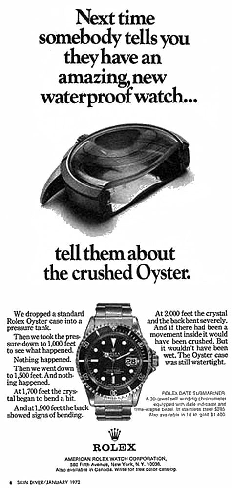
The first ad is triggered by the question that people that are not heavily into watches sometimes ask me, and it’s why Rolex uses the word ‘Oyster’ for many of their watches? The Rolex Oyster case has been the symbol of water resistance ever since Rolex introduced the revolutionary case in 1926. Over the years, Rolex has explained the magic of the Oyster case in many different ads, but none of them was as effective as this ad from 1972. The ad explains what happens to a standard Rolex Oyster case when putting it inside a pressure tank and increasing the pressure. Essentially what it does is explain what happens to an oyster case rather than trying to explain what the idea behind the technique of the oyster case is. It’s a simple and effective way of explaining to anyone what’s so special about the oyster case and why you should buy a Rolex Submariner Date that features that same Oyster case.
2. If You Want To Know More About Rolex Watches…
But all of these details do not make this a uniquely bad ad.
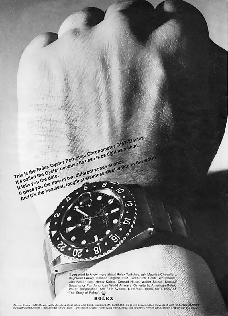
This second ad is a funny one. First off, the composition of the image and the text is horrible. Especially the text above the GMT-Master in the picture is placed at an angle which makes the image weird. Secondly, you can see they had to place the text so people could actually read it, but unfortunately, they haven’t done so successfully. Parts of the text are almost indecipherable due to the shadows on the hand.
Another remarkable thing is that there is no headline or real big statement. There is a statement in the text, and that’s probably what they are trying to get across in the ad and that’s ‘it’s the heaviest and toughest stainless steel watch in the world.’ My guess is that’s why we see a clenched fist. In all honesty, I had to look for some time before I connected the dots, and it still feels like a stretch. And lastly, the angle at which the GMT-Master has been shot is also far from perfect. It looks like the creators focused the clenched fist rather than the watch.
But all of these details do not make this a uniquely lousy ad. Go and Google ‘Rolex ads’ and you will find some fantastic results. The thing that caught my eye however when reading this ad is the text underneath the GMT-Master. You would think it states that if you would like to know more about Rolex watches, you can get in touch with Rolex. And it kind of does…but not before it states that if you want to know more about Rolex watches you can ask several famous people including hotel mogul Conrad Hilton, actress and model Jinx Falkenburg, actor Walter Slezak and Frech singer and actor Maurice Chevalier. It’s a funny detail because it reads like ‘These famous people know all about Rolex watches so ask them all you want to know about Rolex first and afterward you can get in touch with us if you really need to.’ It’s just one more funny detail of an ad that looks very simple at first but has some layers to it.
3. The Flying Rolex Logo
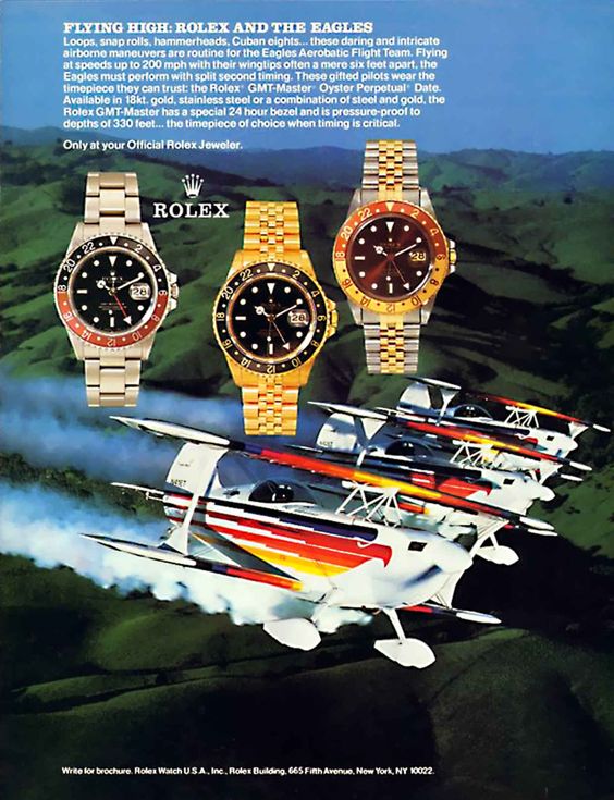
First of all, I absolutely love seeing the Rolex GMT-Master ‘Tiger Eye’ in this ad from 1988. It’s also known as the GMT-Master ‘Root Beer’ or ‘Clint Eastwood’ but I prefer the name Tiger Eye, more specifically in the German translation ‘Tigerauge.’ You can find numerous ads with stainless steel and full gold GMT-Masters, but the Tiger Eye version is a rare sight in ads. Another thing that’s quite rare in that the ad features three watches. Over the decades Rolex has mostly featured just one watch in all their ads so seeing the full line-up GMT-Masters is unique.
The absolute ‘star’ of the ad, however, is the Rolex logo. It looks like it decided to make its own trip up north. Normally you would expect the logo at the bottom right of the page, but someone decided to place the logo in between the stainless steel en full gold version of the GMT-Master. The placement doesn’t seem completely random as it is placed underneath the text about the watches, but it totally disrupts the images of the three watches, and it looks weird in the overall composition of the ad. I’m curious whether the placement of the logo has been subject to discussion or this felt like the right place to put it for everyone involved.
4. The Famous Rolex From Thunderball
The watch featured is actually a Submariner with an Explorer dial.
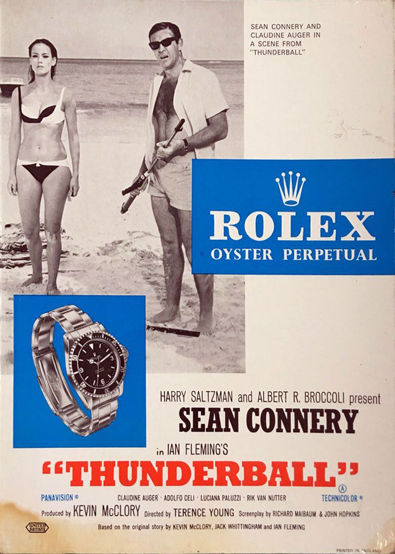
There are numerous stories about James Bond and his Rolex watches, and it is great fun to sink your teeth into all the facts, opinions and speculations that have been written over the years. This ad actually shows the brilliance of Sean Connery as James Bond wearing the Rolex Submariner with reference 6538 in Thunderball. It’s the last Bond movie that stars Sean Connery wearing his Rolex Submariner. The Submariner is not the watch that is featured most prominently in Thunderball. In the film, Bond could also be seen wearing a Breitling Top Time and that watch is the first Bond watch that featured special gadgets that could help Bond out it difficult situations.
Looking at the poster itself, there are a couple of details that stand out. At first, it looks like Rolex has hi-jacked the Thunderball movie poster. Look a little longer and somehow it all seems to make sense: what looks like a relatively straight forward movie poster has turned into a stylish ad with the addition of the Rolex branding and the Submariner image. The rectangular shapes are connected, the blue and red colors bring some life to the ad, the large image of the iconic Rolex Submariner draws a lot of attention and the image of Sean Connery and Claudine Auger brings the stylish world of Bond. I must admit, though, it’s not Sean Connery’s best facial expression in the picture.
Another remarkable thing about the ad overall is the absence of the name James Bond. The actual movie poster used for Thunderball mentions James Bond, but this ad doesn’t. It’s not that we need it at all, that’s why it takes some time to find out the name is missing from the ad. And the most remarkable thing in the ad is the actual image of the Submariner. I missed it at first but looking at the poster a bit longer; I noticed that the watch featured is actually a Submariner with an Explorer dial and crown guards (ref. 5513). Sean Connery actually wore a Submariner ‘Big Crown’ in the movie that does not have crown guards or an Explorer dial. It’s funny how you overlook the most remarkable detail as it feels so familiar.
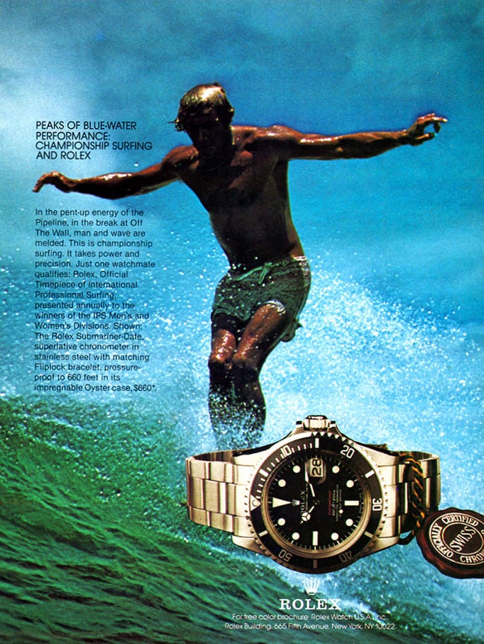
5. Rolex Watches And Surfing Pipeline
Rolex has been a sponsor of many different sports over the decades, but I was surprised to find this ad that shows the brand has also sponsored International Professional Surfing in the late 1960s. At first, it seems like an odd couple as surfing is far from the usual world of Rolex but think about it a little longer and it makes sense based on the Submariner’s functionalities. This specific ad from 1967 states that the annual winners of both the men’s and women’s IPS Division will receive a Rolex watch. It does not state that they will receive the now famous Rolex ‘Red’ Submariner (ref. 1680) that we see in the ad, but that would have been a great first prize.
Another thing that makes this ad remarkable is the fact that we don’t see a surfboard. Somehow the creator of the ad decided to place the Red Sub exactly where the surfboard is and it creates a funny overall image. We know it’s surfing, but we don’t actually see the guy in the picture on a surfboard. The last detail I never thought I would find in a Rolex ad is the names of two of the most legendary surf spots in the world: Pipeline and Off The Wall. I’m a longtime fan of surfing, and to me, that makes Rolex even more legendary than it already was.
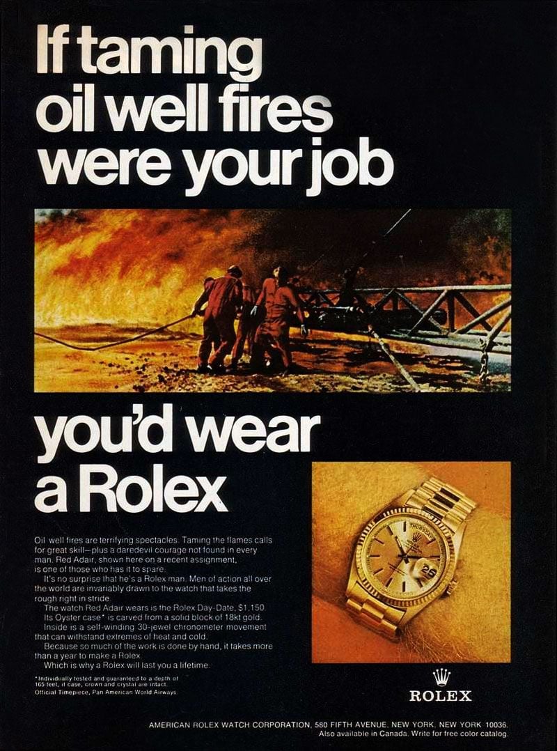
6. Taming Fires With A Yellow Gold Rolex Day-Date
Rolex produced an iconic series of ‘You’d wear a Rolex’ ads in the 1960s and 1970s that in my opinion are the best the brand has ever created. The ads feature a very clear grid of text and images placed on a black background. Every single one of the ads featured the message ‘If you were … tomorrow, you’d wear a Rolex.’ placed in the iconic Helvetica font. The font was created by Swiss font designer Max Miedinger, and he named it Helvetica in 1960 which means Swiss in Latin. It’s a nice and clever choice Rolex made for the ads.
Red Adair and his men did wear their gold Rolex watches at the job.
The reason this version of the ad stands out has to do with some details that make it an odd one out in the series. Rolex made the clever choice to put the gold Day-Date on an orange background, so it’s in line with the colors of flames in the picture above were Red Adair and his men are fighting an oil well fire. Featuring a yellow gold Day-Date in the ad doesn’t seem logical as it seems impossible you would wear a full gold Rolex Day-Date when taming oil well fires. But legendary oil well firefighter Red Adair and his men did wear their gold Rolex watches at the job.
The main detail that is different in this ad is the slogan used. All the ads in the series used to start with ‘If you were in this situation tomorrow, you’d wear a Rolex.’ For this ad, the sentence is changed to ‘If taming oil well fires were your job, you’d wear a Rolex.’ So the decision was made to stop using the aspirational situation the reader could be in tomorrow. I think it’s a shame because it would have been the same message if it would have said ‘If you were taming oil well fires tomorrow, you’d wear a Rolex.’ It’s what makes this ad a bit different, but overall this has to be one of the most iconic and impactful ads Rolex has ever made.
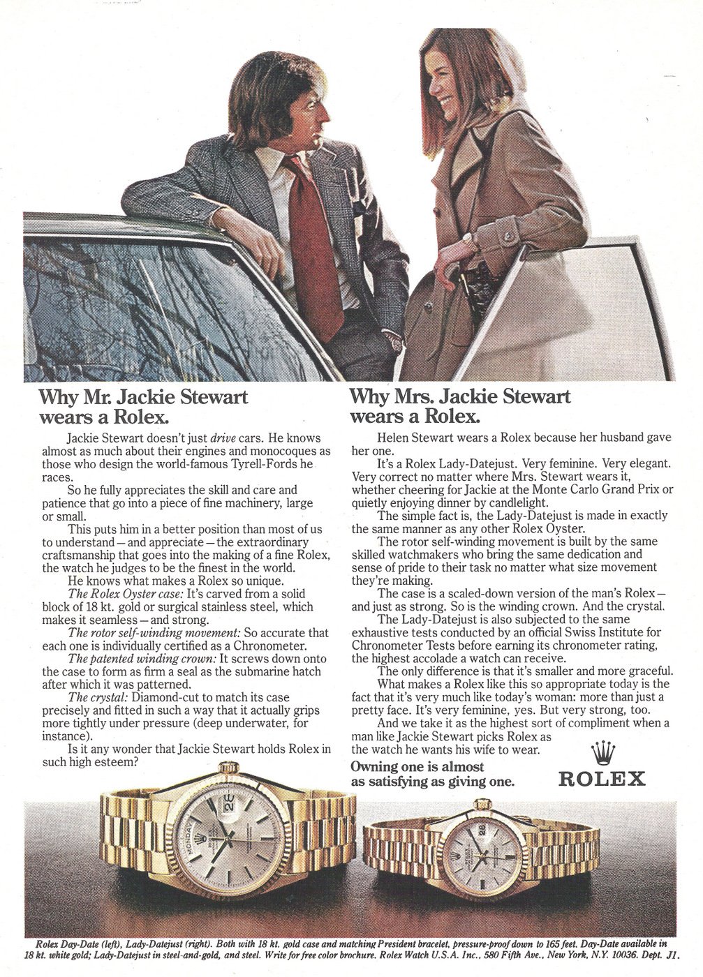
7. What About Mrs. Jackie Stewart?
This ad is a bit controversial in its message. At first sight, it seems like a completely normal ad featuring longtime Rolex ambassador Jackie Stewart and his wife Helen Stewart explaining the reasons why they both wear a Rolex watch. For Mr. Jackie Stewart is a list of impressive technical features and facts that make the yellow gold Day-Date the watch Stewart can relate to and making it the perfect watch for him. For Mrs. Stewart, the reasons for wearing a Lady-Datejust are a bit less personal. The first reason mentioned: ‘Helen Stewart wears a Rolex because her husband gave her one.’ Right okay…maybe after Stewart gave it to his wife, she found more reasons why the Lady-Datejust is her preferred watch?
‘Helen Stewart wears a Rolex because her husband gave her one.’
After quickly stating that the Lady-Datejust is very feminine and graceful, the text continues with another list of technical facts and features that seem to be completely irrelevant to most women when they would buy a watch. Almost all the text written for Mrs. Stewart is written from a male perspective and to top things of, the statement at the end is the true spirit of the ad. ‘What makes a Rolex like this so appropriate today is the fact that it is very much like today’s woman: more than just a pretty face. It’s very feminine, yes. But very strong, too. And we take it as the highest sort of compliment when a man like Jackie Stewart picks a Rolex as the watch he wants his wife to wear.’ More than just a pretty face right…?
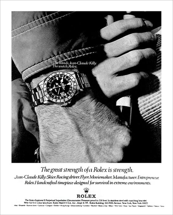
8. The Hands And The Watch
I have to say I love this ad. It features my favorite version of the Rolex Explorer II (ref. 1655) on the wrist of French former professional skier Jean-Claude Killy. Killy has been a Rolex ambassador and member of the Rolex board of Directors for over 40 years. It’s a well-known fact that Killy wore the orange hand Explorer II during his ski career, but his name is more closely connected to the Rolex Dato Compax. It doesn’t take anything away from the iconic power of this ad if you ask me. The Explorer II is the center of attention in this ad, and it looks beautiful.
This ad is part of a series of ads that feature the hands of a famous person and a Rolex watch they are wearing. You can find other ads in this series with the hands of Lamar Hunt, Telly Savalas, and Virginia Wade. All of them have the same grid and show a beautiful picture that features the text ‘The hands: … The Watch: Rolex’ and in all of them, the placement of this text is different. The reason the version with Jean-Claude Killy is featured is that the placement of the text is way too close to the watch and it is placed over dark and light parts of the image, making it hard to read. It’s this detail that makes this iconic ad weird. Does it ruin it? Not really. Look at it a bit longer and you will get used to it. It might even become this quirky detail that makes it even more iconic. But I find it remarkable how Rolex over the years has had great trouble placing text in their ads, so it’s easy to read and makes sense in the overall composition of the ad.
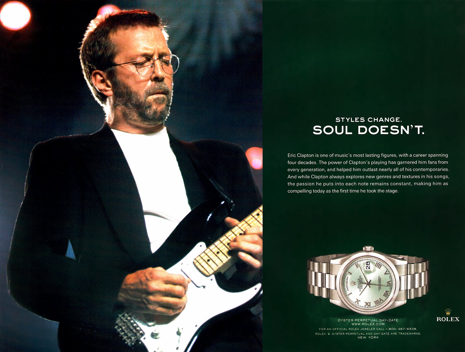
9. Styles Change. Soul Doesn’t.
The power of the words ‘Styles change. Soul doesn’t’ is what makes this a great ad.
This ad is all about the mentality behind the images, and I think these make the greatest ads. I have to admit though that it is the only ‘recent’ Rolex ad because most of the newer ads are not as exciting or remarkable as the older Rolex ads. A lot of the current ads are even a bit boring, so there weren’t many great ads to choose from when looking at the modern Rolex ads. This one is great, however.
Eric Clapton obviously is an icon in the music industry and a famous watch collector. So it seems logical that Clapton, who is a big Rolex enthusiast, is the best brand ambassador you could wish for. But the power of the words ‘Styles change. Soul doesn’t’ is what makes this a great ad. I don’t like Clapton’s music, I don’t think it’s a great image of him, and I would choose a Les Paul over a Stratocaster any day. But that’s not what it’s about and why I love this ad. It’s about the mentality with which both Rolex and Clapton have done things over the decades, and I understand and respect that. And that’s what the words in the ad point out perfectly.
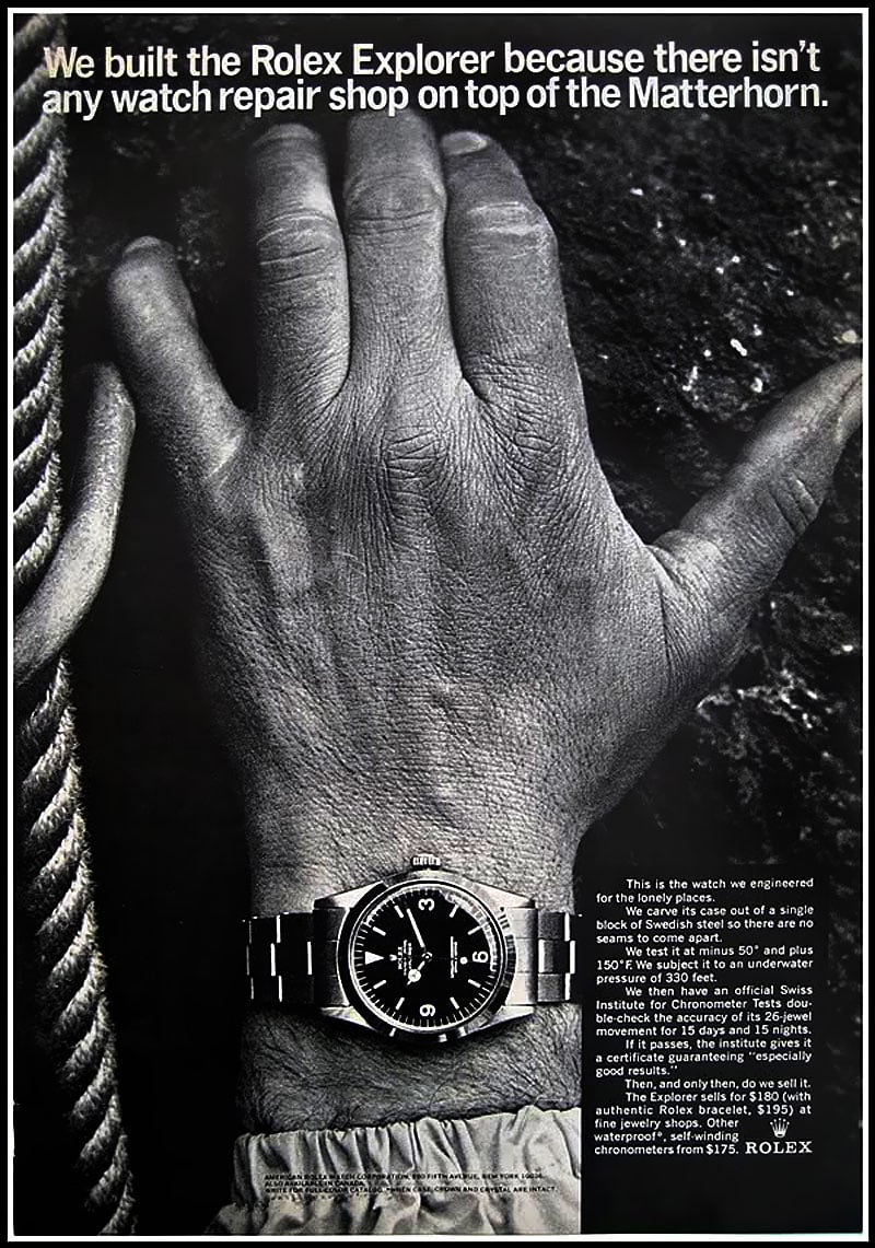
10. Exploring The Matterhorn
For this article, I have seen hundreds of different ads and this is my personal favorite. This ad was created in 1966 and five decades later, it still is stylish, relevant, and iconic. The image is absolutely stunning, and I love seeing the Rolex Explorer (ref. 1016) on the wrist of a mountaineer on his way to the top of the Matterhorn. The message of the ad is as much fun as it is true and it immediately creates an image of the famous mountain in the Swiss Alps that has become synonymous with Switzerland.
It wouldn’t be a proper Rolex ad however if there wasn’t a problem with a piece of text. If you look closely at the sleeve of the mountaineer’s jacket, you will see some small black text that is very hard to read. It’s a strange place to put the text and it would have been better to place it on the right side underneath the text about the $195(!) Explorer. Speaking of the text on the right, we would outline the text a bit differently nowadays to make sure there is enough space between the arm and the text. But both are minor details in this iconic ad that you could still publish today.
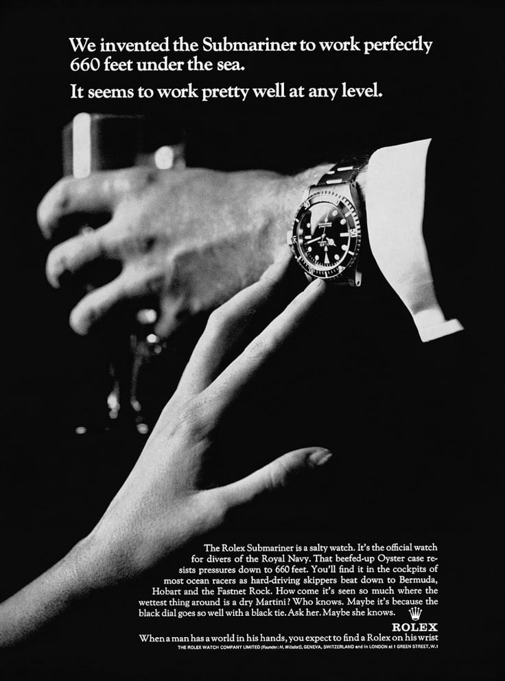
11. The Influence Of James Bond
It’s the most iconic Rolex ad ever created.
This list of ads would not be complete without this famous ad that is inspired by James Bond. The tongue-in-cheek message is what makes this a great ad and the overall style is completely in line with the world of James Bond. It’s probably the most iconic Rolex ad ever created for the most iconic luxury watch in history. And there is not much more to explain about this ad. It’s the perfect example of why Rolex is the iconic brand so many people love.
Over the decades, Rolex has created hundreds of ads that are worth checking out. This is only a small selection, and it will be fun to select more ads in the future and come up with a follow-up as the world of Rolex is full of remarkable ads.
More information about Rolex on their official website.
*Most images were taken from Jake’s Rolex World. Others were grabbed via Pinterest.

