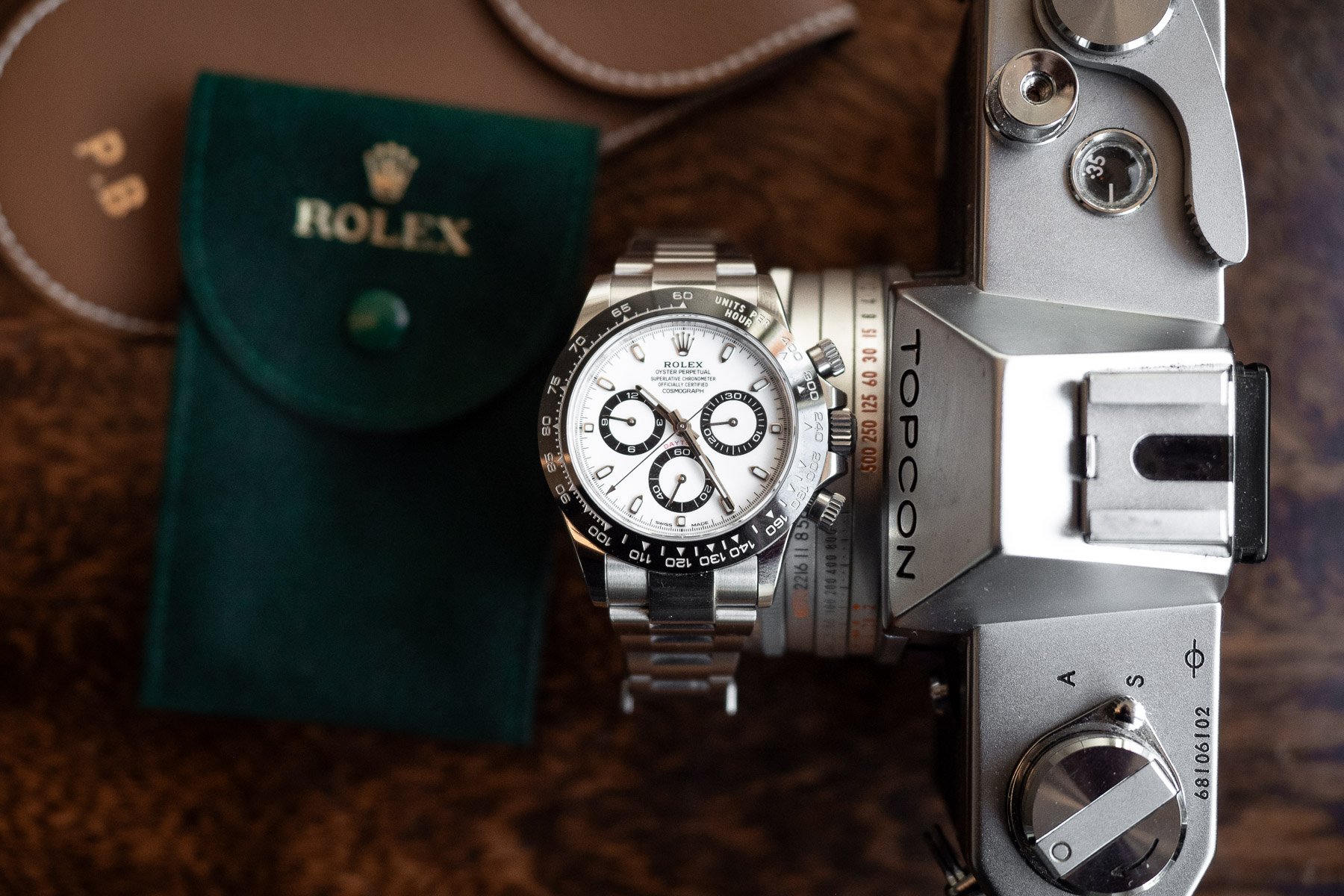
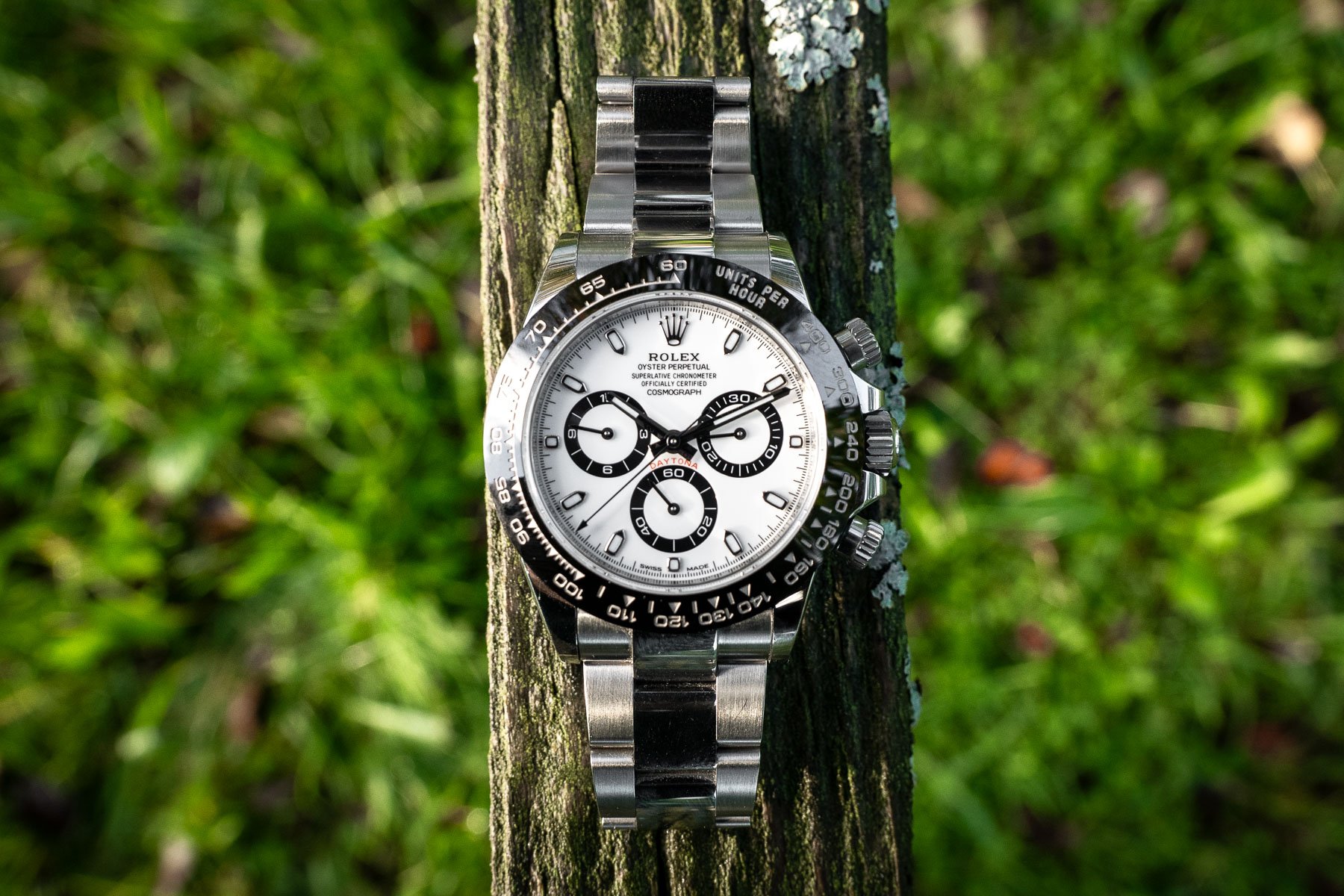
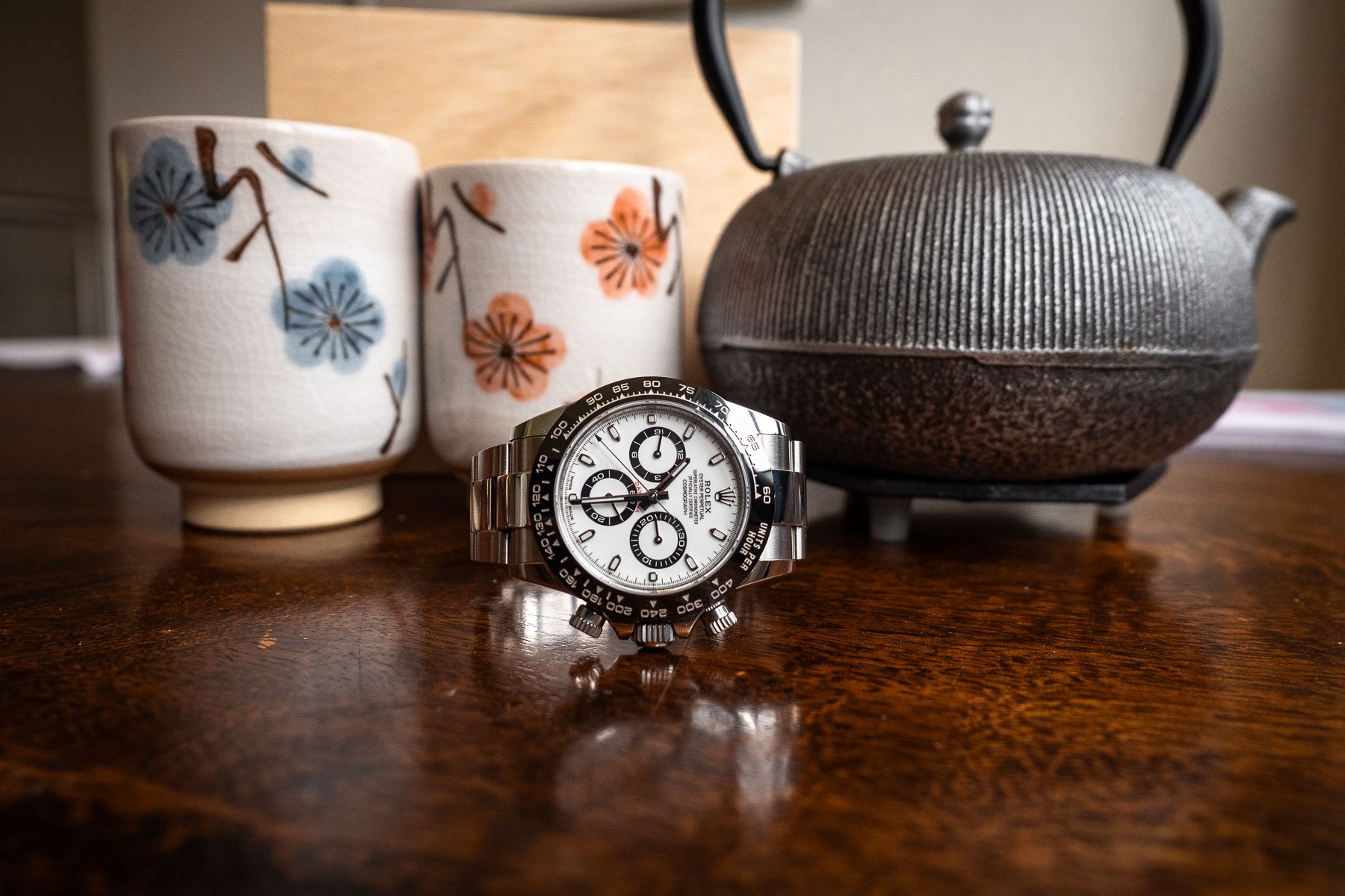
An Owner’s Review Of The Rolex Daytona 116500LN — The Good, The Bad, And The Ugly
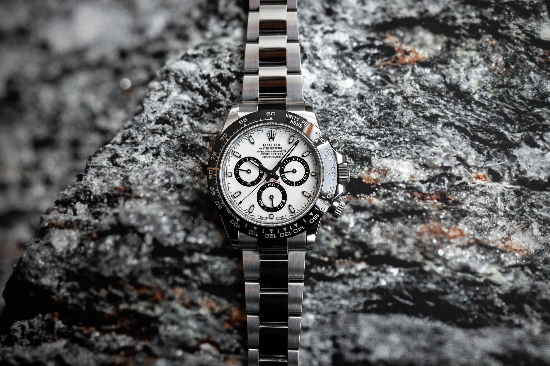
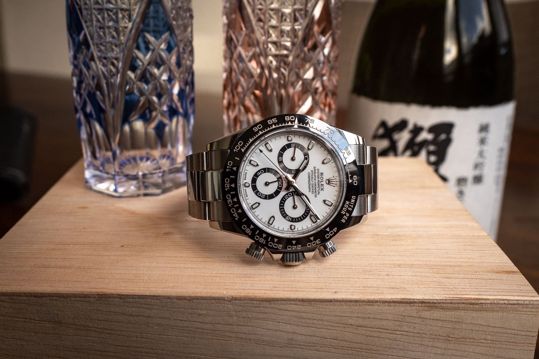
A few months ago, it finally happened: I got “the call” from my Rolex dealer that I could pick up one of the store’s very last Rolex Daytona 116500LN models with a white dial. By the way, while we’re on the subject of the dial, what is up with everyone referring to this model as the “Panda”? Has anyone ever seen a panda bear with rings around its eyes instead of solid black circles? I’m curious to hear your thoughts about that in the comments below!
Anyway, for obvious reasons, I consider myself very lucky to have received the outgoing model shortly before its official discontinuation. The Daytona 126500LN that Rolex unveiled at Watches and Wonders this year started arriving at stores in September, but I find its predecessor more elegant. I could go over the reasons why I like it more, but I actually found that Ben’s arguments in this Sunday Morning Showdown article summed my feelings up perfectly! I will say, though, that some aspects of the updated model do still make it a fantastic chronograph, and I will only truly make a judgment once I’ve physically handled the 126500LN.
I’ve owned my 116500LN since July. Here are what I believe to be “the good, the bad, and the ugly.”
Rolex Daytona 116500LN — The good
For the sake of starting the article on a positive note (but to also stay true to the title of the 1966 western starring Clint Eastwood), let’s start with the good. It will come as no surprise to you that this section is the easiest to write as this white-dial Daytona in steel truly is, hype aside, a great watch. I will admit that I was quite excited when I finally got notified that I could pick it up. However, after wearing the watch for a few hours, that initial excitement of finally owning a Daytona subsided remarkably quickly. I’m including this in “The Good” section because I’m excited about this watch in a different way.
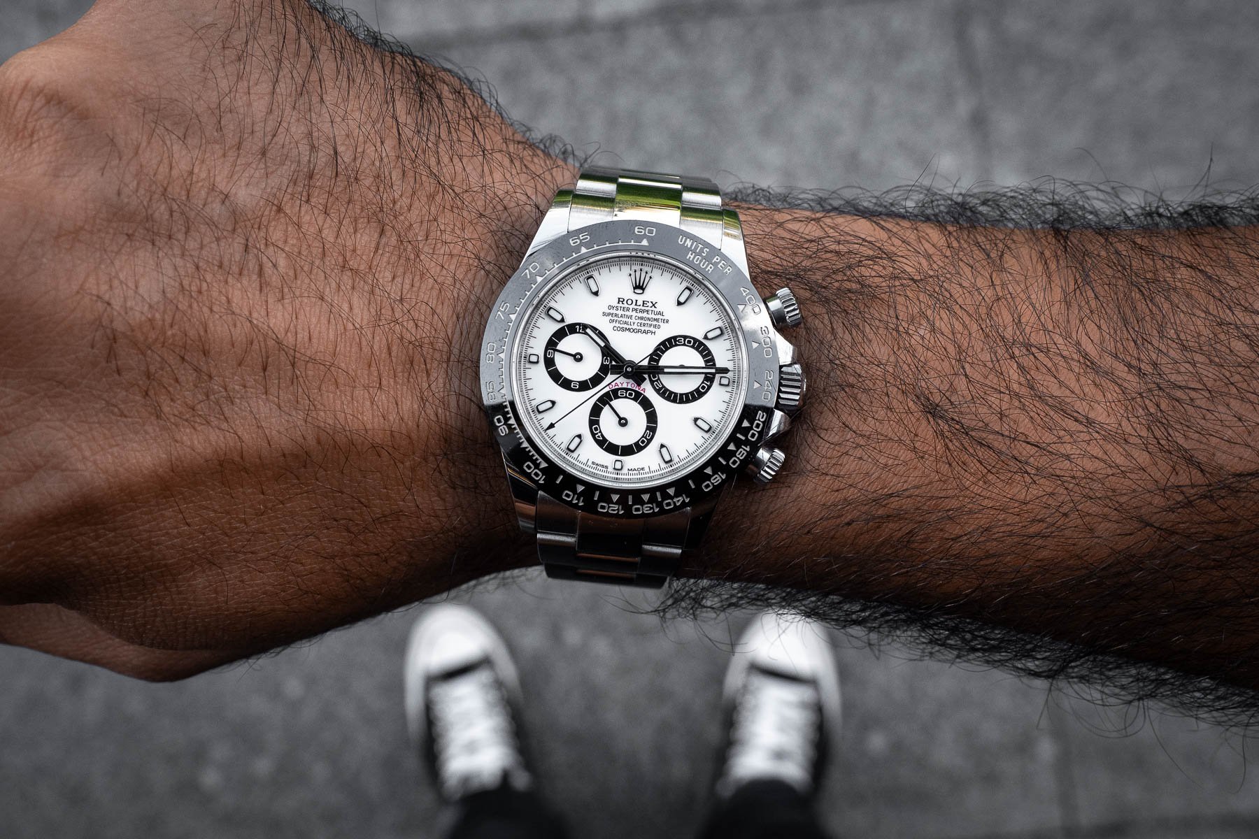
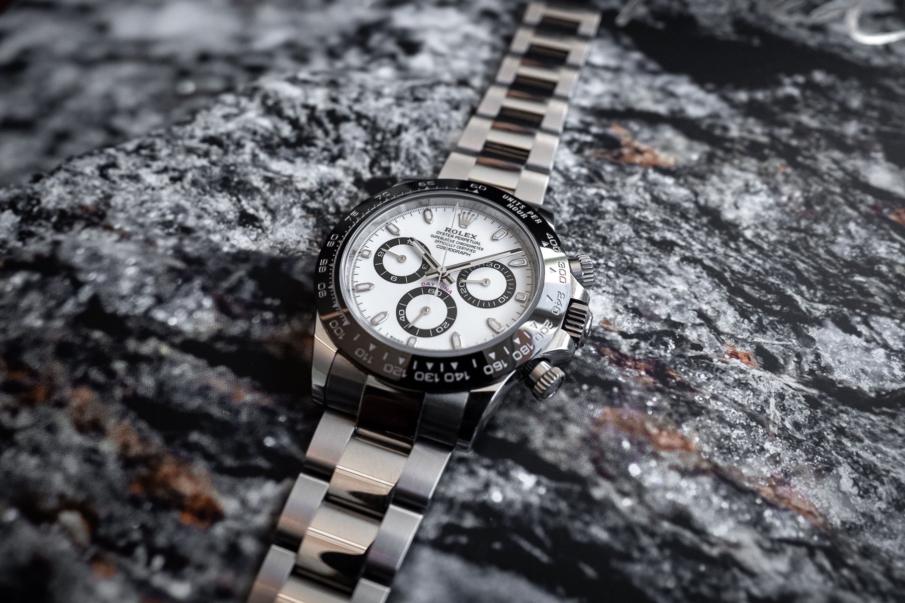
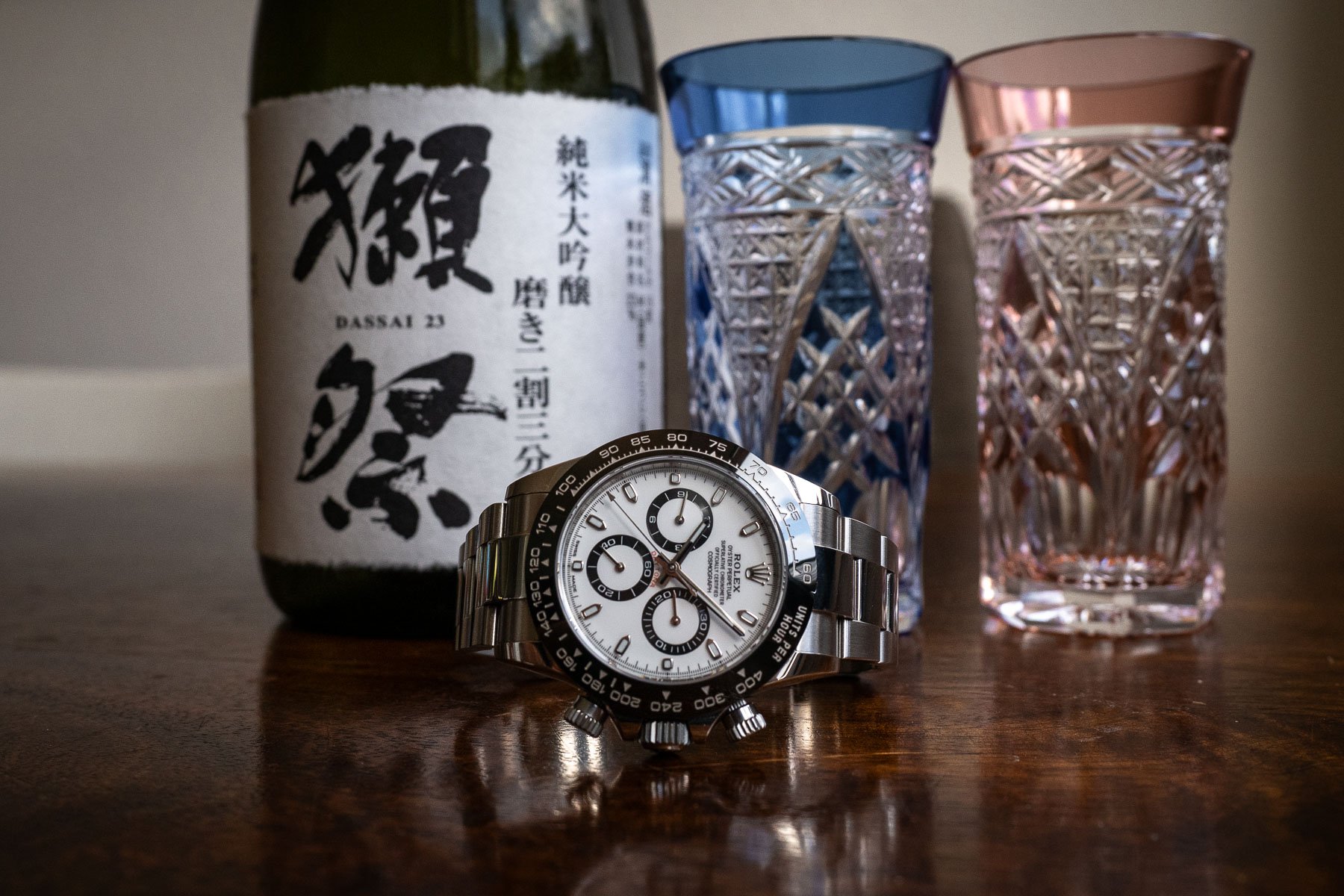
With my 16.5cm wrist size, the Daytona’s 38.5mm case diameter (how Rolex gets away with calling it 40mm is quite baffling!) and 12mm thickness hit the sweet spot. It feels remarkably similar to the Speedmaster Professional because, despite the Speedy having a 42mm diameter thanks to its crown guards, its lug-to-lug is only 0.6mm longer, and the case is 1.2mm thicker compared to the Daytona. The case is different from many other iconic references within Rolex’s Professional lineup. The rounded, polished case more closely resembles that of a Datejust, Day-Date, or Sky-Dweller than that of a more brutalist Submariner, GMT-Master II, or Explorer II.
Dial-side delights
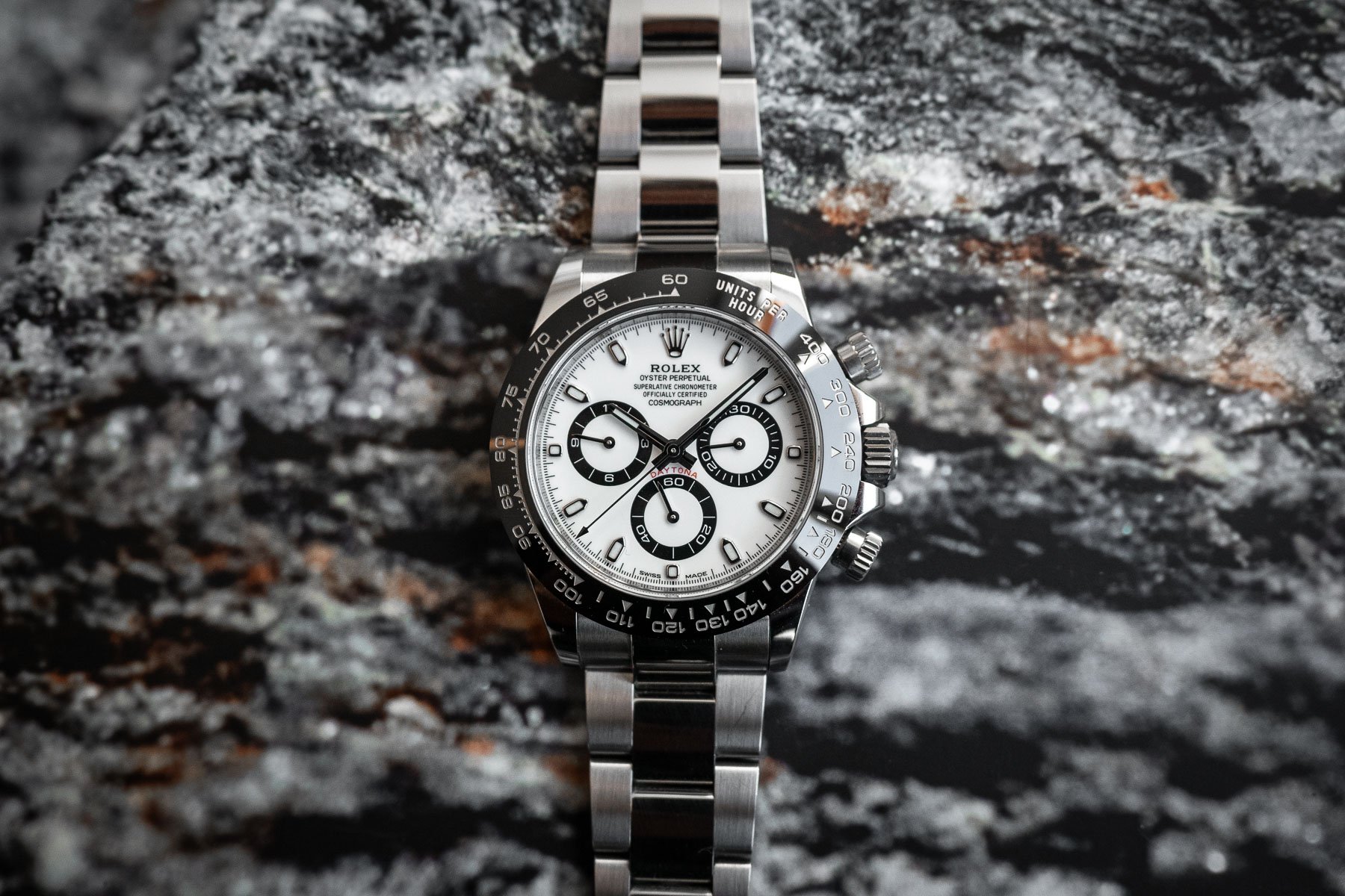
Moving on to the dial, I very much enjoy how the colors create an optical illusion that the watch is larger than it is. This becomes even more noticeable when it’s next to a black-dial model. This Daytona’s black/white contrast is what instantly made me a fan in 2016 when debuted at the now-dead Baselworld. While the predecessor, ref. 116520, is a good-looking watch as well, to me, the white and silver dial looked a bit “soft”.
The bracelet and clasp are pretty much what one would expect from the superlative Geneva-based Oyster producer. Both elements are extremely well engineered and strike the perfect balance between heft and elegance. The polished center links of the Daytona’s Oyster bracelet give it a bit of a dressy look compared to the fully brushed bracelets of other models. Additionally, the clasp features an Easylink extension. This proved to be a very welcome feature during the blisteringly hot, humid days this past summer. I would adjust the bracelet multiple times a day, especially when entering and leaving air-conditioned environments.
Rolex Daytona 116500LN — The bad
What could one consider “bad” about one of the most coveted and iconic watches in the industry? Well, as fine of a watch as the Rolex Daytona is, it does have some shortcomings that I can’t neglect to mention. To start, let’s talk about the obscure sub-dial placement. For the record, I don’t mind non-centered sub-dials in general. Looking at two-register chronographs, the lower sub-dial placement of the Patek Philippe 5172 creates a beautiful balance with the “Patek Philippe Geneve” text at 12 o’clock. Ditto for the A. Lange & Söhne 1815 chronograph.
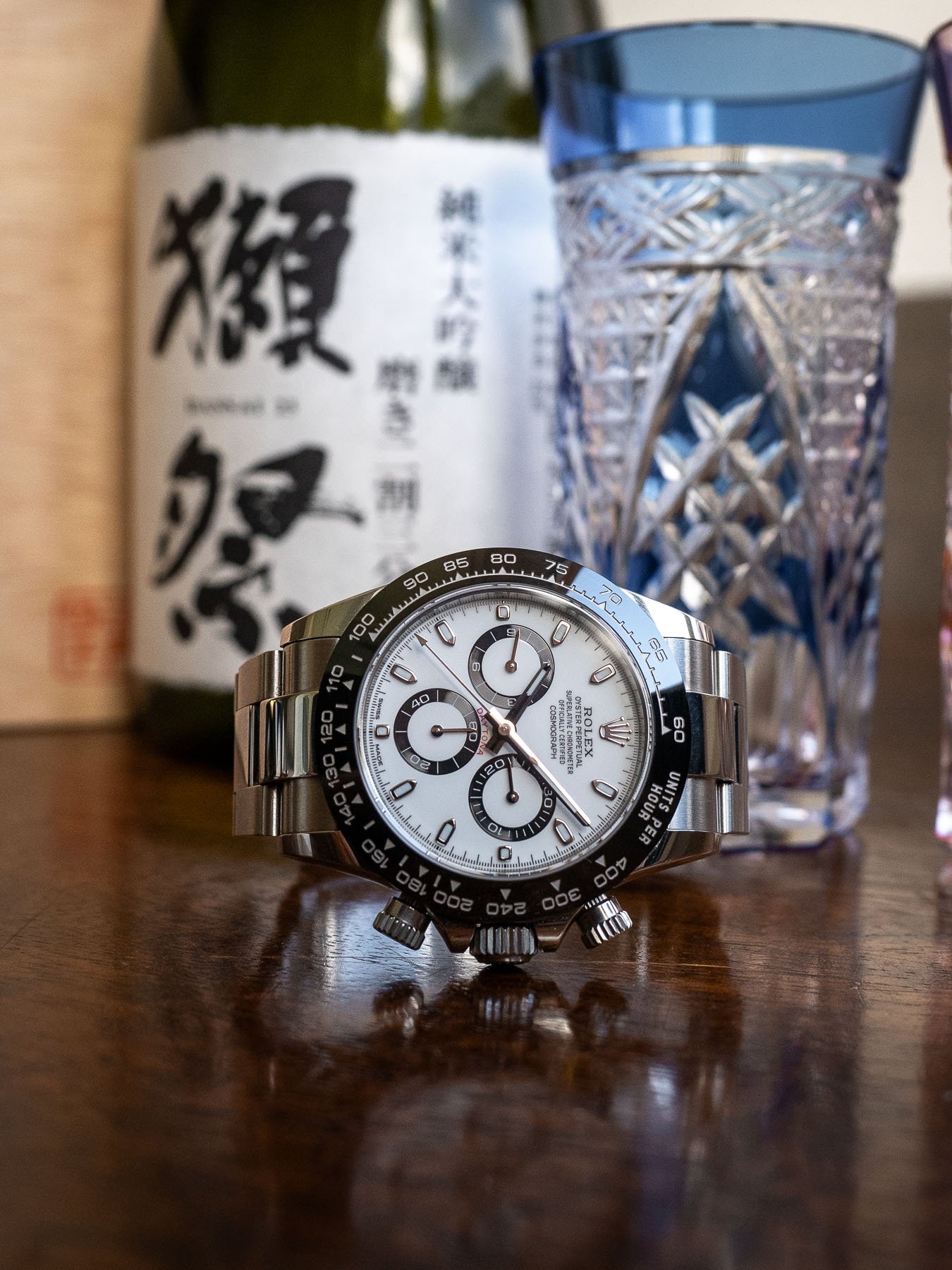
On the Daytona, however, there’s something that looks slightly off. The sub-dials are only very slightly raised, which almost makes it seem as if the positioning was a compromise. Luckily, this doesn’t bother me as much as it does some, but I do not understand why Rolex made this design choice when designing the 4130 caliber in this reference. Rolex’s first automatic chronograph, the Daytona ref. 16520, famously used a modified Zenith El Primero movement. On that reference, the sub-dials were dead center, which, from a design standpoint, looks superior to me.
A matter of price
My next point is perhaps a little controversial, and many will probably disagree with me (I’m happy to be roasted down below!), but we have to talk about the price. I don’t want to sound ungrateful that I had the privilege to pick one of these up at retail, but I do find the price to be somewhat steep. One could argue this to be the case for all Rolex models, but the “Rolex tax,” if you will, is strong with this one. I do believe one can find decent value within the Rolex catalog with the Oyster Perpetual line. But if we’re comparing the Daytona to other iconic chronographs by different brands, it is superlatively (I couldn’t resist) expensive.
At CHF 14,100 for this outgoing model (CHF 14,300 for the successor), it did sting a little. Sure, it trades for more on the street, but if I decide to keep it for good, that money won’t do much for me. I still paid the full retail price. In comparison, the current Omega Speedmaster Professional (Hesalite) and Breitling Navitimer 43 cost CHF 6,600 and CHF 8,750, respectively. In my opinion, these represent greater value.
On the pushers
I’ll be honest that I have mixed feelings on the final point — the screw-down pushers. Like many of you here, I am a nut for chronographs. You can read an article I wrote about why I think that chronographs are the best subcategory of watches here. Not only do I love the look of them, but I’m also constantly using the chronograph function. Timing things using the watch I’m wearing has become a bit of a habit. I’ll use it for measuring all kinds of things — cooking, the length of a drive or a hike, and my children’s screen time, just to mention a few.
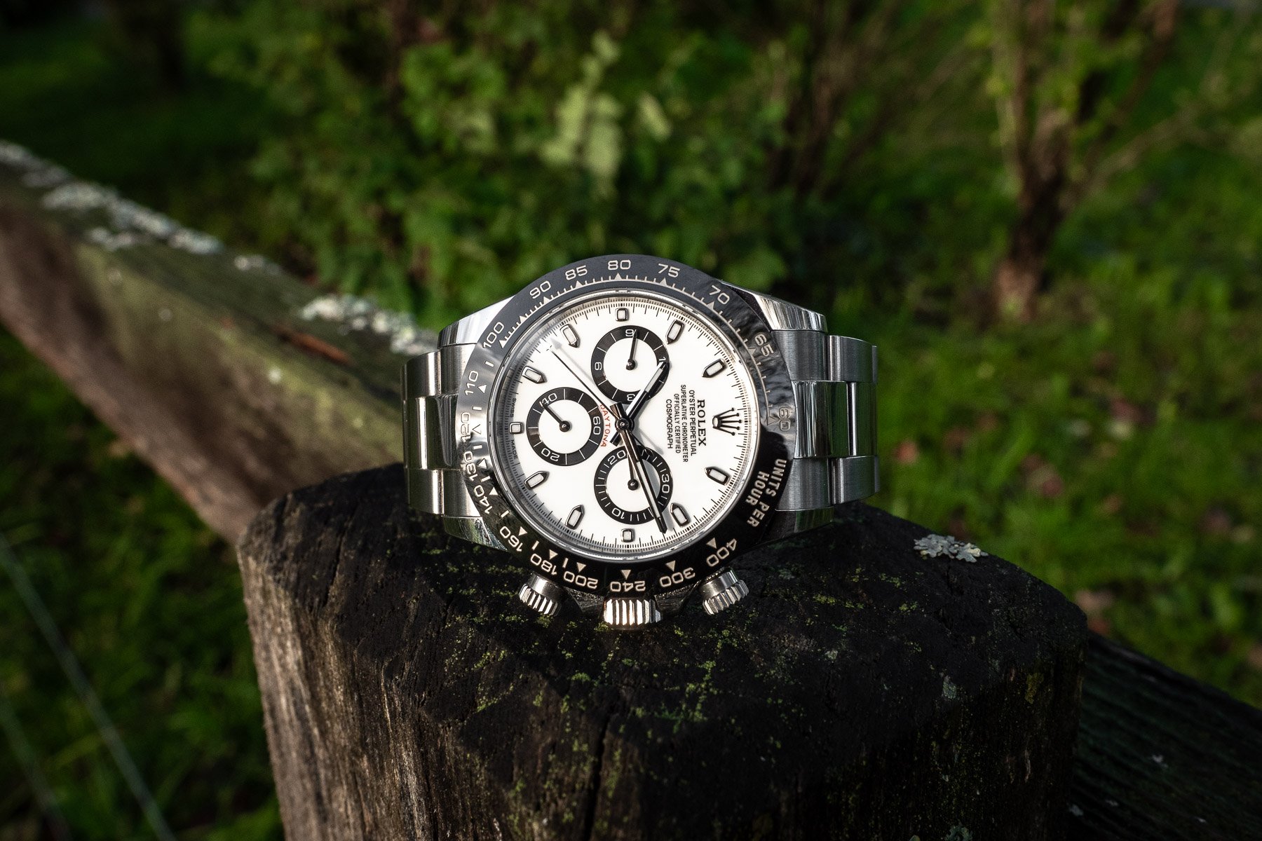
Having to unscrew the pushers to use the chronograph caught me off guard several times, especially when I don’t have both hands available, like when I’m riding my motorcycle. I’m aware that I’m sounding nitpicky, but we’re buying little mechanical objects for large amounts of money. Is it unreasonable to be a bit nitpicky? I’m on the fence about just always leaving them unscrewed as that defeats the purpose of the screw-down feature. Rolex states the watch is still water resistant if the pushers are unscrewed and that having them screwed down is to prevent accidental use while the watch is submerged. I will say that I appreciate the idea of screwing them down and do also enjoy the look.
Owning a Rolex Daytona — The ugly
To clarify, I’m using “the ugly” to sum up points that have nothing to do with the physical watch but about owning it instead. I bought this watch knowing that I would keep it as I had tried it on several times before, so none of “the ugly” caught me off guard per se. But I must mention that this is the only watch I’ve owned that causes people on the street or in various establishments to directly ask me how much I paid and if I would sell it. I’ve only owned it for a few months, but I’ve been wearing it nonstop. It has already happened a few times in person and many times on watch-related social media. It shows that the watch stands out, which means I will have to consider where and when I plan to wear it.
Other frequently asked questions are the classic, “Where did you get it?” “How long did you wait?” and “What was your purchase history?” If I’ve never met the person before, I really don’t feel like answering those questions. They are, however, the result of the Daytona’s hype and market value versus retail value (although, thankfully, this has calmed down compared to a few years ago). You’ve heard my thoughts on the high retail price, so you won’t be surprised that I’m throwing the Daytona’s market value into “the ugly” section too. As of right now, this white-dial version has a street value of roughly double its retail, which is every bit as absurd as it sounds. When searching Chrono24 for what you can get for almost CHF 30,000 from brands like Patek Philippe or A. Lange & Söhne, this fact becomes even more absurd.
Final thoughts
In light of the above-mentioned points, my biggest takeaway from having owned the white-dial Rolex Cosmograph Daytona ref. 116500LN for a few months is that the actual watch scores extremely highly in almost every regard. It is, as mentioned, by no means a perfect watch. But for what Rolex designed it to be — a more-than-capable everyday no-date chronograph on a bracelet by the most powerful brand in the industry — it’s not too far from perfect either. I have been and will be wearing this watch a lot, and I predict it will be a cornerstone of my watch collection. Please share your opinions on the Daytona in the comments below!

