Are Case Backs The Unsung Heroes Of Watch Design?

The watch hobby is one devoted to attention to the details. So it seemed remarkable to me that, until this article, I had never paid too much attention to an entire area of a watch’s design — the case back.
The case back is an area where a multitude of watch brands have had their fun, expressed a flair for design, or perhaps even shared an inside joke. At the same time, others (I’m thinking the Hans Wilsdorf variety) have frequently said more with less.
An appreciation for the case back
The case back of a watch started to land on my radar after the series of articles that my colleague Thomas wrote on the creation and execution of his VPC Type 37HW (you can read those features here). One element of the multifaceted process of creating a watch design is what to do with the mass of material protecting the watch where it meets your wrist, i.e. the case back. What material should it use? Should it be a see-through sapphire number to showcase a movement? Should it be steel, titanium, or something else altogether?
Then there are the questions about what the case back should or shouldn’t show. So here are a few examples of case backs I have found engaging and the reasons why. As always, dear readers, I would love to read your opinions and thoughts in the comments section. Without further ado, let’s get started.
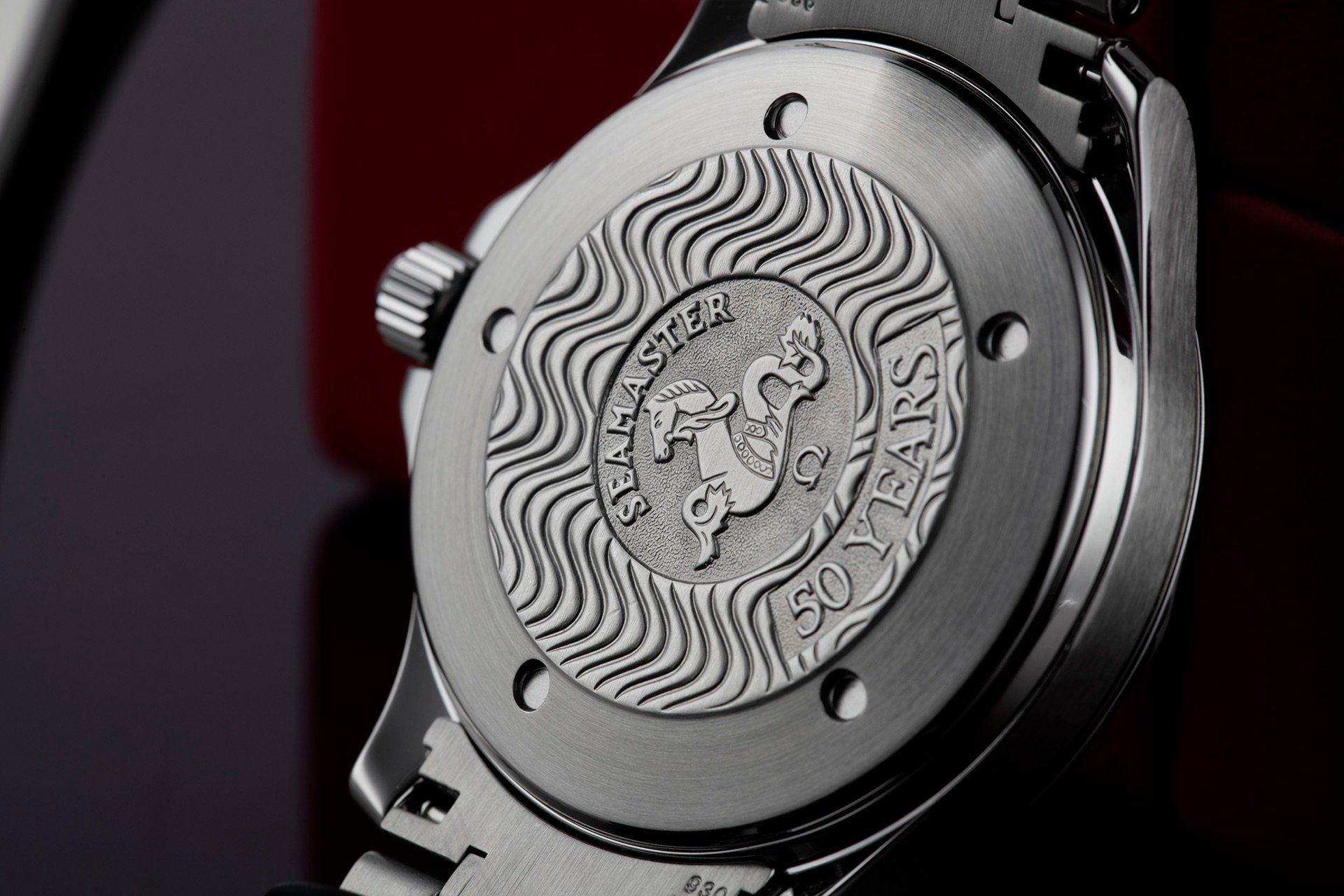
Image: The Watch Club
Omega: A host of interesting case backs
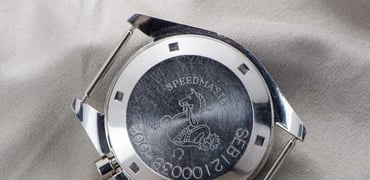
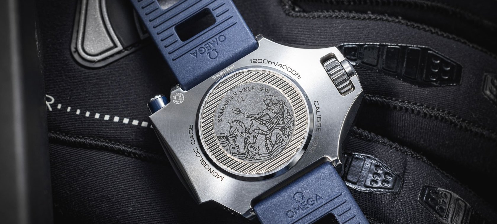
Let’s start with Omega. The reason I am doing so is that Omega has to be one of the leading brands when it comes to interesting case-back designs. A lot of modern Omega watches feature sapphire display backs, which exhibit beautifully machined movements. But many of my favorites are of the all-metal variety. The Omega seahorse (hippocampus) started appearing on Omega Seamasters in 1957. Not only is it a beautiful design, but it has also now become iconic for the watchmaker.
The design adds a degree of classically stylized flair to an Omega watch. More importantly, though, it connects the Seamaster name to a symbol of the ocean. According to Omega, the design began with a member of the company’s designers getting inspiration while on a holiday: “On a visit to the city, a member of OMEGA’s design department was struck by the famous gondolas and the beautifully sculpted representations of Neptune’s Seahorse on each side. OMEGA’s symbol for its Seamaster collection had been found, and the emblem began appearing on models from 1957.” Since then, Omega has played with the design, including adding wave patterns on case backs to signify the ocean’s surface. Bravo, Omega, on a beautiful and iconic design!
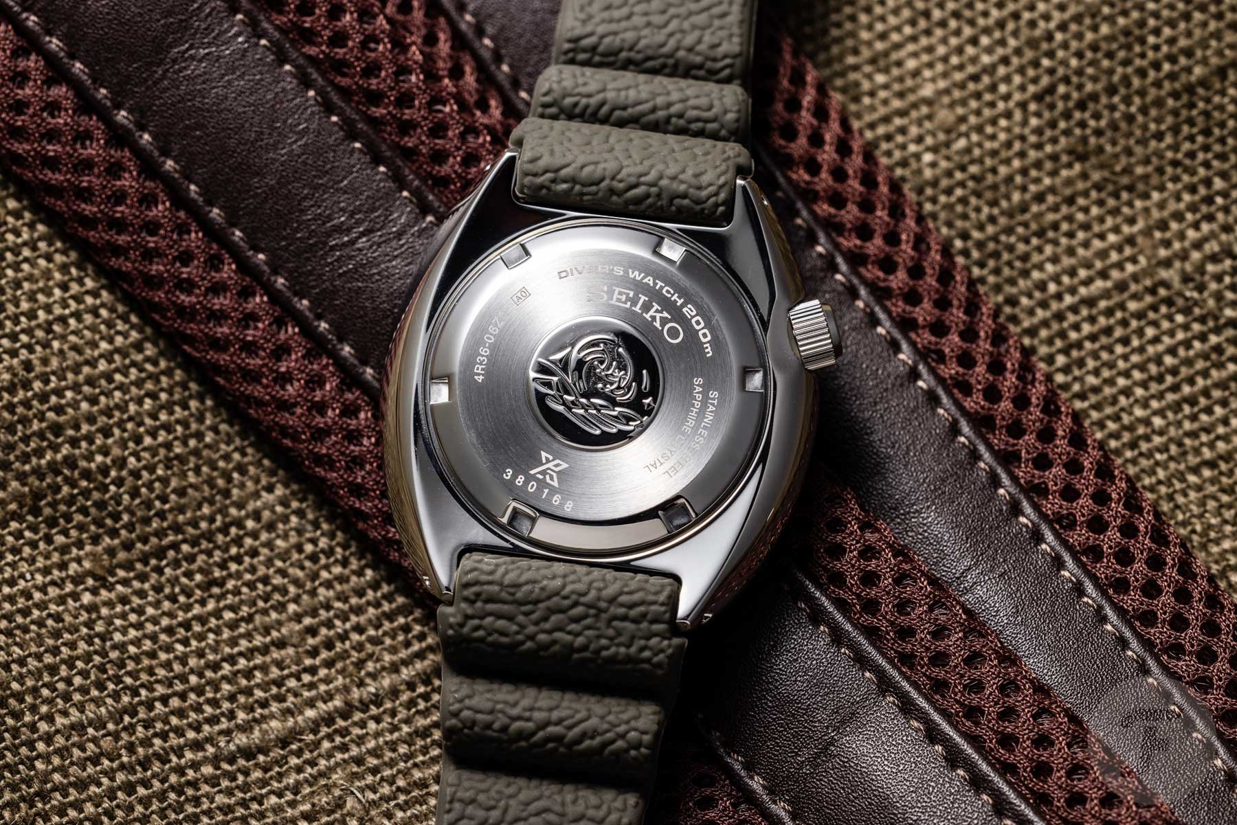
The Seiko “Wave” case back
Next, we come to a favorite of mine — the Seiko “Wave.” Seiko has a few different wave designs for its case backs. Today, we are discussing the one found on its Prospex divers (and vintage dive watches, like the 6309-7040). The tsunami logo, as it’s known, represents a professional-spec dive watch that is water resistant to at least 20 ATM (200 meters). You can see a guide here.
It is a common misconception that this design is a stylized version of a famous artwork known as The Great Wave off Kanagawa. Actually, as stated above, it is a symbol of the watch’s underwater prowess and its ability to withstand the harsh conditions of the ocean. This has to be one of my all-time favorite designs for a case back because of what it represents — respect for the power of our oceans.
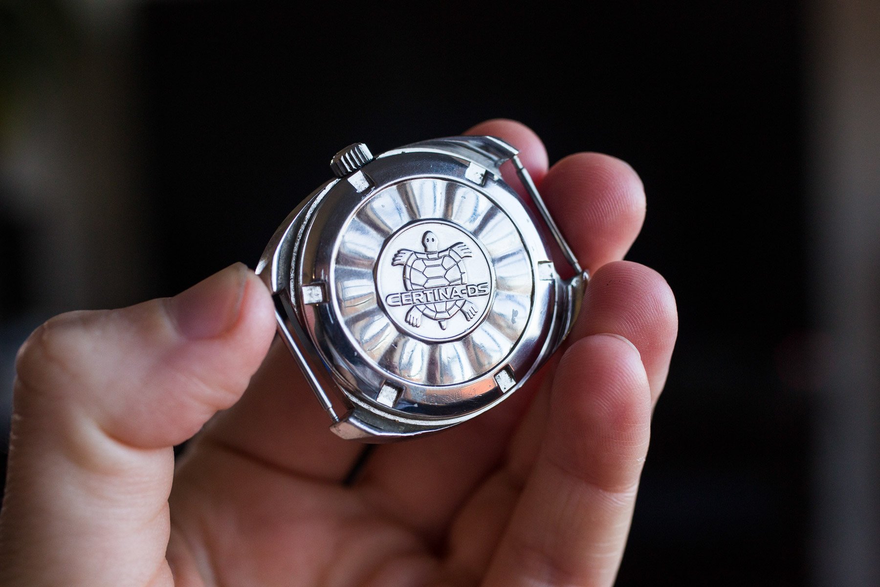
The Certina “Turtle” case back
Next is another personal favorite. This time, we are looking at the Certina DS “Turtle” design. The DS, or Double Security, is a type of shock resistance that Certina introduced in the 1950s. During its development, the brand incorporated several interesting design advancements. Essentially, the DS System allowed the watch caliber to “float” inside the case thanks to an elastic shock-absorbing ring. This was in addition to an Incabloc shock absorber inside the movement. Certina also placed a small gap between the dial and the case so that the movement could physically move in all directions. On the website VintageCertinas.ch, you can read more about this.
To designate the presence of this shock-absorption system in its DS watches and symbolize their durability, Certina had a turtle etched on the case backs. Indeed, the DS System provided a high degree of ruggedness and shock resistance, particularly for the time. Certina DS watches went on to be part of several notable mountaineering expeditions, including an attempt to ski down Mt Everest.
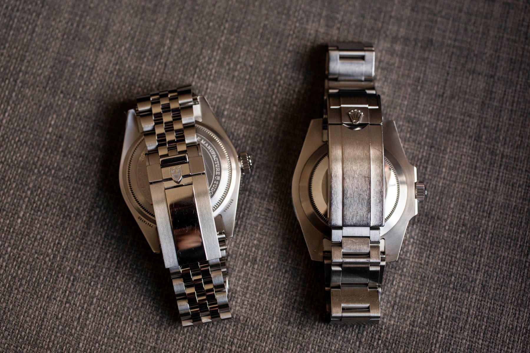
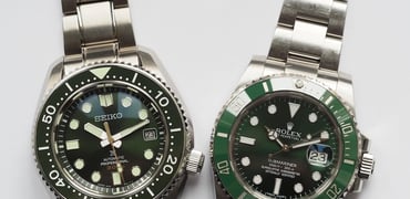
The Tudor and Rolex blank slate
Both Rolex and Tudor have become the masters of the “blank slate” approach to case backs. Most of the Tudor Black Bay line features not much on the case back except a concentric line of text with some technical information. Something like the Rolex Submariner will feature nothing at all.
I like this less-is-more approach. It not only leaves space for personalized engraving (a standalone subject, to be sure), but it also riffs off the core founding ideology of these two brands — understated excellence. Now, you could say that the core ideology has changed somewhat over the years, particularly with Rolex! But at least many of these two brands’ case backs take the same approach as the iconic models from the middle of last century. Long may this last.

The Grand Seiko power reserve indicator
Grand Seiko is a powerhouse when it comes to modern watch manufacturing. Unfortunately, though, there have been very few of the brand’s modern models that resonated with me. One of the biggest issues has been Grand Seiko’s repeated decision to insert a power reserve indicator on the dial of its Spring Drive watches. For me, this is a blemish on what would otherwise be a beautifully symmetrical dial design.
But not all Grand Seiko Spring Drive watches have this. Some, like the SGBD201, showcase their beautifully finished 9R01 movement beneath a sapphire window on the back, which showcases the power reserve indicator beneath. In my humble opinion, this is one of the best uses of an exhibition back. With it, Grand Seiko is utilizing the sapphire as a genuine technical improvement, providing a window for the owner to not only appreciate the beautiful movement but also to see how much power is left in the tank! This approach, at least to me, is some of the best in modern Grand Seiko design. This is an exhibition case back done right.
Closing thoughts
Looking at a watch’s case back is always an exercise worth your time. For me, at least, the case back has long been an underappreciated element of design. Now that has changed! But, dear readers, what would you say is an example of an iconic or interesting case back? I would love to read your suggestions in the comments.