Back To Basics: Watch Hands—The Most Underestimated Element In Watch Design?

Watch hands are not just literally at the core of any watch’s design. They are the functional heart of a watch, the final parts turning a complex mechanical chain into a time-telling device. As the primary point of focus when looking at a watch, they determine much of its looks. At the same time, they are hardly ever explicitly discussed. Therefore, this installment of Back to Basics digs deep into watch hand design.
As always, Back to Basics is aimed at newcomers to our beautiful shared watch hobby. If that’s you, I hope to open your eyes to the weight of watch hands in the overall aesthetic and function of a watch. They will never escape your attention again when evaluating a watch. I will not be reviewing every style individually; Thor Svaboe did an amazing job at that. You can find his two-part series on the topic here and here.
Watch hands—the end of the chain
As I mentioned above, a watch’s hands are the end of the chain. Everything that happens inside a watch culminates at the tips of the hands. Whatever fancy stuff goes on underneath the dial, at the end of the day, the tips of the hands need to point out the correct time. In this sense, everything runs in service of the watch hands. They are the end of the chain and the absolute heart of the watch, at least visually.
It may not surprise you, then, that the handset has a massive effect on the watch’s overall appearance. They carry major weight in any watch’s design, so much so that swapping a handset for a differently shaped set can change the entire character of a watch.
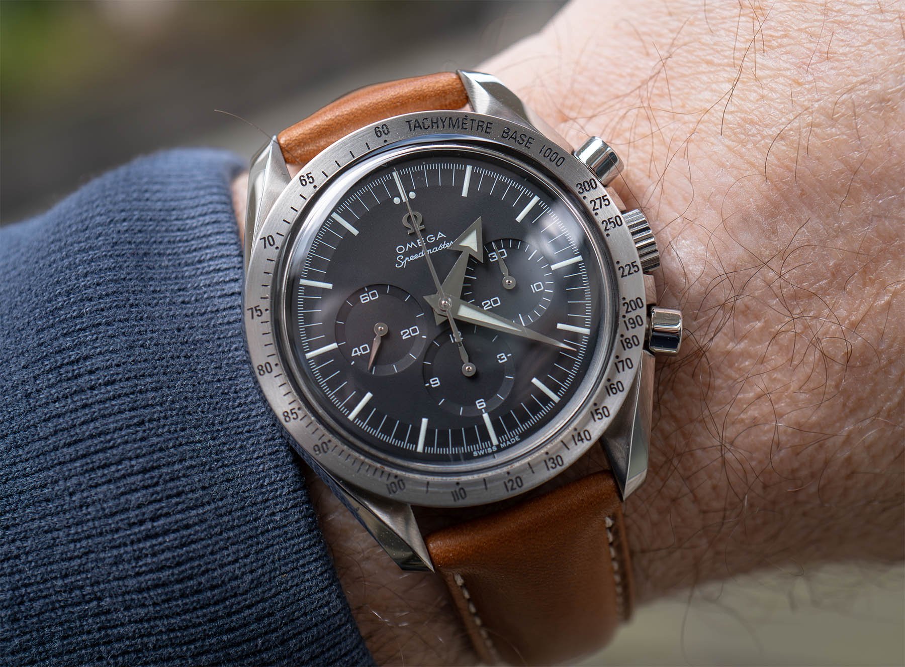
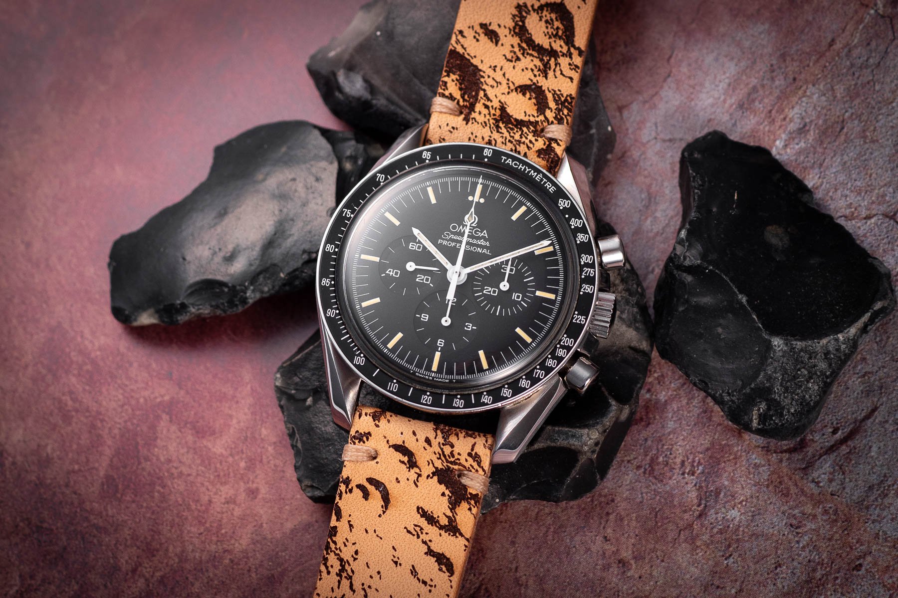
Think, for instance, of the Omega Speedmaster. You may associate it with the now-iconic white baton handset. The first models, however, came with broad arrow hands. The aesthetic difference is huge. Our own Lex Stolk, for instance, is uninterested in baton-handed Speedies but absolutely loves his Ref. 3594.50. You can see how the arrows amplify the mid-century vibe of the Speedmaster while the batons look more modern and straightforward.
Watch hands can make or break a watch
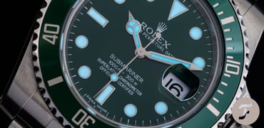
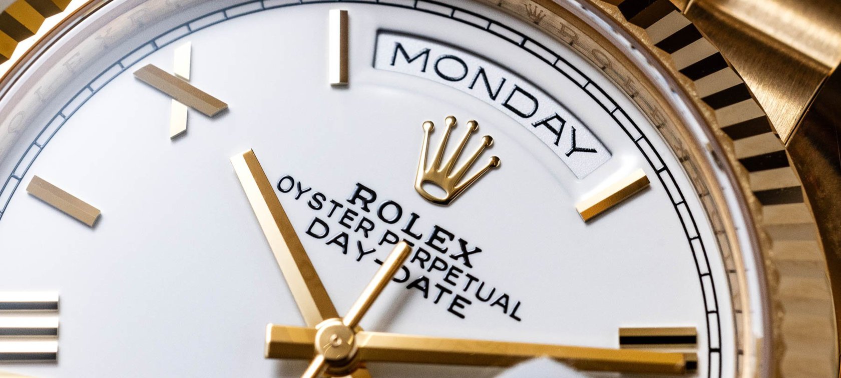
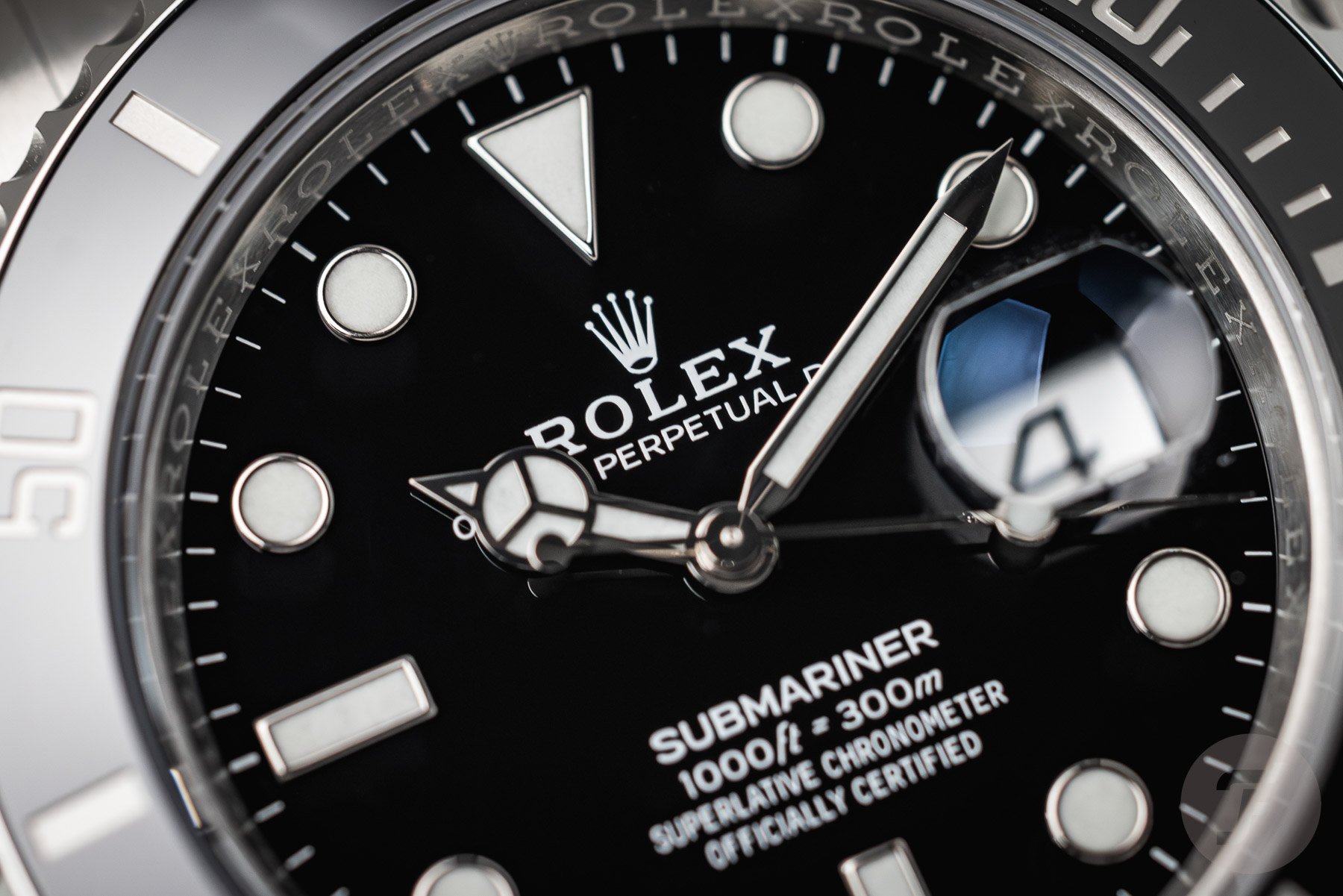
Some watch hands have become iconic for specific brands and/or models. Think, for instance, of Rolex’s Mercedes hands. They are so emblematic of the brand that others cannot use them without appearing to copy the crown. In fact, Rolex pulled this off twice. Their specific version of the baton style has become equally characteristic of its more formal models as the Mercedes hands of the sports models.
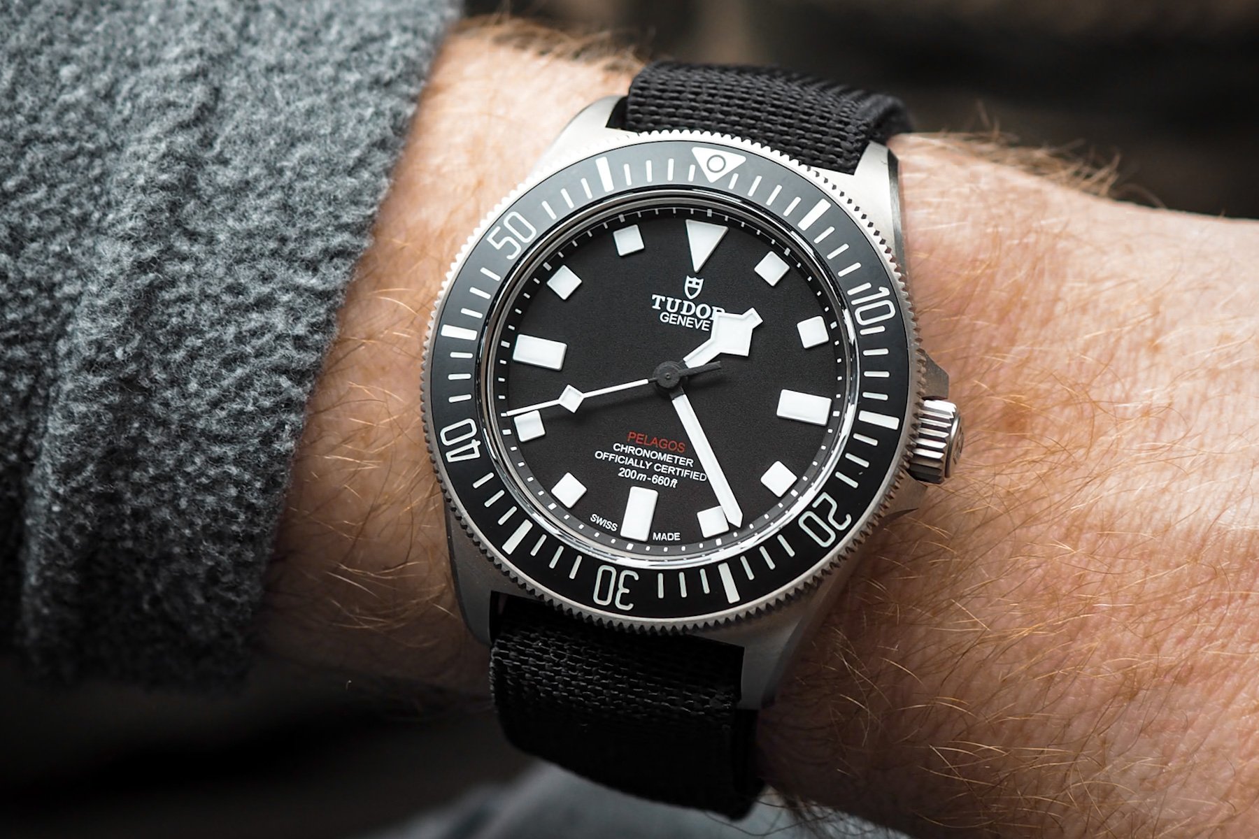
Some hands have become quite divisive among enthusiasts. Tudor’s snowflake handset springs to mind. Whenever we write about Tudor, someone comments that they could never get over the snowflake hand. At the same time, they make any Tudor instantly recognizable.


The Omega Seamaster Professional is similarly divisive. Or, at least, its skeletonized sword hands are. As with the snowflake hands, they are instantly recognizable and cannot be mistaken for anything else. But they are also quite complicated and contrived, which bothers some. The discontinued Ref. 2254 offers a chance to see the same design with a sword handset. As with the Speedmaster, you will see it makes a huge difference to the watch’s overall appearance.
As always, details matter
Watches are all about details and refinement. This is what makes the difference between a good watch and a great watch. Watch hands, similarly, can be the subject of great craftsmanship and design. When brands get them right, they can truly elevate any watch.
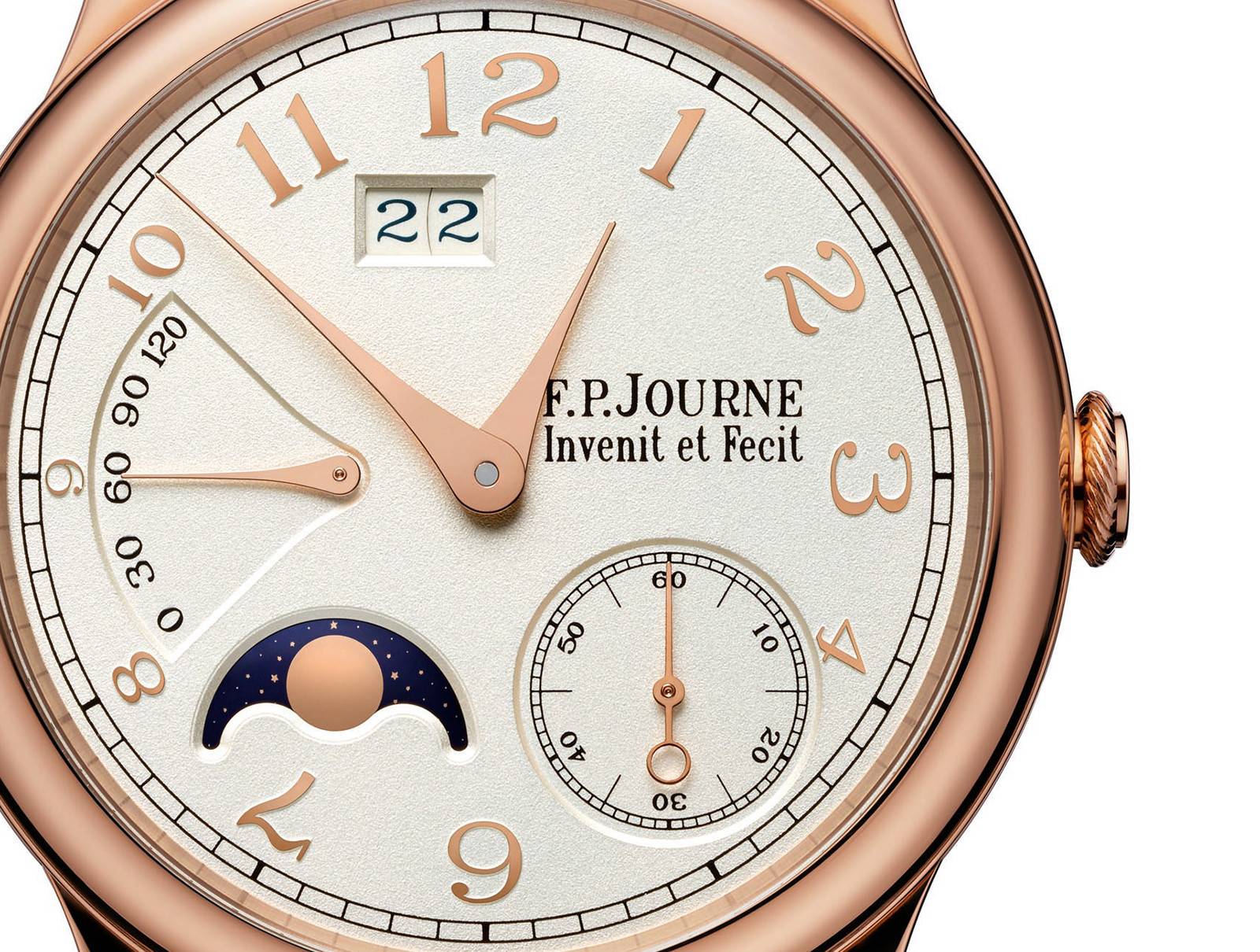
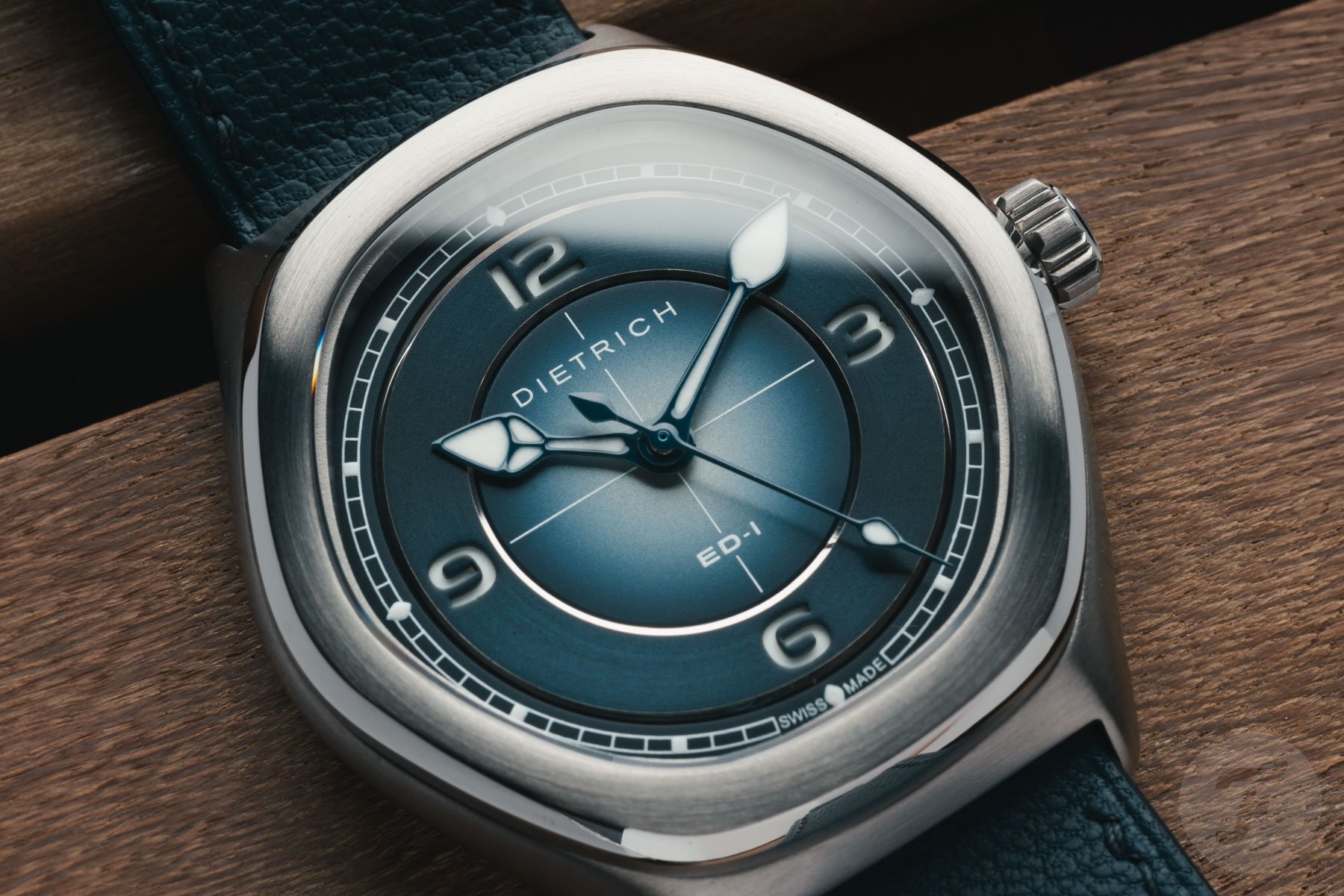
F.P.Journe, for instance, has a great signature handset. Its hands feature no counterbalance. Instead, the concave sides culminate in a circle at the center. This keeps the handset looking incredibly clean, no matter the time, while most handsets tend to look less attractive at specific angles between the hands.
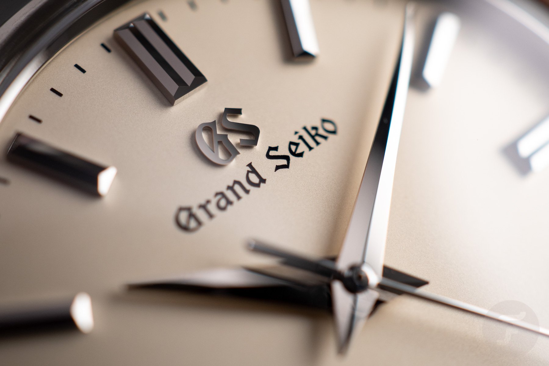
Grand Seiko has another neat detail to explore. Most watches, including many of Grand Seiko’s, use lume for nighttime legibility. This requires cutouts in the hands, where the luminescent compound can be applied. However, Seiko’s Zaratsu polishing is so reflective that it doesn’t necessarily require lume. I own an SGBW231, which is more legible in the dark than most lumed watches. The hands just pick up and reflect the tiny amounts of light almost always present, reflecting them right back at me. The lumeless hands look cleaner, sharper, and simpler than they would have with a lume bassin.
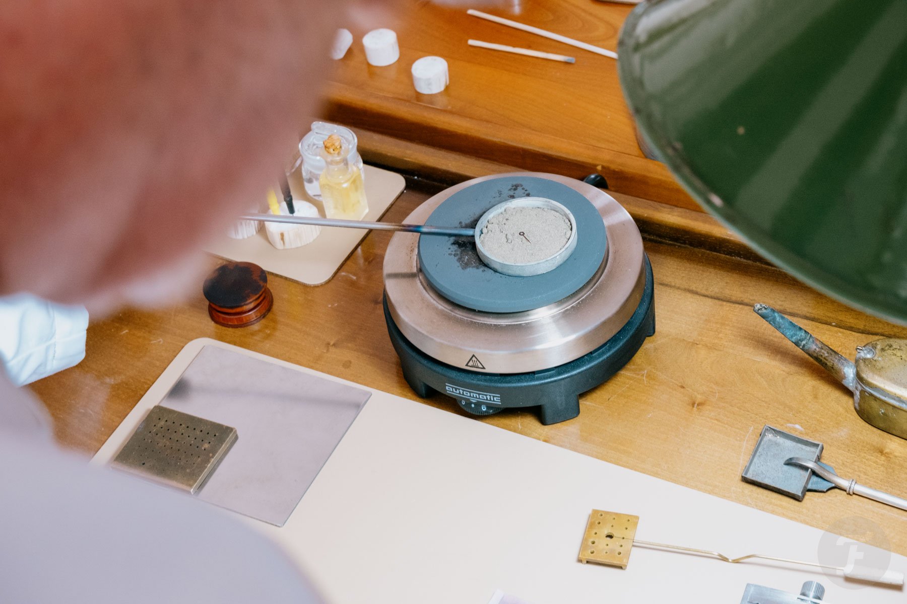
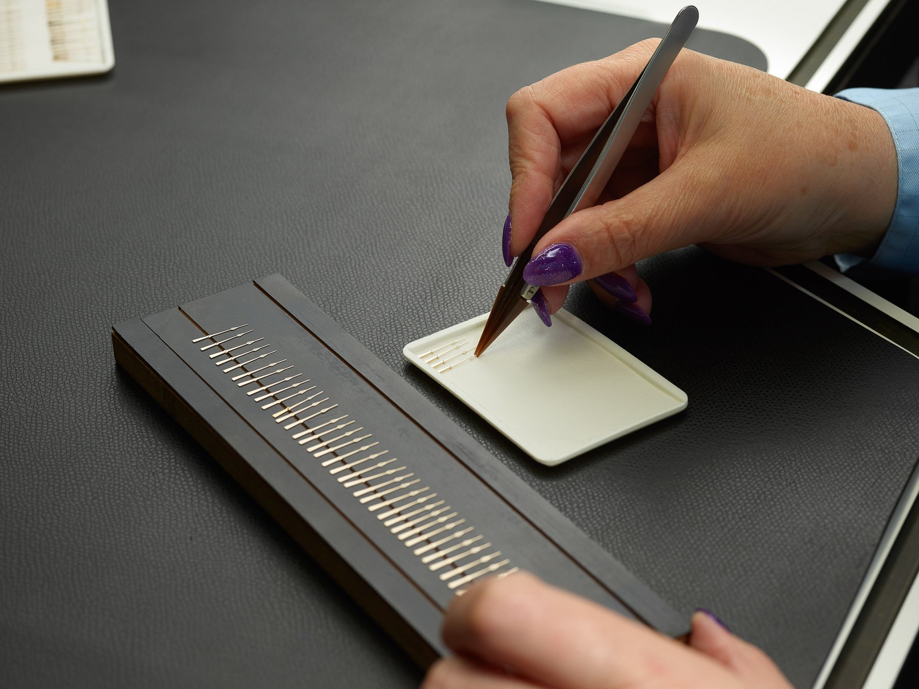
Heat-blueing watch hands
What watch hands say about a watch’s quality
Watch hands aren’t often mentioned in the context of a watch’s quality. Still, they often tell you a thing or two about it. Brands can source generic handsets for a few cents per set. On the other end of the spectrum, you will find completely hand-sawn, faceted, hand-polished, flame-blued examples made of precious metals.
Affordable handsets are stamped out of sheet metal. Most are coarsely polished, resulting in a handset that appears shiny from a distance. Under a loupe, you will quickly spot scratches and imperfections. You may even see that the surface is slightly warped from the stamping process. You know you are dealing with something a little nicer when you find facets and sharp angles.
Similarly, the most cost-effective thing to do is to buy off-the-shelf handsets. It is not always possible to tell, but handsets that are either too long or too short are a dead giveaway. When brands source tailor-made hands or produce in-house, things get significantly more expensive. As a small-scale watch brand owner, I can tell you from experience that it can be tens to hundreds of times more costly. Since many consumers aren’t equipped to spot the difference, most affordable brands don’t bother.
Closing thoughts on watch hands
As you have seen, a humble set of watch hands massively impacts a watch’s overall appearance. Put a set of cathedral or syringe hands on a watch, and it instantly looks more retro. Leaf-style hands soften a watch’s appearance, while dagger hands can make it more assertive. Then, there is the relationship between the hands and the dial. They have to come together to provide a cohesive aesthetic.
Functionally, the impact is equally great. If the proportions between the individual hands are even slightly off, legibility goes down the drain. Similarly, you need contrast between the dial and the hands, unless you are chosing to consciously sacrifice legibility for artistic purposes.
In any case, watch hands are worthy of careful examination. They can signify the loving touch of a careful designer or give away that corners were cut. So, next time you evaluate a watch, have a good look at its hands, both from a distance and through a loupe. You may learn a thing or two about the entire watch.
What is your favorite style of hands? And do you have shapes you avoid? Let us know in the comments below!