Casio G-Shock × Bamford Watch Department Hands-On Review
Old Bamford’s been busy this year, but despite his interesting work with LVMH, his own brand, and our friends at Time+Tide, he found time to collaborate with Casio on one of my favorite G-Shock limited editions of recent times.
Funny story: I am so anal about my watch collection, I decided that I needed exactly two more G-Shock squares in my collection to fill one row of six cushions in my Casio storage case. Prior to Bamford and Casio announcing their collab, I had four. As soon as I got wind of the new release, I placed an order (with real money) and took delivery of my very own Bamford × Casio GW-M5610BWD20-1ER shortly before it launched.
…see what I thought about it long-term.
Alas, the first model I received had a wonky module (the screen was tilted so it was almost diagonal). With a bit of cajoling, I managed to get it almost perfect, but, by that time, had informed Bamford Watch Department, who kindly shipped me a replacement. Regrettably, that took a few days to arrive so I missed the chance to write about this piece while it was still available. Instead, I decided to wear it on my wrist for a few weeks and see what I thought about it long-term.
The Bamford effect
A lot of people don’t like what BWD does. I understand that. Honestly, I get it on a visceral level. There is something almost blasphemous about taking these hallowed creations and turning their design language on its head. I have a huge amount of sympathy for anyone that takes issue with it. I, however, do not. That’s not to say I like everything the company does. I don’t. But every so often the creative team’s take on an established classic is really worth getting excited about.
A strong run
Ever since Bamford and Biver struck their arrangement, the world’s foremost watch customizer has been on a roll. Confidence has clearly been growing and exciting takes on several Zeniths pushed the limits of what the company was capable of and brands were comfortable with. And then our good buddy James Thompson got involved and somehow made the TAG Heuer Carrera desirable to me (that was no mean feat, trust me). His Fordite dials are something else. In fact, they exactly the kind of something else only Bamford can get away with.
For most brands, going down that route alone would be too terrifying to countenance. George Bamford, on the other hand, is the horological equivalent of the kind of guy that would light a cigarette on a petrol station forecourt, toss aside the match, and walk away from the billowing carnage behind him in slow motion, while taking a drag and counting the dough. What I mean by that is that Bamford is creatively destructive. Some people will see what he does as making a mess; others will see it as inimitably cool.
A reputation
What that means is that Bamford, the enfant terrible of modern watchmaking (does anyone ever get tired of being called an enfant terrible?), has earned himself a reputation. Not only has he earned himself a reputation, but he’s also managed to sum it up with a signature color — baby blue.
…an unusual pairing that certainly comes across as edgier than one might expect…
Yeah, I thought it was a bit weird that he went with baby blue (not exactly the most threatening shade), but bear in mind it’s always paired with black, resulting in an unusual pairing that certainly comes across as edgier than one might expect possible.
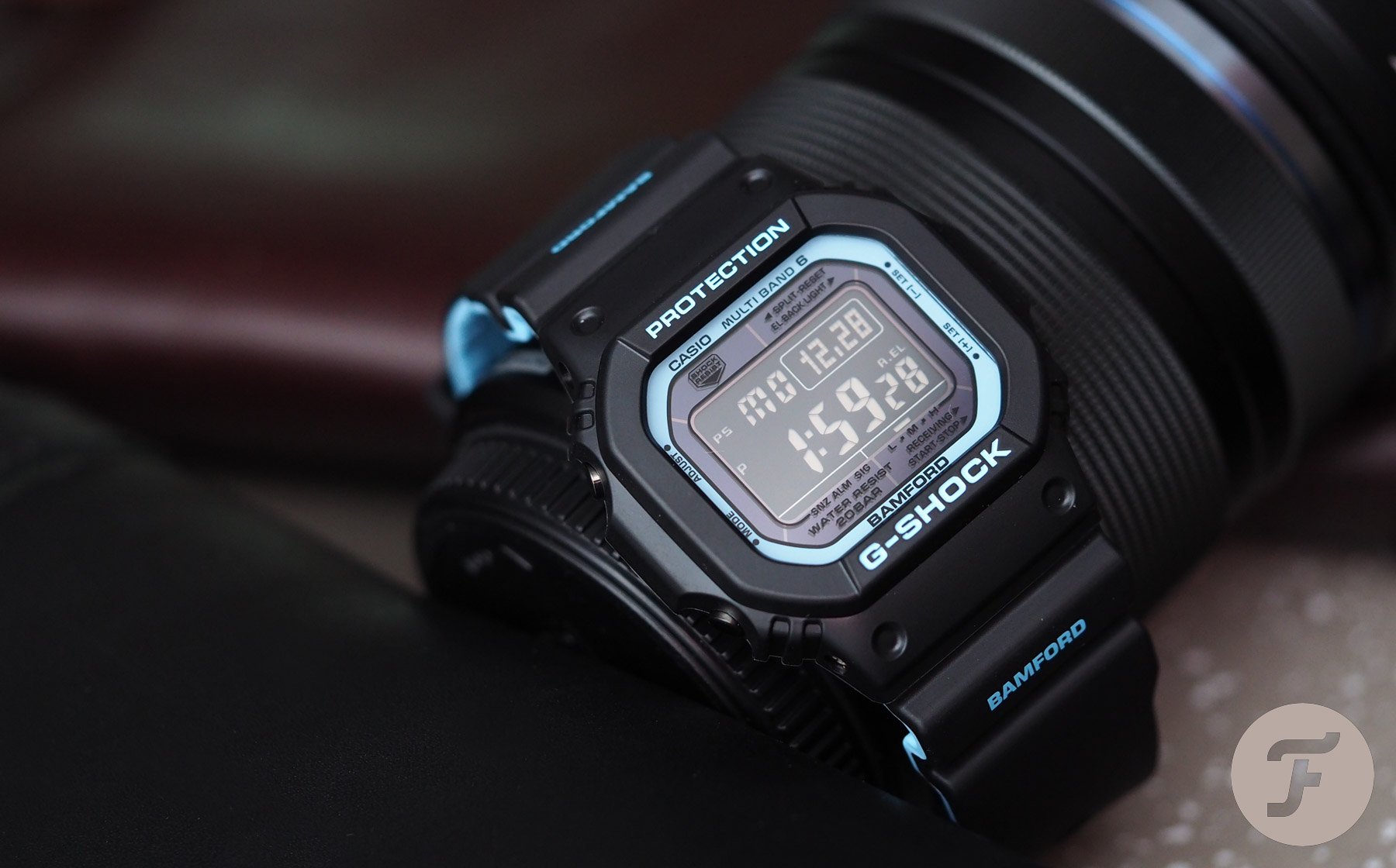
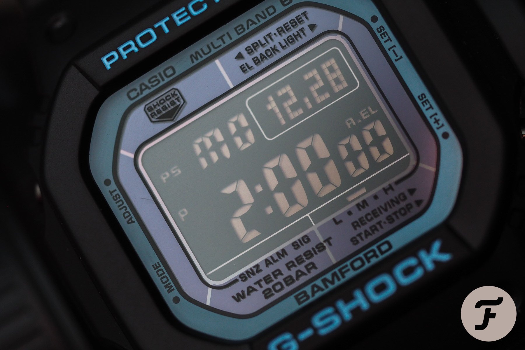
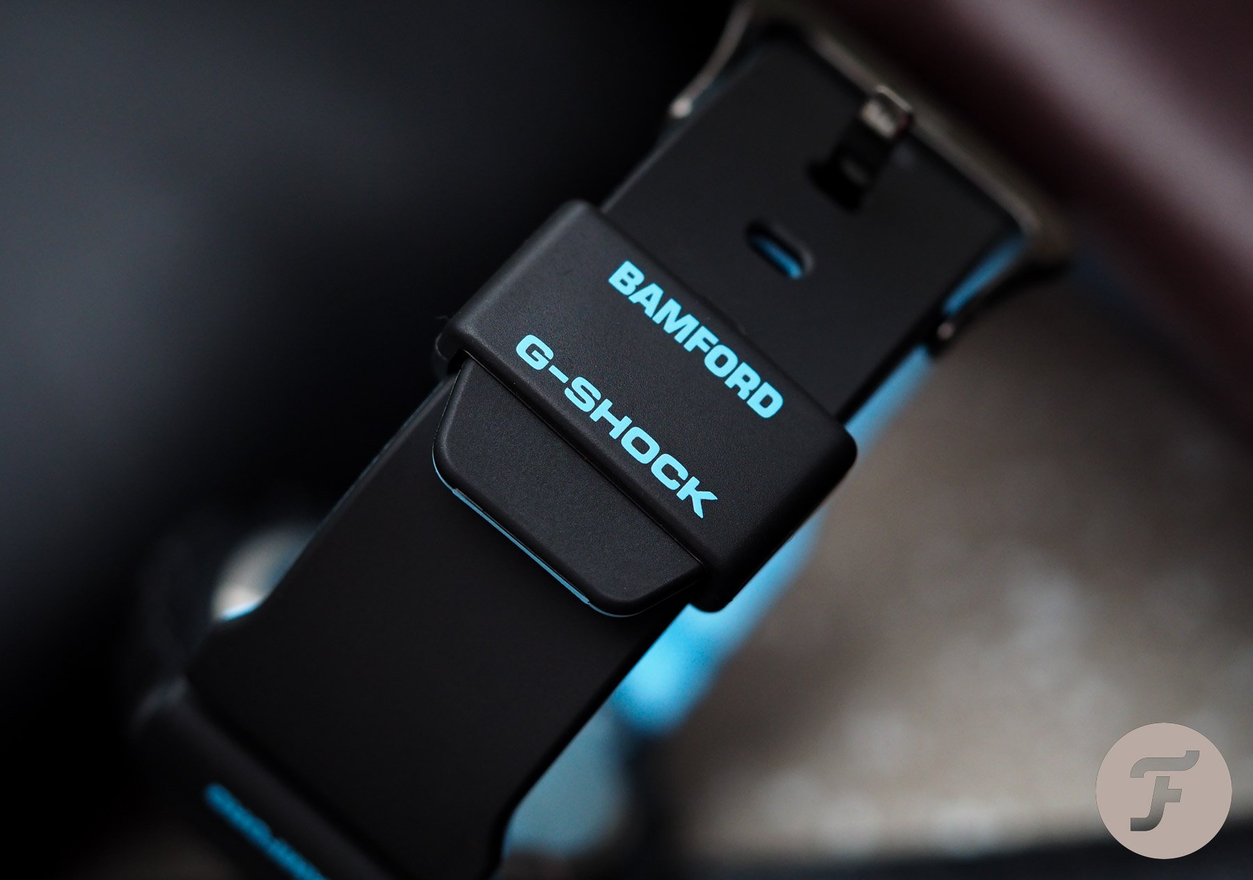
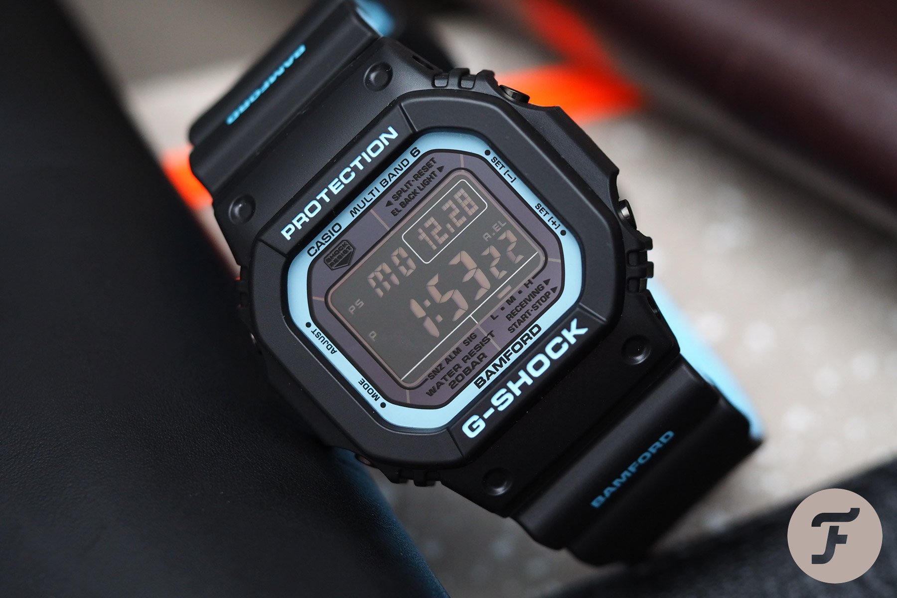
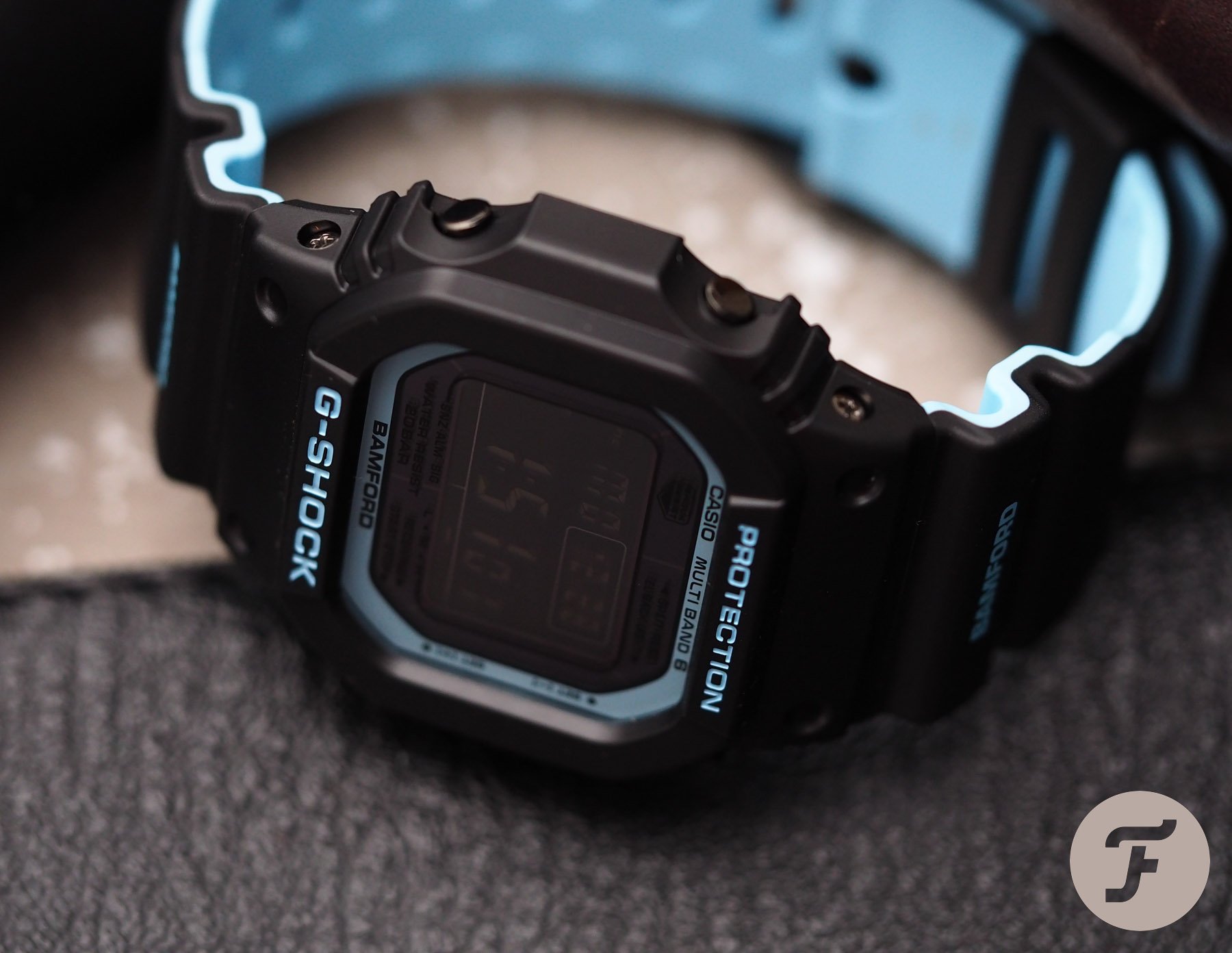
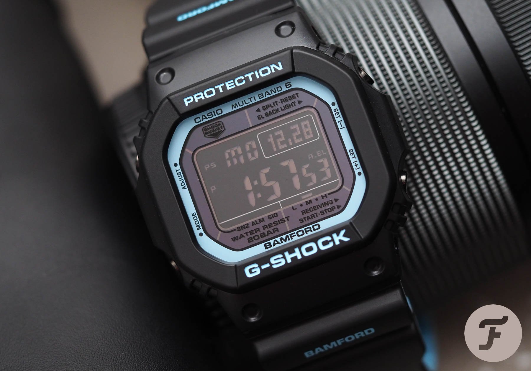
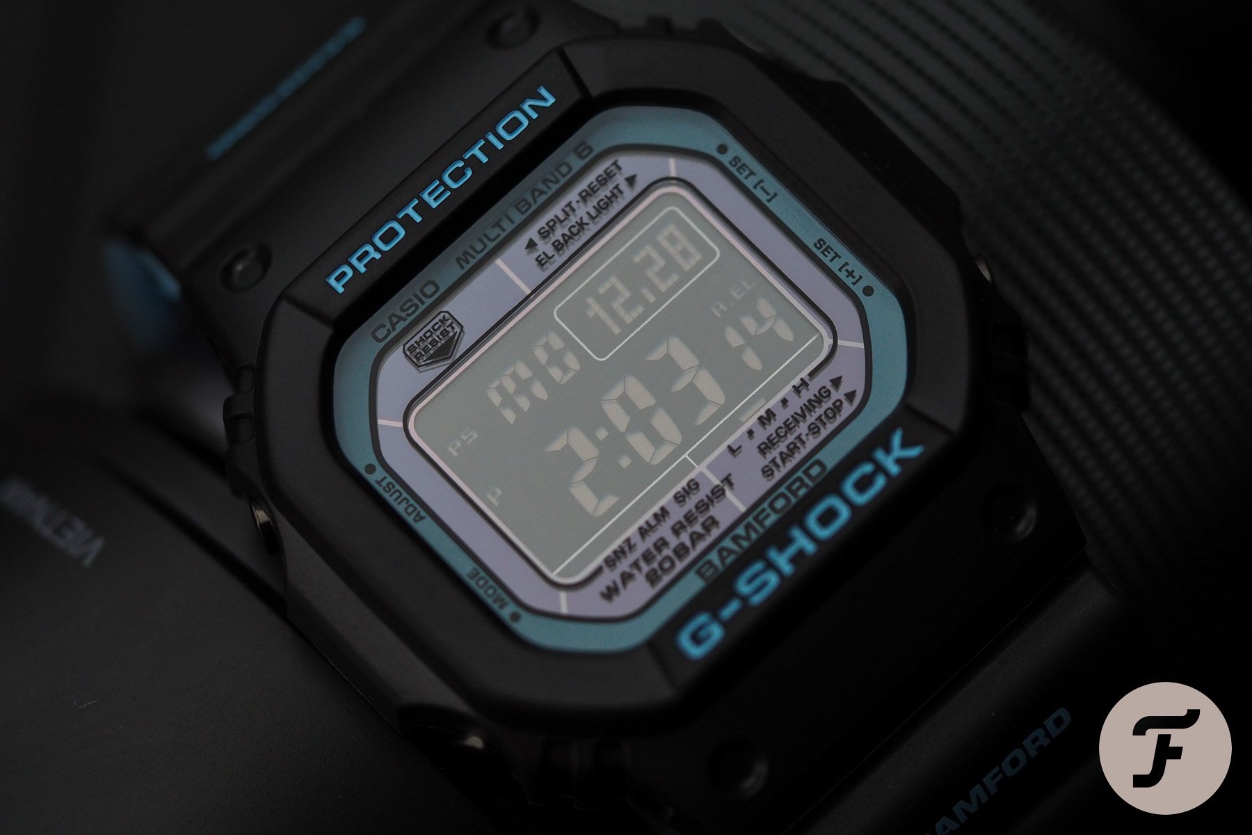
And so when it came to Casio, Mr. Bamford knew what he would do right away. In fact, it was almost a paint by numbers exercise (such is the process behind designing Casio G-Shock limited editions). Firstly, the strap would have a baby blue lining. Secondly, the strap would be printed with the Bamford name. Thirdly, (and perhaps most obviously) the screen would be a negative (white on black) display. Beyond those three (kind of obvious) choices, however, Bamford went a step further in at least one direction that I applaud.
A distinct character
The screen surround is really when G-Shock limited editions live or die as far as I’m concerned. It’s here that the brand can sometimes be surprisingly creative. The strap choices are too obvious and too external — too removed from the watch head — to feel like genuine customization. The screen surround, however, is where things get spicy.
…a kind of aubergine-tinted gray.
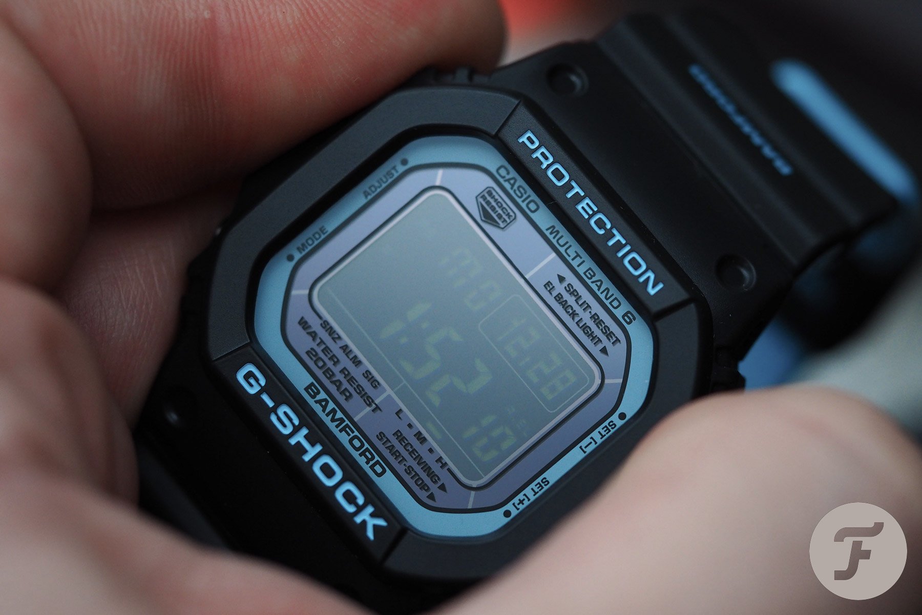
There is a ring of baby blue around the outside edge. That’s really nice if a bit predictable. But it is the color that sits between that predictable frame and the negative display that elevates this piece to something else. It is a kind of aubergine-tinted gray. It harmonizes with the blue superbly and sets the stage for what should have been the pièce de résistance. Unfortunately, however, it was not.
The backlight is blue
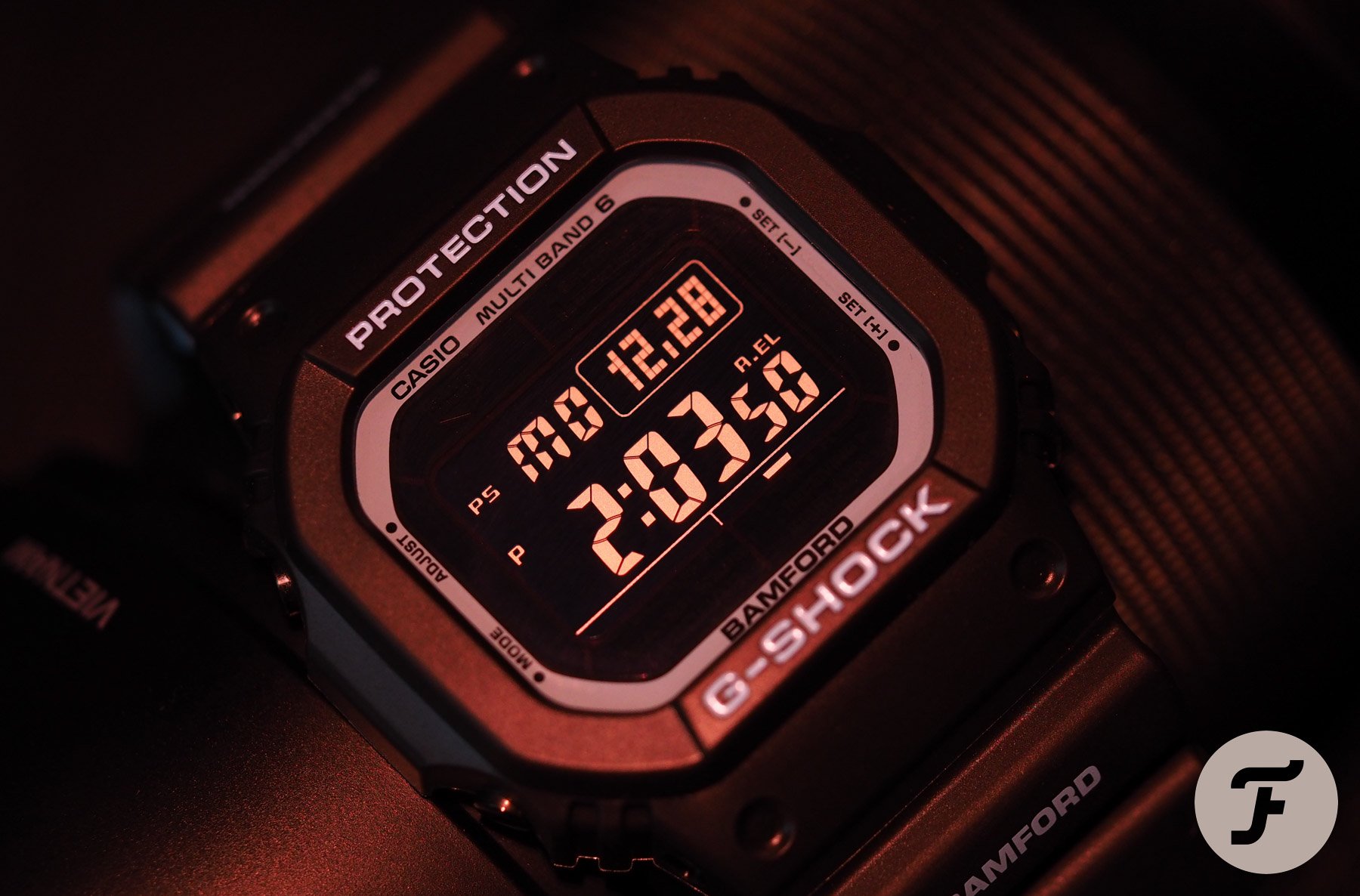
The set-up was majestic. Colors few would have thought to put together with all singing from the same hymn sheet. The chance for a runaway success was in hand. And then a weird thing happened. Rather than make the backlight green (as is clearly indicated by the press photos) and like something you would have found squirreled away in the corner of the screen of an old F94-W from 1997 (which would have been awesome), they decided to make the backlight the standard, uniform blue, which completely, entirely, utterly changes the look of this thing in the dark.
I was bemused. I couldn’t really fathom it.
Look, I still really like this watch. I didn’t buy it because it was a Bamford; I bought it because I thought it was (and is) a damn handsome G-Shock. But when I turned off the lights and activated the backlight I was… Well, to be quite frank, I wasn’t even disappointed: I was bemused. I couldn’t really fathom it. I mean, why make the light color on the renders different from the light color in real life.
The obvious answer is that it looks better. Fair enough. It does. So here’s the obvious follow-up question: why not actually make it like that? If I hadn’t had two of these pass through my hands by coincidence, I might have convinced myself I’d just picked up a duffer. That, somehow, I’d ended up with sole rogue blue unit amid a couple of thousand green. As it is, it seems more likely the backlight is, in reality, blue, and that the green light shown on the press images is nothing more than something between wishful thinking/cunning misdirection.
Conclusion
All in all, though, I’m quite satisfied with my Bamford × Casio collab. It’s hard to gripe with a £150 watch that looks just dandy in the daylight. I do (and will continue to) rue the missed opportunity, though. Tell me in the comments below if you think I’m crazy, or overegging it at all, but, to me, the details in watchmaking matter. A backlight isn’t just a functional thing. It affects the overall mien of the watch. And I certainly think the watch I saw in the photos is a better, more adventurous blend of colors than the admittedly adventurous-enough model I have on my wrist.
Watch aficionados, eh? What a nightmare bunch of customers we are…

