Date Windows: Embracing Their Functional Beauty With Examples From Grand Seiko, Laurent Ferrier, Oris, And More

As an admittedly vain man, I understand the wristwatch as more than an instrument, embracing its jewelry-like presence. After all, the adage that men are not allowed to wear any other jewelry still rings true, especially when your partner catches another order confirmation pinging on your phone. But to me, functionality is still king, including date windows.
I never leave the house without a watch, I sleep with one on most nights, and I feel naked without one. Even with the constant glare of Apple screen lighting from phones and tablets, I still check the time and date on my watch. Yes, unlike many watch enthusiasts these days, I enjoy a date window, which is the most overlooked complication. Some brands excel at its inclusion rather than deleting it for visual clarity, so consider this a celebration of a much-debated but useful feature.
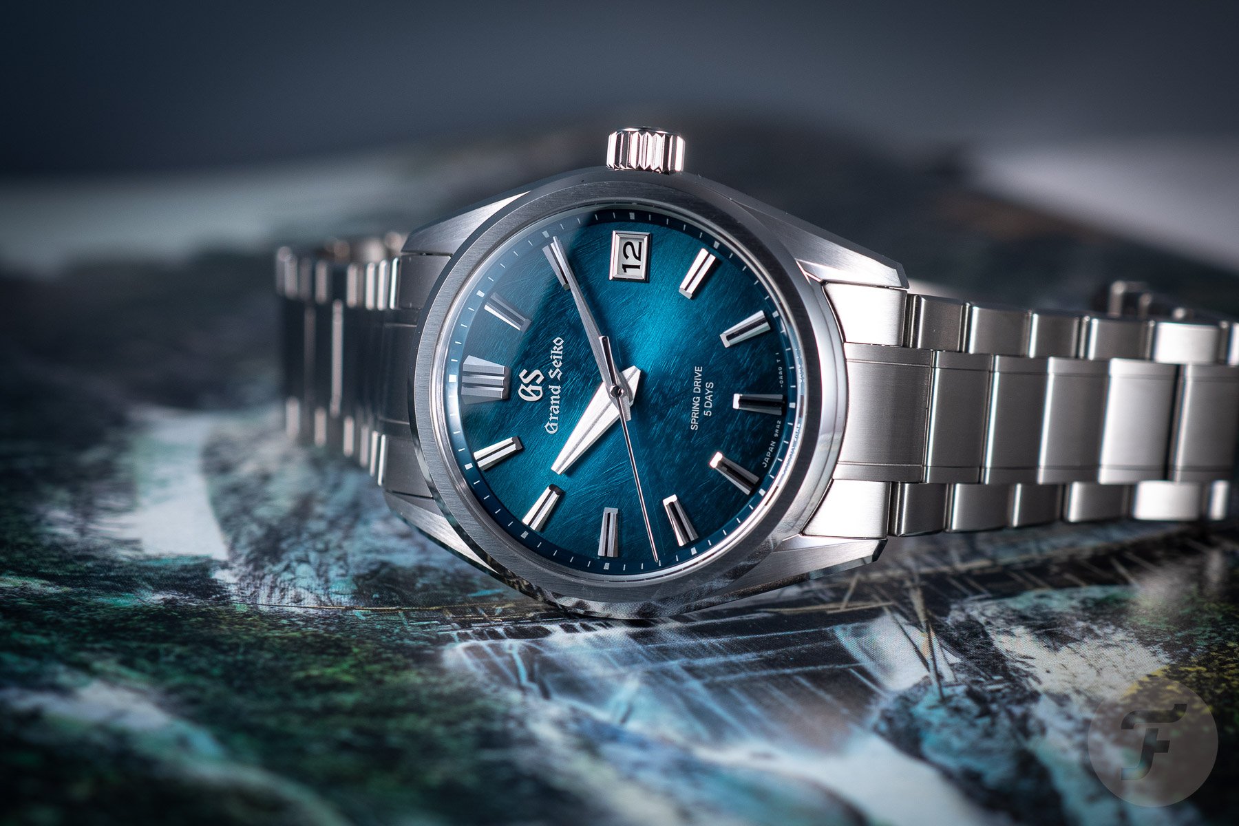
Grand Seiko SLGA025
Let’s start with the no-nonsense approach of Grand Seiko and the example of the beautiful dial in the recent SLGA025. Grand Seiko has become a byword for Japanese scaled-up craftsmanship. Yet, as a brand, it deserves so much respect because much of the finishing is still done by hand. In contrast to competitors, such as Rolex, the brand shares how it works and the stages a watch and its constituent parts go through. And while the ethos of Japanese watchmaking verges on the obsessive, we misunderstand. Grand Seikos are designed to be solid daily watches, hence the over-thick cases of many models. This, to many collectors’ chagrin, also includes non-color-matched, traditional date windows.
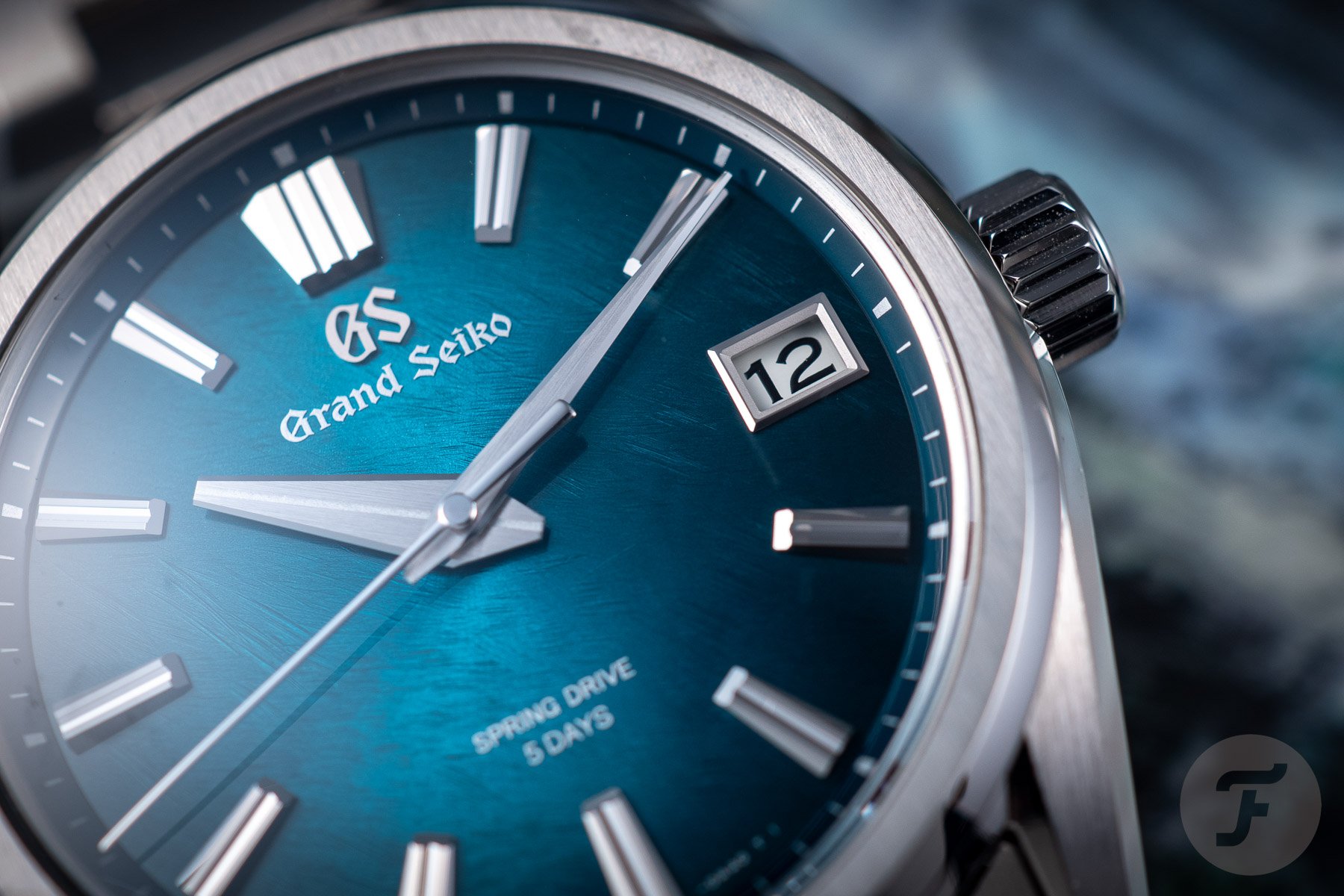
The presence of a crisp white date wheel might make the deep blue dial of the SLGA025 feel compromised to some, but I disagree. After all, legibility is paramount in a good everyday watch, so I enjoy the perfection of a slightly beveled frame and large date numerals. Grand Seikos are intensely dependable and beautiful watches, at least if mine are anything to go by. I’m on my third, and the Zaratsu polishing still gets to me with its bright, perfectly flat feel. And it is probably more reflective than most watch cases you will have seen. So, while it is a perfect everyday driver, a watch-babying fool like me will save it for special days.
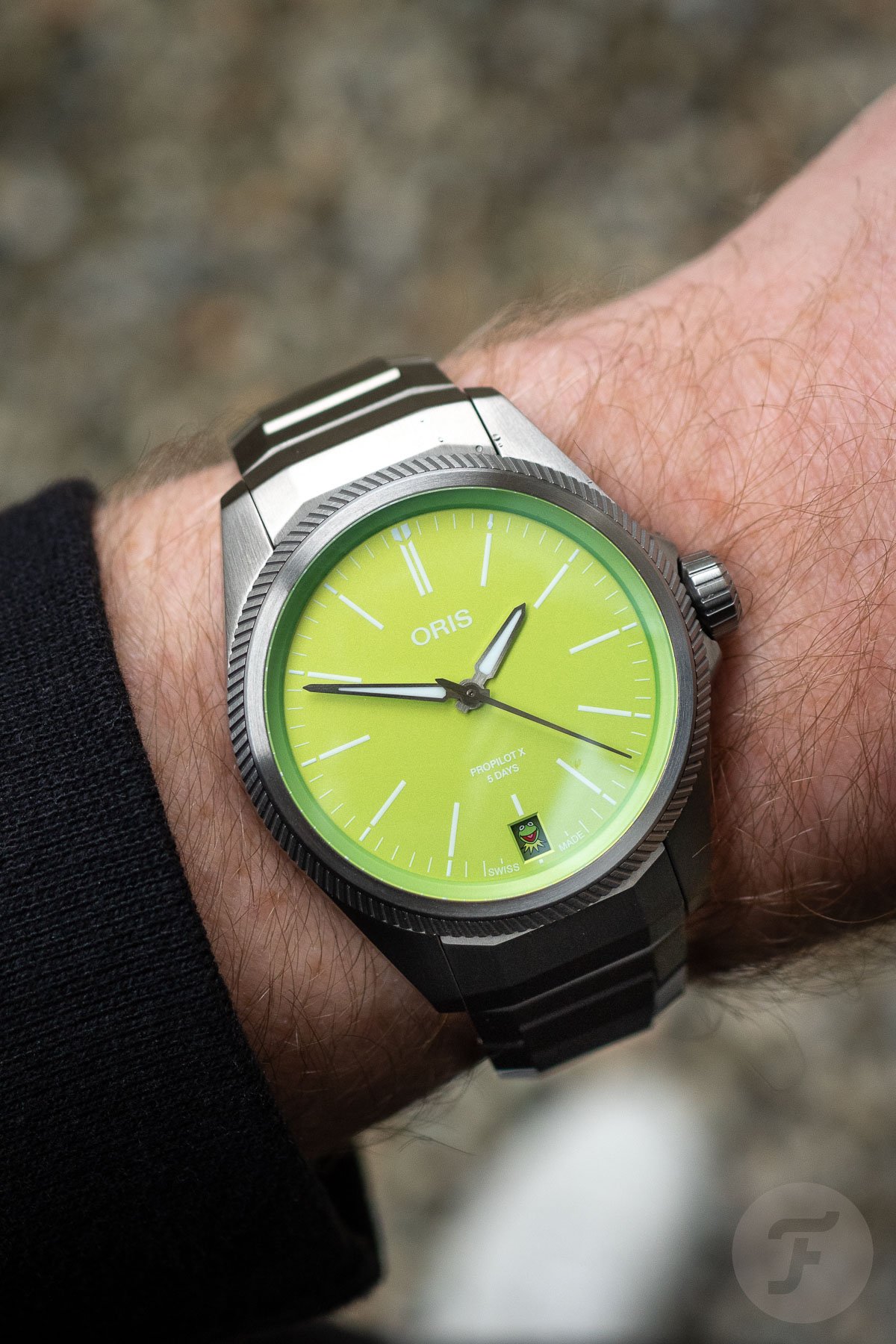
Oris ProPilot X Kermit Edition
Oris knows how to serve up a colorful wrist cocktail, as we saw with the cheerfully bright recycled dials of the recently updated Aquis Upcycle series. But the ProPilot X is a more clean-cut and modern tool watch than the brand’s vintage-inspired ranges and dive-functional Aquis series. So back in 2023, I was not expecting the mad lime-green pop of dial art, and the date window threw me off course. The dial is a searingly bright pop of green, while a small date window at 6 o’clock appears very dark to be color-matched if it’s the first of the month. And what’s that red dot?
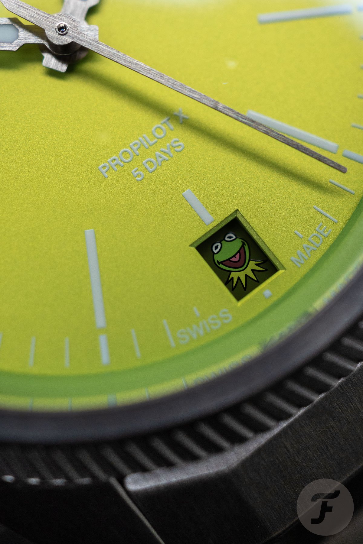
Yes, folks, look closer, and you’ll see the wide-grinning face of Kermit the Frog appear on the first day of every month. I also respect the ProPilot X as a staunchly modern watch design with a pretty flawless bracelet. It houses the Oris Calibre 400 with a five-day power reserve, and it’s seriously light thanks to its Grade 2 titanium construction. Coming in a 39mm medium build, you would expect this mad acid-green pop to be gone already, but it was not limited. Yes, the Kermit Edition is still available in all its green-tinged glory. So yes, date windows can be functional and fun, especially with a balanced aesthetic. Who knew lime green was such a good match for matte titanium?
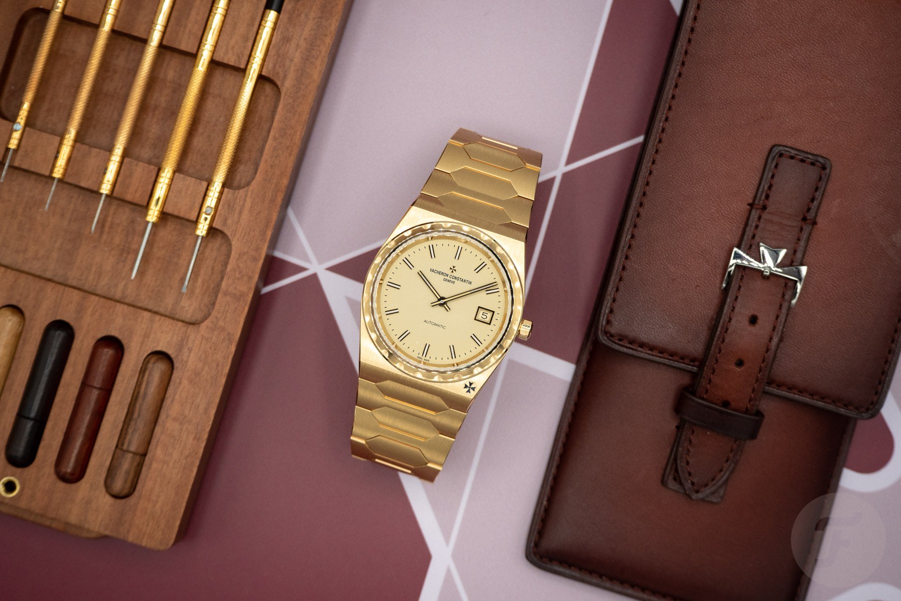
Vacheron Constantin Historiques 222
The 222 is more than a mere watch. With a €72K price tag, it’s more like an unattainable talisman of the glamorous ’70s jet set. We’d all love it if Vacheron released a slightly more accessible version of this full-gold grail. Still, for some reason, I doubt it’ll be affordable unless you count your Submariner as a daily beater and an F.P.Journe for occasions. But all this is beside the point. As I keep reminding my collector friends, you can still enjoy the Mona Lisa without having the budget to purchase it from the Louvre, right?
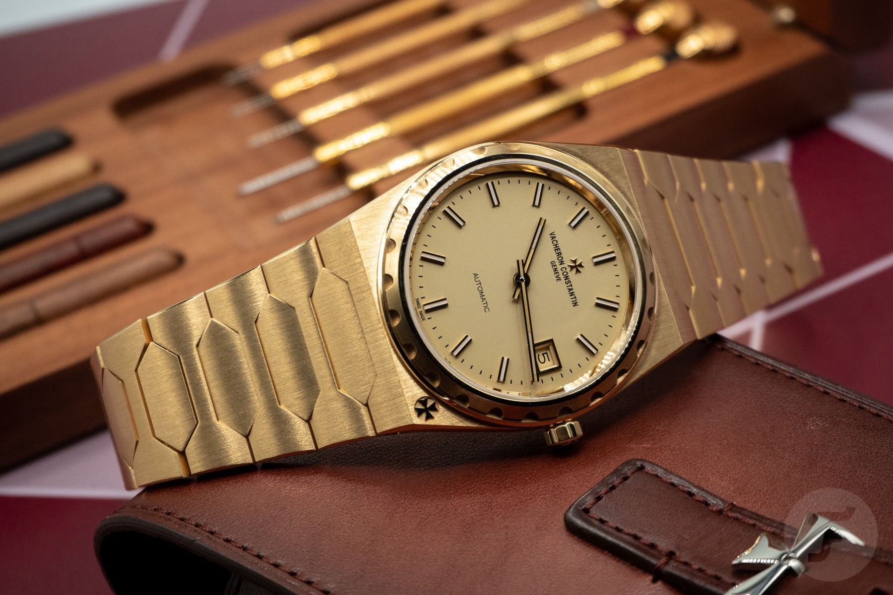
The 222 is all about delicate tonality and the allure of gold. And this is why I will include it here. Its date window is quite ordinary — to some, even annoying. But this Vacheron is a delightful example of a time when watches were necessary to make it through a busy day. So imagine checking your svelte Vacheron Constantin 222 in the office for a calendar appointment in 1977, and you’ll appreciate it more. The 222 would look cleaner without the date window, but its slim, faceted frame fits the vibe, and the date wheel matches the discreet brushing and color of the dial to a tee. Period-perfect renditions like this are for a select few, but I’ll still note it for my grail list, however unrealistic that might be.
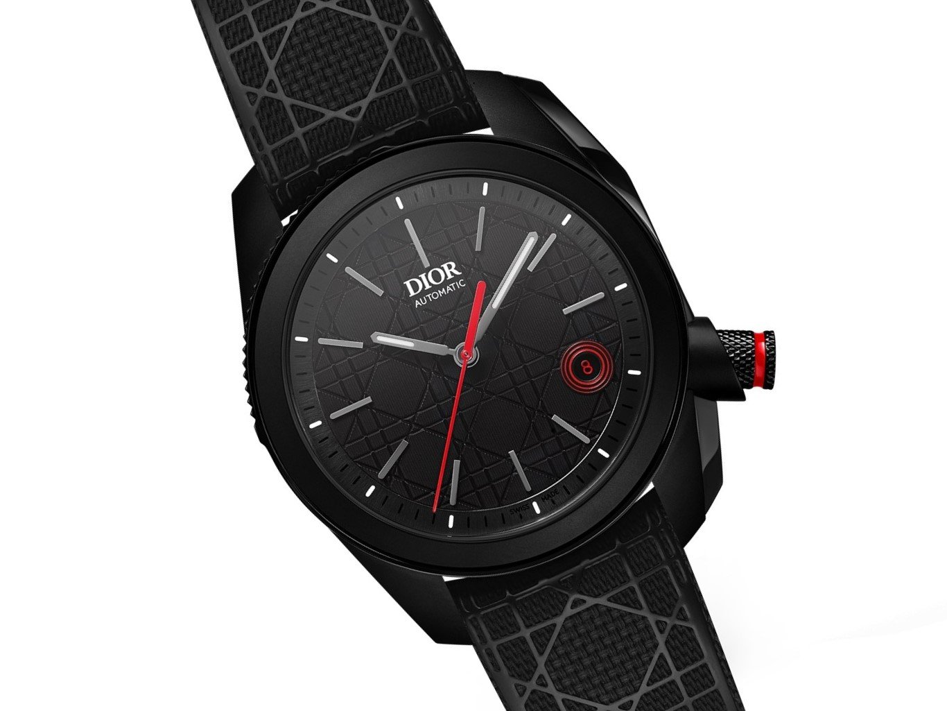
Dior Chiffre Rouge
Before any of you raise your virtual hand or put on a troll costume, the debate on fashion-brand watches is dead. And Dior, like Chanel, Louis Vuitton, and others, has come a mighty long way with the same fresh approach. With the Chiffre Rouge as an example, you can see why the approach is far removed from most watches, probably because the designer is not from our niche horological world. The Chiffre Rouge is about the timeless combo of deep black and red, with a surprising focus on the date window.
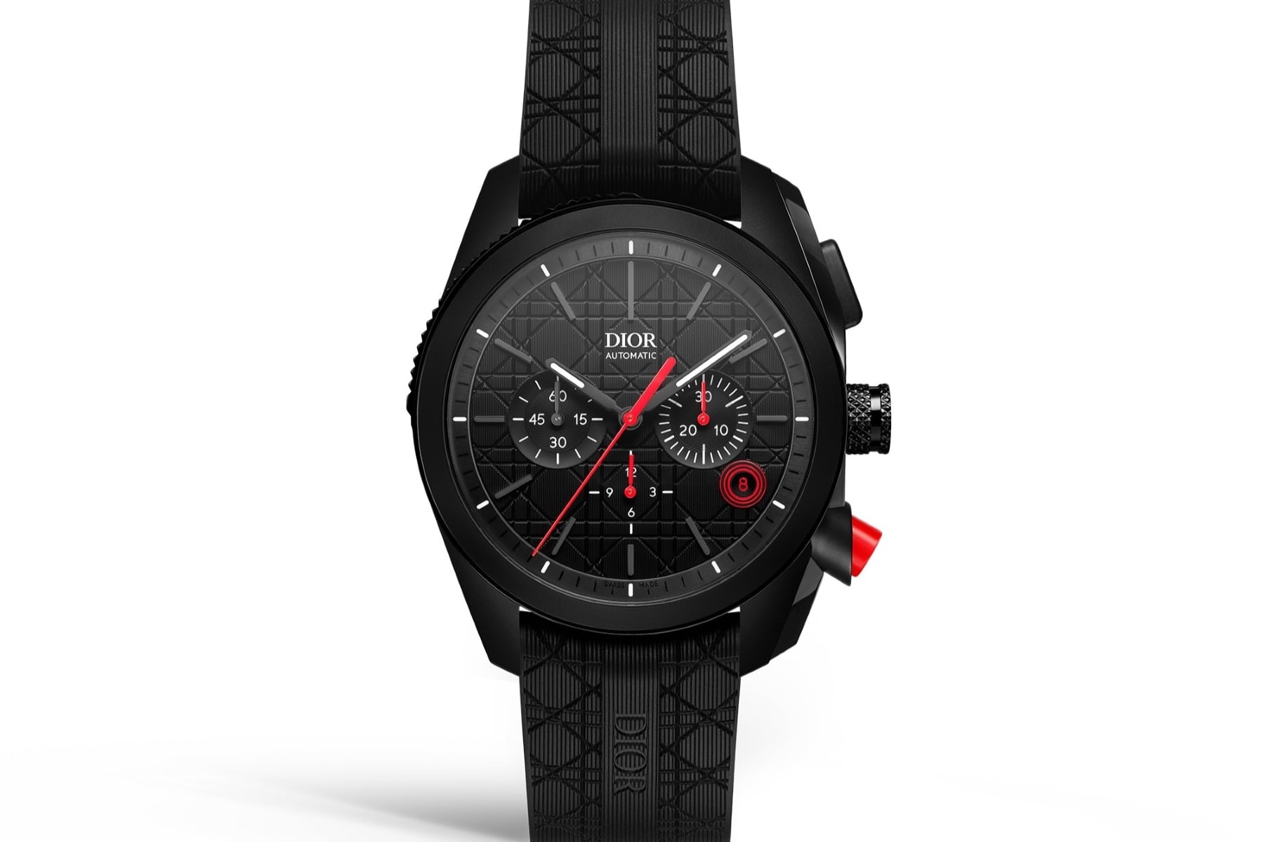
The angular case, big crown, and red chronograph pusher at 4 o’clock are nothing short of dramatic. In a sartorial move, the dial pattern matches that of the rubber strap. Consider it stealth-elegant rather than mission-ready. It’s a difficult balance, and Dior’s designer walks a tightrope between classy and tough. But back to the date window, which is circular and would be a quiet presence on the dial if it weren’t for its bullseye of red circles and one red number — 8. Including a single red number on a date wheel is nothing new, but it tends to be 31, marking the end of a month. Here, it is 8 because this was the lucky number of the legend Monsieur Dior.
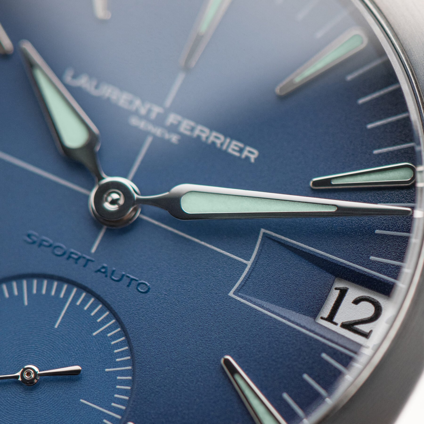
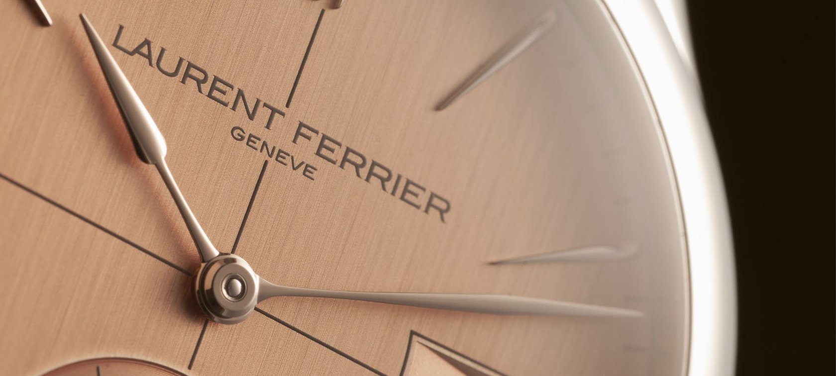
Laurent Ferrier Sport Auto
Laurent Ferrier is a brand with a reputation for its pared-down elegance and smooth, pebble-like cases. So I was thrown off the scent when the Sport Auto came out. It was so unlike the brand’s previous designs that it shocked me with its take on an integrated-bracelet sports watch. But with its quirky case shape came a sense of something new, unlike the well-known grails of the genre. The shock subsided, and then there came an intense admiration of today’s most beautiful date window. With the price of a good car, you would be bold to use the Sport Auto as an everyday driver. But that is exactly where it excels.
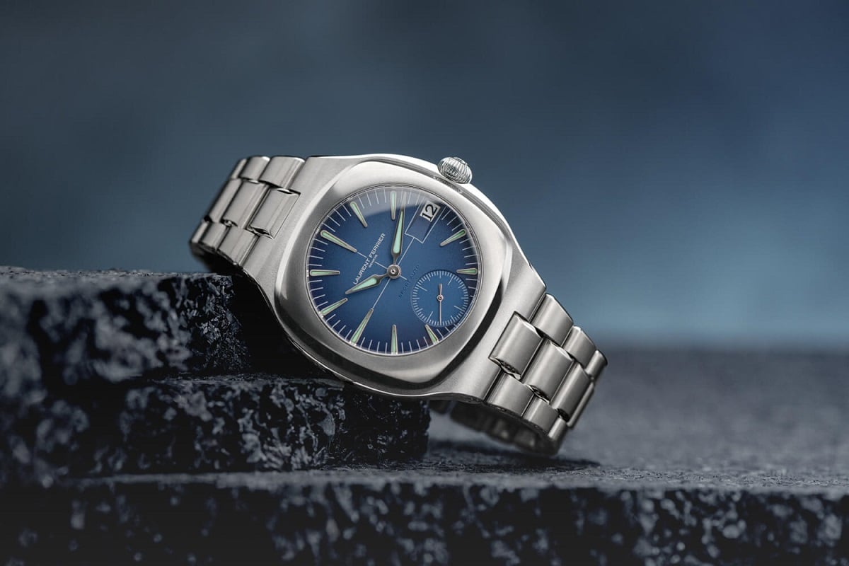
The bracelet feels loose and almost vintage. However, the more generous space between links will not pull any hairs, and the surfaces have a sublime finish that only Ferrier could manage on titanium. You could even call the big, beautiful date window at 3 o’clock the pièce de resistance. It resides on a soft blue dial balanced by discreet crosshairs. Ferrier’s racing influence seems clear, though I am speculating here: the deep slope pulling your eye down to the rhomboid window is like a NACA duct on a racer. Instead of attempting to disguise it, Ferrier has framed it with pinstriping. It reminds me of custom paint jobs on muscle cars and joins the crosshairs in a celebratory elevation of functionality. If any of my watch-collecting mates ever tell me the Sport Auto would look better sans date, I will never speak to them again. Ever.
Evident omissions and honorable mention
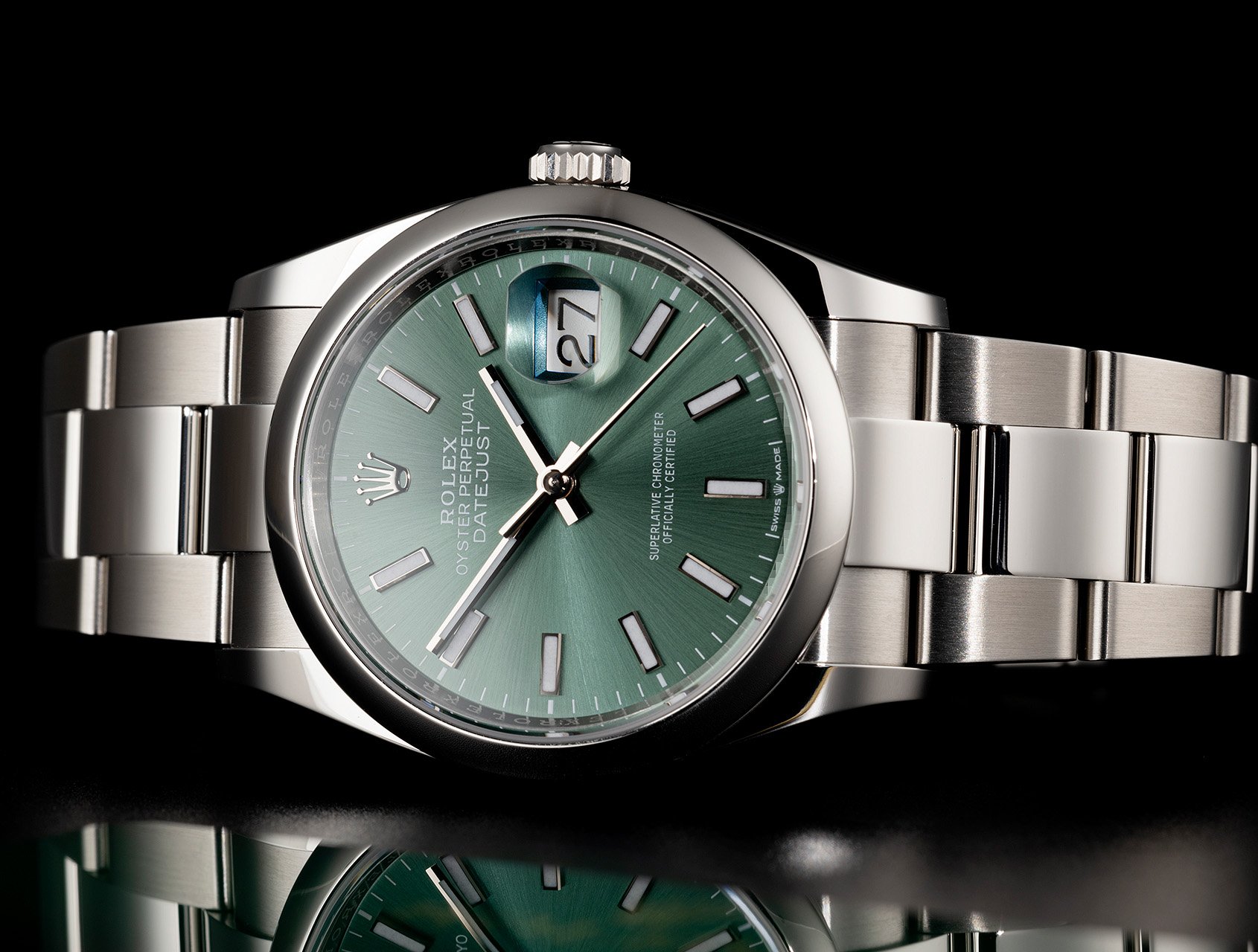
As I write this, I can feel the virtual wrath of die-hard Rolex collectors. They will be questioning my omission of the brand’s ubiquitous Cyclops lens. I see it on the same level as a facial wart. No offense meant, and I have nothing against Rolex, but the bloated and slightly distorted look of the numbers disturbs me. So no, I’d rather see a crisp, color-matched, discreet square sans magnification.
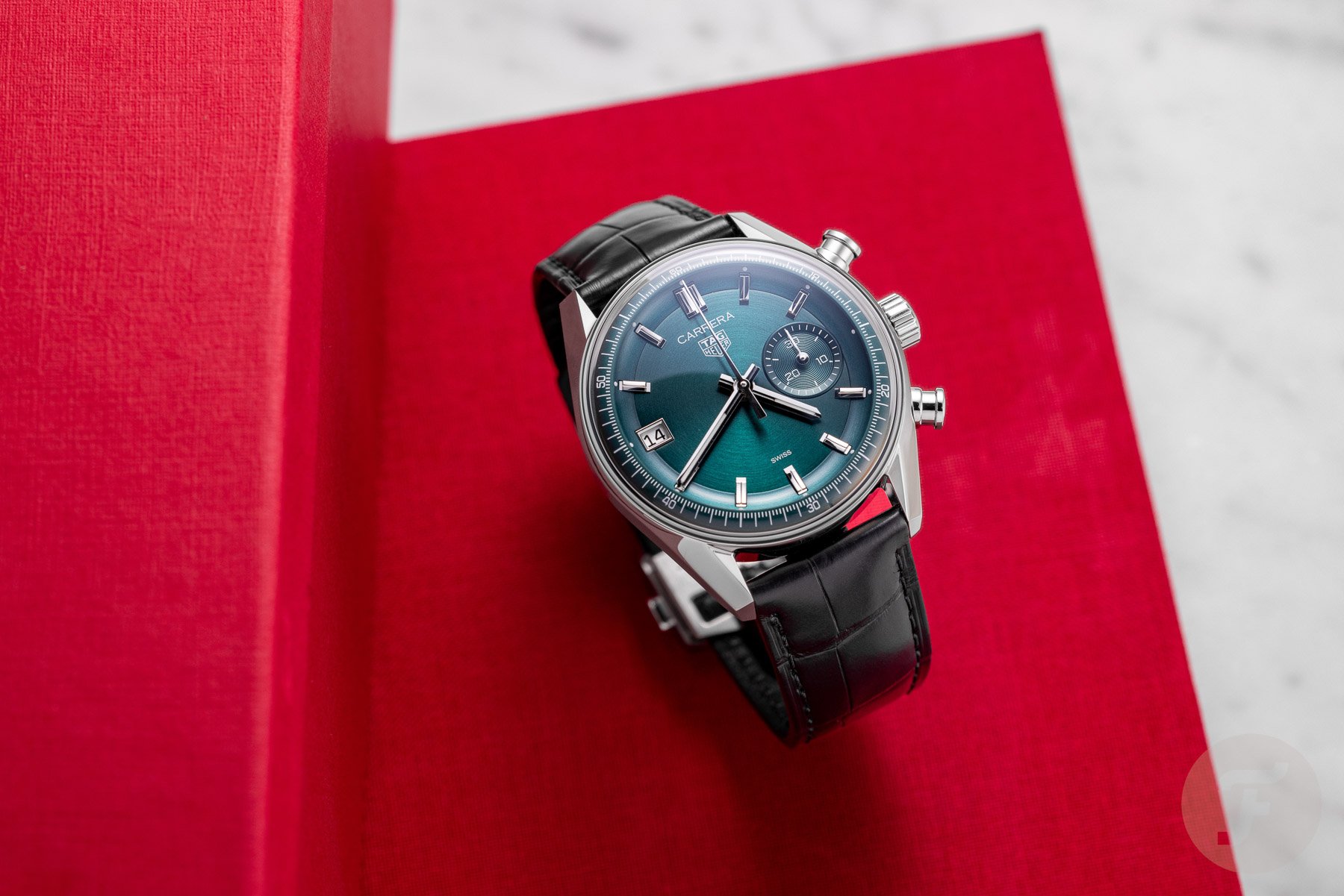
And what about a swap like the TAG Heuer Dato reissue, appearing at 9 instead of 3 o’clock? This deliciously dark green model is a new Glassbox version of the OG Dato 45. It is modernized, though, with the bold move of keeping the date disc clean and white. If you know Heuers, you’ll get it, but I’m sure this will cause a lot of googling for those newer to the watch hobby. The cheeky swap and single register win by sheer audacity alone, and I’d happily rock this watch.
What about you, Fratelli? Are you obsessed with clean dial architecture, or are you a lover of functional aesthetics? Let me know in the comments, and let the debate begin!