Dear Seiko, Bring Back The Stylish SCVF007 “Red Alpinist”
Liking or loving a watch often comes down to small details. There is an abundance of watches that I like, but there is only a small number of watches that I love. Often, the distinction lies in details like color, typography, a logo, numeral style, or even case curvature. So many factors propel a watch from a nice addition to the overall watch universe to a watch that I want. A perfect example is the current Seiko Alpinist. I think the Alpinist is one of Seiko’s most characteristic watches currently available. But I miss this little spark that makes it a watch I would buy — a spark that is all in a name. What is a Seiko Alpinist without the Alpinist name?
That might sound a bit cryptic right now, but the Seiko Alpinist fans already know what I am hinting at. We’ll get to that in a bit. First, I have to add that it’s about more than just a name. It’s also about a dial color and some pretty important details that Seiko could and should fix. For good measure, we are not talking about the “Baby Alpinist” or the reissue of the 1959 Laurel Alpinist. It’s about the popular Alpinist with its two crowns on the side that was first introduced in 1995. With that out of the way, let’s first remind ourselves of the current Alpinist collection.
The current Alpinist collection
I say “collection,” but it’s actually a string of models that are part of the Prospex line. More precisely, it’s part of the “Land” series within the Prospex collection. Confused? I am with you there. We all know that the Prospex collection was introduced as Seiko’s collection of dive watches. But over time, it became “a collection of timepieces for sports lovers and adventure seekers whether in the water, in the sky, or on land,” as the brand describes it. Within the Prospex lineup, we have the Sea, Land, and Street series, the Prospex Speedtimer series, and the LX line. I understand that it is easy to combine different series of watches into a collection with a certain mindset, but let’s say that within the Prospex collection, some creative solutions lack consistency.
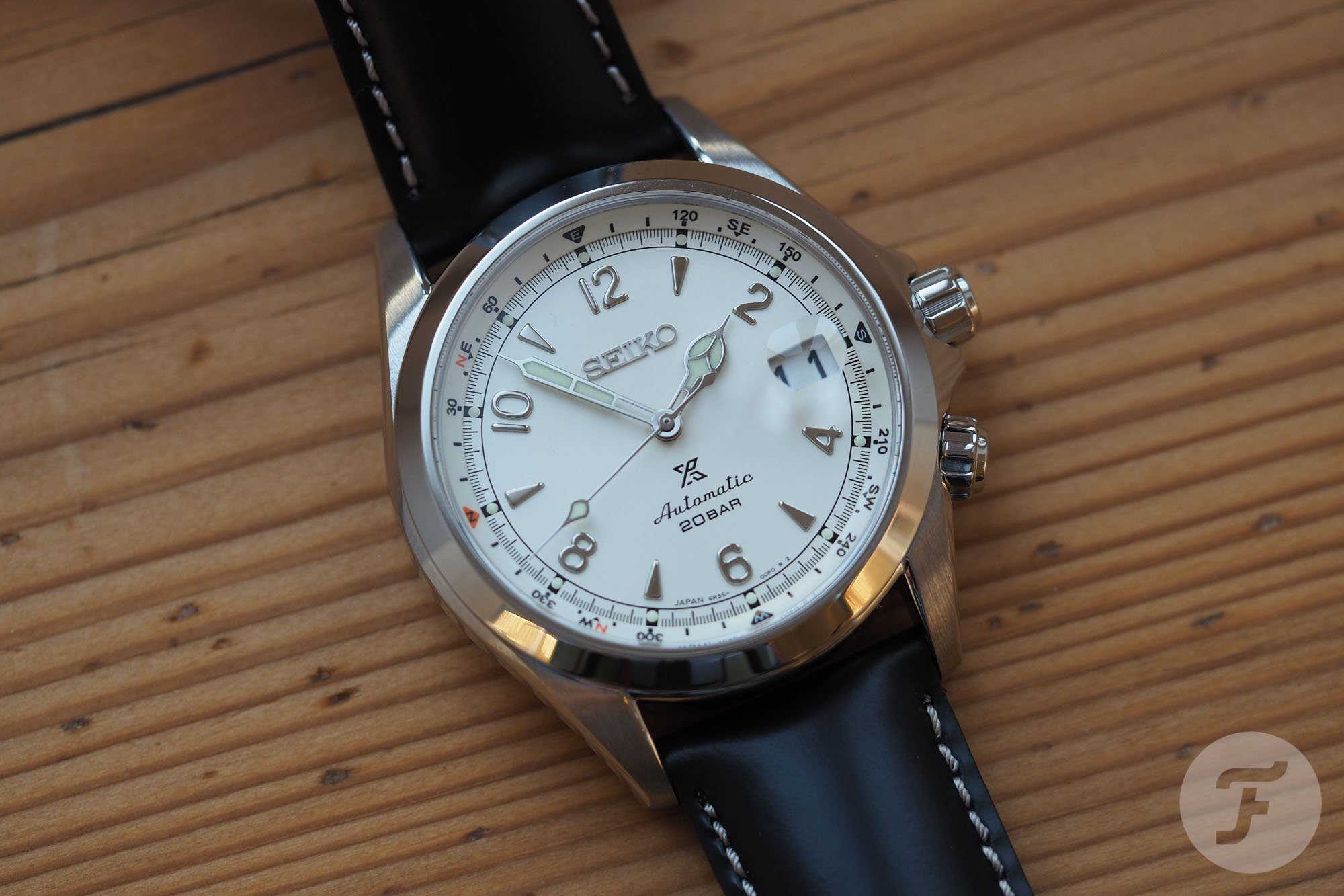
The current generation of Alpinists within the Prospex collection was introduced in January 2020. The first three models available were the SPB117 with a black dial and silver indices, the SPB119 with a beige dial with silver indices, and the SPB121 with a green dial and gold indices.
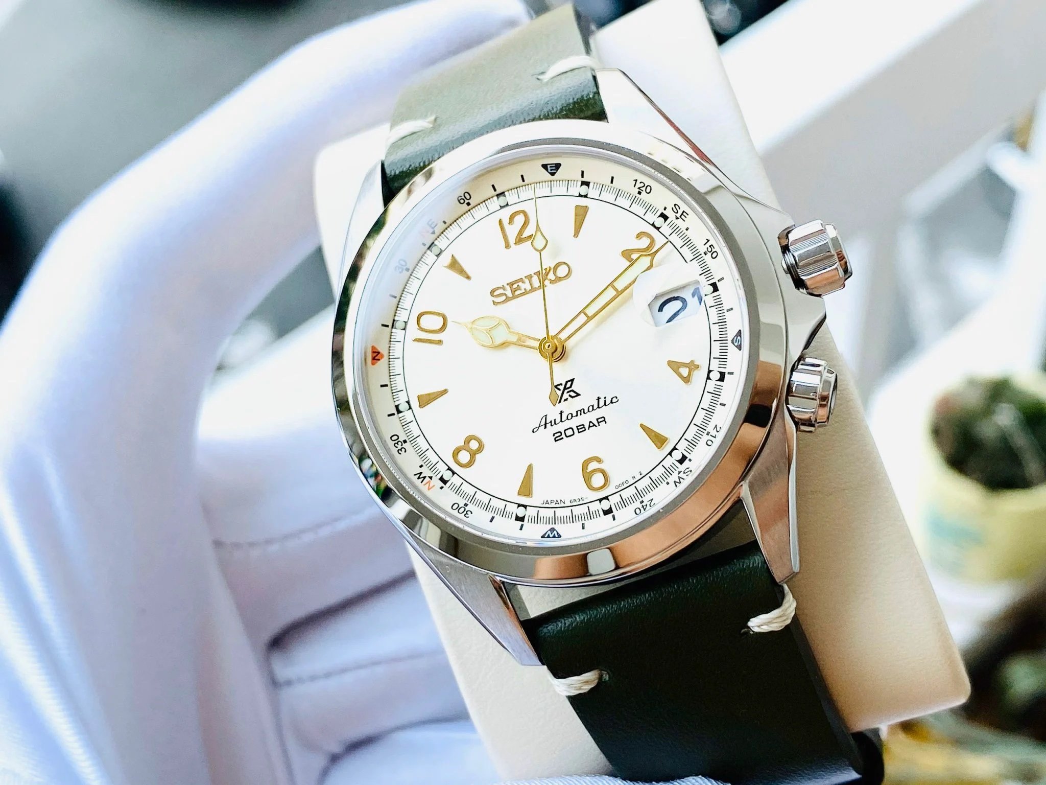
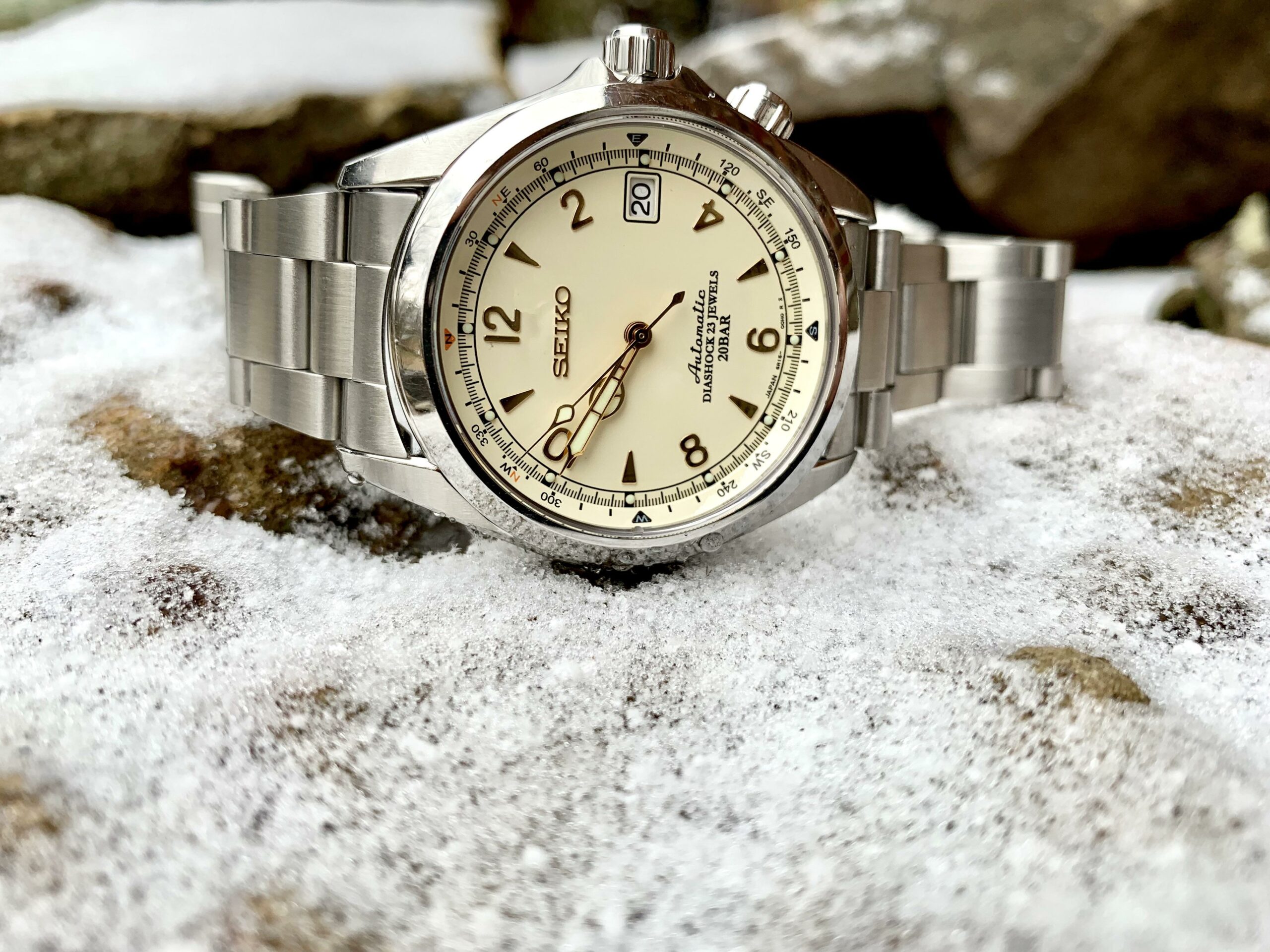
Seiko added the SPB123 with a cream dial and gold indices later in 2020. This specific model was celebrated as the watch that brought back the looks of the iconic Seiko SCVF007 “Red Alpinist” from 1995 and the SARB013 from 2016. And I am one of the many fans of the Alpinist with a cream dial and gold details. It gives the watch an incredible injection of vintage style that I love.
The Seiko SCVF007 “Red Alpinist”
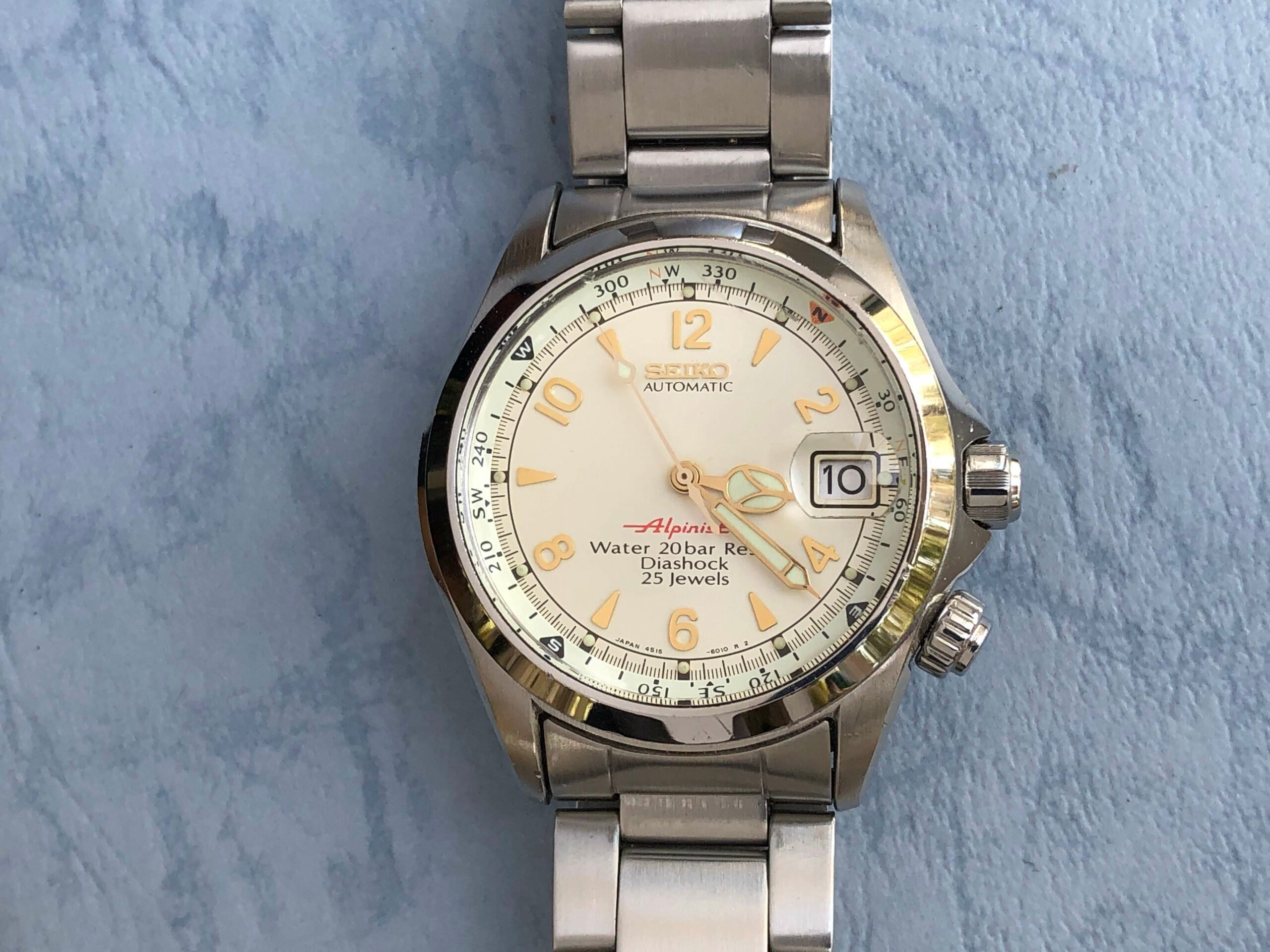
That SPB123 is not part of the collection anymore, and the beautiful aesthetic of the Seiko SCVF007 “Red Alpinist” has disappeared as well. As Mike explained in his article about the modern Alpinist, the Red Alpinist series from 1995 reintroduced the Alpinist name that had been discontinued three decades before in the mid-1960s. With the introduction of the series, Seiko introduced a new aesthetic for the Alpinist. Gone was the classic dressy styling, and in came more sporty and modern looks. Having said that, the design has plenty of classic inspiration so as not to feel like a modern watch per se, and I love that.
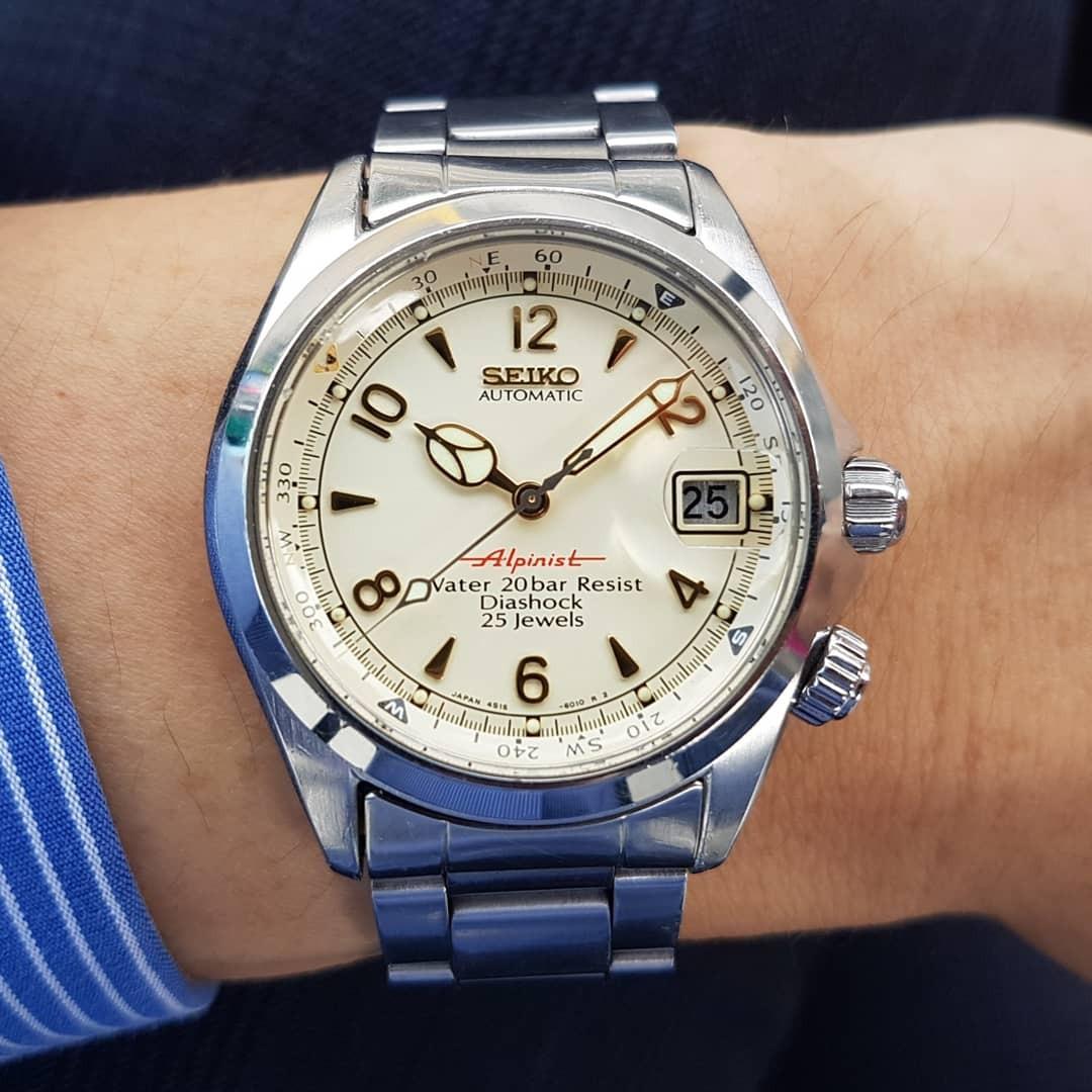
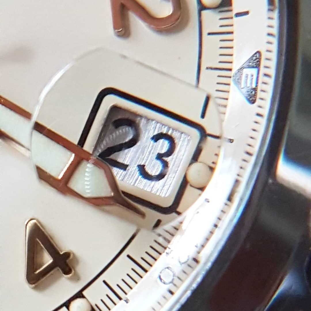
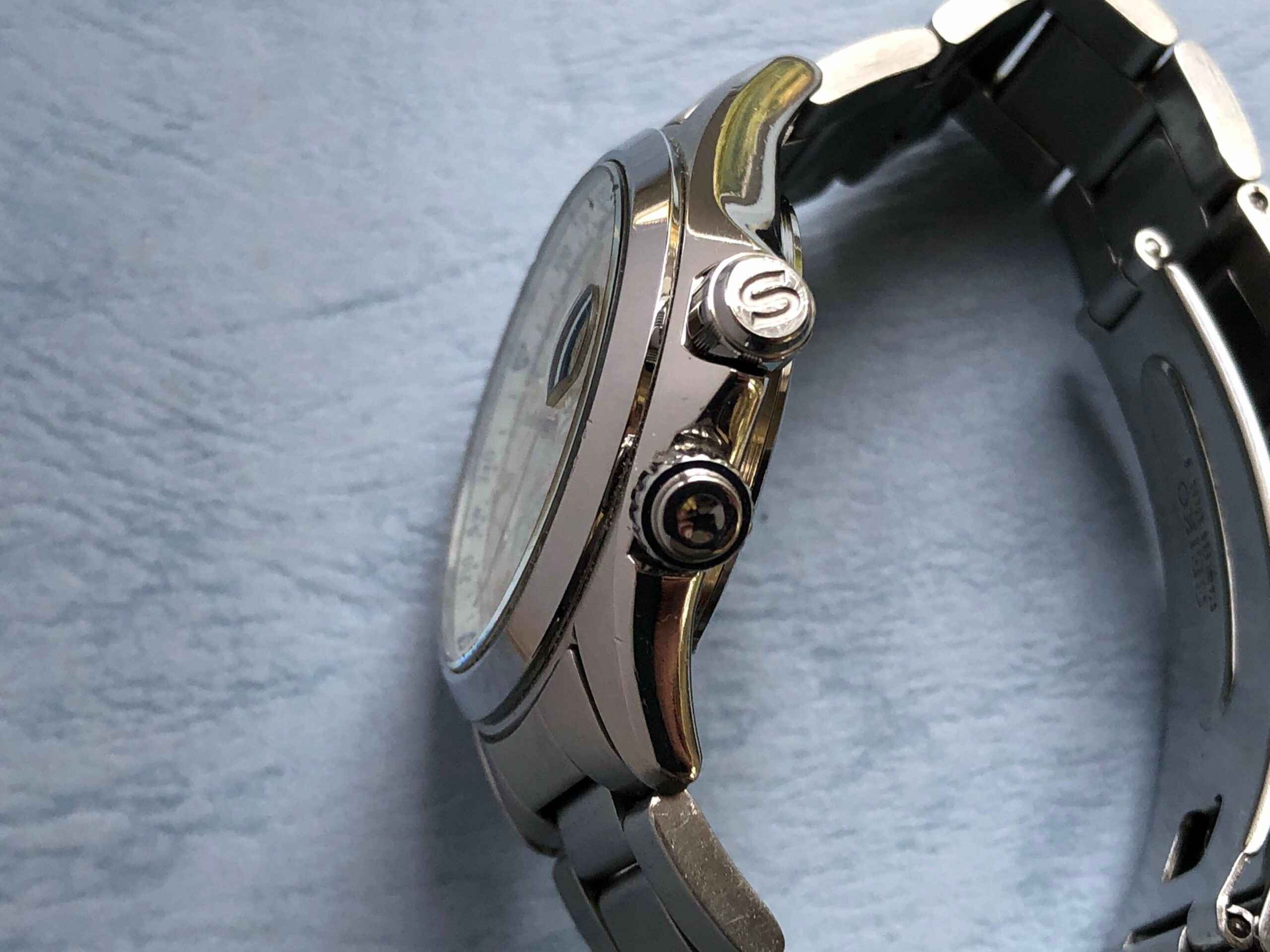
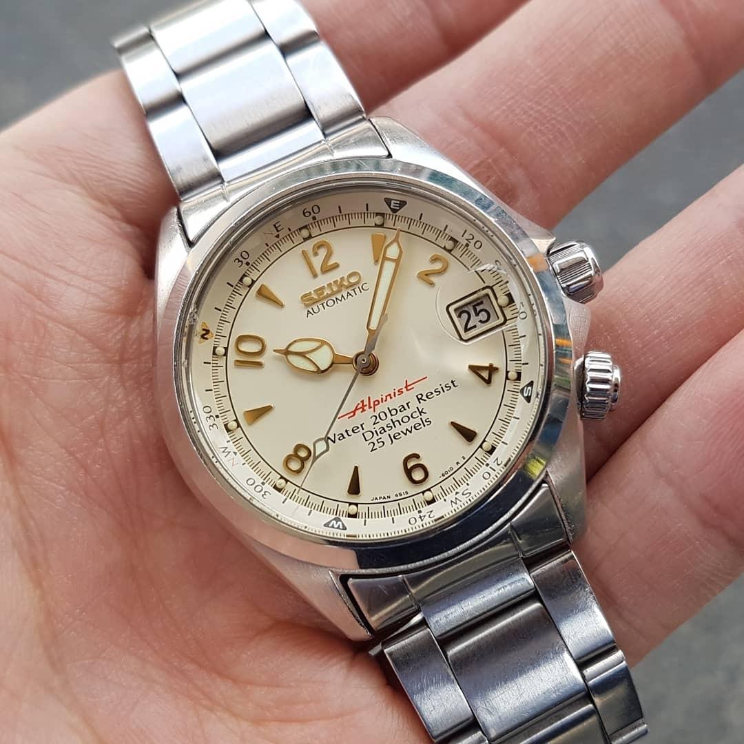
The new design came with an updated and elegant 38mm case, cathedral hands, and a second crown at 4 o’clock to rotate the internal compass bezel. The watch had a water resistance rating of 200 meters and came with a Sapphlex crystal (a mineral crystal with a synthetic sapphire layer on top) with a magnifier at 3 o’clock for the date window. Another notable feature was that all the models were available on a stainless steel bracelet. The models introduced in 1995 were the SCVF005 with a black dial with silver chevron indices, the SCVF007 with a cream dial and Arabic numerals in gold, and the SCVF009 with a green dial and Arabic numerals also in gold. Each of the three models has a distinct presence.
The love for the cream dial with the red Alpinist name
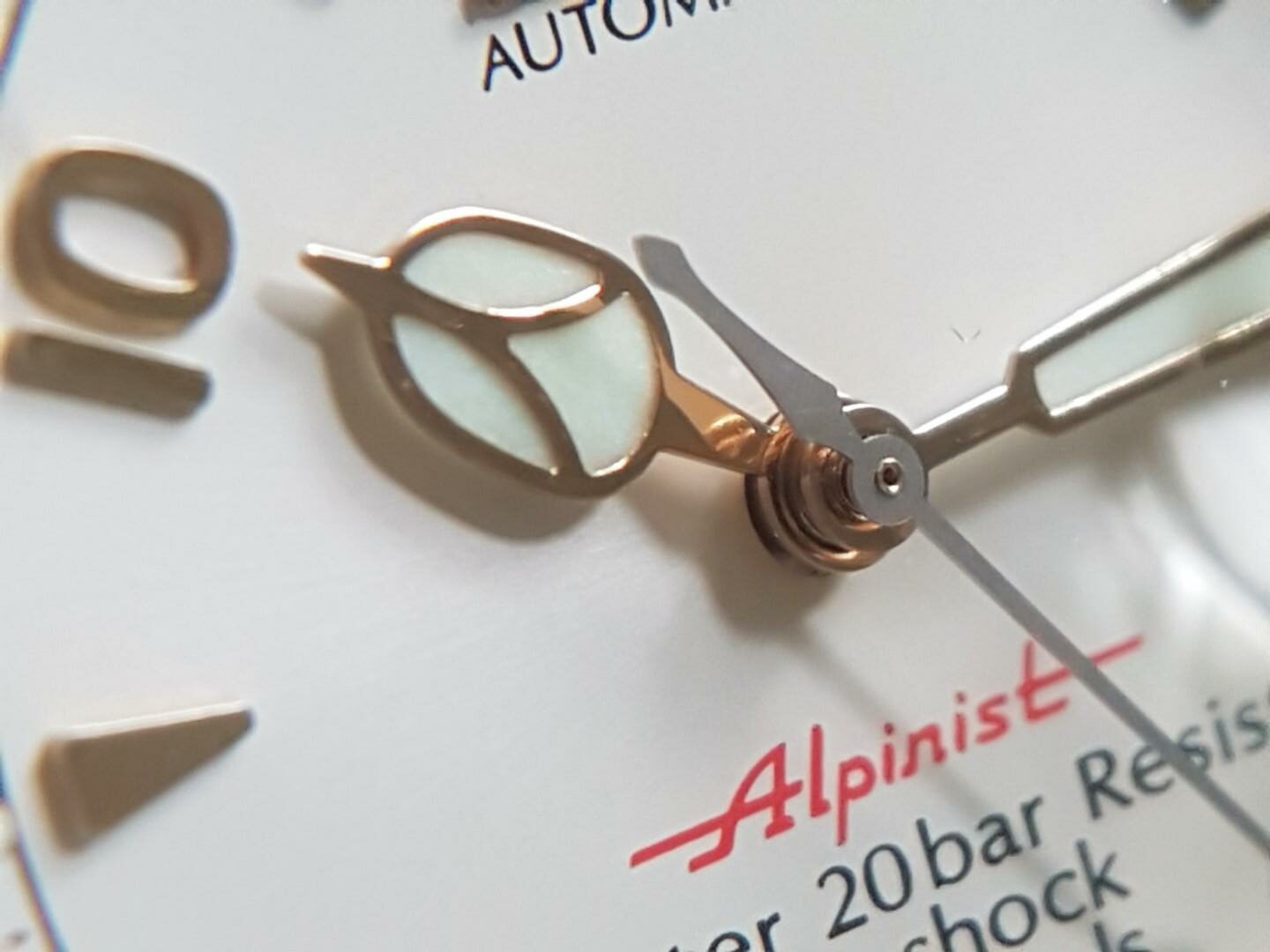
While I love the black-dial version with its unique chevron indices and the green-dial version for its vintage appeal, the cream-dial version has always made my heart beat faster. I love that dial color because it has such an authentic feel and works wonders with the red “Alpinist” name. The name disappeared from the dials of the Alpinist series that came after, and that is a big absence, in my opinion. First off, the red “Alpinist” text that gave the series its name injects the dials with the right amount of zing. It works well on all three dial colors that Seiko introduced to the Japanese market in 1995.
But there is more to it than just colors. Seiko is a brand that we know predominantly from its reference numbers and fan-created nicknames. And the Alpinist is the brilliant exception to that unwritten rule. Here, we have a series with a unique and instantly recognizable name in the watch universe. Say “Alpinist,” and every watch fan will know what you are talking about. On top of that, the name adds aspiration to the series. It helps to define the character of these watches that fit in a select group of “accepted” and traditional timepieces for explorers. That connection is not just welcome in the world of watches but makes this probably one of the most iconic and aspirational Seiko names.
A wish for something obvious that is within reach
We need the “Alpinist” text back on the dial in favor of the modern-looking Prospex logo. The latter simply does not fit the overall style of the watch. And while the construct of the Alpinist models as part of the “adventurer’s” Prospex line might make sense in the context of Seiko’s overall catalog, it does not mean that the watch needs that designation. That’s why I would love to see a return to the overall aesthetic of the Seiko SCVF007 “Red Alpinist.” Having said that, there are some more details that we could discuss while we are optimizing.
Another thing that would be great is the addition of signed crowns like the ones on the models from the mid-’90s. Additionally, the current date discs are all white with black printing. Could we not have them in the same colors as the dials? It’s a simple change that adds style and one that we have already seen happen for the baby Alpinist. Speaking of which, the Red Alpinists’ crystals featured a date magnifier, as do the current models.
But the 2006 SARB series of Alpinists showed that the watches look better without a magnifier. Lastly, the Red Alpinists featured a 38mm case, whereas the current models feature a 39.5mm case. I could pull off both sizes easily and am honestly on the fence. For that classical Alpinist feel, I love to see a 38mm version, but the baby Alpinist is also 38mm, so that is probably a bridge too far.
An updated movement to make it the perfect modern Alpinist
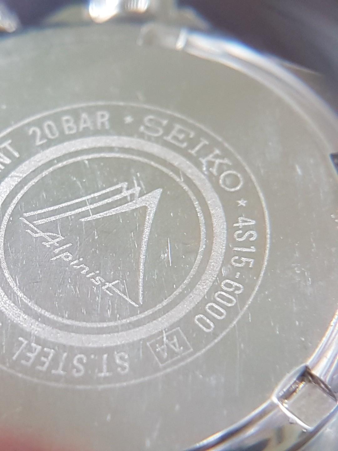
The one thing that definitely needs a modern upgrade compared to the original Red Alpinists is the movement. The watches from 1995 were equipped with Seiko’s 4S15 automatic caliber. This movement operates at 28,800vph and has 25 jewels and a 40-hour power reserve. The 4S15 can be manually wound, and it has a quick-set date function and hacking seconds. It was conceived by Seiko in the early ’90s to shake the quartz image of the brand.
Almost three decades later, Seiko has more modern movements that could do the job better. For the 2006 SARB series, Seiko used the reliable 6R15 movement that also powers my first-generation Sumo. For the current-generation Alpinists, Seiko used its 6R35 movement, an upgraded version of the 6R15 with an improved power reserve from 50 to 70 hours. An easy upgrade would be the new caliber 6R55 that was recently debuted in the new 39mm King Seiko models. The caliber slightly increases the power reserve to three days. And it potentially also proves to be more accurate than the current 6R35, which has shown its hiccups in terms of accuracy.
Final thoughts on the Seiko SCVF007 “Red Alpinist”
The Seiko SCVF007 “Red Alpinist” is a much sought-after reference for collectors. A big part of that is because it was a JDM-only model and, as such, was never widely available. And regardless of what dial version you pick, that entire series represents the modern Alpinist in all its glory. But I have a huge soft spot for that beautiful cream-colored dial. It makes this a standout classic that I would love to see make a comeback in a modern version with the glorious red Alpinist name on the dial. That Alpinist name makes the 1995 version so much more aspirational than the current models. Add the return of the cream dial with its gold accents and a solid bracelet, and I would make my way to the Seiko boutique without any hesitation.
For more information on the current offerings, visit the official Seiko website.
*Featured image: Vintage Seiko NL


