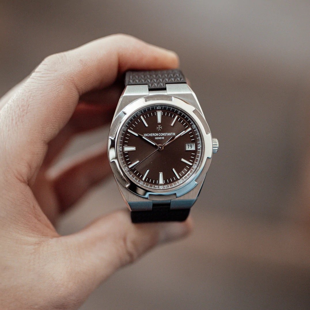
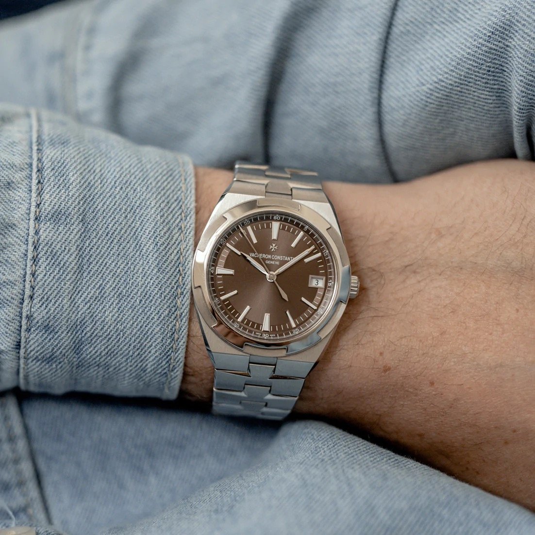
Dear Vacheron Constantin, Bring Back The Overseas 4500V With The Stunning Brown Dial
Regular readers of this series of articles know that it’s all about beautiful and special watches from the past. But what about a model that is still in production? And to be even more specific, it’s “just” about a dial color. I have wanted to write about the Vacheron Constantin Overseas 4500V with the stunning brown dial for a while now. But I was also a bit hesitant because it was simply a dial color of a watch that is part of Vacheron Constantin’s collection. Still, every time I look at the watch, I realize the huge transformational power that the color has. So here is the story of a dial color.
What made me decide to write this story after all? The answer was actually very simple. Besides coming back to the watch multiple times and being smitten with it, I talked about it with other Fratello team members. While the opinions about the Overseas 4500V differ greatly among the team, everyone agreed on the magic of the brown-dial version. This rare dial color has a special charm and class that everyone seems to appreciate quite a bit. It turns the Overseas from one of the many luxury sports watches out there into a stand-out timepiece in the genre.
The introduction of the Vacheron Constantin Overseas 4500V
Let’s start with some background on this version if the Overseas. Back in 2016 at SIHH, Vacheron Constantin introduced the current-generation Overseas to much critical acclaim. The first models released were a blue-dial version and one with a silver dial. The blue version was a no-brainer as it is the preferred dial color for many interested in the luxury sports watch category. The Royal Oak and the Nautilus also are predominantly known as pieces with a blue dial. And I have to say that Vacheron’s blue dial color is beautiful. But by conforming to the category-standard dial color, it also plays a game that others are better at in the eyes of many watch enthusiasts.
The silver-colored dial is a lot less striking, in my opinion. It definitely has a certain depth to it that comes courtesy of the sunray pattern that is finished with an applied translucent lacquer. But overall, its presence is a bit too bland for my taste, especially after Vacheron Constantin decided to clean up the dial design with this version compared to the second generation (2004–2016). Overall, watch enthusiasts agreed that this new generation was a great evolution of the Overseas series compared to the previous two.
The design of the third-generation Overseas
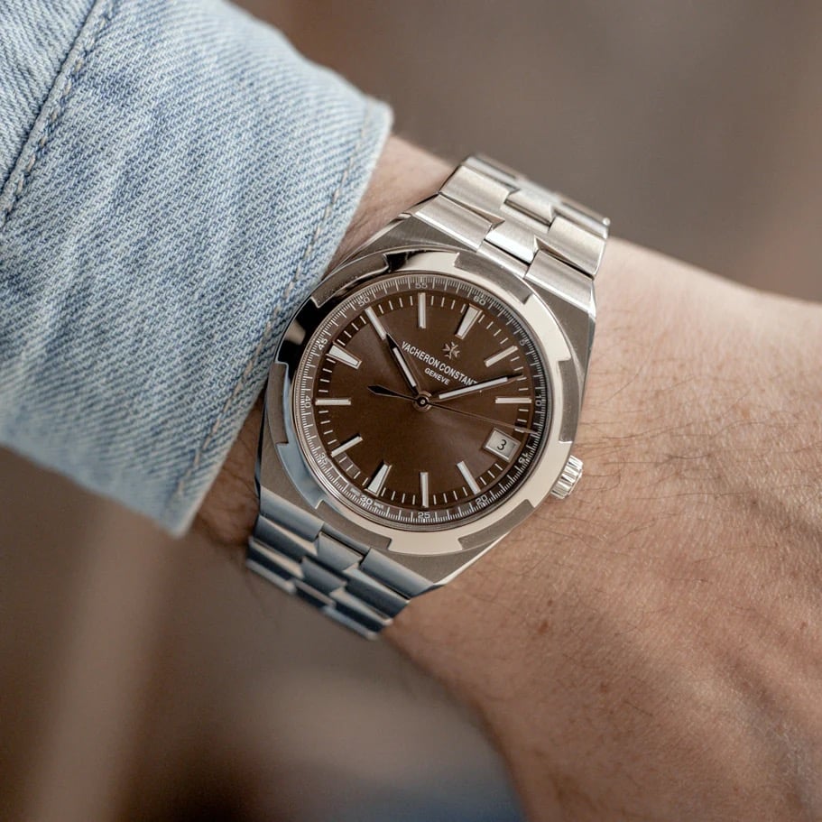
And I fully agree with that observation. The first- and second-generation Overseas models were way too frivolous and too defined by the time they were conceived in. While there is definitely a certain sentiment to that, the Overseas missed that timeless relevance in design to make it a true competitor of the Royal Oak and the Nautilus. But with the 2016 Overseas, Vacheron Constantin made significant steps in coming up with a truly beautiful watch that, in my opinion, should not be viewed as a substitute for its two biggest competitors. The 41mm stainless steel Overseas has plenty of qualities that make it a stand-out piece in design, execution, and technical prowess.
But it is only fair to say that the design of the current Overseas is divisive. Two years ago, Rob and I discussed the pros and cons in an early installment of the Sunday Morning Showdown series. You all showed that I was right in my argument for the Overseas. I stand by everything that I said back then when it comes to the design that Vacheron designer Vincent Kaufmann created. The element that, for me, raised immediate eyebrows was the bezel. It was hard to shake impression of its sawblade-esque shape. It’s a reference that did not particularly feel pleasant. But if you get a chance to witness the Overseas up close, that image quickly fades.
Too many brand elements?
Another design choice that might take time to get used to is the repeated integration of the Maltese cross in the bezel and the bracelet. Is it a case of too much branding, or is that stand-out design feature that a watch needs to become a classic? I am usually not a big fan of making your logo a big part of the overall branding. Especially when it comes to watches, branding should never be a big part of the overall design. Watches are fine timekeeping instruments in which a logo is the confirmation of a choice rather than a reason for buying it. Once again, though, the proof of the greatness of this design came through witnessing it in the metal.
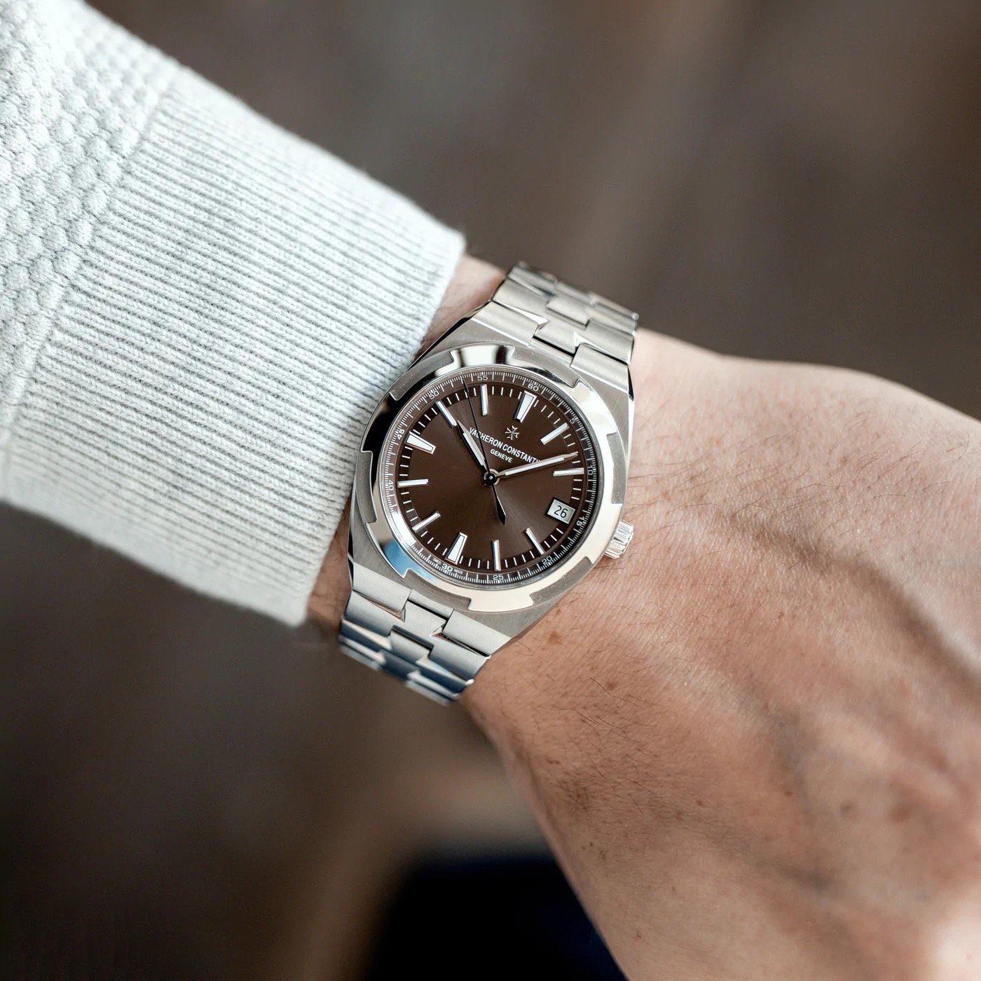
The refinement of the bracelet is absolutely wonderful and caught me somewhat by surprise after seeing the angular shape of the individual links. The bracelet wraps itself around your wrist comfortably. And once on the wrist, the bracelet turns out to be extremely comfortable and a lot less edgy than it seemed at first. But I should have expected as much because, after all, this watch is by Vacheron Constantin. If there is one thing that the brand understands, it’s refinement. Further proof of that comes in the form of the dial design.
The Overseas dial is full of details
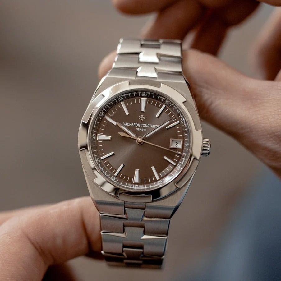
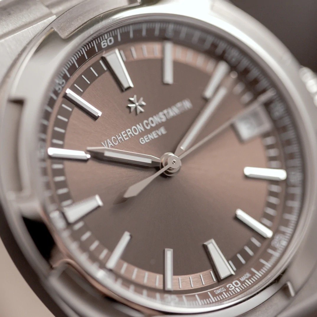
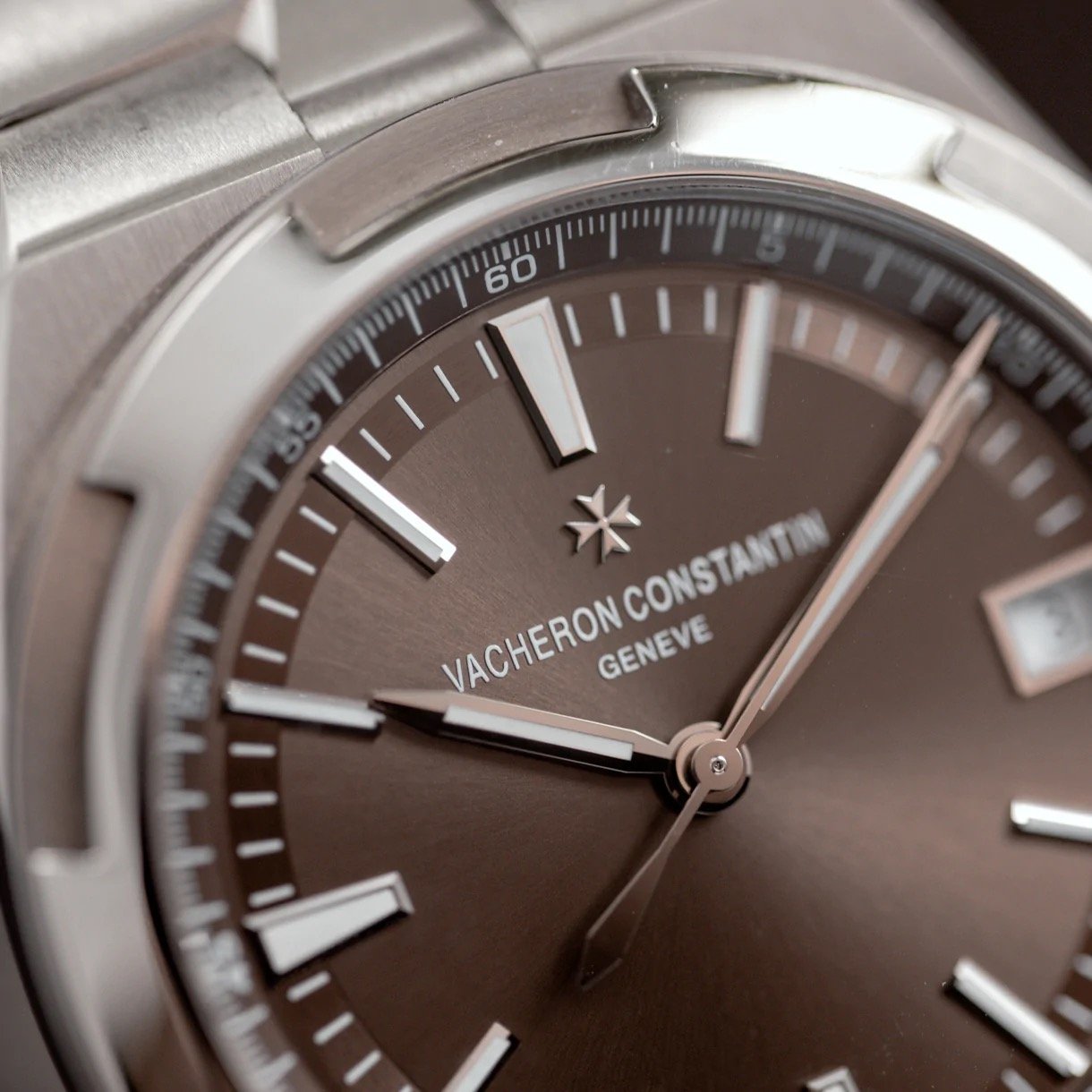
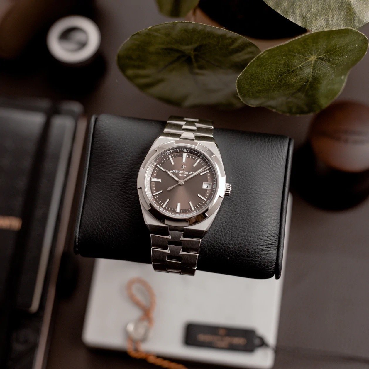
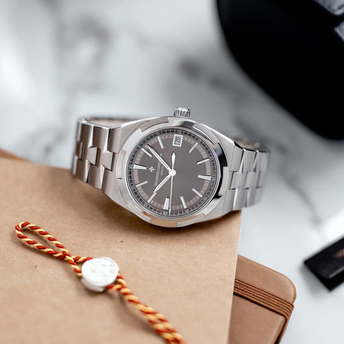
I love the overall design of the dial of the Overseas. I absolutely adore the seemingly simple layout with quite a few nice intricate details. It all starts with the beautifully clean central part of the dial with its sunray pattern. As mentioned before, that sunray pattern is finished with an applied translucent lacquer. The result is a dial that comes alive in natural daylight. And it has plenty of room to come alive because the only elements in the center are the applied white gold Maltese cross with “Vacheron Constantin” and “Geneve” as proud indicators of the brand identity. But if you let your eyes slowly move toward the outer parts of the dial, you are greeted by a number of elements that have the refinement I mentioned before.
The rehaut features a 60-second scale that brings a lot of detail. On the periphery of the dial, you will find the 60-minute scale with applied white gold markers for every five minutes. The trapezoidal markers are slightly larger at 6, 9, and 12 o’clock. At three o’clock, the date window looks rather wide at first. But look again, and you will find that it fits nicely with the five-minute markers. Usually, I prefer the date disc to have the same color as the dial, but in this case, I love that it matches the white Super-LumiNova coating applied on the markers. A single-digit date might look weird at first in the wide window, but if you look closer, you see that it is aligned perfectly with the inner edge of the velvet-finished minute track. Lastly, the seemingly simple faceted baton hands perfectly complete the dial’s style.
The story of the brown dial
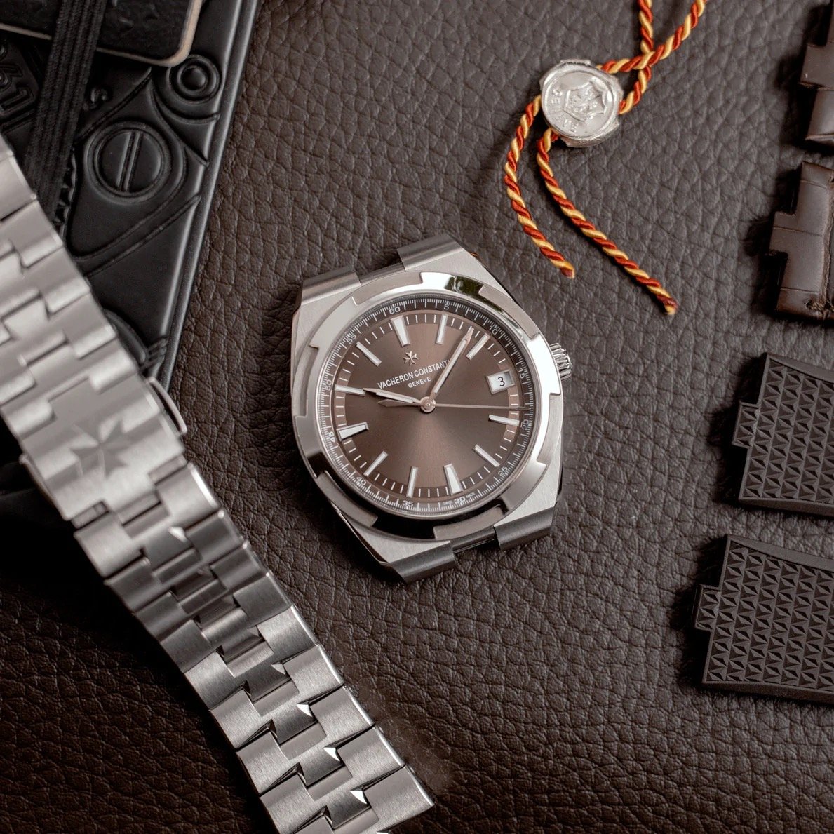
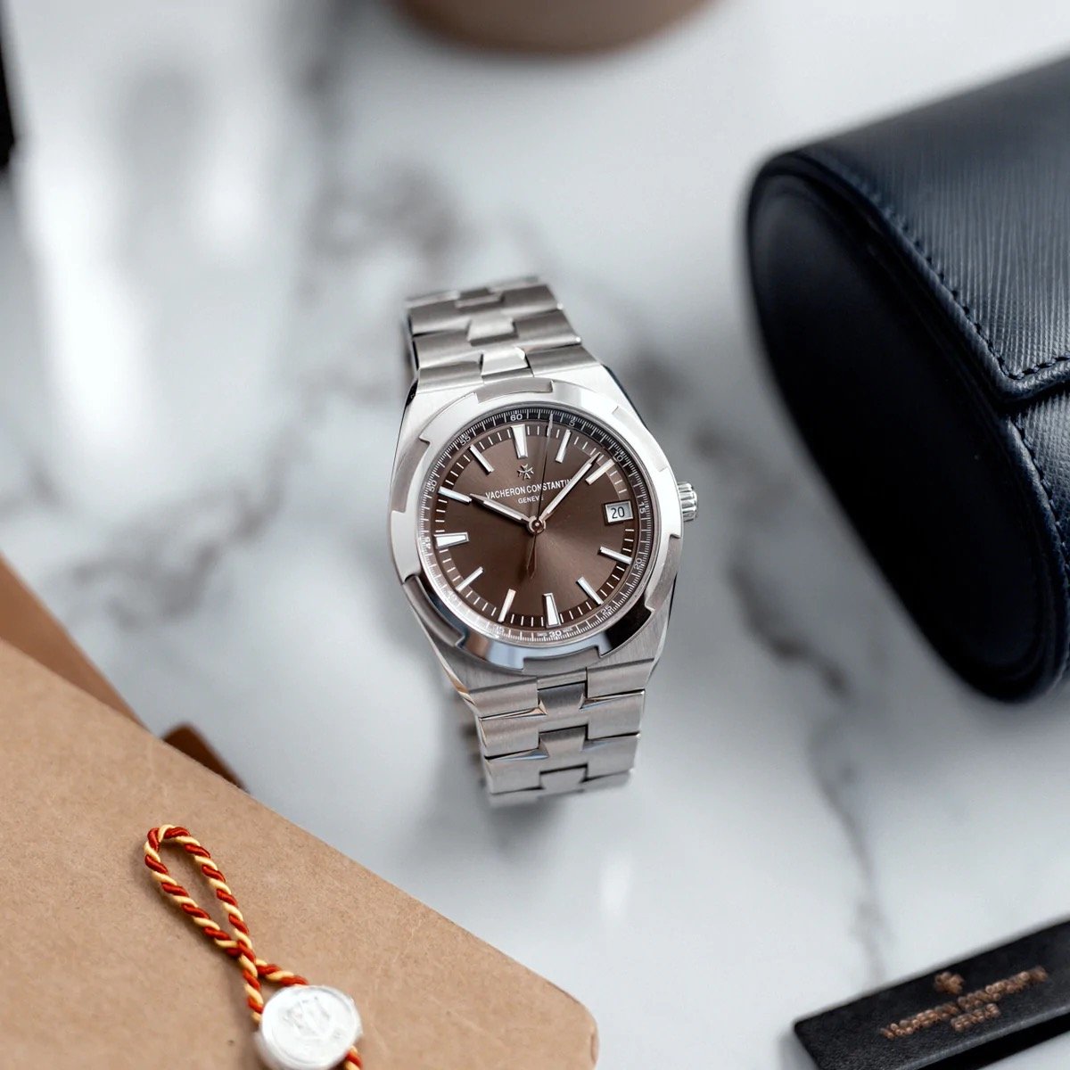
Moving on to the true topic of this article — the story of the brown-colored dial. In May 2016, just four months after the introduction of the new Overseas, Vacheron Constantin introduced two new watches with stunning brown dials. The first was the Overseas 4500V in this article, and the second was the Overseas Chronograph 5500V. The two models immediately stood out. A brown dial seems bold and different in a world where white, silver, black, and blue are the main dial colors. But is it really? First and foremost, it’s simply a stunning color that adds great depth. It was love at first sight for me six years ago.
But the brown dial color did something more than just being different. Vacheron did an outstanding job picking the right shade of brown. The specific brown hue adds an extra layer of class and presence, bringing a sense of sophistication that we do not often see in the realm of luxury stainless steel sports watches. So it’s this combination of seeing a different color and the perfect shade of it that transforms the watch into something more stylish and unique overall.
There is more to the Overseas than its dial
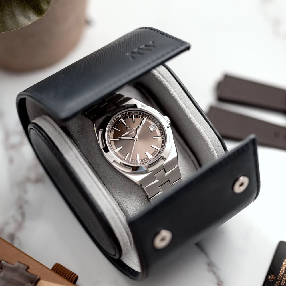
Obviously, there is a lot more to the Overseas than just its dial. But as this is a specific story about the brown dial, I hope you will forgive me for not diving too deep into the technical specs. Having said that, it is important to go over them to do the watch proper justice. The Overseas 4500V features a 41mm stainless steel tonneau-shaped case that is 11mm thick and 150m water-resistant. A soft iron casing ring protects the movement against magnetic fields of up to 25,000 A/m. The watch came with a stainless steel bracelet, a brown leather strap, and a brown rubber strap. All of them are easily interchangeable if you want to change the look.
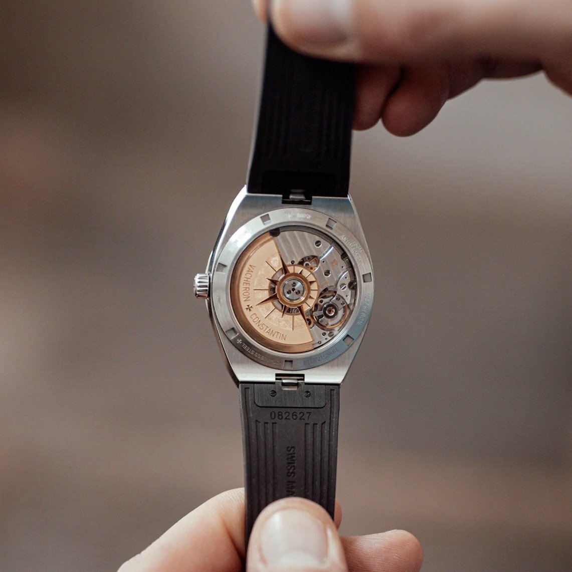
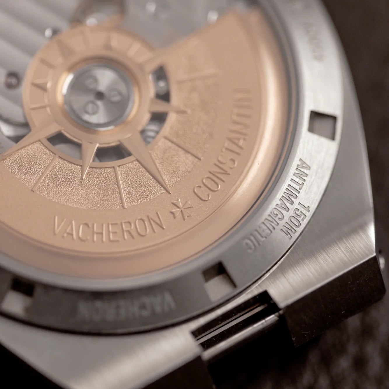
If you turn the watch around, you will see the in-house caliber 5100 in all its glory. This self-winding movement was brand new when the third-generation Overseas debuted in 2016. It consists of 172 parts, has 37 jewels, operates at 28,800vph, and provides 60 hours of power reserve thanks to the twin barrels. The movement features a beautifully engraved 22K gold oscillating weight that features a compass rose. Additionally, the movement is finished beautifully and features the iconic Hallmark of Geneva. While nowhere near as impressive as some of Vacheron Constantin’s other movements and rather straightforward for the brand, it does fit the overall style of the Overseas perfectly.
Not that far from home
And style is also at the heart of this article. Basically, it’s a plea to bring back one single dial color. Vacheron Constantin only produced the brown-dial Overseas ref. 4500V/110A-B146 for one year. After that, it was taken out of the collection and became an illustrious version of the great Overseas series. It goes without saying that the watch fetches crazy prices on the pre-owned market. Back in 2016, the watch was available for €21,700. A quick check shows that you currently have to pay roughly between €37.5K and €65K for one. I would like to think that the price is driven by a deep love for the actual color. However, we all know that scarcity and hype have definitely contributed to the current prices.
This is something that Vacheron Constantin could easily take care of. Just bring back this absolutely stunning dial color, and more people will be able to enjoy it at its current €25,700 list price. This brown-dial version is, without a single shred of a doubt, my favorite Overseas ever. And come to think of it, a brown dial fits luxury watches perfectly. It makes you wonder why we do not see it more often. To put it into context, many of the emotional (luxury) products we love share the same color. Think of leather, cigars, dark wood, and coffee. All these products and materials are closely associated with the world of luxury and share their brown color. So it’s not really all that strange that people love seeing this brown-dial version of the Overseas. Besides it being an awesome color, there is a subconscious context that feels very close to home for many watch fans. I happen to be one of them.
All photos in this article, including the cover image, come courtesy of Mr. Watchley.

