Different Types Of Date Displays – The Best, The Worst, And Why!
Date displays are one of those complications that divide the community. Some people swear by them; others hate them. I’m in the former camp, and I find myself at a bit of a loss without a date indicator at times. I find myself often looking down at my watch to check the date, only to come up short. So, today I’m looking at some of my favorite types of date displays: what works best and what leaves me out in the cold?
There are, of course, several different methods that watch brands use to display the date on watches. Some are more suited to certain watch styles, and others are more easily legible at a glance. That said, they still all have their uses. Still, I definitely seem to prefer some over others.
Love them!
Let’s start with the ones I love best. These are my favorite options and the ones I’ll usually pay the most attention to when watch shopping:
Date
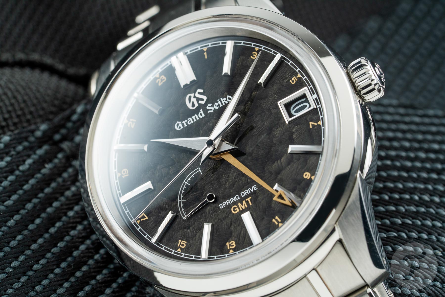
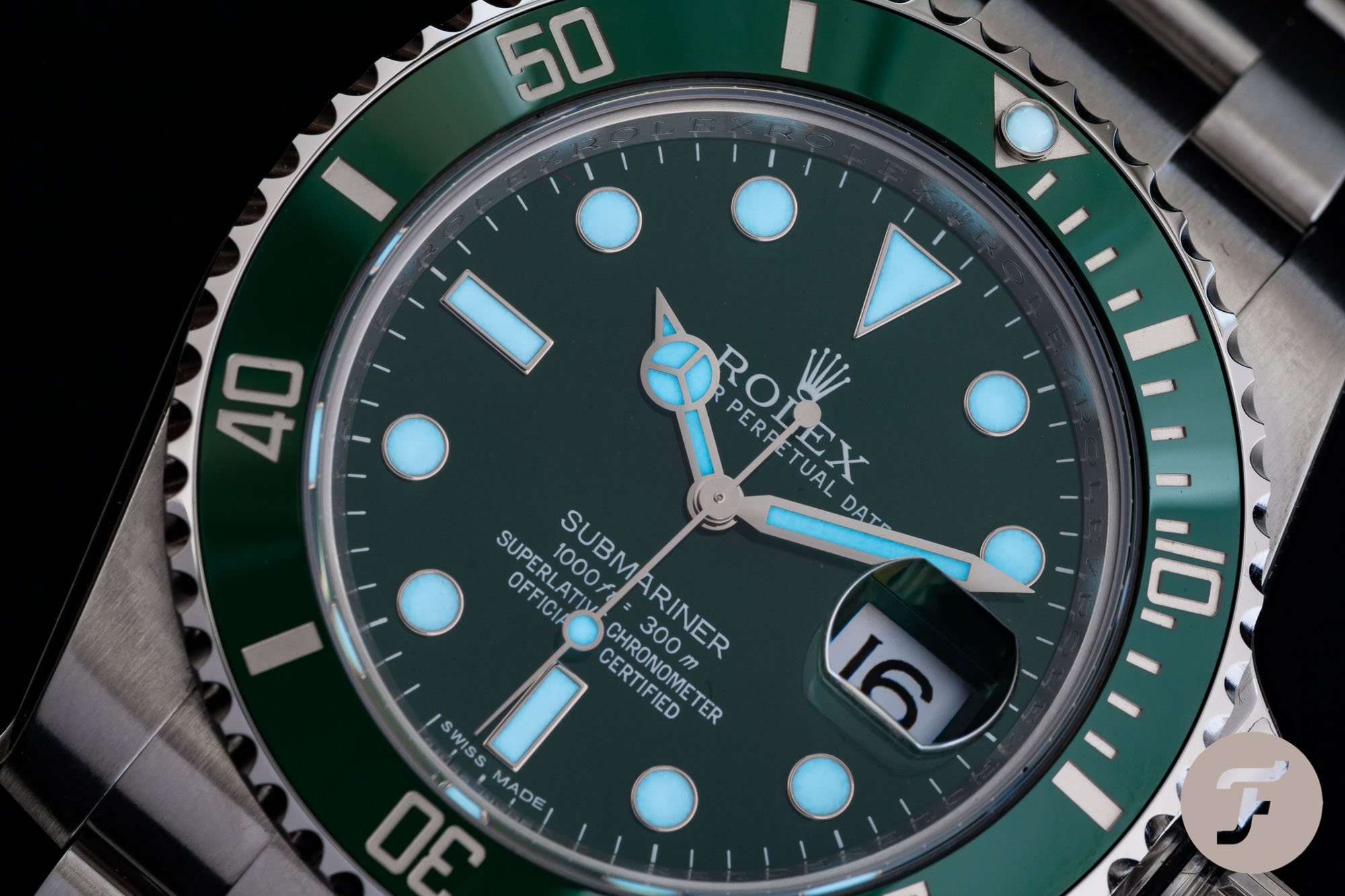
I think I will always prefer the simplicity of a classic date window. It’s the most straightforward too. Underneath the dial, a printed disc runs around the dial’s edge. Each day, the wheel clicks forward, and the following consecutive number shows through the dial cutout. This type of simple date display usually requires manual adjustment for months with less than 31 days. Thankfully most such movements have a quickset feature accessed by the crown’s second position. It’s hard to argue with the tried and tested classic date. I mean look at the cult-like classic Rolex Submariner!
There is a lot to be said about watch design here, as it can totally make or break the integration. Obviously, date window cutouts can technically be placed at any point on the dial over the date disc. The most common positions are 3 o’clock and 6 o’clock. These are my favorite positions, with 3 providing a slightly more “vintage” style, and 6 is slightly more “modern,” in my opinion. The only issue with these positions is that they affect the size and shape of the corresponding hour marker. For that reason, some brands use a dial cutout at 4.30 to counteract this conflict.
Examples include: Rolex Submariner, Grand Seiko SBGE271.
Big Date
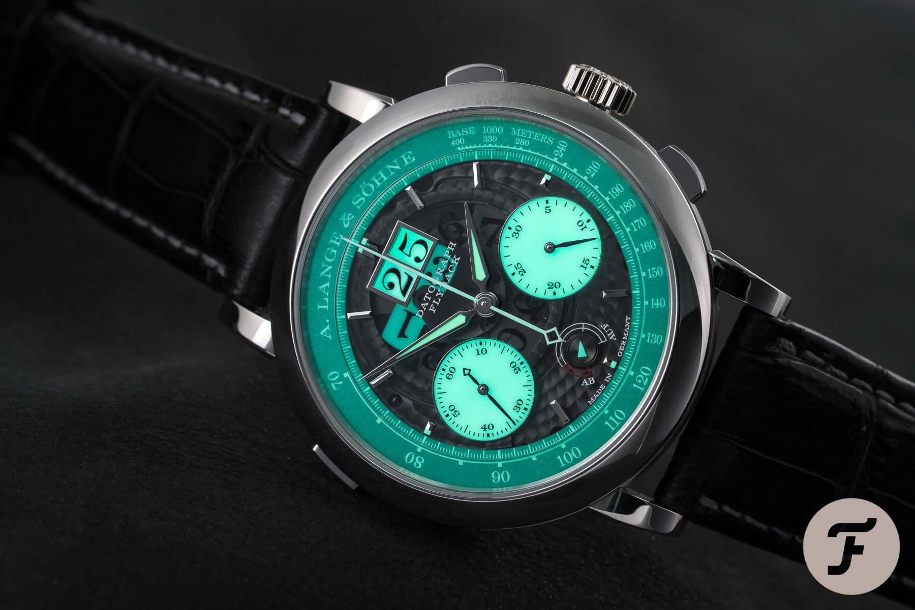
What if you want a more prominent date display? Admittedly some of the small displays are difficult to read at times. Some brands opted to add a magnifying cyclops to the crystal. However, that is more of a Band-Aid solution, despite its decent result. Enter the big date! The big date is the classic date’s big brother. It pretty much does what it says on the tin. It’s the date, but big. Simple, right?
A bigger date will obviously be far more legible. Still, this bigger display comes at the expense of more dial real estate. I like legibility, and a well-integrated big date display can be super useful in that regard. Although some big date complications use a larger peripheral date disc, most big date displays use two separate discs, one for each numeral. This elegant solution is more challenging to implement from a technical standpoint, so watches using this type of date display are usually a little pricer than their smaller-sized cousins.
Examples include: A. Lange & Sohne Datograph Lumen, Glasshütte Original SeaQ Panorama Date.
Central Pointer Date
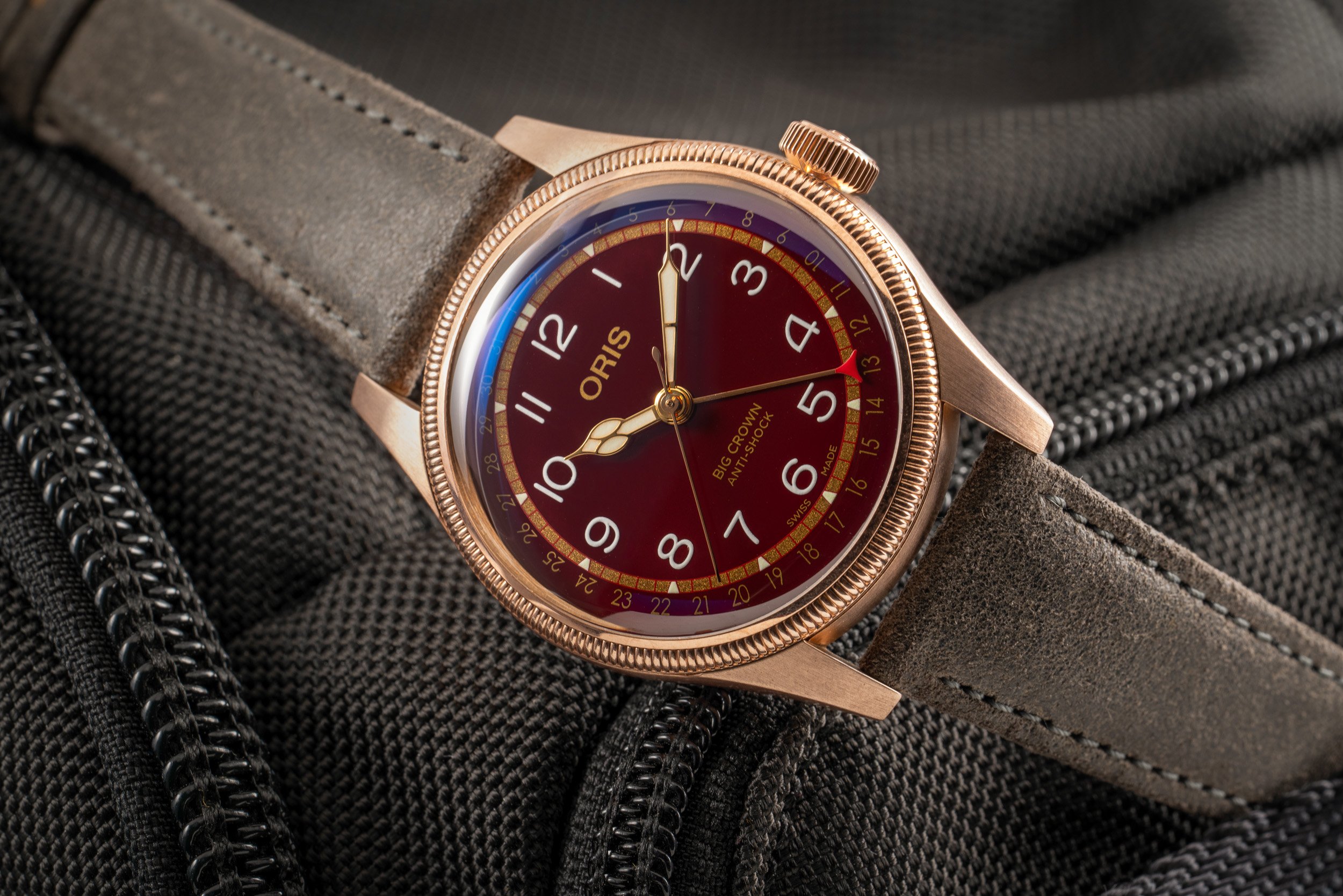
Finally, my third and final “love” is the central pointer date. In my opinion, it’s possibly the most elegant date solution. Although the pointer style date was one of the first types of date displays on watches, it has found itself slightly less popular these days. Until recently, even I was not the biggest fan of the pointer date. I took the acquisition of my Fratelloris for me to realize quite how cool it was. Sure, a pointer date isn’t quite as instantly readable as a classic date window, but hey. I find that you get over that quite quickly.
The central pointer date is a fairly self-explanatory name. A centrally-mounted hand points to the date on a scale around the dial’s edge. The best thing about this style of date indication is that it doesn’t skew any dial symmetry, and there’s no window or sub-dial required. As I mentioned, the pointer date is a more visually attractive option, so don’t expect to find it on rugged, modern tool watches.
Examples include: Oris Big Crown Pointer Date, MeisterSinger Neo Pointer Date.
Hate them!
OK, time for my not-so-loved options. While there’s nothing inherently wrong with these types of date displays, I just prefer other styles for various reasons:
Day-Date
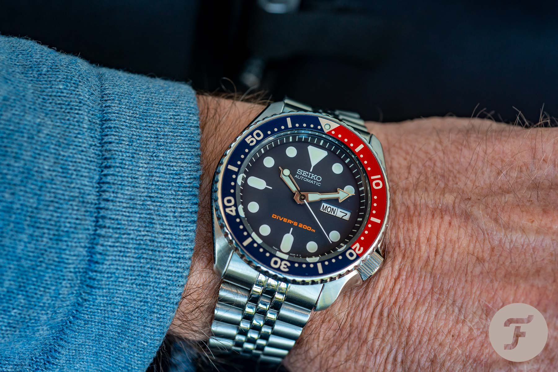
The day date. It’s super: functional, so why am I not a fan? Well, I always know the day. OK, granted, during the lockdown, there were a few times when the days all blended into one and I perhaps lost track a little. Still, for the most part, it’s just an unnecessary feature for me. It takes up extra space on the dial and has always looked a little awkward to me. Similar to date complications, the days are printed onto rotating discs. When the hour hand passes midnight, the day wheel snaps forward along with the date wheel.
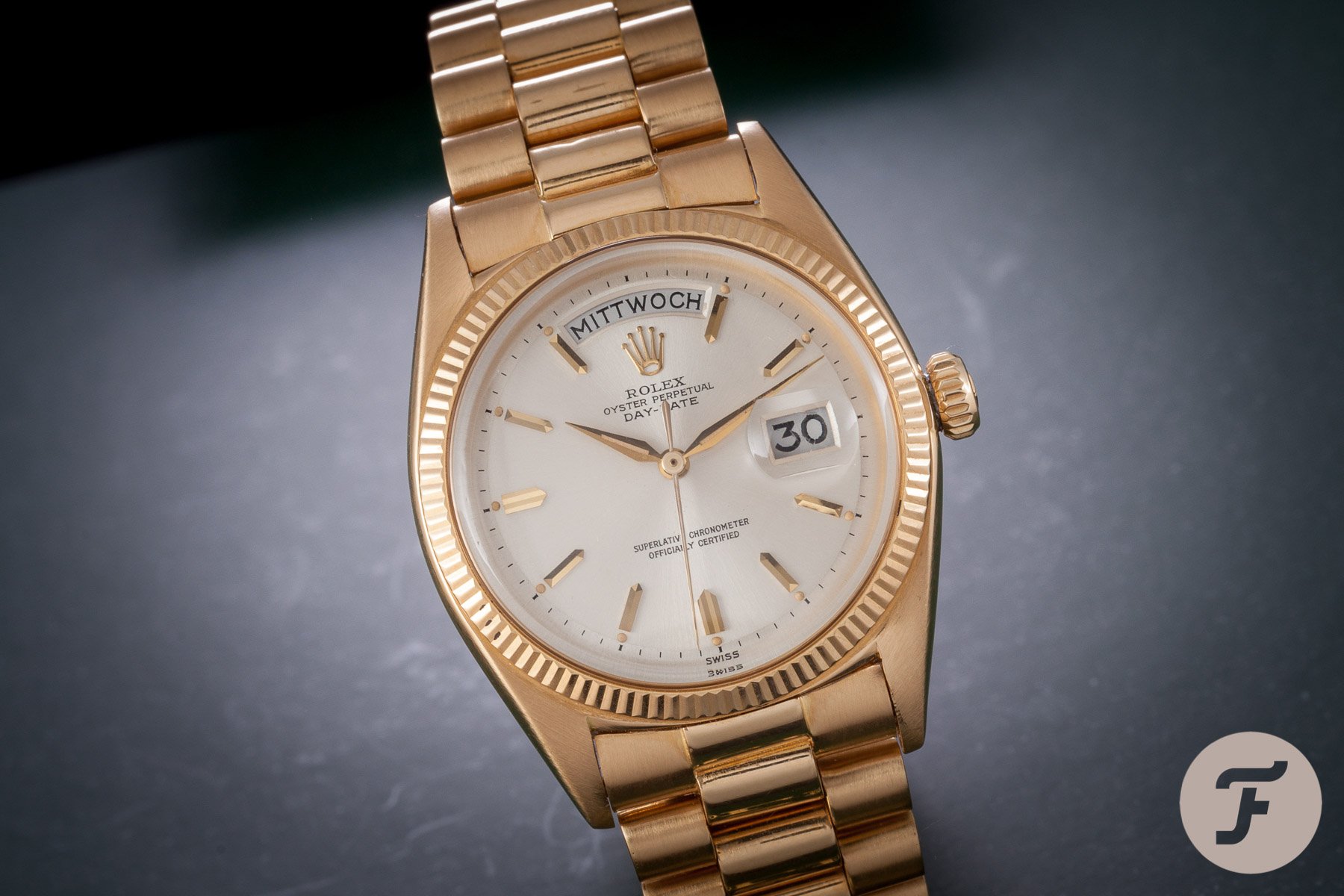
OK, some versions are nicer than others. The abbreviated forms are my least favorite when the day is squeezed in next to the date. I have a little more time for the whole word displays, such as on the Rolex Day-Date. When the day is allowed the space to breathe and display the whole word, it “can” look a little nicer. But, when all is said and done, I still just don’t need a day.
Examples include: Rolex Day-Date, Seiko SKX009.
Sub-dial pointer date
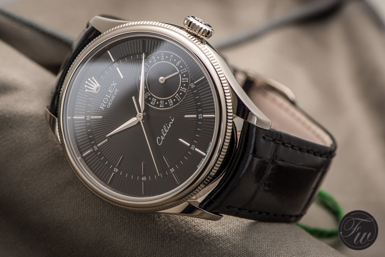
I imagine you’re possibly wondering why I dislike sub-dial pointer date complications if I’m OK with the centrally mounted pointer dates? Well, the sub-dial pointer dates lose their charm when downsized, and they become even more challenging to read. At least a scale around the dial’s edge can display every date numerically. The sub-dial dates often use a handful of numbers and various dot markers. Not exactly easy- to read on the fly.
Additionally, one of the benefits of the central pointer date was the fact that it allowed the dial plenty of space and room to breathe. A sub-dial eliminates that and adds “business” to the dial. Sundial pointer dates are often found on dressier-style watches too. If I’m honest, this style of watch doesn’t do much for me, so it could be a vital part of my dislike for sub-dial pointer dates. If you can think of some modern-looking watches using this type of date complication, please let me know in the comments. I’m open to having my mind changed!
Examples include: Seiko Presage Cocktail Time SSA343J1, Rolex Cellini Date 50515.
Triple date
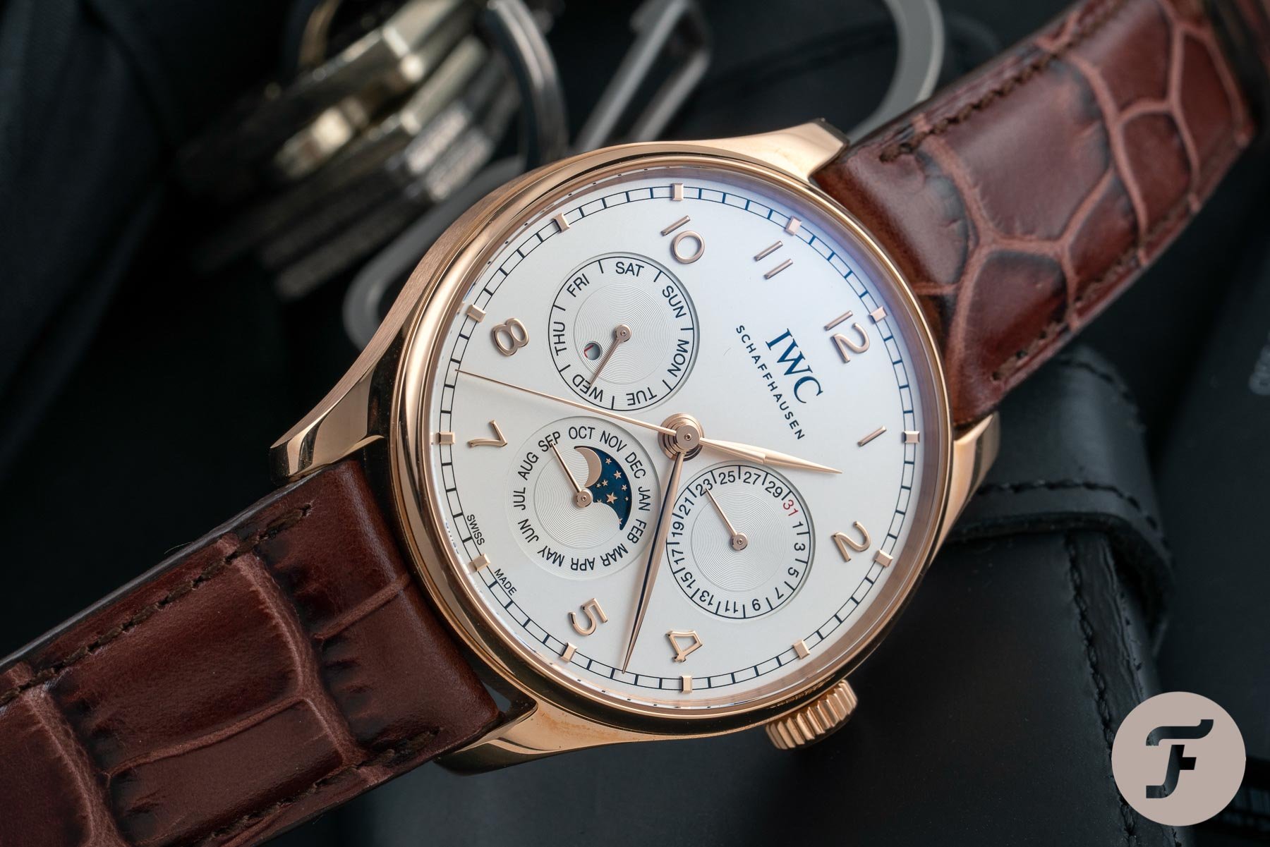
Now triple dates only half belong in my dislike column. Triple dates can come in two formats. Firstly, there’s the windowed type which I actually love. Take a look at the Patek Philippe Reference 5905/1A-001 for example. Reading this date is super easy, and it’s attractively laid out. However, when brands used a series of subdials to display the date, that’s when I start having issues. I suppose it’s taking my dislike for the sub-dial pointer date and just really rubbing salt in the wound.
I like the date to be legible and readable at a glance. Subdials really make you stop and look for longer than I feel should be necessary. When you’re multiplying that by three (day, date, and month), then that’s far longer than I’m comfortable with. In my opinion, it’s also not the most elegant method of displaying the date. Seeing as Patek Philippe is well-known for using a trio of sub-dials to display the date, I can understand your potential confusion at me describing it as “not the most elegant”. After all, Patek is known for its decidedly elegant watches, but three subdials are just not the right fit for me. Personal preference. Give me windows for a triple date, any day of the week (pun partially intended).
Examples include: IWC Portugieser Perpetual Calendar 42, Patek Philippe Perpetual Calendar 5327G-001.
So there we have it. My favorite and least favorite date integrations. I’m keen to hear where you stand on this divisive matter? Do you keep it simple and eschew the date altogether? Or, if you are with me on #teamdate, what’s your preference? Let me know in the comments!
Follow me on Instagram: @davesergeant

