Fans Of Linen Dials Rejoice — John Robert Archetype Prepares To Launch On Kickstarter
Recently on Fratello, we’ve been talking a lot about the importance of dial texture. It is something that has been on my mind personally for quite some time. I’ve been keen to see more mainstream brands experiment with different finishes and materials on the faces of their watches for years, but, all too often, this charge falls to the novel, more liberal brands to advance. This week, we’re taking a look at another such brand, this time, from Melbourne, Australia. The John Robert Archetype is a new line of watches soon to hit Kickstarter with a range of handsome, linen-dialed watches. Read on to learn more…
It is fascinating to examine brands from all corners of the globe. Historically, Australia is not known as a horological hotbed. That is not to say, however, there is any such dearth of interest in the craft. Far from it. What the world’s least populated inhabited continent lacks in denizens, it makes up for in passion.
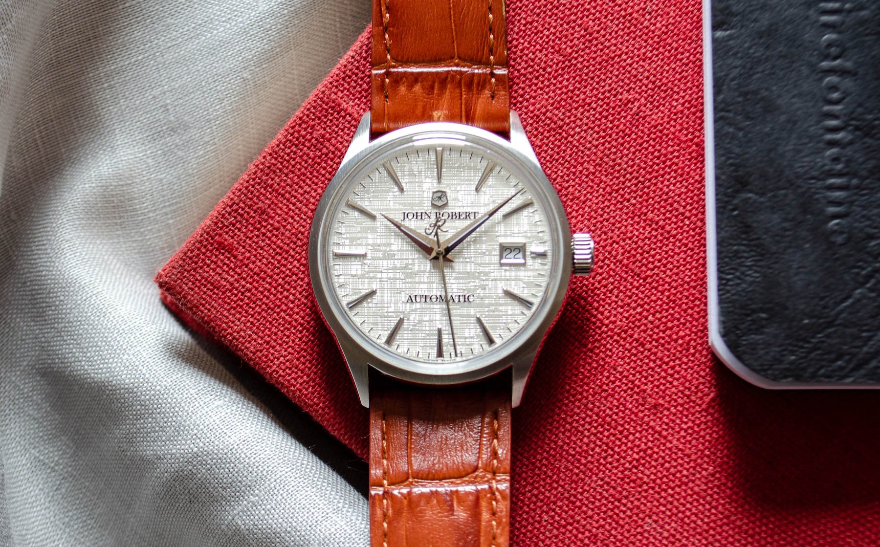
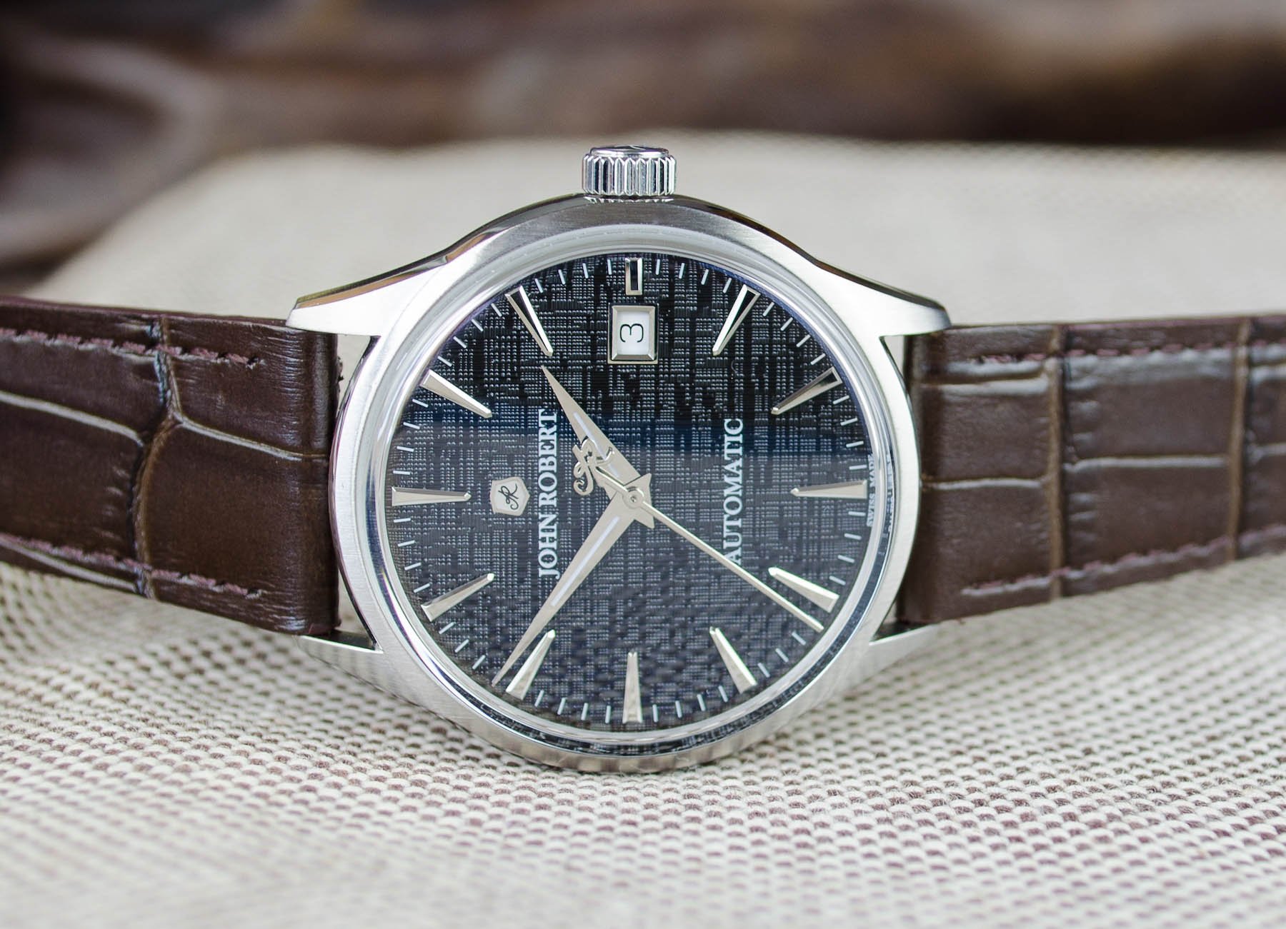
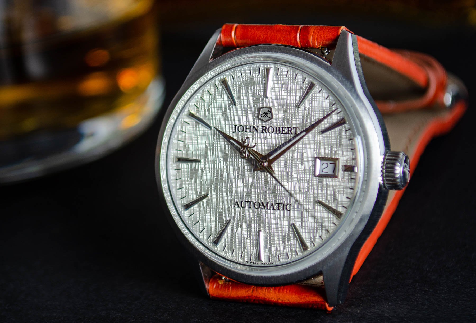
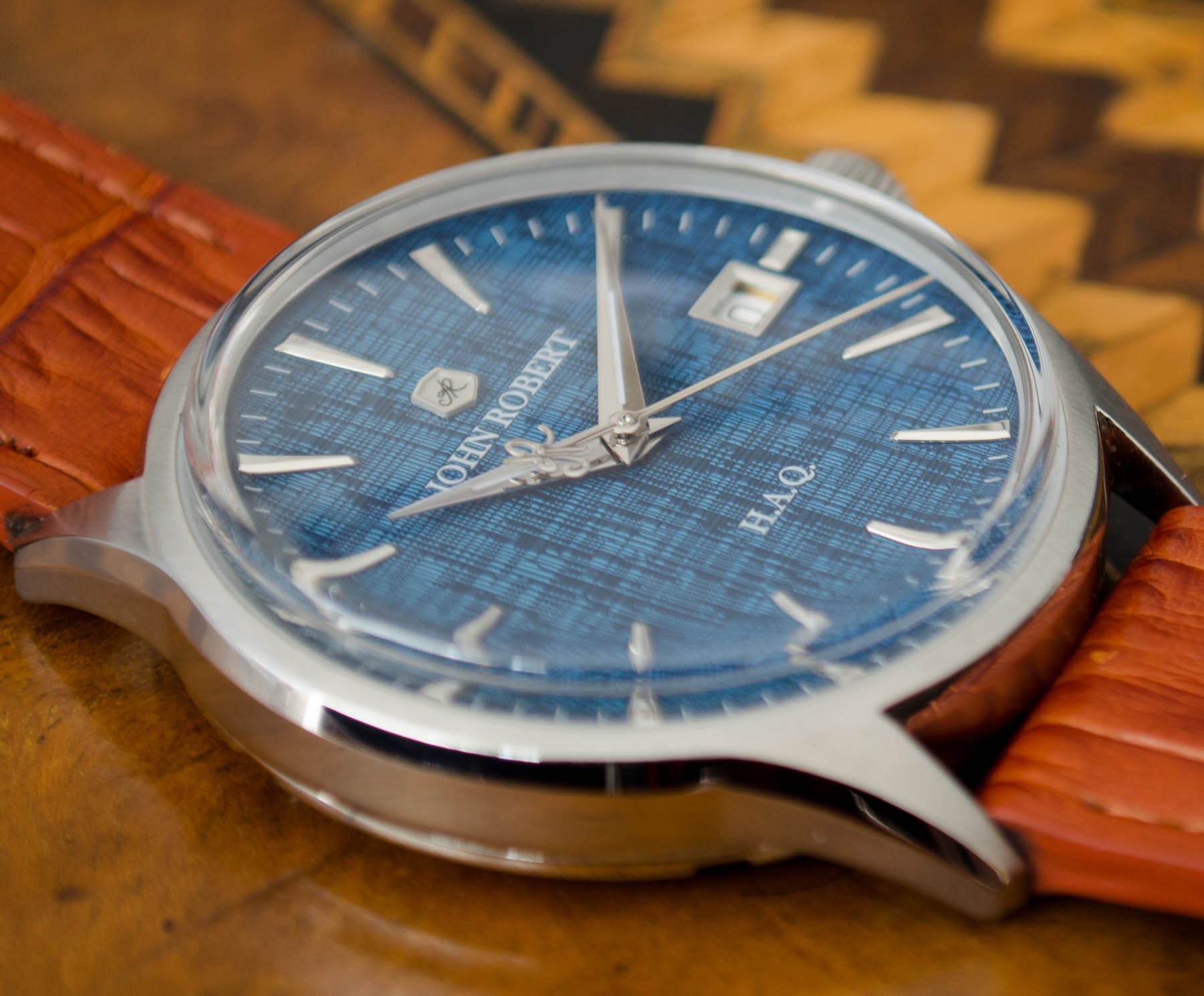
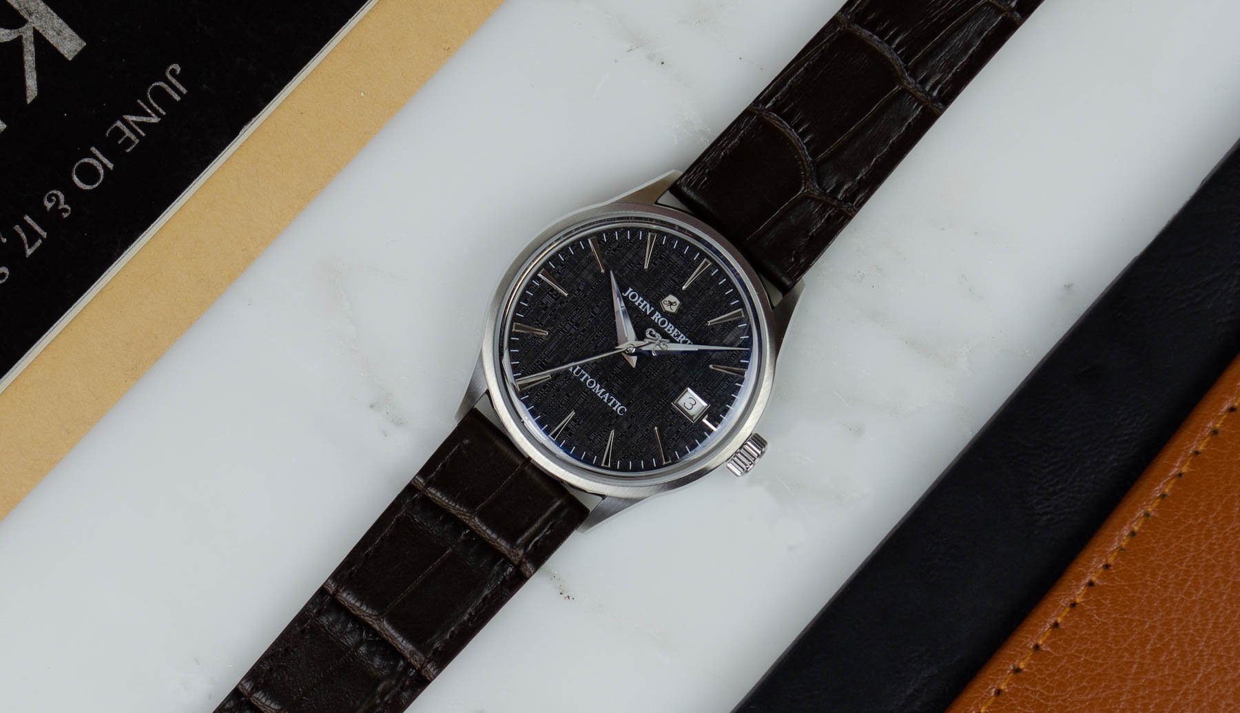
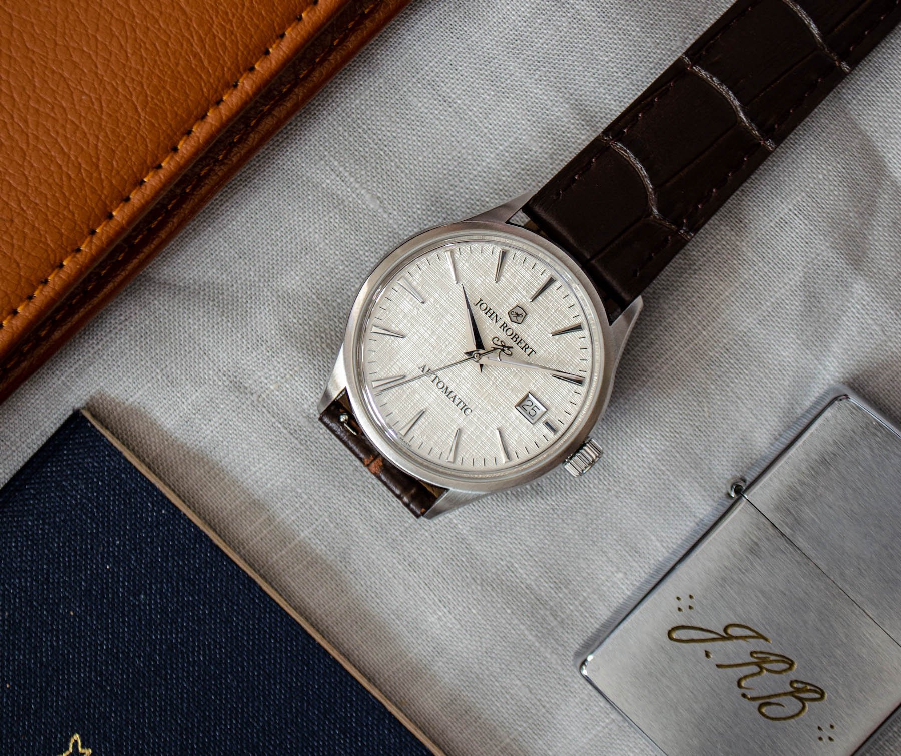
I’ve been lucky enough to work with retailers and collectors groups from the land down under in the past, and I’m thrilled that they’ve got another homegrown hero to champion as 2021 gets underway. The John Robert Archetype range comprises classically styled timepieces, available with both quartz and automatic movements, that place an emphasis on good-quality case finishing to complement the criminally-underused linen texture of the dial.
Texture trumps color in 2021
Whenever a new year dawns, brands and collectors alike are wont to speculate as to the colors that will dominate the months ahead. According to Pantone, the color of the year in 2020 was “classic blue”. While that seemed relevant to the watchmaking industry (when is blue not popular), the colors chosen for 2021 are less likely to find success with the watch-loving community.
Two colors have been chosen to represent 2021. While the gray (known as “Ultimate Gray”) might meet with a neutral enough reaction, the complementary pale yellow (dubbed “Illuminating”) does not look like the kind of shade anyone would want anywhere near a watch dial. Thankfully, then, we have another brand celebrating the use of texture rather than color to create differentiation.
…there’s more to this brand than just a tempting range of watches.
By employing linen dials in white, charcoal, and a fetching shade of blue, John Robert Archetype watches immediately stands out from the crowd. Blending this aesthetically interesting offering with the affordability of quartz makes for an unusually compelling proposition. But there’s more to this brand than just a tempting range of watches. There’s quite a bit of character too.
Charm beyond the product
In this increasingly competitive price point, branding is everything. Every single independent maker starts off in the same position. The first release is a mountain to climb. Everything about the build-up toward the inaugural product release has to be perfect. There are no reviews to rely on, no real-world ambassadors, no history or heritage to point to. You’re on your own. Therefore, you better make yourself stand out from the crowd. With a surprisingly engaging website, John Robert does just that.
And I’m not talking about flashy graphics or expensive coding. No, I’m talking about good old fashioned writing. There is an unusual amount of character in the text that brings this website to life. It speaks of confidence. There is an assured tone that enables the brand to project itself beyond its first product launch. That’s not a reason to buy a watch alone, but it certainly makes the prospect of being an early investor seem a little less daunting.
So, obviously, I’m biased. I’m a writer too. I look for these subtle points of differentiation in brand presentation. None of this would work if the watches weren’t good, but, in my opinion, there is something worthwhile here. Something worth taking a closer look at. We nodded to John Robert watches in this Saturday’s This Week in Watches column. I’d be interested in completing the set by getting a hands-on experience of these watches when they make it to market.
Kickstarter launching imminently
For that to happen, though, they need to survive the gauntlet of Kickstarter. While there are perhaps fewer new brands attempting to launch on the crowd-funding site than a year ago, it is still a crowded market. Despite the challenges that await John Robert — which is due to begin its campaign on January 30th, 2021 — I have quite a lot of faith in this one powering through to realization.
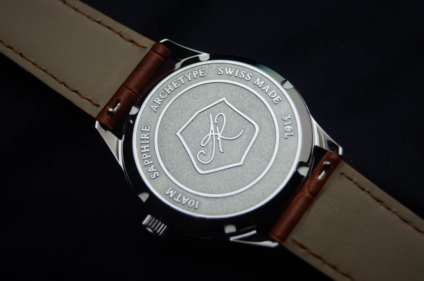
The specs of these surprisingly rugged dress watches read very favorably. At 38mm, the stainless steel case is on the smaller side of men’s timepieces but has an edge-to-edge sapphire and an uncluttered dial, which increases its visual impact significantly. The automatic version comes in at 12.4mm thick, while the High Accuracy Quartz (H.A.Q.) measures just 11.4mm tall on the wrist. That’s a nice touch — using distinct cases for the auto, and the quartz version might seem obvious, but it is never a given that microbrands will go that extra mile.
What I really like here is that the quartz module (as well as the Sellita SW200 automatic) is Swiss made. Unusually for a microbrand, John Robert has invested in the ETA E64.111, which has an accuracy rating of +/-10 seconds per year and a battery run time of three years. That’s the kind of investment that makes a difference at this price point.
Regular pricing of the John Robert Archetype H.A.Q. collection starts at $489 (USD), and the automatic collection starts at $979 (USD). During the 30-day Kickstarter pre-order only, the HAQ will be available for $389 (USD) and the automatic will be available for $789 (USD). To discover more about the brand and to sign-up for the John Robert mailing list, follow this link.
This is a preferred position post. Learn more.

