Hamilton Khaki Aviation Converter Air Zermatt Watch Review: Because Blue Is The Coolest Color
In watchmaking, while color isn’t everything, it is certainly enough of a thing to make or break a design or to establish a connection with a brand partner, collaborator, or good cause for whom a watch stands for. Although the heroes of Air Zermatt — the Swiss beauty spot’s mountain rescue team — fly a red helicopter, Hamilton chose to draw inspiration for the degradé sub-dials see on this special version of the Hamilton Khaki Aviation Converter from the crack team’s logo.
As you might have noticed, I’m quite a fan of green and orange, but I’m not averse to a bit of blue and red either! In fact, for a decidedly average-looking man, I have a surprisingly colorful wardrobe. I’m not afraid to draw attention to the searing mediocrity of my face with the colors I wear. Perhaps I’m subconsciously trying to make myself more interesting with my array of damson jackets and scarlet tracksuits. Maybe I’m just hoping to distract people from the man within the outfit. Whatever it is, ask anyone: I’m a fan of color and I’m all for wild experiments therewith. But how did this one pan out when it came to having it on the wrist?
The concept behind the watch
Hamilton has been partners with Air Zermatt for 10 years now. As we know from experience, it isn’t like a luxury Swiss watch brand to let a good anniversary pass without celebration, so here we are. I have to say, that as far as these kinds of collaborations go, this one isn’t half bad. The chosen colors, while on paper relatively standard, have been deployed in quite an unusual way.
After all, this kind of baby, almost ice blue (which certainly gives the impression of freezing as it gets significantly lighter toward the center of the sub-dials) is not exactly the sort of thing you’d expect on most sports watches. Funnily enough, this kind of chromatic anomaly is even rarer in the entry-level segment.
As we climb the food chain, brands are more willing and able to take off the gloves. At this point, however, conservatism often reigns supreme. That’s hardly surprising given the general target market of Hamilton and its price point, which caters to the kind of customer more likely to buy one luxury watch than to find themselves slotting this one into a more affordable segment of a broader collection.
Is the Hamilton Khaki Aviation Converter a good watch?
Well, as with pretty much all mechanical Hamilton watches (and the majority of the quartz pieces found in the men’s collection), the answer is, in my opinion, yes. Hamilton has the undeniable advantage of the economy of scale. As an essential part of the Swatch Group’s entry-level strategy, Hamilton gets all sorts of theoretical pricing breaks in its supply chain to ensure what SG is putting out there on the front line really is an unbeatable value proposition.
…as aesthetically “interesting” as the Converter range gets…
Consequently, you can say this about most Hamilton watches: you can’t fault the product. So the crucial question is whether you like the look of it or not? If this kind of overly technical display gets you excited then Hamilton’s aviation range has a raft of awesome options, many of which you will find in the Converter collection. This one is, for me, about as aesthetically “interesting” as the Converter range gets, although I suppose if I were choosing one for myself, I’d probably take the blue sunburst GMT model. This is because I think that particular shade does a good job of softening all that information on the bezel and that model specifically has a cleaner dial than the chronograph display we see here.
A good daily chronograph
As one might expect, we have a triple sub-dial setup here, showing the elapsed hours and minutes, as well as a smaller going seconds indicator at 9 o’clock. This color-matched running indicator balances the day and date at three o’clock sufficiently. I always rate dial balance, but I think it is especially important with busy dials. When it comes to high-information displays, a misstep in this area can result in a very noticeable gap (or a yawning expanse of nothingness that cannot help but draw far too much attention to itself).
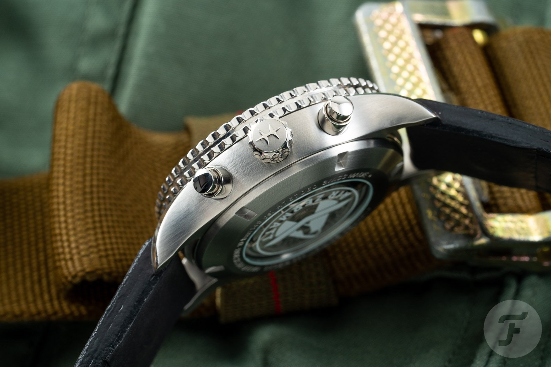
The Hamilton Khaki Aviation Converter Air Zermatt chronograph employs a slide rule bezel, which encircles the dial. Interestingly (to me, at least), is the fact Hamilton sets up its slide rule bezels the opposite way around to the most famous bezel of its type, found on the Breitling Navitimer. Hamilton places the information Breitling would print on the dial (so it is fixed) on the outside (on the bezel) and vice versa.
The internal scale on the Hamilton is the simpler of the two and thus has less text in a smaller space.
Practically, this makes very little difference and really comes down to how you find reading information from the slide rule easiest. However, there does seem to be some sense in it. I believe Hamilton did this for clarity. The internal scale on the Hamilton is the simpler of the two and thus has less text in a smaller space. The Breitling is the opposite way round, presumably because Breitling deemed it simpler to perform the calculation with the simpler scale on the outside. Hamilton’s interpretation of it means the scales look more visually balanced, though, with more space afforded to the more complicated of the two.
Is a slide rule useful?
In daily life, you will likely find very few opportunities to use a slide rule, but it is most commonly cited as a handy tool for working out tips after dinner (thanks to its ability to calculate percentages). I’m guessing that’s the kind of thing you do more because you can rather than because you must, but that in itself is a sneaky metaphor for mechanical watchmaking in itself.
A lot of the products we lust after are only in existence because they are possible, not because they are necessary. From that perspective, a slide rule is probably as “useful” to most people as a chronograph (many of which sit unused on the wrist). If you like the aesthetic and what it stands for historically, however, I’m sure that would be enough of a reason to pick one up.
How is the H-21 caliber an upgrade?
From the dial, many movement buffs will have had an inkling of what sits behind it. The H-21 movement is upgraded from a Valjoux 7750 base and features a meaty power reserve of 60 hours (improved from the standard 42 hours) and an anti-magnetic silicon balance spring, which is supremely appropriate given this thing is supposed to be worn in a helicopter. If you want to take a look at this movement, you can do so through the display case back, which is printed with the Air Zermatt logo.
And if you like that logo (as I actually do), you can find it again (twice) on the strap as each of the “buttons” embellishing the black calf leather band are themselves decorated with the stylized image of the Matterhorn. This model is limited to 988 pieces and priced at €2,145. Learn more about Hamilton here.

