Hands-On: The Leica ZM 11
Last October, during an event held in its hometown of Wetzlar, Germany, the camera manufacturer Leica announced the introduction of its latest watch. The Leica ZM 11 was a step in a new direction. It complements the ZM 1 and ZM 2, a pair of impressive and far more complicated watches. The ZM 11 models focus on the basics, offering a classic central three-hand time indication and a date display at 3 o’clock. But even one quick look at these watches reveals a curated aesthetic and bold design choices. A closer examination reveals the level of quality and attention to detail. Flip them over, and you’ll see that Leica isn’t messing around. This seems to be more than just a promotional product or an attempt to sell a pricey accessory to those who have bought into Leica through its photographic offerings.
At a glance, it looks like Leica cut no corners and, in true Teutonic fashion, went all in. However, several minutes in the hand and a handful more on the wrist can only reveal so much. How do these watches hold up after several days of wear? Are they, like the brand’s cameras, products that will last a lifetime? And more importantly, is the premium price tag justified? I got my hands on all three of the Leica ZM 11 models and put them to the test. Today, I’ll explore the questions above and address some of the valid concerns raised by our readers in the comments of my introduction article of the ZM 11 back in October.
The Leica ZM 11
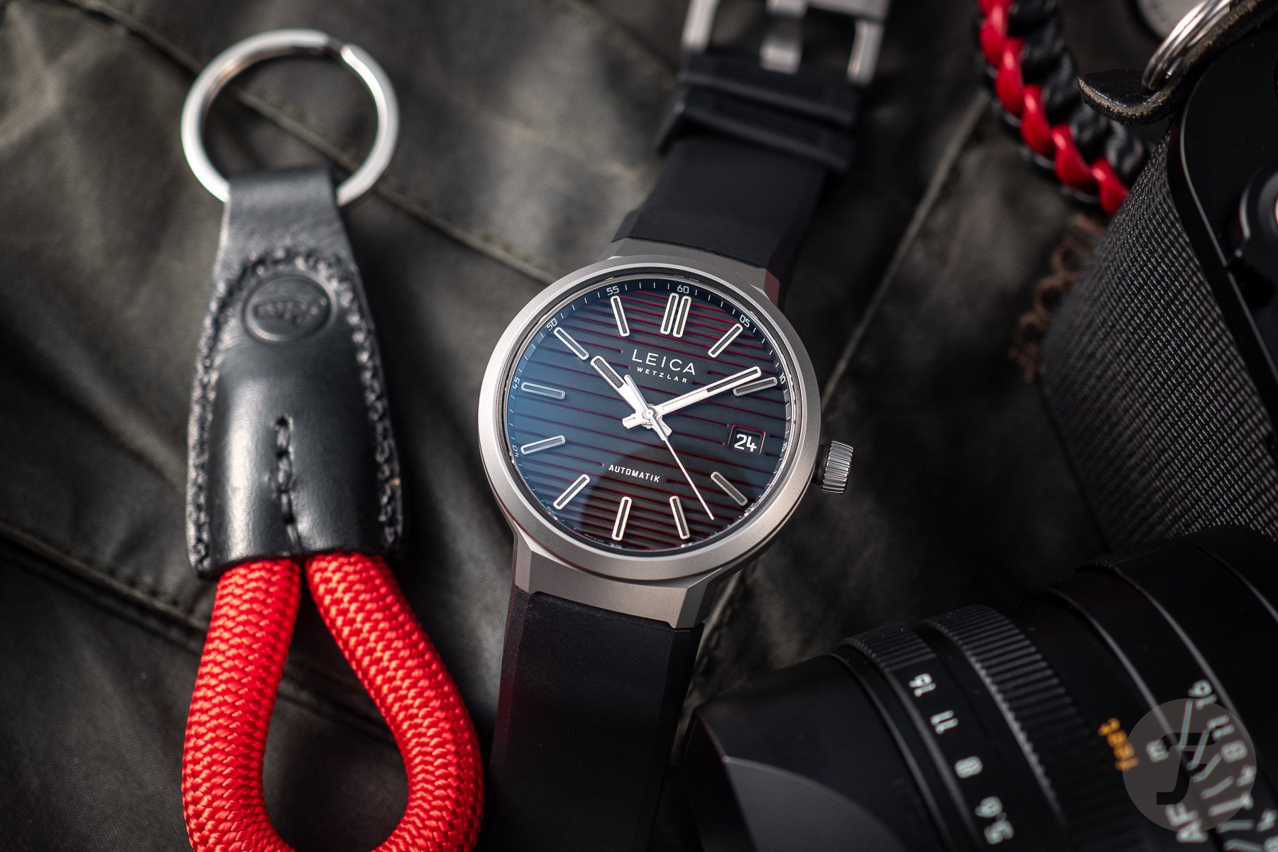
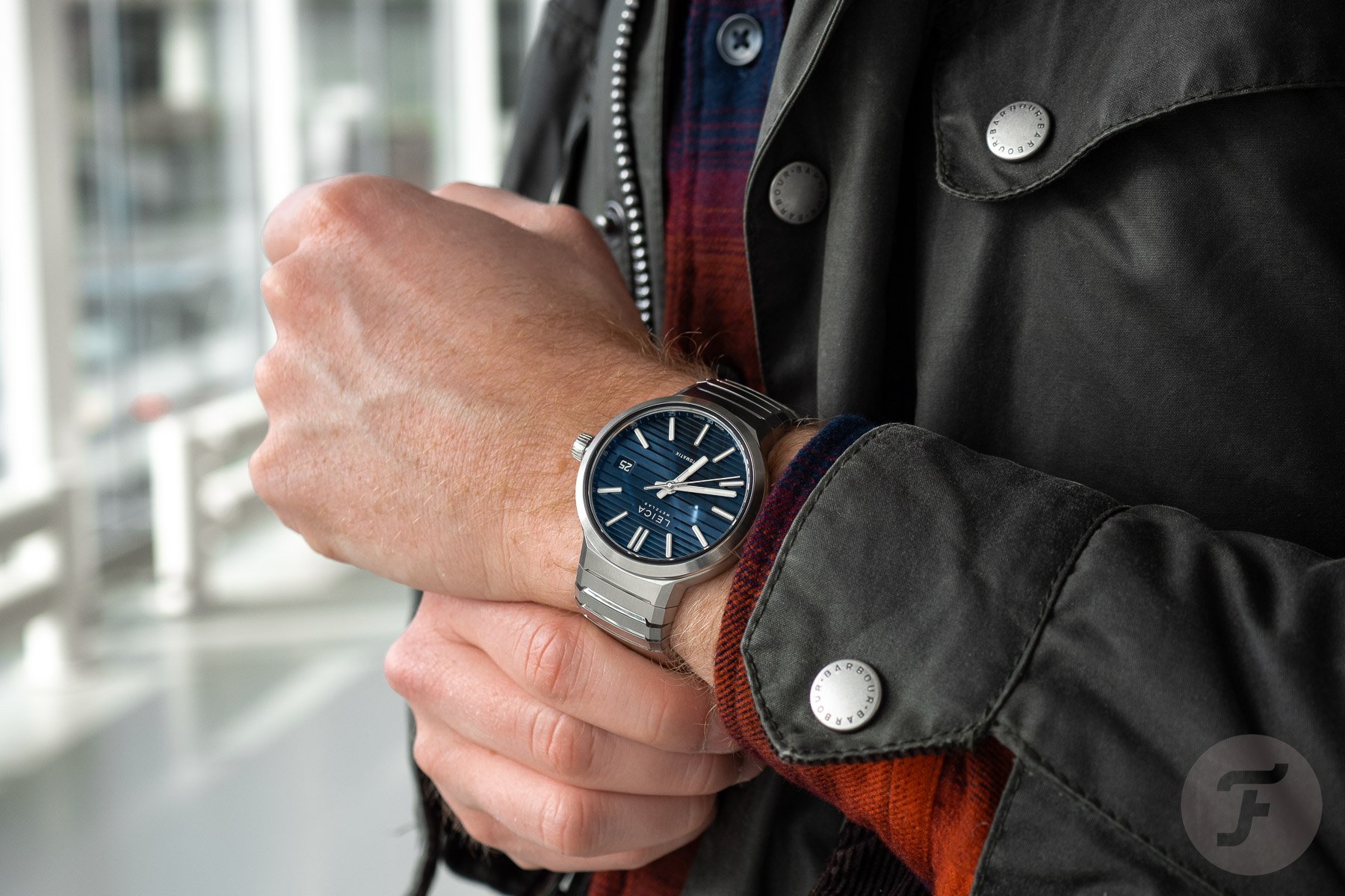
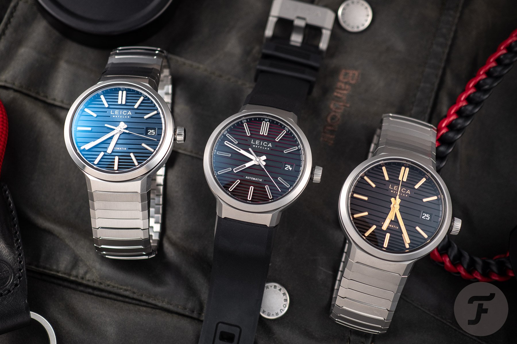
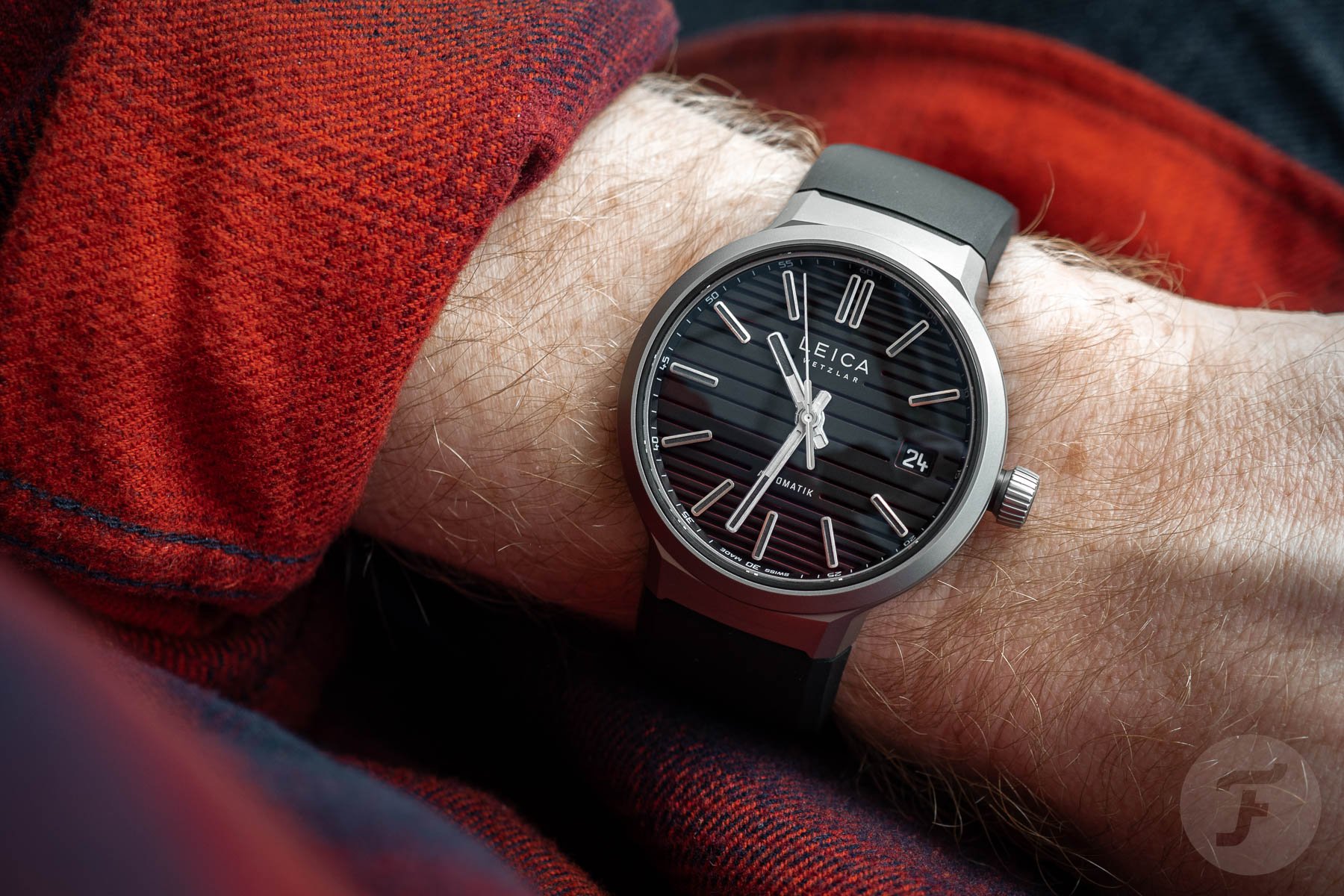
A box arrived from Wetzlar with three ZM 11 watches inside. These were the blue-dial stainless steel model on the bracelet, the brown-dial titanium model on the bracelet, and the limited black-and-red-dial titanium Launch Edition model on a black rubber strap. First impressions were positive, and the watches looked and felt the part. The dials were not overly shiny, with clean lines and nicely saturated colors. Despite the watches’ 13mm thickness on paper, they felt slimmer. This is because approximately 2.5 of those millemeters come from the subtly domed sapphire crystals on both sides of the watch. The 41mm case is surprisingly ergonomic despite its rather straight lines. With a 47mm lug-to-lug, it sits well on my 17.75cm (7″) wrist, and the integrated bracelets and strap did not flare out at all. I’ll get into the rubber strap and bracelets in more detail later on.
The grippy crown smoothly threads in and out of the case, clicking confidently into the date- and time-setting positions. On the way back in, it feels slightly spongy, as if you’re pushing past a thick rubber gasket. The winding action of the movement is quiet and glassy. There was some criticism of the crown being a missed opportunity to display the famous Leica red dot, as previous models have done. Honestly, though, I didn’t mind the slightly understated look. Previous Leica watches were more on the nose with their nods to the brand’s cameras, so the subtlety was nice this time. The only “issue” with the crown is that it threads into a slightly protruding black crown tube, which makes it look like it’s not screwed all the way in. Though this might annoy some, I don’t mind it because the fit and construction are nice. Plus, when the crown is out, the difference is clear.
Devilish details
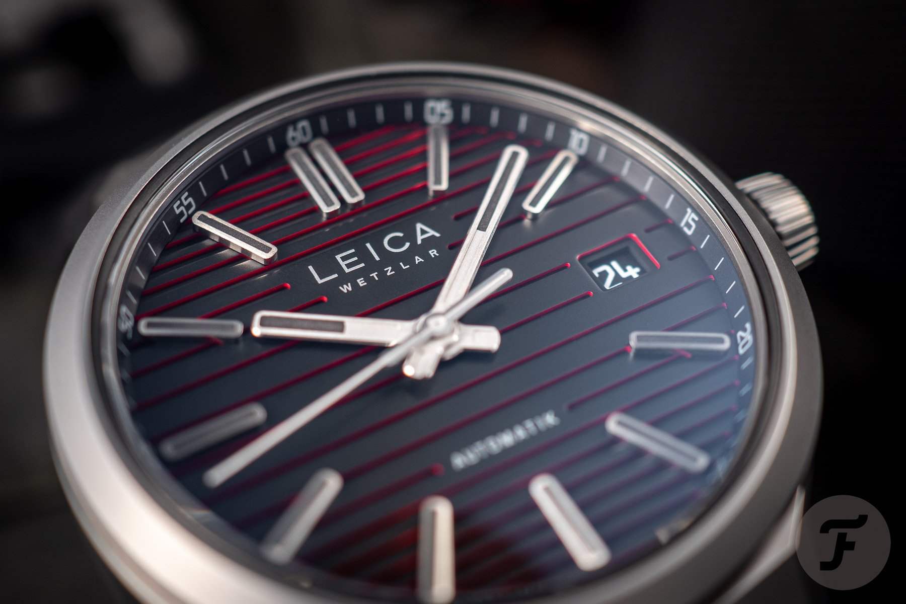
I’ve mentioned that previous Leica watches contained copious references to the brand’s primary focus on producing cameras and lenses. The shape of Leica’s cameras inspires the profile of the ZM 1 and ZM 2, and the button placement is also like that of a shutter release. Their domed crystal was made to look like a lens, and some of the dial elements were directly inspired by indicators on some of Leica’s older film cameras. In the Leica ZM 11, there are also a number of details, but they are far more subtle. The dial certainly has photographic inspirations. As I mentioned in the introduction article, Leica describes the dial as “the canvas, where light and shadow create depth.” This depth is achieved with a multilayered dial with different colors and finishes. The blue dial is glossy with a sunburst texture, whereas the others have a satin finish.
In my experience wearing these watches, the dials are lovely to look at. Their design makes good on the promise of adding depth and character. This is especially the case for the Launch Edition. Its red accents are only fully visible at an angle, which often had me performing a hypnotic twist and turn of the wrist. These dial ridges are nicely machined and end around the dial text and date window with a nicely rounded edge. The shape of the hands, markers, and date window mirror this, creating a nice harmony between all dial-side elements. Speaking of the date window, you’ll find it at 3 o’clock, color matched to blend in nicely and using the same font found on Leica lenses. The diamond-cut hands are beautifully finished. They feature a brushed top with a matte central ridge, an application of Super-LumiNova A1, and a gleaming polished edge.
From dial to case back
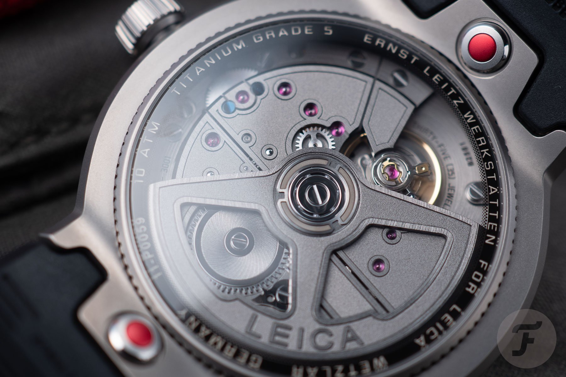
To wrap things up dial-side, let’s talk lume. The hands and the tall, elongated lozenge-shaped markers contain a healthy dose of lume. However, none shines brighter than the gold-brown model. This is because it uses the more traditional green-glowing lume as opposed to the blue-glowing lume on the blue-dial model. As you might expect, the black lume on the Launch Edition is the least impressive of the bunch. Black lume just doesn’t tend to work that well, as we’ve seen with Sinn watches in the past. It looks good, but to me, a choice that puts aesthetics before function knocks a couple of points off. Flipping the watch over, you’ll notice that the Leica ZM 11 doesn’t really feature a case back. It’s more of a ridged bezel housing a domed sapphire crystal. Around its edge is text once again reminiscent of that found on the front of Leica’s camera lenses.
On the back , you’ll have also noticed two buttons highlighted with an anodized red finish. These are part of the brand’s new quick-release system. The strap/bracelet interfaces with the case using a two-pronged shape to prevent wobble. The strap has a tab with a hole cut into it, which clicks in and out of place with a press of the button. It feels secure enough, but considering the price point of these watches, there is room for improvement. For example, it would be nice if the strap/bracelet could simply slot into place when pressed into the case. As it is now, you have to press the button before the strap will engage with the case. My other slight niggle is that, in the case of the rubber strap, there is indeed a bit of wobble present. Part of the mechanism is visible from the front when viewed at an angle.
The Leica LA-3001 movement
We’ve been looking at the back of the ZM 11 for a hot minute now, so let’s talk a little bit about the main attraction. Visible through the aforementioned domed sapphire crystal on the back is Leica’s LA-3001, the brand’s first proprietary automatic caliber. Developed alongside renowned Swiss movement producer Chronode, it’s not merely a nice thing to look at. Putting it on the timegrapher at Fratello HQ showed a straight line, with an average derivation of +4 seconds per day between all three movements. The movement contains 35 jewels, runs at a 28,800vph frequency, and provides an accuracy of -4/+6 seconds per day. The movement’s bridges feature a dark gray galvanic ruthenium plating complemented by a sandblasted finish, raised brushed edges, and polished chamfers. There’s also a pair of blued screws on the plate above the keyless works.
The industrial look of the movement — also found in the LH-10 and LH-20 calibers of the ZM 1 and ZM 2 — is a perfect match for the aesthetic direction of the Leica ZM 11 models. Perhaps the standout is the steel model. It’s my least favorite of the three because the overall look is a bit flashier than I’d like. It’s also quite a bit heavier. With a complete bracelet (not sized) it comes in at 179 grams. That’s almost 40 grams heavier than my Omega Seamaster 2254 on the bracelet (sized for my 7″ wrist). For me, the two titanium models are the winners. And of the two, I was surprisingly more keen on the gold-brown dial version. There’s something about its Porsche Design by IWC Ocean 2000 looks that call for the dark gray matte titanium luster.
The all-imporant bracelets and straps
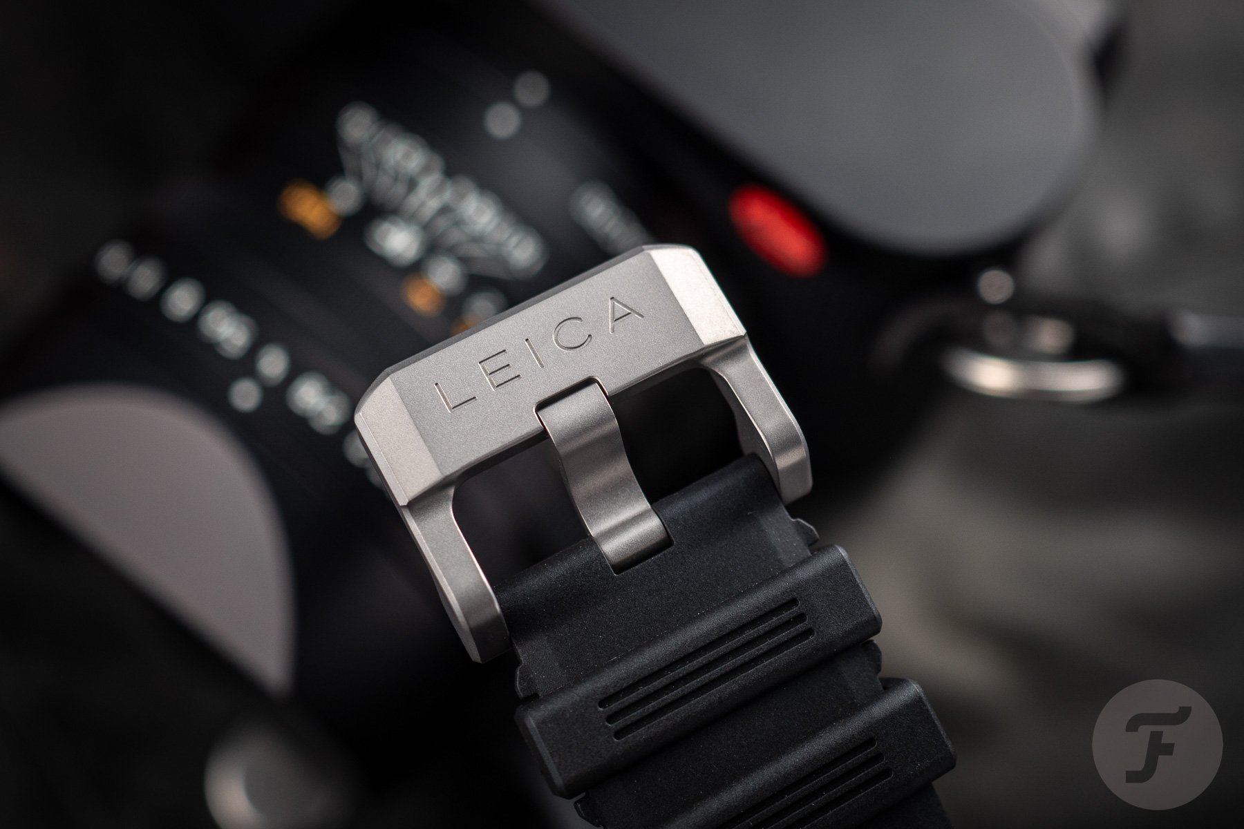
Now it’s finally time to talk about the available wrist-fastening accessories. These can be make-or-break elements for an integrated-design watch that won’t allow for any of the usual aftermarket alternatives. I’ll start with the “software,” the rubber strap. I found it rather comfortable, close to perfect in length (if not a bit long), and with some interesting details. On the back, a ridged pattern reminiscent of the one on the dial adds some venting for hot-weather days. A Leica logo and “press to open” are etched near the quick-release buttons. The ridges are also featured on the keepers and the outer tip of the strap. The rubber material feels robust and seems not to attract dust. A chunky signed buckle in titanium completes the look. I can’t speak for the textile strap as it was not included alongside the three review units that Leica sent.
I spent most of my time with the titanium bracelet. There doesn’t seem to be a huge rift in construction between the steel version and the one made of this lightweight alloy. The bracelet is sized with a fairly standard pin-and-collar system. The fairly small links made it easy to get a comfortable fit (I removed eight links overall). As I mentioned before, the bracelet has a more solid fit to the case. There’s virtually no wobble. Though I’m not a fan of butterfly clasps, using one here makes sense. It allows the bracelet’s sleek lines to flow uninterrupted, creating a full halo effect around the wrist. Given the price point of the watch, however, the clasp could have been better. Taking a page from Apple and Bvlgari’s book and having the arms sit flush with the bracelet would have been a nice touch.
Final thoughts
In closing, I think it’s fair to try to answer the question, “Who are these watches for?” Well, regardless of how seriously Leica has taken the quest to create a great watch, it still seems that these will ultimately adorn the wrists of those who have bought into the Leica brand in a wider sense (something I have not done myself). With price tags in the €6,800–8,150 range, these are not likely timepieces you’d buy before buying a Leica camera — and I’m not talking about a D-Lux. The exception would be if you are particularly struck by their looks and have the budget to spare. But that’s sure to be a minority of buyers. Most enthusiasts will be skeptical of the association with the camera brand.
Still, you have to respect that, even in creating a product for the few rather than the many, Leica has made a watch that wouldn’t look out of place in the catalog of a long-standing Swiss watch brand. My advice? Even if you’re only slightly curious, try to see the ZM 11 in person next time you’re in a city with a Leica boutique.
As always, leave your thoughts in the comments section below.

