Hands-On With The Farer Maze GMT Watch
The Farer Maze GMT amazes and amuses me. Really, I haven’t worn such a playful and imaginative watch for quite some time. And that’s in spite of the fact I am not a huge fan of its case shape. But the Farer Maze rocks on so many levels. Let’s dig into it.
When I put on a divers watch, I don‘t feel like I have to go diving immediately. I don’t even think of water. The moment I put the Farer Maze GMT on for the first time, I felt a jolt of energy course through me. It was the energy to do things. It sounds bonkers, I know, but I felt like I was suddenly some cool architect or crazy designer. No watch before made me feel like I want and could do other stuff, beyond that which had already been on my mind. The Farer Maze GMT is a truly inspirational watch. And my time with it was a lot of fun.
The Farer Maze Dial
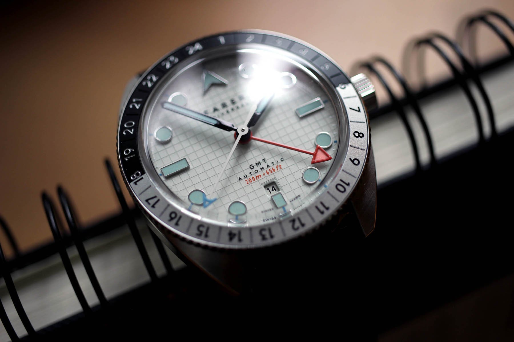
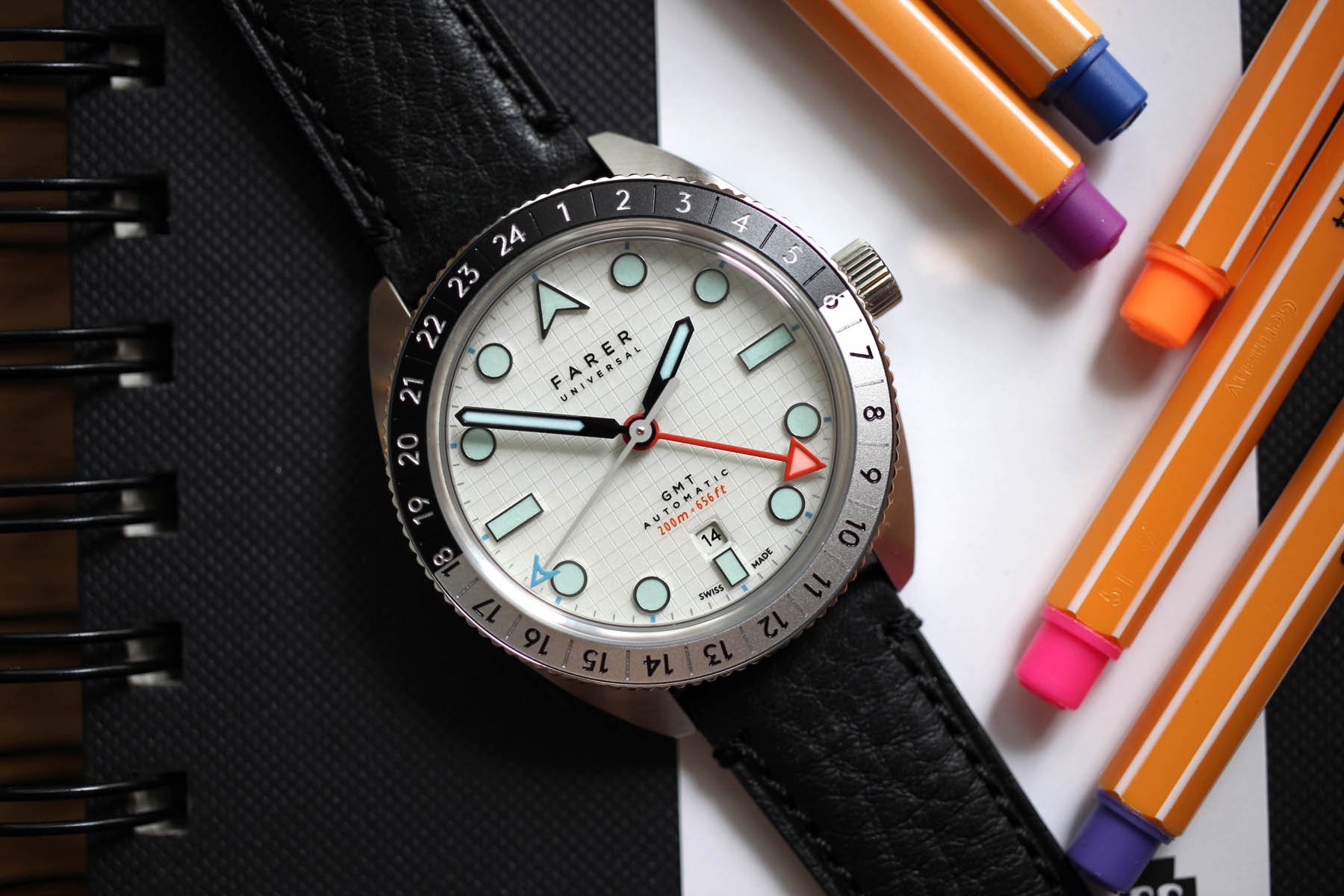
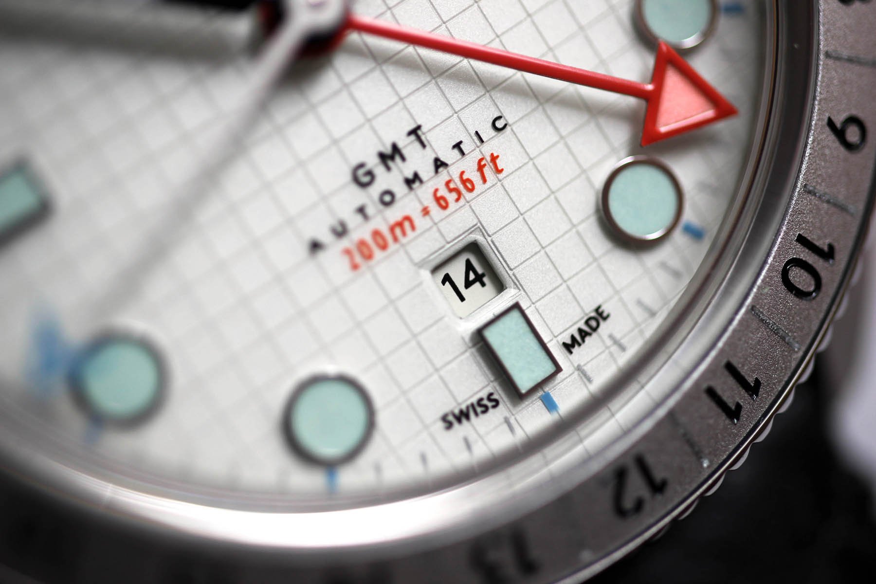
I have no academically proof to back up my belief, but I believe my reaction is entirely down to the dial. It must be. The other two models that Farer introduced, the Charlon and Crooms, passed me by without any emotion whatsoever. But there is some instant magic behind this “swimming pool tiles” dial. Well, at least Farer calls it, “swimming pool tiles”. It didn’t cross my mind until I read it in the press release. And honestly, I don’t buy it. I don’t see swimming pool tiles. It’s nothing else than squared paper for me! The same squared paper you and I loved so much when we were kids.
It’s strikingly opulent, but not cheeky. It’s creative and original, yet still grounded.
White blank paper always scared the heck out of me. It was endless and I was lost. I never knew where to start. But the squared paper was a perfect playground that led my hand from square to square until new shapes emerged. Squares made it all a bit easier. And look at what Farer built on it. It’s strikingly opulent, but not cheeky. It’s creative and original, yet still grounded. You want to laugh over the shapes, colors, and proportions, go ahead. But, in the end, you realize it’s just seriously good.
aMAZEing colors
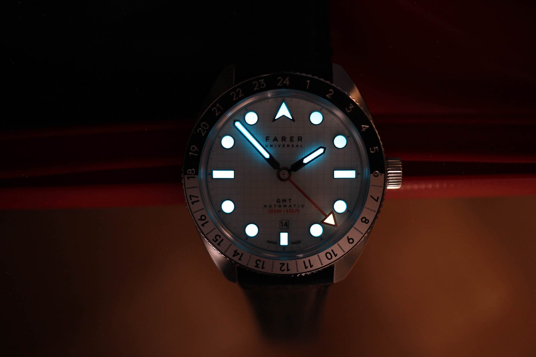
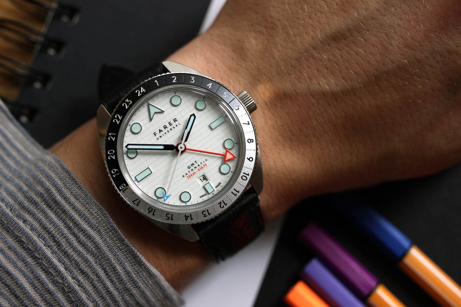
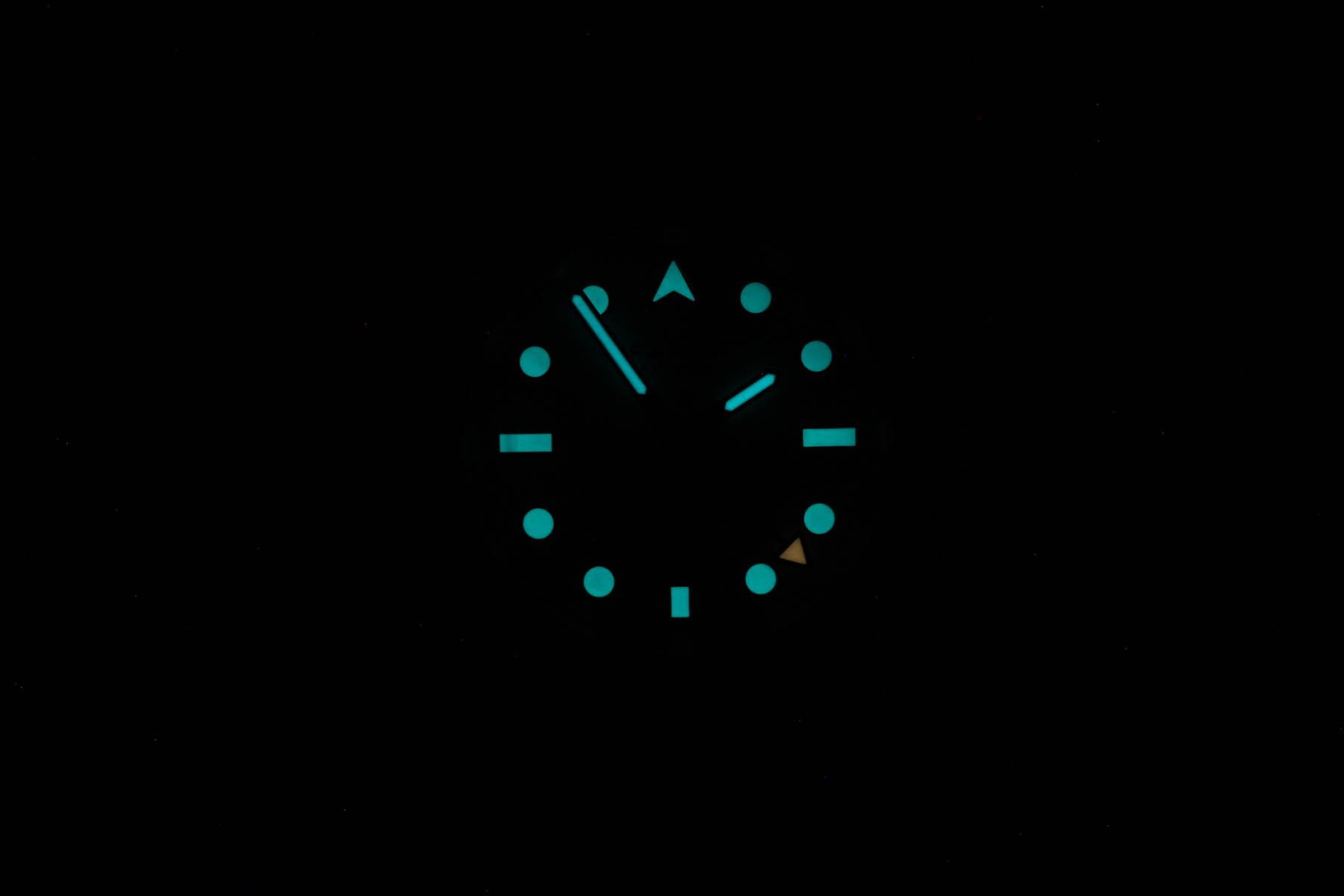
I would have thought that my mind would explode over the busy dial and the mish-mash of colors employed to decorate it. I had to take a magnifying glass to see the relief structure of the dial. It’s not just some lines printed over the white background, there are actually thin grooves creating that pattern. Now see the markers. They are big enough to use as coasters! Oh, and that size multiplies the effect of the lume color tone. I don‘t nurture gender stereotypes and I don’t mind buying women’s trainers if I like the style. But I must admit that this soft blue tone made me think: “Isn’t it a female watch?“
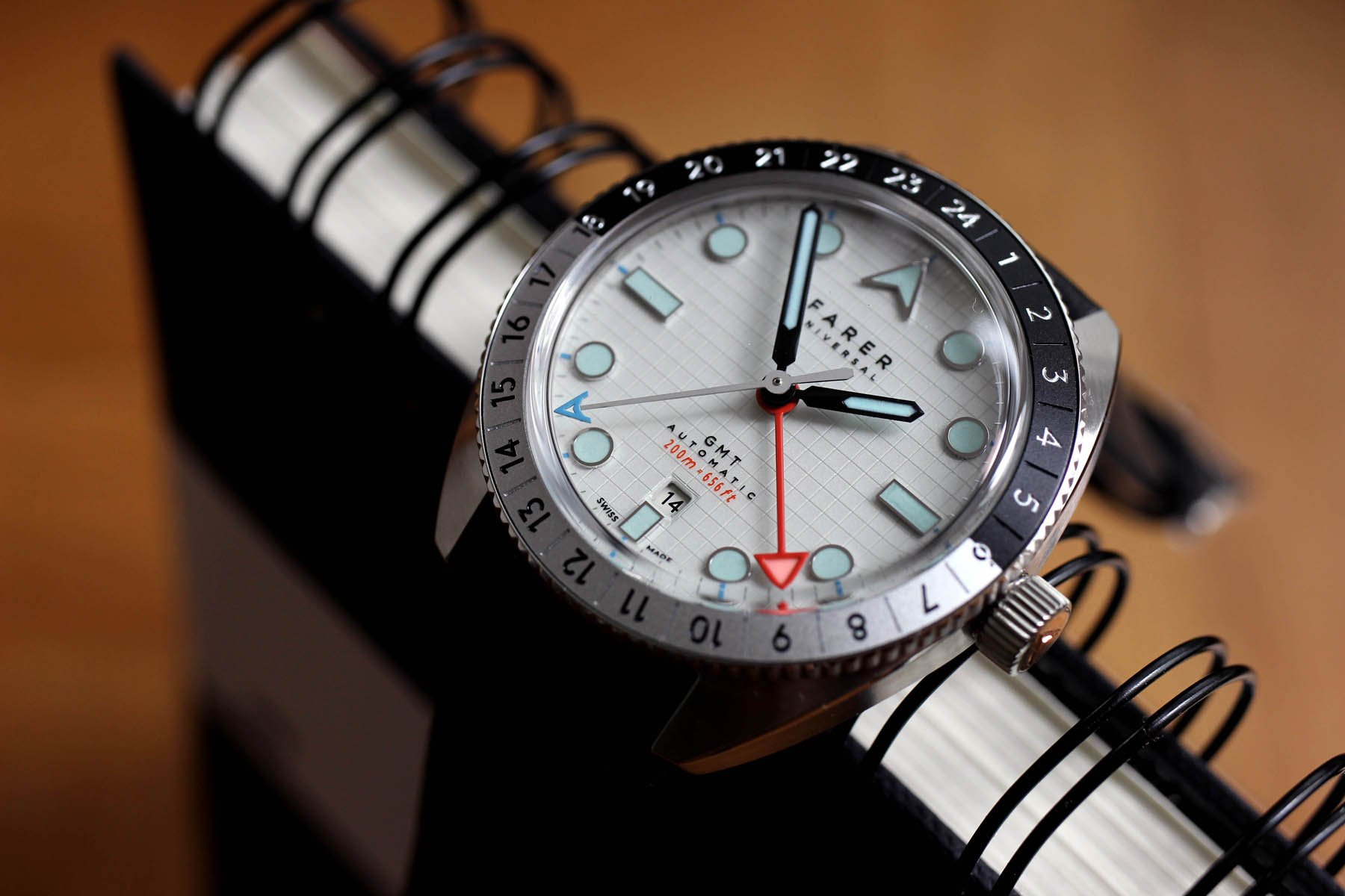
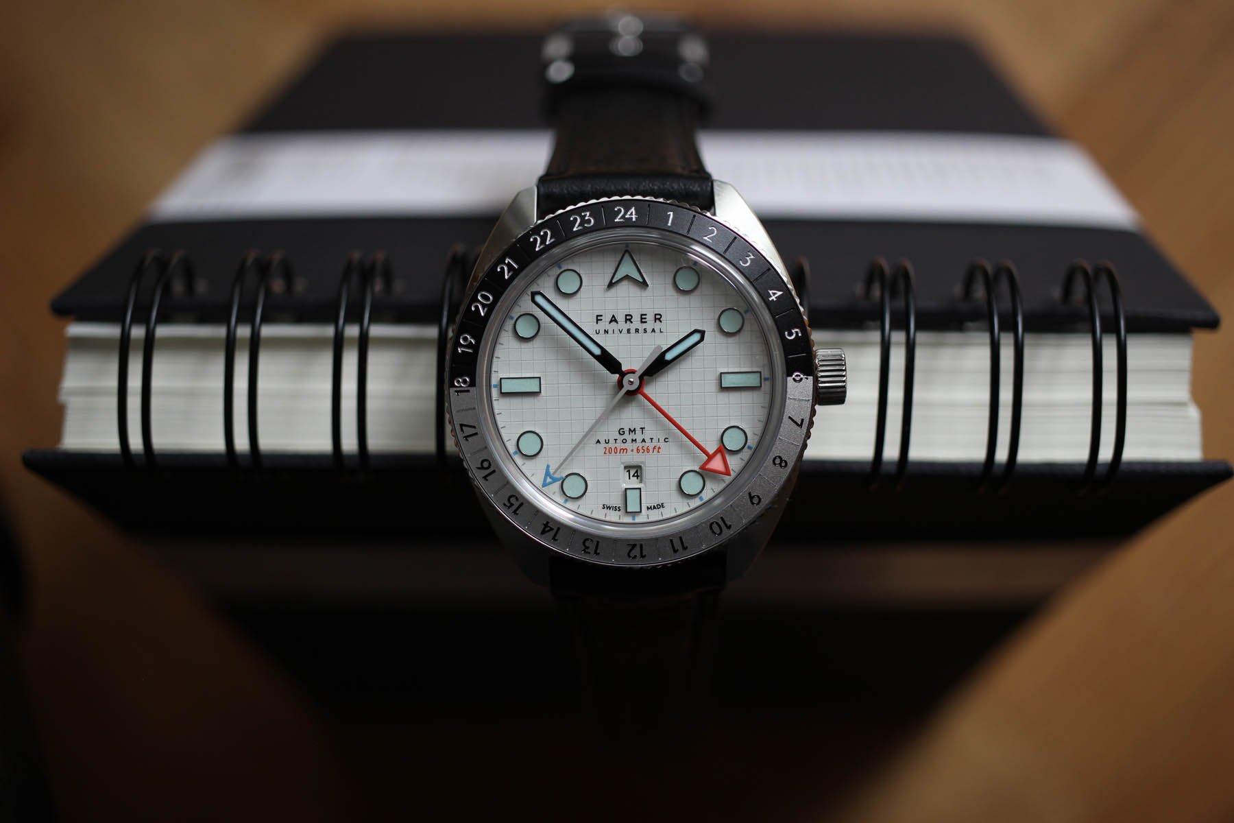
The response? No, it’s not. I assure you that the light blue feels perfectly okay after a week on the wrist. Hard to believe maybe, but even the salmon-like lume in the GMT triangular tip feels utterly masculine. Which brings us to the (below) helicopter view of the case. I can’t shake the hilarious feeling that the entire Farer Maze looks like one huge Rolex cyclops eye. If you have some doubts about my state of mind, I assure you I am perfectly sober and mean every word.
Objections
One of the two objections I have regarding the watch is the diameter. Before you come at me, I realize I will be fighting the odds with the first objection. I don’t enjoy this case shape as it looks huge to me. Statistically speaking in comparison to what’s out there, with a 40.5mm diameter it can’t even be considered as big. But I am just sad that there is no single watch with this case style sized at 38mm only. What do you say, Farer? I guarantee that if the Farer Maze GMT was a couple of millimeters narrower, I would not review a press sample now, but my own piece.
The second detail and only redundancy in my view is the minute track. It’s not visible much, so it isn’t really a top of mind objection. I can live with it, but I just think the dial would look slightly better without it. The minute lines crossing the grooves and squares here and there don’t make for a nice view. But the hands are the real win here. I would not expect the hour and minute hands to be shiny black, but it looks spectacular. The contrasting combination with the white central second-hand fits the bezel that is also halved in day and night colors.
Bezel stop
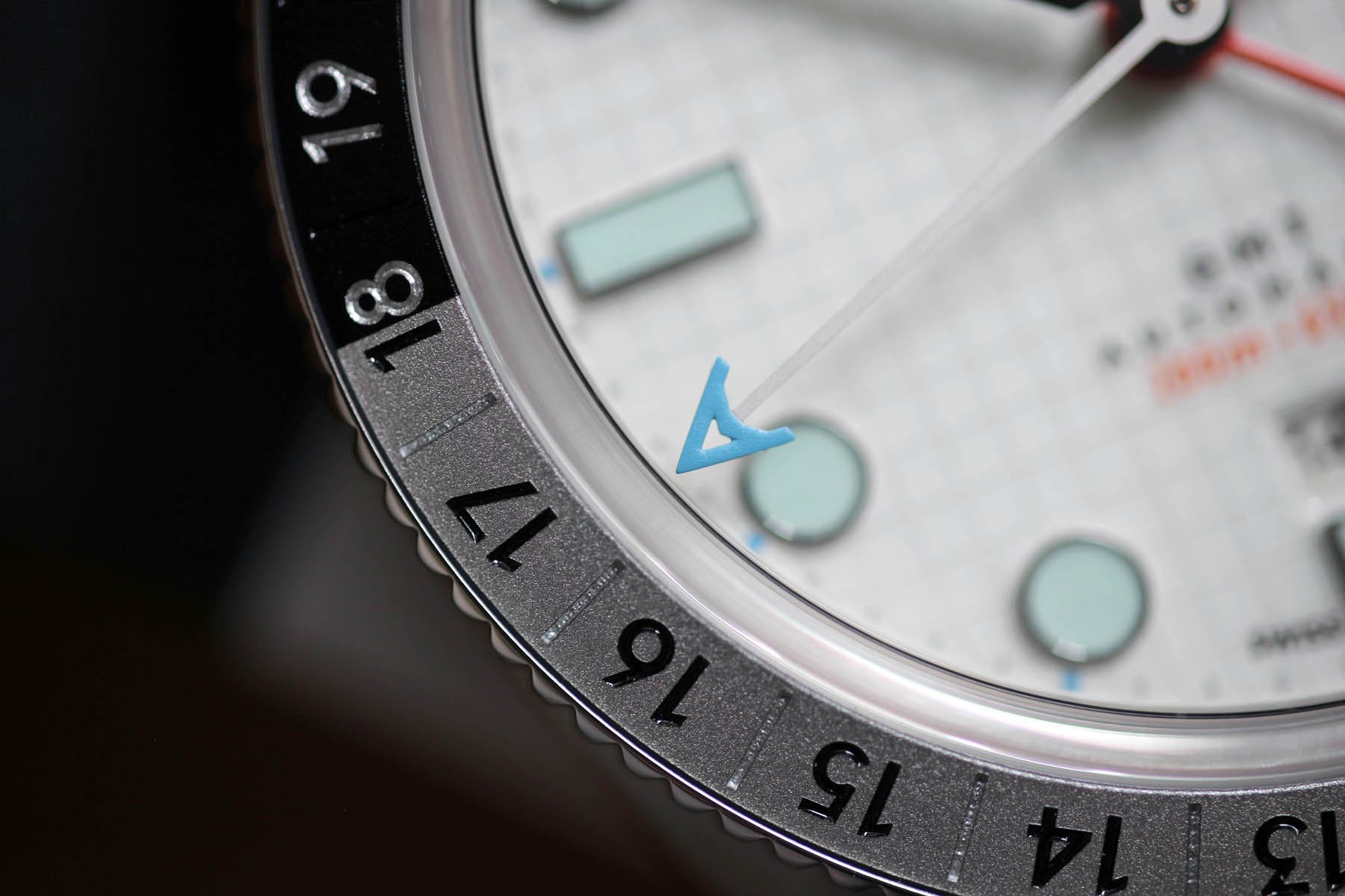
The bezel deserves its own paragraph. I don’t know how you have it, but as I use the bezel often, the manufacturing quality is important to me. If I compare this one to the recently reviewed Mido Decompression Timer, for example, this one is in a higher league. It’s more precise, it’s sturdier, and just feels more durable and reliable. It doesn’t have your typical click, but rather a muffled bang. Instead of rotation, I would describe it as jumping up just to immediately plunge into another position. It’s very very satisfying. And I love the unusual tarmac-like surface structure of the aluminum ring in the bezel.
Shotgun notes
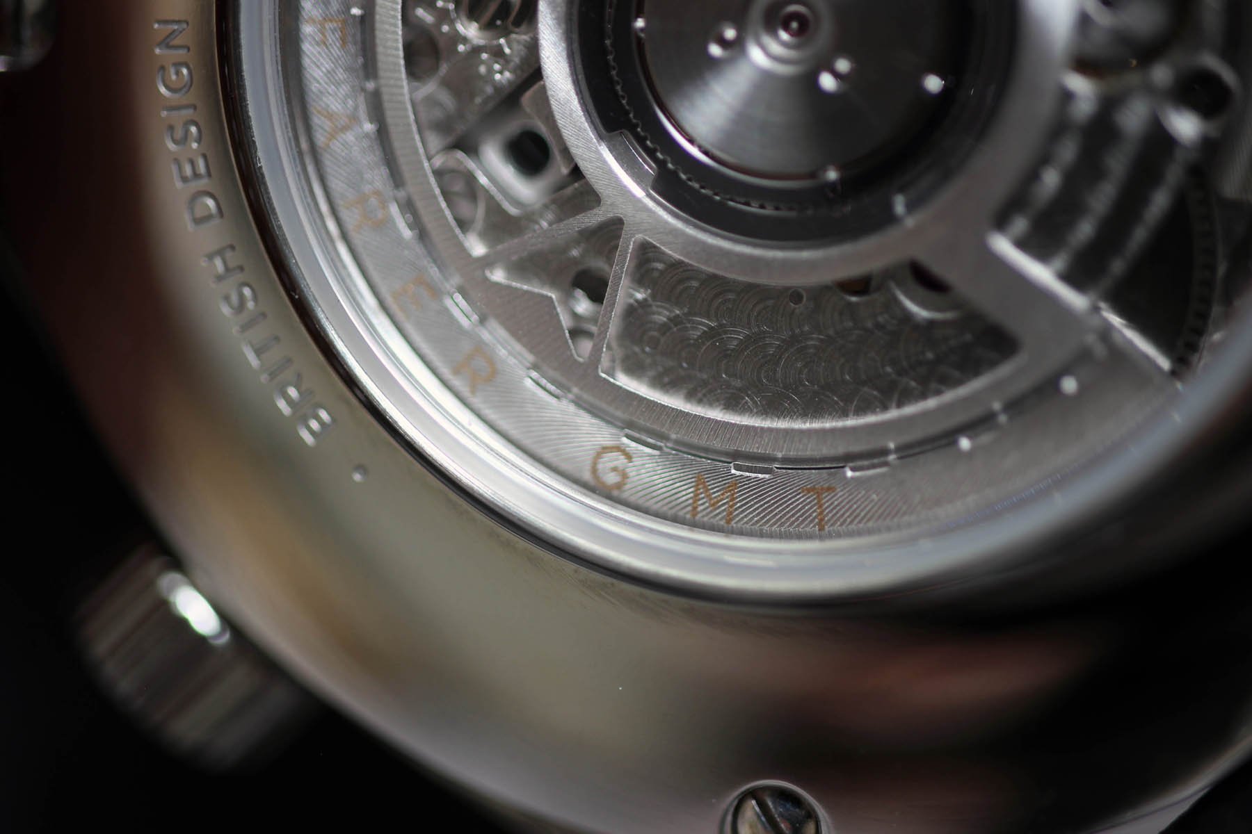
The retro feel of the black leather strap is pleasant. I really like it’s slightly thinner than industry-standard fit. The case back with an exhibition glass holds to the case with four screws. That’s a really nice detail on an otherwise chubby and mildly boring back. At least you can see a bit of the Swiss Sellita SW330-1 Top Grade movement with its Glucydur balance wheel and bespoke Farer rotor. If you were wondering where the name comes from, it refers to Maze Hill. It’s one of the three roads that surround Greenwich Park in London.
Verdict
Competition is fierce around the €1,000 price tag. And you don’t even need to leave the British Island. I guess that the Christopher Ward C65 GMT Worldtimer speaks towards a more conservative audience, while the Farer Maze GMT (£1,250) has the potential to speak to more creative minds. What team are you on?
Battle Of Britain — GMTs

