Hands-On With The Large Cartier Santos In Green And Blue
As a trained anthropologist, I’ve always been taught that you should tell people what your starting point is. So I’ll also do that in the case of this hands-on with the large Cartier Santos in both green and blue. As you might already know, my Cartier Santos Galbée XL is one of my favorite watches. I think a Cartier watch should always be a little smaller than average with a white/silver dial and black Roman numerals. My Galbée XL is precisely that. On the other hand, the current large Cartier Santos in green or blue is all but that. However, I’m willing to give it a chance to see if it can change my mind after spending more time with it.
The story of the all-steel Cartier Santos with its magnificent bracelet started about 45 years ago. That’s when Cartier introduced the modern re-interpretation of the original Santos Dumont. The late George Cramer gave a good overview of the evolution of his beloved Santos until it was discontinued in 2016. And then, in 2018, Cartier launched the current version of the Santos. It now has that divisive polished bezel that flows into the brushed bracelet instead of being square like before. As you might’ve guessed, I’m definitely on Team Square Bezel. But I know many people who are okay with the current design. Heck, the current Santos might even be the most popular Santos to date. So let’s see if the large Cartier Santos models in green and blue can convince me.
Tinted and colorful gradient dials
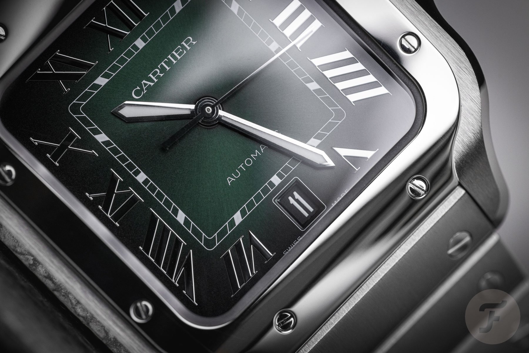
I remember seeing the Santos’s green and blue dials at Watches and Wonders for the first time this year. As I’m already quite familiar with the current Santos case, I was immediately drawn to those colored dials. The first thing I noticed was how dark they look in person. You need quite a powerful light source to make the colors pop. I even struggled to recognize the colors in the pictures I took during the press presentation. I’m not saying that this is a bad thing, though.
That dark hue is obtained by manually applying a tinted layer of lacquer over the dial. On top of that, the colors have a nice gradient to them. They start lighter in the middle of the dial and deepen towards the edges, so it’s obvious that the darker look is what the Cartier designers were going for. The effect reminds me of the paint that BMW used on its cars. My parents had an E36 Touring in Boston Green, which could appear black in some circumstances. I liked it because it didn’t give it all away at once; it was classy. And that’s the same impression I get from the dial colors on these Santos models. So yes, it’s a nice effect, but if you’re looking for an in-your-face blue or green dial on your Santos, these won’t be that.
Can you spot the color?
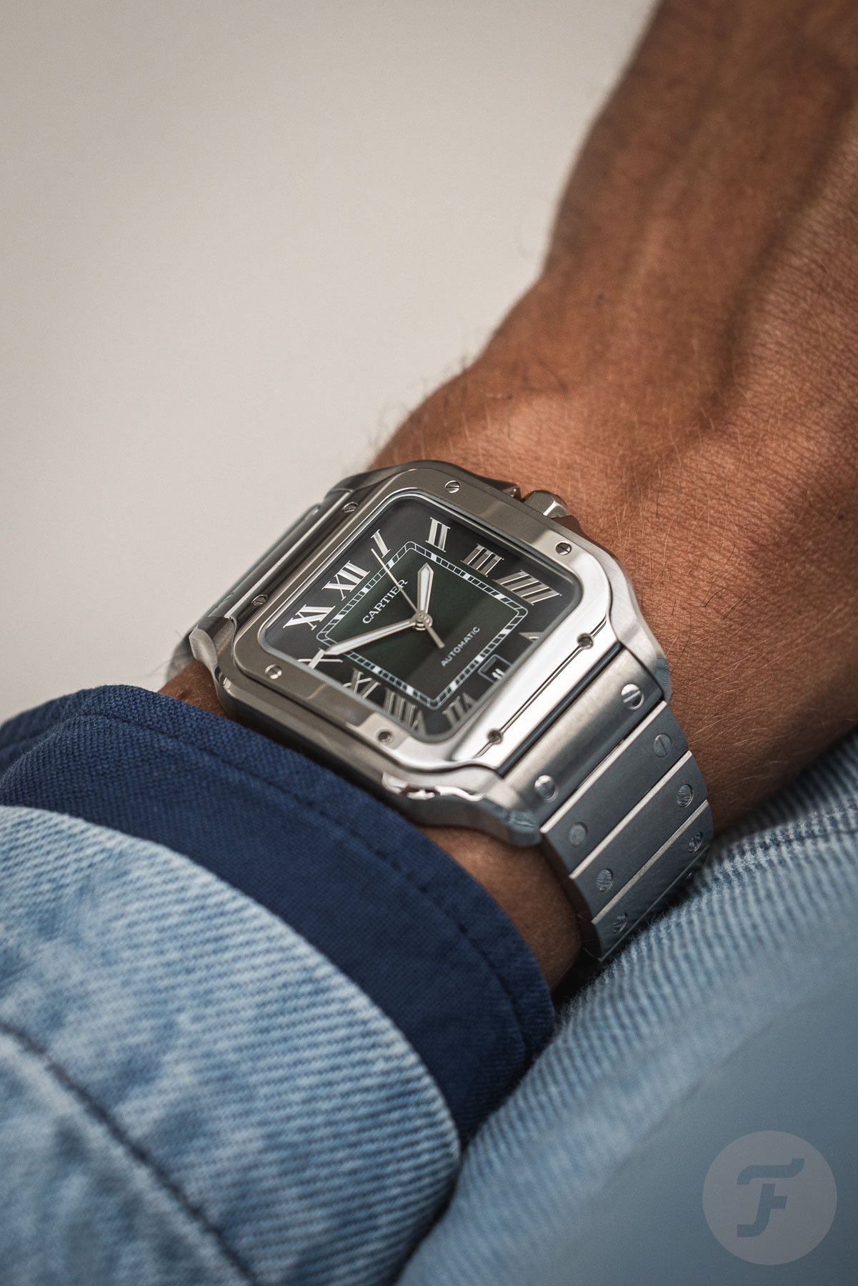
In that respect, we’ve deliberately tried to make the photos in this article look as realistic as possible. By that, I mean that Morgan, our photographer, paid extra attention to the representation of the colors of both dials. That’s why, unlike in press pictures, you might even struggle to see which color the dial is in some of the images. And that’s precisely how you feel in real life sometimes when you’re wearing the Santos on your wrist. This characteristic can be seen as a feature since this dark hue suits the Santos very well.
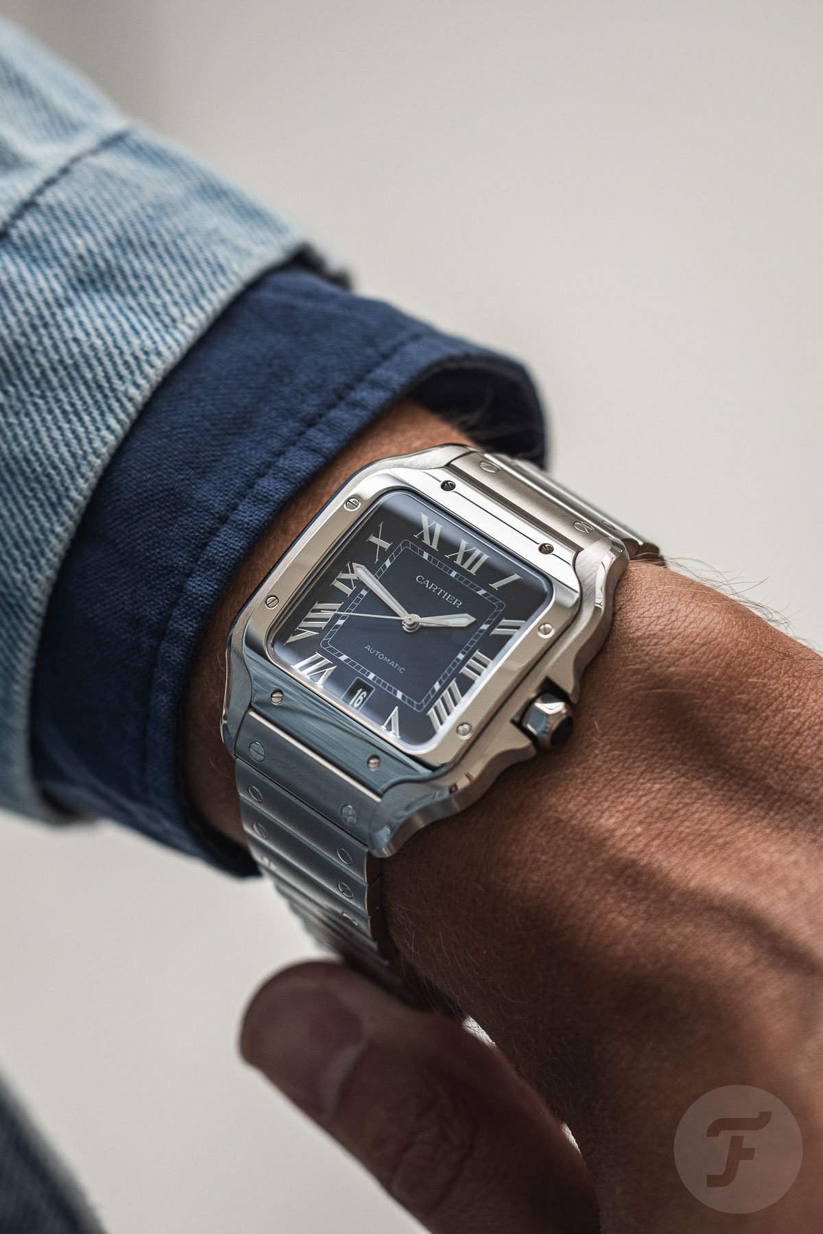
I was afraid that the colors would be too bright because I didn’t think that would suit the style of the watch. But again, there’s no need to be scared of that. Sometimes, it even almost looks like these new dials are entirely black. And that’s when it seems like an inverted version of the classic white Cartier dials with black Roman numerals. At times, it reminded me of the 2002 limited-edition Santos Galbée with a gray sunburst dial and white numerals (pictured left above). I’m a big fan of that design, and I prefer it over these blue and green dials. That said, I enjoy these colored dials a lot more than I expected.
Yes, it’s large, but…
Now, let’s talk about that large size. I’ve said it before, and I’ll repeat it; a square watch is hard to judge on its measurements alone. My Santos Galbée XL is 32mm wide. In theory, that makes it smaller than the current medium size, which is 35mm wide. And yes, there’s a noticeable difference in dial size. However, the current Santos has shorter lugs compared to the older generations. The current medium model measures just under 42mm from lug to lug, whereas my XL is 45.5mm long. So in practice, both watches wear pretty similarly on my 17cm wrist.
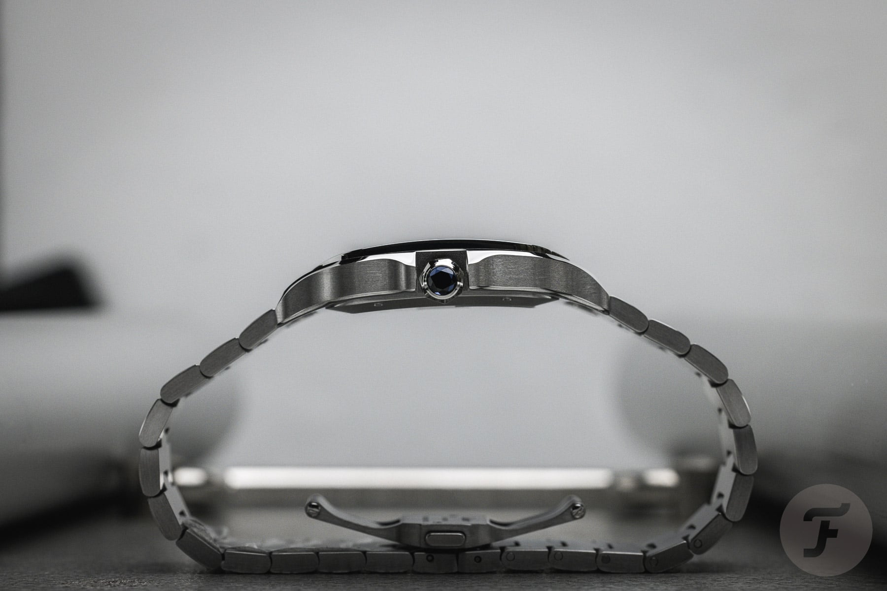
The large Santos lives up to its name. It’s almost 40mm wide, so it’s much bigger than the medium size. But again, the lug-to-lug distance of 47.5mm isn’t the longest in the world. So this Santos looks like a big watch on my wrist, but it still curves nicely around it. There’s no overhang from these lugs whatsoever. Large wouldn’t be the size I’d pick, but it looks manageable on my wrist. Again, that’s because of the short lugs and because the large Santos is still well under 10mm thick. What also helps is the dark dial, which always makes a watch look smaller compared to a lighter-colored dial.
A nice surprise
In conclusion, the large Cartier Santos models with the green and blue dials positively surprised me. The colors are not audacious and daring as the brand mentions in its press release. But that’s good because Cartier matched the colors perfectly with the Santos’s classy and sporty style. The date at six is something I could live without, but it’s not as disturbing as the date at four-thirty on my Galbée XL. I also like that this version of the Santos has lumed hands, which means you can read the time in the dark. That’s something I struggle to do with my non-lumed Santos.
I still prefer my more classically styled Santos Galbée XL, and I’d go for the current medium size if I had to choose a new one. But I enjoyed the colorful dials much more than I thought I would. Cartier’s designers tried to do something new for the Santos with these colors, and they executed it perfectly. It shows me that I should avoid always choosing classic designs and perhaps choose a more daring option in the future.

