Hands-On With The Zenith Chronomaster Original Triple Calendar — A Real Gentleman’s Chronograph
I think we can all agree here that the Zenith Chronomaster Original is already one of the best-looking chronographs out there. Adding the calendar and moonphase complications on top could’ve ended in absolute disaster. However, it certainly didn’t — quite the opposite, actually. When the Chronomaster Original Triple Calendar launched a little over a month ago, it was hard to find people who didn’t think this was another great-looking watch. But a watch is more than just a pretty face. That’s why we go hands-on with it and find out what it’s really like to wear.
In his introduction article, Jorg already went over the origins of the new Zenith Chronomaster Original Triple Calendar. He told you it’s based on a prototype from the ’70s and that the brand has done re-editions based on that prototype before. As I won’t have to go over all this again, that allows me to tell you in as much detail as possible what it’s like to handle and wear these three very handsome watches. Are they really as brilliant as Jorg described them? Let’s find out.
A very pretty face
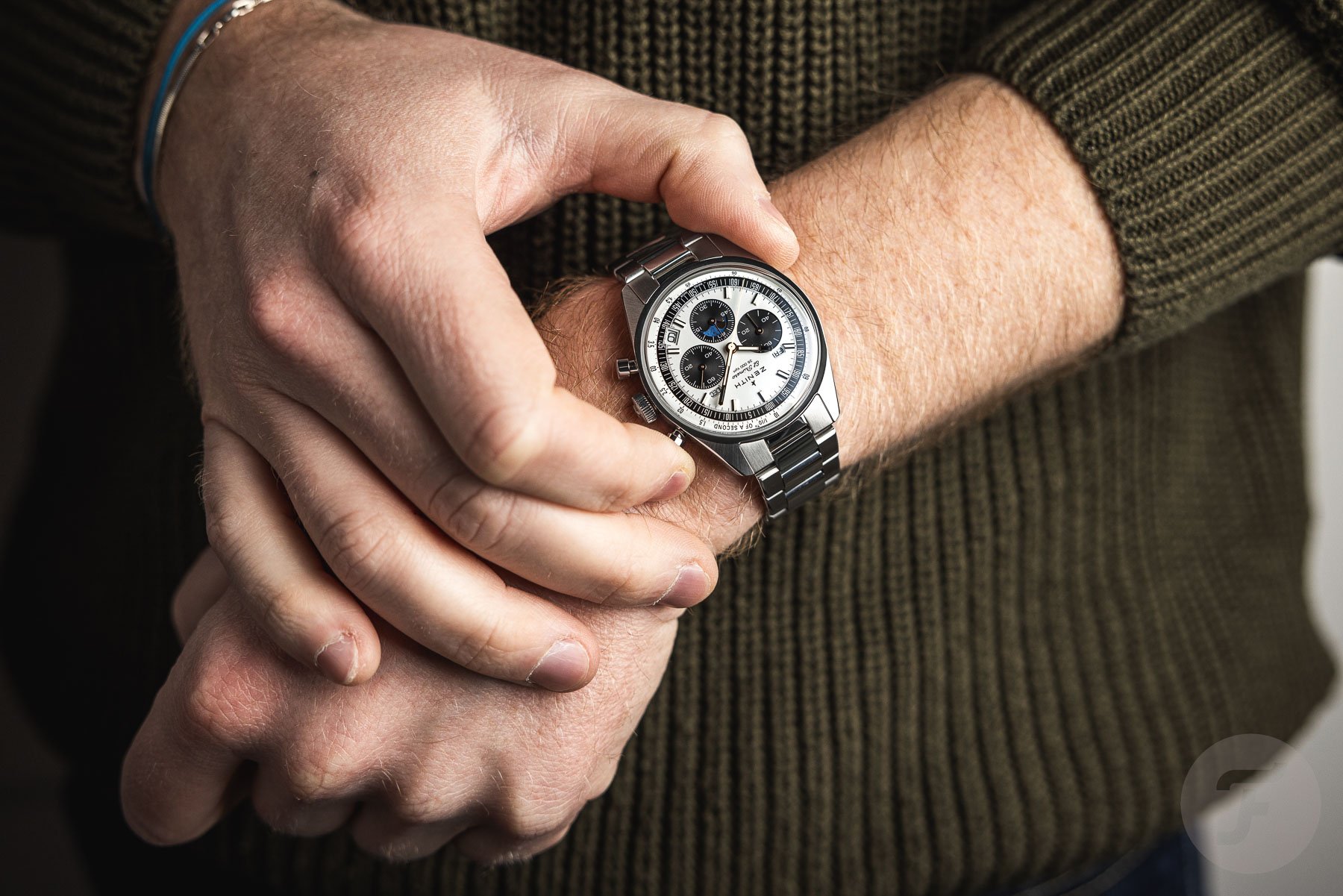
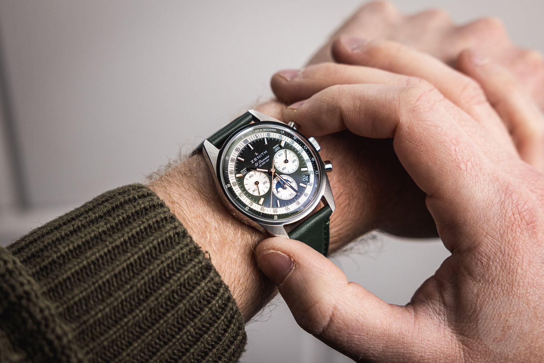
Yes, I will indeed tell you all about what’s behind those three very pretty faces later on. But I would also like to tell you what these three classically styled dials look like in real life. Jorg said his favorite was the silvery-white-and-black panda version, so let’s start there. It’s the least colorful of the three but certainly also the brightest. Although the dial is matte, it still reflects a lot of light. The sub-dials, like in the other two versions, are slightly recessed and have a very fine circular-grained texture. The three calendar windows are well executed, and the discs underneath perfectly match the dial color.
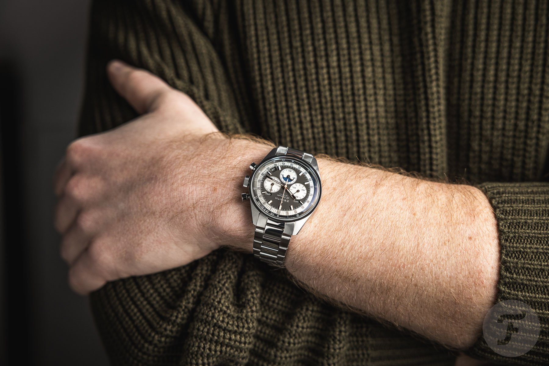
The other two versions have silvery-white sub-dials with different background colors. There’s the slate-gray version, which I’d call taupe, and then there’s the olive-green boutique exclusive. Like the white dial, the taupe dial is matte, whereas the green dial has a subtle and satiny sunburst finish. All three dials feature rose-gold-plated indexes and hands. It looks very classy, but just like one of the commenters under the introduction article, I think I would’ve preferred them in silver or white gold. The contrasting “decimal scale,” a stylistic throwback to the 1969 El Primero A386, is slightly recessed. Finally, there’s the 1/10th-of-a-second scale printed on an angled and brushed flange.
All three versions have a rather clear layout even though there’s a lot of information on them. Yes, the three calendar windows eat into other elements on the dial, but it still maintains a clean look. I find it hard to pick a favorite, but if I had to, I’d choose between the taupe and green versions.
A blue moon(phase disc)
As I said, the rose gold plating isn’t my favorite, but other than that, there’s only one other thing about the dial that bothers me a little. Yes, the moonphase indicator in the minute-counter sub-dial is beautifully executed. It has a brushed blue background, and on it, you’ll find polished rose gold stars and moons. However, what I don’t like is that its bright blue background doesn’t match any of the three dial executions very well. All in all, though, I feel these three dials have only very minor cosmetic flaws. Therefore, I take my hat off to the Zenith design team. Designing and launching one beautiful watch is already an achievement, but doing the same for three different ones deserves a lot of respect.
Smooth and snappy
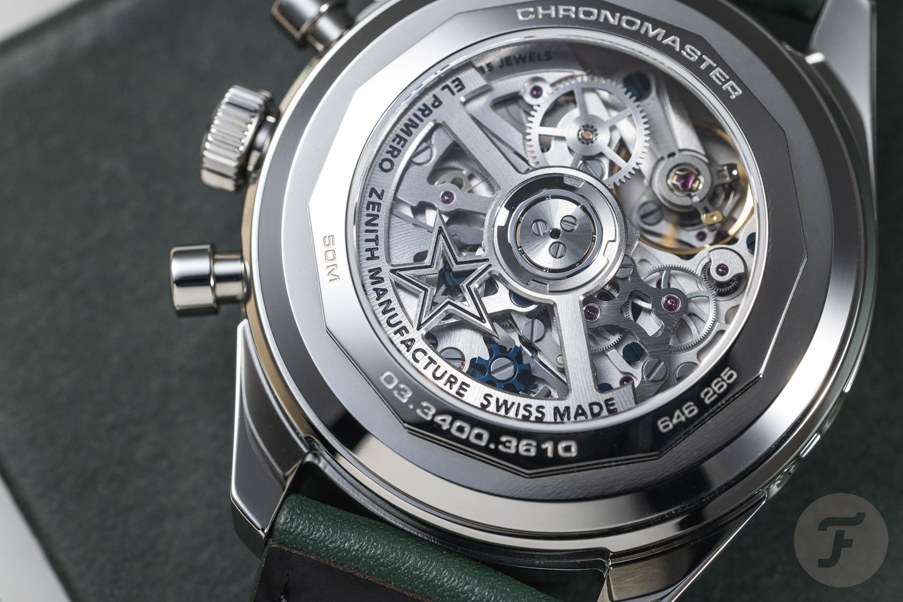
The Chronomaster Original Triple Calendar is powered by the new in-house-produced 3610 automatic caliber. This is a column-wheel chronograph movement that runs at a high 36,000vph frequency. It also features 35 jewels and holds a power reserve of 60 hours. The activation and resetting of the chronograph feel very smooth, and you don’t have to use a lot of force. The same smoothness is apparent when setting the time and calendar with the crown. When you pull it out, it’s snappy, and it feels very smooth when turning it. The day, date, and month discs also quickly jump ahead when the hands hit midnight. While the finishing of the movement isn’t particularly impressive, it’s still nicely done, and you can enjoy its complexity through the sapphire window on the case back.
The 38mm flyover case
Now, let’s finally examine what these watches are like on the wrist. Just like the regular Chronomaster Original, the Triple Calendar version has a modest 38mm stainless steel case. It also spans 46mm from lug to lug, but now comes the elephant in the room — its increased thickness. Including its domed sapphire crystal, the regular Chronomaster Original is already 13mm thick. Obviously, the Chronomaster Original Triple Calendar is slightly chunkier because of the additional complications. It comes in at 14mm thick, which only means an increase of one whole millimeter.
But because of the way the Chronomaster Original’s case is constructed, it feels a little bit like a flyover (or overpass) on the wrist. That’s because the Chronomaster doesn’t have a more common mid-case design. Its lugs almost lie on top of the case, which causes quite a protrusion underneath them, almost like an iceberg. Therefore, the thickness isn’t very well concealed because the case sits on top of the wrist rather than hugging it. That is especially noticeable when wearing the watch on the bracelet because the end links don’t drape toward the wrist right away. But that’s not the only gripe I have with that bracelet.
Ready for an overhaul
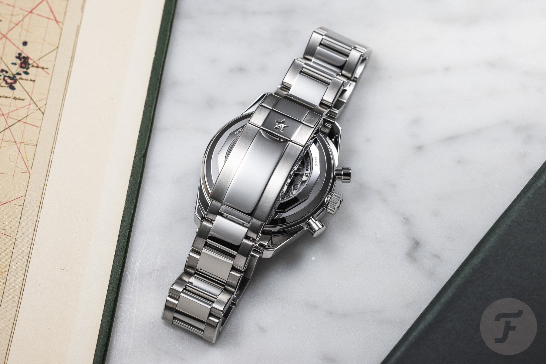
Of course, the Chronomaster Original Triple Calendar is a vintage-inspired chronograph. That, however, doesn’t mean that its bracelet should also feel like it was made in the ’70s. The brushing and polishing are indeed well done and match the finishing on the case. But it’s when I touched it and operated the stamped clasp that I simply didn’t feel like I was handling a €14,500 watch. The Christopher Ward C65 Dune GMT costs almost 10 times less at €1,465, but that watch has a bracelet that can truly compete with a Rolex Oyster bracelet.
That bracelet, which features a milled clasp offers a toolless micro-adjustment option as well as a quick-release system to make swapping straps easy. Those are features that the Chronomaster Original’s bracelet can only dream of. Luckily, the dual-deployant clasp that comes with the leather strap is quite good. It features ceramic ball bearings so that it won’t wear out anytime soon and dual pushers for easy opening. Although that makes it a good alternative, I still think that the bracelet needs a proper overhaul very soon.
Final thoughts
The well-organized and good-looking dials of the Zenith Chronomaster Original Triple Calendar make it a real gentleman’s chronograph. It’s a little sportier on the stainless steel bracelet, but overall, it has a very classy look to it. The rose-gold-plated indexes and hands and the blue moonphase disc could’ve benefitted from a different color. But even in their current configurations, all three versions are very nice-looking watches. In addition, the new movement inside feels well made and looks impressive through the exhibition case back.
The only major reservation I have with these three watches is the way they sit on the wrist. I feel like their increased thickness could’ve been concealed a bit better than it is now. Also, the bracelet most definitely needs some improvement, especially because it’s on a watch that costs €14,500. For more information on the new Zenith Chronomaster Original Triple Calendar, check the brand’s official website.
Let me know in the comments below what you think of the new Zenith Chronomaster Original Triple Calendar.


