Introducing: The Maen × Worn & Wound Manhattan Limited Editions
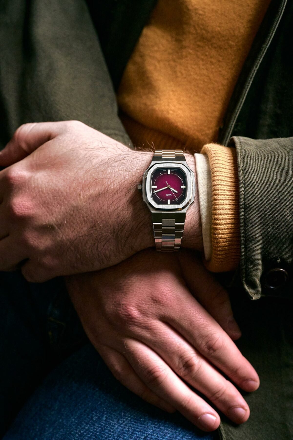
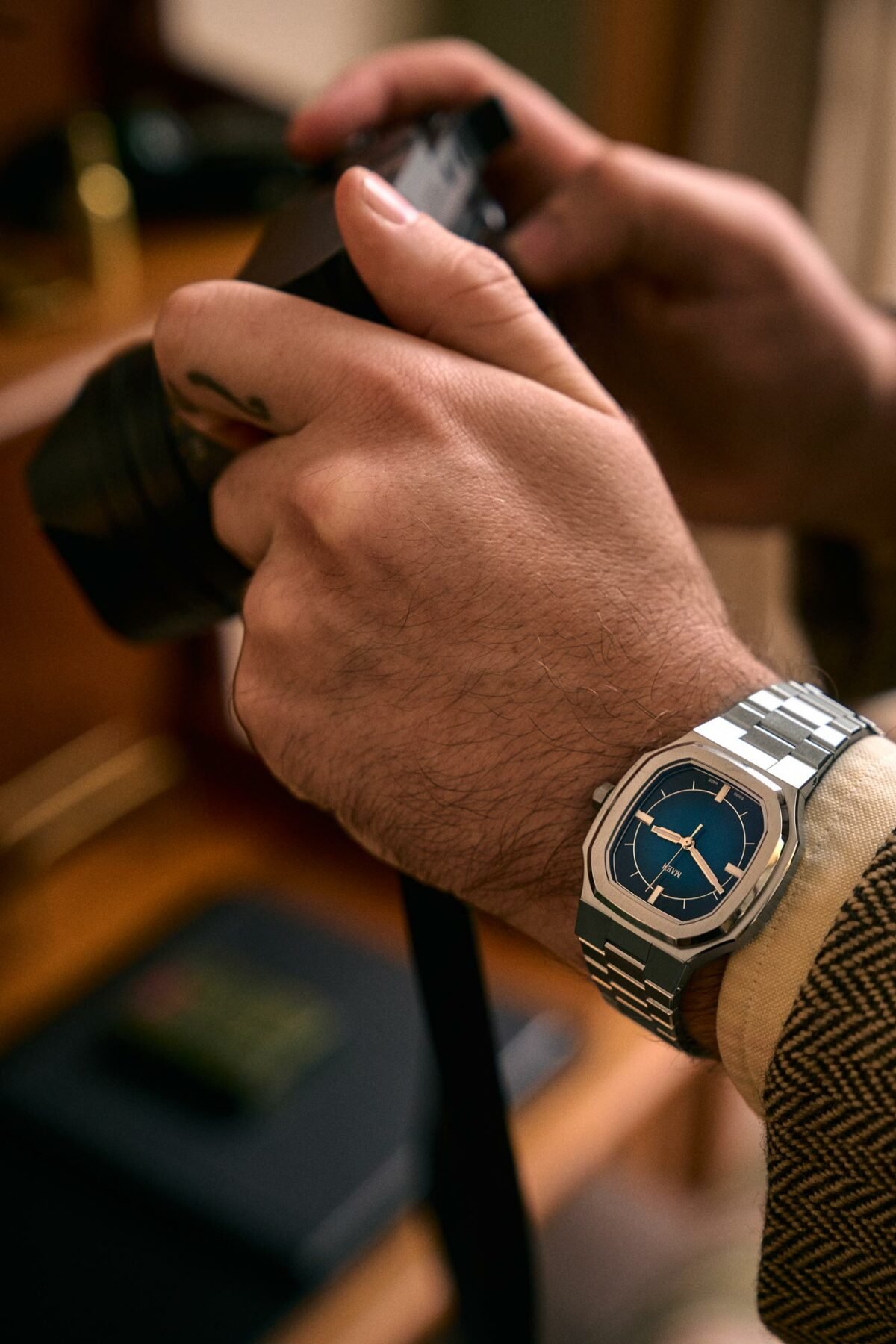
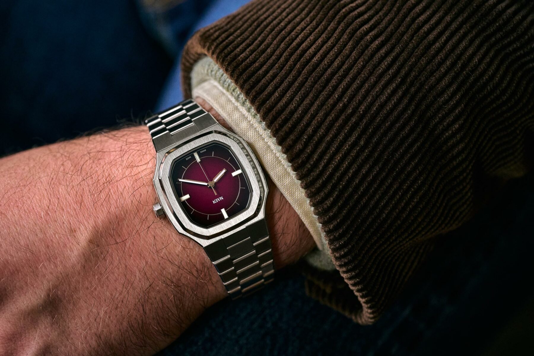
Sure, the last story I wrote was focused on modern designs, and I had a renaissance for larger case sizes this past summer. But for me, the autumn and winter months mean layering up with warm colors and smaller timepieces. The Maen × Worn & Wound Manhattan seems like just the ticket, a 37mm watch we know but with a colorful transformation.
Maen represents value with its 38mm Hudson and the more upmarket Skymaster 38 MKIII Chronograph that I recently reviewed. But we all know what’s hottest in 2023, right? It is small-sized and has an integrated bracelet. This is where the Manhattan plays its odd-shaped card just right. I had the salmon-dialed version as a house guest last year and was pleasantly surprised. But this time, our friends at Worn & Wound show how much a color or two can do to transform a watch.
Maen × Worn & Wound Manhattan — A solid build and fumé delight
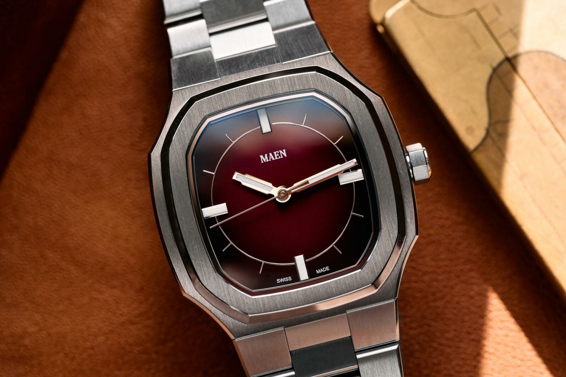
The sartorial vibes of the original Manhattan were firmly in the dressy category of wristwear, yet the watch still felt like a solid everyday piece. Flat-link bracelets are not easy to get right for small brands, but Maen seems to have cracked the code. It’s a slim design, sporting a discreet bevel on the edges of the links. But this time, with 75 pieces of the Manhattan in each colorway, a smooth, glossy dial plays a rich game of color above sturdy Swiss Sellita SW200-1 automatic movement.
Both versions of the Maen × Worn & Wound Manhattan are spare in design. And the minimalism suits the size, with a fumé gradient dial adding depth to the design. The indices are kept to a thin silver ring with equally slim lines for most hours. Contrasting these are big rectangular lume markers at the quadrants. To me, this makes for a great balance between the fresh nature of the blue and burgundy dials and the elegant vibe of the case.
A strong, quirky case shape
The colored depths of the two limited-edition dials will fight for attention with the Manhattan’s quirky 37 × 47 × 9.3mm case. It’s a cohesive design with a nice top bevel and the dynamic sweep of a concave edge on each corner. If these were bigger and hidden under the bezel, the image would have been very Nauti-like as the sides would have protruded. Those inward-curving corners play a juxtaposing shape game with the broad facet on the bezel, and it works. The case, with its defined brushwork, angles down to hug the wrist, and the octagonal crown is a nod to the hot shape of the ’70s that we know and love.
Conclusive thoughts on the Maen × Worn & Wound Manhattan
My only gripe about this watch is that the pieces will probably be sold and gone by the time you read this. While the case shape is eccentric, the zeitgeist says its size and vibe are perfect. It has the quasi-Genta feel that we like, from the broad, brushed bezel to the sleek bracelet. And for US$899, it’s pretty good value for its grail-like looks. The dial is a brand-new and instantly recognizable design, something that many brands try for but fail to create. So big kudos for the collaborative efforts of Worn & Wound with Maen. You’ll find the watch for sale here unless it has already flown off the shelves.
Fratelli, my sweet Fratelli, what about the Maen × Worn & Wound Manhattan do you like? Is it the perfect ’70s nugget, or are you still nervous about small-sized wonders? Let me know in the comments.


