Introducing: The Seiko Prospex SPB481, SPB483, SPB485 Divers
We watch fans are a funny breed. As enthusiasts, we are always craving something new. But when we are presented with something new, the first thing we do instinctively is find watches from the past to compare it to. Once we’ve pinpointed the references to existing timepieces, that often becomes a reason to disqualify a design. Why am I telling you this? Because the new Seiko Prospex SPB481, SPB483, and SPB485 will undoubtedly receive similar treatment. That enlightening conclusion results from some quick self-reflection upon seeing the three new models. My brain immediately wanted to find comparisons. But once I got past that instinctive urge, I greatly appreciated the new silhouettes of these three surprising Seiko Prospex Coastline divers.
You might wonder what my immediate references were upon seeing the new Seiko Prospex SPB481, SPB483, and SPB485. A glance often results in comparing shapes, and the TAG Heuer Aquaracer immediately came to mind due to the octagonal bezel. But that’s where I stopped my internal search for references. If you want to, you can probably come up with more watches that have similarities with the design of these new Seiko Prospex Coastline divers. So, if you feel the urge, feel free to list them in the comments section.
Initial impressions of the Seiko Prospex SPB481, SPB483, and SPB485
However, I was more intrigued by how the watches first triggered a pendulum between ‘”like” and “dislike” within me. It was the result of my brain processing multiple things simultaneously. Like most watch enthusiasts, I start associating new watches with others immediately, and an octagonal bezel, being rather uncommon, can make that uncomfortably easy. But the Seiko designers made sure that this remarkable shape is embedded in a design that feels like a true Seiko Prospex diver.
Creating that familiar context ensures that the outspoken bezel lands gently if you get past those initial obvious references. One thing I initially didn’t have the answer to was whether these three watches had a clear retro vibe. While the shape might suggest that, the watches do not feel like previous creations inspired them. The new case shape erases any thought to the contrary. After letting my first impressions sink in and ending on a high note, it was time to check out the details and wear the watches.
The details of the Seiko Prospex SPB481, SPB483, and SPB485
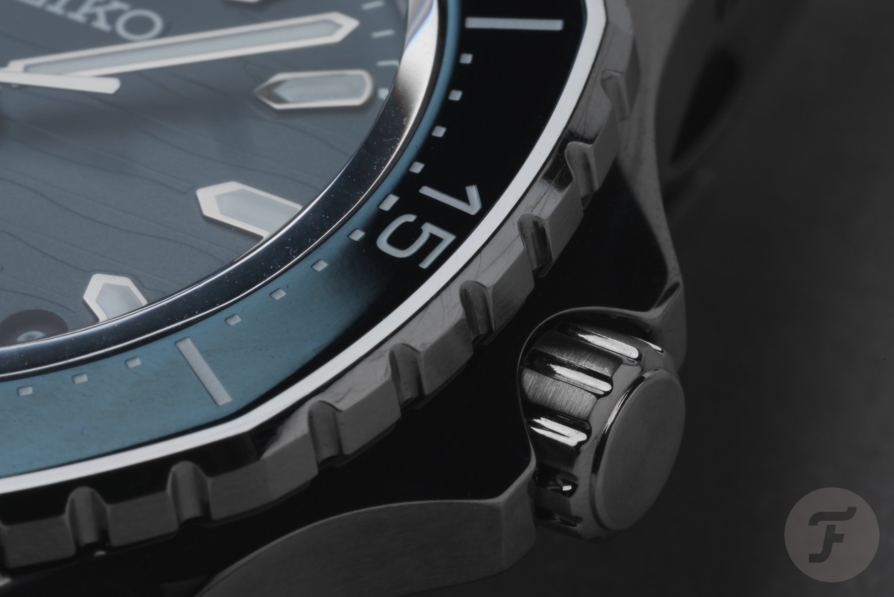
As the Seiko Prospex SPB481, SPB483, and SPB485 are new creations, let’s look at some details. The three watches have a 41.3mm stainless steel case with a 12.5mm thickness, 48.2mm lug-to-lug, and 300m depth rating. The modern case design features sharp, angular lugs that suit the bezel style nicely. On the right side of the case, you will find the screw-down crown protected by modern-looking crown guards.
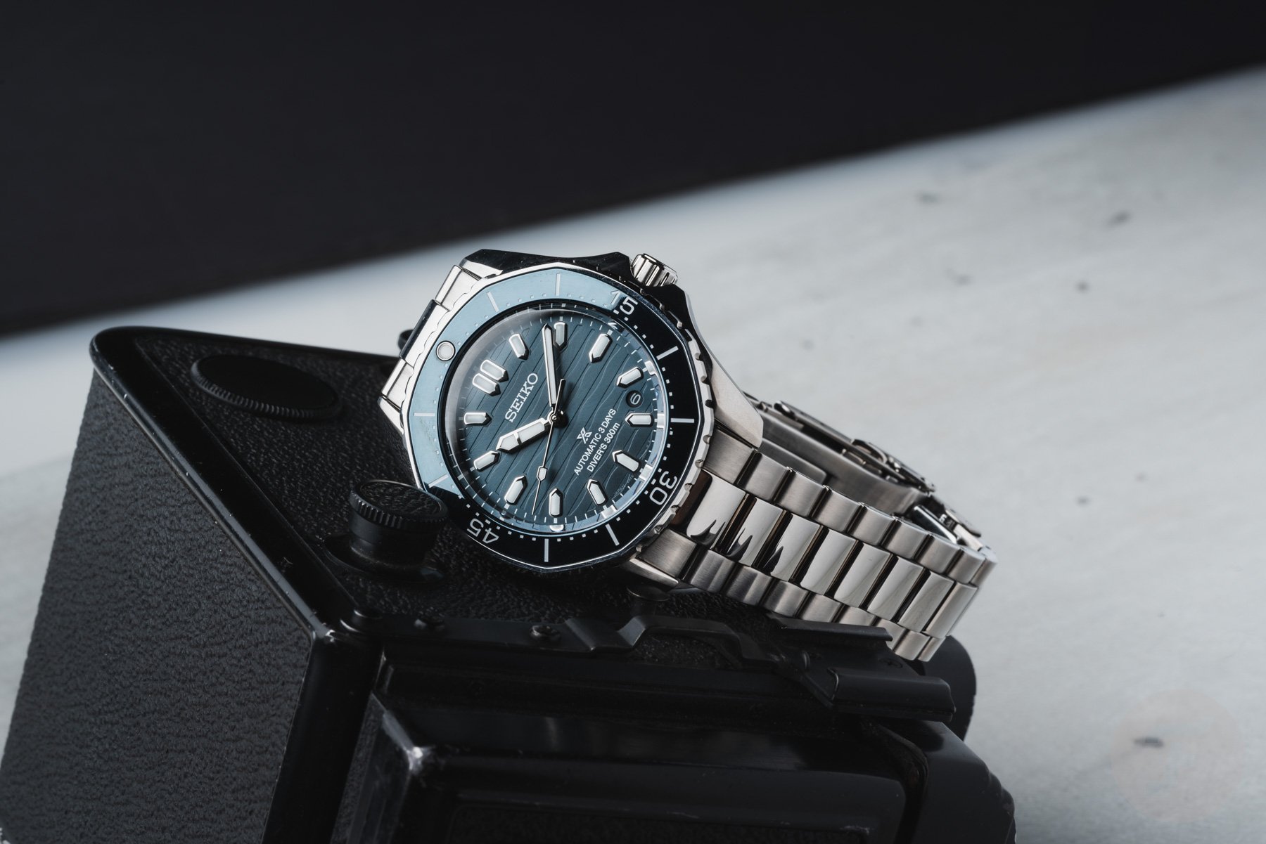
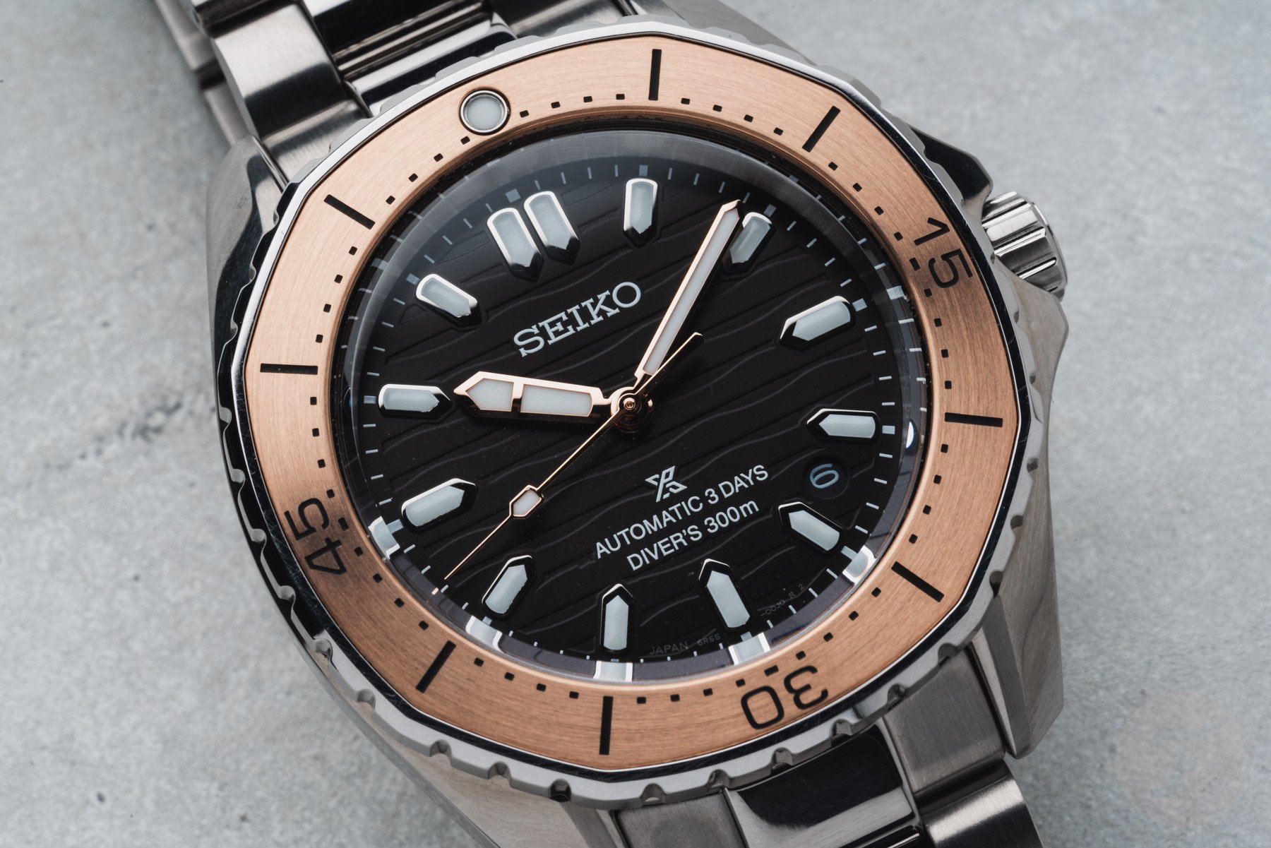
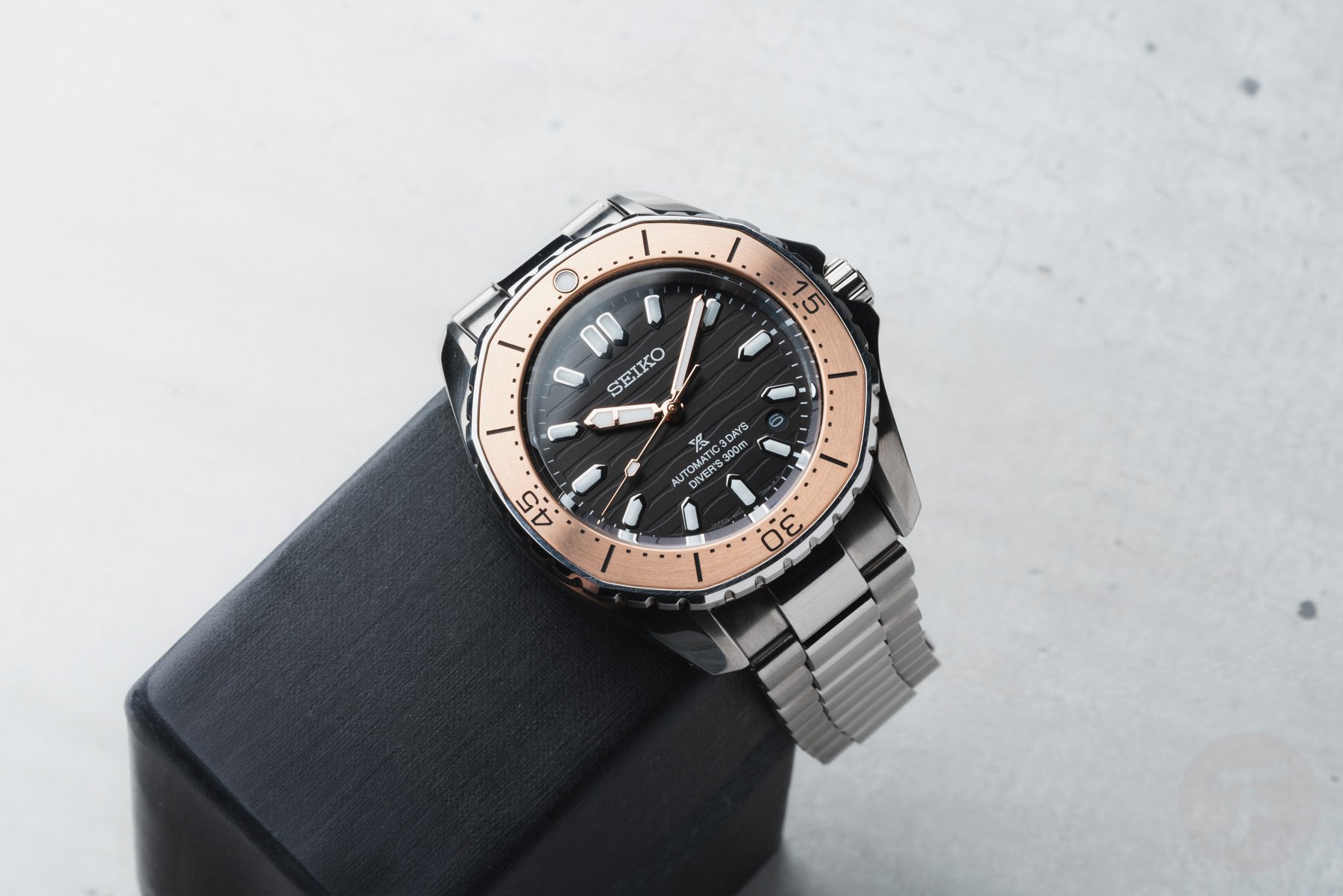
Seiko calls the new bezel “polygonal,” but a closer look reveals that it is octagonal. Having said that, the eight sides of the bezel have a rounded shape that is less defined than the bezel of the aforementioned TAG Heuer Aquaracer. The Seiko designers hit the nail on the head with that bezel design because it feels organic despite the angular shape. As you will understand by now, soon after picking the three models up from the box, I was impressed by their looks.
Dials inspired by the Japanese coastlines
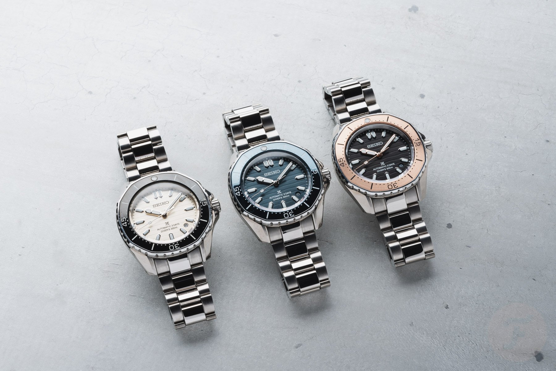
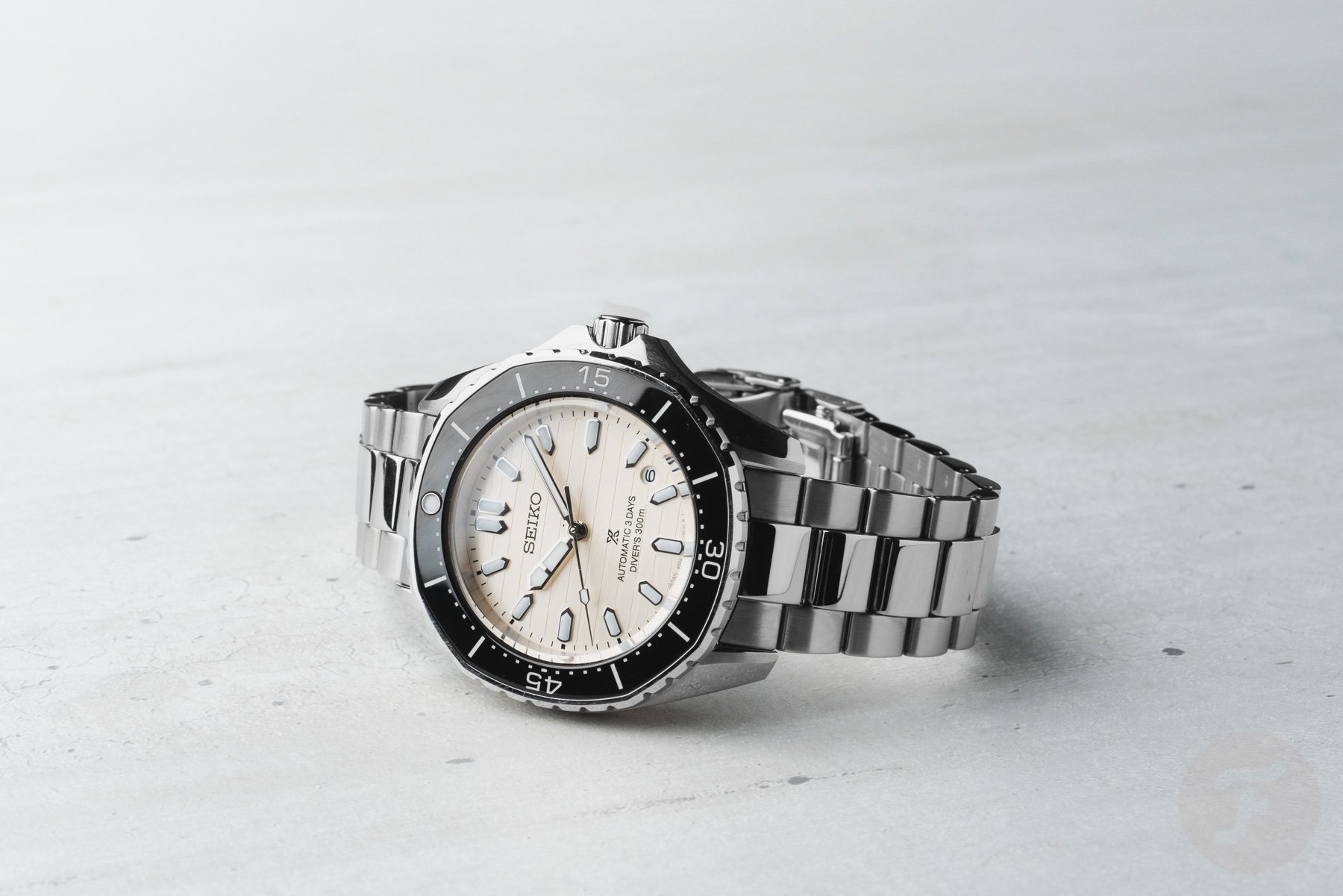
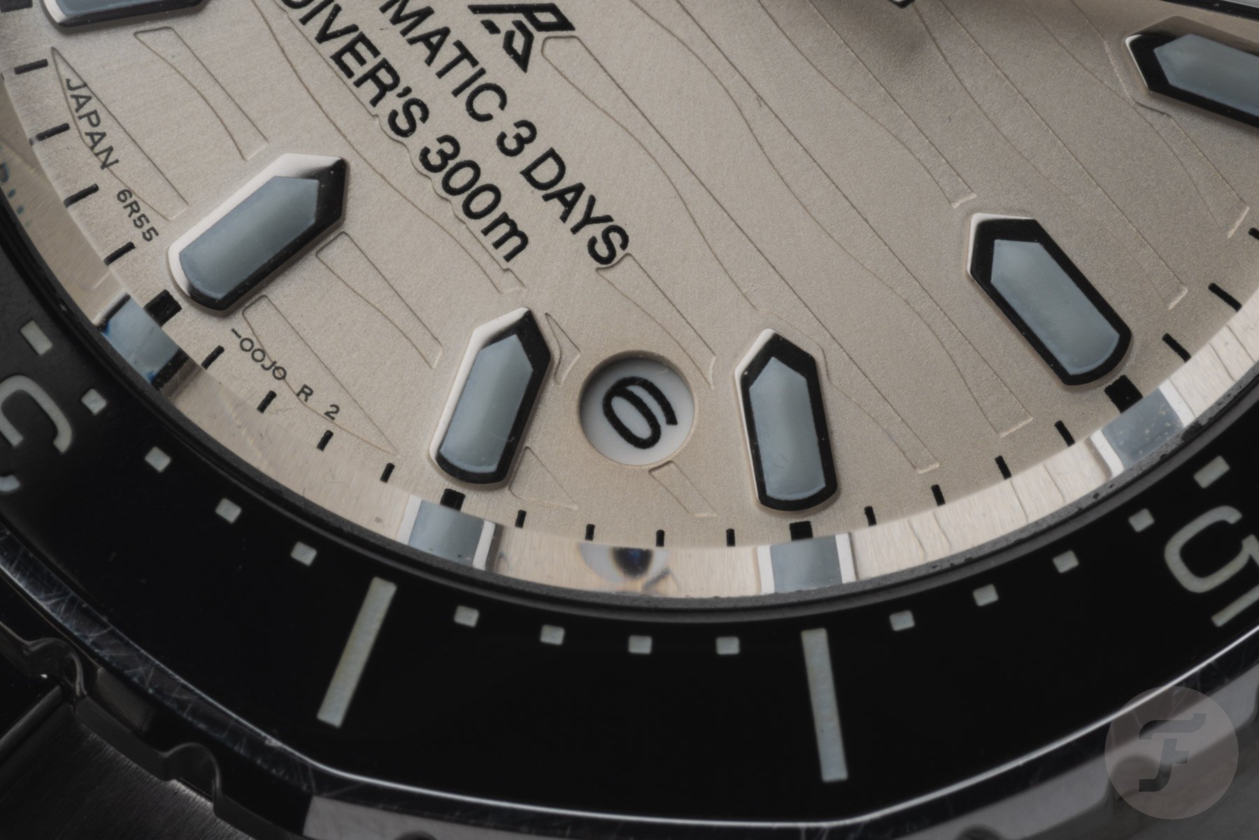
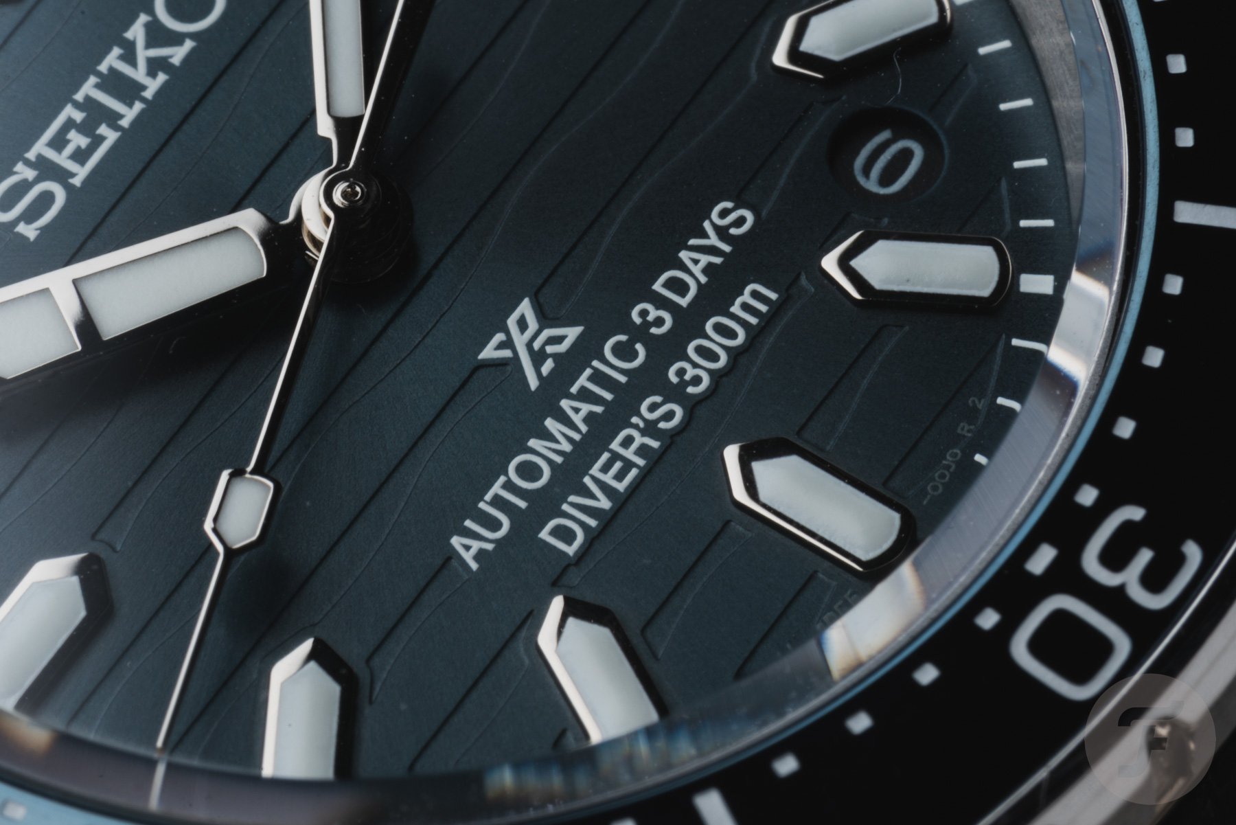
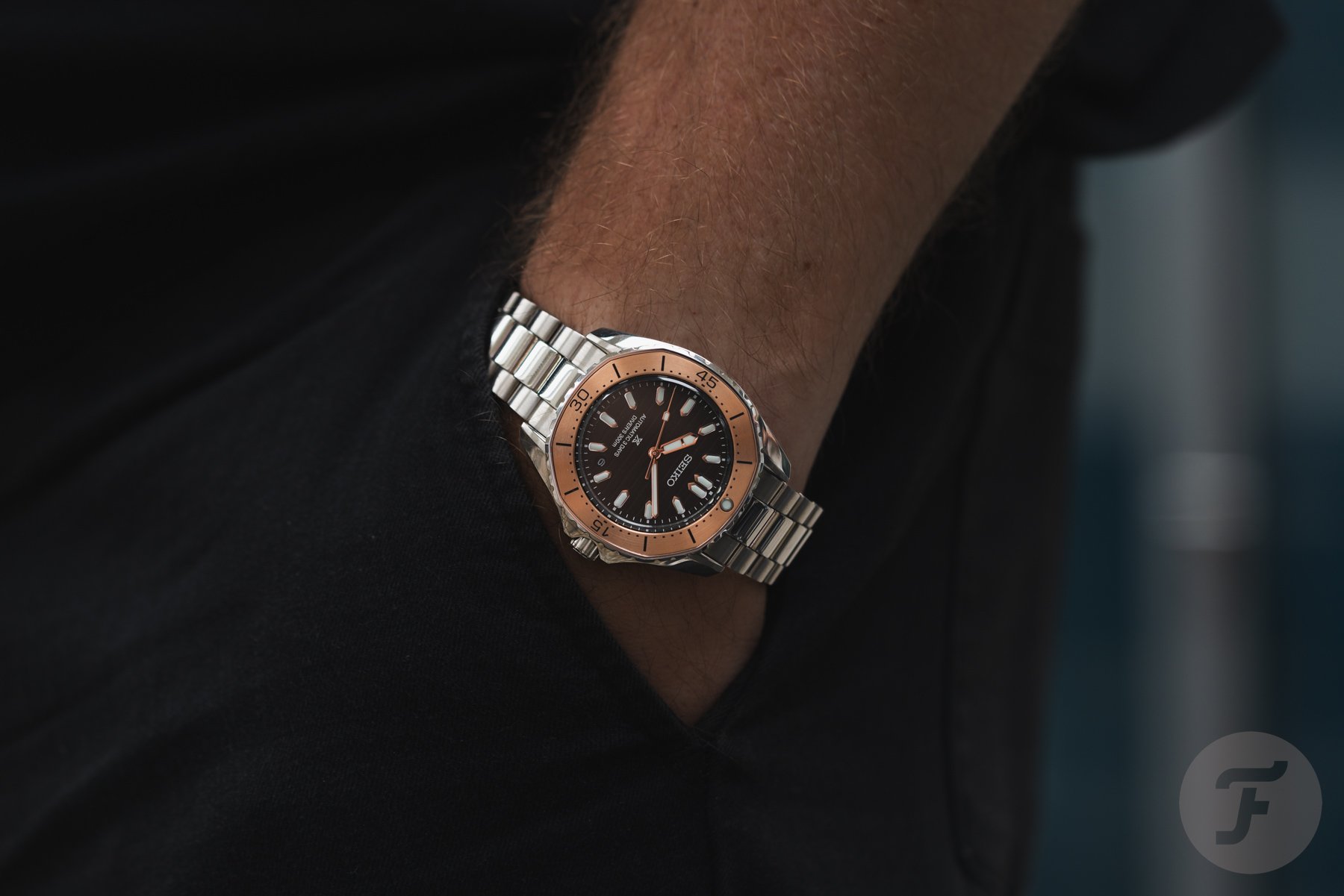
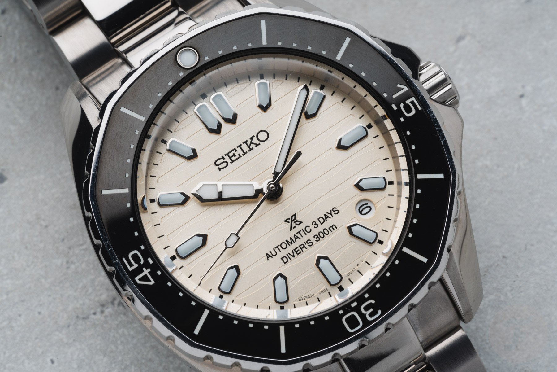
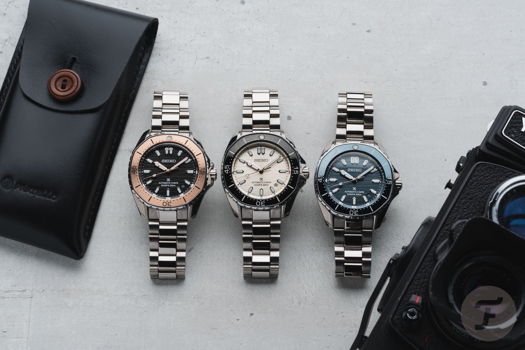
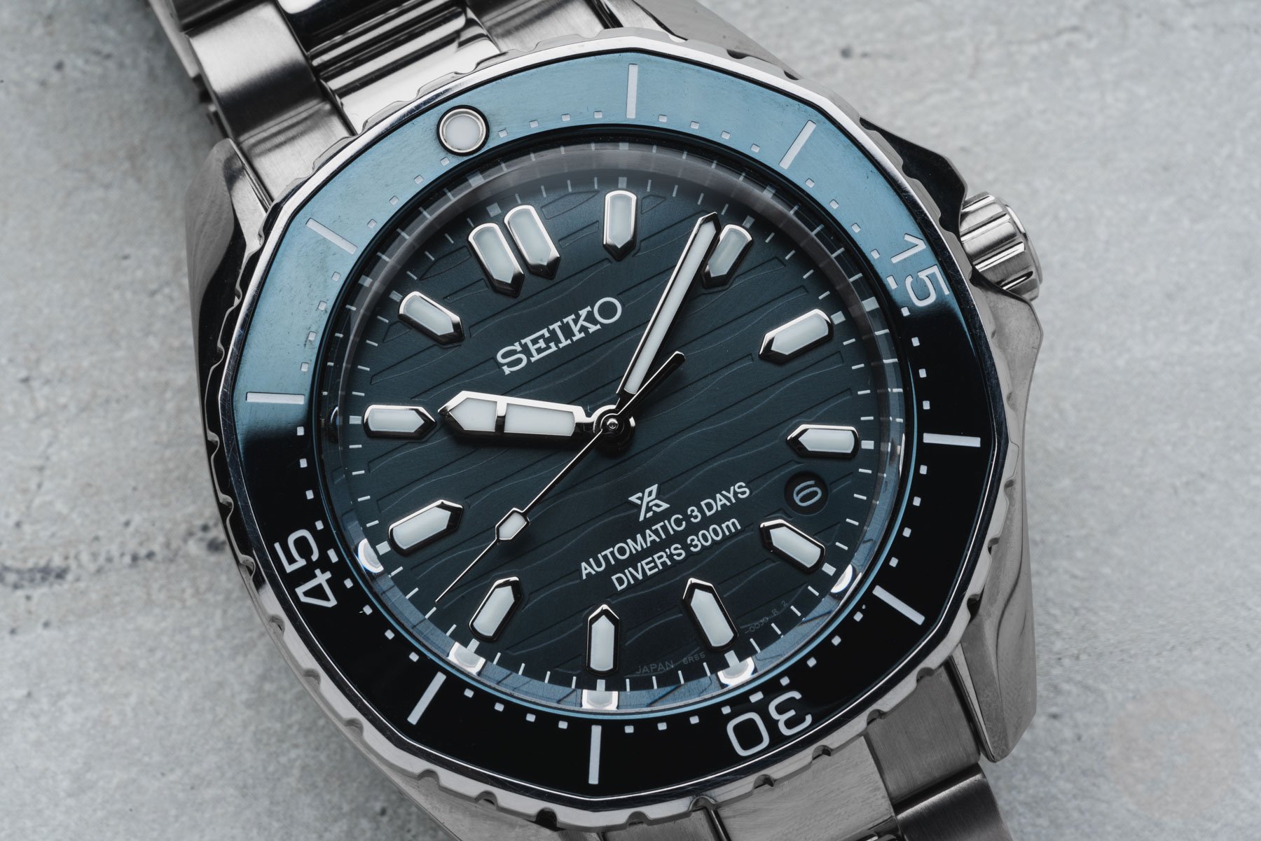
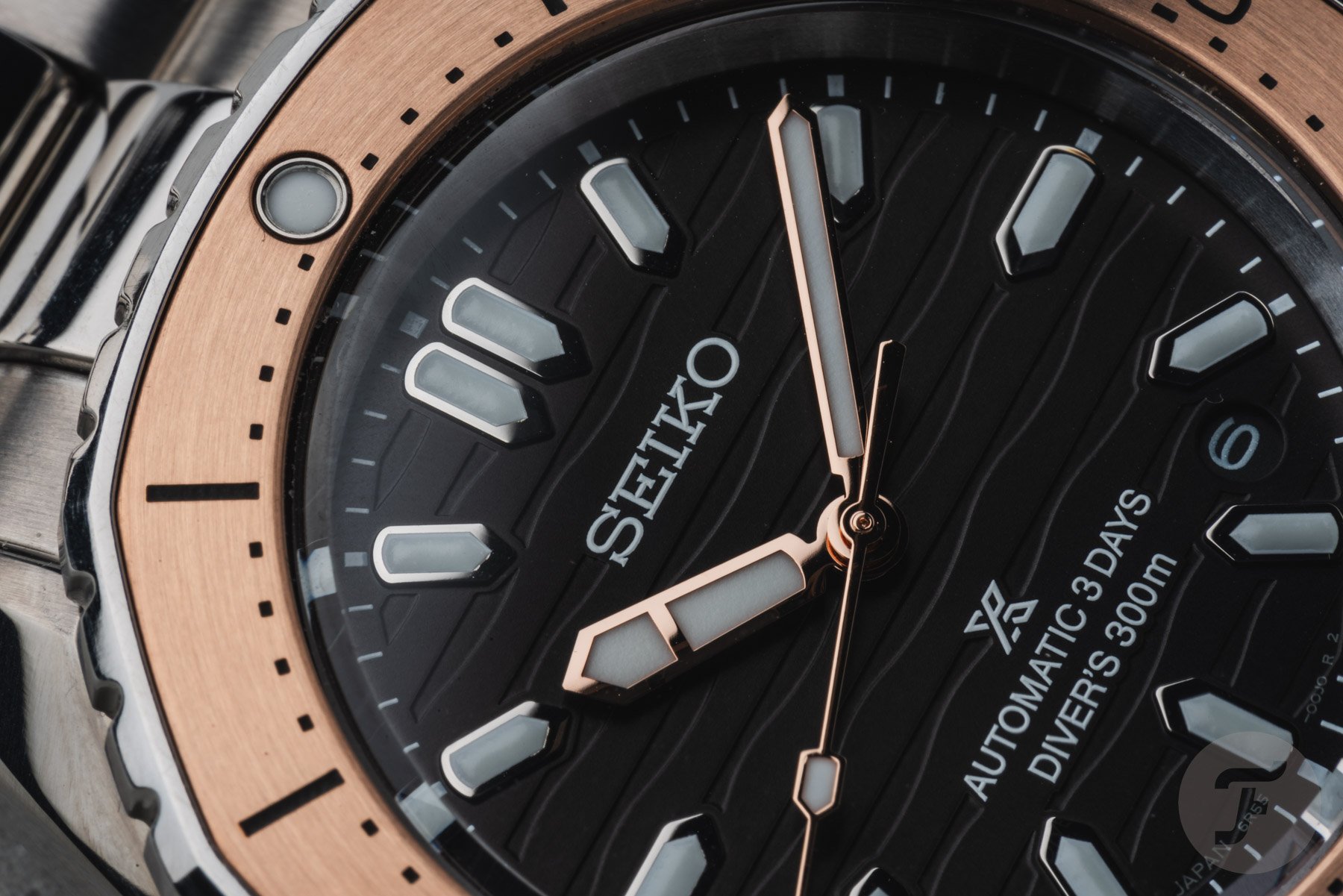
The case is paired with dials inspired by the profile of flowing coastlines, and the dial pattern works well in all three colors. The first version is a black dial with a brushed copper-colored stainless steel bezel with black markers, and the second is a beige dial with a shiny black stainless steel bezel and white markings. The last option is the blue-dial version, which has a glossy blue stainless steel bezel with white markings. All three dials feature applied markers with LumiBrite, and the prominent handset also has a healthy filling of this glowing material.
A fun detail is that the polished rose gold-colored hands of the black-dial model echo the color of the bezel for some extra visual pizzazz. The other two versions feature stainless steel hands and markers that suit the design well. As you can see, the dials also feature a date window between 4 and 5 o’clock. I’m still on the fence about the size.
Thanks to the relatively small aperture, the date blends in well. However, it also doesn’t stand out when you need it to. Depending on your preference for a date, you will probably have an opinion about that. I usually do not miss a date, but I would like it to be easy to read if it’s there.
The Seiko 6R55 inside
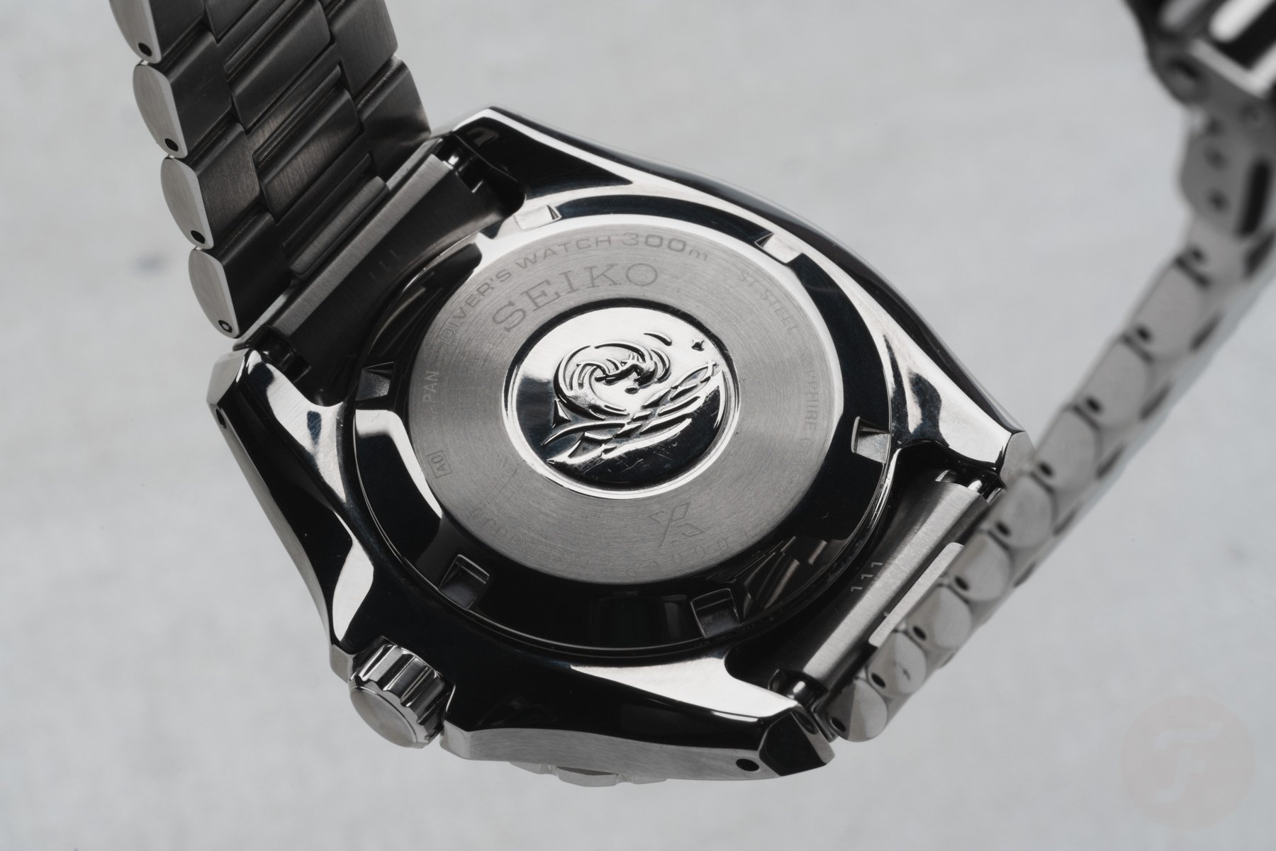
Hidden behind the closed case back is Seiko’s in-house caliber 6R55. This automatic movement operates at 21,600vph and offers 72 hours of power reserve. It’s a familiar movement that Seiko uses for various watches. The 6R55 offers an advertised accuracy of +25/-15 seconds per day, and you can wind the movement manually.
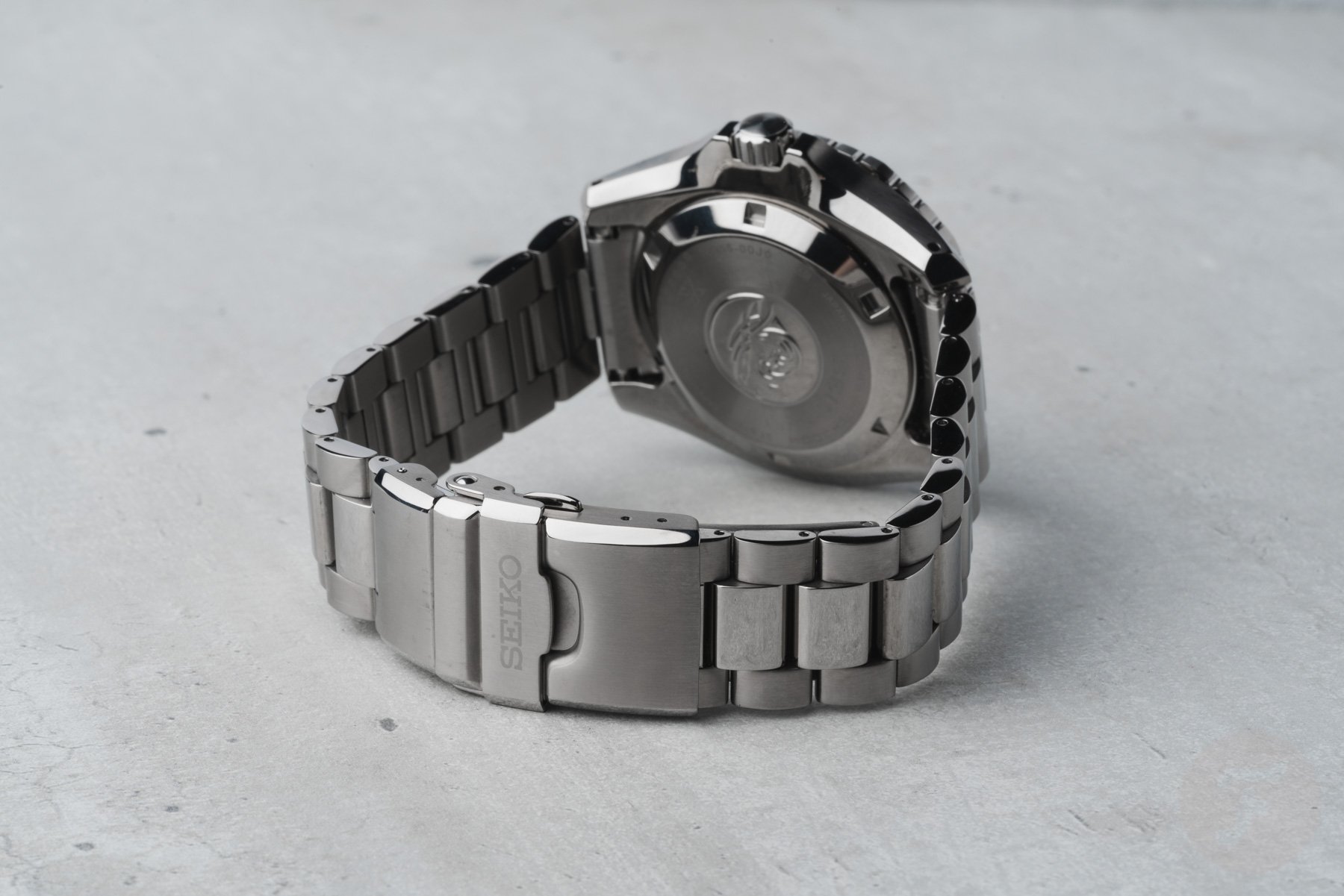
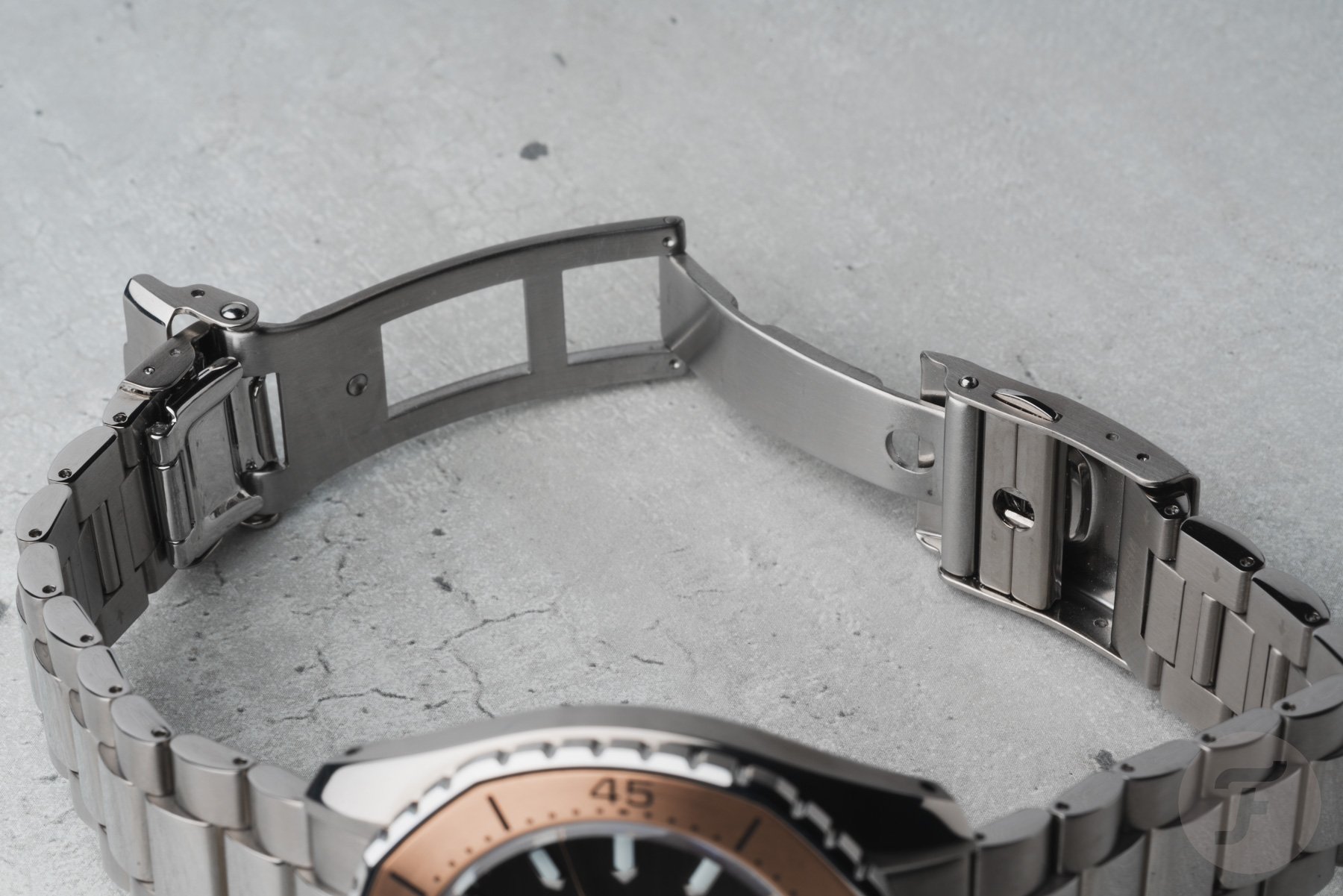
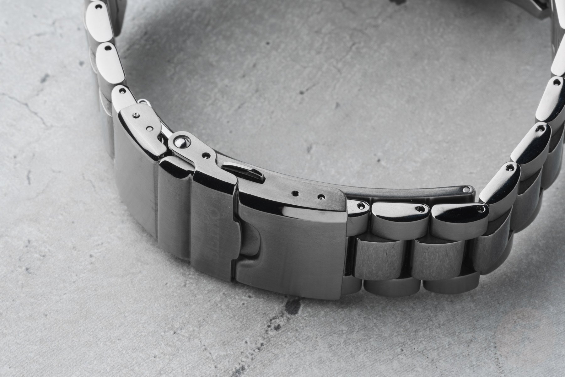
The watches have a stainless steel bracelet and a folding clasp with a push-button release and an extra fold-over security lock. The bracelet’s three-row design looks good, and the rounded links add a bit more character, differentiating it slightly from typical Oyster-style bracelets.
The bracelet features polished center links and brushed outer links with polished sides. As a result, there is plenty to enjoy visually, giving the watch a luxurious feel. The clasp is decent but doesn’t stand out compared to competitors’ clasps. It is fitted with a dive extension for people who plan to wear it over a diving suit.
You can micro-adjust the bracelet with a tool, although Seiko offers only one extra position. Overall, I must say that while the bracelet’s quality is on par with what competitors offer, a great clasp could improve that overall feeling of quality significantly. If Seiko could improve its clasps and fit them with a toolless micro-adjustment mechanism, that would be a great step forward.
Wearing the Seiko Prospex SPB481, SPB483, and SPB485
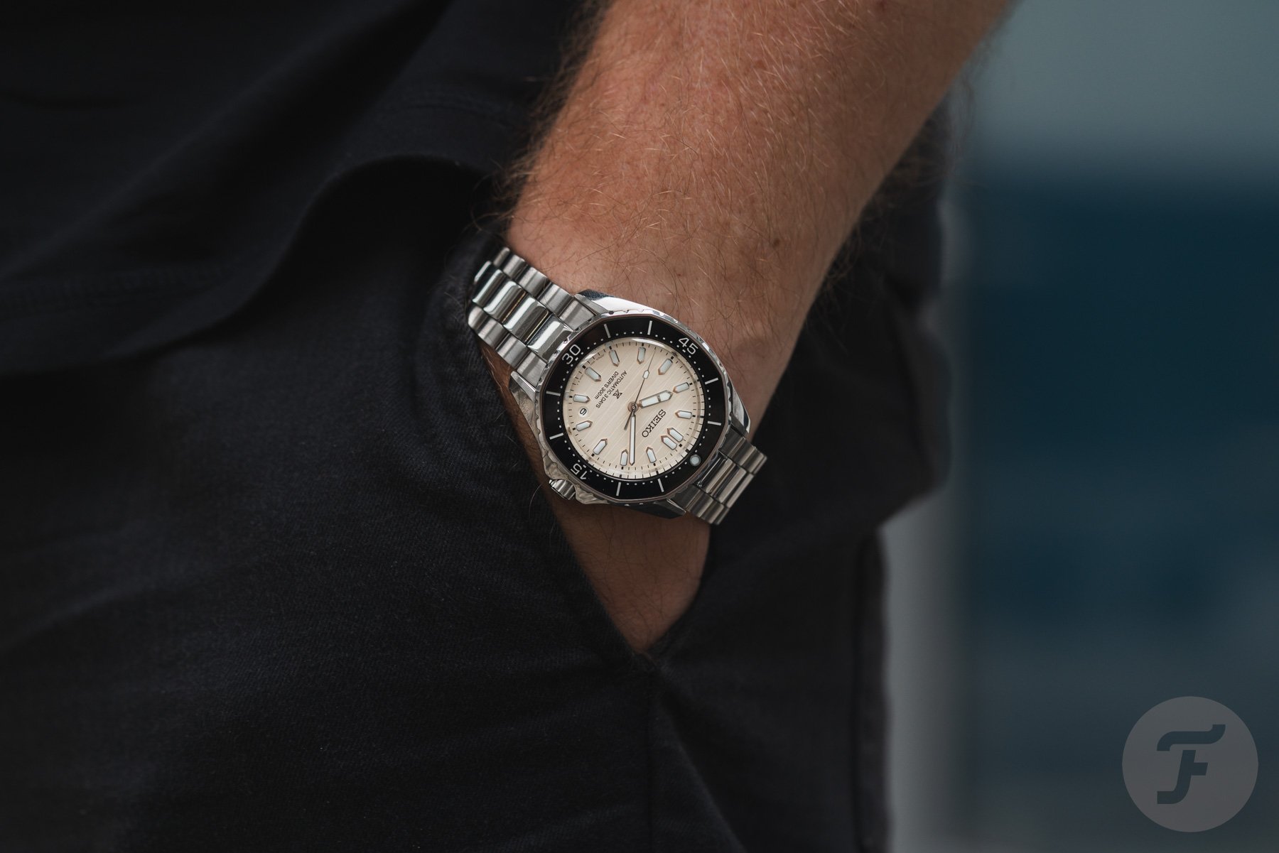
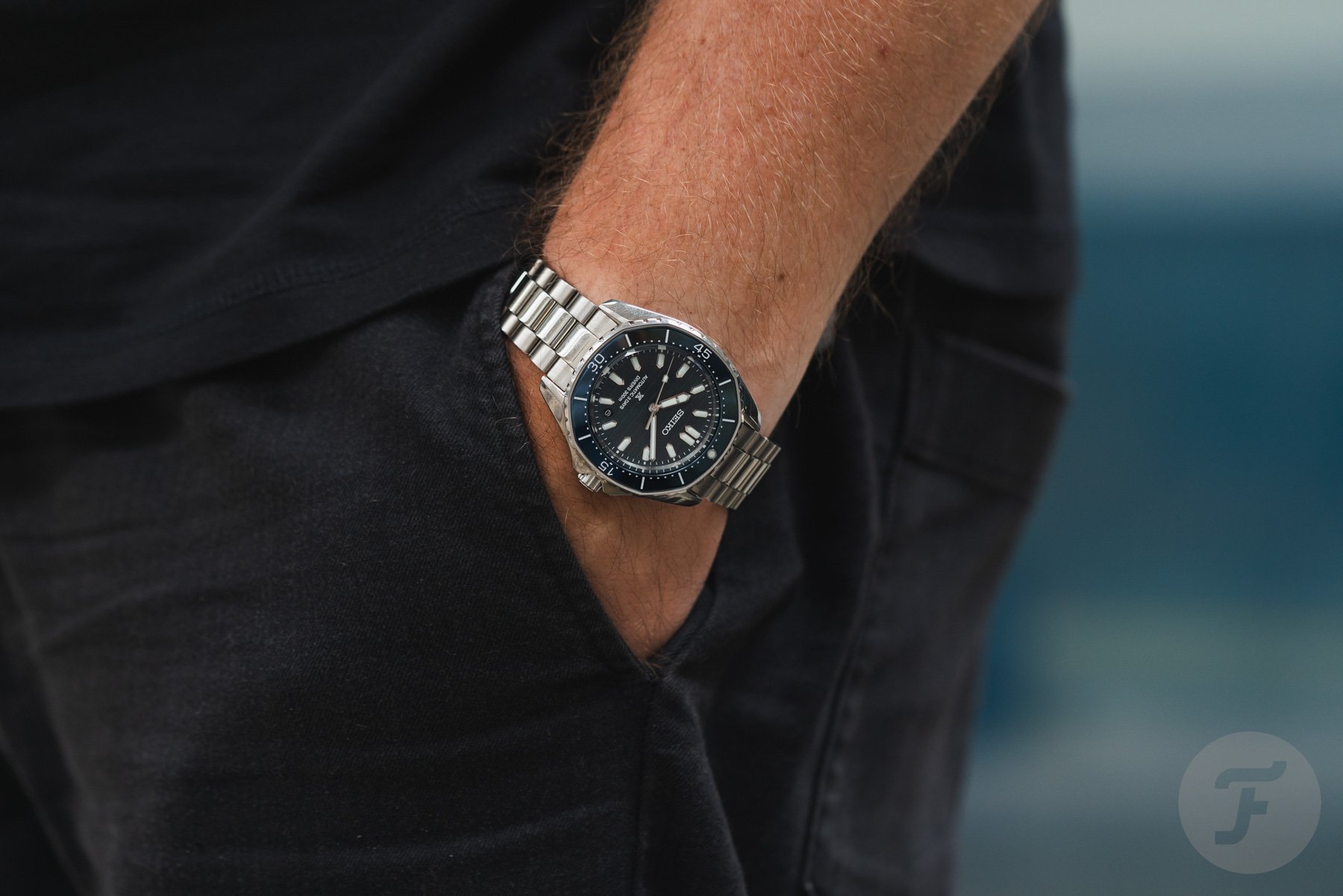
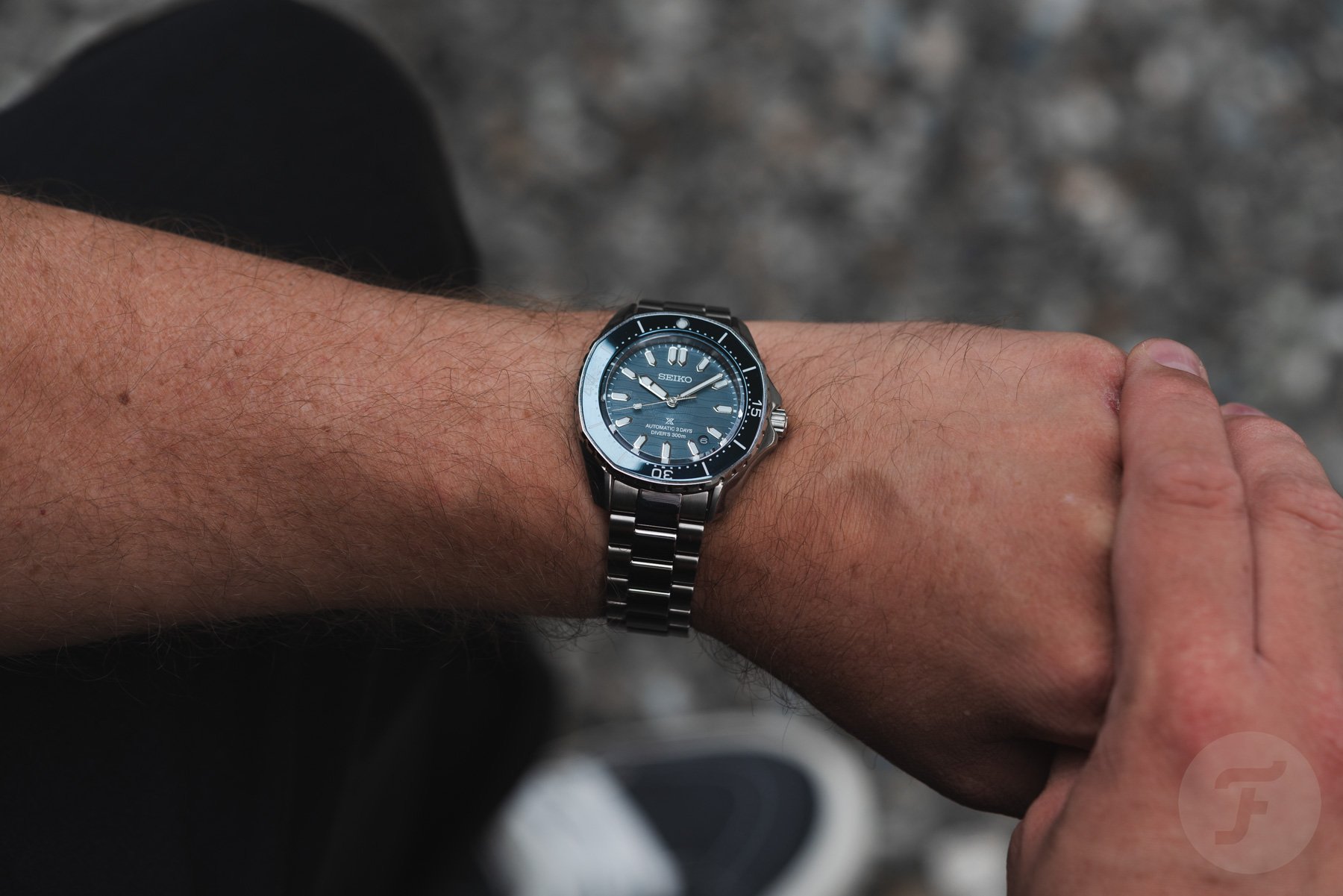
On the wrist is where the three watches truly came to life. That’s where I got a great idea of the size, the shapes, and my favorite of the three options. The 41.3mm diameter feels right at home on my 18.5cm wrist. While I mostly wear watches in the 38–40mm range nowadays, this slightly bigger size is perfect for a modern dive watch.
With the watch on the wrist, you will also get a great feel for the modern case profile in combination with the characteristic bezel. My gut feeling is that it is a love/hate situation regarding the bezel shape. If you don’t initially like the shape of a bezel like this, it will be hard to get used to it. That said, if you are open to something different, I suggest you give these three watches a try,
After trying the three models, I found that the blue SPB483 spoke to me the most. Thanks to the very similar dial and bezel colors, it feels like the most balanced version. The matching colors also emphasize the bezel shape a bit less than with the other two versions. I have to compliment Seiko on the shades of blue used for the dial and bezel.
They are deep, rich blues with hints of gray and look super classy. The combination of the glossy blue bezel insert and matte dial also makes for a beautiful execution of the watch.
The balance of the case and bracelet is crucial
The beige-dial SPB481 is a nice distant second, and while the black-dial version with the brushed copper-colored bezel looks good, it is simply not my thing. Wearing the watches also gave me a better idea of the balance of the case versus the bracelet. As the case is more angular, the flow from the case to the bracelet is less fluid. The balance between the case size and the bracelet must also be perfect. A natural way to tackle both of these challenges is an integrated bracelet. However, as this is a dive watch, that is not the chosen solution.
The proportions of the case and the bracelet are spot on. The lugs have a 20mm spacing, and if it had been wider at 22mm, the flow from the case to the bracelet would have been a lot chunkier. As it is, a natural flow keeps the proportions balanced and the head-on view elegant. One thing that did stand out immediately, though, was that the bracelet’s end links sit below the insides of the lugs.
The designers did try to compensate for that by adding a steep angle on the inner part of the lugs, sloping toward the bracelet. But there is a definite difference there that feels less elegant than I would have liked. Especially because the case is relatively slender at 12.5mm thick, I think this “drop” to the end links is a bit of a missed opportunity to make the watches feel more sophisticated.
Final thoughts on the new Seiko Prospex SPB481, SPB483, and SPB485
These three new Seiko Prospex Coastline models surprised me a lot. I certainly never saw something like this coming from Seiko. We are so used to seeing Prospex models based on the greats of the past that something new like this is a welcome break from the norm. On top of that, it’s rather ballsy to release a series with such a distinct bezel shape. First, the shape is rather divisive. As I explained, this alone could make people either love or hate the design. On top of that, watch fans will come up with plenty of references to support their opinions one way or the other.
After the initial surprise, what stood out most for me was how much these watches feel like Seiko Prospex divers. The designers perfectly understood how to fit these watches into the typical Seiko design mold. Therefore, the watches don’t feel strange or outlandish. I ended up liking the SPB481 and SPB485 and loving the blue SPB483. In the short time that we had the watches, they offered me something new that I never knew I wanted.
Plus, with a price of €1,200, these three watches sit right at the heart of the Prospex collection. What you get in return for that sum is a fresh, original take on a Seiko dive watch. I found these new Seiko Prospex models some of the most surprising releases of the year, and I am fully on board with the concept. It’s safe to say the blue SPB483 even secured a place on my wish list.
But what do you think of the new Seiko Prospex Coastline divers? Let us know in the comments.

