I Have Serious Issues With The Combination Of Black And Yellow In Watches — Why Is That?
Yes, I do have serious issues with the color combination of black and yellow in watches. I do have to make one thing clear: I don’t really mind a completely yellow dial. It does need to be the exact right shade of yellow, of course, and getting that just right isn’t easy. But it’s yellow details in black-dialed watches and vice versa that I have a problem with. Why is that? It could very well be the “Best Buy” vibe, but there must be more to it. The fact is, I don’t really know, and that’s why I’m trying to answer that question. You’re welcome to tag along and find out.
Quite a few moons ago — it must have been the late 1990s — I owned a Breitling Superocean Diver Professional with a matte yellow dial. The watch in brushed steel with a matching brushed bracelet had an instrumental and sporty look that I loved at the time — there’s one exactly like mine on Chrono24 that you can have for €1,950. What I adore about that watch is the absence of black. It’s steel and yellow with a bit of white, so you can read the time. Perfect. In the current Breitling Superocean range, there are two versions with a yellow dial. There’s a 46mm version in black steel and a 42mm Superocean that you can sometimes admire on the wrist of my colleague Dave. In both cases, yellow does dominate, but I see too much black and white on the side. And that somehow puts me off. Why?
The combination of black and yellow in watches bothers me — is my lizard brain trying to tell me something?
In the wild world of animals, the combination of black and yellow works as a warning. A black and yellow animal indicates that it could sting or poison you. I will give you an example. The Panamanian golden frog (Atelopus zeteki) is a species of toad endemic to Panama. Not only is it a critically endangered species, but the black and yellow Atelopus zeteki is also the most toxic species of Atelopus. To give you an indication of just how poisonous the yellow and black frog from Panama is, the skin of the 5cm-long amphibian contains enough toxins to kill 1,200 mice weighing an average of 20 grams each. In other words, it would also kill an animal weighing 24 kilos. And I’m quite sure that if I were to come in skin-to-skin contact with the frog, my 75kg body would suffer tremendously.
My lizard brain at work
My theory is this. The part of the brain that handles primitive, non-rational, and self-interested behavior is called the lizard brain — fight, flight, feed, fear, freeze, and fornicate are about all that’s on a lizard’s brain. It’s the primitive lizard brain in people that gives you the sensation you’re in mortal danger, while the rational side of the brain knows very well that’s not the case. Wearing a watch on my skin in the colors of an animal that can do mortal damage activates my lizard brain.
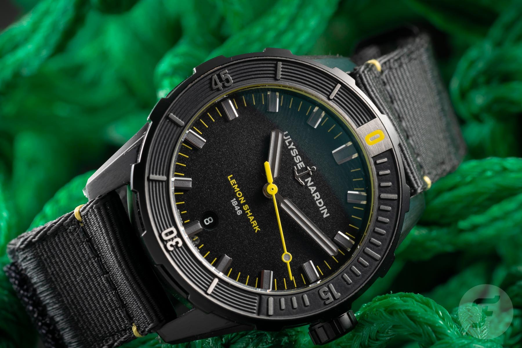
And naming a watch after an animal that could potentially kill me will absolutely not go unnoticed by my lizard brain. That’s why chances are pretty slim that you will ever see me wearing the Ulysse Nardin Diver Lemon Shark.
The perception of yellow
Again, I have nothing against the color yellow, including the shade used for objects that desperately need to be noticed, like road maintenance equipment. I don’t even mind the hue that induces states of anxiety and creates feelings of frustration and anger — according to color experts, some shades of yellow do just that. According to those same specialists, yellow also influences the left side of our brain, and that’s the spot where deep thoughts dwell. We must also take into account that the perception of yellow varies in different cultures. In the West, yellow is not very popular. A 2000 survey revealed that only six percent of respondents in Europe and the USA named yellow as their favorite color.
In China, on the other hand, yellow is way more popular as it stands for happiness, glory, and wisdom. And in Islam, yellow is the color of gold, and it also symbolizes wisdom. Dutch painter Vincent van Gogh might be the Western exception to the rule. “There is a sun, a light that for want of another word I can only call yellow, pale sulfur yellow, pale golden citron. How lovely yellow is!” he once said. And please remember that Van Gogh, during his life, sold just one single painting.
Unromantic and romantic yellow
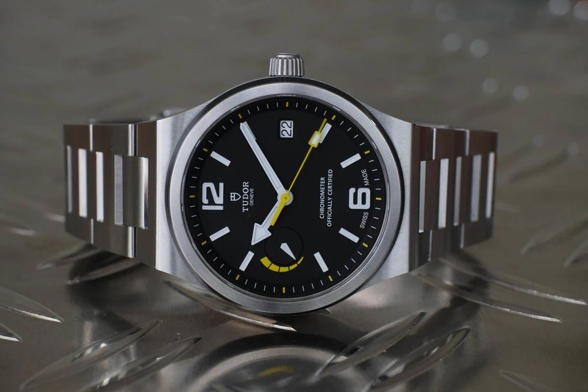
Enough with the mumbo jumbo and psychology already. Let’s talk watches. Watches with a combo of black and yellow — potential “Best Buy” watches. Well, the Tudor North Flag wasn’t. The watch debuted in 2015, and unlike the romantically retro Black Bay that was an instant hit with watch enthusiasts, the angular North Flag, with its yellow seconds hand and power reserve indicator on a black dial, was never a fan favorite during its six-year lifespan.
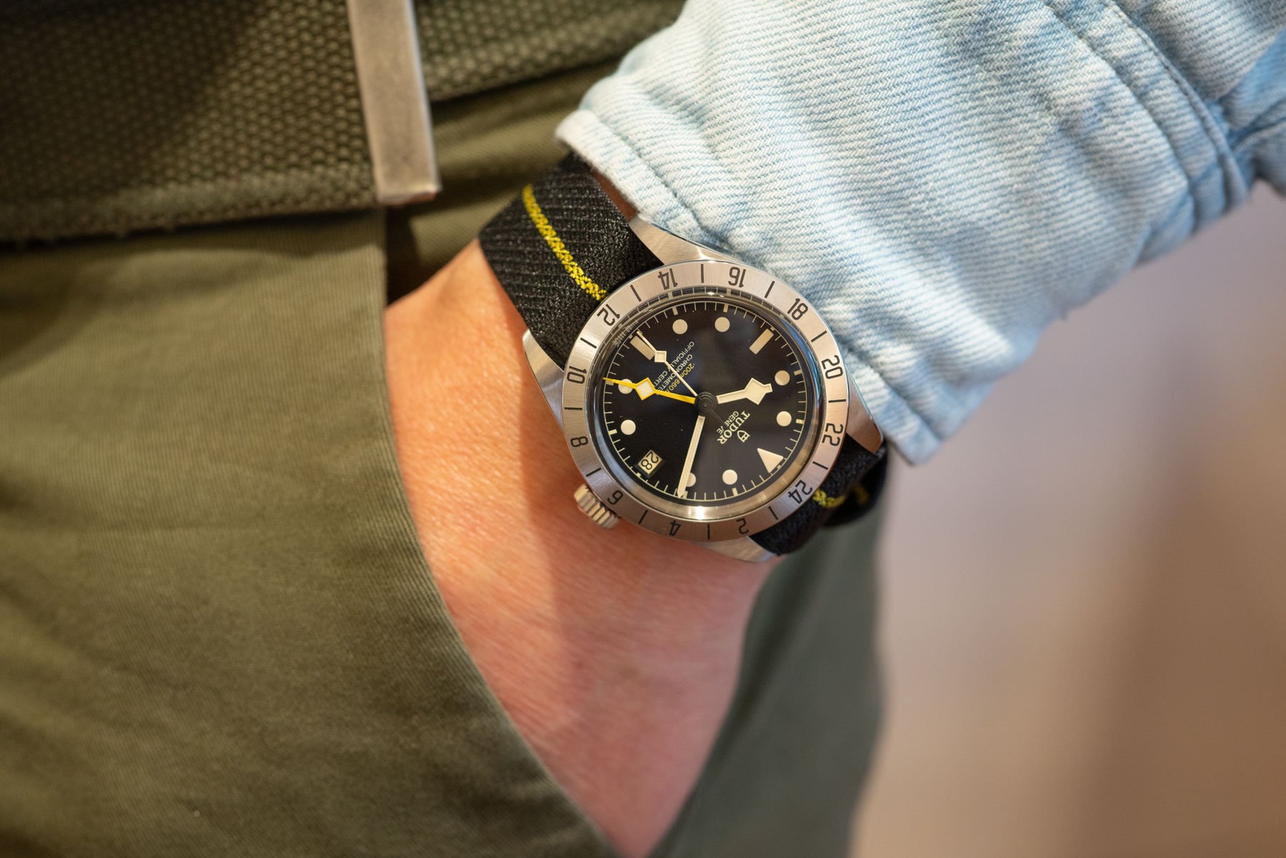
It probably wasn’t the color combination alone that made people think twice about buying it. I mean, the 2022 Black Bay Pro with its two yellow design elements is a fan favorite. You can probably guess why I think it works in this particular case — did I hear anyone say “Freccione”? — and it’s not the subtle, slightly warm shade of yellow that Tudor decided to use…
Fashionably yellow and subtly yellow
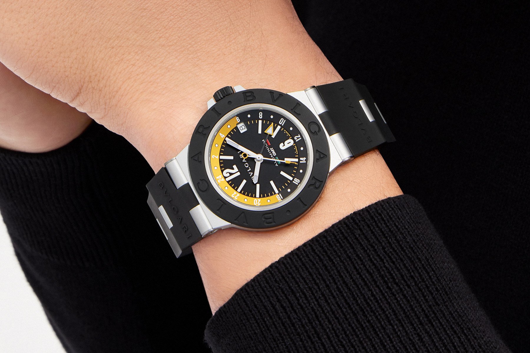
No need to elaborate much further. In the end, favorite colors and color combinations are very personal. You either like a specific color or you don’t, and the question of why is of no real importance. Therefore, let me just present you with a selection of watches that use yellow in different ways. There’s the fashionable Bvlgari Aluminium Amerigo Vespucci GMT, for instance, that uses a dark yellow color to help you on your travels. But in my humble opinion, it could do the same with the use of azure blue, the color of the Italian national football team.
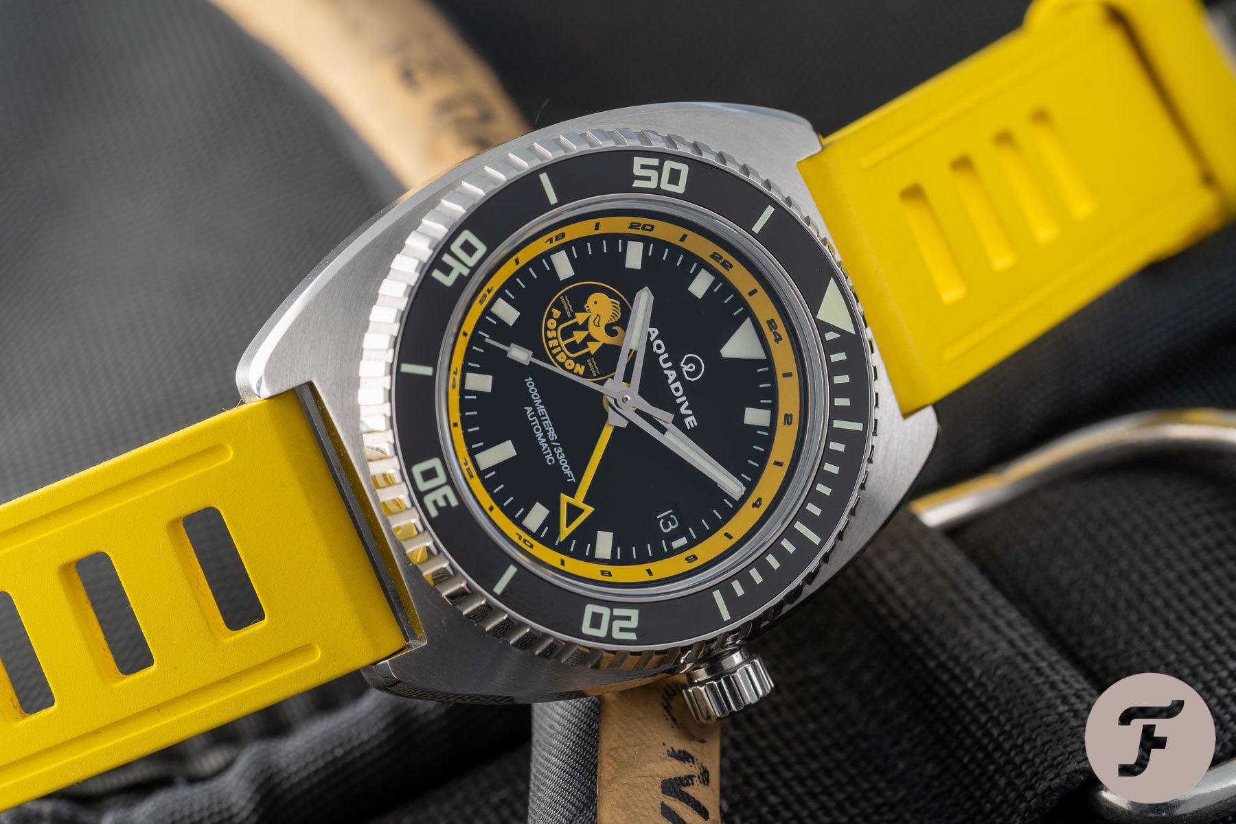
The Aquadive 100 GMT Poseidon Limited Edition is a diver’s watch that uses yellow to make itself visible in dark and murky waters. A completely yellow dial would do the same thing, but that’s just me expressing my taste.
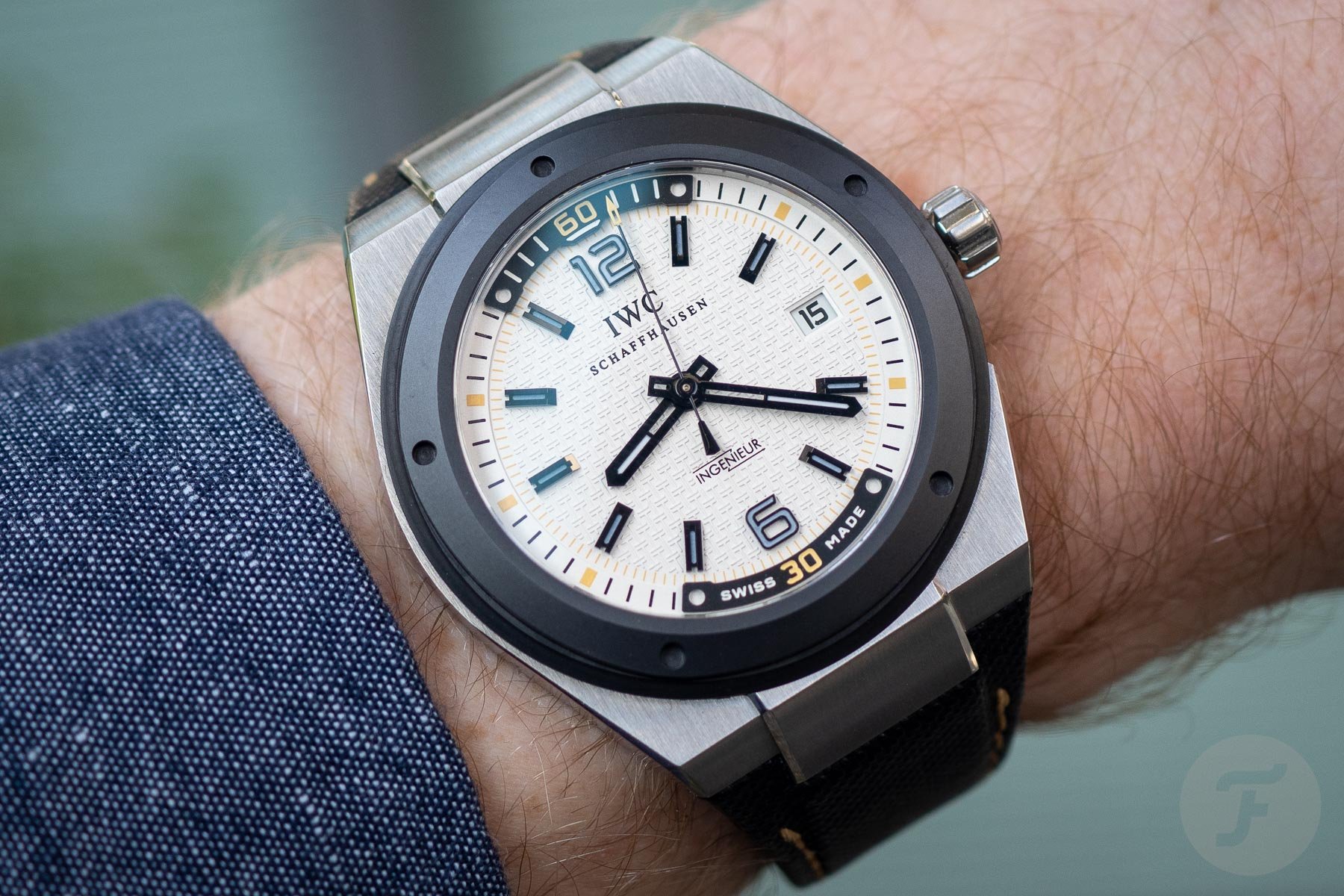
A dominantly white dial with a few yellow elements, like in the IWC Ingenieur Automatic Climate Action Limited Edition, is more to my taste. Yellow in combination with a lot of white is subtle and the total opposite of yellow on black.
Inevitable yellow
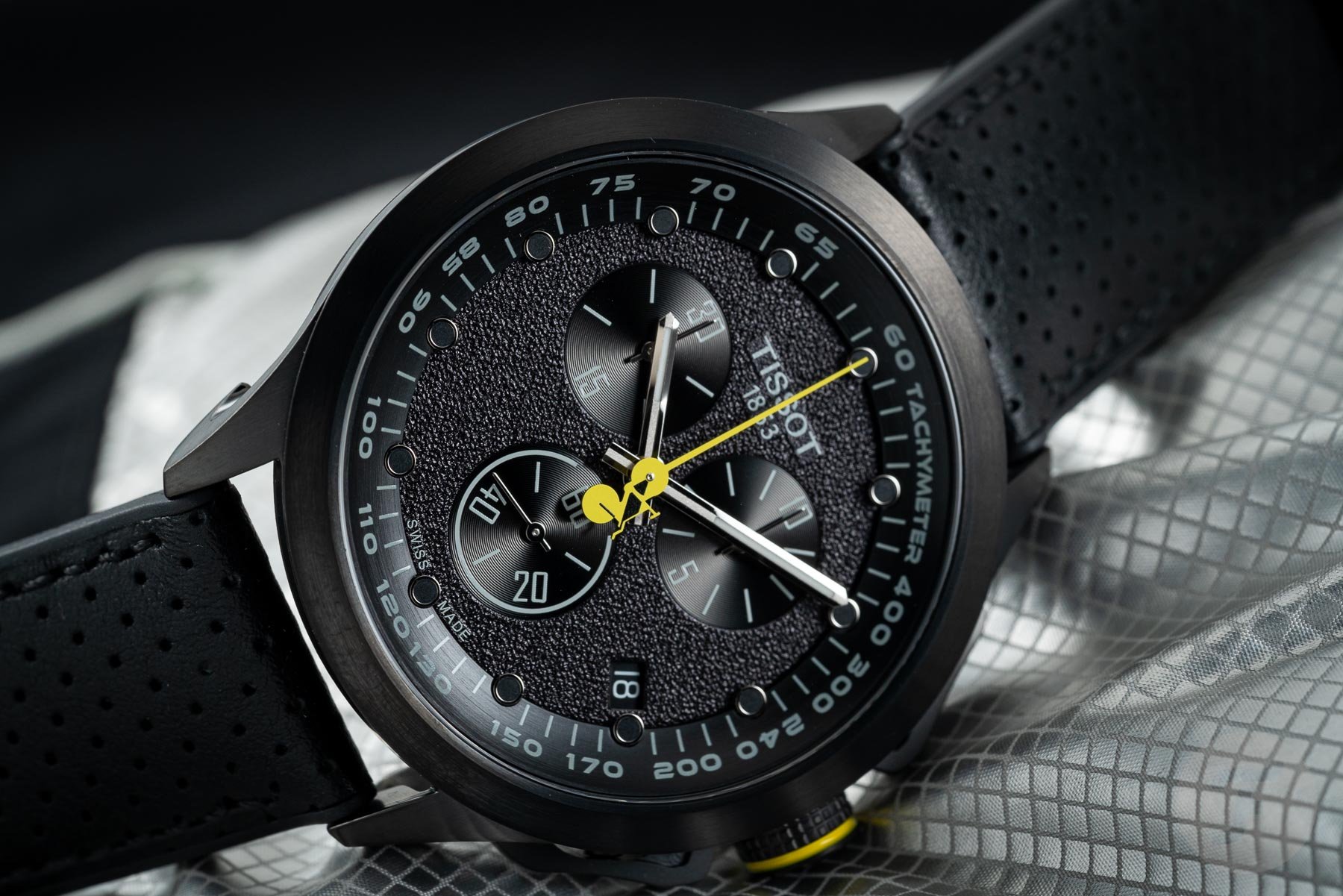
When you match a watch to a certain event, the event’s official color will usually be present in the watch. And since yellow is the color of the Tour de France — the French newspaper L’Auto was printed on yellow paper, and it organized the first Tour de France in 1903 — a dedicated watch by sponsor Tissot can’t deny the color. That’s why the Tissot T-Race Cycling 2022 Tour De France Special Edition is a watch that would look good on the “TdF” leader wearing the famous yellow jersey. And I dare to make the educated guess that the 2023 version of the watch will too. It’s simply inevitable.
Neo-vintage yellow
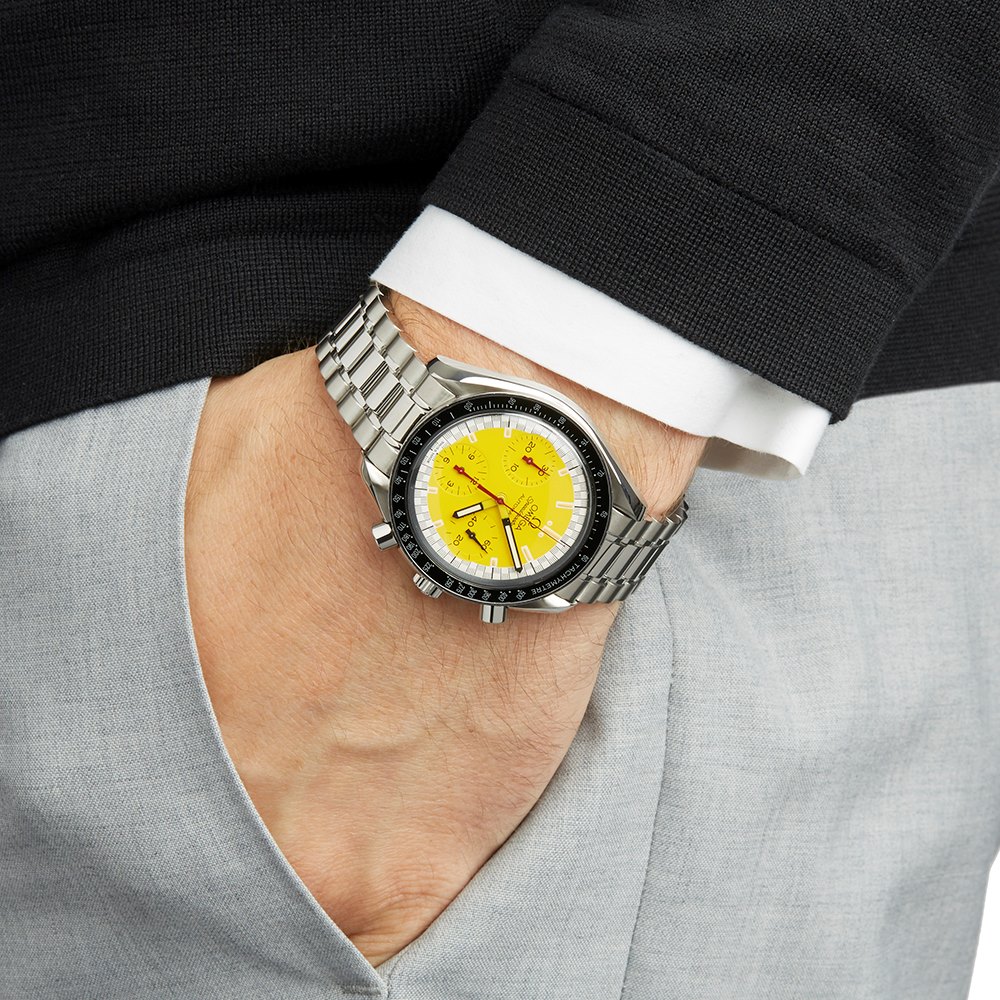
As I said before, I do like yellow dials — clear and functional bright yellow dials, that is, and preferably, in neo-vintage watches. The Omega Speedmaster Racing Schumacher is borderline because of the white surrounding the dial and the contrasting black bezel. In comparison, the newer Speedmaster Racing 40mm 326.32.40.50.06.001 that I used as the featured image for this article just doesn’t have enough yellow for me. The little touches of yellow are a bit timid — too timid for a ready-to-race chronograph, I think.
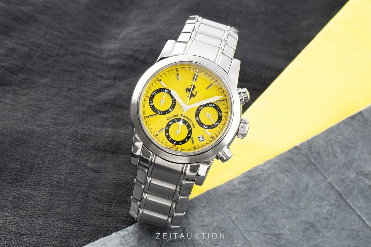
A Girard-Perregaux Pour Ferrari ref. 8020 in Modena yellow is more to my taste, I guess, and kind of in line with my watch resolutions for 2023. If I manage to come to terms with the black rings around the three sub-dials, that is. Luckily, the watch has a full-steel bezel to soften the overall look and vibe.
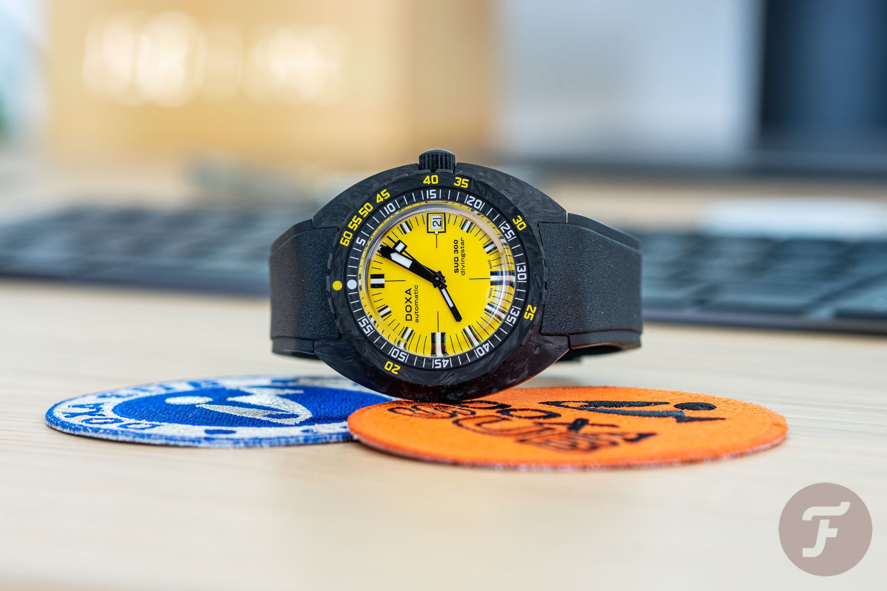
The Doxa SUB 300 Divingstar — that’s the Doxa name for yellow — might be a contemporary watch, but its styling is about five decades old. I do like the version in steel with a steel bezel on a yellow rubber strap and with very little black in sight. But the more modern Doxa SUB 300 Divingstar Carbon sets off the alarm in my head; there’s way too much contrasting black and yellow. The forged carbon case of the Sub 300 Carbon is awesome, though, and in combination with an orange dial — Doxa gave that hi-vis color the name Professional — it looks just as instrumental and functional as the Divingstar but way less harsh/dangerous.
A colorful conclusion: don’t take yellow too seriously
What’s your opinion on the use of yellow in watches and the combination of black and yellow in particular? Am I taking the color too seriously? Do I need to find a way to minimize the influence of my primal lizard brain? Maybe I should think like the late Bobby Unser, the very successful race car driver who had to deal with a lot of yellow flags signaling an accident on the racetrack. He once said that “yellow usually means it’s not that serious,” and maybe I should remember that next time I see a watch dressed up as a poisonous frog.
Find and follow me at Lex Stolk • Instagram.


