Omega Constellation Manhattan — 52Mondayz, week #8-2020
After wearing the massive Omega Seamaster Ploprof in my last installment of 52Mondayz a couple of weeks ago, it’s now time to discuss something on the other end of the Omega spectrum. For this week’s 52Mondayz I chose to wear the first generation Omega Constellation Manhattan. It’s an icon from the 1980s that started a new line of watches.
That line welcomed its latest generation just three weeks ago. If that’s not a nice reason to dedicate this article to the first generation of the Omega Constellation Manhattan, I don’t know what is.
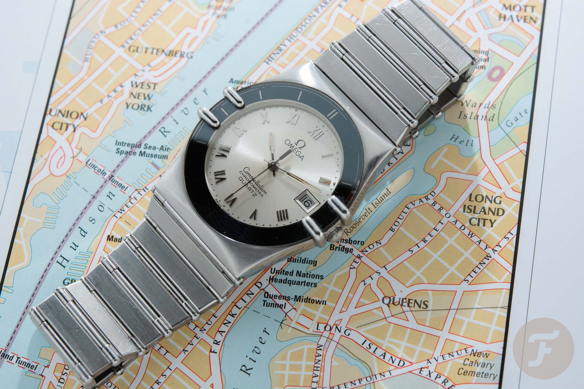
Wearing the Omega Constellation Manhattan feels like coming home every time I put in on my wrist. It’s a feeling of recognizing everything that’s so good about it over and over again. I have had my stainless steel version with a champagne dial for a couple of years now. That came after years of refusing to believe the Constellation Manhattan could ever be a watch for me. Over the last three years, the watch has grown on me tremendously. Moreover, it has also sparked a “healthy” obsession for the first generation Constellation Manhattan.
Strangely familiar and comfortable.
I was born in the seventies but grew up in the eighties. It makes sense to me that a watch created in the eighties feels strangely familiar and comfortable. I say strangely because as we all know the 1980s aren’t remembered as the most stylish decade, the most refined in music, or the most prolific in watches. But hey, popular opinion can be wrong sometimes. And here’s why…
The decade of decadence
I myself have denied the influence of the eighties on my own life for a long time. In my early thirties, I realized the decade of decadence had a great impact on my life. Only then was I able to embrace what I had, up until that point, regarded as a decade without style.
From the vivid picture that Bret Easton Ellis painted of the eighties in his novels like The Informers and American Psycho, to the influential music of The Smiths, Depeche Mode, and Huey Lewis & The News, to the incredible John Hughes movies like The Breakfast Club and Ferris Bueller’s Day Off, these eighties’ influences have played a subliminal but pivotal role in the development of my taste and preferences. And the Omega Constellation Manhattan is another one of those examples. The 1980s brought us some amazing things that stand out in a landslide of wasteful products lacking depth and style.
The Unique Design
You could debate whether the design of the Constellation Manhattan is a typical eighties design, to begin with, or whether it has become synonymous with the eighties because of its release in 1982. Thanks to Omega Constellation collector Desmond Guilfoyle who did an interview with Constellation Manhattan designer Carol Gygax-Didisheim — that can be found here — we know a lot about the revolutionary design of the watch.
Among those designs was a sketch that would form the basis of the first generation Constellation Manhattan.
The story starts in 1980 when the 26-year old Carol Didisheim starts working at Omega. She was straight out of the School of Decorative Arts in Geneva where she studied jewelry design. During her first year at Omega, she sketched a lot of watch designs. Among those designs was a sketch that would form the basis of the first generation Constellation Manhattan.
But the Constellation Manhattan would not have been the same without the input of then-Omega-product-director, Pierre-Andre Aellen. He got the inspiration for the use of the iconic claws from an unframed bathroom mirror that was mounted to the wall by eight claws. The claws made sure that the technique of ‘printing under glass’ could be made possible to keep the profile of the watch very thin.
The four claws
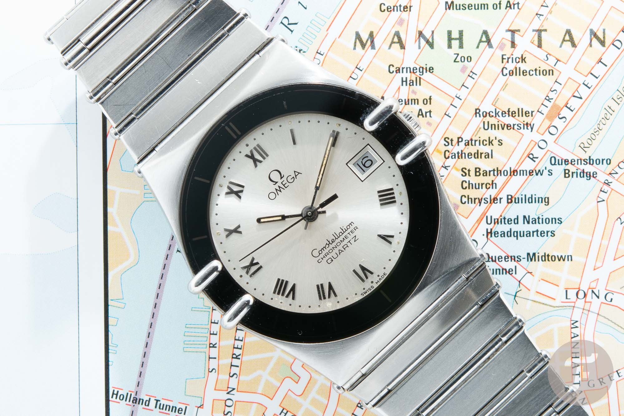
Didisheim and Aellen got rid of the bezel and incorporated the hour markers into the crystal by using the revolutionary printing under glass technique. The four claws pressed on the crystal to keep it in place resulting in a very thin watch. Didisheim designed the integrated bracelet afterward, ensuring it paired well with the essential claws.
At the time of the introduction in 1982, the Omega Constellation Manhattan was not only unique in its design but also revolutionary in some of the techniques that were used to realize the concept. It makes the story of the watch even more special. The more I look at the little details of my Constellation Manhattan, the more I start appreciating the work that went into creating it.
The Different First Generation Models
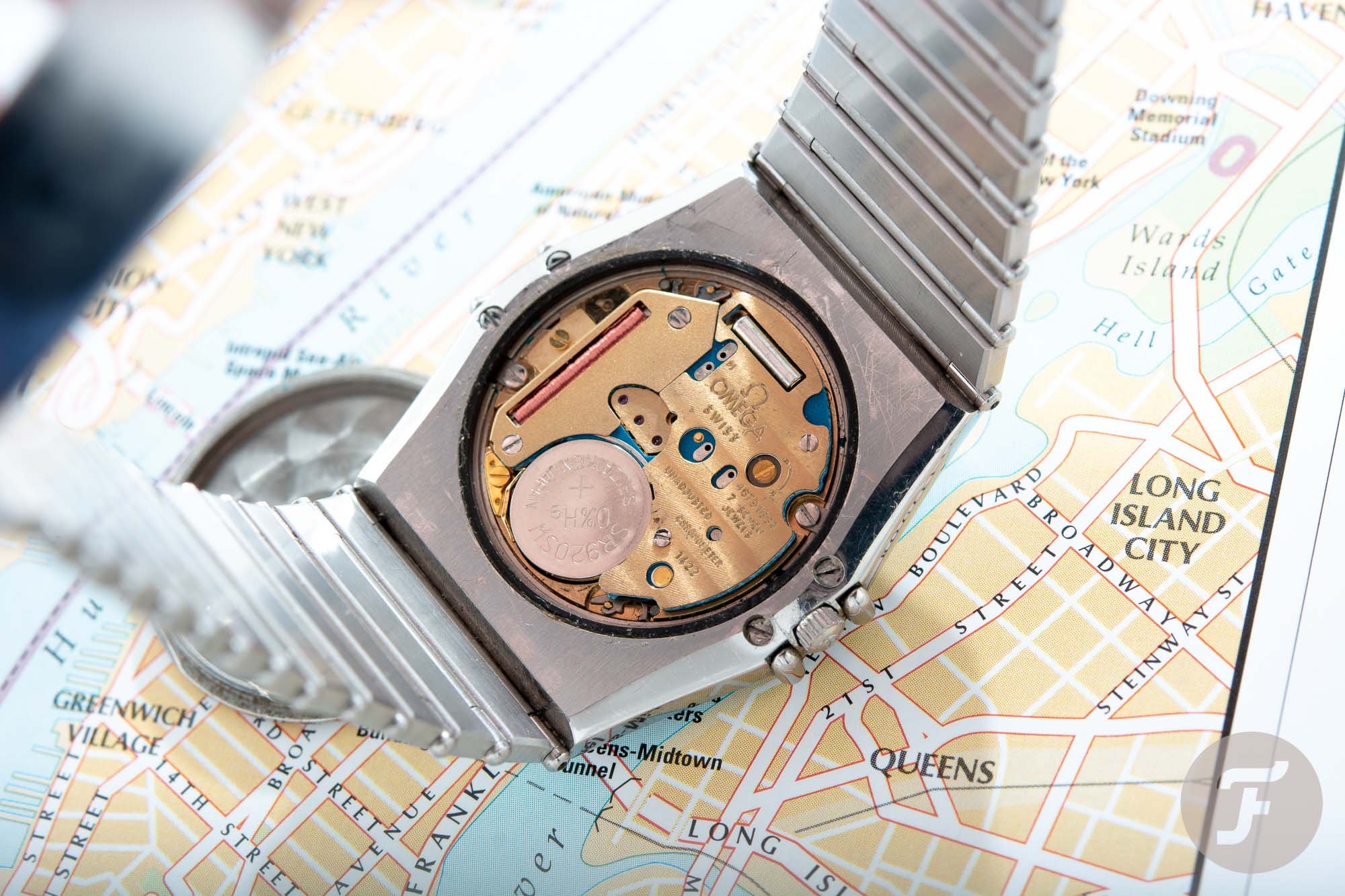
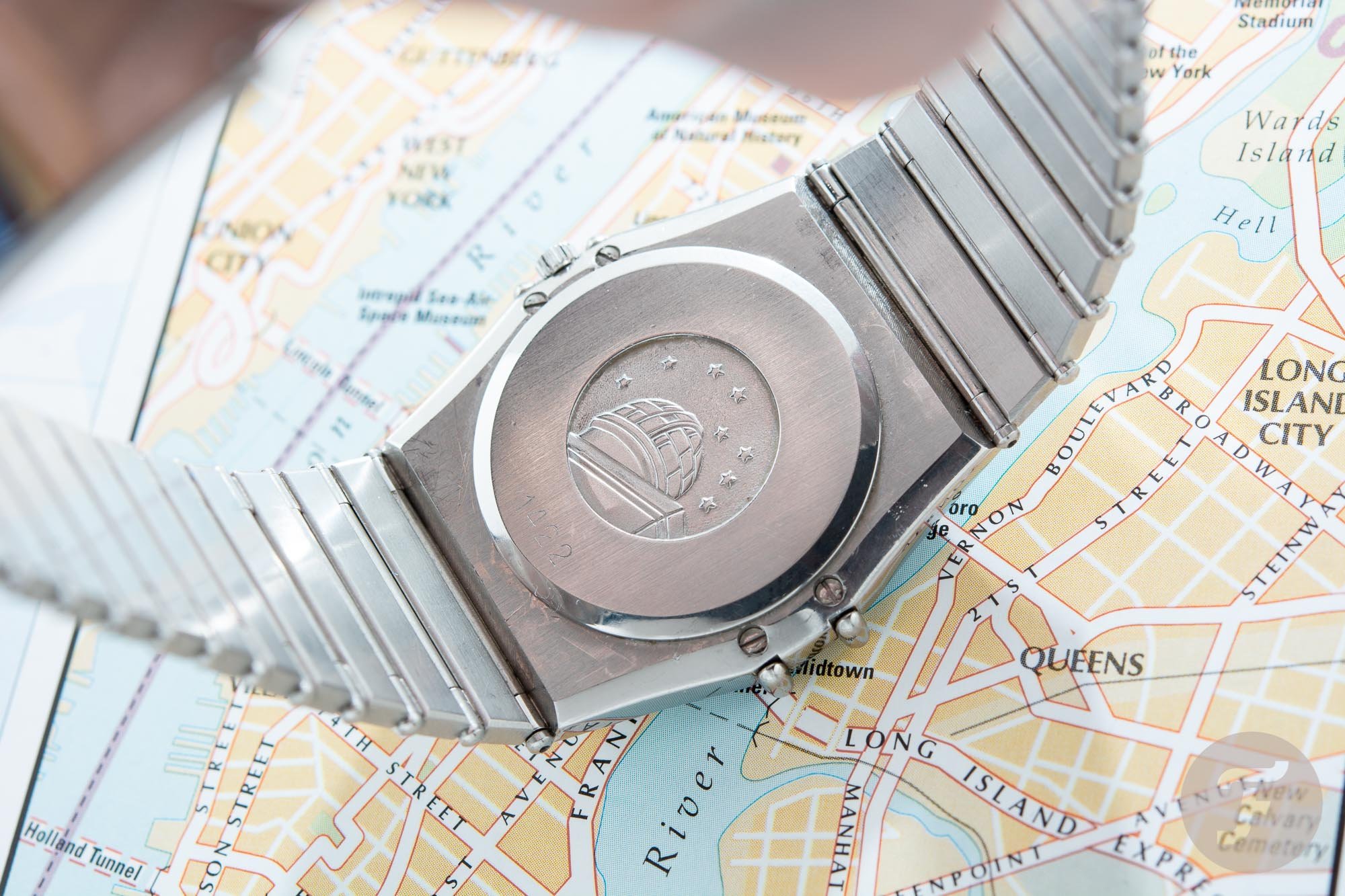
Omega decided that the Constellation Manhattan was to be the new flagship of the Omega collection in 1982. The watch was subsequently introduced in a variety of colors and materials, in both men’s and women’s sizes. You had the choice of stainless steel, steel & gold, or a full gold version. Additionally, you could choose between a black, gold, or champagne-colored dial. The first models on the market were powered by the caliber 1422, an ultra-thin quartz movement was developed jointly with ETA. In 1983 Omega introduced the caliber 1431 movement for the Manhattan model. This new movement was a world’s first quartz movement to feature a servo-control system for the stepping motor that made using the watch’s features a lot easier and resulted in saving battery power.
This automatic version was produced for only two years…
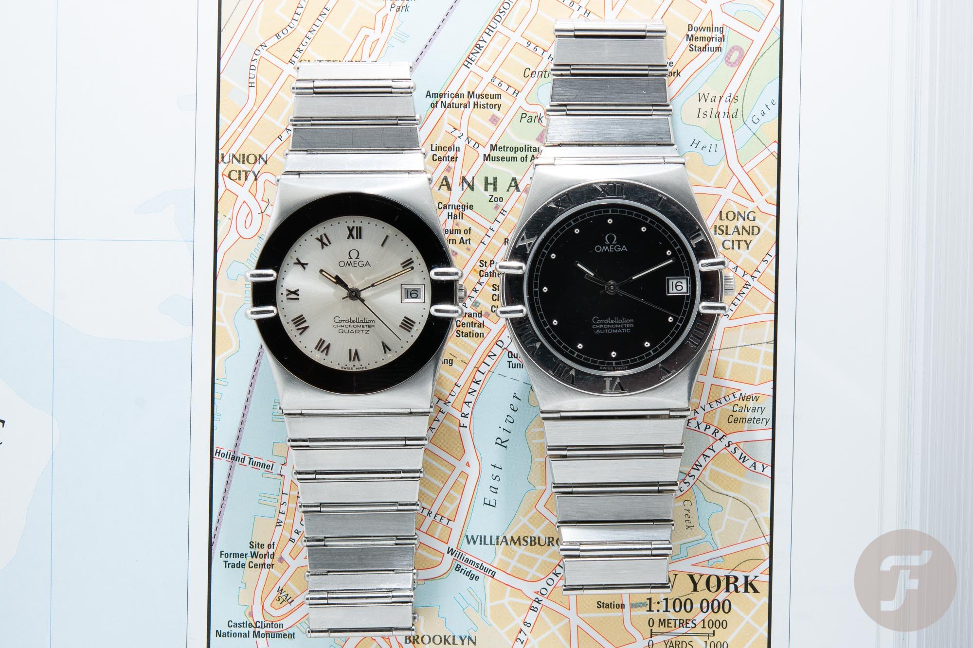
In 1984 Omega decided to add an automatic version of the Manhattan. Caliber 1111 chronometer-certified movement, based on the ETA 2892-2 movement was chosen for the task. This automatic version was produced for only two years — in 1984 and 1985 — and therefore has become quite a rarity on the pre-owned market. The previously mentioned Desmond Guilfoyle also wrote an interesting essay on this highly sought-after first-generation automatic Manhattan that you can read here.
A more conventional version
A couple of years after the introduction, Omega decided to update the design and let go of the unique printing under glass technique. Instead, the brand trialed a more conventional version. This time, a normal bezel engraved with Roman numerals, was used. The numerals, which had been part of the dial on the first-generation Manhatten, were replaced by dots. Although the new version still featured the iconic claws, their raison d’être was no more. Instead, they were nothing but a decorative addition. They’ve remained that way ever since. Although I love how Omega has always stayed close to the initial design of the Constellation Manhattan over the course of almost forty years, nothing beats that original version with its unique design and groundbreaking technical ingenuity.
Wearing The Constellation Manhattan
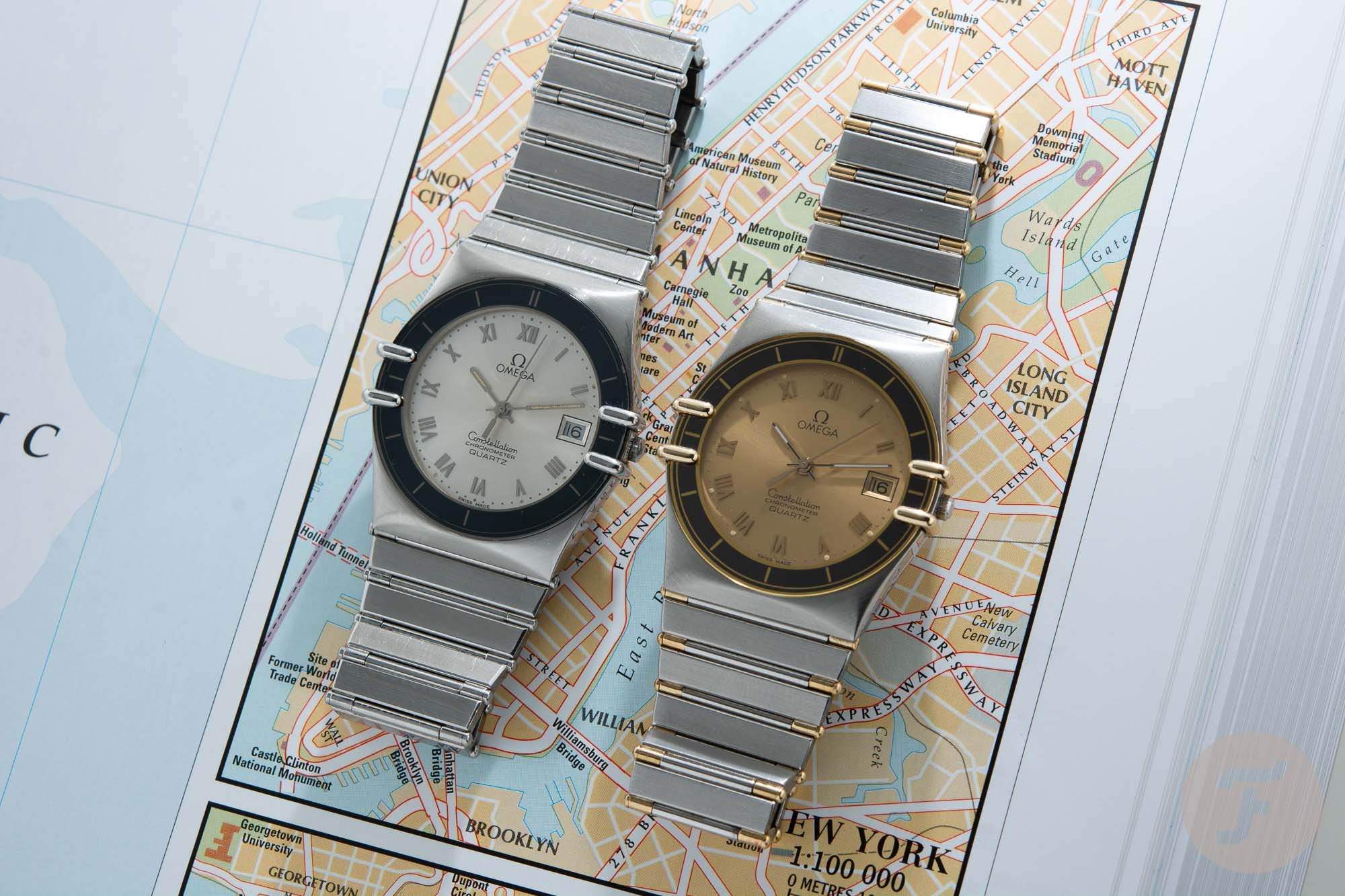
I bought my 1984 stainless steel caliber 1422 Constellation Manhattan with a champagne dial almost three years ago. In those three years, it has become one of my favorite watches for a number of reasons. First of all, it’s the version that’s the most neutral or least flashy. If you compare it to Robert-Jan’s gold and steel version with the gold dial, you can see there is a huge difference in presence. It’s not that I love one more than the other but the thing I absolutely love is that although it is the most understated version of the first generation Manhattan. It looks incredibly classy. That’s thanks, in large part, to the black and champagne color combination.
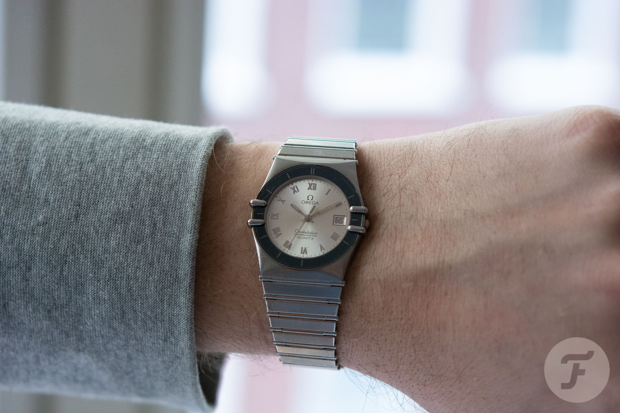
Secondly, I really like the combination of design elements that make the face of the watch. The champagne dial, the claws, the Roman numerals on the dial, the incredibly slim handset, the date indication at 3 o’clock, and the black ring with the hour markers are perfectly balanced and have room to breathe with a small case size just under 33mm. Which brings me to one of the most surprising and amazing features of the watch.
A lot bigger than its measurements suggest
The Constellation Manhattan wears a lot bigger than its measurements suggest. By today’s standards, a size just under 33mm would be considered a women’s watch and not a big one at that. But the combination of the barrel-shaped case and the incredibly comfortable integrated bracelet gives the watch a presence that’s at least a couple of millimeters bigger than the actual 33mm. Because of those elements, I can wear the watch without it ever feeling too small.
I sometimes forget I am wearing a watch at all.
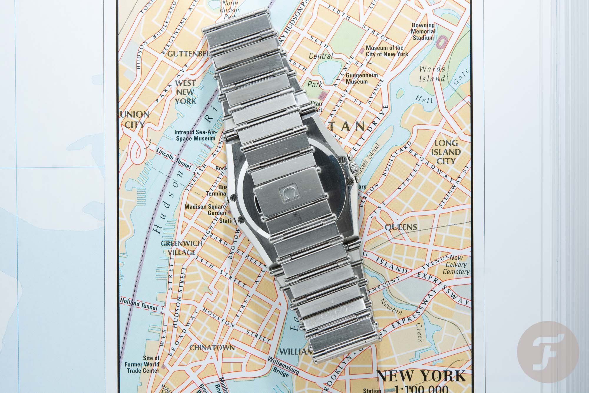
All those things together mean that this watch wears more like a bracelet. It’s light, it’s comfortable, and it’s an absolute joy to wear. There are no sharp lines to be found on either side of the case or bracelet. Even the back of the case has rounded edges. These help to make the watch so much more comfortable. It is so unintrusive on the wrist, in fact, I sometimes forget I am wearing a watch at all. That is until I take a look at the incredible design of the Constellation Manhattan. I’m instantly reminded that I’m wearing a watch that was the crowning jewel of the Omega collection 38 years ago.
A Collection Of Constellation Manhattans
All credit goes to Carol Didisheim and Omega for creating a watch that is not only unique in its looks, technically innovative, but also very comfortable to wear. The fact that Didisheim achieved this at age 26, fresh out of school, makes the story even more compelling. Combine it with the incredible ad campaign that features one of the eighties’ kings of cool Robert Wagner (that you can find in this article on Omega ads) and you will probably understand why the Omega Constellation Manhattan is, for me, the watch of the 1980s.
Sure there are other eighties icons. Take Genta’s Cartier Pasha or the Ebel Sport Classic Chronograph, for example. But none of these pretenders comes close to the iconic first-generation Constellation Manhattan. As a result, I have set my sights on adding more of the first-generation Omega Constellation Manhattans to my collection. All because the 1980s turned out to be an incredibly influential decade in my life. And what better way to celebrate than with the biggest watch icon of that era. Visit Omega online for the current collection of Constellation Manhattan models.

