Q Timex: A Hands-On Review With A Killer Quartz Watch
No, don’t worry: You’re not in a time warp. Yes, Timex has just released the Timex M79 Automatic, and yes we know that this is not that model. This is last year’s Q Timex. It’s ready to be reviewed after spending several weeks (in total) on my wrist. And you know what? It’s not half bad…
Let’s get this out of the way fast: The Q Timex is a quartz watch, not a mechanical watch. For those of you that don’t care for quartz, I urge you to stay your clicking finger for just a few minutes more. While I too am rarely one for crystal-regulated heathens, I occasionally make exceptions when the shoe fits. I own (and adore) a Breitling Aerospace. A mechanical version would be pure sacrilege, so I’m aware that feeling can go both ways. Quartz is not a bad thing. It is a bad thing when it is applied lazily. Or, even worse, thoughtlessly. But when it’s used for a reason, it can be just as satisfying (in its own way) as a mechanical timepiece.
A deeply held personal philosophy
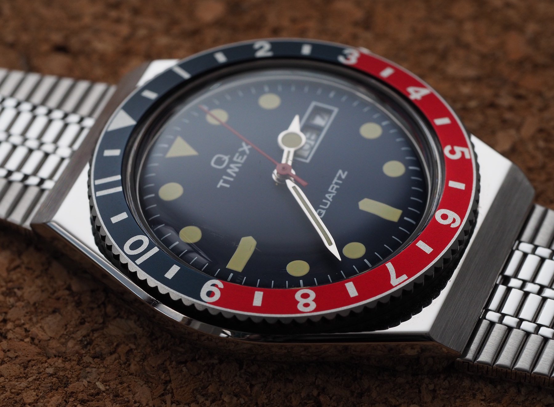
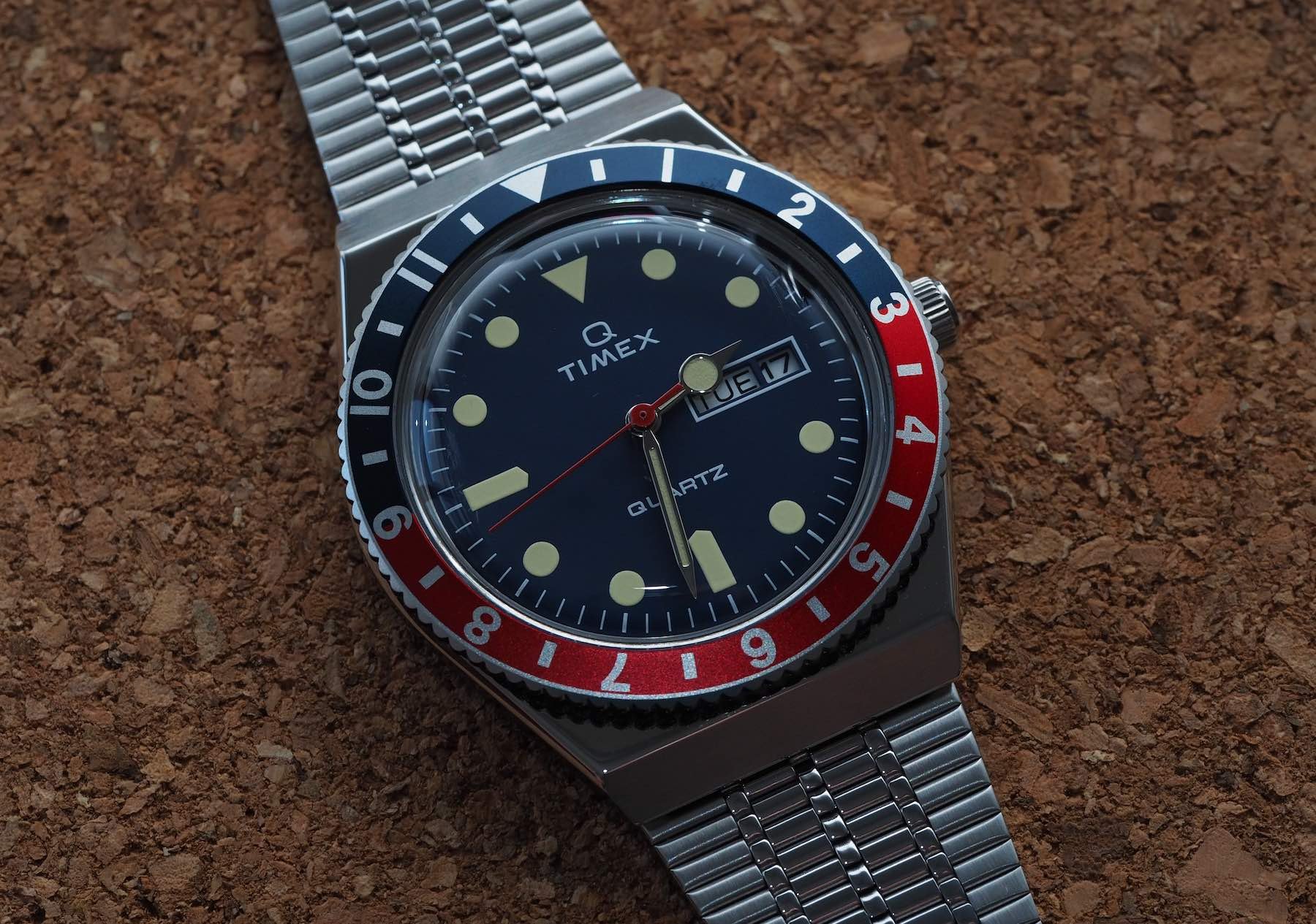
There are those who will tell you the M79 automatic is better. Sure, they’re entitled to their opinion, but I disagree with them. I disagree with them strongly. There are some very subjective reasons for that (I think the Pepsi bezel is better than the Batman; I think the red hand on the M79 looks like it wandered out of the painting room and got lost; I think the added thickness makes the watch look imbalanced and cumbersome), but there is actually a deeply held personal philosophy that is compromised by the M79 and satisfied by the Q. Allow me to explain.
Creativity without boundaries
I am, for want of a less damning term, obsessed with watches. I look at the design of a watch as a harmonious whole. No one thing should exist independently of any other. A watch should be designed for a purpose and every design decision should follow that route. Most importantly, designers must be aware of their limitations. They must design within themselves.
If you have no budget and you decide you’re going to make a tourbillon, you’ll end up with one of those God awful Kickstarter projects that claim to be “turning the luxury industry on its head,” when it’s patently clear no one in the building has even considered the definition of luxury. Worse still, brands of that nature are hooked on “disrupting” an established industry when, in reality, the only thing they are capable of disrupting are the contents of my stomach.
Ambition is great. Realism is better. Creativity without boundaries is a mess. It is the walls erected around art of watchmaking that makes designing a classic watch such a challenge. And I don’t mean walls of prestige or status or wealth. I mean literal rules that must be adhered to if you want the blessed thing to tick.
The best of nothing
Designing within the limitations of one’s goal is an art form. Not a flashy art form, but an art form nonetheless. Making smart, cost-effective, manufacturing-centric decisions is underrated. The guys and girls at Timex (those behind the Q) nailed it. Here we have a period-appropriate, super slim, deliciously genuine quartz watch that focuses on bringing a classic bang up-to-date and little more.
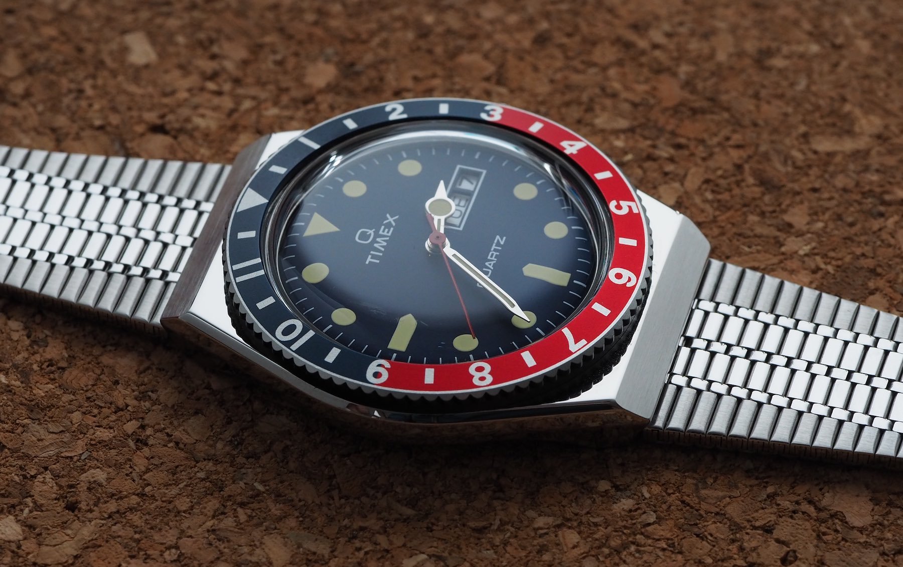
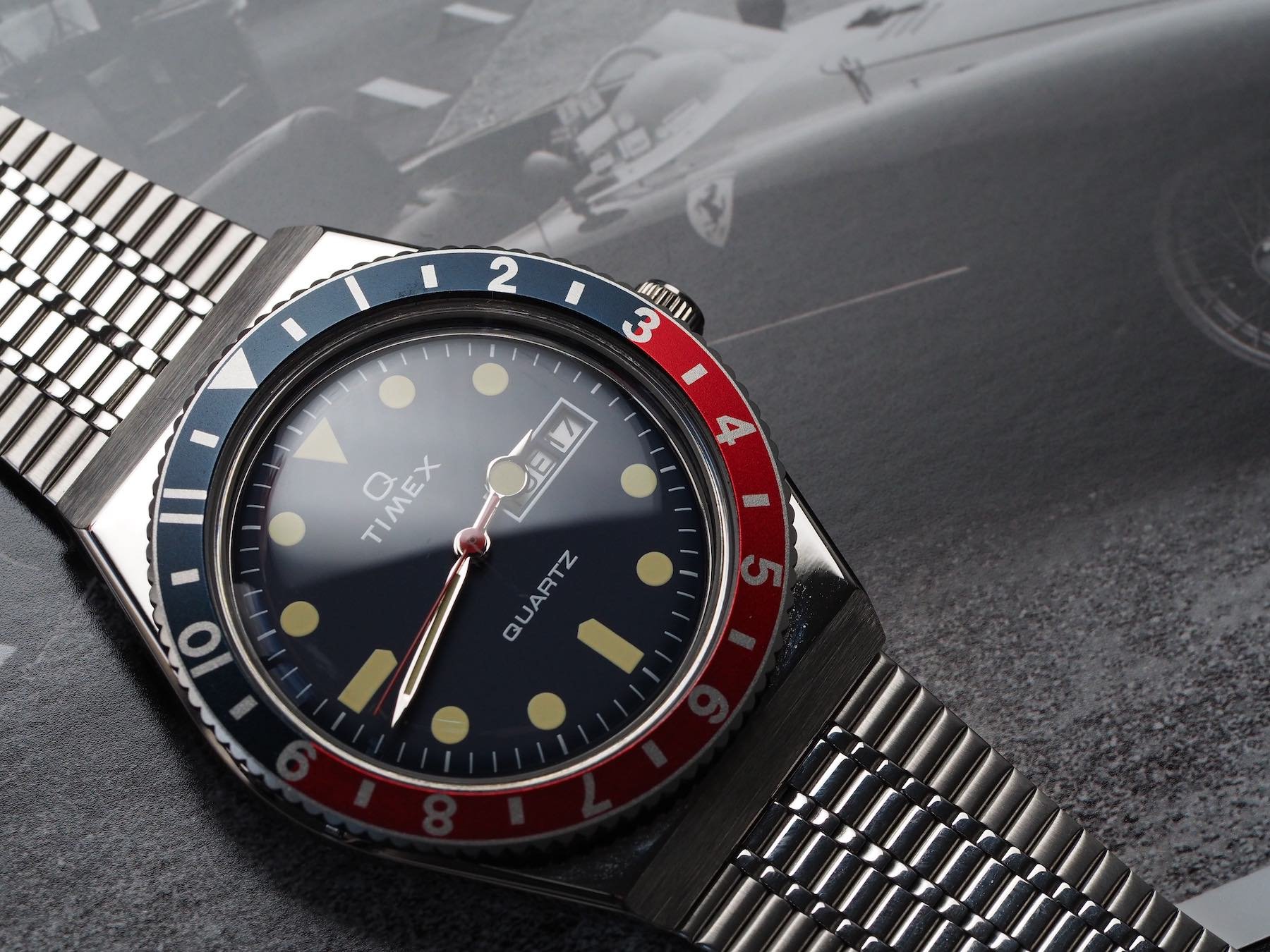
The 2019 version I have on my wrist has all the calling cards of its predecessor — the warm distortion of the hesalite crystal, the coin-operated battery hatch that reminds any child of the ‘80s of a Soviet submarine, the surprisingly comfortable bracelet that, amazingly, does not have a vendetta against arm hair — and executes them to the standard to which customers in 2020 have become accustomed.
Meanwhile, the M79 is the best of nothing. It is more than 100 bucks more expensive. It has a “fine” but boring movement inside it. And, in my opinion, it has a far duller colorway. And it’s just not what this range should be about. What does it think it is? Does it think someone who wants a Rolex GMT Master II Batman is going to buy that and be happy about it? They may well do, and may well be (for a couple of weeks). But it just ain’t the real McCoy. Meanwhile, the humble Q Timex isn’t pretending to be anything other than a cheap and cheerful quartz watch that is gleefully proud to be the future. At least that’s what it thought in the seventies…
Humility and performance
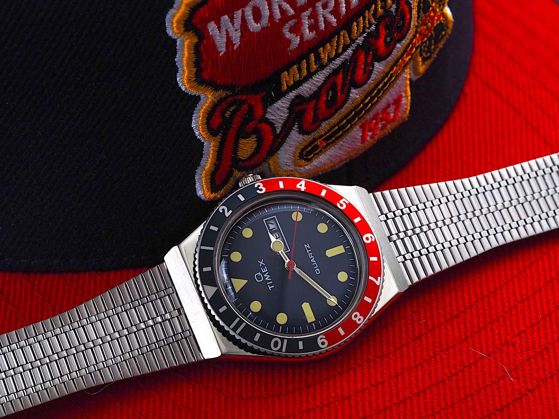
The Q Timex comes in a really nice box, is easy to adjust (although you may need a knife or nail file to prise open the sliding clasp at first), and supremely comfortable on the wrist. It weighs barely anything and that bracelet is just about as well machined as I could have hoped for given the price point.
In fact, that’s unfair. For the price point, the bracelet is absolutely brilliant. Because it doesn’t try and copy anything wildly famous, it doesn’t look like a cheap copy. It just looks clean and crisp and totally well-realized.
The domed Plexiglass looks great but it does pick up scuffs pretty easily. I put a line down the middle of mine following a relatively innocuous knock just a couple of weeks after strapping it on. It didn’t bother me too much and a soft cloth and a bit of toothpaste (the regular kind, not the stuff with hard particles in it) buffed it out well enough for me to not notice it without a loupe.
I love it
Some people will hate the fact the bezel is friction-fit rather than sprung. I must admit, an added click would be appreciated as I have knocked it accidentally a couple of times after setting it up to show a different timezone. The advantage is, of course, the ability to track any time zone you please (including 30- and 15-minute increments). Rotor-click bezels rarely accommodate for that.
Swiftly put, I love it. I think that if you’ve got a teenage kid who’s showing an interest in your watch collection, this would be a neat option with some collectors’ provenance from a great brand with a fascinating history. It wears well on wrists of any gender thanks to accommodating size and refreshing levity. The Q Timex is available for €179 you can’t go far wrong. You can read more about it here.


