Eccentricity Squared: A Look At The Rado True Square Designer Collection
Some people may be surprised to hear that reviewing watches isn’t always a walk in a park. It’s not a binary process — “Is this watch good? Yes/No”. There’s more to it than that. Watchmaking and design is an art form, which you have to consider when reviewing a watch. Just because you don’t inherently love a watch, it doesn’t make it wrong. Art is meant to evoke some kind of emotion or discussion, so if a watch does that, then surely it’s a success? This philosophical question was very much at the fore of my mind when I spent some time with the Rado True Square Designer Collection watches.
Obviously, I will look at the raw details of these pieces, as that’s always a “must” when trying to describe watches to people. The physical details always matter, but they form a part of the bigger picture. In itself, saying that is a bit of a cliché, but here we are.
Old man wisdom
I want to start with my initial impressions of the watches. On the surface, I wasn’t too keen on them, if I am frank. Perhaps barring the yellow Tej Chauhan model, I struggled to make any connection to these watches visually. You know that feeling when you see a watch, and you have your Wayne Campbell moment? “It shall be mine!” — Nope, nothing of the sort here. Quite the opposite, everything about these watches was putting me off. My cold heart thawed a little when I started trying them on, but I struggled to connect to the watches, and I was worried about writing this article!
I then had a conversation with my friend and esteemed colleague, Rob “The Pilot” Nudds. He immediately pointed out that these were not meant to be watches. That perplexed me a little. Here I was sitting with this so-called “not-a-watch” on my wrist, telling me the time. But no, Nuddsy always knows better. He described the Rado True Square Designer watches as objects that tell the time. For a moment, I scoffed at him and was about to ask him for some of whatever he was smoking, and then I realized there was some sense in this old man’s words.
In collaboration with…
You may have noticed that each of the Rado True Square Designer Collection of watches is a collaboration with a designer. The name subtly hints at that. So, of course, these watches are not a sole representation of what Rado envisaged the watch to be. These watches are a unique artistic representation of what each collaborative partner envisaged what the True Square “could” be. At that moment, I sadly realized that Nuddsy was indeed right, again. These watches are indeed not supposed to be watches, but rather objects that just so happen to tell the time.
That’s the critical thing I think you have to consider with these watches (yes, I will keep calling them watches to avoid any confusion). If you try to take them purely for how they look on the surface, you’ll likely be disappointed. Instead, we must look a little deeper and enjoy the journey and design process that the collaboration partners take us on. We get a look inside their heads. That is what these watches are all about. The fact that they tell the time is just a nice bonus.
Solid little tickers
Despite their very different aesthetical characters, all of the watches remain united by their underlying specifications. A 38mm ceramic case holds the Swatch group’s impressive Powermatic 80 movement, giving these watches 80 hours of power reserve. Eighty hours is nearly double what many more expensive watches can offer, so that alone is not to be scoffed at. Let’s take a quick look at each of the five models I had on hand.
True Square Over The Abyss
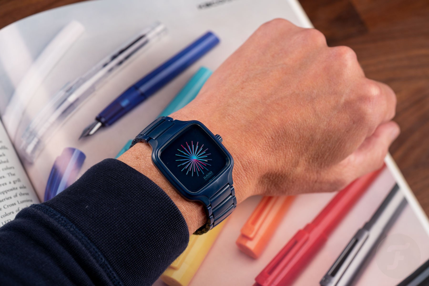
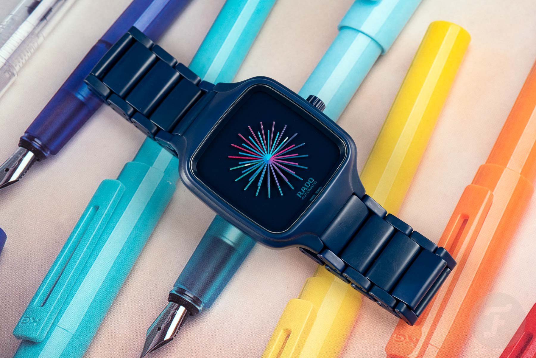
The True Square “Over The Abyss” is a design collaboration with the New Delhi artist duo Thukral and Tagra. The artists’ vision was to represent all the different timezones worldwide to symbolize how we are all connected. This is not a GMT watch, so 37 “hands” (18 hour hands and 19 minute hands) represent the different time zones, painted in a rainbow of colors ranging from pink to blue.
This does make it a little harder to read the time at a glance, but remember my point above? This is art, darling. Time is a secondary feature. Two of the 37 “hands” have luminescent tips to indicate the current hour and minutes. The matte blue high-tech ceramic case and bracelet feature a blue PVD-coated titanium caseback with a unique engraving created by the Indian designers called Dominus Aeries.
True Square x Yuan Youmin
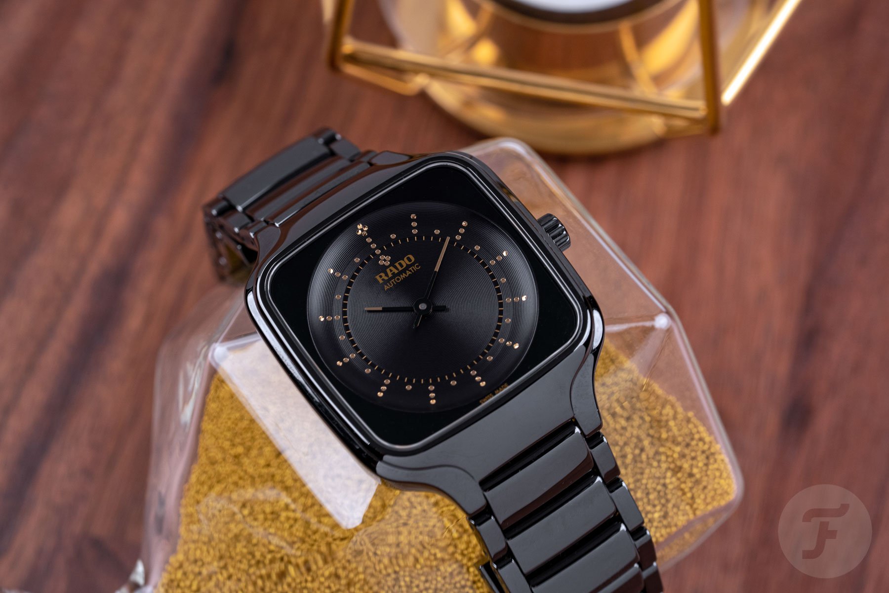
The next watch collaborates with a Chinese graphic designer and professor at the China Academy of Art, Yuan Youmin. For his design, he took inspiration from the classic steelyard scale, which has been used in China for over 2,000 years. The steelyard scale is a portable instrument for weighing things and is composed of a horizontal balance beam suspended from a fulcrum. A plate is attached to the shorter end, and a sliding bronze counterweight is moved along the beam until both arms are balanced at the pivot.
Youmin cleverly incorporates the weighing tray on the dial concept with a recessed, central bowl, highlighted with a lightly snailed pattern. The hour and minute hands interpret the balance beam or arm of the scale. The case back reveals the Chinese symbol for eternal rebirth, the phoenix. Rado uses its glossy black high-tech ceramic for the case and bracelet, although the folding clasp is titanium.
True Square Tej Chauhan
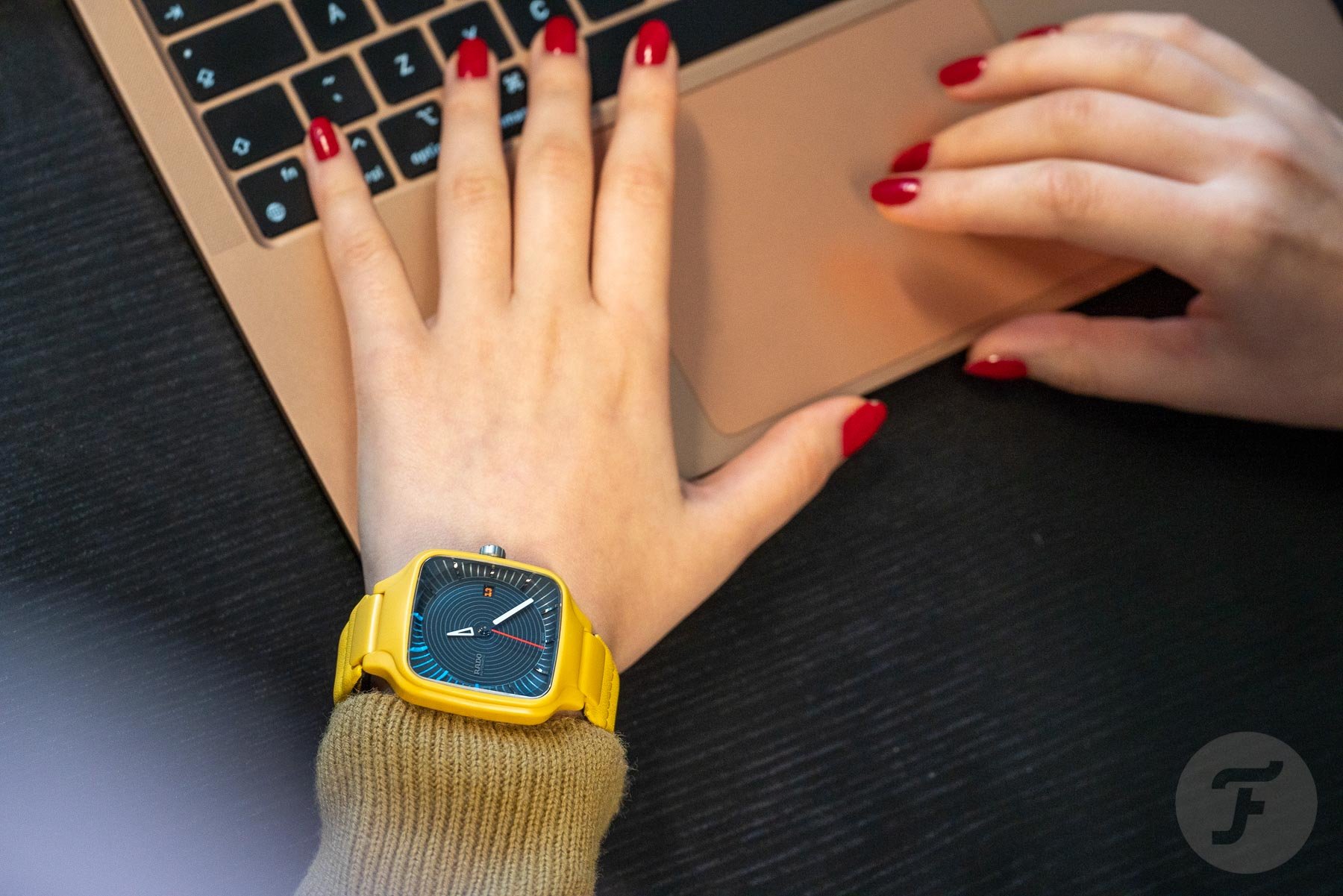
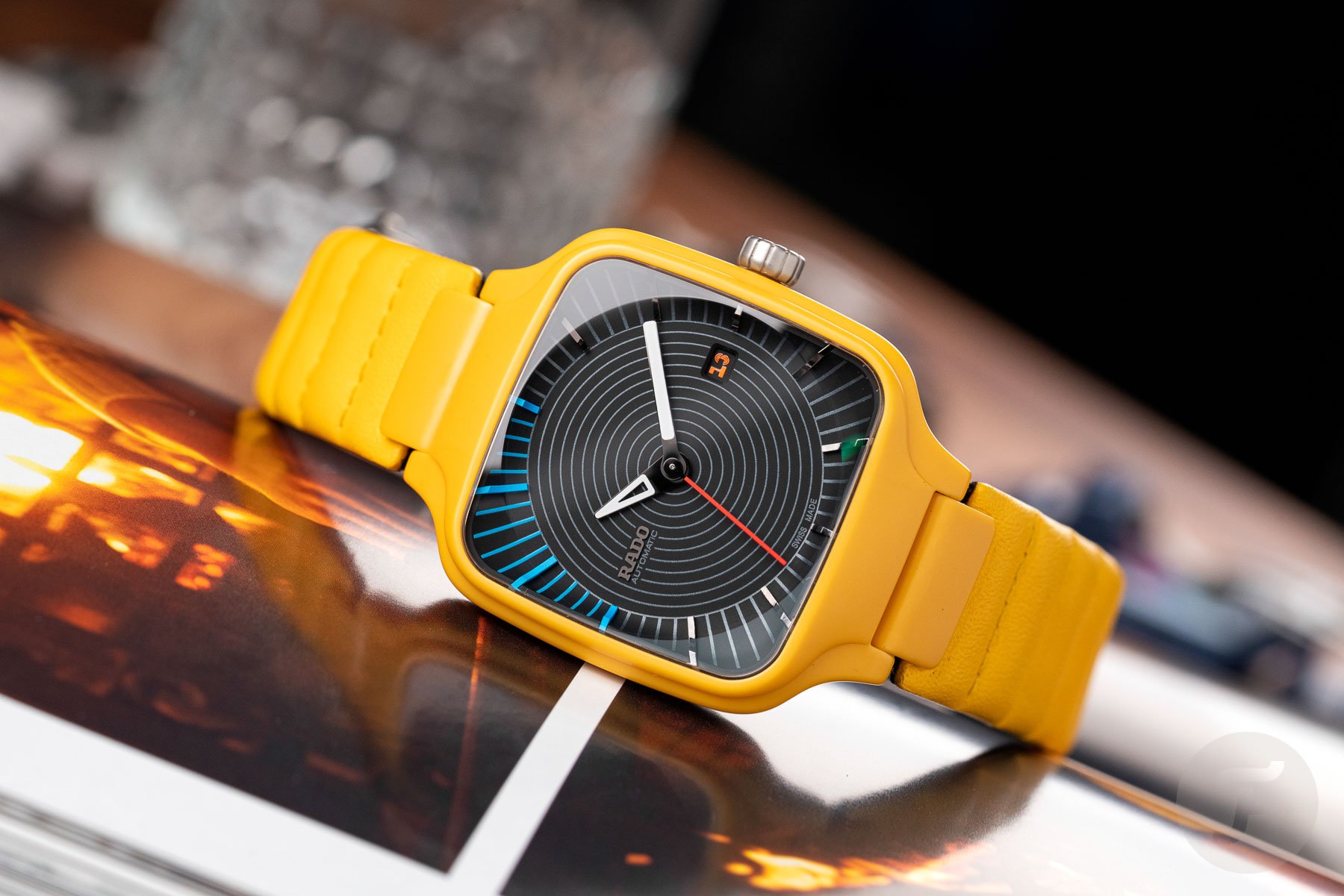
This model is the brightest and probably my favorite because I like yellow. I’m a simple man. This particular True Square collaborated with award-winning British industrial designer Tej Chauhan. Tej gave the True Square a pop-art makeover and made it his own. As you’d expect from an industrial designer, every element of this watch feels purposeful and thought out. Chauhan chose a matching yellow leather strap instead of a High-Tech Ceramic bracelet to match the case — a wise choice as it offers an alternative texture to the satin ceramic.
I love how the radial dial pattern meets the minute markers, which reach the edge of the case, marrying the square case shape with the round dial. The flash of blue for the markers between 9 and 12 o’clock is excellent, even if it is a little random. I do not doubt that there was a thought process that led to that decision for Tej, but it’s almost more intriguing by not knowing. Finally, the quirky font of the date wheel stands out in orange text and feels so out of place that it almost feels oddly natural too.
True Square Undigital
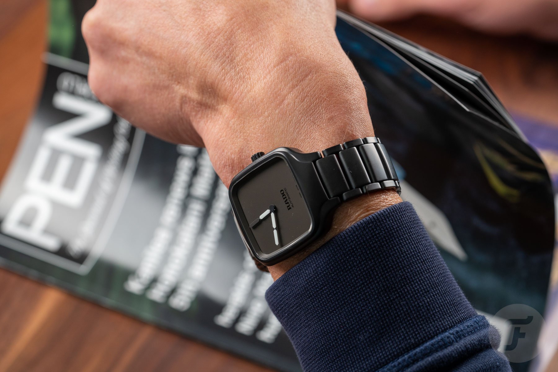
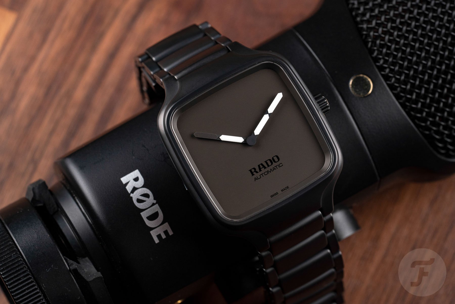
Next up is a collaboration with the Japanese design duo YOY. This is an interesting piece as it’s the most typical Rado in overall execution. YOY has taken on a role similar to the work of seconde/seconde/ in as much as it’s only changed the hour and minute hands. However, this is enough to get the message across. The watch represents a union of analog and digital time telling. The hands use small “bars” similar to the segments that make up the numbers on LCD digital displays. It’s rather charming.
As mentioned, the rest of this watch is very on-brand for Rado and not much of a departure from the regular True Square design. So much so that the True Square Undigital is the most “watch-like” of these five pieces. It’s also my second favorite.
True Square Formafantasma
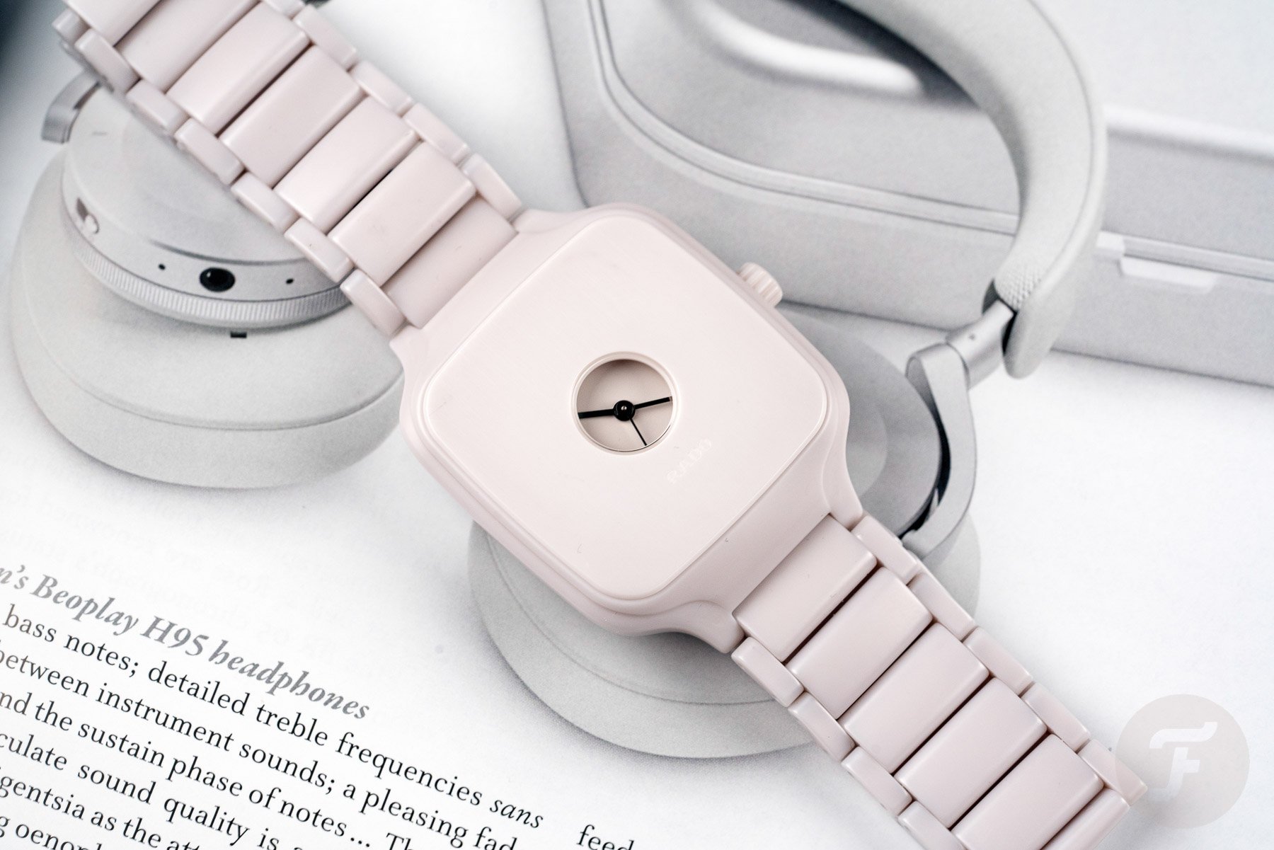
If I have a favorite of the five Rado watches today, I inevitably have a least favorite. Well, that honor falls to the final piece, the True Square Formafantasma, an eponymous design collaboration with the award-winning Italian-Dutch design duo. The all-white High-Tech Ceramic case and matching bracelet are the stars of the show here. By that, I hope you like the white ceramic as it encompasses the majority of the watch. Apparently, this watch is inspired by the half-hunter pocket watches of old. It’s an odd inspiration to bring to a watch like the True Square, and, sadly, it hasn’t quite worked out for me.
The shrunken dial aperture allows a view of the hands of varying thicknesses. The thickest is the hour hand, the medium is the minute hand, and the thinnest is the seconds. The True Square Formafantasma is an actual realization of minimalism, but I’m not a fan. Even as an “Objet d’Art”, it misses to mark for me but, that said, I know it’ll find a place on somebody’s wrist. As is the way with modern art, one man’s trash is another man’s treasure. So, I guess, by that logic, the Formafantasma is also a success? I’ll let you make your own mind up there.
You can find out more about the True Square Designer Collection on Rado’s official website.
Follow me on Instagram: @davesergeant | @fratellowatches

