Which Flavor Of Rolex GMT Bezel Do You Want To See Next? NuGrape, Diet Coke, Fanta, And More…
Bezels. They split opinions almost as often as they are themselves split by two contrasting colors. While the two-color GMT bezel has a practical origin (to communicate daytime and nighttime hours at a glance), they have become just as appreciated for their aesthetic qualities as anything else. The Rolex GMT-Master II Pepsi still stands atop the mountain when it comes to the most sought-after releases in the last five years. But haven’t we supped enough Pepsi? Isn’t it time for a fresh flavor to carry us into 2022? Here are my top five suggestions of what Rolex should do next.
Given that the bezel of a GMT watch is a painfully obvious canvas for expression, it is kind of crazy we don’t see more wild color combos deployed there. I had a lot of fun thinking up the ones below and got Dave to chime in with a couple of contributions. I’d love you, dear readers, to do the same. We’ll mock up the best ones you send us and run another article ASAP so we can all have a good laugh at our combined brilliance. Rolex, I hope you’re reading…
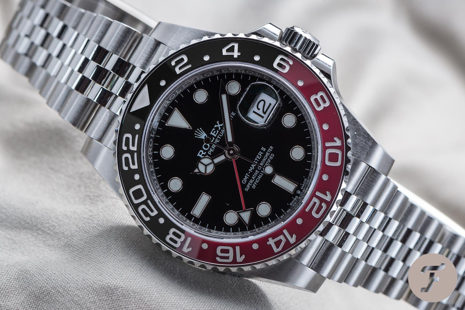
First off, bring back the Coke bezel
One of the real drawbacks of Rolex’s Cerachrom technology is that it layers one color on top of another. While the end result is vivid and hardwearing, layering a less-than-black color on top of anything else (red, I’m looking at you) does result in some slightly blended hues whether we like to admit it or not.
You might have noticed that the blue of the Pepsi, when scrutinized, actually has a slightly purplish hue about it. Now, this is far from unattractive, but it is a little bit irksome if you’re looking for the crisp and rather stark contrast of the old anodized aluminum and even older bakelite bezels provided. It’s doubly annoying when you compare the application of this technology to Omega’s alternative. Omega actually uses two separate ceramics, which are fused along the horizontal axis. This results in a super-sharp divide, which is a source of no little pride for the Omega contingent when challenged by their Crown-loving brethren.
When the darkest color of the two is black, the problem seems to evaporate. The Batman is, although not to my liking personally, probably the best execution of the technology available in Oystersteel, However, in my opinion, it doesn’t hold a candle to the Root Beer, which is my favorite current GMT-Master II. So with the preference for black established, the red and black of the classic Coke bezel is a no-brainer. But let’s see what else we can do to bring this range up-to-date in the most flavorsome of ways…
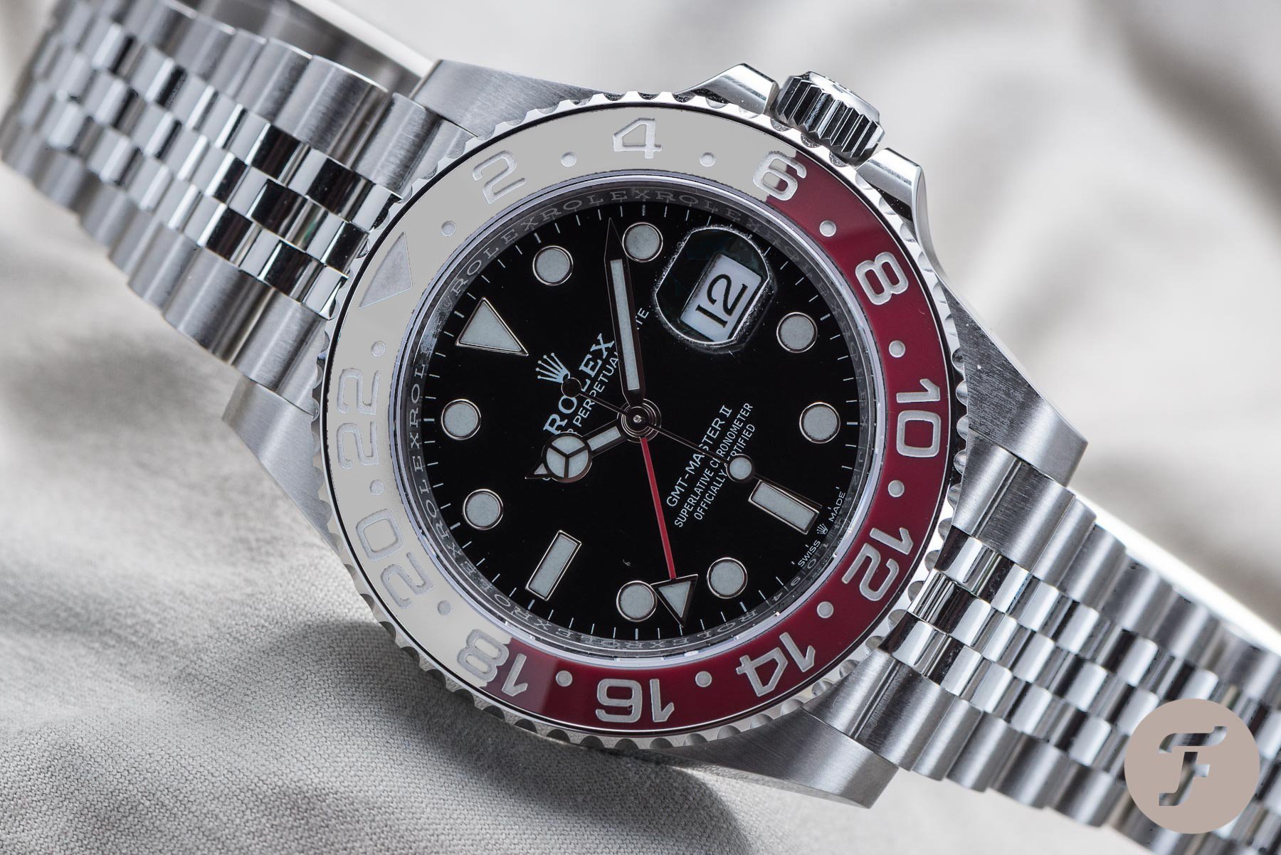
Diet Coke for me, please
Dave Sergeant came up with this one and I like both the concept and the design. He suggested we shelve the black of the classic Coke original recipe bezel and replace it with silver. Now, I’m no material scientist, but I’d be pretty confident in wagering that the dull, metallic nature of silver ceramic would probably make it just as opaque as black. My mind is transported back to my modelmaking days in childhood. I remember the metallic paints I used to slather all over the badly glued together aircraft I was occasionally gifted at Christmas being much thicker than the other colors. Whether that translates to Cerachrom or not, I don’t know, but it wouldn’t surprise me if it did.
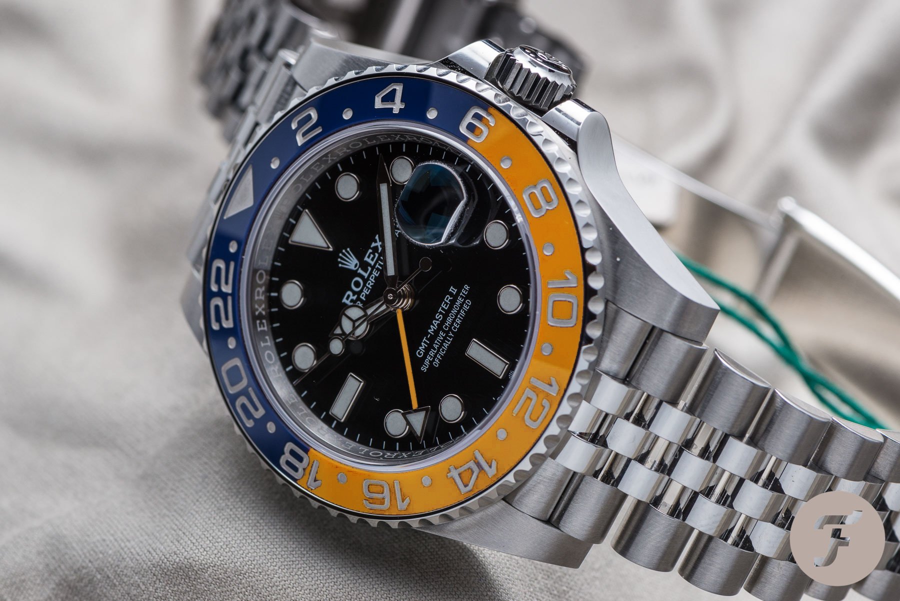
Fanta is crying out for a sip
Orange and blue is a classic color combination in sports watches but it has never made an appearance on a Rolex GMT-Master II bezel. Perhaps that’s intentional. We all know Rolex likes to buck trends. However, this one seems like low-hanging fruit with an internationally recognized soda just sitting there, waiting to be immortalized in watchmaking.
We did consider naming this one the Irn-Bru due to my unhealthy addiction to it and in honor of our dear Fratelli member, Warky (he’s a Scot, don’t you know). However, we figured that the name might struggle to catch on with the global community so we kept it on the backburner on the off chance Rolex releases a watch with near-lethal sugar content in honor of the now-discontinued recipe for Scotland’s orange pride.
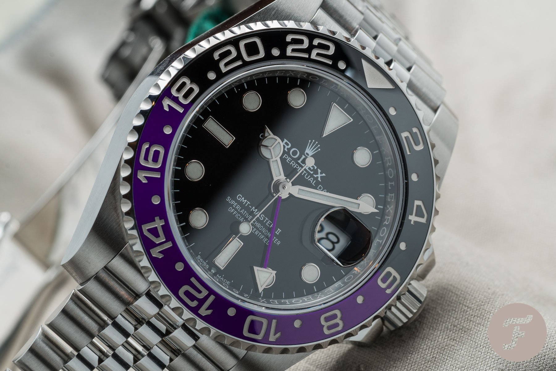
NuGrape
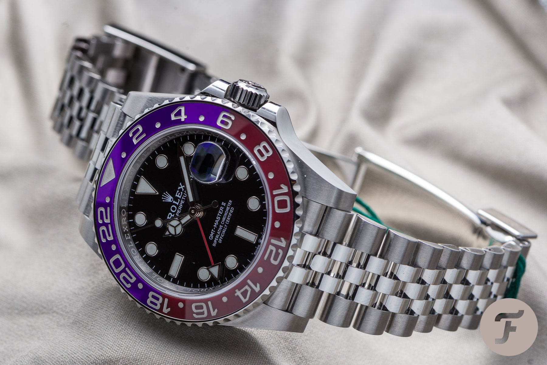
Okay, I’m contradicting myself here because it’s possible that very few of our readers outside of the southern states have heard of NuGrape, but I need something purple that wasn’t the next item on this list and Grapeade seemed too generic. Additionally, NuGrape sounds absolutely deadly and I love it. Here we have a half purple, half black bezel, with the GMT hand treated in the same grapey shade.
It seems that purple is a pretty popular color generally. It frequently cracks the top five on color surveys and even features as one of the 16 shades to follow in 2021 according to Pantone. And yet, for some reason, purple is still vastly underrepresented in watchmaking. Our very own Brandon wrote a humdinger of an article recently expressing his desire (nay, demand) for more purple dials. Well, Brandon, what do you think of this as a compromise? What’s that you say? Not spicy enough for you? Okay, have a taste of this…
The Vimto: it’s a crime this doesn’t exist.
Purple. Red. You heard it here first. This initially jarring combo is going to be big in watchmaking soon. I don’t have any proof of this other than my gut tells me so. In my opinion (which I reckon sits alone on a desert island), this has been a long time coming. A deep purple and a vivid red is a weird but electrifying combo I was first switched onto a few years ago. I’ve kept that one to myself until now, but behold: the glorious Vimto bezel is a hot cake just waiting to be baked.
Mountain Dew For You, Sir?
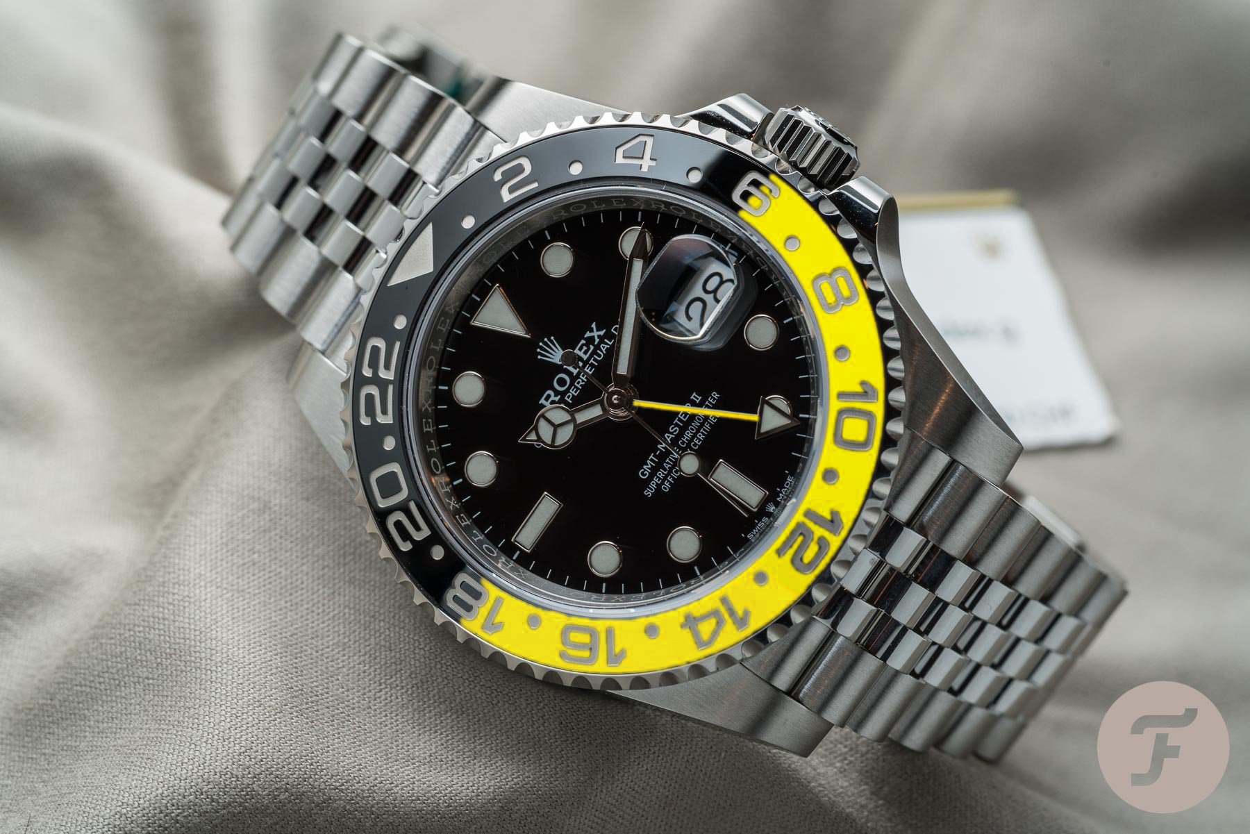
This one will turn your insides yellow, but it’s worth it. Mountain dew’s electric green/yellow bottom is legendary. It makes the fizzy juice within seem absolutely nuclear. So why shouldn’t there be a bezel that reflects that kind of power? Black and fluorescent yellow is definitely a sport combination and one that doesn’t get enough wrist time in this industry. Make it happen, Rolex.
You know when you’ve been Tangoed
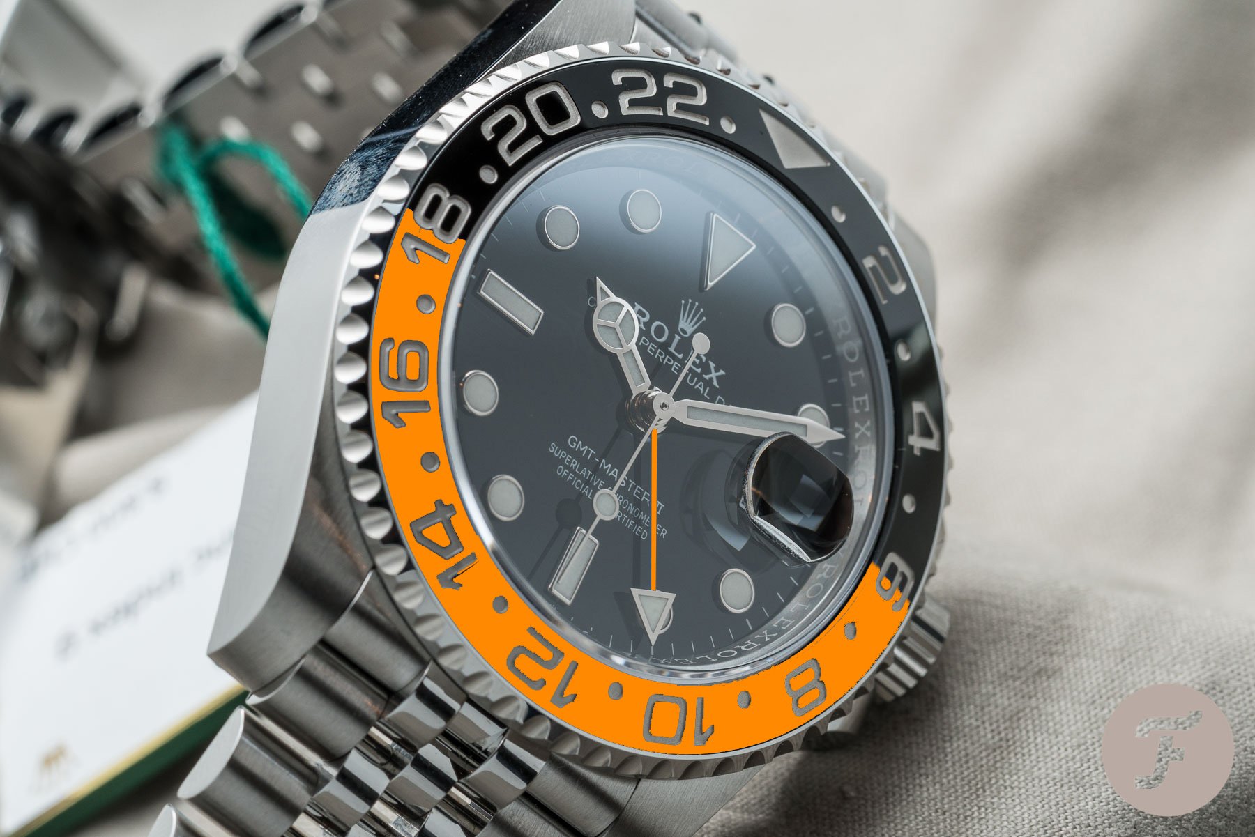
One for our UK readers: Tango is primarily sold in Great Britain and Ireland. It is a type of orangeade that was, during the ’90s, best known for an amazing series of adverts in which a completely mental “Tangoman” would run around “Tangoeing” people, with the adverts concluding with the tagline, “You know when you’ve been Tangoed.” Don’t worry, this black and orange combo won’t turn you orange, but it will leave you feeling fruity fresh.
A bonus helping of Cream Soda that might be too far for even me…
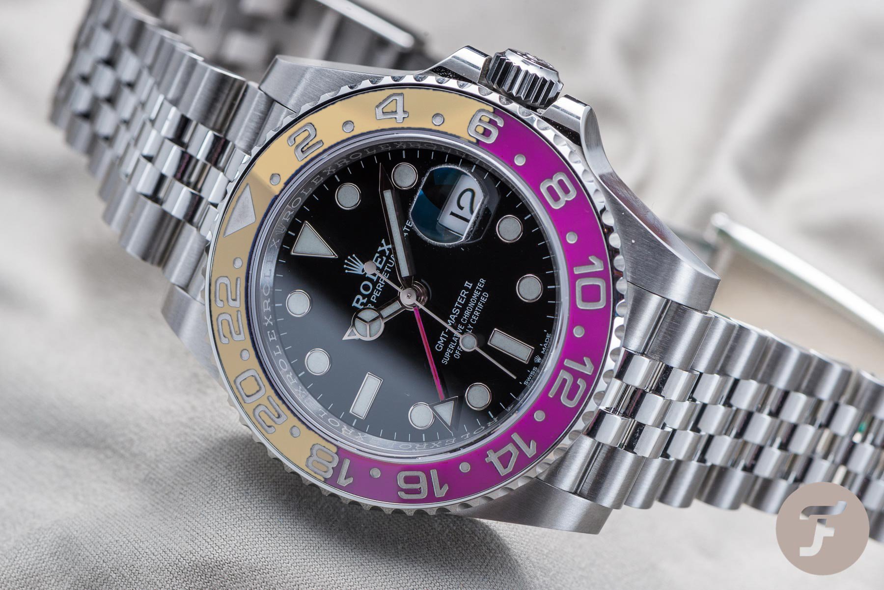
Crack open the skull of Dave Sergeant and a load of odd stuff pours out. This was his last suggestion: pink and cream. You know what? Why not! The GMT-Master II is popular with all kinds of watch fans and maybe this more unisex/feminine colorway would be well received. Better still, align it with a charity in the same way as the pink dial project was and you might actually have a goer. At least from a material perspective, it should work nicely, with cream being a pretty unobtrusive base for a delicious fuchsia to be laid over.
You have now been exposed to our ideas for where we would love to see Rolex take the bi-color bezel of the GMT-Master II. So now, we would like to hear from you. What would be your drink of choice? Would you reach for a blue and yellow lemon Fanta? Or are you wishing for something green and red like 7up? Remember to keep an eye on your sugar intake and share your ideas in the comments below!

