Rolex Just Turned The Colors Up To 11 With The Oyster Perpetual “Celebration”
In 2020, Rolex managed to start a colorful trend when the brand released multiple brightly colored dial variations within the Oyster Perpetual collection. Many brands have followed suit, from giants like Omega with the updated Aqua Terra collection to smaller brands like NOMOS and Sinn. None of them have managed to create the same amount of hype as Rolex, though, especially with the infamous “Tiffany blue” variation.
A bubbly display of color
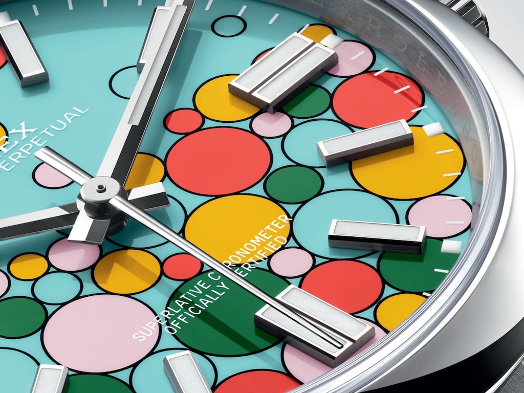
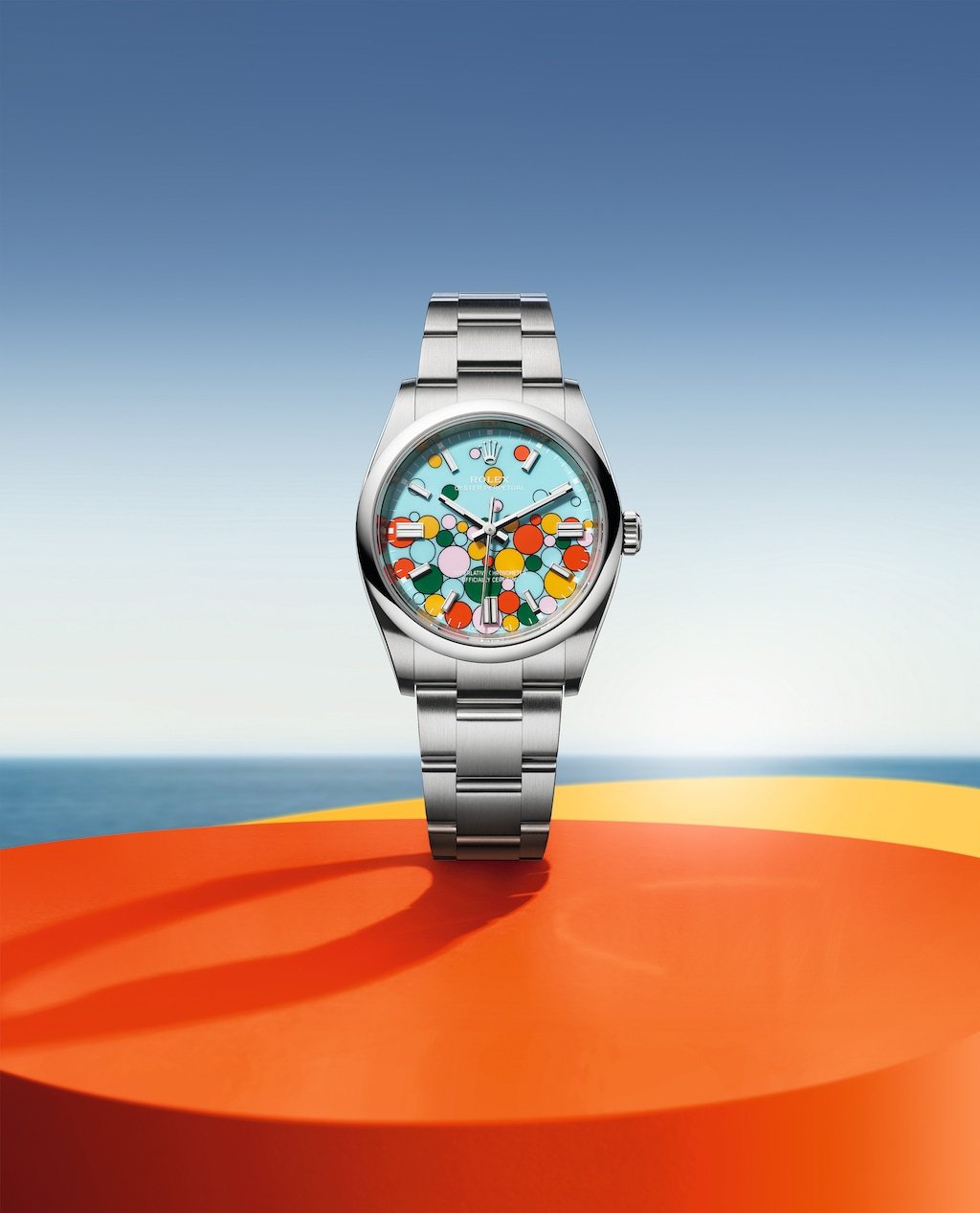
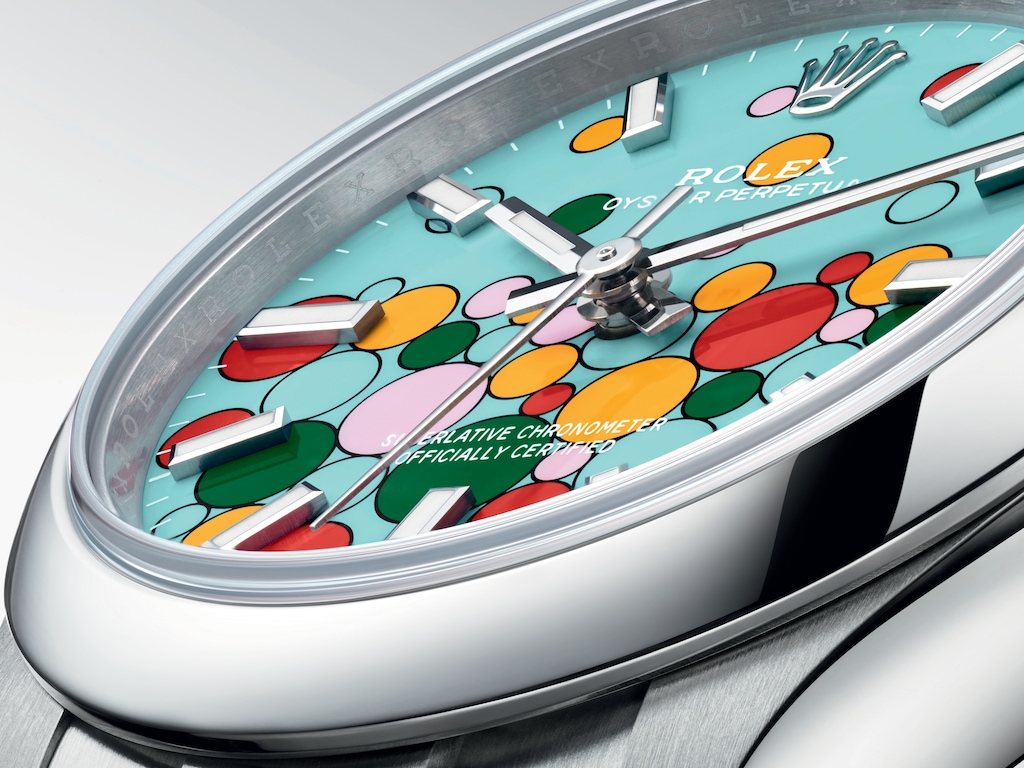
Available for the Oyster Perpetual 31, 36, and 41, the new dial decoration — named “Celebration” — adds differently sized bubbles to the Crown’s most hyped-up dial color, “Tiffany blue”. Or, as Rolex officially calls it, turquoise blue. The bubbles come with a black border and are in the colors of the previously released Oyster Perpetual dial variations — candy pink, turquoise blue, yellow, coral red, and green. And…that’s basically it. If you need more than a new dial color to be excited about a watch, there’s nothing to see here.
However, looking at the tremendous impact that the colorful additions to the Oyster Perpetual collection had in 2020, one should not underestimate the trends that Rolex can start with something seemingly simple as a new dial decoration. Looking at the Oyster Perpetual’s solid specs, one might also argue that no improvements are necessary to enjoy the watch.
The Oyster case is crafted from a solid block of Oystersteel and protects its in-house caliber 2223 (31mm) or 3230 (36mm and 41mm) with a 100m water resistance rating. There is nothing exceptional about the OP specifications, but when it comes to getting the job done as a reliable everyday workhorse, few brands do it as well as Rolex. Prices are €5,550 for the 31mm option, €5,650 for the 36mm version, and €6,250 for the 41mm model.
A new trend?
Thinking about all the watches that were inspired by the colorful Oyster Perpetuals after their release in 2020, one has to wonder: will the bubbles catch on? Back in 2020, the pop of color seemed to be perfect for Instagram. It stood out. It was the ideal match for the age of social media hype. Other brands noticed. Within months, colorful models from competitors started to pop up. Three years later, it no longer seems like the exception but the norm to have a collection that resembles Rolex’s colorful dials.
On the other hand, not everything Rolex does catches on. And for good reason. Take the palm motif that Rolex introduced two years ago, for example. If brands would have followed suit, this would have felt wrong. Having a solidly colored dial, on the other hand — there’s nothing wrong with it. Not being first doesn’t mean it’s in bad taste. The palm motif was just too specific. I feel the same thing applies to the bubbles in the “Celebration” dial. It’s too distinct. What’s your take? Do you like the new burst of colors? Would you like it if other brands came up with a similar design? Let us know in the comments!


