Sunday Morning Showdown: Seiko Prospex Dive Watch Edition
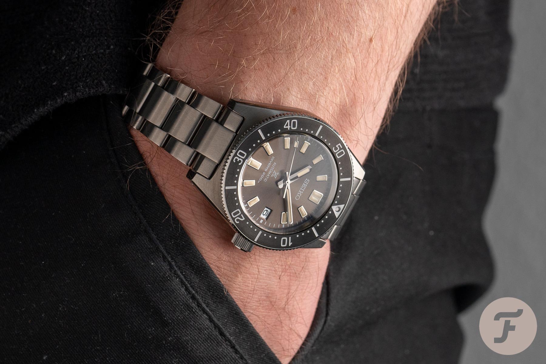
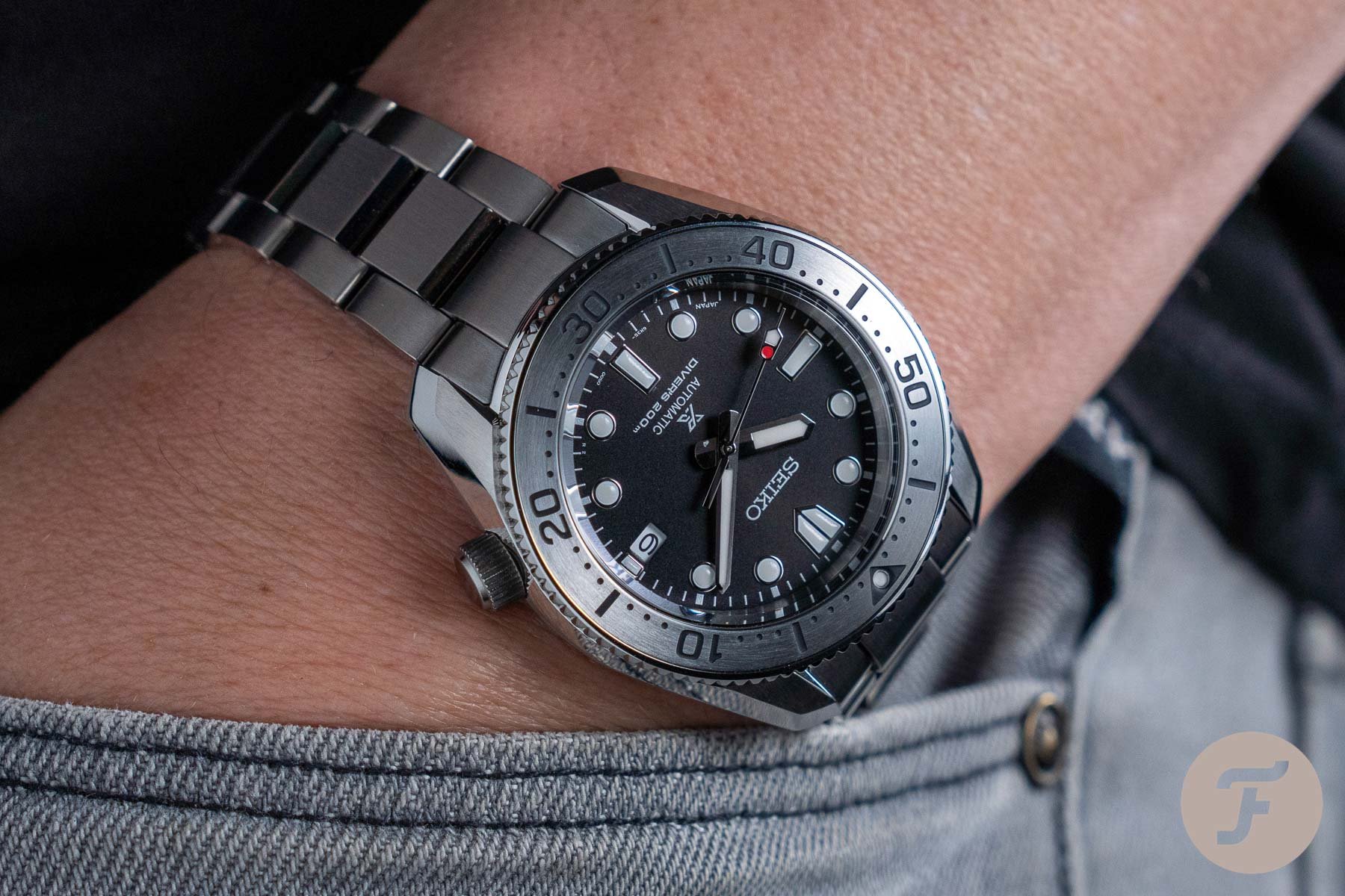
In our Sunday Morning Showdown, two of our writers go head-to-head in an epic showdown for the ages. Strong opinions and hysterical hyperbole are welcome (so feel free to join in with the fun in the comments section below). And don’t forget to let us know which watches you’d like to see torn to shreds/effusively exalted next week. We’ll try and feature as many of our readers’ choices as we can. For this morning, our writers select two modern re-interpretations of iconic Seiko dive watches. The Prospex SPB143 recreates the spirit of the 62MAS from 1965. Whereas the Prospex SPB185 takes inspiration from the reference 6159-7000 from 1968. As the prices line up, please cast your vote and let us know which one floats your boat.
It was only two weeks ago when we asked you to submit your ballot between Seiko and Grand Seiko. In the fight between two similar-priced titanium dive watches, you chose the Grand Seiko. Specifically, the SBGA231G over the Seiko Prospex LX SNR029J1. The question was whether Seiko could stretch its price tag into the realm of Grand Seiko. It felt like unfinished business at the time, as we were more than aware of the value propositions still prevalent at Seiko. Therefore we return with two Prospex models that are part of Seiko’s bread and butter. Both of them are in that attainable hot-pocket pricing of €500–€1,500 that Seiko typically dominates. So the choice now resides with which Seiko best revives the iconic references from the ’60s — the reference SPB143 or SPB185.
Both watches share similar specs and come in at the same list price of €1,250. So for this battle, our writers get to flex their muscles and debate the watches purely on style.
Master and apprentice
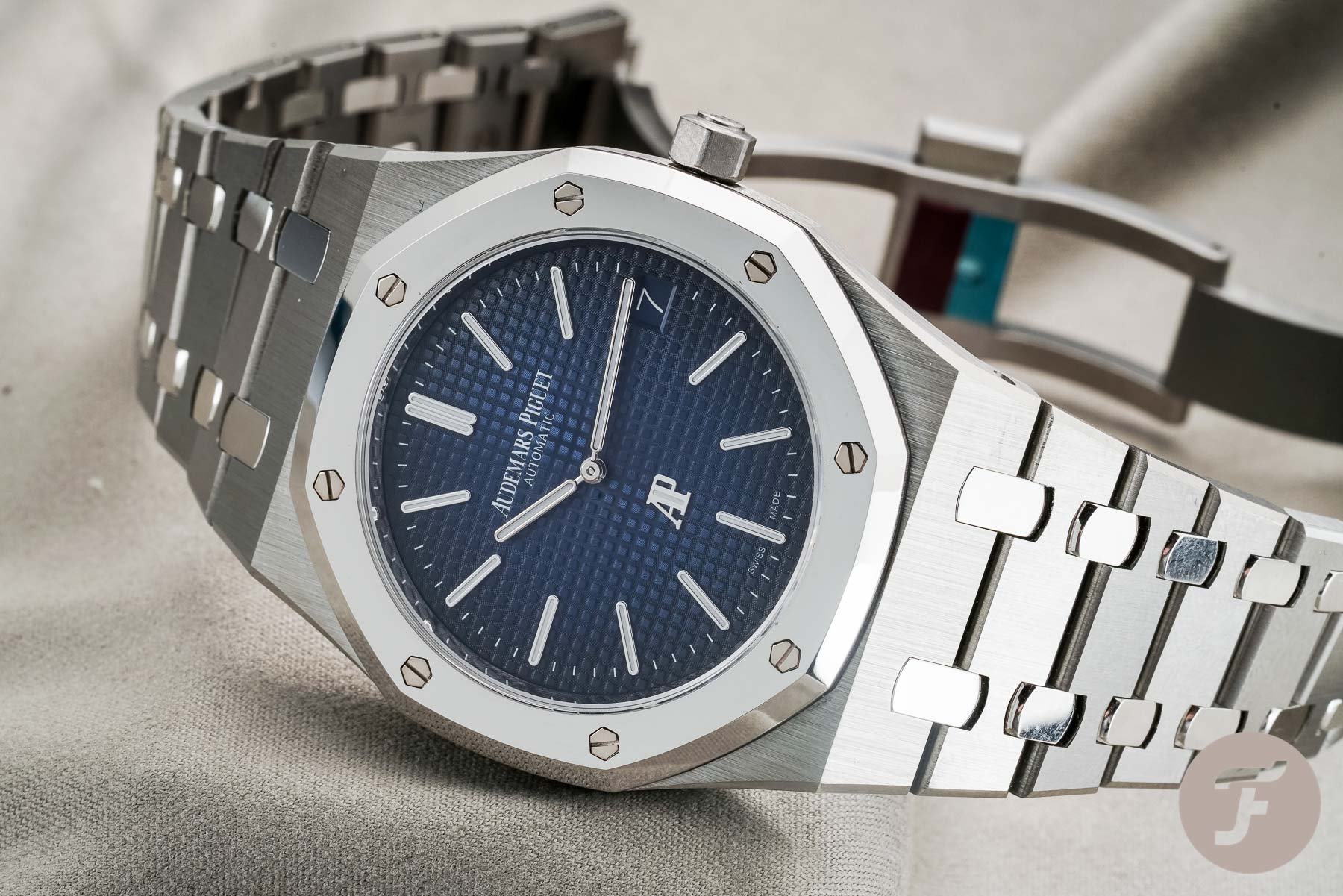
But before we get into things, let’s take a look back at our master and apprentice match-up from last week. We asked you to decide between the Genta-designed Audemars Piguet Royal Oak — and gladly pay double the retail — or go for Genta’s legacy instilled in the Octo Finissimo. And the results showed us the crown still rests on the head of the Royal Oak. The AP 15202 took the win by a margin of 65% versus 35% for the Bvlgari Octo Finissimo. Your votes show us that money is no object when it comes to owning an iconic luxury sports watch.
Here at Fratello, our team found it hard to choose between last week’s contenders. The cons for AP amongst the Fratelli seem to relate more to the brand’s leadership’s eccentricity than the watch itself. Yet there’s no denying the Royal Oak’s everlasting design, and we eagerly await the releases for the 50th anniversary next year. Simultaneously, Bvlgari is going from strength-to-strength and feels on the cusp of creating its halo-piece. It took Girard-Perregaux four years to land its coveted onyx-dial Laureato Infinity that resonated with the enthusiasts, so it could be Bvlgari’s turn this year. But let’s get back to today’s diving duo.
Redesigning Seiko history
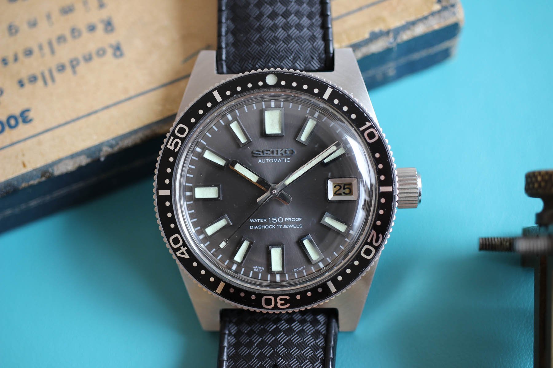
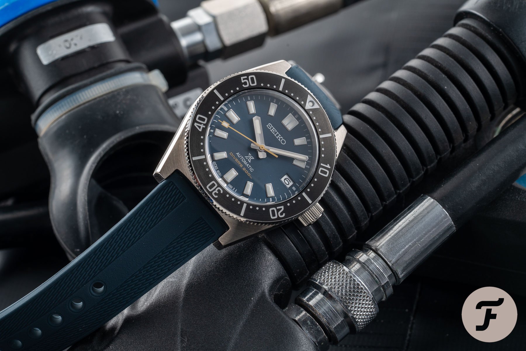
Seiko was pretty late to the party, yet its vintage divers are some of the most respected and sought-after watches. Two of the most significant references form the inspiration for today’s contenders. First up being the 1965 Seiko 6217-8000/1, better known as the 62MAS — Seiko’s entry into the world of diving watches. The revival came last year by way of the Seiko 1965 Diver’s Modern Re-interpretation, at it’s officially known. The SPB143 takes the design traits of the 62MAS and combines them with modern-day specs at an affordable price.
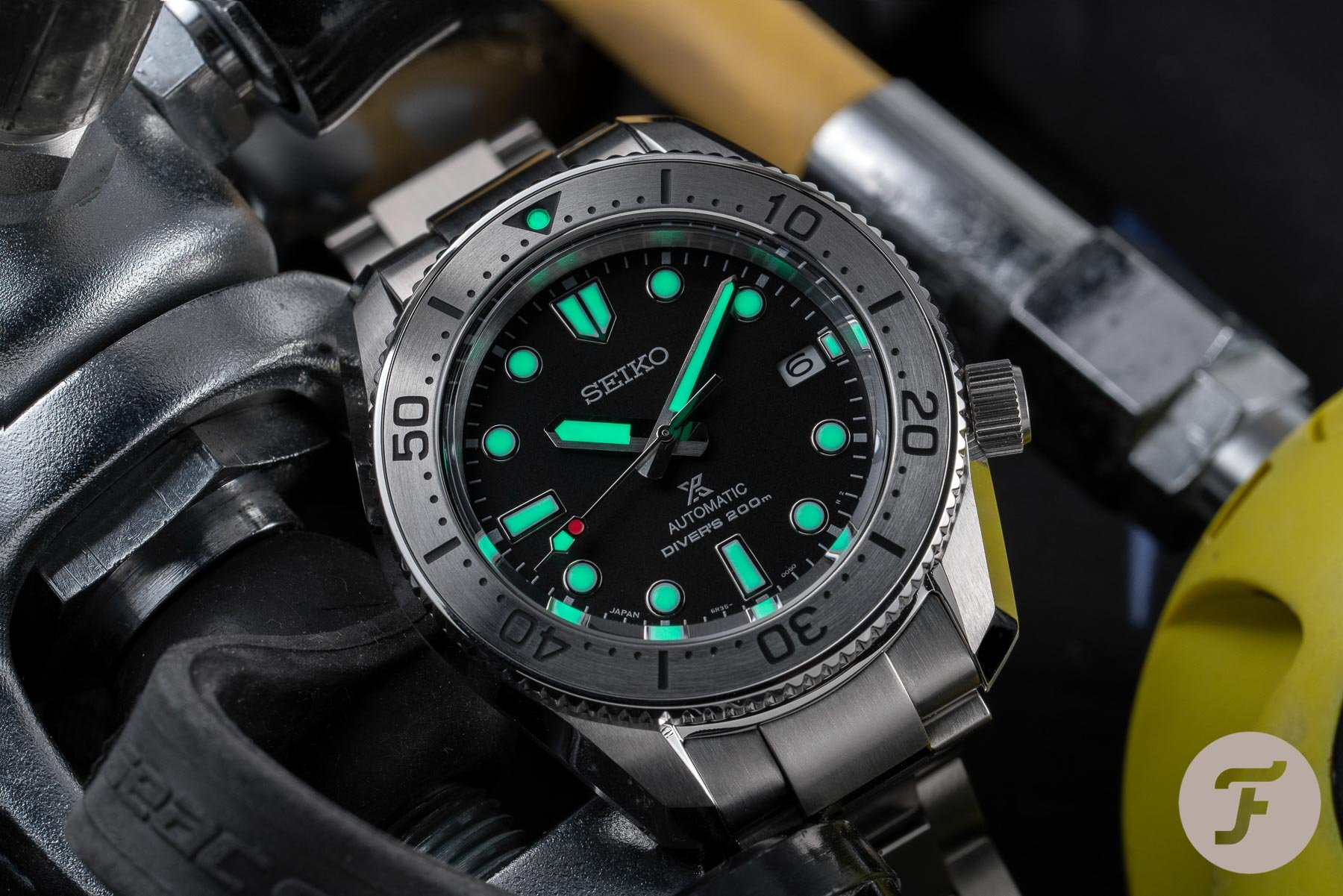
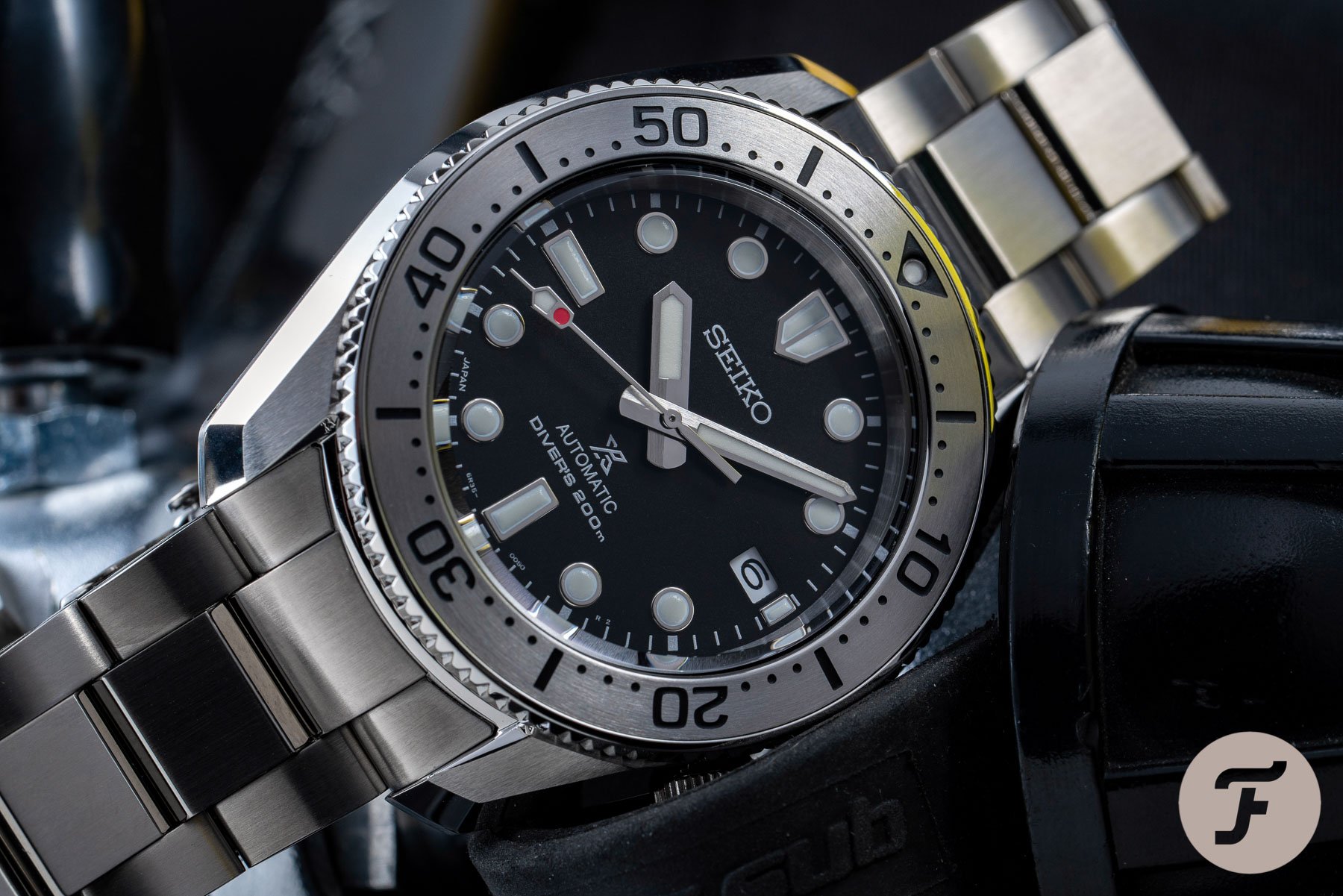
Reference 6159 was the first Seiko Professional dive watch, with the Seiko 6159-7000 from 1968 inspiring our second contender, the SPB185. While Seiko refers to the 6159-7001 as the inspiration for this dive watch, the 7001 was released a year later in 1969. Characteristics of the 6159 have spawned most of Seiko’s Prospex collection, including this Diver’s 1968 Re-interpretation, and enthusiasts refer to it as the Marinemaster 200 (MM200).
Both pieces received praise for their sharp and legible lines. The smaller than typical dimensions also overcame the €1,250 price tag for each option. But the price is not a factor in today’s showdown, so let’s get stuck in.
Jorg — Seiko Prospex SPB143
With many of our recent showdowns coming down to branding, movement provenance, and finishing styles, today’s fight is a breath of fresh air. The Seiko 6R35 movement powers both Seikos, and they cost the same at retail. Now is my time to shine in putting my design eye to good use. Yet, here comes the curveball — I prefer the look of the vintage 6159-7001 over the 62MAS. I had the pleasure of going hands-in with each last year when Mike brought them to the Fratello office.
Ben: That curveball clipped the hairs on my head. Either I’m taking an early lead, or I need a trip to the barbers (definitely the latter).
The 43.5mm size of the 6159 is a better fit for my wrist than the modest 37mm diameter of the 62MAS. On top of that, I love the bold aesthetic of the 6159 more than the plain Jane 62MAS. The quirky looks of the 6159 had a more significant influence on the future Seiko Prospex line than the straightforward 62MAS. Yet, I find myself advocating the 62MAS modern re-interpretation — so what happened? Well, the vintage 6159 may have set the tone for the SPB185, but with that comes a realization.
My beef with the SPB185
After reading Rob’s reviews of the new SPB185 and the blue dial version, SPB187, I thought it’d merely be a choice of two colors for my next Seiko purchase. But as I was scrolling through the Prospex collection, I noticed the Seiko Sumo SPB101. Suddenly, I was reminded that Seiko does, on occasion, create stunning new novelties. The Sumo is one of the few modern Seiko dive watches that does not draw from the past. While I wouldn’t dissuade Seiko from referencing its history, it’s nice to see new ideas and concepts in the Prospex range that do not carry the name “Modern Re-interpretation”.
Seiko finally released something the fans had anticipated for a long time.
I own a first-generation Sumo SBDC001, and this reminder immediately gave me the impetus to give it some wrist time. By doing so, it shifted my perspective for my next Seiko purchase. That’s when I realized the Sumo and the SPB185 are very similar style watches with the Sumo being slightly larger — which is no problem for my wrist. But most of all I was reminded that with the Sumo in the collection, there is no real need to choose the SPB185.
Monochromatic emphatic
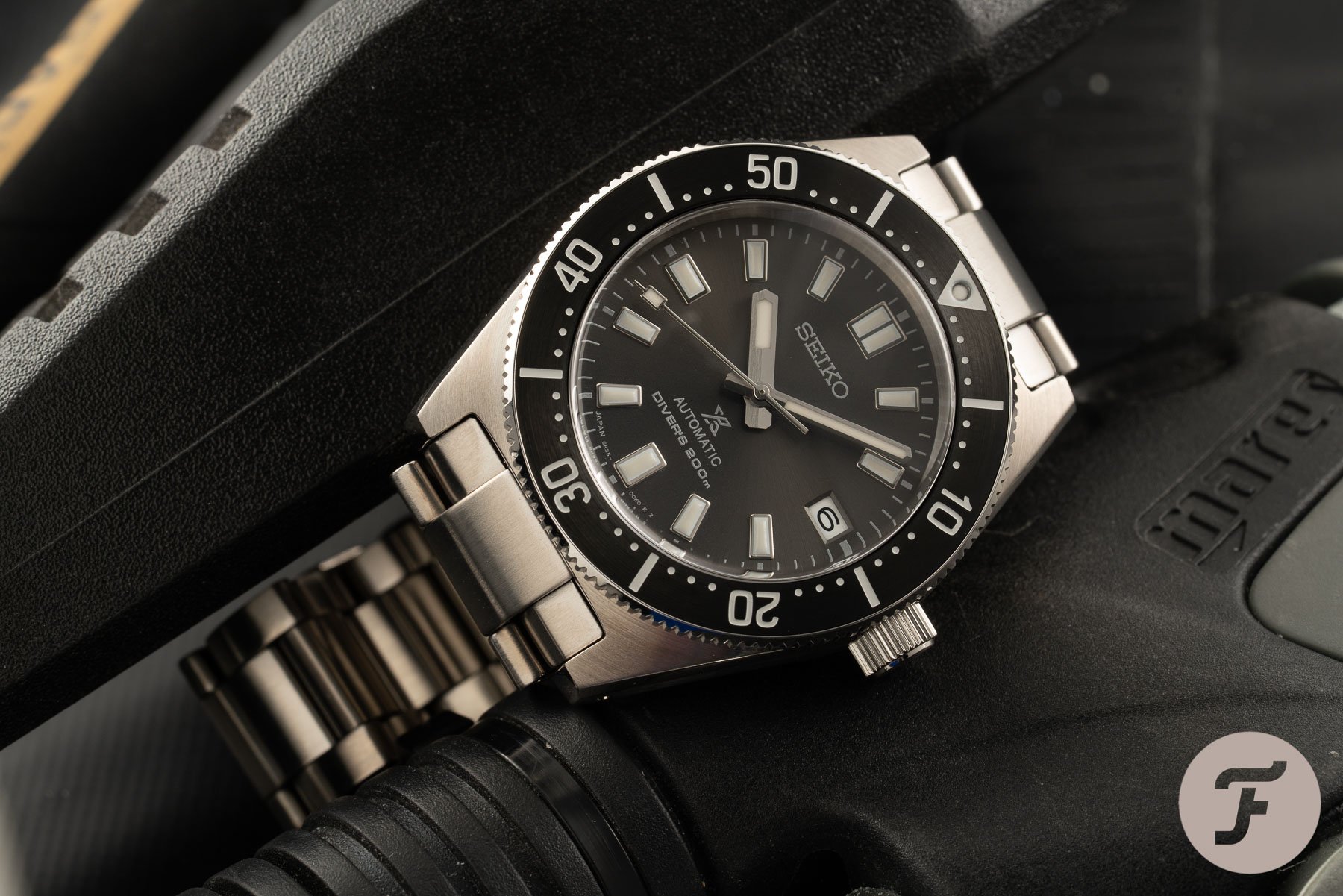
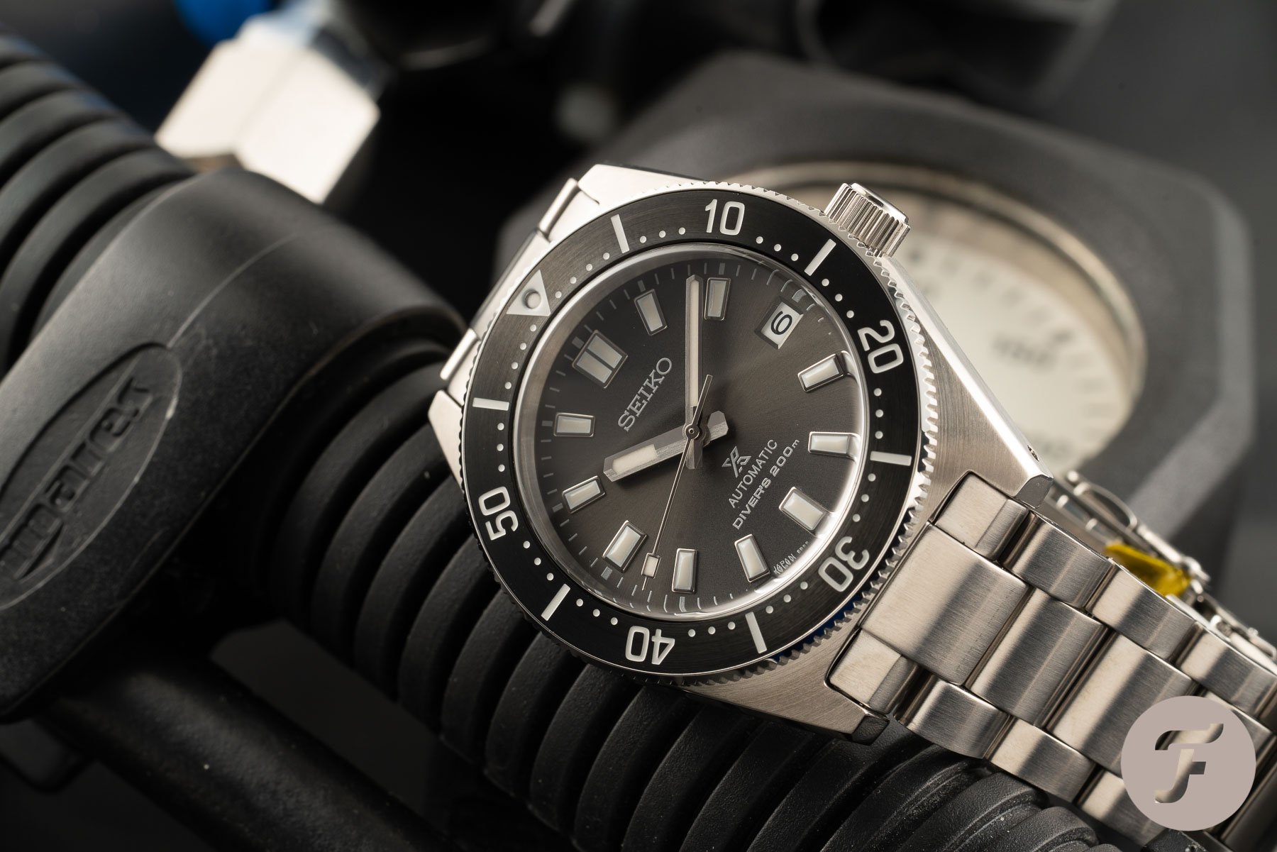
Initially, the 1:1 55th Anniversary recreation of the 62MAS in blue took my interest in 2020, but my gosh, that price. I almost forgot about the 1965 Diver’s Modern Re-interpretation line, partly due to the ridiculous name. But soon, the series of four SPB14x models started to make sense. By adding a smaller 40.5mm diver to the Prospex line-up, Seiko had a diver without history holding it back. With looks inspired by the design of the 62MAS, the SPB14x series takes a unique spot in the Prospex collection.
Initially, the stunning blue dial SPB149 caught my attention. The SPB147 also has its charm with retro-inspired looks. But as Gerard explained, the SPB143 has the ultimate adaptability with the grey-black dial. The bracelet was a massive improvement over the often criticized quality of the bracelets from the past. But more than anything, I have to come back to how refreshing it is to have a thoroughly modern take in the Prospex collection.
My main issue with the SPB185 is that it feels too familiar within the Prospex line of dive watches, especially the Sumo. Putting the SPB185 next to the current Sumo and you can have a similar style with only a 3mm difference and a €400 saving. It doesn’t make the SPB185 a bad choice, not at all. But its design and smaller size give the SPB143 simply more relevance in the current Prospex collection for me personally. And that’s why I would pick it over the SPB185.
Ben: I’m not going to argue that the Sumo is better value. But this not why we’re here. Time for me to lay down my thoughts on the Seiko SPB185.
Ben — Seiko Prospex SPB185
Jorg just took us on a meandering journey of how the SPB143 springboards from its forebear to satisfy the masses. Clearly, Seiko succeeded as I’m seeing any one of the SPB14x models everywhere on digital photo-sharing platforms. But I fear Seiko sacrificing its identity for the sake of pandering to the mainstream with this reference. In my view, by sticking to its laurels, the SPB185 cuts a unique shape that still appears relevant. Calling these re-interpretations of vintage dive watches throws me off slightly. I understand the cues of the classics carry through, but the watches feel thoroughly modern in execution. It probably has to do with the originals coming out ahead of their time, but I could be convinced this design was conceived last week.
Many lament the loss of the SKX range, but for me, the SPB185 is everything, and more you would want in a Seiko diver.
Seiko releasing modern re-interpretations of its dive watches is nothing new — especially over the last five years. Yet, somehow, I eagerly await every release drop. Many lament the loss of the SKX range, but for me, the SPB185 is everything, and more you would want in a Seiko diver — albeit at a higher price. Indeed, the enthusiasts have spoken, and we are now seeing more traditional straight hour and minute handsets. Previously, Seiko had a penchant for broad hour-hands, such as the SPB051, which was met with indifference in 2017.
Seiko bracelets
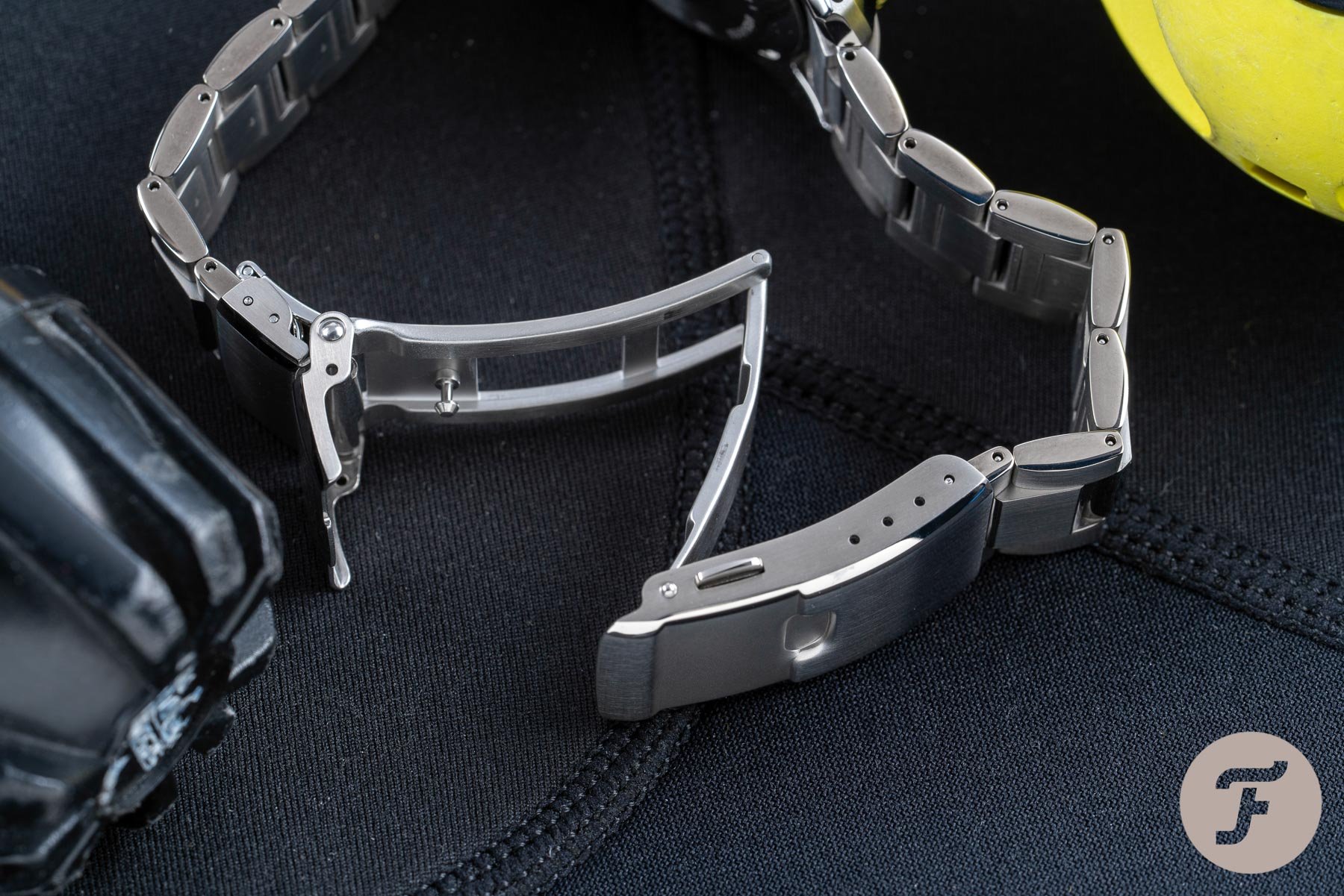
Before I get into the features of the SPB185 that sell it to me, I have one complaint. Well, it’s a complaint that stretches over the majority of Seiko models, including mine and Jorg’s picks: The bracelet. The machining is up to the standards you’d expect for the price, so that’s not the issue. Also, the bracelets feature a gentle taper that is wonderfully proportioned. Ergonomically, the links and clasp maintain comfort, unlike the early skin-pinching/hair-pulling jubilee bracelets. Seiko also implements quality of life benefits to make it easy to adjust and feel secure on the wrist. So what’s the problem?
Seiko cases and bracelets look like they were designed by two different people who eventually met in the middle.
Well, do you remember the Porsche Carrera GT, Jorg? The German rear-drive supercar with a screaming naturally-aspirated V10 engine achieving over 600hp?
Jorg: I most certainly do — the widow-maker! I still remember vividly that at its introduction, Porsche test driver and rally legend Walter Röhrl said about the Carrera GT: “the first car in my life that I drive and I feel scared.” If its looks didn’t already leave a stunning impression, his words certainly did.
Automotive journalists remarked that each end of the car looked like it was designed by two different people who eventually met in the middle. Now, I think it’s one of the most beautiful cars in existence, but I cannot help but remember it when looking at both Seikos in this showdown. Specifically, where I see a resemblance is where the bracelet connects to the lugs. There seems to be a jarring disconnect from where the case stops, and the bracelet end links start. As if it was made with two entirely different alloys.
Can the SPB185 win me back?
Being able to view multiple watches in quick succession, this jarring effect is not something I pick up regularly unless I am dealing with Seiko. It’s one element I hope to see Seiko bring focus on to rectify. Rob Nudds called out the bracelet on his review of the SPB185 as lacking charisma. But I believe that Seiko fundamentally needs to work on integrating lugs to the bracelet and providing a seamless aesthetic. Despite the bracelet’s setback, the remaining concoction of the SPB185 makes it the most exciting Seiko I’ve experienced in years.
The sapphire crystal and the super-hard coating give it robust credentials as a daily beater. Going on a diet with 42mm×12.5mm dimensions also significantly improves wearability. As Rob pointed out, the final spark is the red dot on the shovel seconds hand. Along with the generous use of LumiBrite, the red dot brings the dial to life in an otherwise brutalist mass of steel.
Jorg: I agree that it does work perfectly on the SPB185. But with more color in play, as per the blue SPB187, I find it to be a potential nuisance.
I do wish to one day see more variations in this range, perhaps with a Pepsi-bezel to honor the spirit of the SKX009, but this may be on the cards. The Tourneau case shape with the notifiable 4 o’clock crown seals the deal and revamps the Seiko SPB185 as a must-have dive watch.
- Seiko Prospex SPB185
Final thoughts
Jorg: I think we can say that both the SPB143 and the SPB185 are excellent choices as affordable daily wearers. Both watches prove that even with the recent price increases, Seiko divers are still hard to beat when it comes to value for money. Both references make it clear Seiko is on the right path of finally introducing smaller-sized dive watches. But there are still some points that Seiko could improve on.
Mike wrote an article on what he would like to see from both Seiko and Grand Seiko. As a Seiko enthusiast, it’s easy to agree with the different points he raises. One of the topics was Seiko’s ongoing eagerness to link every design back to their past — as if that is the only justification to release new watches. This battle is purely one of pure style, and we both value each contender as a worthy modern Prospex choice. I can’t help it that the SPB143 is my preference at this point.
Ben: I cannot overturn you on your choice, Jorg. But likewise, if I had both watches in either hand, I’d happily fork out for the SPB185 without hesitation.
But what do our readers think? Vote now and make your voices heard in the comments below

