Strap Check: Forstner Cuts A Contemporary Look With Its Flat Link Bracelet For The Omega Speedmaster
I’ve been test-driving each generation of the Forstner Flat Link bracelet for nearly two years now. From the early prototypes to the final product, I’ve kept a close eye on each continual improvement. The new Forstner Contemporary Flat Link is the most significant update yet and gives an option to those wanting a modern feel. But while it still maintains the vintage cues, the Contemporary Flat Link is not without sacrifice.
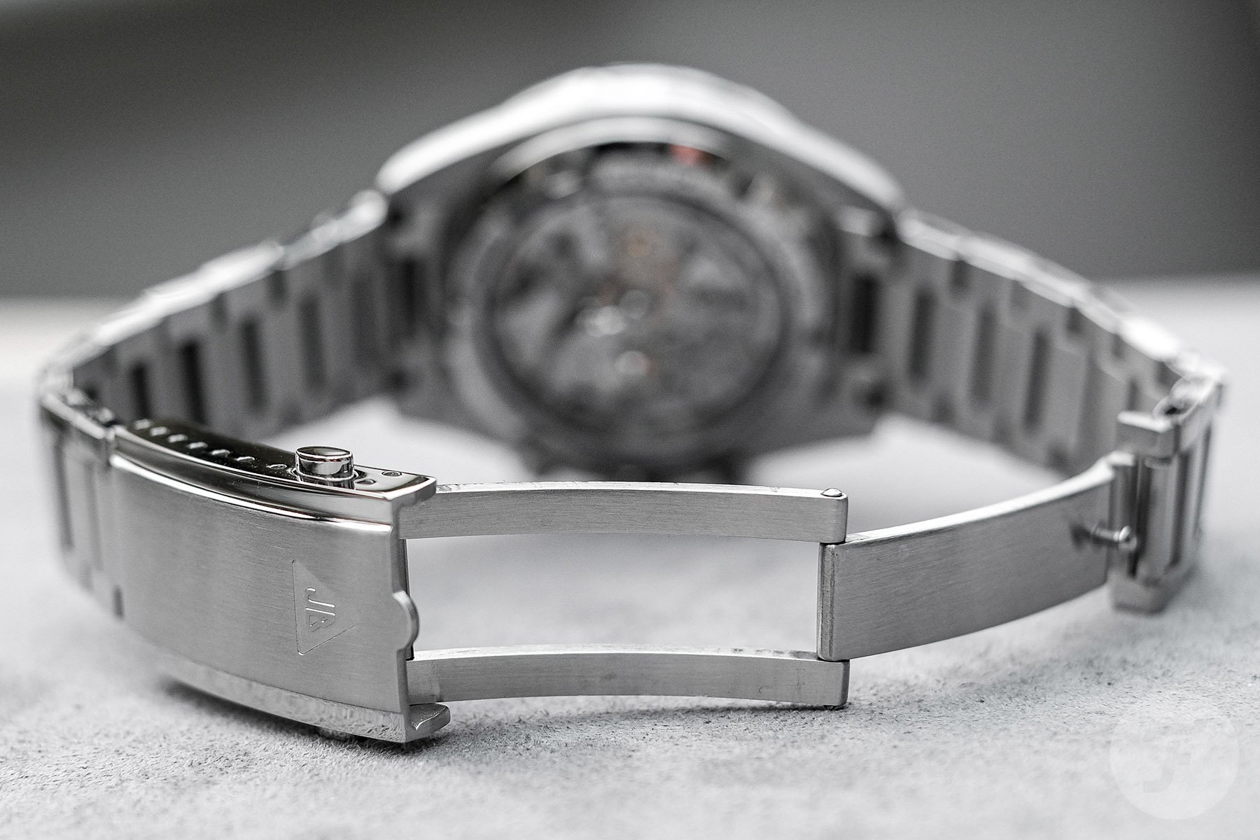
In his review here, Rob delivered the run down on this new Forstner bracelet. While it was fantastic to see the Flat Link on the Broad Arrow Omega Speedmaster, the Moonwatch is the iconic home of this bracelet style. As this is only a Strap Check, I won’t be retreading Rob’s steps, as for the most part, I echo his thoughts. However, Rob mentioned that the “nipple” (as he called it) that protrudes from the clasp unnecessarily rubs the nearest center link. I didn’t experience this, but just as with men, the nipple seems a somewhat redundant inclusion. Looking at the Omega bracelet side by side, I can appreciate the existence of this bump following the silhouette of the Omega logo on the clasp. Nevertheless, I’d prefer its omission.
Forstner Contemporary Flat Link
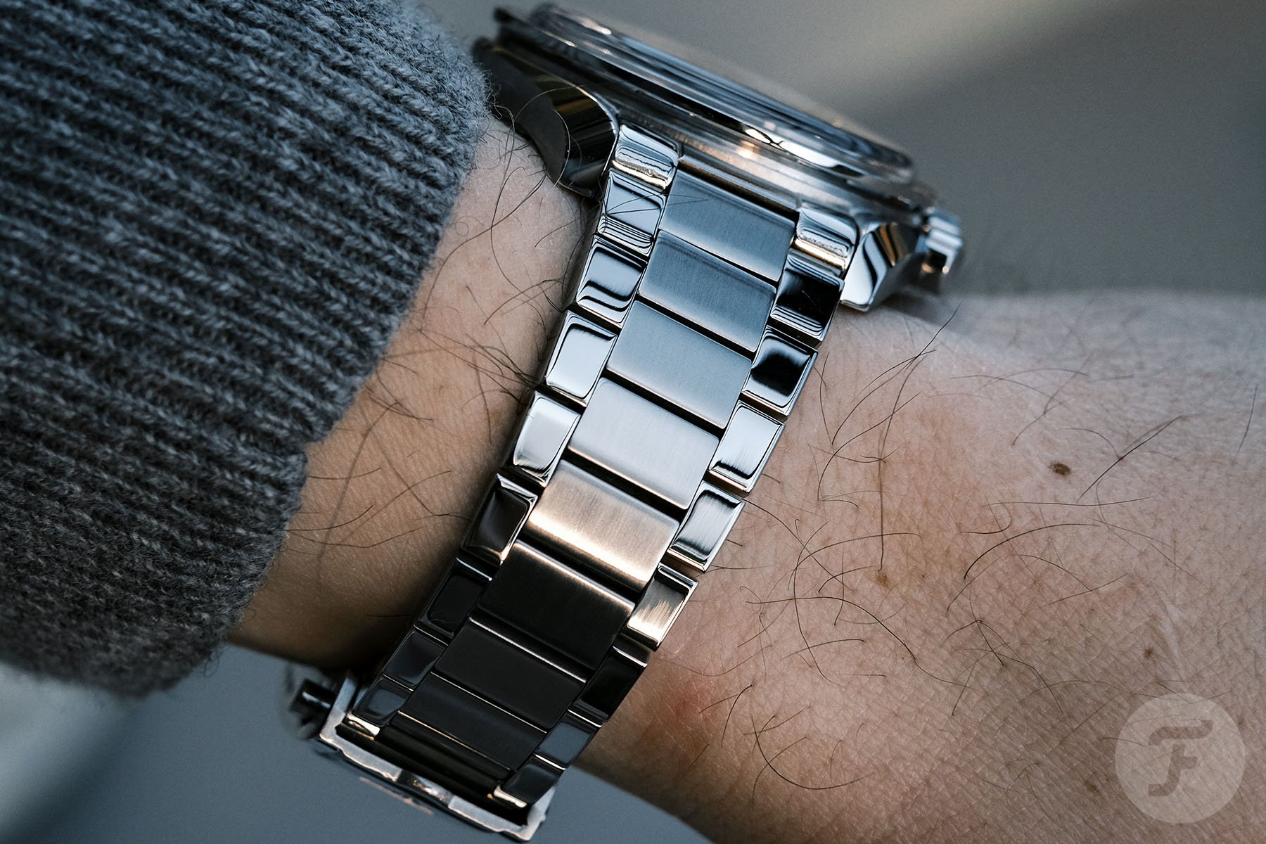
Compared to the previous Forstner bracelet, each link is chunkier yet retains the namesake flatness. Notably, a “Flat” link must have a straight edge on the outer surface. If the edges of the links begin to curve to allow more freedom of movement, such as the Seamaster 300 bracelet, it disqualifies it as a Flat Link. It may only be me adjudicating this, but I see the term “Flat Link” prescribed to too many bracelet designs that I need to step in and draw the line. I am happy to report that despite the added thickness of the Contemporary, the links are still relatively flat. That’s no simple feat, as there is a point where the curvature is necessary when upping the heft of the links. You’d get to the point of no articulation with a square-shaped construction.
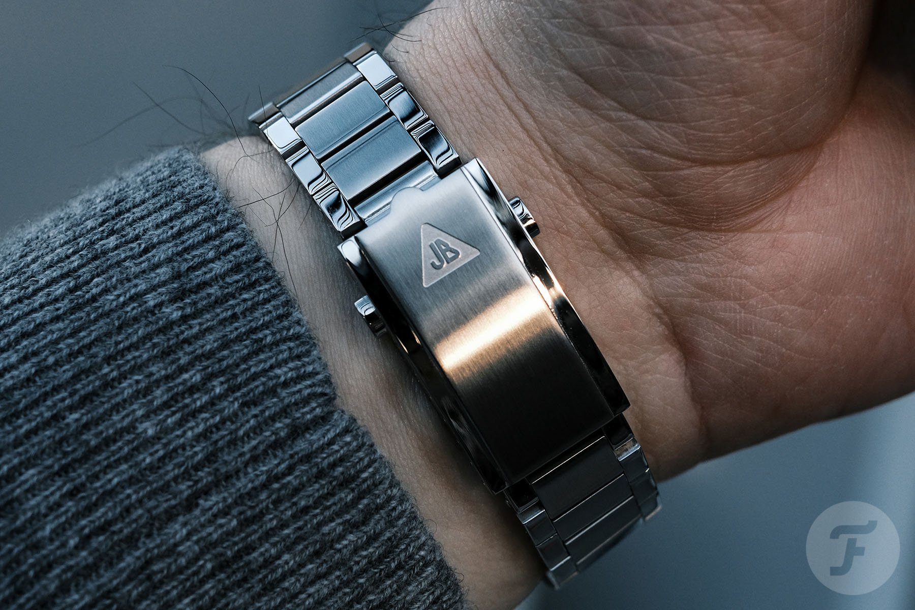
Another noticeable upgrade is the double push-button clasp release. No longer a nail-buster, the clasp is unfastened by pinching the buttons on both sides. Folding over the clasp showcases a solid steel machined structure with a central latch that follows the lines of the center links. This latch appears quite wide, making up a significant proportion of the folding mechanism. Compare this to the OEM Speedy bracelet, where each fold-over part is equal. Thanks to the Contemporary’s links measuring 3mm thick (as opposed to the 2.5mm thickness of vintage Flat Link), there is enough space to fit a single screw. Having single-slotted screws avoids the “user error” issues that the finicky, vintage-style double-screw system often causes. Going further than that, the screw-link connection on this Forstner Contemporary is perhaps even better than Omega’s own.
Comfortable to adjust, but no “comfort adjust”
On the newest ref. 1479-style bracelet mounted to the regular Speedmaster Moonwatch, each link has two screw heads and a pin. The pin slots through and is capped with tiny screws on each side. From experience, these screws tend to go walkies if you knock the table or happen to breathe near them. Their diminutive size makes them a pain to slot in the housing. Tweezers, finger gloves, and a lot of patience are the additional tool requirements for adjusting the newest Omega Speedmaster bracelet. In comparison, the Forstner Contemporary Flat Link has a single substantial screw per link, making it a cinch to adjust.
So what are we missing with the Contemporary Flat Link? The bracelet no longer expands with the wrist. The flexibility of the stretchy links was a compounding feature that set the original Forstner Flat Link apart from the equivalent bracelet from Uncle Seiko. With the latest bracelet, each link is fixed in its place. It’s somewhat disheartening that the iconic flex inspired by the 1960s Omega reference 1039 bracelet is not implemented here. However, I understand that the expanding links offered a vintage feel that didn’t match this new Flat Link’s contemporary style. It’s worth pointing out that Forstner offers the latest Contemporary bracelet alongside the updated original style for those still wanting the vintage feel, yet both have solid end links. Whichever version you go for, you can opt for the underside lip for 3861-powered Speedmasters (post-2021 on the site) or the smooth curve for everything 1861-powered or earlier (pre-2021).
Final thoughts
On the wrist, the new Contemporary Flat Link feels precise and durable. It doesn’t stray too far from the original aesthetic or become too bulky. Looking at it top-down, it almost seems as if it was the intended bracelet from Omega itself. It’s only when you rotate your wrist to see the engraved JB logo that it reminds you it’s a Forstner. Losing the expanding links is the only element that further removes it from the ref. 1039 inspiration. But for a solid modern watch, the Contemporary is a better fit for the style and quality. I opted for the polished/brushed version with a seamless transition from the polished outer lyre lugs to the similarly finished external links. The brushed center links tone down the bling just enough to maintain the sporty design.
It has been fascinating to go on this journey with Forstner and the Flat Link, and I struggle to imagine what the next update could bring. The new Forstner Contemporary Flat Link is available for £159. You can read more about Forstner on Fratello here and check out the Forstner online shop.


