Sunday Morning Showdown: Cartier Tortue Monopoussoir Vs. Parmigiani Fleurier Toric Chronograph Rattrapante

Another Sunday, another showdown! This week, we are pitting two heavy hitters against each other. Jorg will defend the honors of the Parmigiani Fleurier Toric Chronograph Rattrapante. Thomas, in the other corner, will fight for the Cartier Tortue Monopoussoir. After several weeks of attainable tool watches in the showdown, this is a battle between two lavish Haute Horlogerie contestants.
We usually pick two watches with relatively comparable prices. After all, we want the fight to be fair. This week, however, we break from that pattern because these two watches sit at very different price points. The Cartier is €46,000 in gold or €53,000 in platinum. The Parmigiani is priced at CHF 135,000. However, in this exalted segment, we reckon if you can afford one, you can afford the other. Consider this a lighthearted thought experiment rather than serious consumer advice. With this little disclaimer out of the way, let’s dive in!
Last week’s results
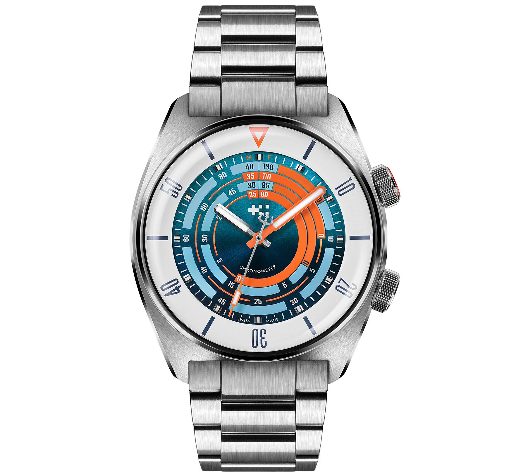
Before we let the gentlemen throw dirt at each other’s shiny objects, we should review last week’s showdown. Thomas must be walking onto today’s battlefield with some confidence because he won against Daan. His Christopher Ward C65 Super Compressor Elite beat Daan’s Mido Ocean Star Decompression Timer 1961. It was no landslide victory, though, with 57% of the votes going to the CW.
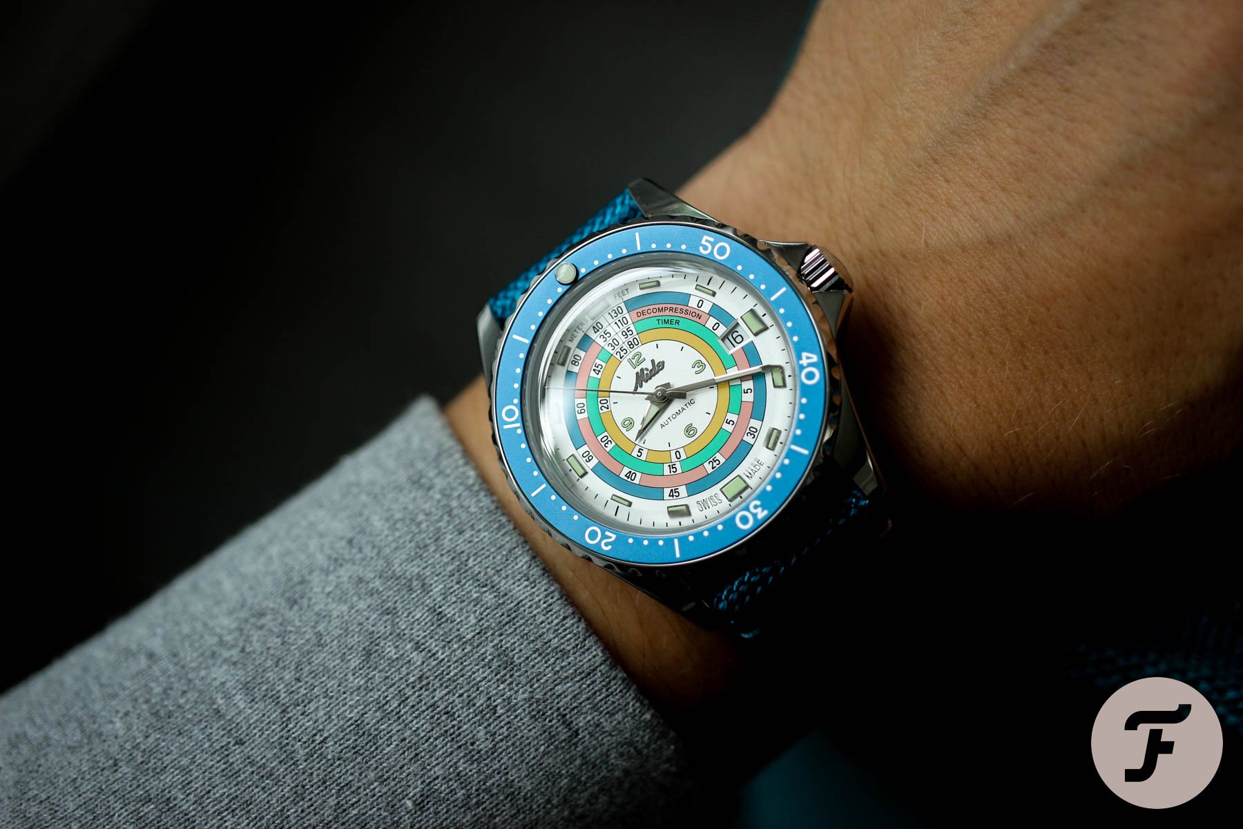
The Christopher Ward scored points for its true Super Compressor construction. Additionally, many of you commented that the build and finishing are superior to the Mido. So, what kept the C65 from a bigger victory? Many commenters agreed with Daan and Thomas’s notion that the branding isn’t great. The logo seems more fitting for a hospital than a watch brand.
In short, neither watch seems to be entirely uncontroversial and universally loved. One commenter went one step further to say that he was done with fun summer watches altogether. Well, we heard you. This week’s contestants are about as serious as can be. No bright colors, beach-ready water resistance, or competitive prices today. Let’s get into the battle of the Haute Horlogerie chronographs! This is Tortue versus Toric.
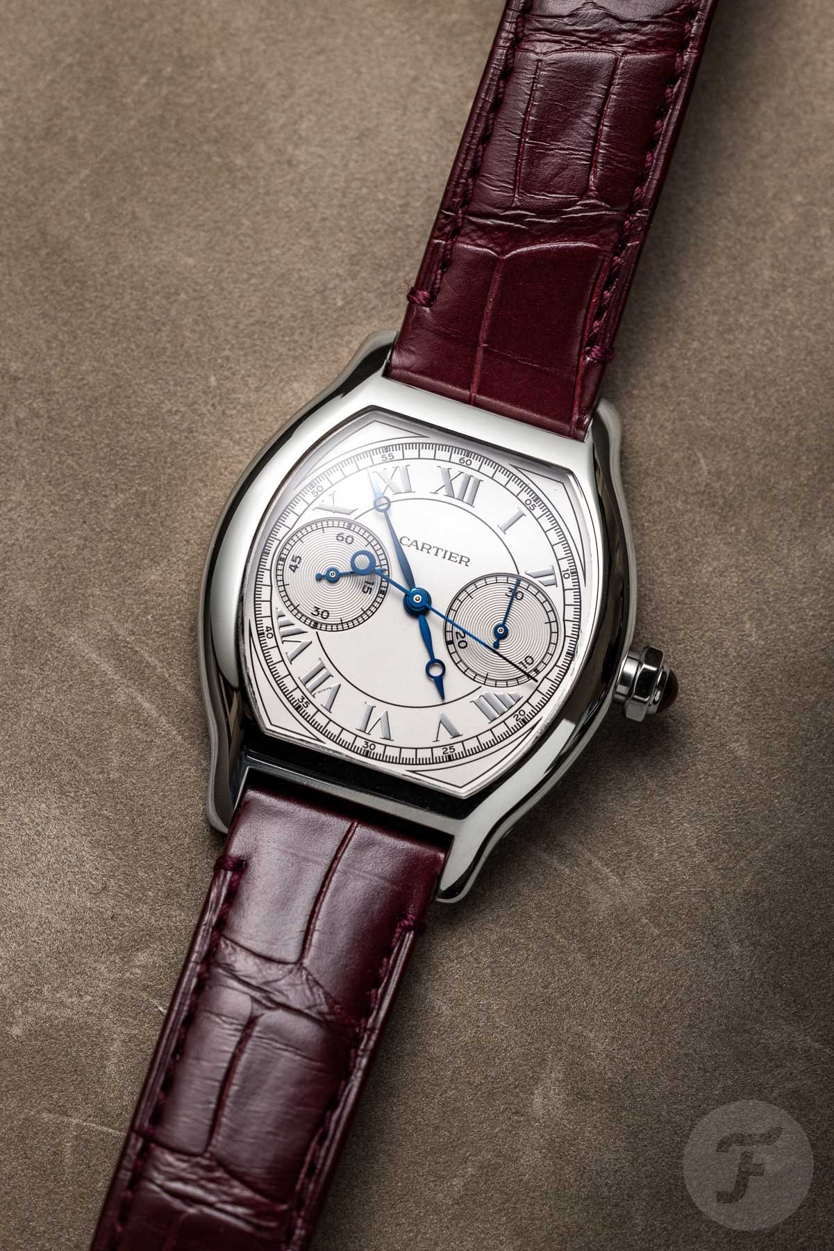
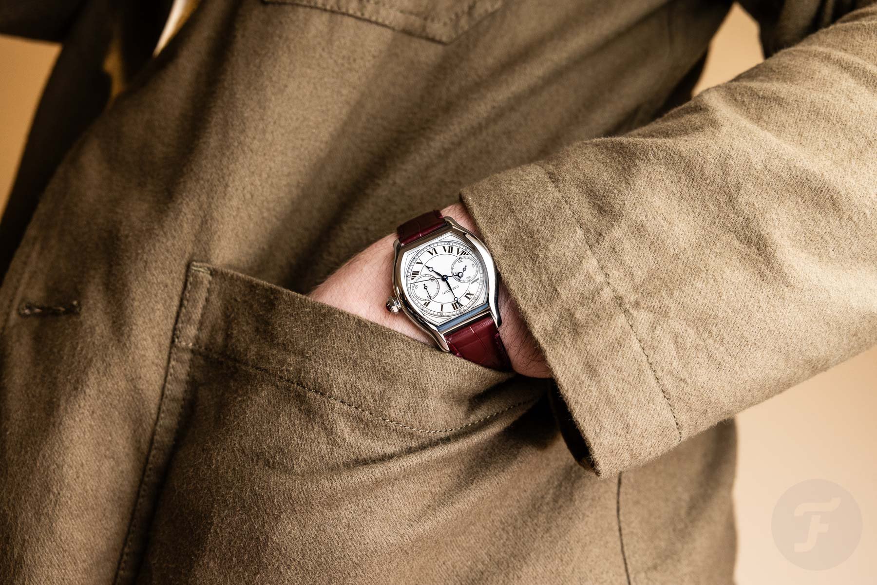
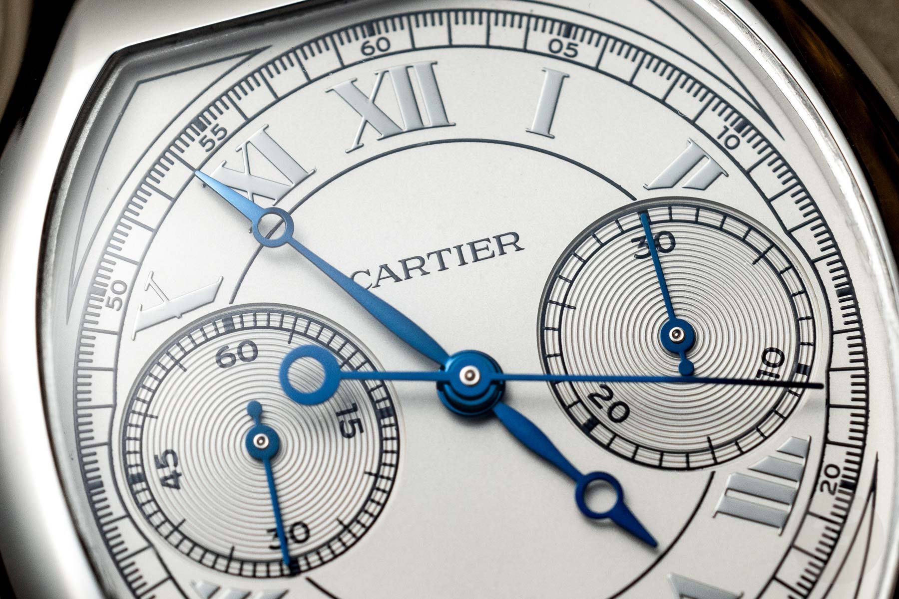
Thomas: Cartier Tortue Monopoussoir chronograph
I had the great pleasure of trying on both of today’s contestants at Watches and Wonders in April. Both watches made a big impression on me, especially from a quality perspective. Whatever you think of them, you cannot argue that these aren’t beautifully made. Of course, considering their respective asking prices, they should be. Still, it is great to see such refined watchmaking in real life. I have compared it to seeing a 4K video for the first time; the sharpness and crisp detail jump out at you. Truly well-made high-end watches give me the same kind of experience, and these two both deliver in that sense.
I will readily admit that the Toric pushes this further than the Tortue. The price difference can be seen and felt. The Toric’s frosted dial and, especially, its movement are stunning. It feels more like independent high-end watchmaking.
So, why am I defending the Cartier Tortue? That’s because I admired the Toric, but I lusted after the Tortue. In fact, the yellow gold Tortue Monopoussoir instantly became my grail watch. I have waxed poetic about it before, but let me try to explain again here.
Falling for the Cartier Tortue Monopoussoir
It is extremely rare for me not to find fault with a watch. I will admit I am a pedantic little purist (even if I often deny it), so I tend always to spot at least one thing I would change. “Remove the sunburst, make it smaller/bigger, design a better end link,” etc. If you have read my articles, you know the drill.
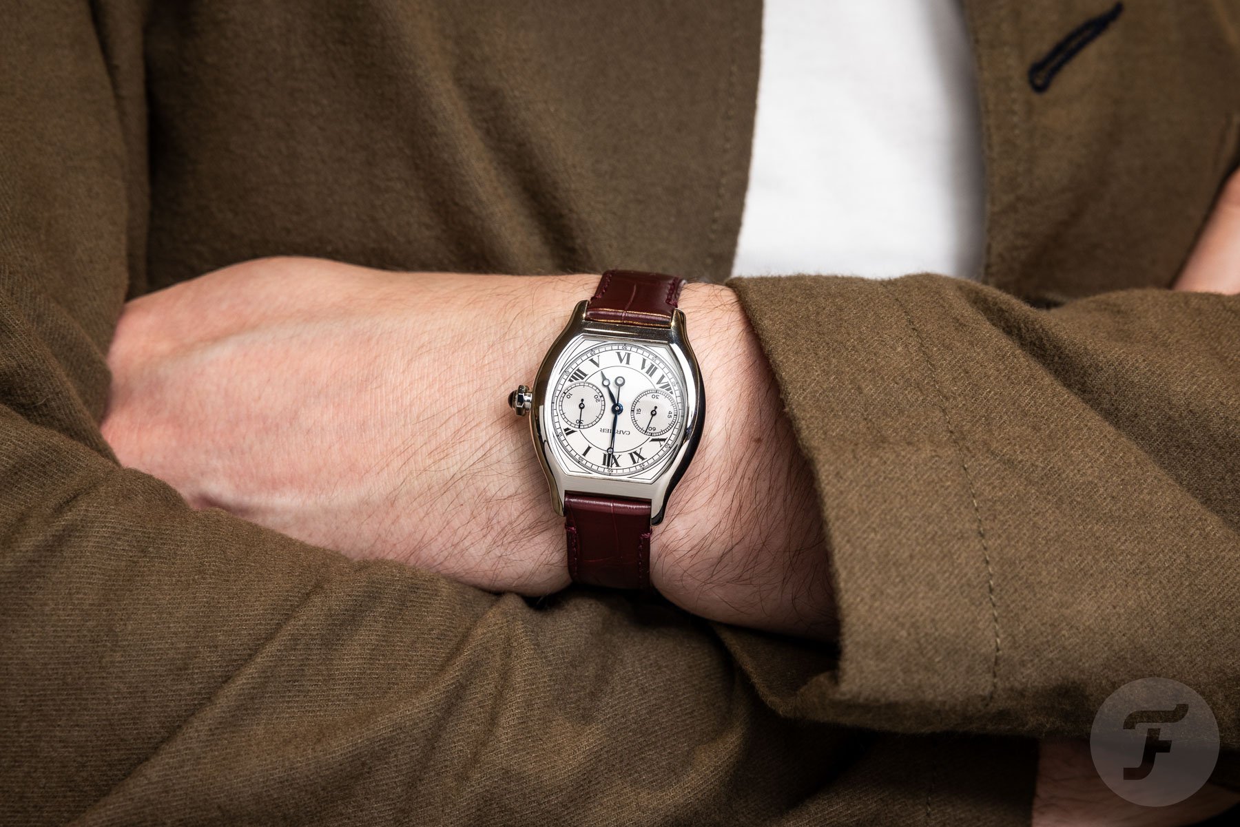
But then, on very rare occasions, I pick up a watch that instantly hits home. I strap it on, and it immediately strikes a chord. It is as if everything falls into place. This is precisely the experience I had with the Cartier Tortue Monopoussoir. I wouldn’t change a single thing about it (well, except its price and availability).
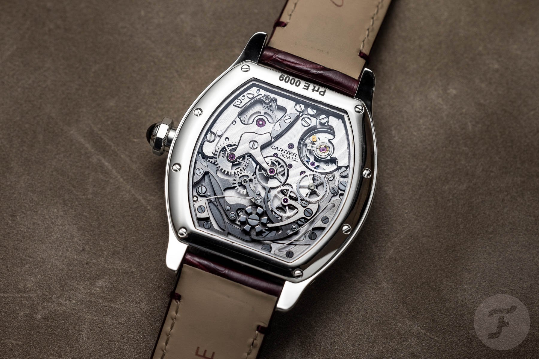
Of course, this is a purely subjective experience, so why should you care? Well, I think it is no coincidence that several of my colleagues were as infatuated as I was. The Tortue is everything we love about Cartier executed to perfection, from the proportions to the classical Cartier dial layout, the oddball case, and the street-cred of a high-end monopusher over the typical basic movements we commonly accept from Cartier.
Tortue over Toric
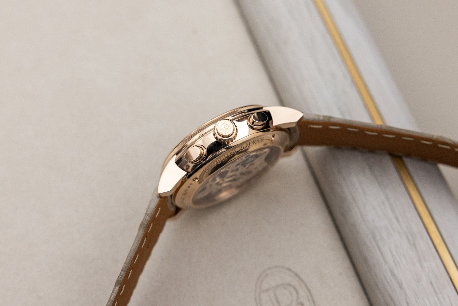
Let me provide a few more arguments just in case you don’t share my instinctive enthusiasm for the Tortue. For starters, I feel the Toric is quite simply the wrong size for its style. A classical, formally styled Haute Horlogerie chronograph should not be 42.5mm wide and 14.4mm thick. I found the proportions and the design to be at odds with each other when handling the watch.
Additionally, I found some design details slightly jarring. The knurling on the crown is much coarser than on the reeded bezel, for instance. There is also something odd about the proportions of the sub-dials compared to the dial’s perimeter. Everything is big and empty until you get to the minute track, which feels cramped. Short hour markers are something of a Parmigiani signature, but the brand went overboard here.
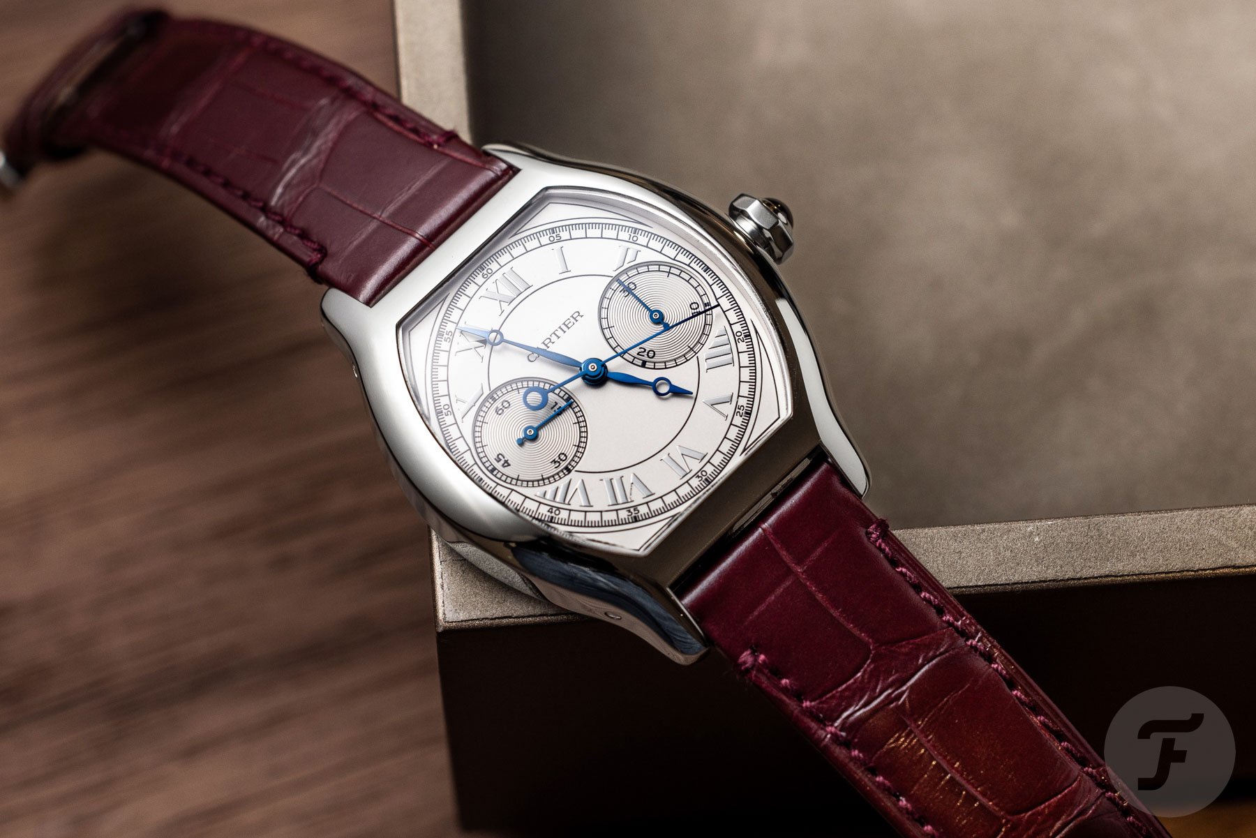
The Tortue, on the other hand, is easier on the eye. Yes, it has a much more intricate and busier dial, but it feels supremely balanced. The monopusher layout keeps the case beautifully sleek, focusing all the attention on the dial. Here, the two big registers are strong anchors for all the fine details around them. Lastly, the 34.8mm width, 43.7mm length, and 10.2mm thickness are perfect for a modern version of the classic Tortue. Note that this odd shape doesn’t wear like a round 35mm watch; rather, has the wrist presence of a 37–38mm one. And with that, I would like to pass the torch to Jorg to tell you why you should vote for the Toric nonetheless. I am sure he has a thing or two to say about these amazing watches.
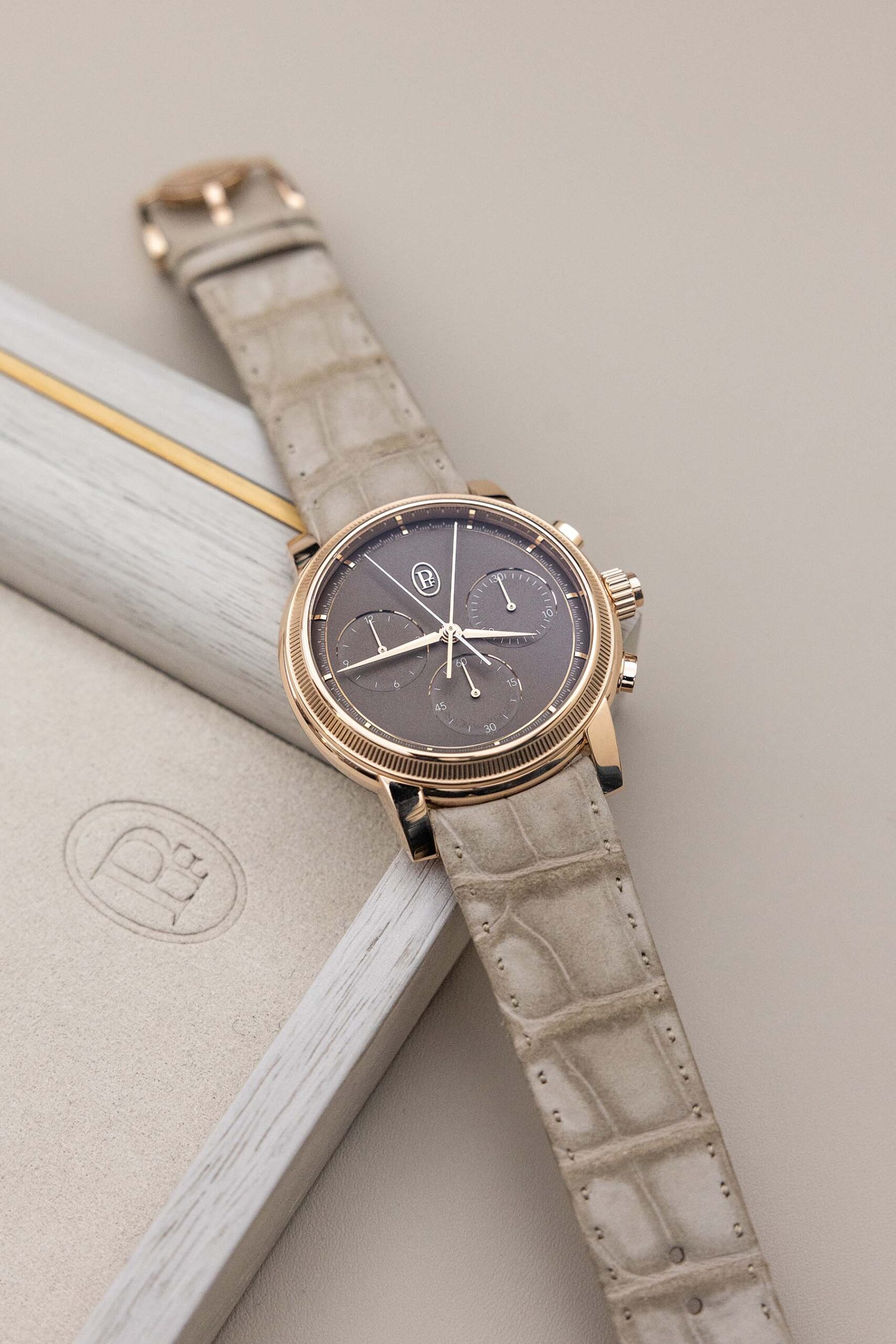
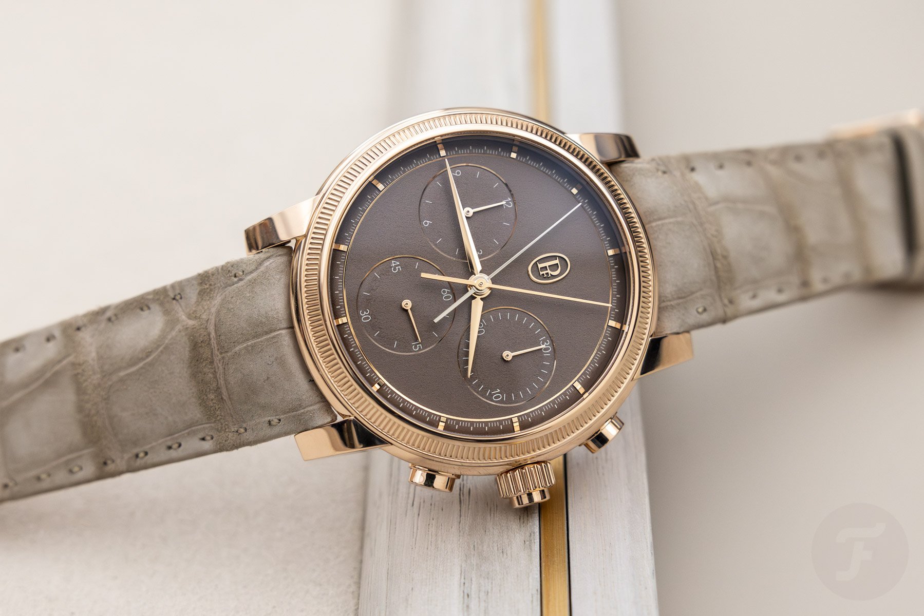
Jorg: Parmigiani Fleurier Toric Chronograph Rattrapante
Thanks, Thomas! I do have a thing or two to say about both watches. Let me start by saying that I greatly appreciate your Tortue Monopoussoir Chronograph. But if I had the choice between the two, I would gladly pay the extra virtual heap of cash to buy the Toric Chronograph Rattrapante. When I saw the new Toric collection that debuted at Watches and Wonders this year, I knew Parmigiani had cracked the code for translating the minimalist style of the Tonda PF to a different line of watches. I was curious to find out how the brand’s designers would be able to make that work without it feeling like a repetitive trick. After seeing the Toric Petite Seconde and the Toric Chronograph Rattrapante, I was even more excited than I had been when I first saw the Tonda PF.
The integration of styles is a wonderful display of design brilliance
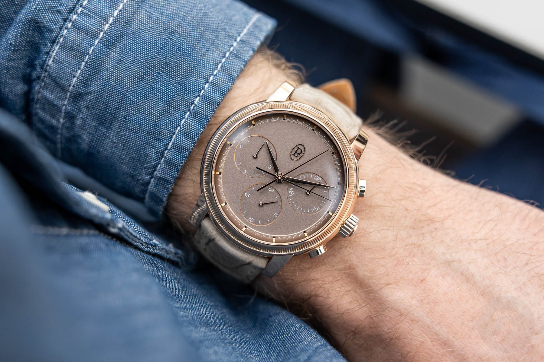
The way the designers have integrated the typical Toric style of the past and combined it with the minimalist design signature that now characterizes the brand was surprisingly brilliant. Not only do the styles combine well, but Parmiagiani has also ensured that the design becomes even better by choosing an awesome color palette. The saturated dial and strap colors complement each other perfectly and are a great match for the case materials. After seeing the watches, I was genuinely in awe of their style and execution. Visually, I like them even more than the Tonda PF line, and I had never expected to say that.
This brings me to your remarks about the Toric Chronograph Rattrapante’s case size and dial design. In regards to your first point, I can only say that our wrist sizes do indeed influence the way we sometimes look at the size of watches. I have bigger wrists, so traditional size standards do not always apply to me. Ultimately, it’s about whether a design works on my wrist rather than most people’s. Unlike you, I don’t have a problem with a 42.5mm high-end chronograph for my wrist, especially not when it’s as impressive as this Toric.
Watchmaking traditions have shifted
I understand that complicated chronographs from the likes of Patek Philippe and Vacheron Constantin were traditionally smaller. But it’s also an ancient conclusion in today’s landscape, as it turns out. A quick check reveals that Patek’s brilliant 5172G has a 41mm case that is 11.45mm thick, and the 5370P Split-Seconds Chronograph is also 41mm wide and 13.56mm thick. My beloved A. Lange & Söhne’s 1815 Rattrapante has a 41.2mm case that is 12.6mm thick. Lastly, the Vacheron Constantin Collection Excellence Platine Split-Seconds Chronograph Ultra-Thin’s case measures 42.5mm wide and 10.75mm thick. While most of these flyback chronographs have slimmer cases, their diameters are not that different from the new Toric Chronograph Rattrapante.
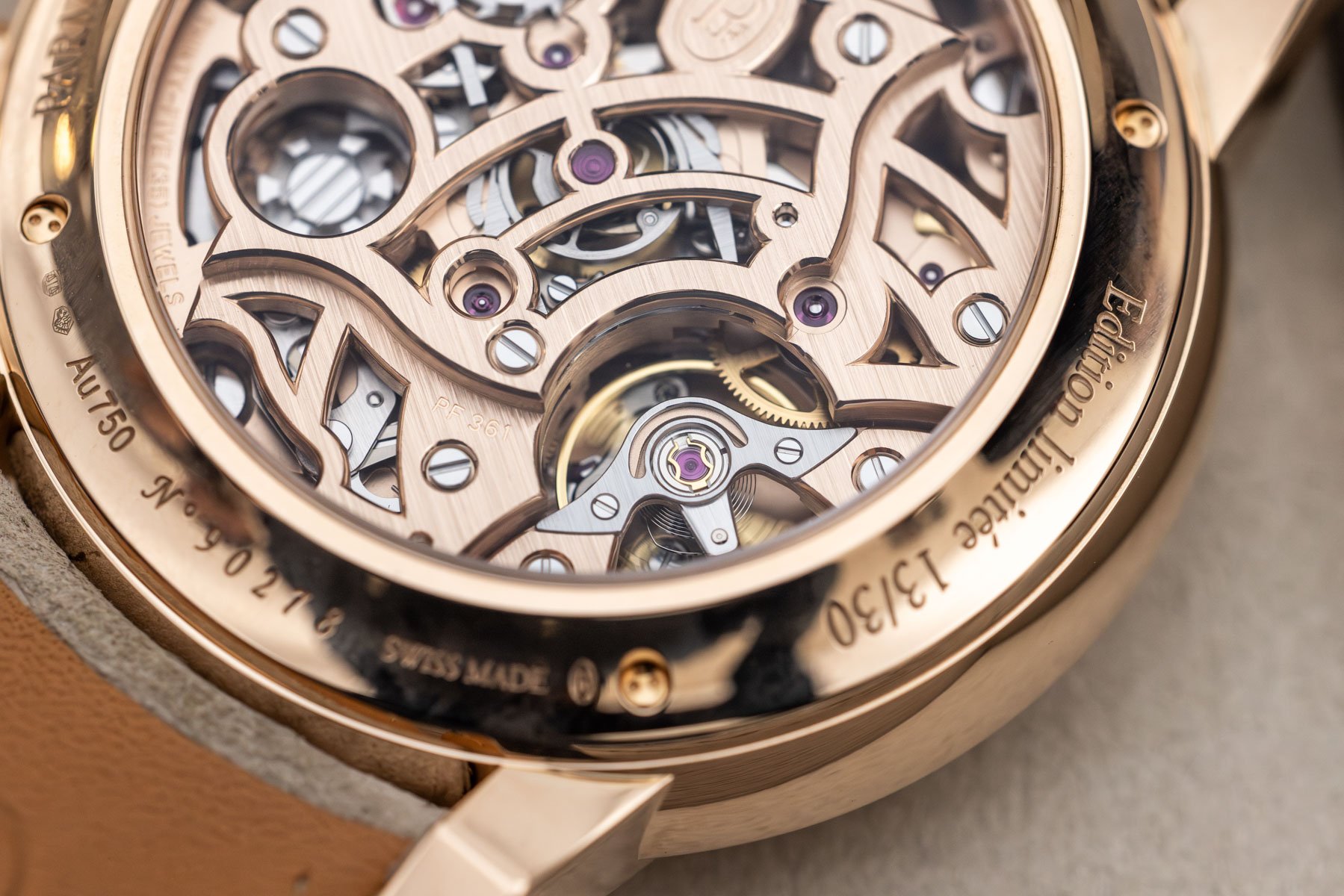
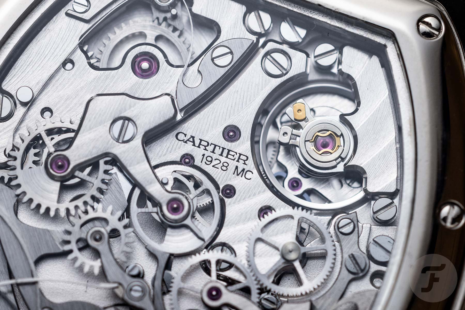
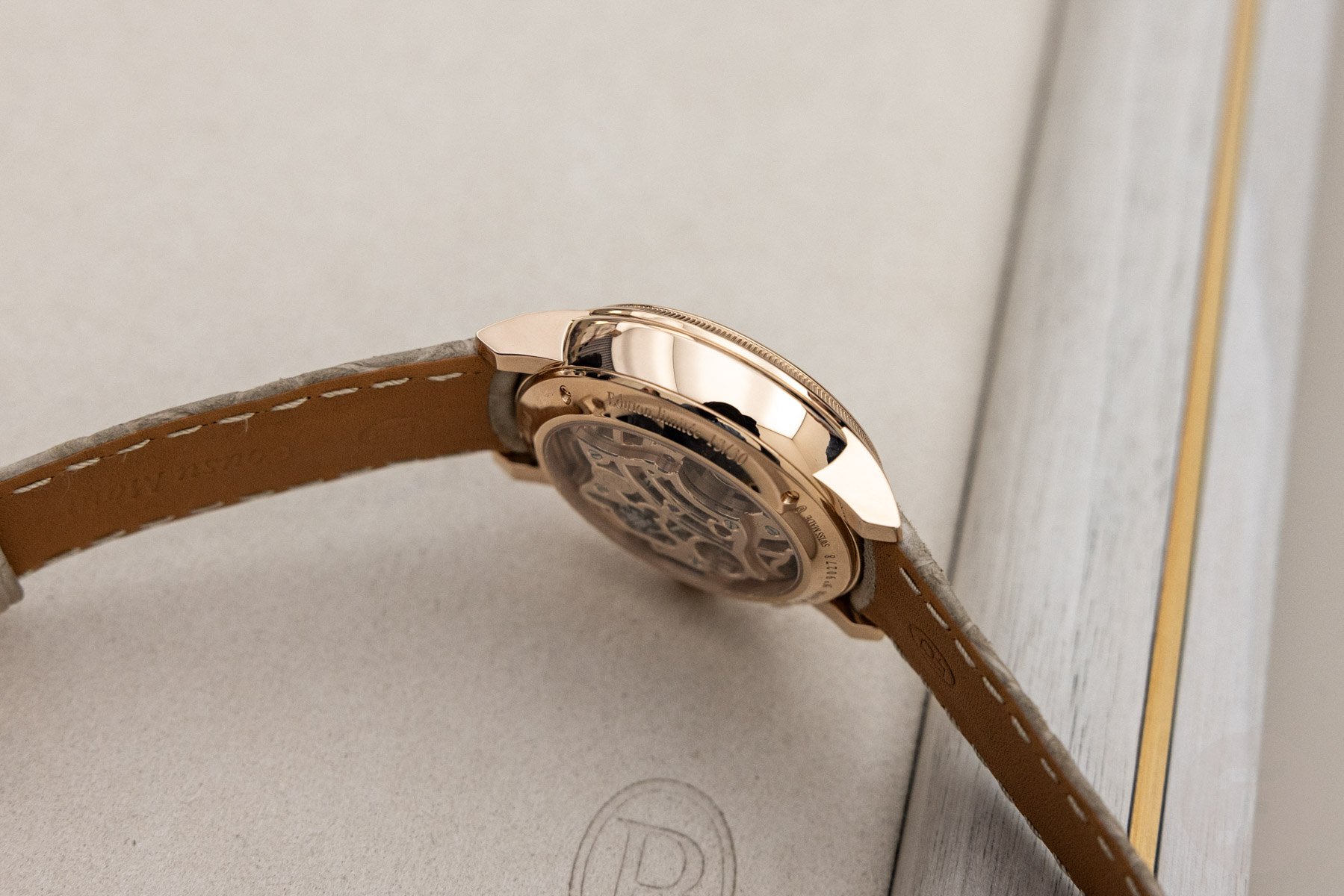
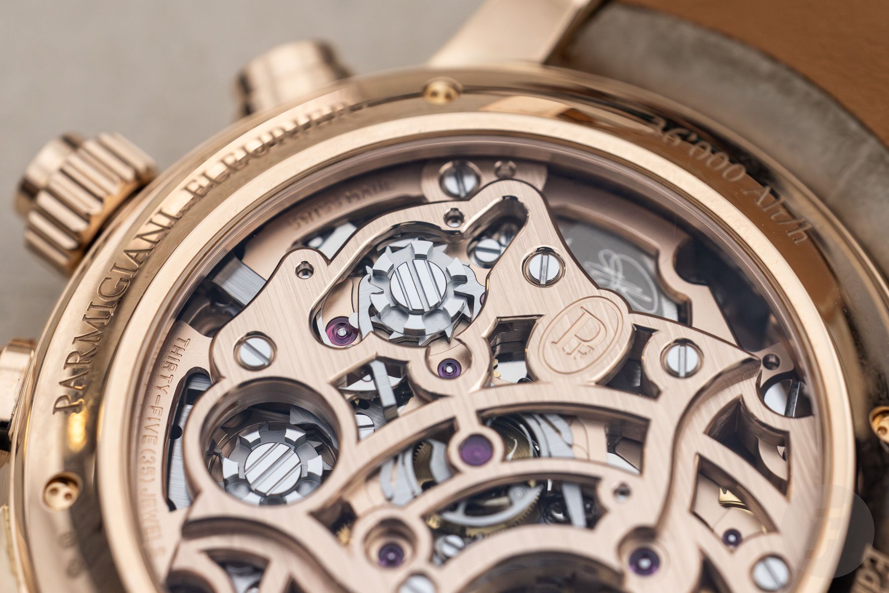
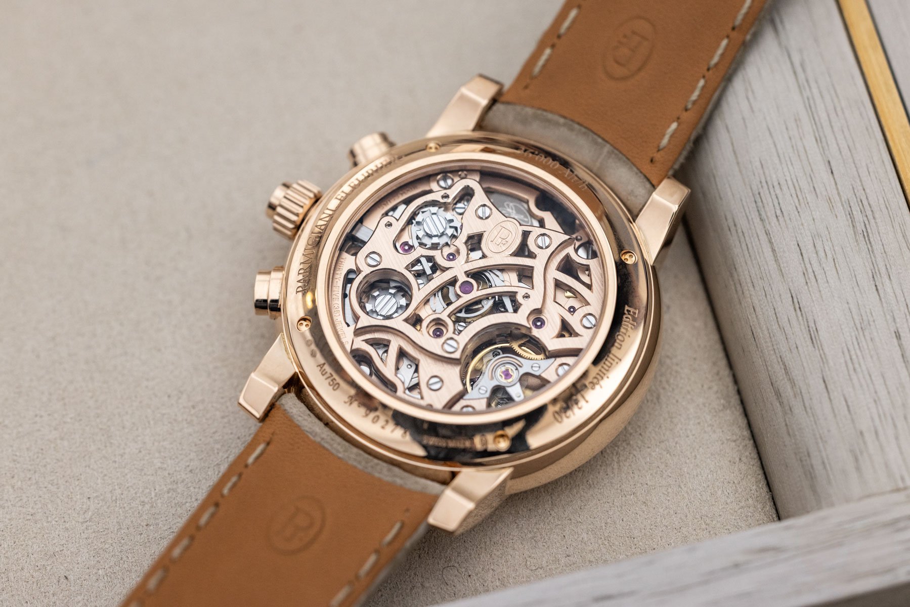
But have you seen the movement of the Toric, Thomas? I know you have, and you will understand why I have even fewer problems with the bigger rose gold case. The utter visual brilliance of the brand’s in-house PF361 rattrapante movement is stunning. The 256-part integrated double-column-wheel chronograph features a solid rose gold mainplate and bridges. It creates an intricate maze of incredibly detailed and impeccably finished parts that show the high-end watchmaking skills of Parmigiani Fleurier’s watchmakers. On top of that, the high-beat movement forms a wonderful, lavish contrast with the minimalist style of the dial.
The Toric is anything but boring
This brings me to your second point about the balance of the dial. In the many great talks you and I have had, I’ve learned that we agree on many design principles but disagree on some. While I understand and largely support your quest for design congruence, I also find that it often leads to the danger of designs becoming boring. If new designs immediately make sense, I know they probably have an expiration date. Especially when it comes to minimalist designs, that danger is never far from the surface.
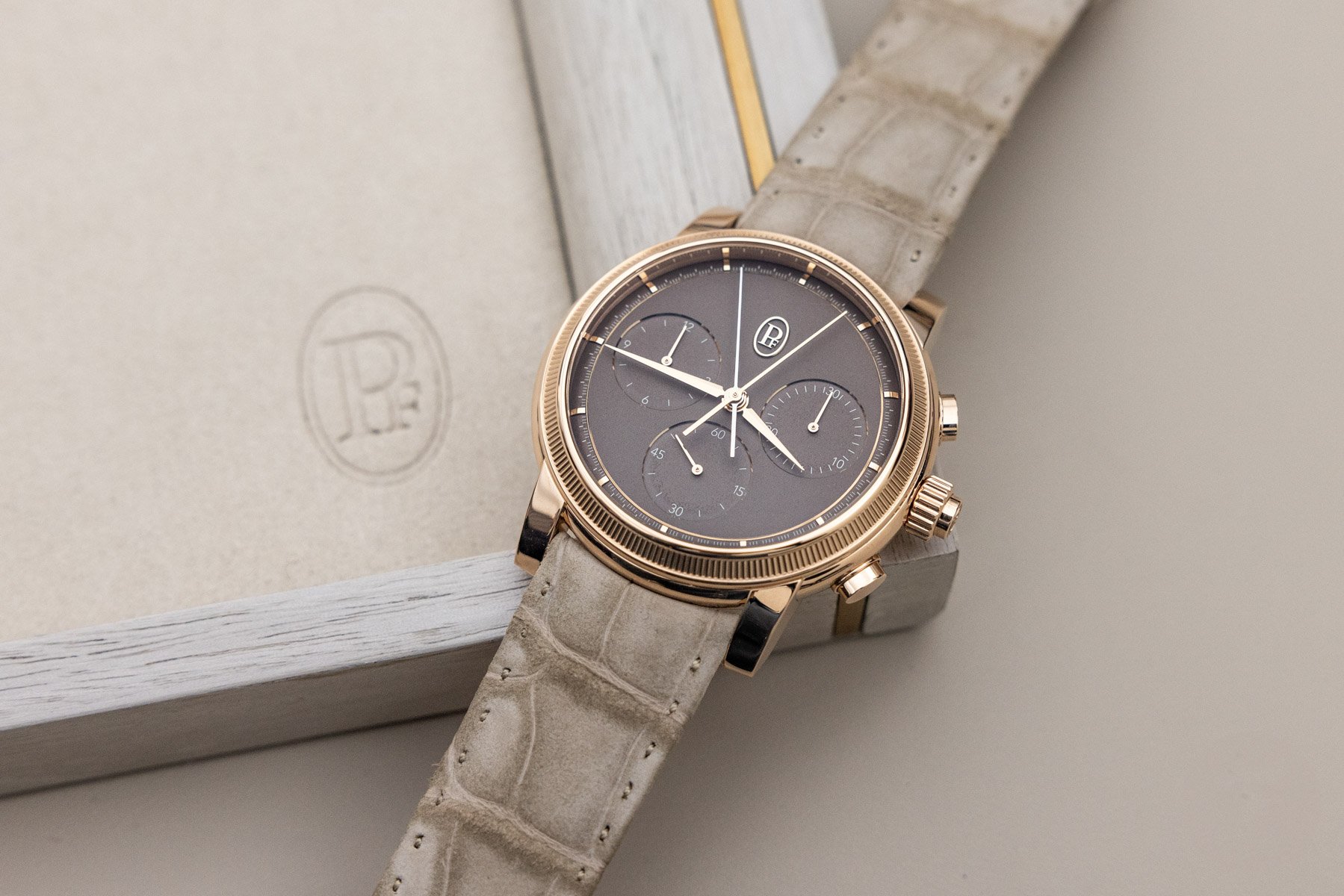
If I learned one thing during my nearly 15 years working in design, it’s that I want a design to have a sparkle or quirk I keep coming back to and that needs time to sink in before I feel comfortable with it. Designs like that will keep me interested longer, and that is exactly what this Toric Chronograph Rattrapante offers. As you said, the large central portion of the “natural umber” dial made of gold hosts three large sub-dials, while the minute track and the applied rose gold hour markers are quite small. It seems unbalanced at first.
Why the Toric Chronograph Rattrapante is an easy pick for me
But look again, and you will see that the wonderfully detailed sloping minute track almost continues the intricate details of the knurled bezel. The dial’s central portion is also a lot more detailed than you would think at first sight. The three sub-dials feature hand-applied 18K rose gold appliques that add exactly the right sparkle to the design. And the same goes for the execution of the hands. If you ask me, these constant contrasts are what make this such an awesome design. Large versus small, detailed versus minimalist… It’s such a tastefully created design and nothing short of brilliant. Combined with the stunning movement and the wonderful colors of the dial and the strap, it makes the Toric Chronograph Rattrapante one of my favorite chronographs today.
Is there something wrong with the Cartier? Not really. It’s more a matter of style. While I love Cartier’s designs, this is not the Cartier watch I would spend my money on. After seeing the Toric Chronograph Rattrapante, I would gladly spend my hard-earned cash on this piece of high-end horology that is not defined by the past but is a wonderful display of modern-day watch design. It is different and exciting, and it defines the unique and wonderful path that Parmigiani has chosen for the future. For what it is worth, the brand can take all my virtual money in exchange for a Toric Chronograph Rattrapante.
It’s time to vote!
Now it’s up to you, dear reader, to vote! Which one is your favorite, the Cartier Tortue Monopoussoir or the Parmigiani Fleurier Toric Chronograph Rattrapante? Cast your vote, and share your motivations in the comments section below!