Sunday Morning Showdown: Rolex Cosmograph Daytona Ref. 116500LN Vs. 126500LN
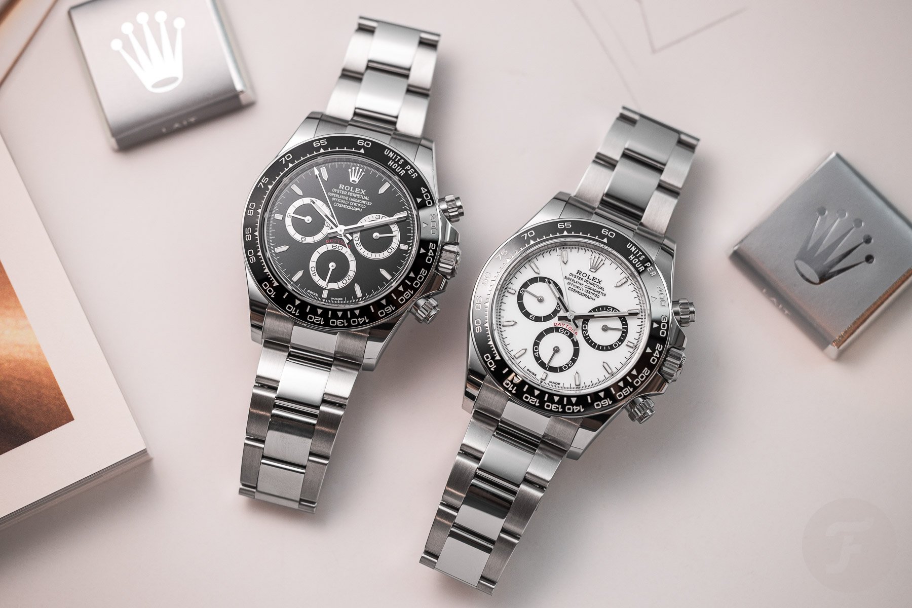
It’s Sunday, so it’s time for another showdown. As the red weather alerts rightfully called off this weekend’s Formula One Grand Prix at Imola, we bring you a motorsports-themed race against time. Rolex has refreshed the entire Daytona collection for the model’s 60th anniversary this year. While the new range appears almost identical to what we had before, the subtleties showcase the Rolex method of gently iterating upon its core models. Despite Rolex believing the changes undoubtedly improved the Daytona, many onlookers took to social media to voice disapproval of the new look. Our writers are no different, so we examine the previous Rolex Cosmograph Daytona ref. 116500LN against the new ref. 126500LN. We’ll leave it up to our readers to vote for their favorite at the end.
This fight has been brewing since Watches and Wonders 2023, so we’re glad to finally bring you this showdown. The Daytona is a bit of a Marmite watch among the Fratello team, primarily due to the hype it receives without living up to it. Our more indifferent team members tend to agree it’s a nice watch, but since you can’t get one at retail anyway, they shrug it off. Hence, it was pretty challenging to drum up excitement for the new Rolex Daytona with so many novelties from the Geneva show. But now, with the dust settling, our attention can turn towards the latest Rolex chronograph and the host of subtle advancements. Ben represents the outgoing ref. 116500LN, while Jorg takes the wheel for the new ref. 126500LN. But first, we’ll wrap up last week’s showdown and announce the winner.
First, a short recap
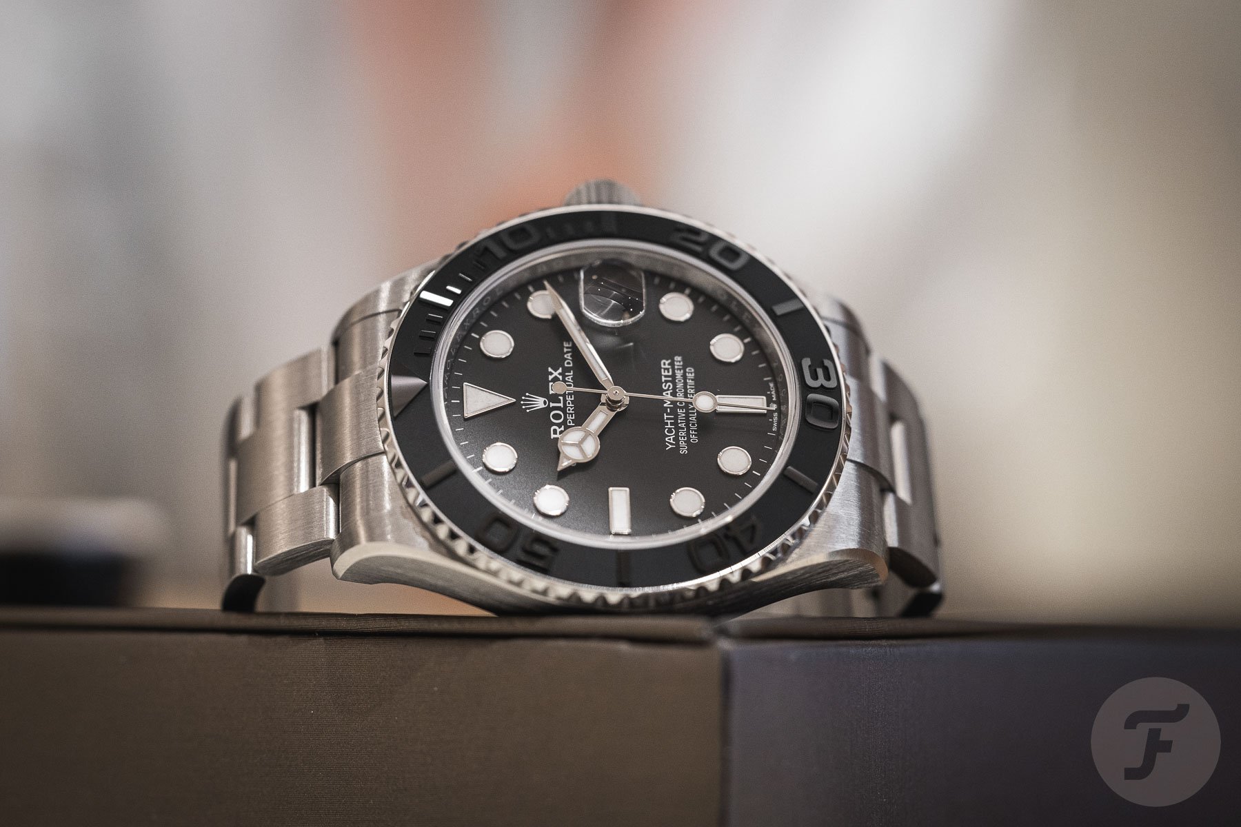
Last week, Nacho and Daan went toe to toe with aquatic titanium watches from Rolex and Omega. Yes, it’s still weird to say that Rolex produces a full-titanium watch, but we’ve seen two models in as many years. Specifically, it’s RLX titanium because giving it a proprietary name means it’s better somehow. Regardless, with 59% of the votes, the Rolex Yacht-Master still won against the Omega Seamaster Diver 300M Bond watch. Despite some inflammatory (yet hilarious) comments that the Yacht-Master “…looks like someone made a Seiko-mod of a Submariner,” the votes favored the Rolex. As we feature another W&W 2023 Rolex in today’s fight, let’s see if the new offerings receive back-to-back victories. Back to the Daytona, with Ben representing the 2016–2023 ref. 116500LN and Jorg backing the 2023 ref. 126500LN.
Ben: Rolex Cosmograph Daytona 116500LN
My very first Sunday Morning Showdown was back in 2020 when we debated the merits and demerits of the venerable Rolex Cosmograph Daytona. RJ and I fought tooth and nail, with my support of the watch eventually winning out. Following the “Rate It” win in my inaugural Sunday Morning Showdown, I’ve represented the Daytona thrice and lost each time to the Speedmaster. Today, as this is Daytona versus Daytona, the Rolex chronograph is guaranteed to win. That said, I am still eligible to lose this fight. As I’ve selected the outgoing ref. 116500LN, I risk not getting the reader’s majority votes. Nevertheless, I stand by my selection as the design elements of the 116500LN better convey the provenance of the Daytona’s mysticism.
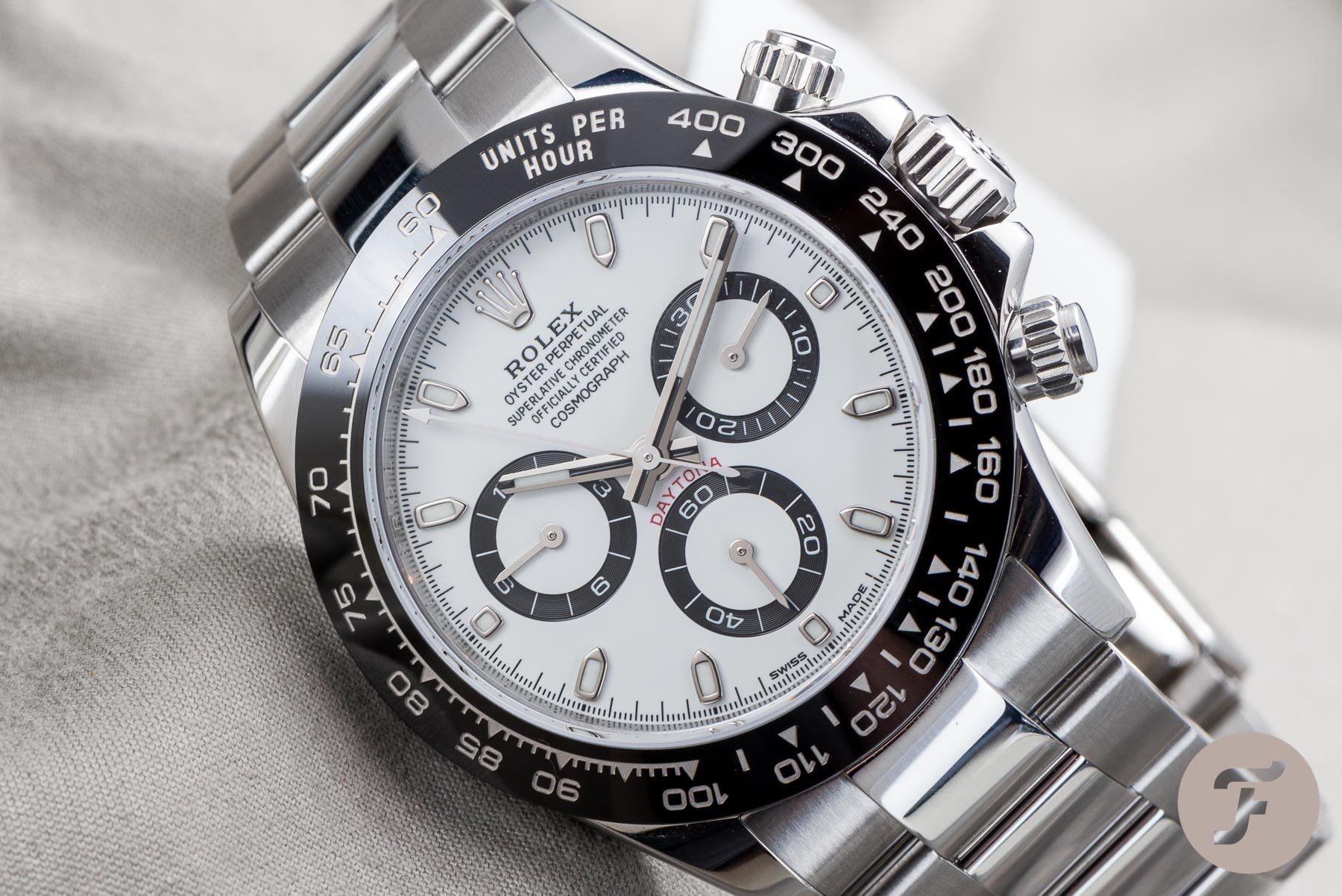
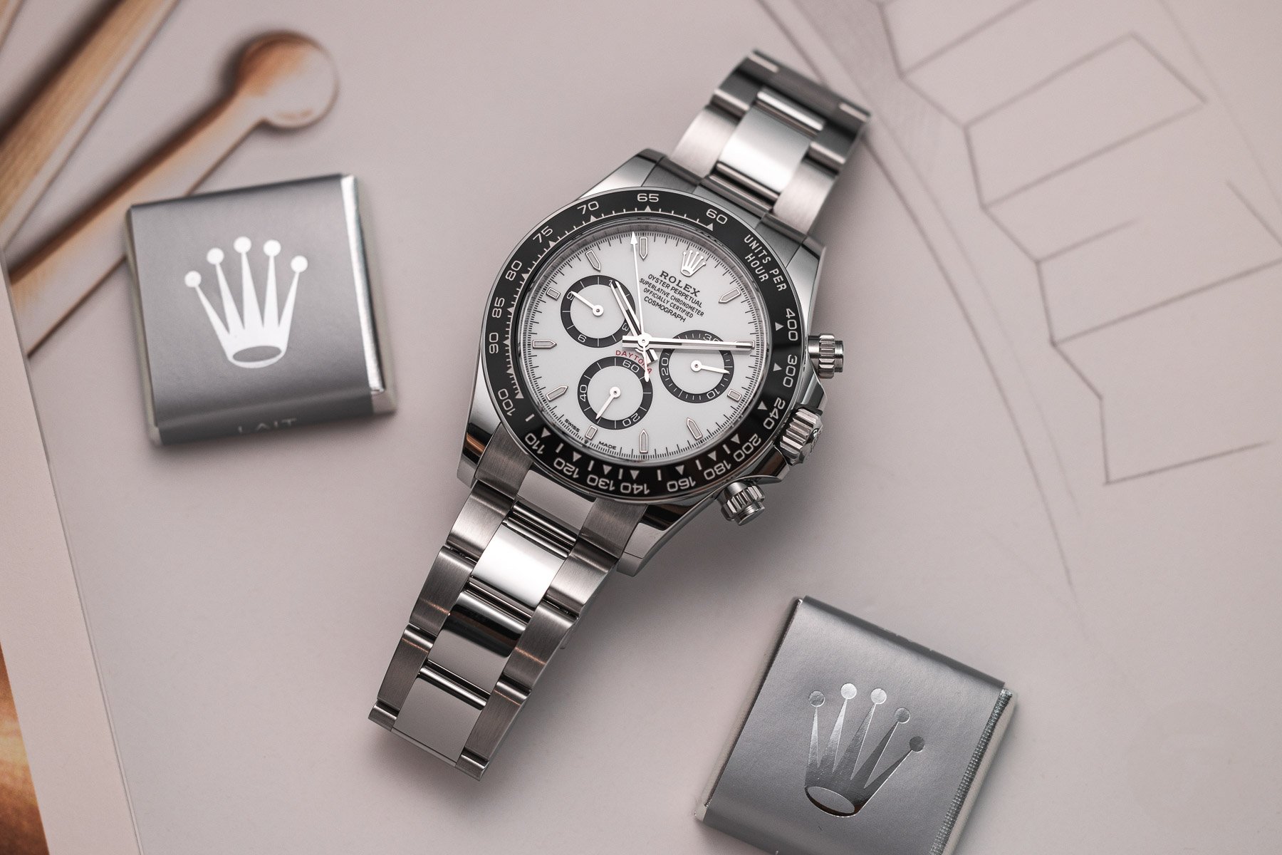
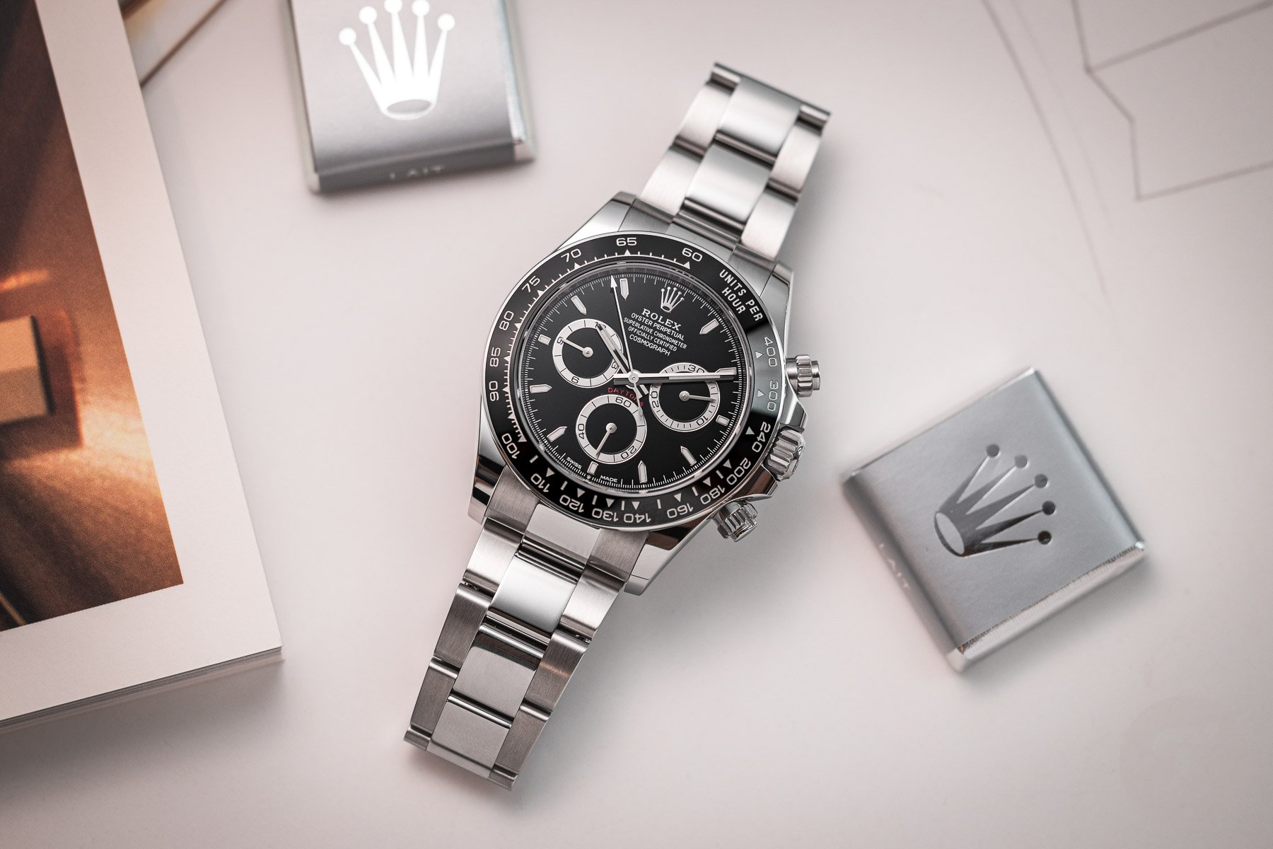
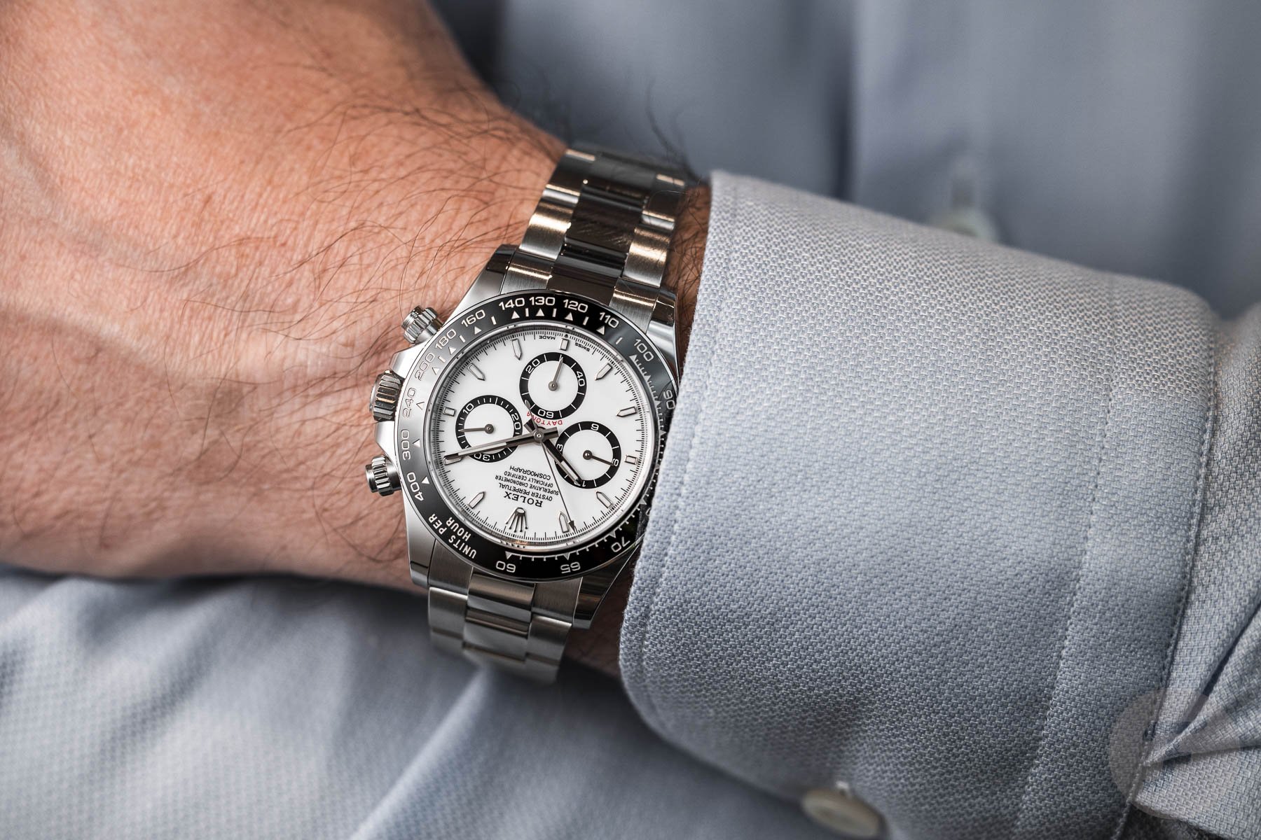
Released at Baselworld 2016, the watch community praised the Rolex Cosmograph Daytona ref. 116500LN. Yet the only updates from the previous 904L stainless steel ref. 116520 were the Cerachrom black bezel with bolder tachymeter scale and black sub-dial rings. The rest of the watch, including the movement, was unchanged. That didn’t stop it from becoming a coveted, waitlisted steel sports chronograph. While the new reference retains much of the design language that made the 116500LN such a hit, the 126500LN’s tweaks only highlight why the 2016–2023 era was peak Daytona. First, I commend Rolex for finally standardizing the Daytona case across all steel, two-tone, gold, and platinum materials. Previously, the Oystersteel Daytona had an asymmetric case. It was almost like the Omega Speedmaster but the reverse, where the lugs on the crown/pusher side were slimmer than on the other side.
Racing edge
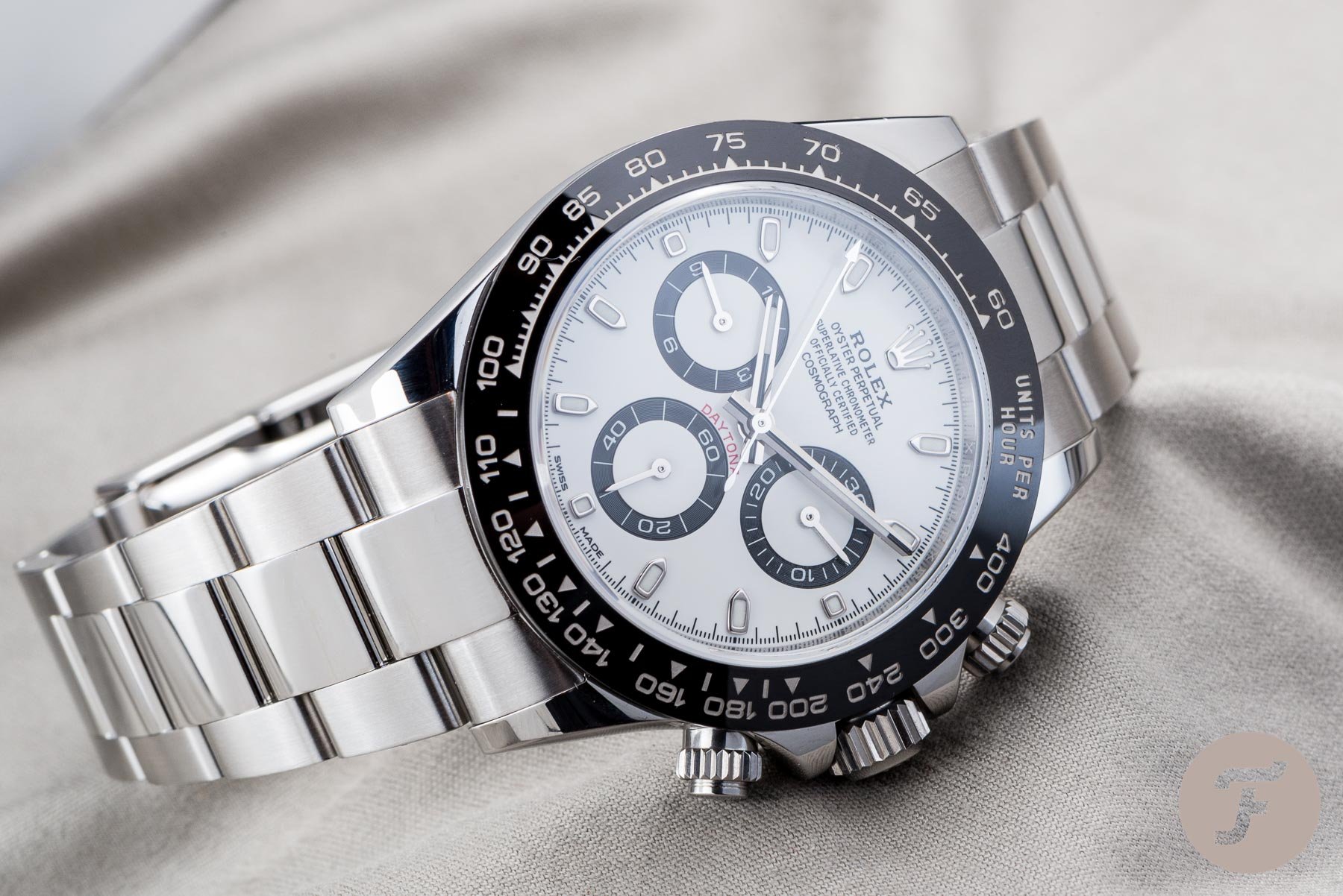
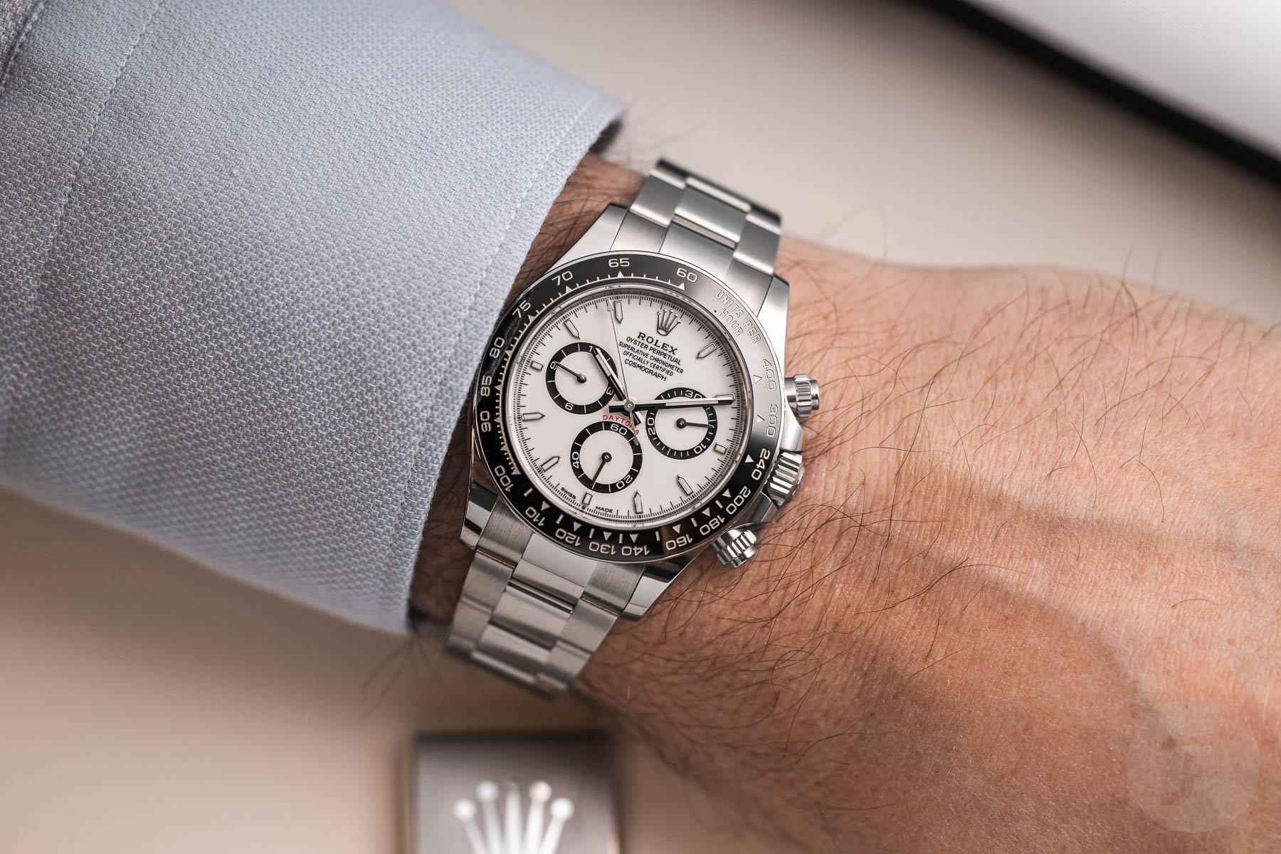
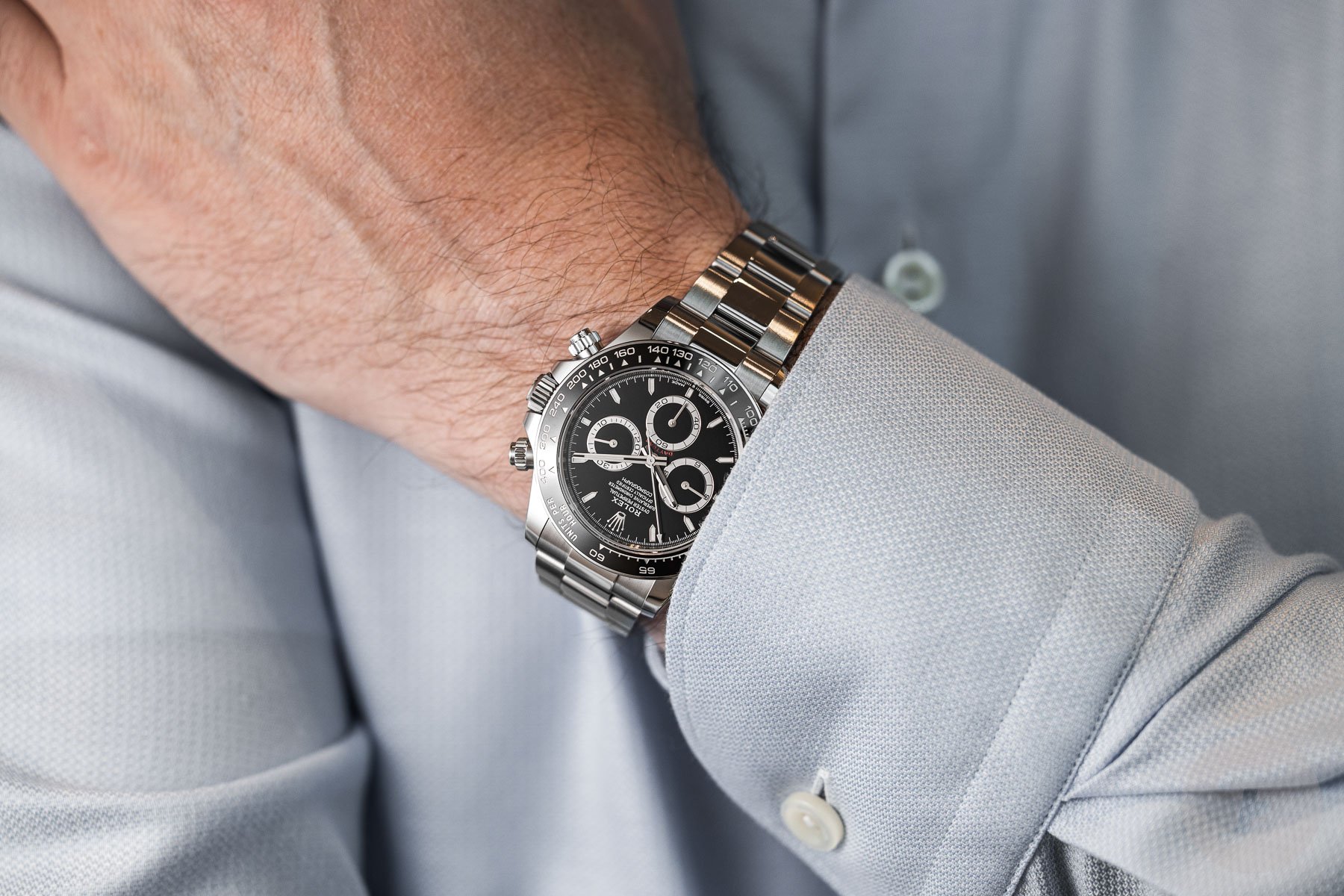
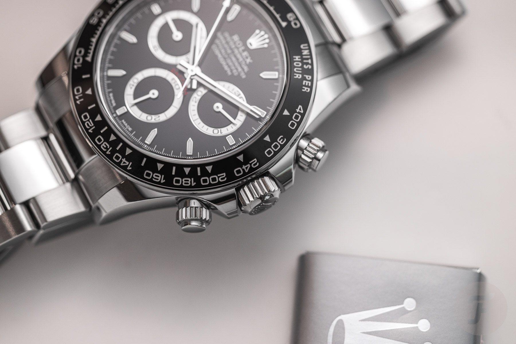
It may be a cool quirk to have pretty “un-Rolex” inconsistency in a professional range, but it’s a welcome act of streamlining. I also like the matching metal sliver running the circumference of each model’s Cerachrom bezel. Where the other tiny differences are almost imperceptible, the outer metal bezel ring is enough of a visual cue whether the watch is a new or previous reference. However, where the refreshed design falters is the case side. While it’s good that the case diameter is now closer to the listed 40mm spec than the 38.5mm ref. 116500LN, the new lug profile strips the Daytona of one of its character. Those polished rounded case sides are typically reserved for the prestigious Day-Dates and Sky-Dwellers, so including them on the grail-worthy Daytona made sense. But now, the slab sides and hook lugs more closely resemble a Submariner or GMT-Master II.
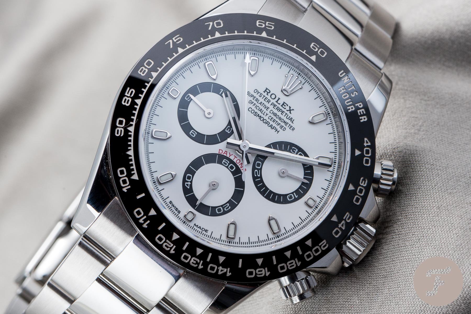
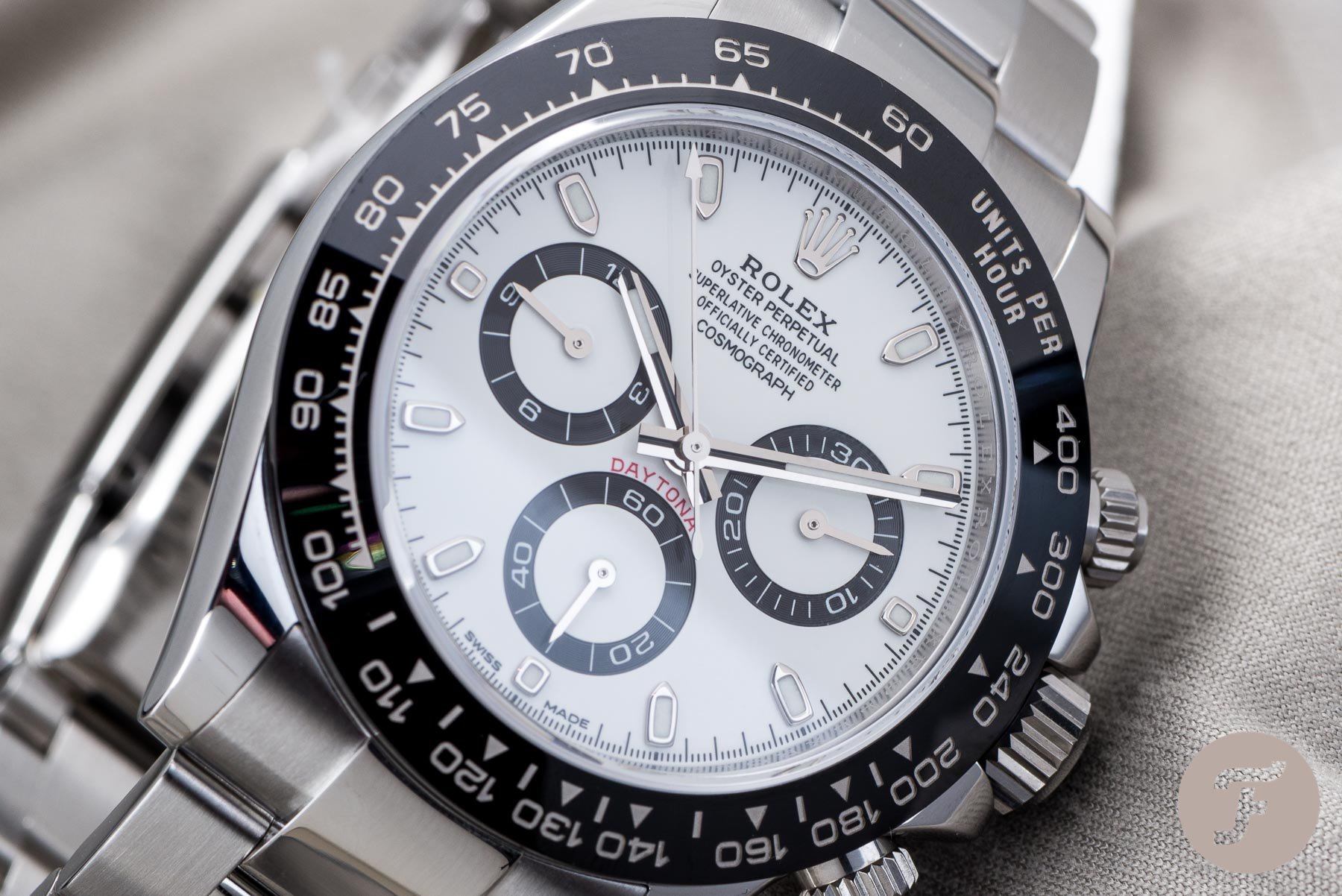
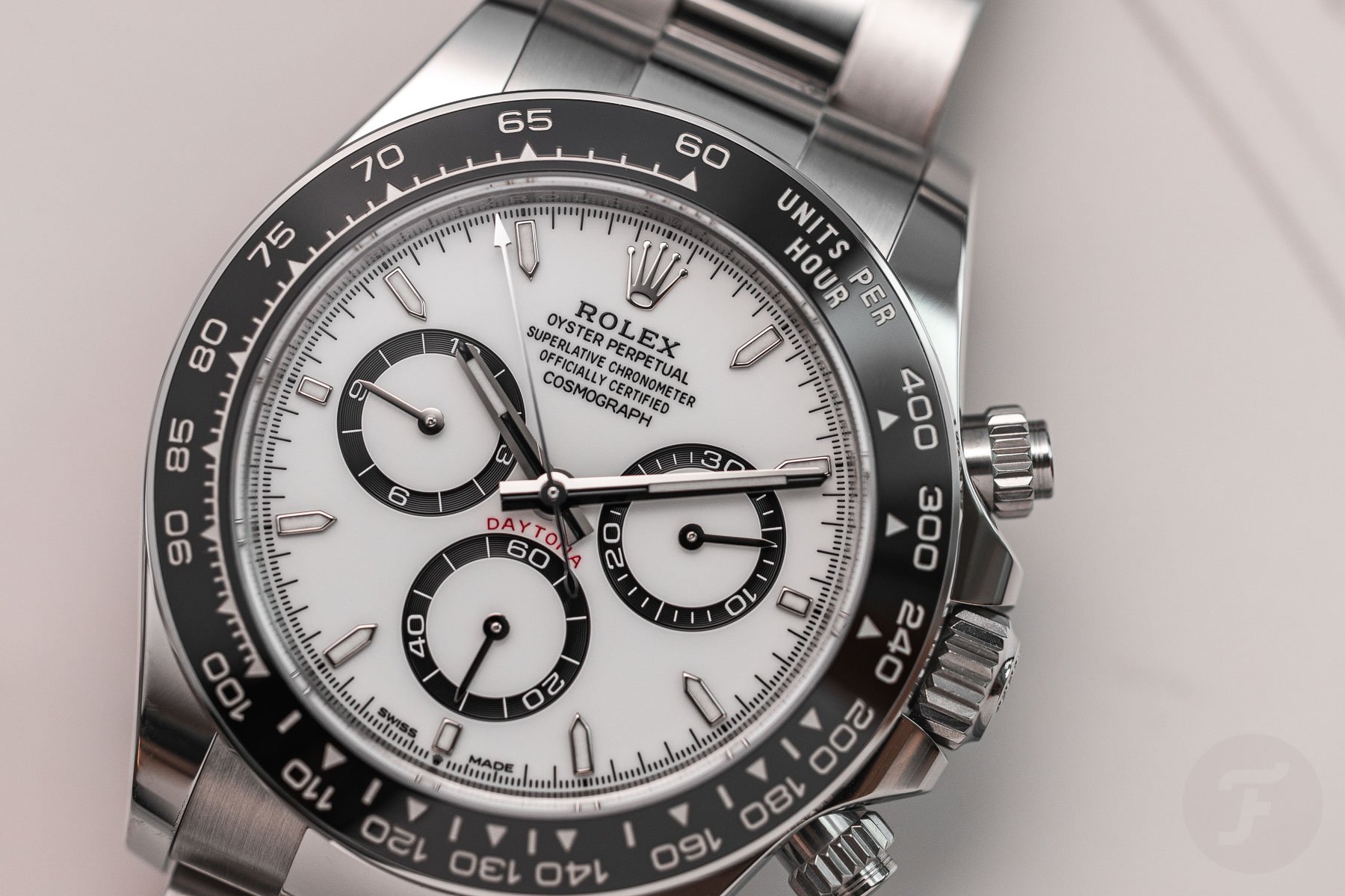
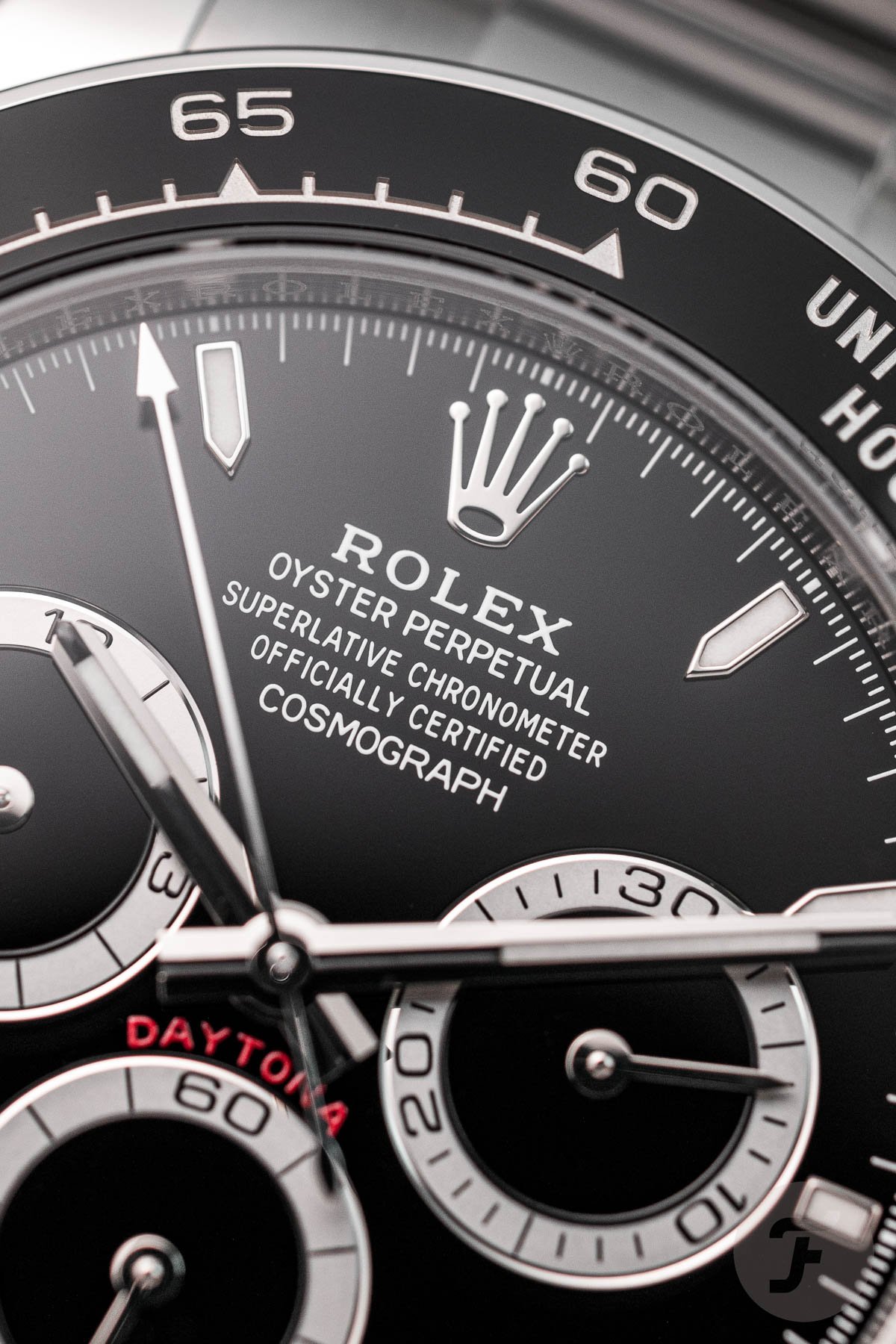
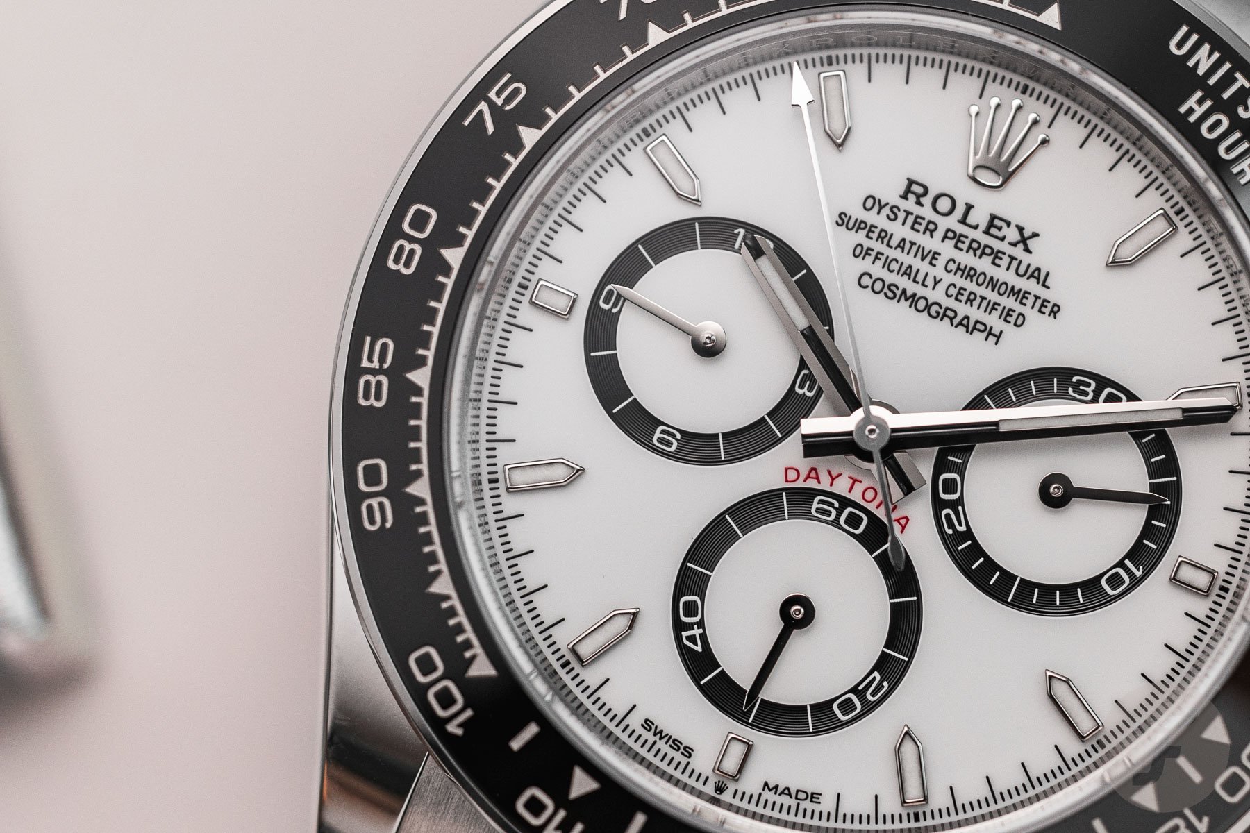
Of course, there is nothing wrong with those tool watches. But the Daytona formerly straddled the line between Professional and Classic. Now it sits firmly in the Professional camp. Even so, the case sides are not the most egregious update. My biggest bugbear is the skinny indices that mark each hour except 12. The new index look refers to the 1988–2000 ref. 16520 (or “Zenith Daytona”) with similarly thin applied white gold markers. But if you thought the Rolex Daytona was difficult to read at a glance before, the illegibility is compounded by smaller indices. While the relative position of the hands is enough to tell the time, when using the chronograph, the central timing hand is almost lost among the vague running track. The ref. 116500LN better complemented its bold tachymeter scale with cushion-shaped outsized indices that are sorely lacking in the ref. 126500LN.
Jorg: Rolex Cosmograph Daytona 126500LN
It’s no secret that I am not the biggest Daytona fan, Ben. Let me be more specific; I am not a fan of the automatic Daytona models. I adore the vintage manual-winding versions. That’s where the romance of Rolex’s iconic chronograph lies, and I’ll pick any of the manual-winding models over the automatic ones. But with this new Daytona ref. 126500LN, Rolex has made significant steps in making the Daytona more likable for me. The keywords in making that happen are “refinement” and “elegance.” While the new Daytona still looks like a Daytona, many details have changed to make it a better watch — one that I would much rather spend my fictional €15,100 on.
Ben: Quite a jump up from the €13,900 of my reference, but I’m sure it’s still not enough to stifle the demand.
First, the new case is an excellent improvement from the previous model. As you also pointed out, Ben, Rolex let go of the overly asymmetrical lugs and replaced them with ones that look much more balanced. I wasn’t a fan of that visual imbalance, and it’s one of those “once seen, it cannot be unseen” elements that didn’t work for me. Additionally, I like the overall shape of the “hook lugs,” as you call them, a lot better. They are slightly wider, point slightly downwards, and connect to the case lower, just above the top chronograph pusher. They also transition into a flatter case band in comparison to the rounder case band of the previous generation.
Ben: To my point, the sides of the new case are not as elegant as the pebble-like case band of my choice.
The new case and bezel design
But that’s not where it ends. The crown guards are both longer and broader in shape, making them flow nicely from the case to integrate the elements better. The new case is also 0.5mm thinner and measures 11.9mm in thickness. Overall, it’s a remarkable evolution in design that works very well. And let’s go back to the flatter case band for a bit because it is part of the new bezel construction that has been much debated and will play a significant role in the Fratelli’s preference, Ben.
Whereas your previous generation had a full-ceramic bezel ring, the new bezel includes a thin polished stainless steel band that is part of the case. Still, the ceramic ring is not an insert, despite what you might assume. Rather, it’s a solid element like on the previous model but in a protective “cage” of sorts. This is a design choice that I like. The new case has a more modern overall shape thanks to all the little design details that have changed. It results in a thinner case and a design that I prefer over the previous generation.
The refined dial is a step forward with a hint of the past
Another element that I think Rolex did a great job on is the dial design. One of the significant issues I have always had with the previous Daytona is the cluttered dial. Many elements are fighting for attention instead of creating a nice visual balance. And the Rolex designers decided to change that by refining the design. The main changes are smaller and thinner indices and thinner contrasting sub-dial rings. While the circumference of the rings is the same, the internal diameter has increased, giving them more room to breathe. Together with the slightly thinner hands and text, it creates a dial that is not as crowded as the previous design.
Ben: It may not be as crowded as before, but I struggle to locate the indices and minute markers in the new Daytona.
Granted, the new Daytona still doesn’t solve the issue of the minute and hour counters sitting higher than the center pinion or the ridiculous five lines of text. But despite that, the dial is much better balanced and more pleasing to the eye. One great detail on the dial is the small coronet at 6 o’clock. Besides adding a regal element, it also hints at Rolex’s new movement for the Daytona. The latest caliber 4131 is an evolution from the previous caliber 4130 with several modern updates to introduce the latest Rolex technologies.
The new Rolex caliber 4131
The architecture of the chronograph movement is still the same, and it still features a column wheel and a vertical clutch. But this caliber now pairs the antimagnetic blue Parachrom hairspring with a more efficient Rolex Chronergy escapement. Furthermore, the new movement comes equipped with a Rolex overcoil, and the oscillator is mounted on Paraflex shock absorbers. The new Superlative Chronometer-certified movement has a power reserve of 72 hours and an accuracy of ±2 seconds/day.
The caliber also features a newly designed rotor, and the finishing is more refined and detailed. Overall, this makes the new movement nicer to look at than the previous one. While hidden behind the closed case back on all the models besides the platinum (or “Platona”) model with its display case back, it is great to see Rolex put more time and detail into how the movements look.
An aesthetic that I prefer
To make a long story short, the new Daytona benefits from a string of updates that make it a more modern and, in my opinion, better watch. A fun detail is that many people said when the design was first revealed, it looked like the “Zenith Daytona” ref. 16520. While I agree that the dial design resembles that of the ref. 16520, there is another Zenith reference that first popped into my mind. When the new Rolex Daytona was revealed, I saw glimpses of the famous Zenith El Primero De Luca chronographs from the late 1980s and early 1990s.
Those watches were created at the same time as the Zenith-powered Rolex Daytona ref. 16520 was in production. Either way, Rolex did a great job of modernizing the Daytona ref. 126500LN, making it my favorite of the automatic Daytona references. It looks more refined and elegant, which is why I believe the new Daytona ref. 126500LN is the better pick in this week’s battle.
Time to vote!
There you have it, folks — another Sunday-morning battle with two popular timepieces going toe to toe for the win! Will the new Daytona ref. 126500LN or the previous Daytona ref. 116500LN get your support? Make sure to vote for your choice below, and let us know why you also picked it in the comments. See you next week for another installment of Sunday Morning Showdown!

