Sunday Morning Showdown: Rolex Cosmograph Daytona Vs. Omega Speedmaster Professional In Steel And Gold
Sunday is here, and you know that means: it’s time for another Sunday Morning Showdown! But it’s not just any showdown this week. We decided to bring out the big guns for a battle that will surely get people talking. We selected the brand-new Omega Speedmaster Professional in steel and gold for this week’s faceoff. What happens if we put it up against the two-tone Rolex Daytona? Let’s find out which one is the Fratelli favorite. Robert-Jan picked the Speedmaster, while Jorg picked the Daytona. You get to decide which watch wins!
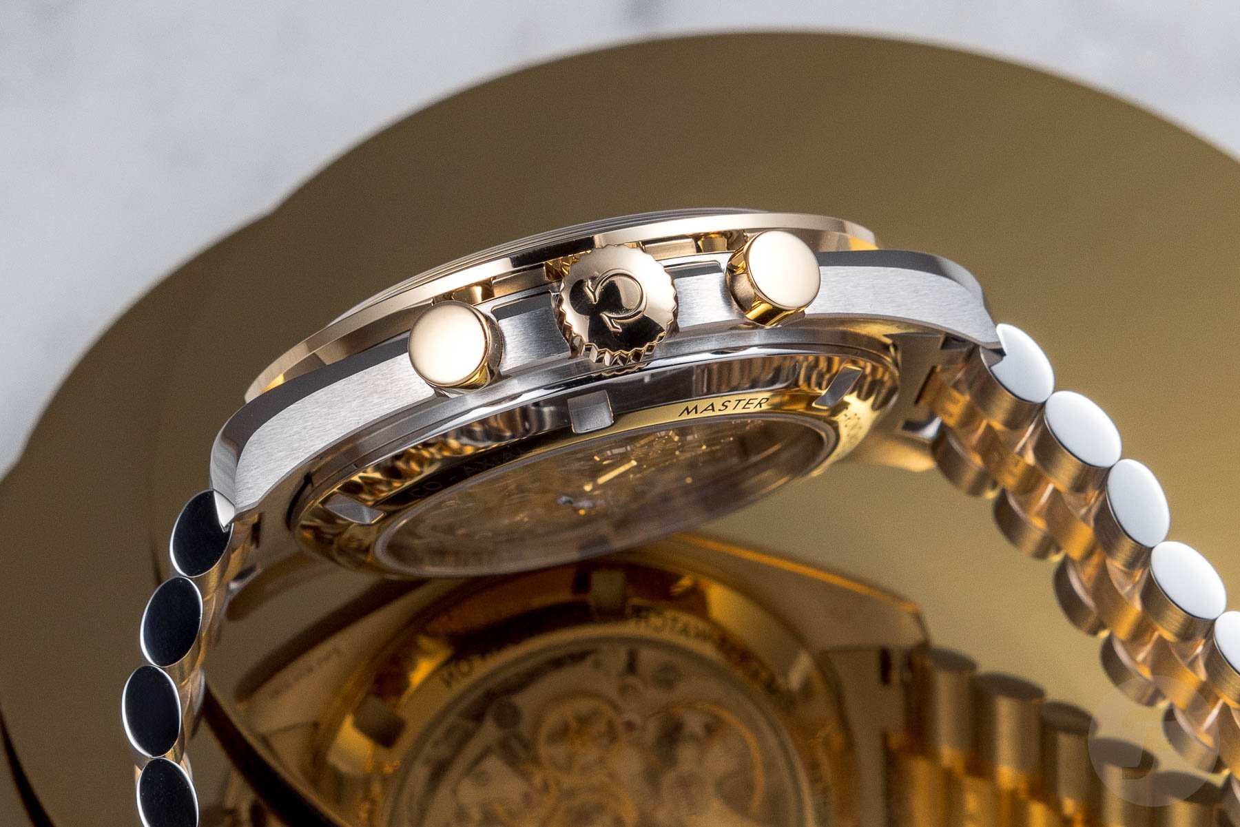
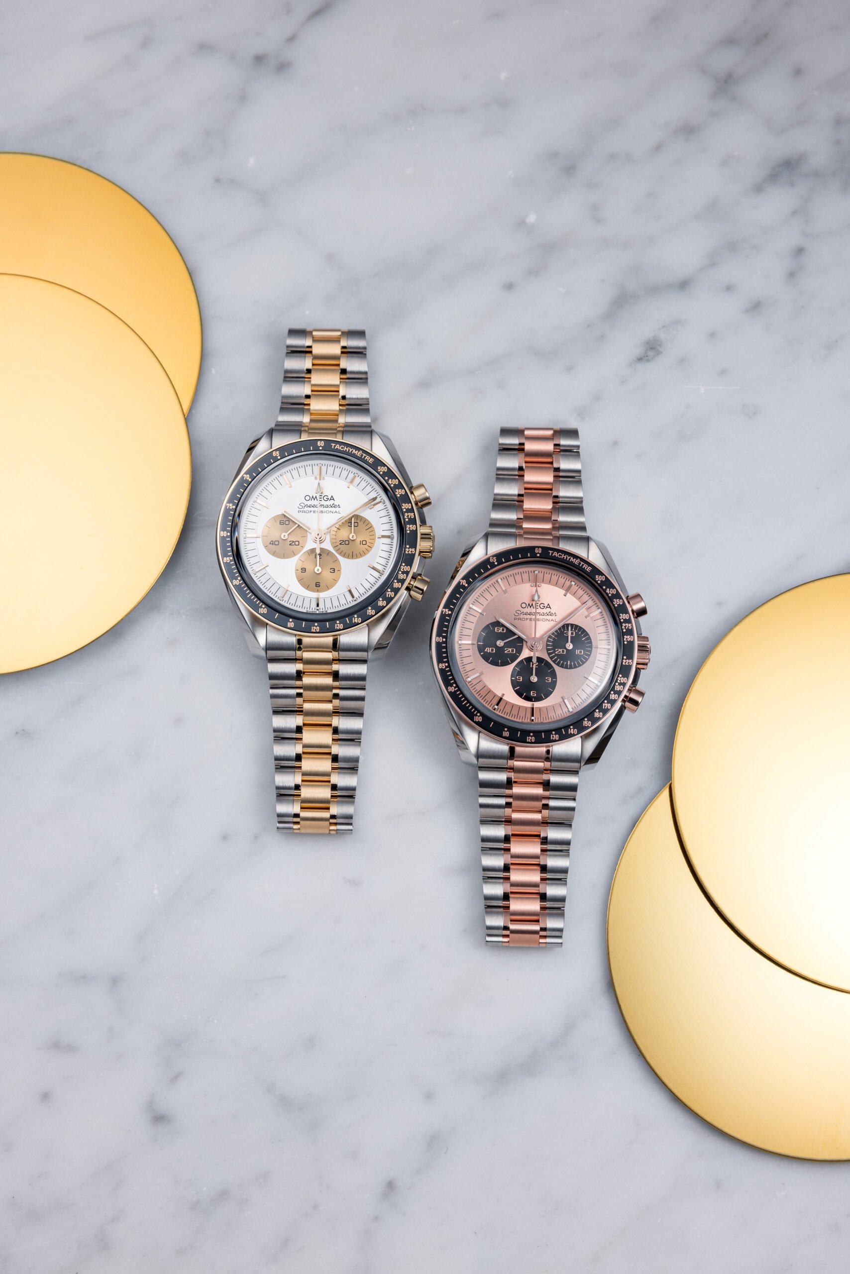
Earlier this week, Omega unveiled two versions of its popular Speedmaster Professional Moonwatch in steel and gold. As Robert-Jan explained, these are by no means the first two-tone versions of the Moonwatch. But they are the first two regular-production models since the ’80s that combine steel and gold. As such, they are big news. Steel and gold Rolex Daytonas are far from new. We all know The Crown is the go-to brand for two-tone bliss, and the steel and yellow gold Daytona was part of the updated collection introduced last year. But which of these will come out on top? It’s up to Robert-Jan and Jorg to make their cases before you vote for your favorite.
Last week, on Sunday Morning Showdown…
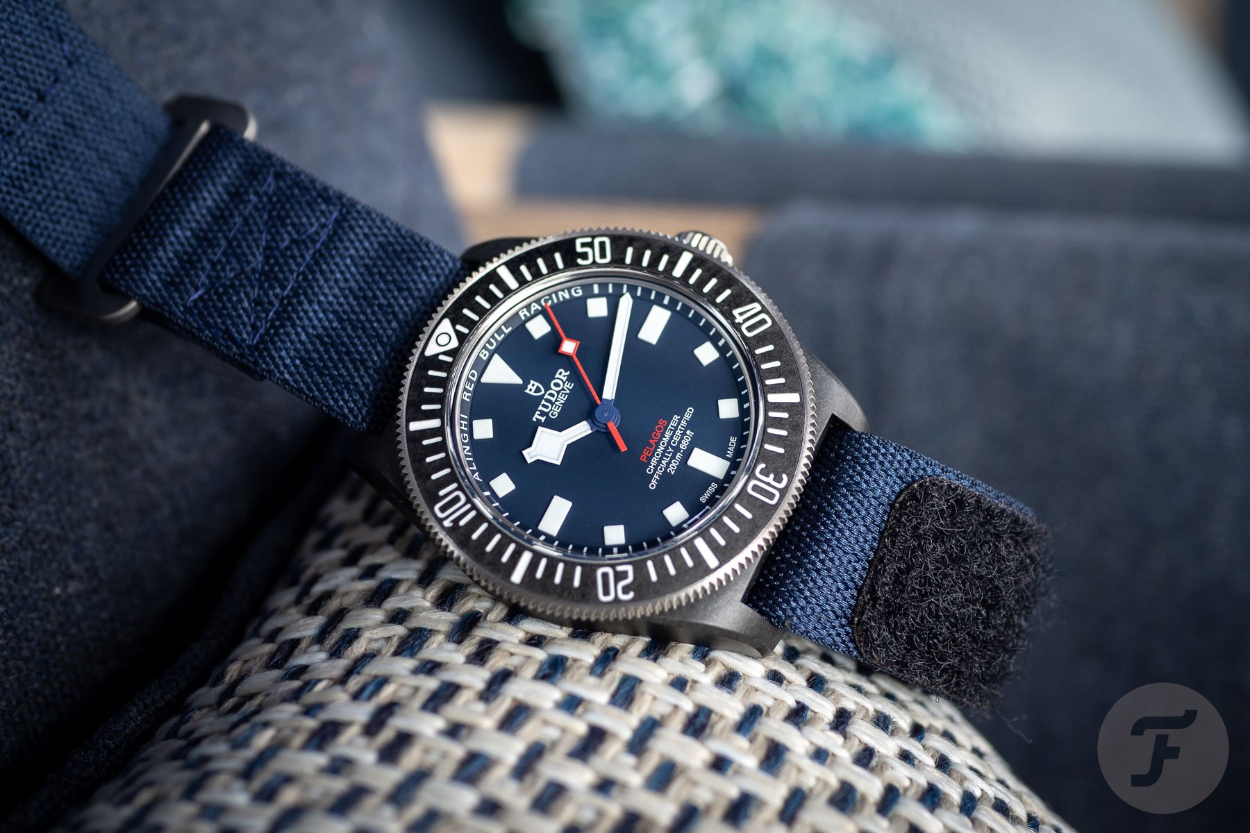
But before we go over to our two writers, let’s look back at last week’s showdown. In the battle of the America’s Cup-ready watches, Thomas’s Tudor Pelagos FXD Alinghi Red Bull Racing Edition took the win with 52% of the votes. It left Daan’s Panerai Submersible QuarantaQuattro Luna Rossa Ti-Ceramic with 48%. It was a surprisingly close outcome, especially knowing that the Panerai costs 4.3 times the price of the Tudor. However, as the comments revealed, quite a few people like the Panerai simply because it looks cooler. It’s a valid point and one that certainly will also play a part in this week’s battle. Now it’s over to Jorg and Robert-Jan to explain why their picks should win.
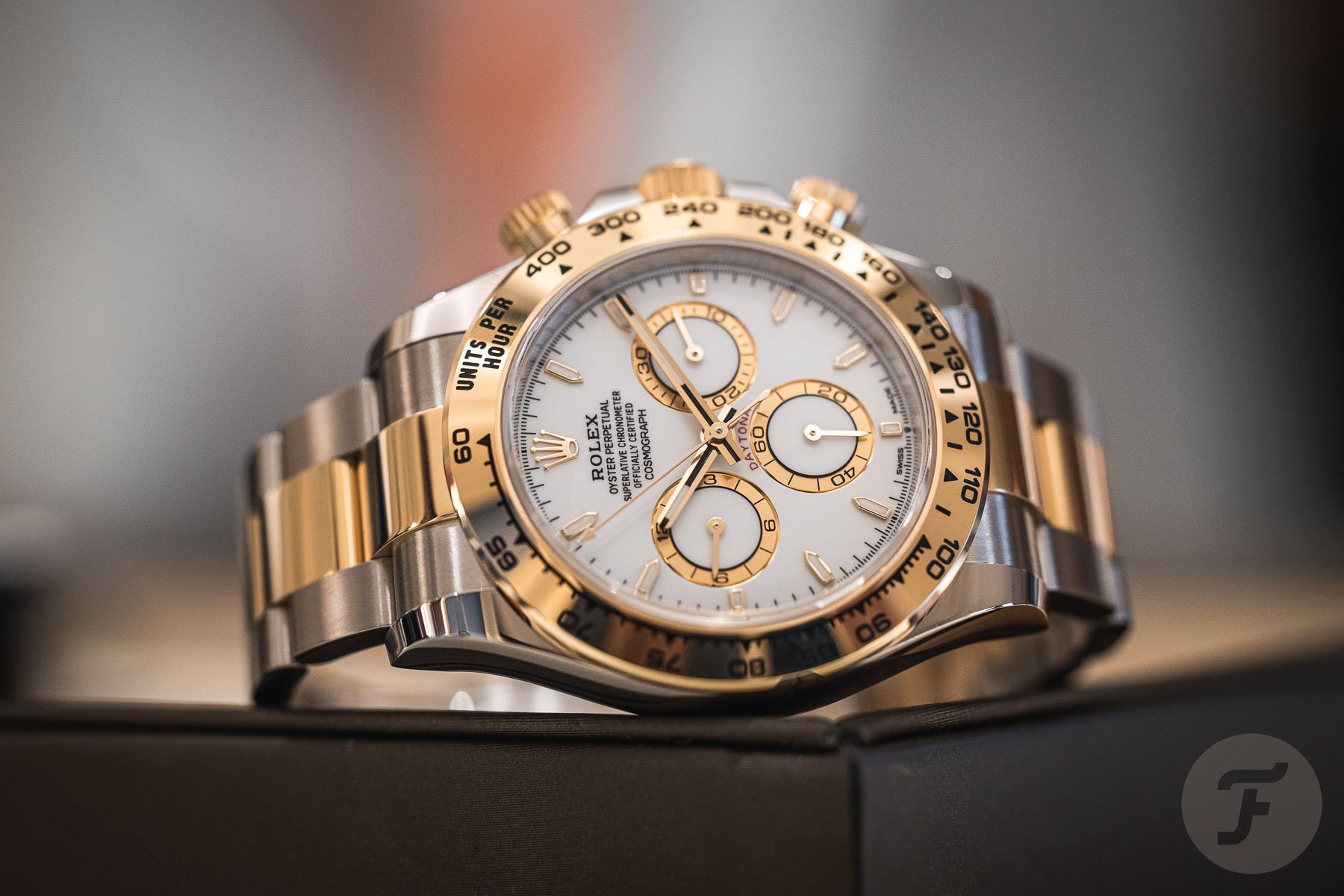
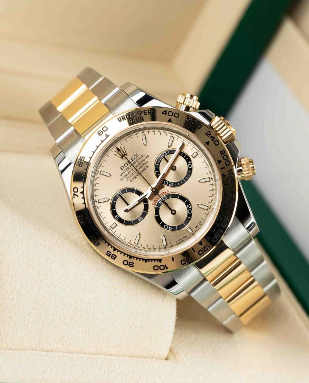
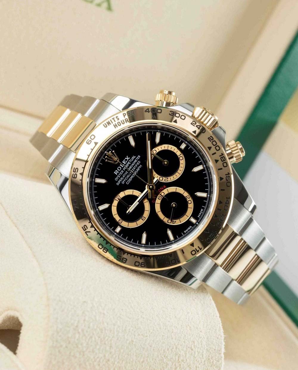
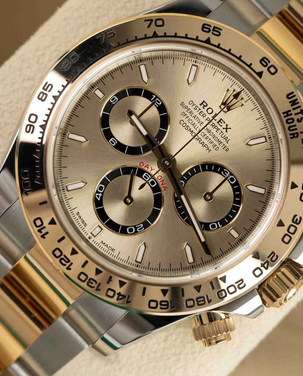
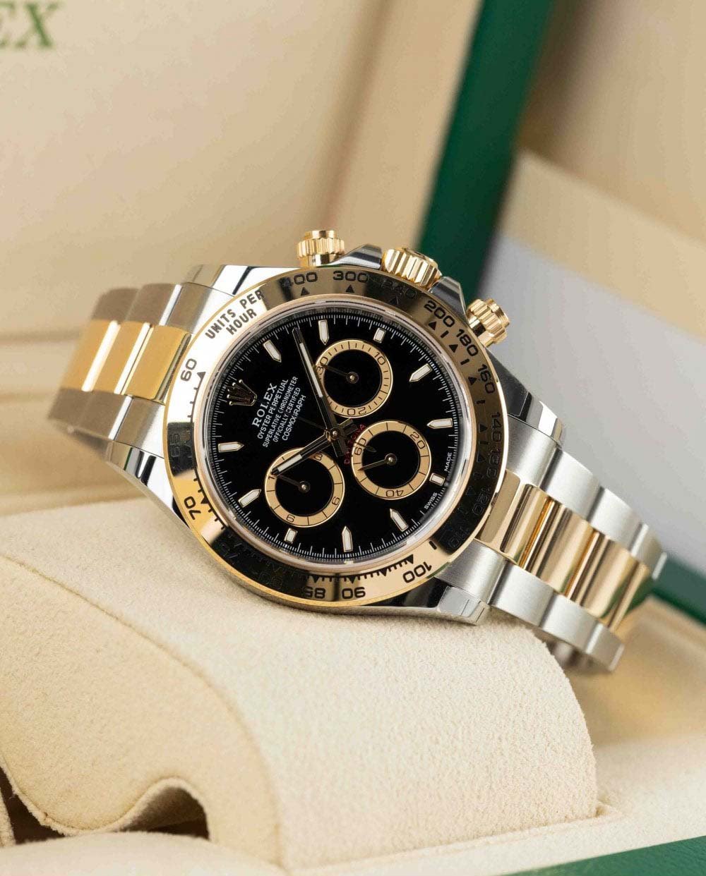
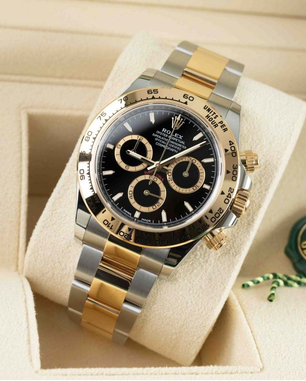
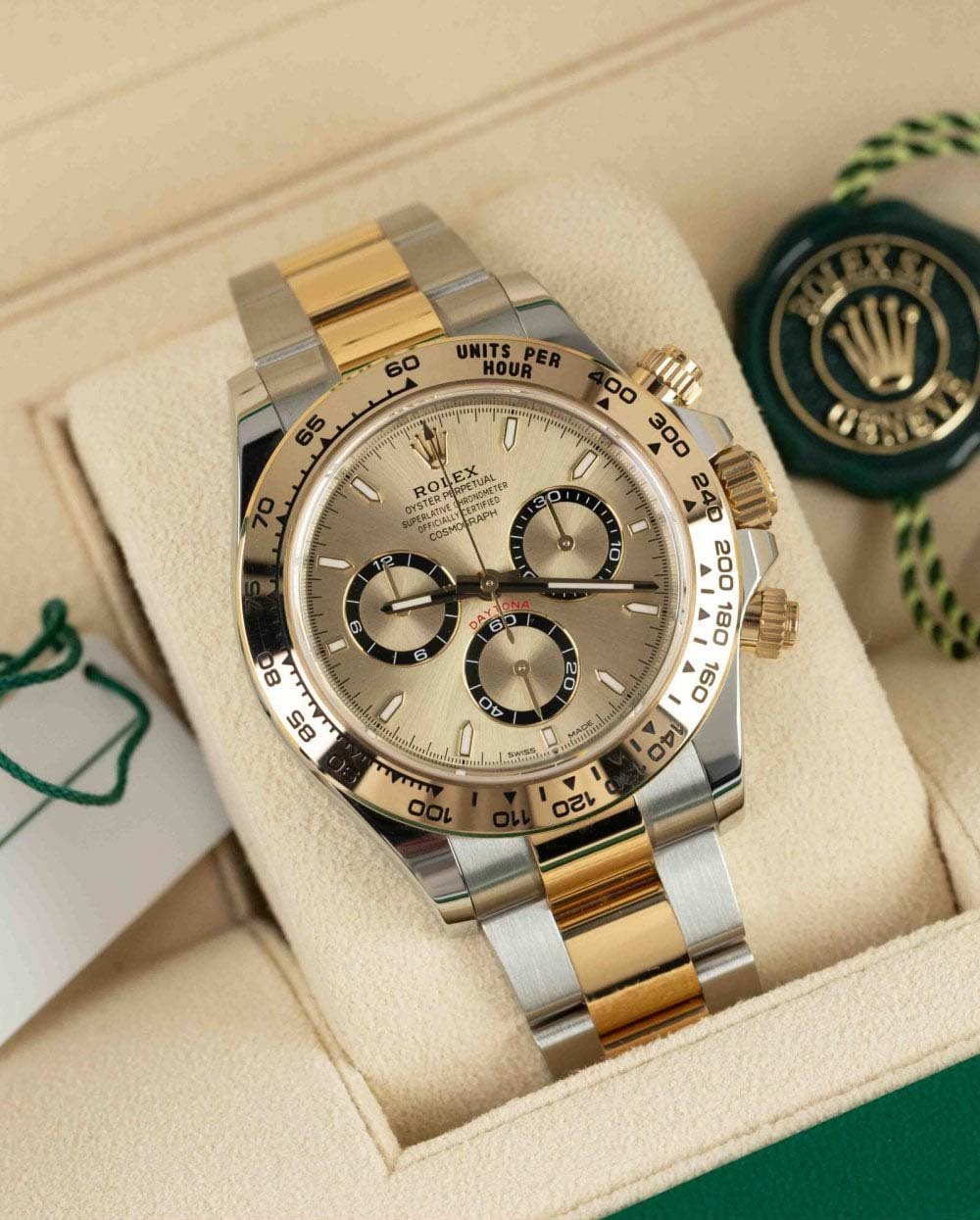
Jorg: Rolex Cosmograph Daytona ref. 126503
I am very well aware that I am fighting an uphill battle here. Last year’s showdown between the same watches in stainless steel showed a comfortable win for the Moonwatch with 70% of the votes versus just 30% for the Daytona. It shows that here in “Speedy Country,” it’s hard to win a head-to-head against any Speedmaster, especially the Moonwatch. But I genuinely think there are arguments to be made as to why the two-tone Rolex Daytona is the better pick in this combination of materials. That’s what I will focus on in this battle. You can prefer either watch based on its movement, design, or finishing, but we have gone over that in the past. In this specific Sunday Morning Showdown, I would like to focus on the impact of the mix of steel and gold.
I am a fan of the Speedy, and I would pick the Moonwatch over the Daytona in stainless steel for several reasons. Those are reasons that also apply in this case, and Robert-Jan will undoubtedly bring them up in his arguments. From the impracticality of the screw-down pushers to the visual nuisance of the 12-hour and 30-minute counters centered above the cannon pinion and the seemingly ridiculous amount of text on the upper half of the dial, the Daytona is certainly not perfect. But there is one specific reason why I prefer the Daytona in steel and gold: the Moonwatch feels uncomfortable in that combination of materials. It seems like a jacket that does not fit the Moonwatch very well.
A Moonwatch in steel and gold feels uncomfortable
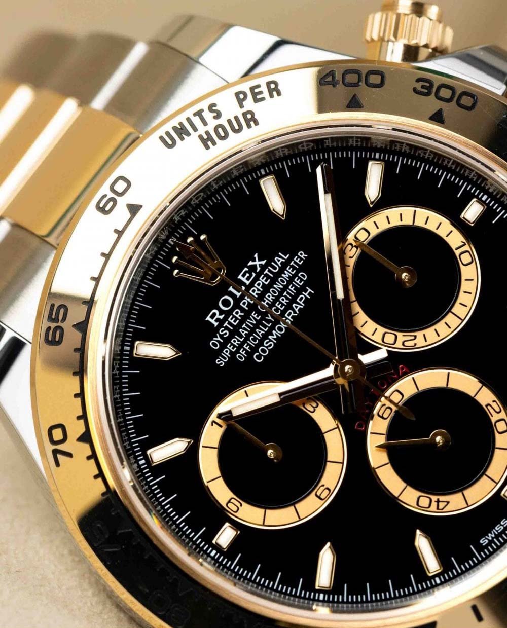
There aren’t many watches that look good in a combination of steel and gold. We can all agree that Rolex is the go-to brand for two-tone watches. While the Datejust is the archetypal two-tone Rolex, over the years, we have seen the brilliance of these materials used for the GMT-Master (II), Submariner, and Daytona. It’s a look that suits all of these watches well. So when I see the current steel and yellow gold Daytona, it looks familiar and comfortable. But I would go even further and say that I love its look with a black or gold dial. With a white dial, it looks decent, but it’s not my preferred configuration. The black-dial version, on the other hand, looks brilliant.
But I lack the same emotion after seeing the two available steel and gold versions of the Speedmaster Professional Moonwatch. I love the Moonwatch in stainless steel, and I love it in full gold. Of the currently available gold Moonwatches, I would pick the Moonshine Gold version with the gold dial and black sub-dials or the brilliant Canopus Gold model. The latter is by far my favorite gold Moonwatch. It’s an understated yet mesmerizing Speedmaster Professional that feels special but not unfamiliar and odd. I feel that way about the Moonshine Gold Speedies too.
Sedna Gold and steel seem to contrast too much
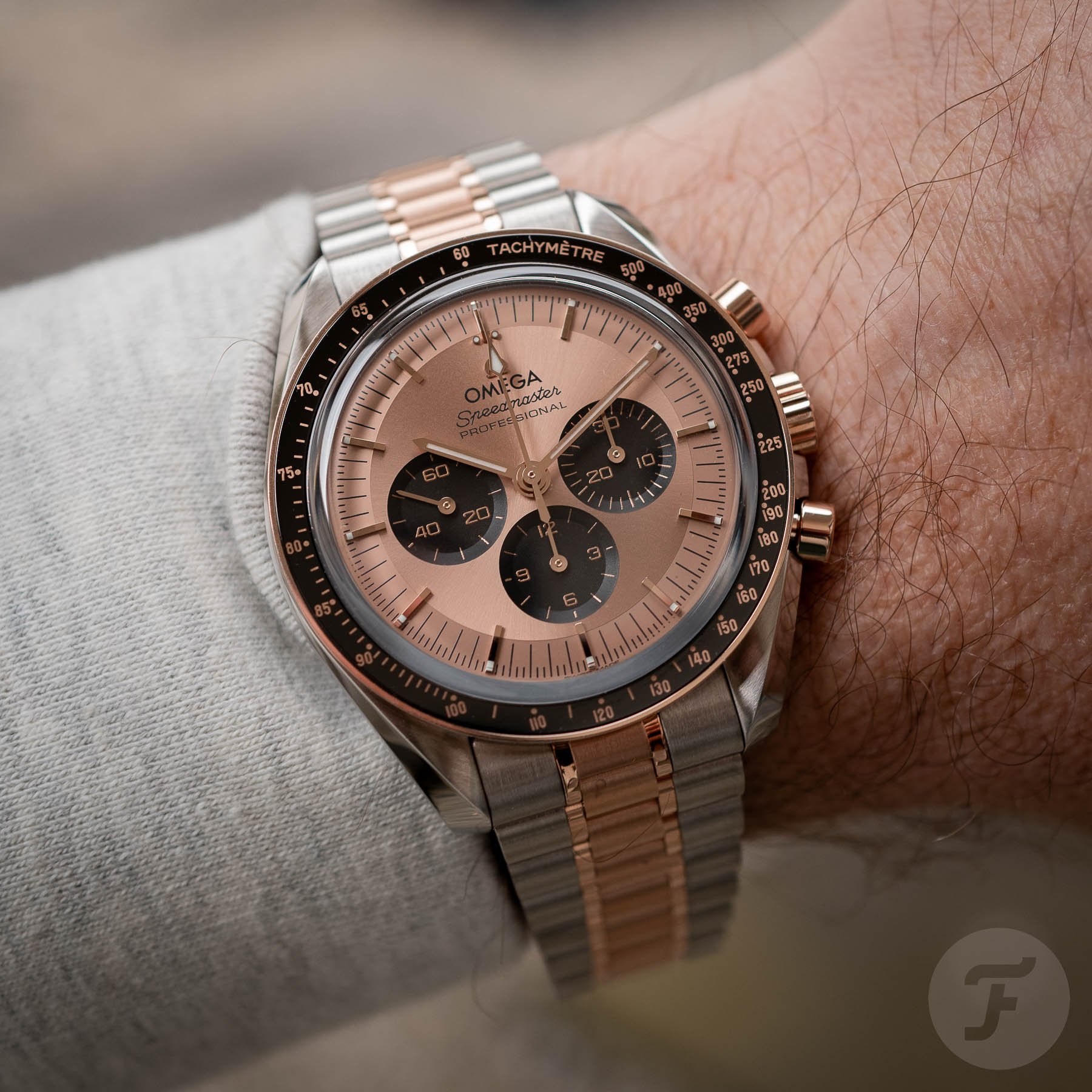
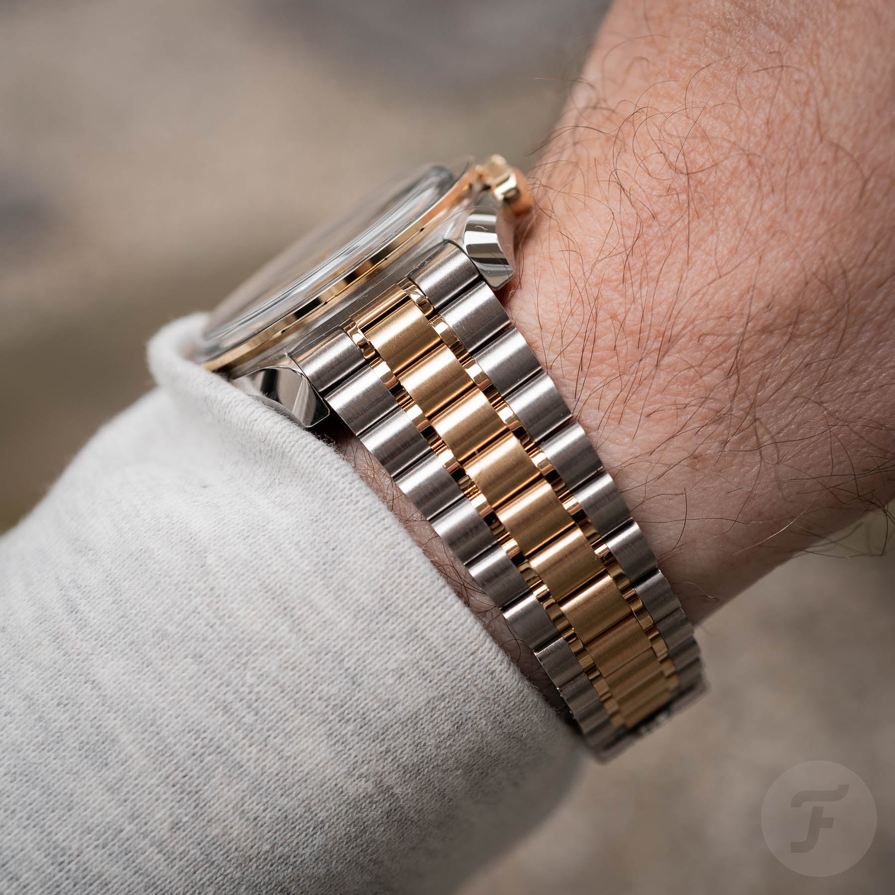
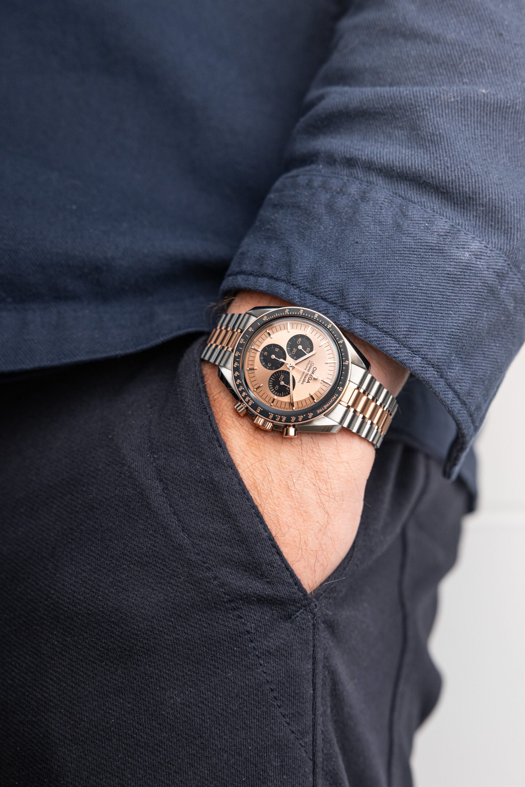
Where things get a bit trickier is with the Sedna Gold Moonwatches. The hue of the material seems to change depending on the context. Combined with stainless steel, it looks very pinkish. While I initially liked the steel and Sedna Gold Speedmaster, I started questioning its very pink overall aesthetic. The two-tone bracelet looks weird because the contrast between the two materials is too great, and they don’t seem to complement each other. Add the Sedna Gold-colored dial, and a pinkish overkill just feels off.
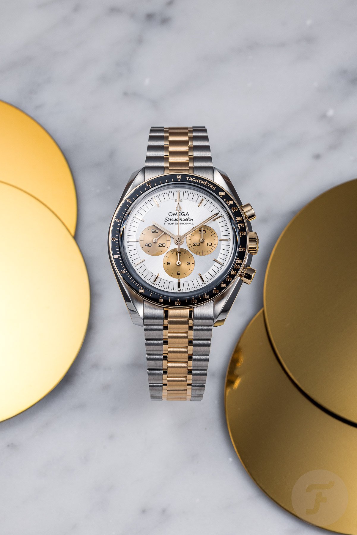
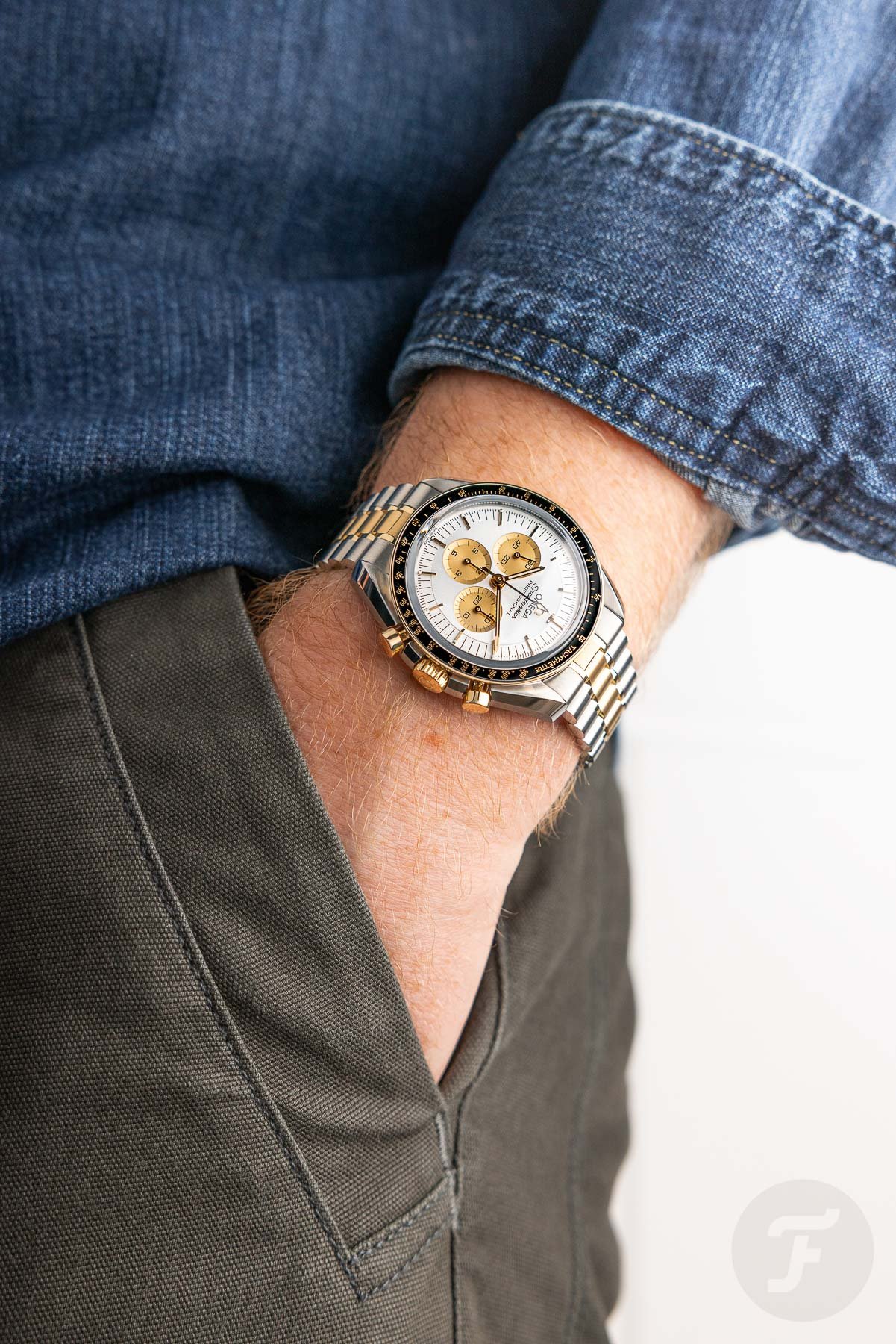
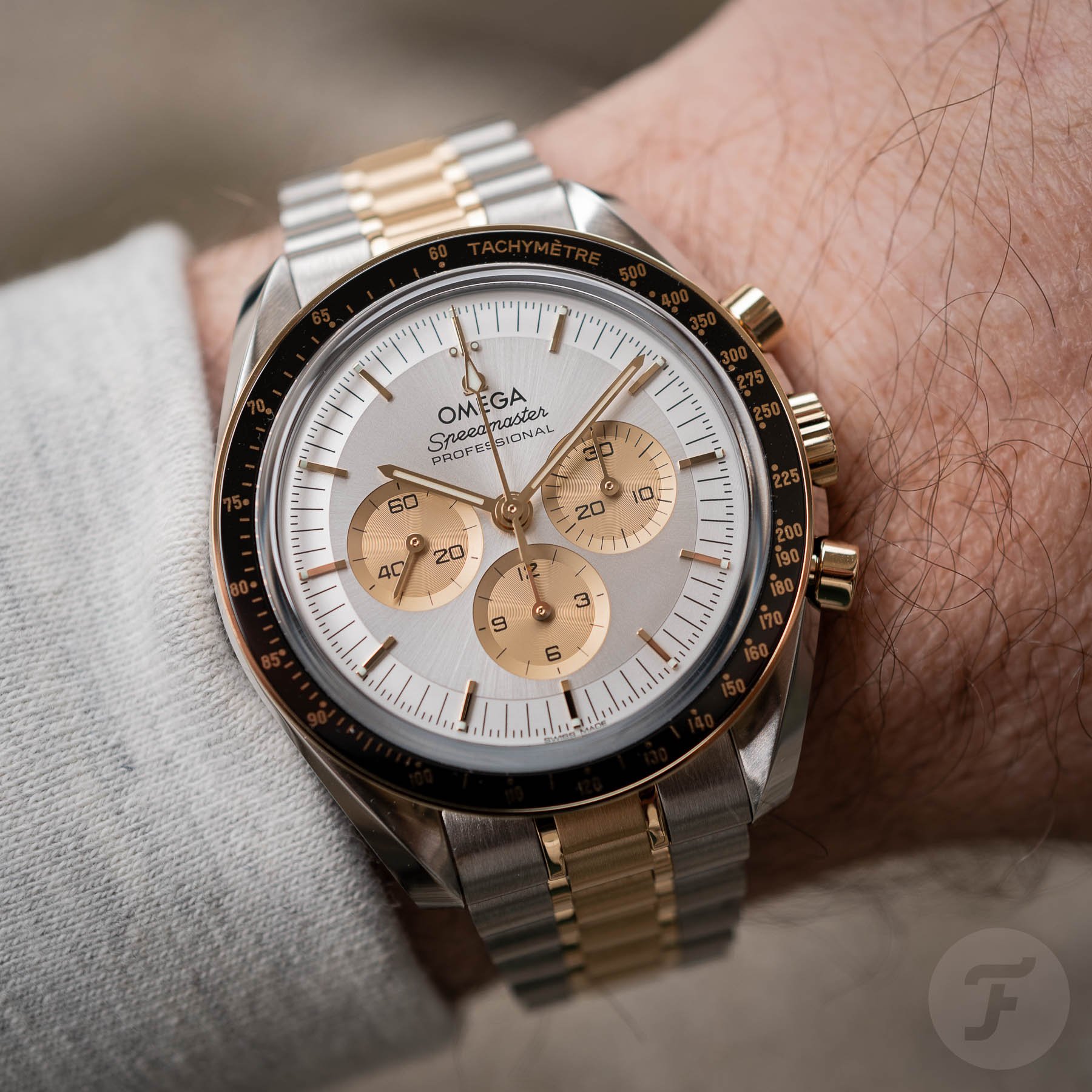
That would make the steel and Moonshine Gold version the easy favorite of the two. But it’s not that simple. While the combination of metals works well, the silvery base dial with its Moonshine Gold-colored sub-dials is just not for me. The lack of sufficient contrast makes the dial look rather pale, and that’s a miss in my book. Why not create a Moonshine Gold dial with black sub-dials for this version or a black dial with Moonshine Gold sub-dials? It seems like Omega wanted to do something different with both versions and, as a result, missed opportunities to create something better.
It’s about choosing the better-looking watch
In the end, I would rather spend €21,100 on a two-tone Daytona with a black dial because it simply looks better. Yes, I would take its impractical elements for granted. For me, the visual nuisances on the two new Speedies are also bigger than on the two-tone Daytonas. I understand that if you are a fan of the Speedmaster, as a matter of principle, you will probably always choose it over a Daytona.
For me, it’s a choice made on a different principle. Even if I love a watch like I love the Moonwatch, it still has to look good. That’s where these two new models go off the rails, and I’ll make an exception and give Daytona the upper hand. It might be a different choice than most of you would make, and it probably won’t win me this battle. Nevertheless, sometimes, looks are a deciding factor in leaving the obvious pick for something better. And as long as Omega does not create different versions of its two-tone Moonwatches, I stand by that choice. But I am sure that Robert-Jan also has something to say on the matter.
Robert-Jan: Omega Speedmaster Professional Moonwatch
What I find interesting is that Jorg is defending the Rolex Daytona in two-tone but has absolutely nothing positive to say about that other than “it looks familiar and comfortable.” That’s one reason to validate dropping roughly €21K on a watch (if you can buy one at that price, that is). Sadly enough, I believe that the brand and model name alone is the reason for many to buy the Rolex Daytona in steel and gold, not because people like the combination of materials so much. I never warmed up to the Daytona in general, but the steel and gold versions don’t work for me at all. I find them very boring, especially compared to the new Speedmaster Professional models in precious metal and steel.
Jorg already wrote that the layout of the Daytona dial is off, and the screw-down pushers are impractical, so I won’t have to repeat this in detail again — noted.
A nod to the 1980s
The new Omega Speedmaster Professional in steel and gold harks back to the first two-tone Speedmaster Professional DD145.022 from 1983, which was available in this combination of steel and precious metal a few years before Rolex came up with the current Daytona design. Until 1988, the Rolex Daytona was a small (37mm) hand-wound chronograph using a Valjoux movement, but it was only available in steel or gold. Just to deal with some of the comments I saw on social media about Omega copying Rolex with these new bicolor chronographs.
Wear the watch that makes you smile
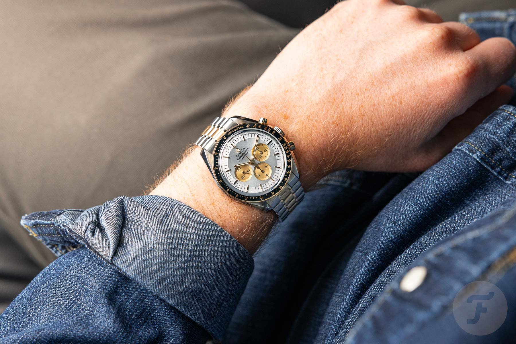
Anyway, let’s focus on the Speedmaster. Since the introduction last week (here is my intro article in case you haven’t read it yet), I have been wearing the Speedmaster Professional in steel and Moonshine Gold almost nonstop. At first, I was more drawn to the steel and rose gold version as it suits my skin tone (also nearly Sedna) a bit better. However, after wearing the steel and yellow gold variation for days in a row, I warmed up to it (no pun intended). As you might know, I have the Speedmaster Professional Apollo 11 50th Anniversary in full Moonshine Gold and can often be seen wearing it. But this steel and gold edition brings a nice contrast.
When driving my car, for example, holding my hand on the steering wheel, the contrast of the materials is so nice. With every subtle arm/wrist movement I make, the steel and gold Moonwatch grabs my attention. That’s what brings a smile to my face when I am wearing a watch, and to me, that’s what matters. A watch should make you smile when you’re wearing it, and that’s what the steel and yellow gold version did for me when I wore it last week.
Vintage or modern
But do you need to drop €20K for that smile? The vintage Speedmaster Professional DD145.022 from the 1980s can be had for much less, but you need to take into account that the new Moonwatch is a different watch. The new two-tone Speedmaster has all the perks of the latest innovations at Omega when it comes to movements, bracelets, materials, and so on, and it will still give you that 1980s/vintage vibe. If you’re a vintage enthusiast, I know you’ll always prefer real vintage watches, but the modern steel and gold Speedmaster is perfect for those who want an everyday watch without worrying about damaging their vintage pride and joy. It’s a bit like the Speedmaster Calibre 321 in steel, you could say.
Rose or yellow gold
As for the two available variations of the Speedmaster, at first, I was Team Pink. As mentioned, the beautiful Sedna Gold alloy matches my skin tone perfectly. Also, the rose-gold-tone dial is not as dark as it appears in some photographs we published earlier, especially when outside in natural light. It became apparent that it matched the tone of the rose gold elements of the bracelet, bezel, and case. Normally, I do not like silver dials with a sun-brush finish on a sports watch. But after resizing the steel and yellow gold Speedmaster to fit my wrist and wearing it for a few hours, my mind started to change.
After a day or so, my appreciation for this version increased even more, giving me some of the 1980s vibes (I have a few bicolor watches from that decade). Whereas the original 1983 two-tone Speedmaster had a gold-colored dial with grayish subdials, the inverted dial of this new model works a bit better for me. The 18K gold applied indices and hands (except the chronograph seconds hand, all hands are made of solid 18K gold) give an amazing contrast to the silvery dial.
The Speedmaster looks more interesting
I simply don’t care for the two-tone Daytonas. The only Daytonas I don’t mind are the vintage hand-winders and perhaps a modern one in full gold. To be clear, I am not anti-Rolex. On the contrary, I have several Rolex watches in my collection, but the Daytona simply never did it for me. On top, the Daytona in steel and gold always looked cheap to me even though it was not (except on the pre-owned market before COVID-19). I think the Speedmaster has a more interesting case and dial design. Wearing a Speedmaster, whether in steel, bicolor, or full gold, also won’t get you clubbed over the head.
To me, the choice is simply a no-brainer, but since taste is personal, you might think very differently. In the end, just buy what makes you smile. A steel and gold watch is not for everyone; that much is clear. But for those who like them, Omega added two very nice variations to the Moonwatch collection. It’s time to slim some of the other Speedmaster families down now, I think, but that’s a topic for another time.
Time to vote!
Now it’s up to you, dear reader, to vote! If two-tone watches are something you’re interested in, both Rolex and Omega offer their iconic chronographs in a mix of precious metal and steel. Which one is your favorite, the Rolex Cosmograph Daytona or the Omega Speedmaster Professional Moonwatch? Cast your vote, and share your motivations in the comments section below!

