Sunday Morning Showdown: TAG Heuer Carrera Glassbox Vs. Omega Speedmaster Professional
This week, we have two modern classics competing in Fratello’s Sunday Morning Showdown. Both chronographs have icon status and go back to the 1950s and 1960s. Designed to play a role in car racing, one actually did, and the other took a turn to space racing. Daan defends the brand-spanking-new TAG Heuer Carrera Glassbox, which is already available at your TAG Heuer dealer, while RJ is defending his beloved Speedmaster Professional Moonwatch from Omega, which was introduced in 2021.
Both brands and watches have their fans and communities. Design-wise, the Moonwatch is the one that has remained virtually unchanged in the past 60+ years. On the other hand, the Carrera exists in all sorts of variations, though its earliest form is simply not around anymore. But is that a bad thing? It doesn’t need to be, but the success of the Moonwatch might be in the fact it never really changed much. It’s a classic.
Last week, on Sunday Morning Showdown…
Last week’s Sunday Morning Showdown was all about integrated-bracelet watches! It was the new IWC Ingenieur, the talk of the town in Geneva a few weeks ago, versus the El Primero-powered Zenith Defy Skyline. The Ingenieur is based on the original 1970s Ingenieur SL1832, and for last week’s battle, Jorg played the Genta-sentiment game. And rightfully so, but with a result of 68% in favor of the Zenith versus 32% for the IWC, it was the El Primero that triumphed. It seems that IWC’s pricing is a bit opportunistic, and the comments reflected that sentiment, even those by readers who voted for the Ingenieur. This week, though, we have two other brands battling each other. One is from the same stable as Zenith, LVMH-owned TAG Heuer, while the other is the #1 watch brand from the Swatch Group conglomerate, Omega.
RJ: Omega Speedmaster Professional Moonwatch
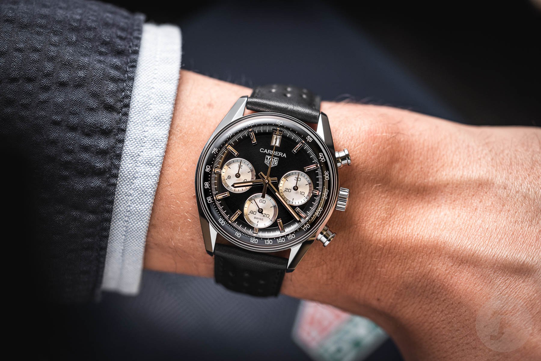
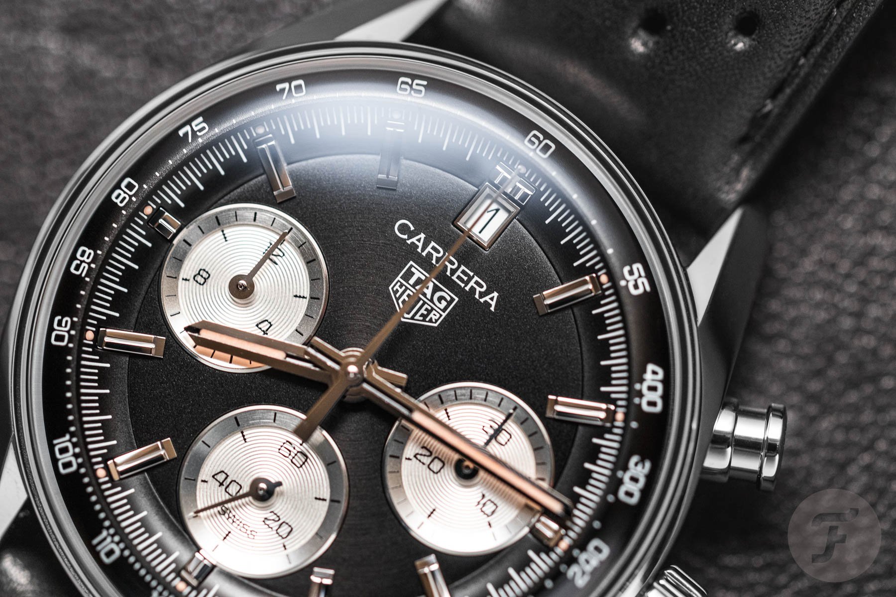
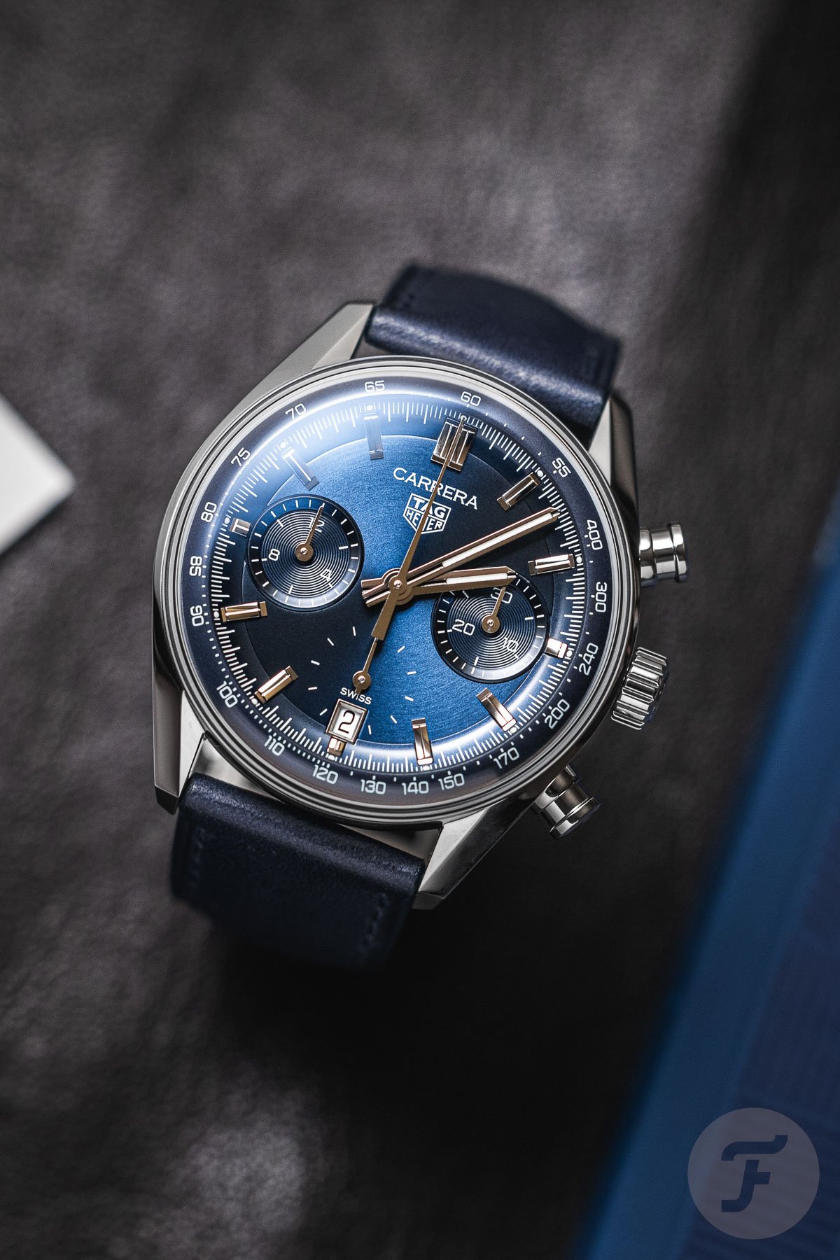
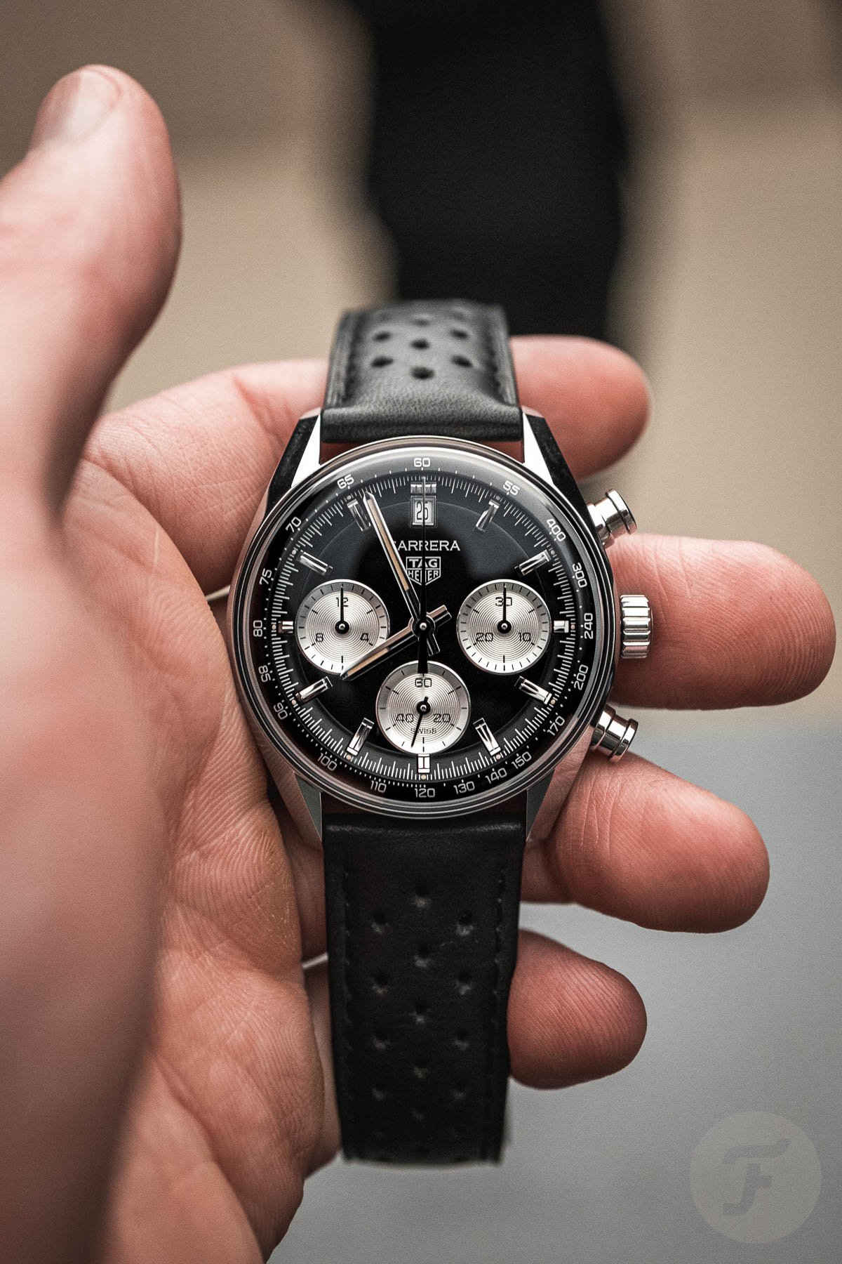
The last time I went Street Fighter II on Daan was when the Chopard Mille Miglia took on the Zenith Pilot. In that showdown, I had no issues being harsh on Chopard for the Mille Miglia. This time, however, it’s different. The TAG Heuer Carrera Glassbox, especially the black-dial version, was one of my favorites of the Watches and Wonders 2023 show in Geneva. The most common complaint was the date at 12 o’clock and that the chronograph seconds hand obscures it. But when wearing that watch, I didn’t experience that, to be honest. It’s perhaps a bit like the halos in F1; you just look past it. The seconds hand is so thin that there was absolutely no problem when reading the date.
How will it age?
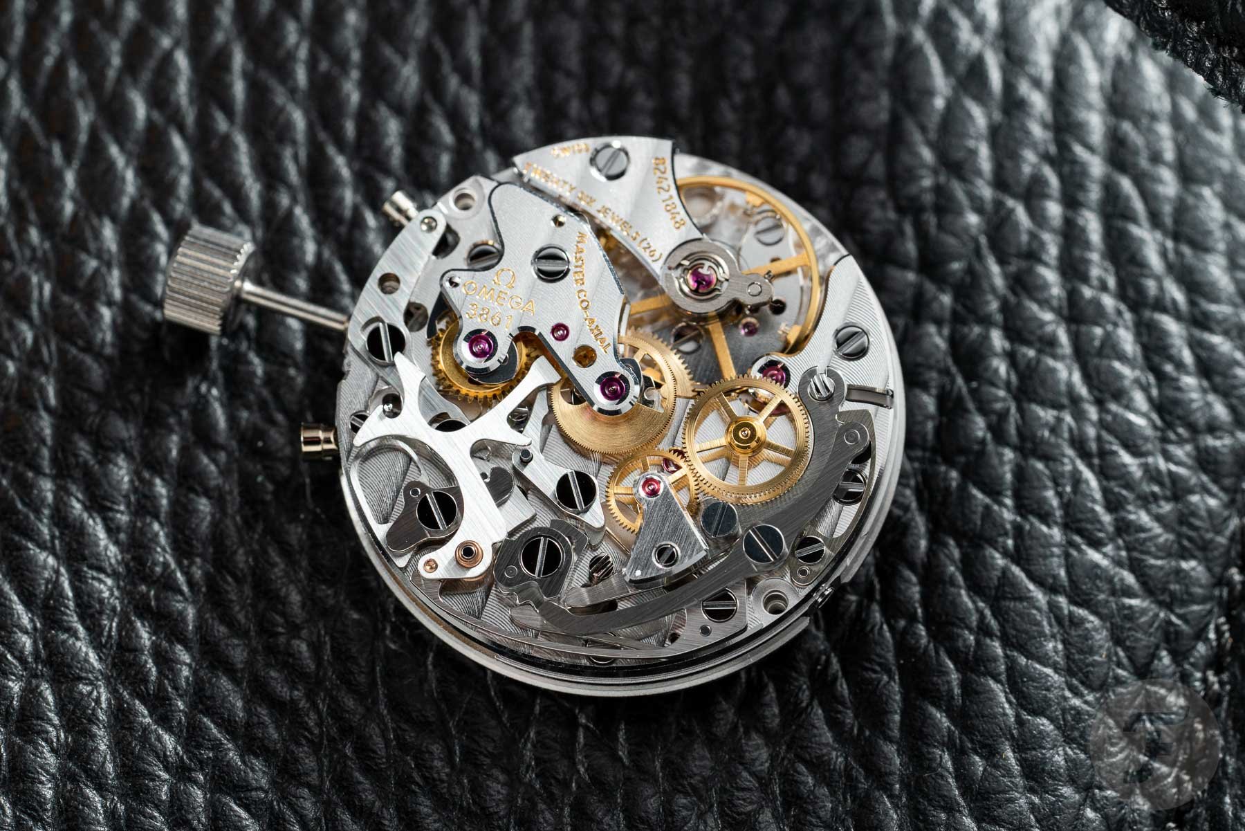
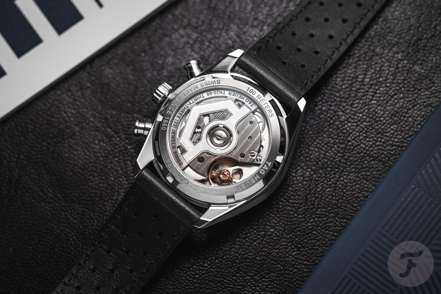
No, my criticism of the new Carrera Glassbox stems from a few different things. The retail price of €6,500 sounds nicer than the €7,500 for the Moonwatch, especially considering the fact you will get a column-wheel chronograph for that amount. And it’s definitely an interesting price, but I have to say that the finishing of the TAG Heuer TH020-00 movement didn’t really put a smile on my face. Another more critical point is that while the design of the Carrera Glassbox dial with the curved flange is definitely interesting today, it also comes across as very “now”. I am not sure how this will look in five or ten years.
It’s not something I often mention, but when I am on the lookout for a new watch, this is something that I wonder about. Will this still be a nice-looking watch in x years from now, or is it too era-specific? Granted, sometimes I am also dead wrong. I thought that the blue of the Seamaster 2531.80 might be a temporary thing, for instance. But that watch is also a good example because while it looked very modern with the nine-link bracelet in 1993, it looks quite “1990s” today. A few TAG Heuer examples of this are SEL models from the 1990s and the Kirium models from, well, also the 1990s. These watches looked “baller” back then, but look at them now…
Anyway, I am not certain this will happen to the Carrera Glassbox since it does have a lot of vintage inspiration going on. Still, the curved flange does worry me a little bit, even though it does look cool today.
Fair comparison
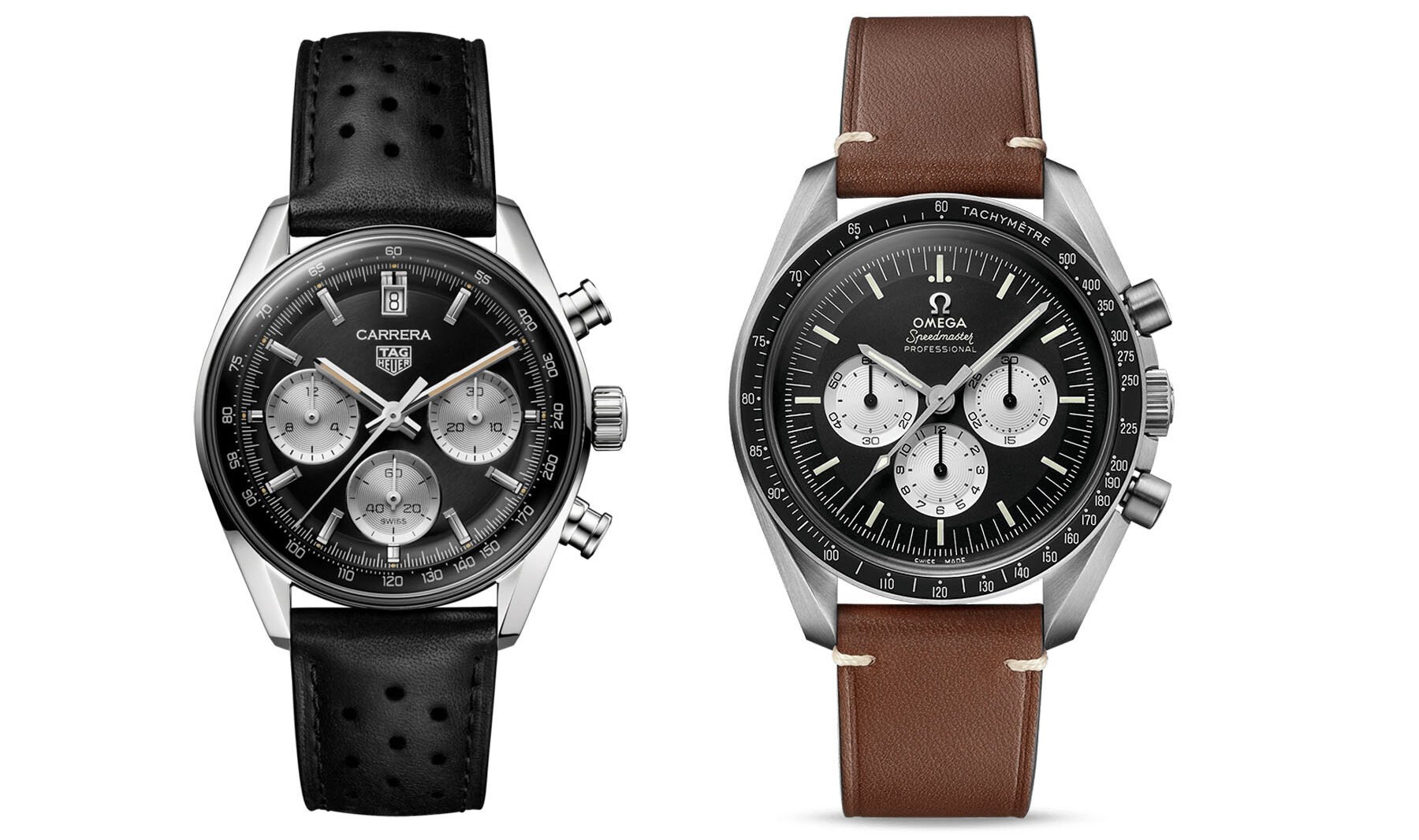
This Speedmaster-versus-Carrera thread is interesting because both are incredibly iconic chronographs that have seen proper milking over the years. And admittedly, some variations sat better with me than others. Especially in recent years, both brands upped their game in terms of bringing vintage inspiration to the modern versions. Above is an image of the new Carrera Glassbox and our Speedmaster Speedy Tuesday “Tribute to Alaska III” from 2017. The Carrera goes back to 1963 and the Speedmaster to 1957, so they share a lot of history as chronographs.
The current Speedmaster Professional Moonwatch is the best
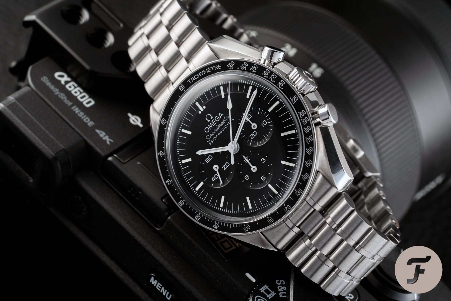
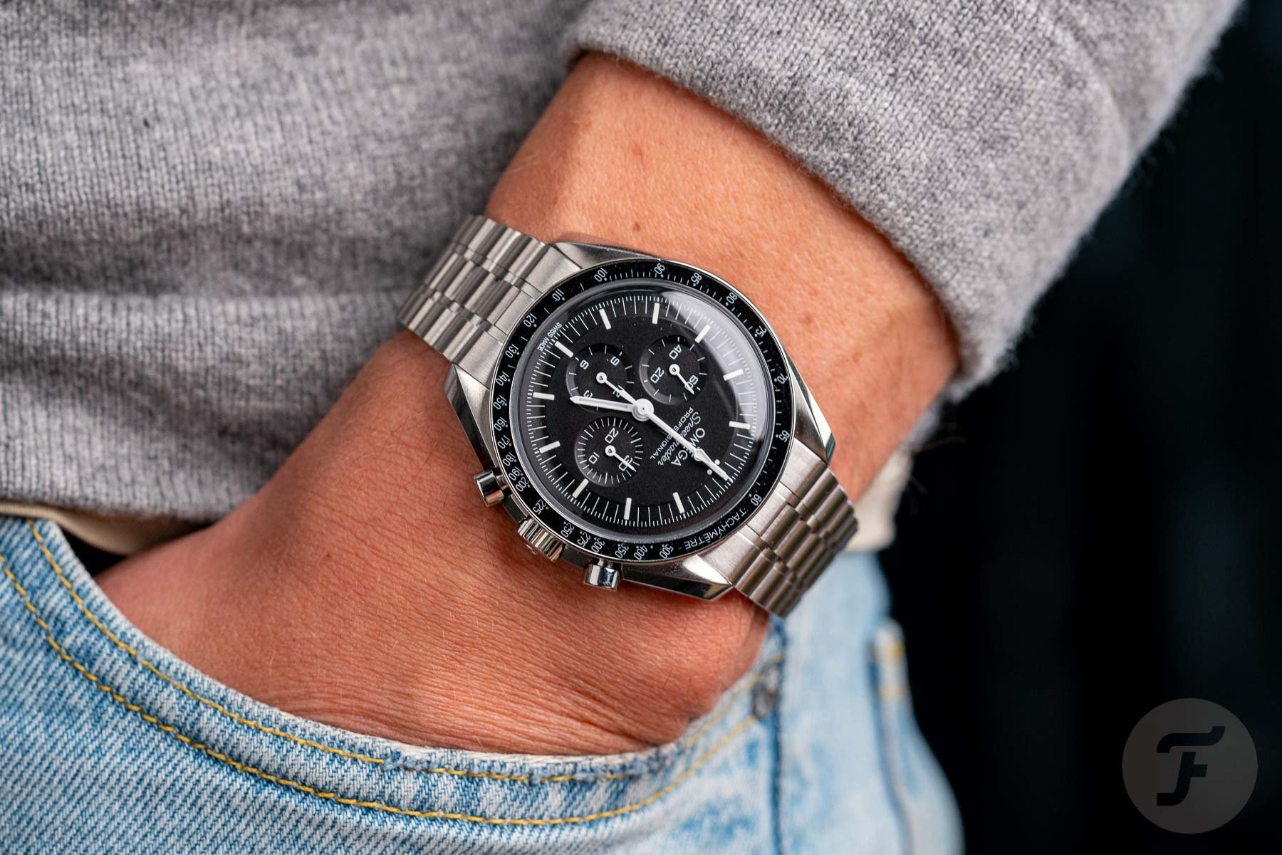
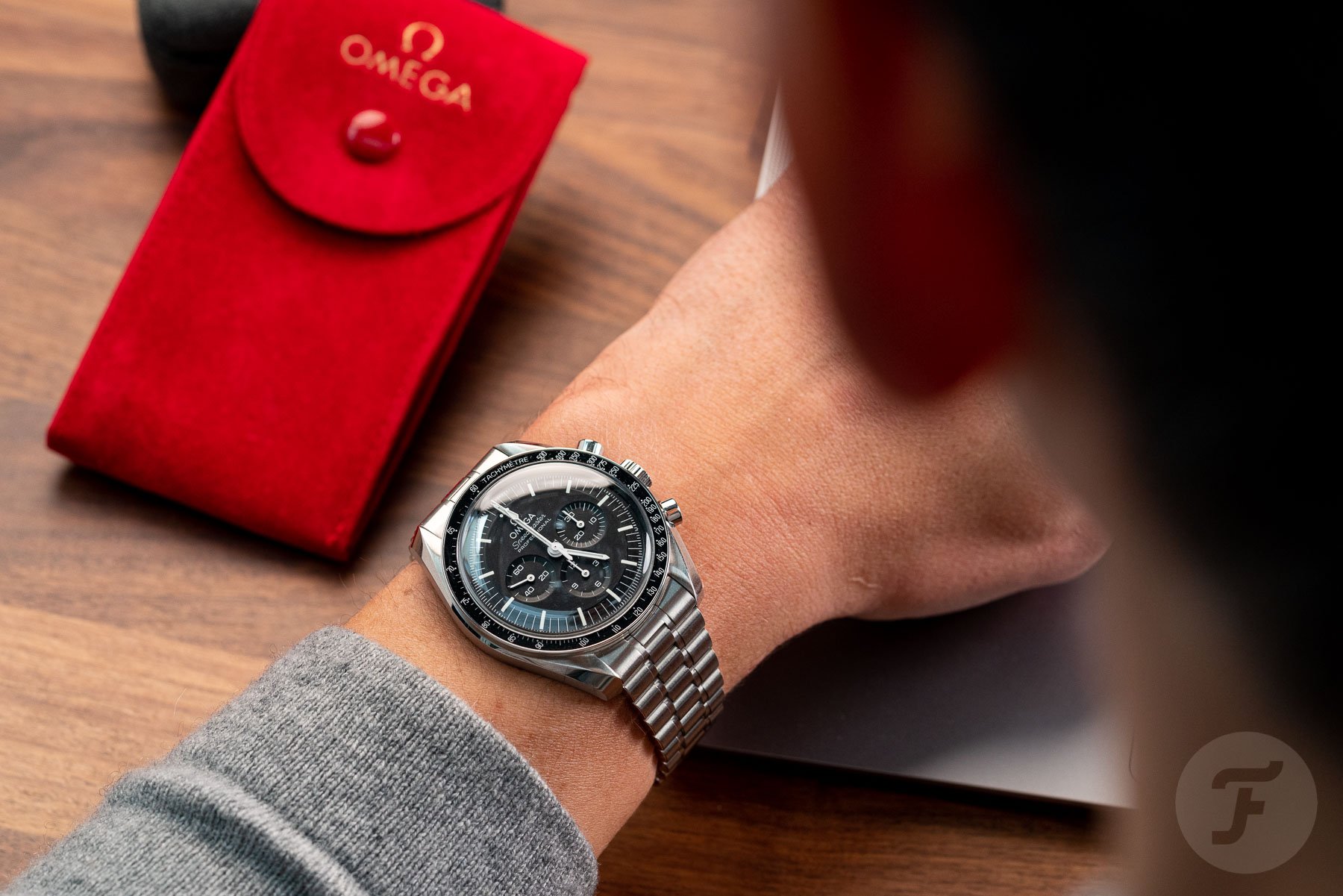
Although I like vintage Speedmasters, I do have to admit that the current Moonwatch model with a Hesalite or sapphire crystal is the best version that Omega has ever made. It’s a combination of the 105.012 CB case (the fourth Speedmaster generation) with a step dial, teardrop chronograph seconds hand, and a new Master Chronometer-certified movement. Whereas the caliber 1861 Speedmasters had an accuracy of -1/+10 seconds per day on average, it’s now 0/+5 seconds per day on average.
The movement is now also antimagnetic to 15,000 gauss and equipped with Omega’s Co-Axial escapement. Last but not least, the Speedmaster Professional Moonwatch comes with a beautiful bracelet that tapers from 20mm to 15mm. This “Nixon” bracelet looks similar to the ones that Omega used in the past and fits much better than the one on the previous Moonwatch reference. The Moonwatch saw some steep price increases in the past few years, but compared to the previous reference (that retailed just below €5,000), you do get quite a bit of added value as well.
Timeless design
In the end, it is all about preferences and taste. There is no right or wrong when it comes to the Speedmaster or Carrera, but I do think that the Moonwatch is a bit more timeless than the new Carrera Glassbox. The Speedmaster might look a bit more boring, but in the end, I think that its design, which has remained virtually unchanged since the mid-1960s, will always withstand the test of time. The Moonwatch is like a classic Porsche 911, an Eames lounge chair, or a Montblanc Meisterstück fountain pen — all of these are incredibly timeless designs. The TAG Heuer Carrera Glassbox, while a nice watch, is not. But hey, perhaps you don’t care about these things and just want a good-looking watch today. In that case, the Glassbox might be worth considering. Then again, so is the Speedmaster Professional. It will always look good.
Daan: TAG Heuer Carrera Glassbox
And that’s exactly the thing about the Omega Speedmaster Professional. If you already like its design, you’ll probably also like whatever Speedmaster Professional will come next, the one after that, and so on. As RJ already said, the Speedy is a bit “boring” with its “virtually unchanged” design. At the same time, that’s also what makes it so good. Especially with the newest reference, I respect the fact that Omega indeed made it better than ever before. That’s also why I own one. But still, it is a bit boring.
Therefore, I applaud TAG Heuer for stepping off of the true-to-the-original re-edition bandwagon without actually losing touch with the earlier models of the Carrera. I think the concave and then convex flange of the dial fits the classic dial design of the Carrera very well. Those highly domed crystals are really something I associate with vintage watches. I love how they’ve finally found a way to make good use of that extra space underneath the crystal. Not only that, but it also looks great and improves the legibility of the tachymeter scale, which usually seems crammed into a space that’s too tight.
Design quirks
But I also have to agree with RJ. This won’t be the last Carrera we’ll ever see, and that flange design will probably be replaced by a different one in future references. I’m not sure, though, that the current flange design will ever look dated. When I saw the watch in person at Watches and Wonders, it still looked like a very vintage-inspired watch to me. It’s not like TAG Heuer went all the way and added very weird colors or shapes that you wouldn’t expect on a watch like this. In the end, I see that flange more as a functional design choice than a cosmetic one. That’s why I think it won’t be as subject to trends as RJ suggests.
That date at 12 o’clock, however, is certainly up for discussion. I don’t get why there’s a date on a watch like this, especially since many earlier Carrera references didn’t have one. It’s probably just because the movement has a date function and many mainstream buyers prefer it. But wouldn’t this watch be even better without a date? I must say, though, that I much prefer the date at 12 over the very interruptive date at 6 o’clock, like on the blue Glassbox. The former doesn’t mess with the overall design as much as the latter. It just looks more like a big index, and it’s even partly hidden underneath the chronograph seconds hand. So I think this is the perfect date-window placement on a chronograph for people that actually don’t want a date window on a chronograph. But next time, TAG Heuer, just leave it out, period.
Focus on the (price) difference
RJ also mentioned that putting these two iconic watches up against each other results in quite a fair comparison. That might be true for the iconic part, but there are also a lot of differences here. Indeed, the Speedmaster has an impressive movement inside. But it’s also a hand-wound movement, and it’s quite a tough cookie to wind in the mornings. The TAG Heuer comes with a brand-new automatic caliber, which also gives you a very generous 80-hour power reserve. How about that for convenience? And I didn’t even mention the fact that it’s water resistant to 100 meters rather than 50 meters for the Speedy.
And then I’d also like to revisit the pricing a bit here. RJ conveniently mentioned the price of the Hesalite version of the Speedmaster Professional (€7,500), but the TAG Heuer Glassbox actually has two sapphire crystals — one on top and one on the bottom. So if you’d really like to make a fair comparison, you should look at the price of the “sapphire sandwich” version of the Speedmaster Professional, which is €8,600. That increases the price difference between these two watches by another €1,100. And I think that makes the TAG Heuer an even more compelling option than it already was, even if it doesn’t have a nice stainless steel bracelet like the Speedmaster.
Time to vote!
There you have it, folks — another Sunday-morning battle with two historically important chronographs going toe to toe for the win! Will it be the new Glassbox that gets your vote? Or are you, like RJ, an uncompromising fan of the Speedmaster Professional? Make sure to vote for your choice below, and let us know why you picked it in the comments as well. See you next week for another installment of Sunday Morning Showdown!

