Talking Watch Design In 2024 With Max Resnick And Emmanuel Gueit
Isn’t it fascinating how your life’s trajectory can hang on decisions you make early in life? I picked a subject profile in high school that would later mean I did not qualify for Industrial Design school. If I had picked differently at age 15, there is a good chance I would have become a designer. Today, I am living out that desire nonetheless by dreaming up watches and collaborating with an actual designer, Max Resnick, to bring them to life. I love talking about watch design. Design is my key point of focus when I review watches. In my opinion, specs, build, and features always live to serve the watch’s design.
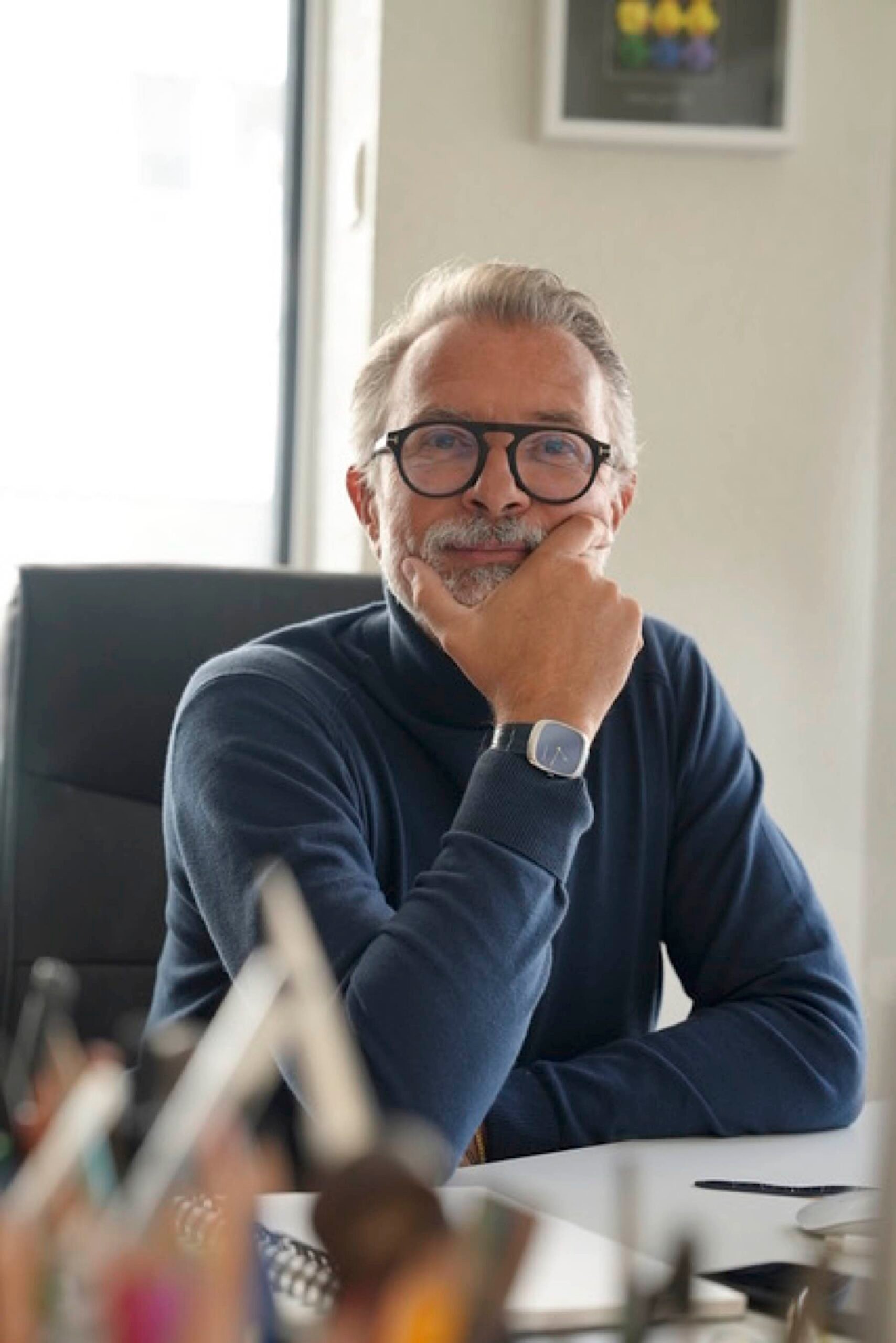
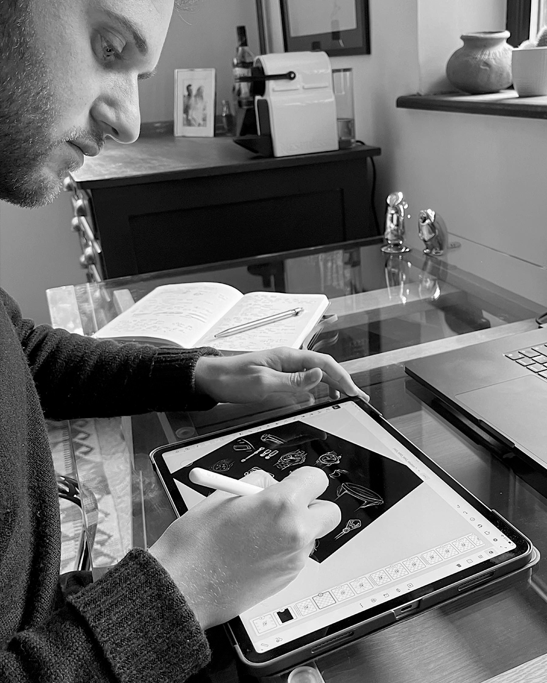
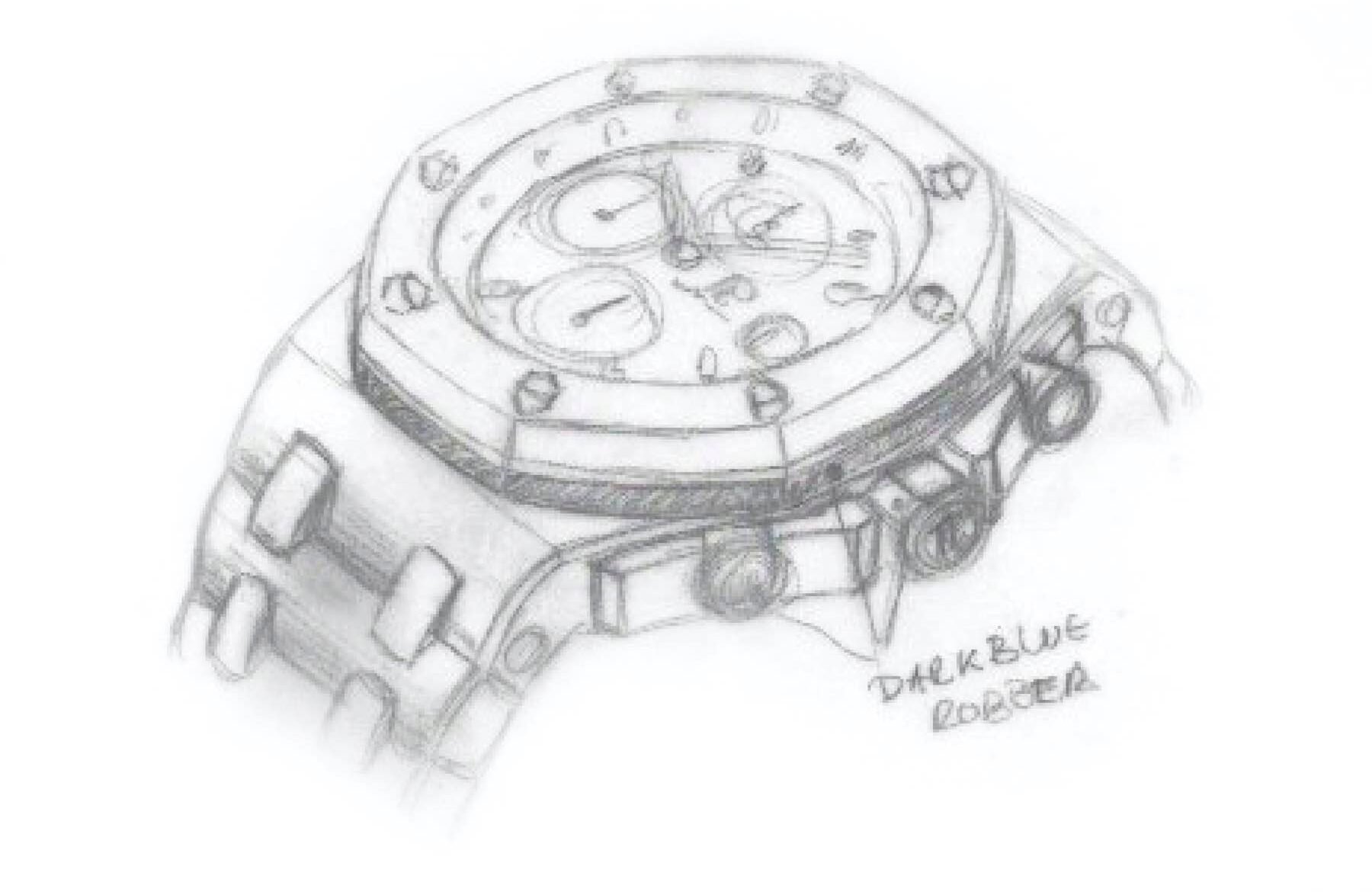
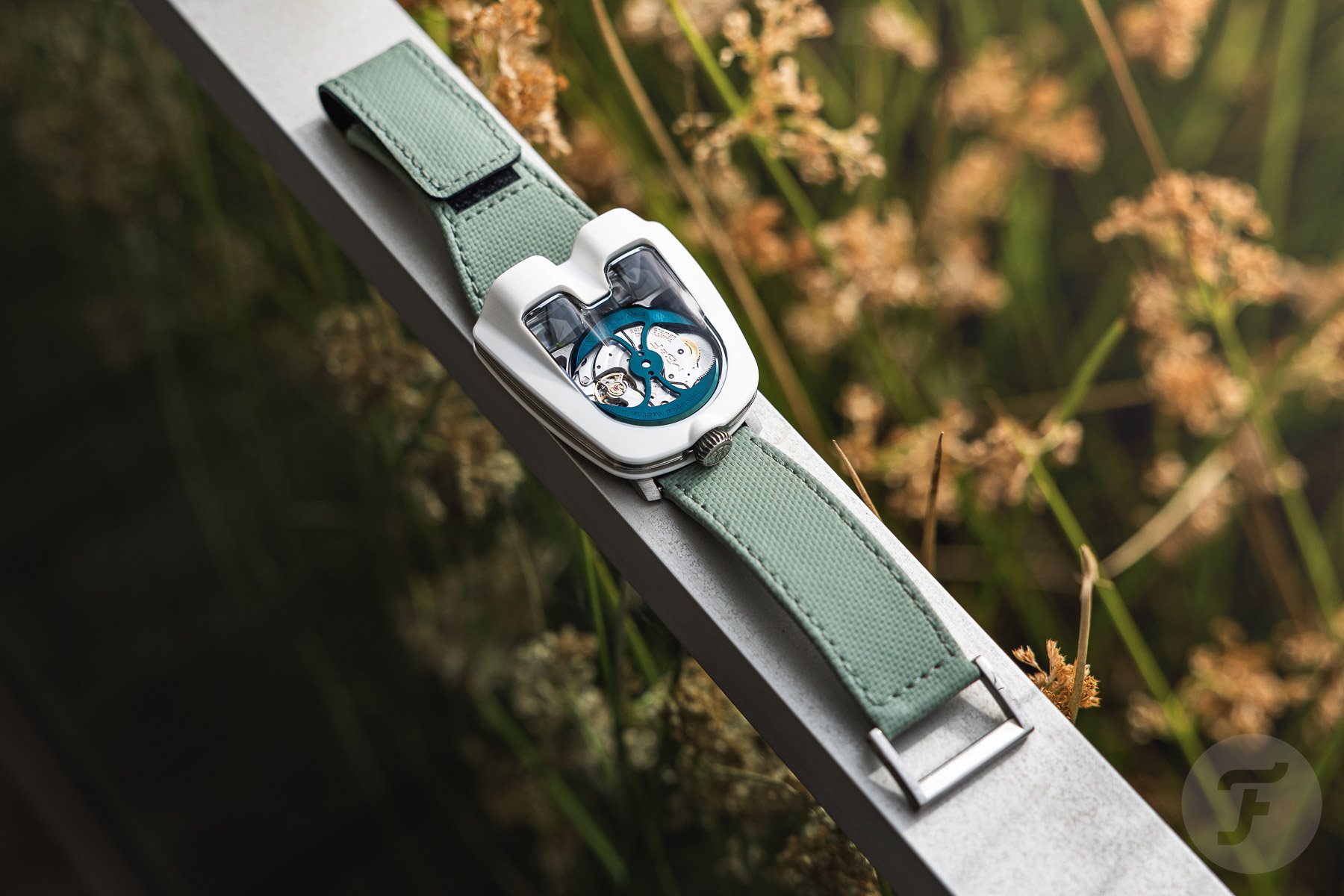
So I figured it would be interesting to have a casual chat with two highly experienced watch designers. I wanted to pick their brains about design, trends, and how they approach their projects. I aim to gain insight into how professionals evaluate watch design and share it with you. Emmanuel Gueit, probably best known for the Audemars Piguet Royal Oak Offshore, and Max Resnick, who drew my VPC Type 37HW, were kind enough to indulge me. Let’s nerd out on watch design together!
How to evaluate a watch’s design
Thomas van Straaten (TVS): When you see a new watch, how do you evaluate it from a design perspective? Can you guide us through the way you look at it?
Emmanuel Gueit (EG): My first thought is whether I like it or not. The biggest one is whether I would buy it and wear it. Then, the evaluation is how the watch sits on your wrist and whether it will last. Will it age well over 10, 20, or 50 years? What I have seen lately, I doubt if it will last long. If it lasts, it will be because of the name, not the design.
Max Resnick (MR): When I see a new watch, I get a gut feeling about how well the design works as a whole. Then, I start breaking it down by asking if it’s fit for its intended purpose, especially if it’s aimed at a specific sport or activity. Wearability and functionality are essential to good design; for me, a strong watch balances both.
I evaluate watches on several key points — wearability, legibility, and whether the design aligns with the brand’s identity and values. After over a decade in the watch industry, I’ve refined my approach to assessing watch designs to consider each element separately as well as whether they all come together cohesively.
Handling the different tools of watch design
TVS: How do feel proportions should be handled in watch design? Are there any rules or guidelines that make a design feel balanced in this respect?
EG: There are no rules regarding the balance, size, and proportions of a watch. It depends on how I feel. For example, when I designed the Royal Oak Offshore in 1989, I made it super big because, at the time, there were no super big watches on the market. I wanted it to be different. Today, I feel the 42–45mm range is out, and 37–39mm is the perfect size now. Maybe the big sizes will come back in 20 or 30 years, but for now, we are back to slimmer and smaller watches. Watches are fashionable now, too, which was not so much the case when I designed the Offshore.
MR: To me, proportions are relevant to every aspect of watch design. Early in the design process, I carefully consider the dimensions of the lugs, the thickness of the watch, and how these relate to the case. These proportions often need adjustment as the design evolves to achieve a balanced feel that’s visually pleasing and comfortable to wear.
The dial layout is another area where proportion is key, and it often requires an iterative process to find the right balance between different elements. While design schools teach concepts like the Golden Ratio, which is a useful guide, achieving well-balanced proportions is often a mix of intuition and a lot of refinement.
TVS: How do you approach typography in watch design? What is its value within the greater design?
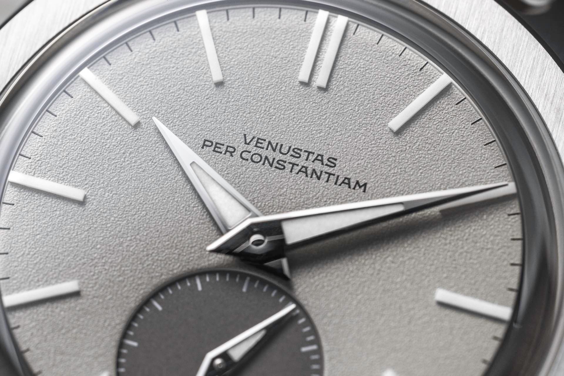
EG: Typography is all about the brand and the design of the watch. I have to respect the brand DNA. If I design a watch that looks like the 1940s, I get into 1940s typography. If I design a watch that looks like the 1960s, I get more creative. Sometimes I like to mix. It is super cool to mix a 1960s-style watch with 1920s-style typography. It can be fun, and it is all about the design. But I respect the brand; that is my first consideration.
MR: Typography plays a crucial role. While the dial must remain legible, the right choice of font can help to communicate the tone and spirit of a design. It’s possible to use typography to unify a collection, align with a brand’s identity, or differentiate models from each other. This flexibility allows typography to enhance both brand coherence and individuality, depending on the overall aesthetic we’re aiming for.
TVS: How do you approach color? Where in the design process does it enter the picture, and do you use any specific methods/theories/philosophy?
EG: If you are talking about dials, we will look at what might be in fashion next year. We also look at what is commercial or not. Of course, blue, gray, and black are commercially good, but sometimes I like to play with color to be different. That works. I don’t use a specific theory or philosophy, but it is also about the brand. If I work for Tiffany, I work with Tiffany blue, of course, and not with orange. But if I were designing for Hermès, Tiffany blue would be a big mistake.
MR: My approach to color often begins with a focus on form. I prefer first to develop a design that feels well resolved in a monochromatic palette, ensuring that the case and dial have the right qualities. Once the watch feels “right” in terms of structure and shape, color and material variation can be added to enhance a design and build out a collection.
For some watches, color is used as a central element of the brand’s identity, and in those cases, it enters the process earlier. However, generally, I see color as a flexible tool to enhance a design’s impact and bring a unique energy to each model.
Trends in watch design
TVS: What changes have you seen in watch design lately? Are there any trends or developments you’ve noticed?
EG: Finally, we are getting out of the integrated-bracelet steel sports watches. We are starting to see designs and not copies anymore. We have been copying brands like Rolex, Patek, and AP forever. Now, small brands are creative, and hopefully, it will wake the big brands up. They need to start designing and not copying.
The trend is very much 1960s and 1970s. This was a really creative period. We owe this period because everything that was designed then, we are still living on it now. They dared to be different, to be asymmetric, or to be feminine for men’s watches. The same goes for cars, furniture, light, and glass. They were two incredibly creative decades; hopefully, we will return to that spirit.
MR: Lately, I’ve noticed brands (both large and small) that are willing to take more creative risks, with a rise in sculptural forms and innovative ways of displaying time. What’s particularly exciting is that these experimental designs are becoming accessible at a wider range of price points.
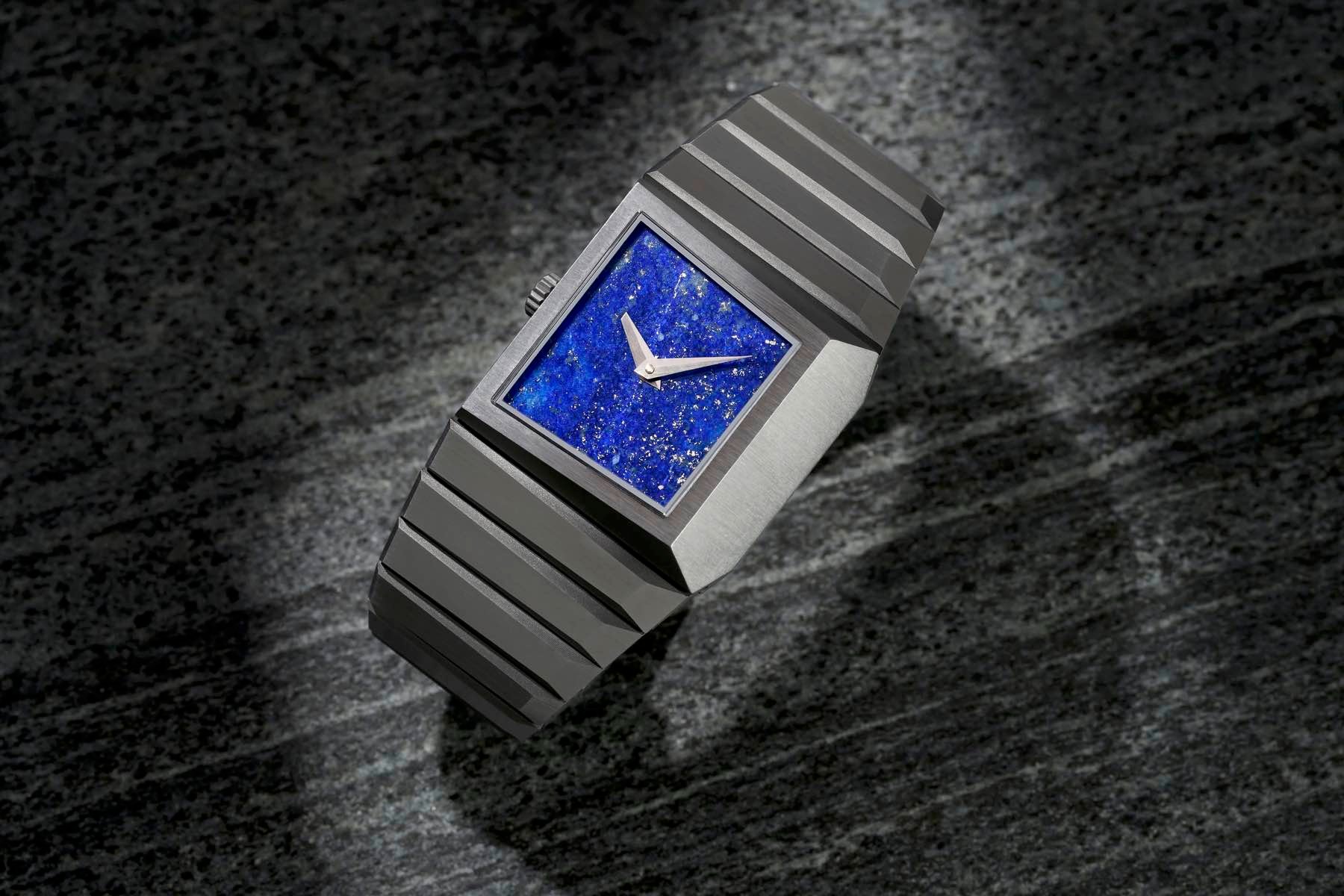
In terms of specific trends, there’s a renewed interest in natural materials, especially stone dials, which are making a strong comeback. We’re also seeing more opportunities to experiment with unexpected finishes and textures. In the long term, advanced manufacturing techniques, such as 3D-printing metals for production, enable designs that couldn’t have been produced previously.
TVS: How do you balance the audience’s love for vintage watch design and the desire to do something new?
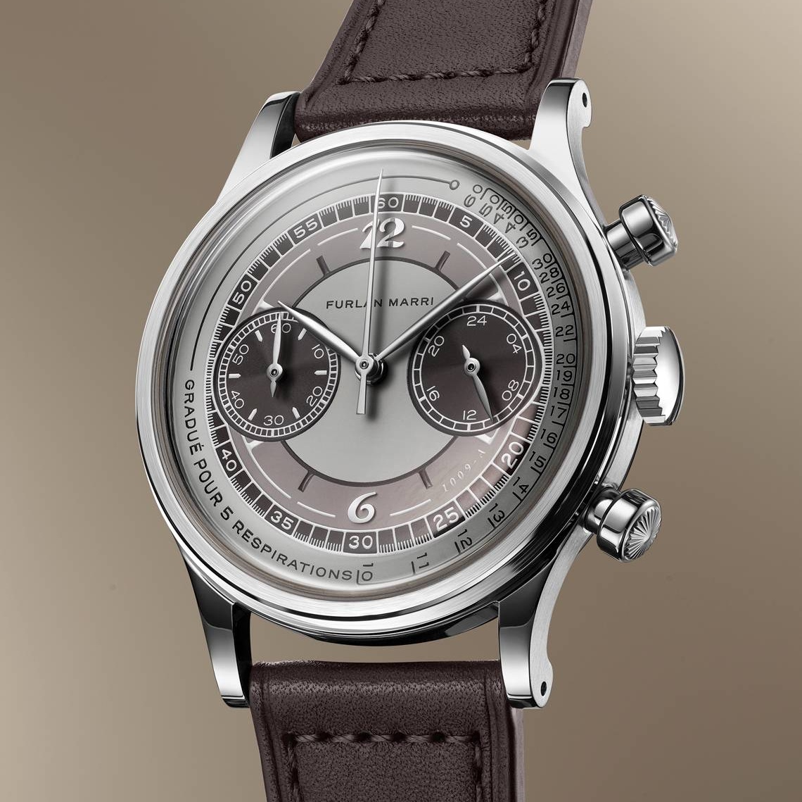
EG: The audience has loved vintage for the last two decades now. Before that, it was very classical, round watches with dark straps. Now, “vintage-inspired” is more like Furlan Marri and the old Patek chronos, more strongly designed watches. Hopefully, people will understand they need to do something new.
MR: Audiences often have conservative tastes and love iconic designs that have been around for decades. This often influences the design briefs I receive from clients.
While I draw inspiration from the past and understand what will resonate with people, I always prefer to introduce new ideas. I’m careful to avoid “like-for-like” reissues because I believe each new watch should feel relevant to today’s design landscape and where a brand is now rather than where it might have been 50+ years ago.
Does form follow function?
TVS: How do you think about function versus aesthetics? Does one follow the other, or are they separate pursuits for you?
EG: Aesthetic comes first, always. I am always thinking about how the watch looks, how it fits on the wrist, how it will age and look after 20 years, and how it can be different. Then, I focus on function and find a solution to fix the function within the aesthetic.
MR: My approach is often to push the design boundaries as far as possible to create a “dream watch” for the brand, challenging the functional and technical aspects — like a concept car in the automotive world, where I first trained as a designer. From there, we pare things back as needed for production but always aim to preserve as much of the original vision as possible.
In some cases, the design is centered around a specific function, manufacturing technique, or mechanical complication, which naturally guides the creative process from the start. When a watch has a unique functional feature, I prefer to highlight it rather than downplay it with a more conventional design. For instance, I’m currently working on a project launching next year using additive manufacturing for production parts, so I have designed the components to show off the capability of 3D printing using generative and parametric design.
Ultimately, I see function and aesthetics as deeply interconnected; each one informs and elevates the other to create a piece that’s visually compelling, technically exciting, and fit for purpose.
Examples of good and bad design
TVS: Which watches by other designers do you admire from a design perspective?
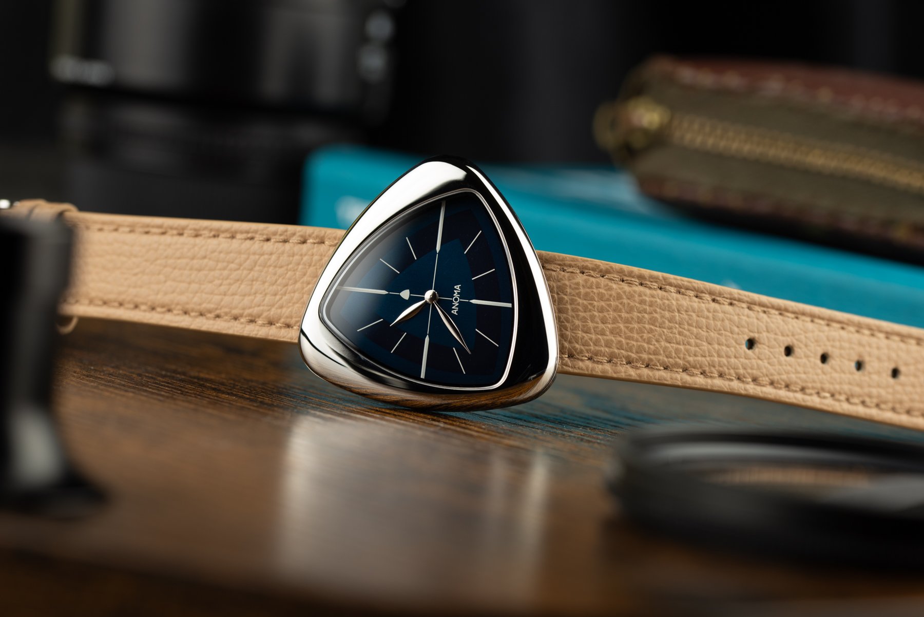
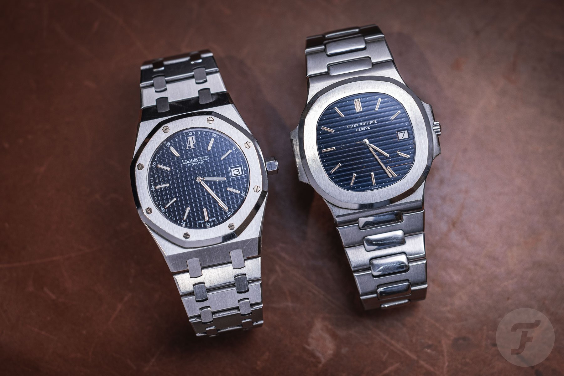
EG: This year, I fell in love with Toledano & Chan and Anoma because they are very much “design watches.” They are very different and very ’60s. I am a big admirer of my dad’s design from the ’60s when he was with Piaget. I am also a big fan of the Royal Oak and the Nautilus, and the latter, I believe, is the sexiest and most beautiful luxury watch.
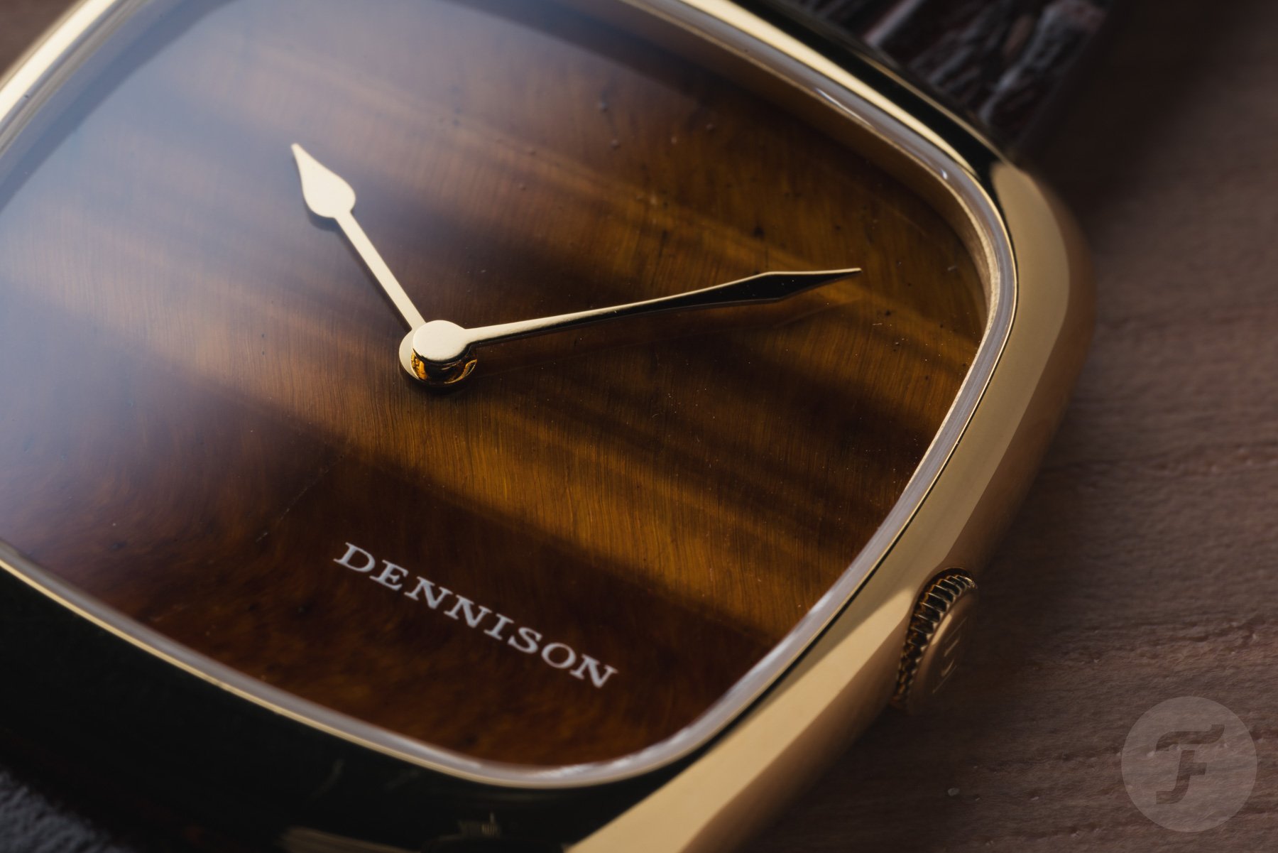
But yes, we should keep an eye on those two brands, Toledano & Chan and Anoma. I am also pleased with the watch I designed for Dennison because I think it came out mega sexy, and on the wrist, it is super hot. Hopefully, more small creative brands will come up. The big brands seem to be sleeping, and I expect little from them. I have high hopes for new, small brands that dare to be different.
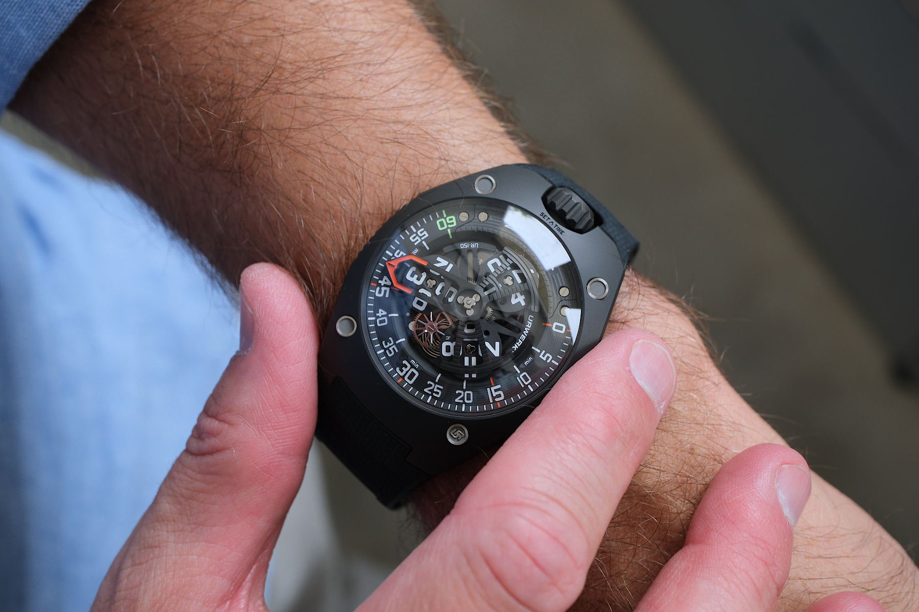
MR: There are many designers and watches I admire, each bringing something unique to the industry. Martin Frei’s work with Urwerk has always inspired me; his approach challenges conventional watch design and redefines how time can be displayed. I also appreciate Marie Boutteçon’s dedication to artistic craftsmanship, which brings a rich, expressive quality to her work. Recently, it’s been exciting to see Sylvain Berneron’s new brand, which allows him to explore concepts that likely wouldn’t have been possible in his work with Breitling.
This is by no means an exhaustive list, though, as there are countless other designers and brands also pushing boundaries in fascinating ways.
TVS: Which trends in watch design would you like to see the end of?
EG: I don’t want to see any design trend end. It always goes back and forth. We are now entering a very creative period. But maybe in 20 years, I will be very happy to see the Offshore back. Maybe I would like to see an end to the copying of old brands and models, such as Patek chronographs from the 1940s and dive watches from the 1950s. Maybe that is enough.
MR: Trends in the watch industry come and go. One I’d like to see phased out is the number of reissues, especially when it results in modern watches that feel like “fancy dress” versions of the originals, oversized and lacking the charm of the vintage pieces they aim to replicate. While these can be commercially successful, I believe the industry would benefit from a greater focus on truly original designs. There’s still so much untapped potential in new collections and concepts, and I’d love to see brands investing in fresh ideas rather than leaning too heavily on past models.
TVS: Let me end with the most important question: what constitutes a great watch design in your eyes?
EG: Nothing is perfect. We can always do better. I think probably the success and the reaction of the crowd determine whether something is a great watch. When you launch a new watch and see the reaction of the people, that tells you whether it is a great design. Of course, as a designer, you have to be happy with the work you do, but it is also to make other people happy. People must be happy to receive it or to offer it as a present. It brings joy. That tells you that it is a great design.
But, if you take a Rolex, it is nothing new in terms of design; it has been the same forever. But it is still a great watch. In the end, you never know what the day will bring when you wake up, so your watch needs to be ready for any occasion or environment, from the swimming pool to the gym, the office, and, finally, the opera. This wasn’t my vision 20 years ago, but it is today.
MR: To me, a great watch design is one that has meaning to the brand that it’s for, ages gracefully, and is something you’d be happy to wear every day.
Closing thoughts
I find it fascinating to hear two experienced watch designers speak about their craft. I like that Max and Emmanuel share an excitement about the times we are entering when design is more prominent again. This is great medicine for all the doom-and-gloom industry news we hear every day. From a design perspective, at least, we may have exciting times ahead!
I would like to express my gratitude to Emmanuel Gueit and Max Resnick for taking the time to answer my questions. Keep designing great watches, gentlemen!
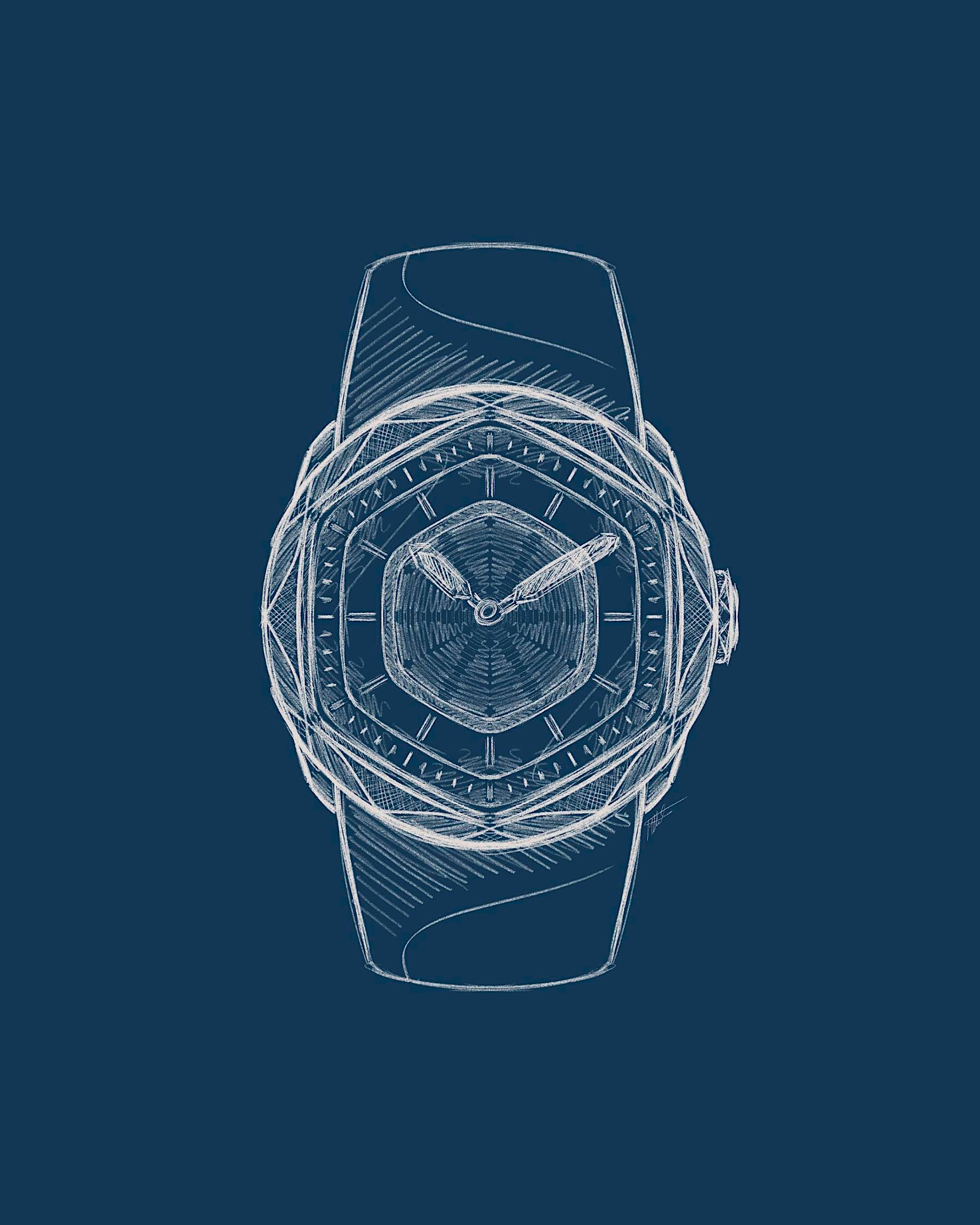
Header image: Max Resnick for Hautlence

