#TBT An Inexplicably Magnetic Nivada Dato Ref. 4368
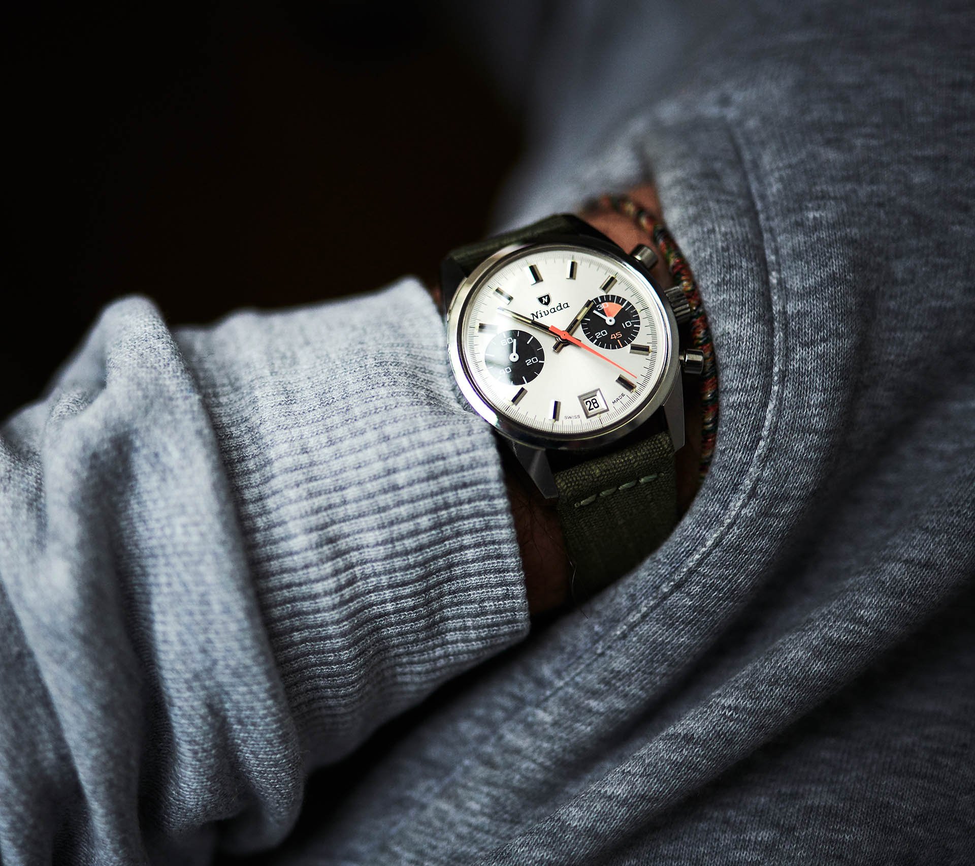
Honestly, the Nivada Dato is not the most fascinating watch in my collection. Nevertheless, it casts such a strong spell over me. I’m surprised by how much I enjoy wearing it. Is it due to the fantastic condition that makes it look like it just left the factory? Let’s dig in and see whether there is more to it than that.
There are two watches that have been sitting on my wish list for quite a long time. Actually, there were two watches sitting on my wish list. As usually happens, after three years of absolutely nothing, I landed both of them within the span of two weeks. Straight after its arrival, the elusive Nivada Datomaster took a trip to my watchmaker to get some loving therapy. I can’t wait to put that gray dial on my wrist. But I will tell you, this almost untouched Nivada Dato makes the waiting pleasingly bearable.
Nivada Dato
As opposed to the Chronomaster Aviator Sea Diver, the Nivada Dato is not an easy watch to source. There are actually so many CASD models out there that it got its own fancy book similar to the one about Speedmasters. And while some nice patina gives the CASD an attractive aged look, any (and I mean any) traces of aging make the Dato look simply horrible. There are watches that look tough and cool no matter the brutality the dial faced over the decades. That’s not the case with the Nivada Dato.
Unusually usual
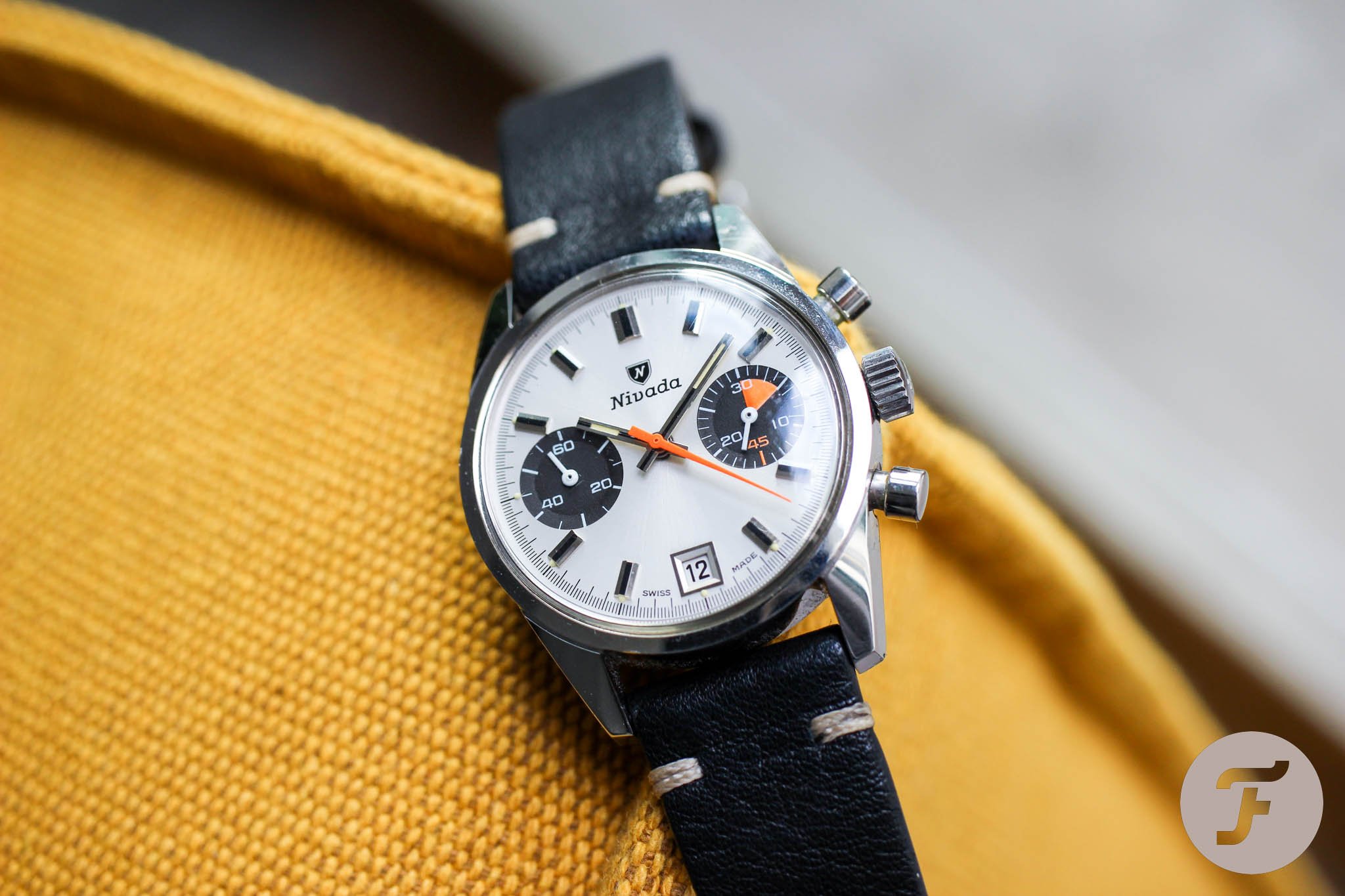
I got my Nivada Dato in a box that was full of other heavy-hitting collectible timepieces. And I’ll tell you, the Nivada shone way more than a few other watches, including the triple-valued Enicar Jet Graph. I didn’t see that coming… The next morning, from all the eight new acquisitions, it was the Nivada Dato that I put on my wrist. And it stayed there for over a week. I just love it. It is a simple chronograph with a contrasting dial and two sub-registers. In that regard, it’s like many other chronographs from that era. But at the same time, it’s totally different in its details.
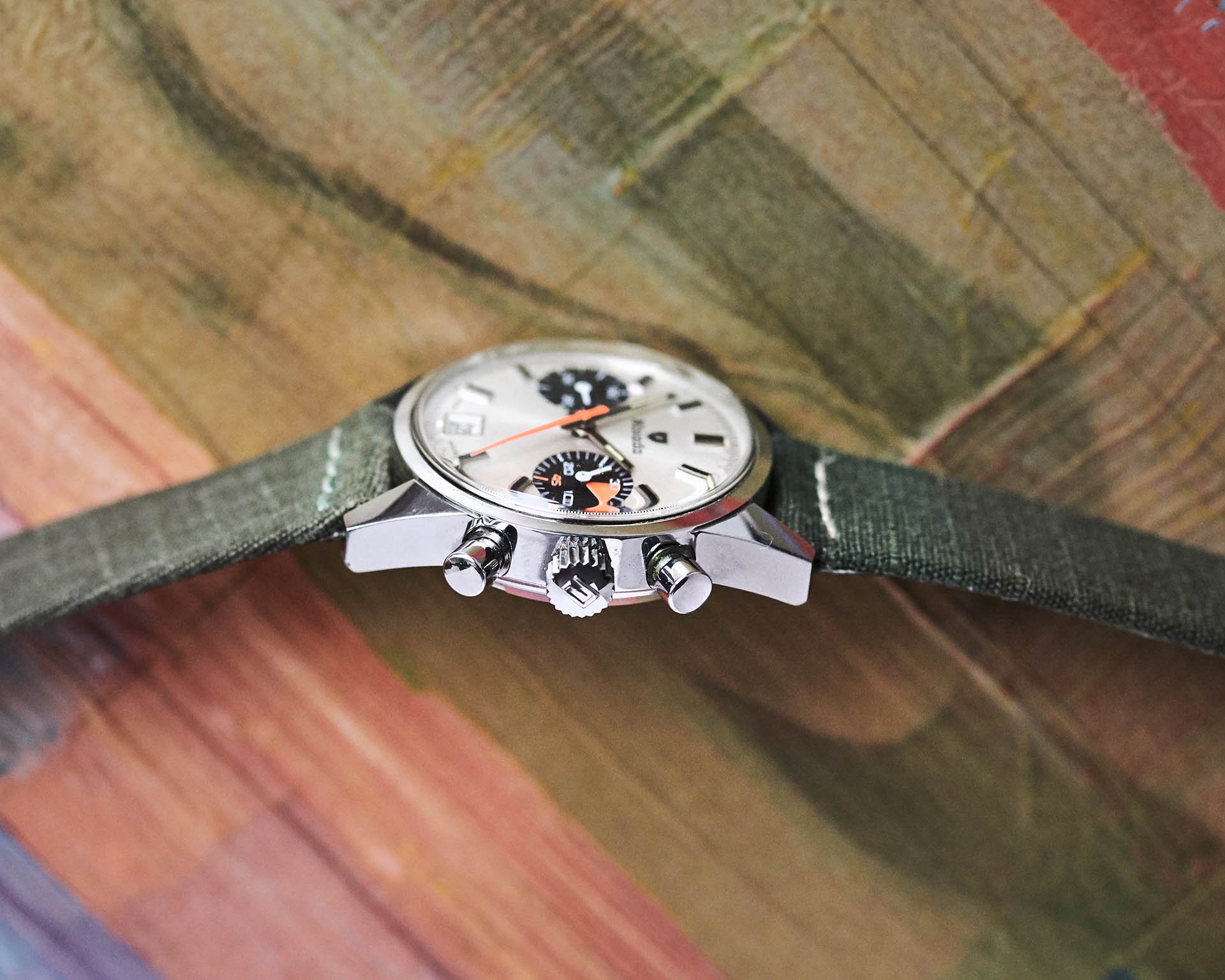
Chunky case
I had never had a Nivada Dato on my wrist before I bought mine. When I studied pictures before the purchase, I noticed surprisingly high and massive lugs. The side profile is amusingly chunky and raised my doubts about how the Dato would feel on the wrist. In the end, my fears proved to be unfounded, as the Dato wears just amazingly. Your eyes barely get the view of the chunky side profile. But what they do get is a surprisingly present and self-confident frontal view. The way the lugs are crafted makes the Nivada Dato look bigger and more muscular than the 36mm diameter might suggest. I have to say that what seemed to be a drawback became a strong point.
A perfectly preserved dial
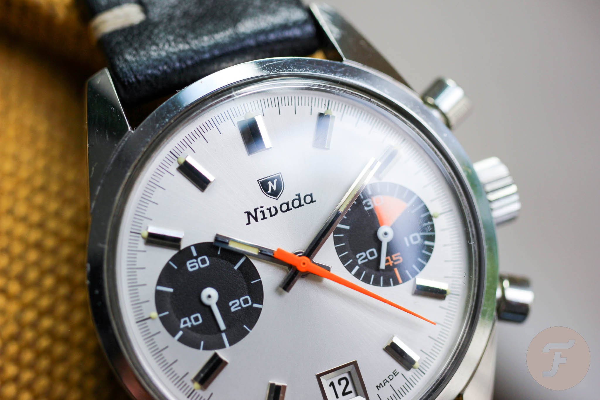
I had to check multiple times to make sure I didn’t buy the modern re-edition of this watch. The silver dial with its gentle sunburst structure turns into a liquid-like white in direct sunlight. There isn’t a single hairline scratch or stain on the dial. The tiny lume dots — sorry, lume balls — that we often see on dials from this era love to deteriorate. They love to shrink, develop ugly stains, or fall apart. On my Dato, I could not believe that all twelve creamy scoops of lume ice cream were still on proudly sitting on their respective thrones (or, should that be “cones”?).
Dachshund watch
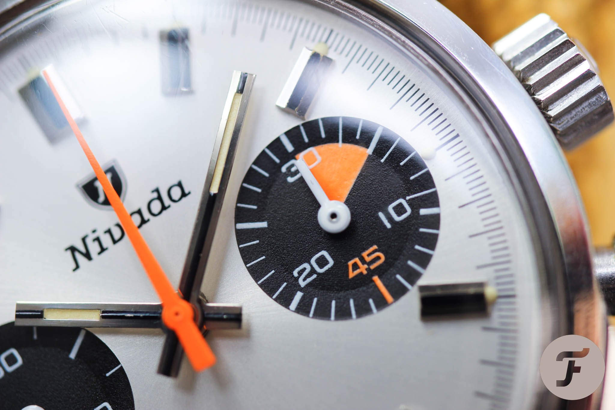
I call my Nivada Dato a dachshund. Why? Well, it all started with the side profile that ruins all the proportional standards you’re used to seeing on your other watches. This characteristic appears on the dial too. Usually, you see a minute hand that stretches up to the minute track. Not here. Also, take note of hands on the sub-registers. They look like someone put them down, cut their tips with a precise swing of an ax, and put them back. Their width and length are pretty unusual. At the end of the day, though, that’s another tiny but relevant design detail that adds to the overall originality.
Orange art
Don’t ask me why orange had such a stellar run in watchmaking in the ’60s and ’70s. Personally, though, I always liked it. And the Nivada Dato uses orange particularly well. Without it, the Dato would look pretty dressy. But it’s the sleek triangular central chronograph hand that gives it a bit of a sporty edge. The orange five-minute “pizza slice” is an additional bonus. Orange was often combined with other colors, especially gray. But keeping the Dato in strict shiny black, white, and orange attire gives the watch an unusual character.
The date window
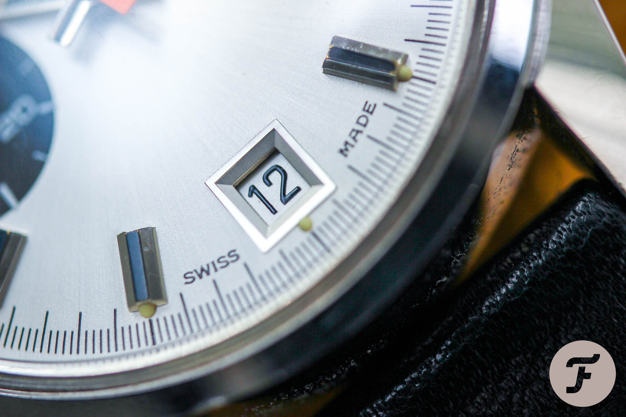
As much as I like chronographs, I like date windows as well. But I usually get dizzy when the date is squeezed between sub-dials at four-thirty. Not an issue today. The modern re-edition has a narrow rectangular window with numerals squeezed into it like blue-collar managers in the morning elevator. The old Dato ref. 4368 has a perfectly square window with “chilled” numerals. Every time I look at the date, it reminds me a bit of a sports jersey. Well done, Nivada. The date window at 6 o’clock has the same height as other applied indexes, giving it a seamlessly integrated feel. It is perfectly functional and counterbalances the beautiful Nivada branding under 12 o’clock.
Last thoughts on the Nivada Dato
I like to experiment with leather straps quite a lot. You’d be shocked by how many surprising color combinations you can find for your watch. And though I tried hard with the Nivada Dato, soft black leather always came out as the way better option. Maybe it’s a bit boring, yes, but a simple choice is sometimes the best choice.
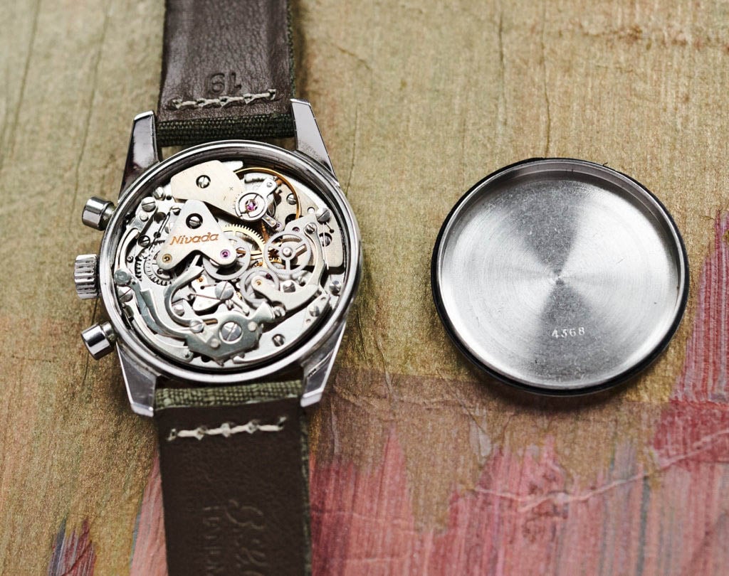
The Valjoux 7734 is maybe a slightly boring (almost disappointing) movement, but it represents the standard of the era. It lacks the charming pusher sensation only finer calibers can provide, but it’s reliable and should not be a problem to service. The movement definitely isn’t the reason to buy the Nivada Dato. Rather, the unique visuals, the individualistic character, and the few pristine examples left make it worth tracking down. Happy hunting.

