#TBT Breitling 814 Top-Time Chronograph
It’s rare that I am able to try on a vintage watch before purchasing it. That sounds funny, but unlike the new watch buying experience, most of my forays into the classic world don’t involve a flashy store, a gratis glass of sparkling water or Champagne, or an anxious salesperson. No, the bulk of my purchases are made online. Therefore, I target watches that typically pick up on a similar theme as they probably look similar to something I already own that I like. Sometimes, though, if I’m lucky, I get to ogle vintage pieces in person and try them on for size and looks. Here again, though, my in-person experiences have always led me down familiar thematic paths. This all changed recently, though, when I spent some time with a friend who was selling some pieces and I tried on the subject of today’s #TBT: the rather affordable and unbelievably attractive Breitling Top-Time 814 Chronograph.
If you’ve picked up on one thing about my articles, you know that I enjoy chronographs. You’d possibly also gather that I tend to favor sporty pieces that are round in shape with manual movements. Well, you’d also be correct about the fact that I like traditional watches in general. This all changed, though, when I tried on my friend’s Breitling Top-Time. You see, my friend emailed me pictures of this watch months ago letting me know that he was passively trying to offload it as he found a later Chrono-Matic version with a similar case, but I dismissed it due to a shape that I feel hasn’t aged very well, at least in pictures. So, it was recently that I stopped by my friend’s house and put eyes on said Breitling; I was intrigued. Then, I tried it on and the magic happened. Strange stuff indeed as this was the first time that a watch completely reversed my opinion positively by sampling it.
The Breitling Top-Time 814 was introduced in 1967 and was only made until roughly 1970. I was able to speak with Breitling aficionado @watchfred and he mentioned that this model was not featured in the 1971 catalogue. The watch was offered with the black dial you see here and either white or orange hour and minute hands. It was also offered in a similarly high-contrast white dial with orange hands. Unlike in earlier Top-Time models where most stated the model name, this version thankfully chose to eschew the verbiage and keep the already arresting dial uncluttered.
The Breitling Top-Time contains the Venus 178 that is one of those classic, triple register, hand-winding, column wheel movements that collectors love. It easily stands up to other classics of the period such as the Valjoux 72, Lemania 321 and Excelsior Park 40 with its 17 jewel, 18,000 bph specs. Unlike the Valjoux that has a bottom pusher spaced slightly further from center than the top pusher, the 178 contains equidistant pusher spacing. I own a couple 178’s and it’s a nice movement with great feel on the pushers and winding crown. I do find it to “kick back” a little during winding and it’s a bit louder than my 72’s but it’s a nice runner worthy of its acclaim amongst collectors. Interestingly, Valjoux acquired Venus in 1966 and in my discussions with Fred, it seems that production of the 178 stopped soon after, so models featuring the movement as early as 1967 were using up stock.
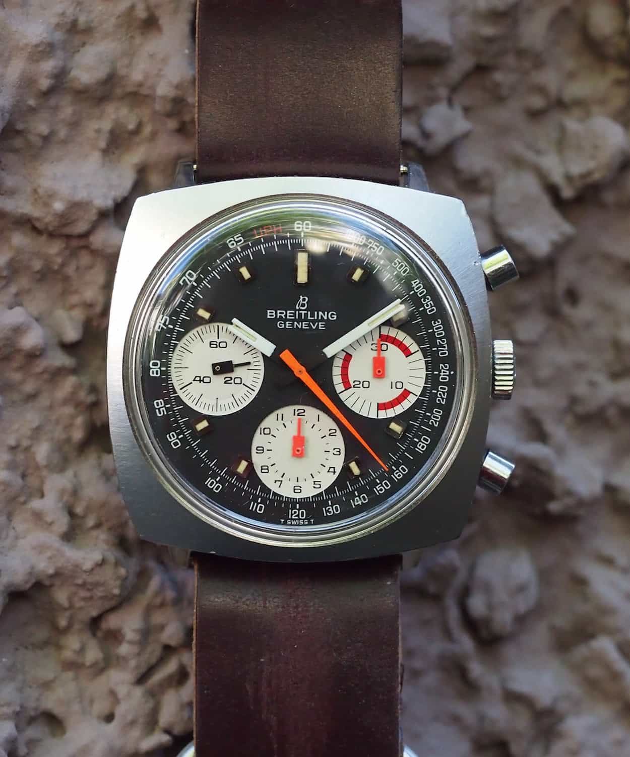
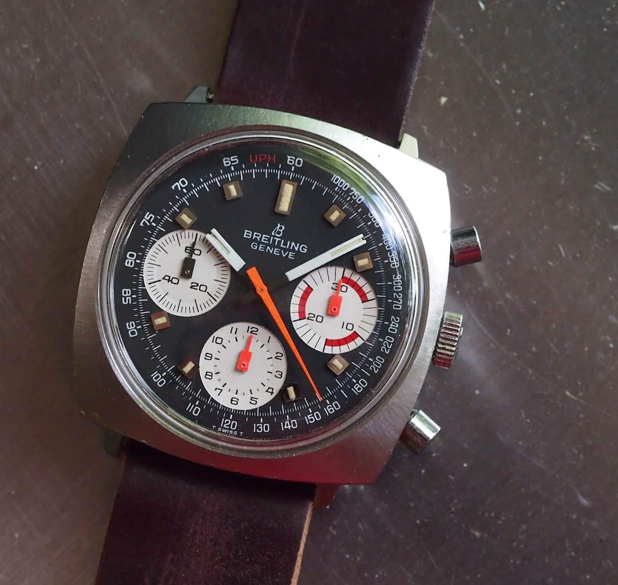
The Breitling Top-Time comes in at roughly 38.5mm in “diameter”, although that’s really the length of one if its square-cased sides, and has a brushed surface on the top of the case that radiates from the center. It’s subtle versus pictures of earlier, 2-register square-cases Top-Times that I’d previously seen. Admittedly, it was these earlier square-cased pieces that turned me off to this case shape in general, so perhaps the finishing was the real culprit. In any case, the finishing on the 814 is sporty with matte brushing on the sides as well.
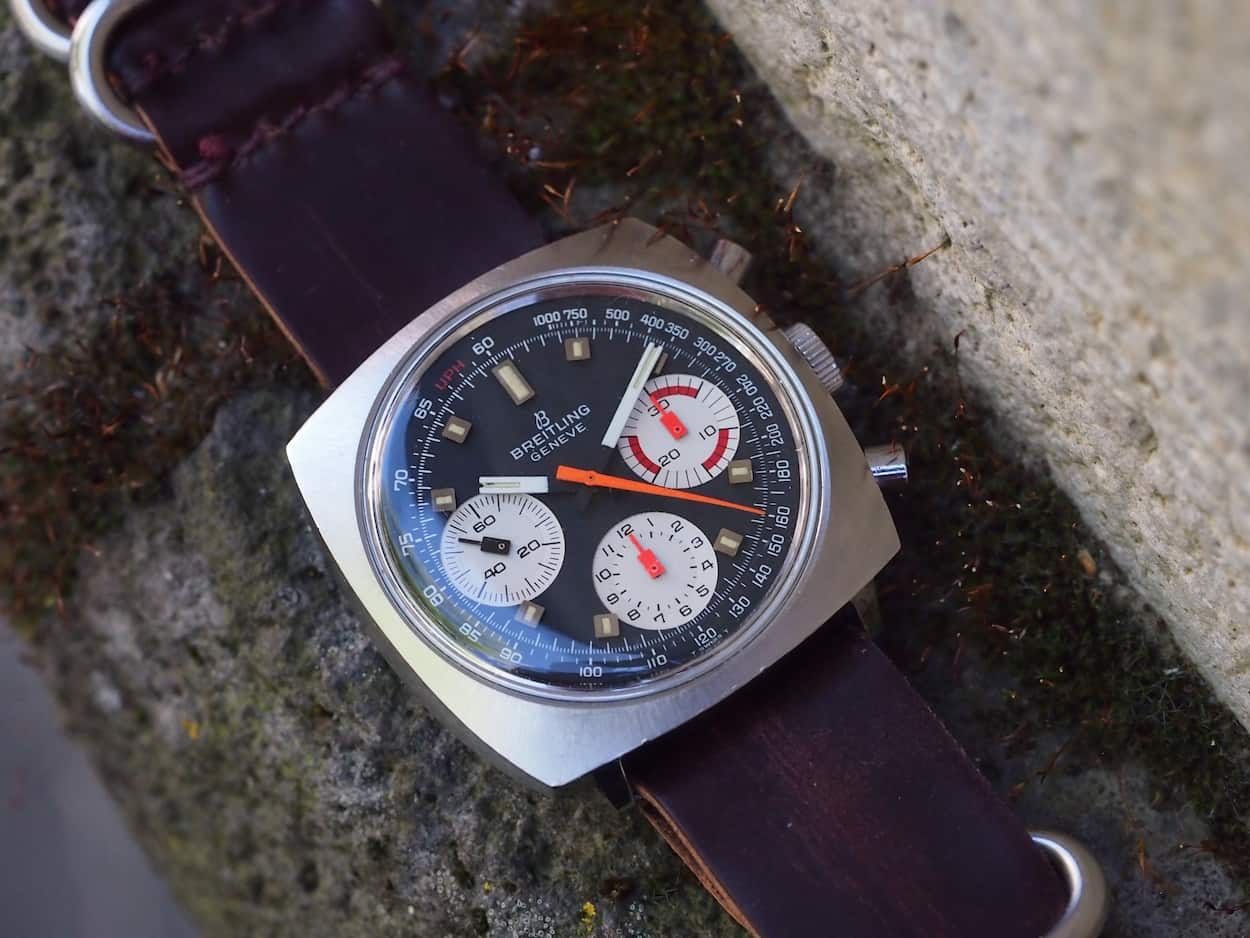
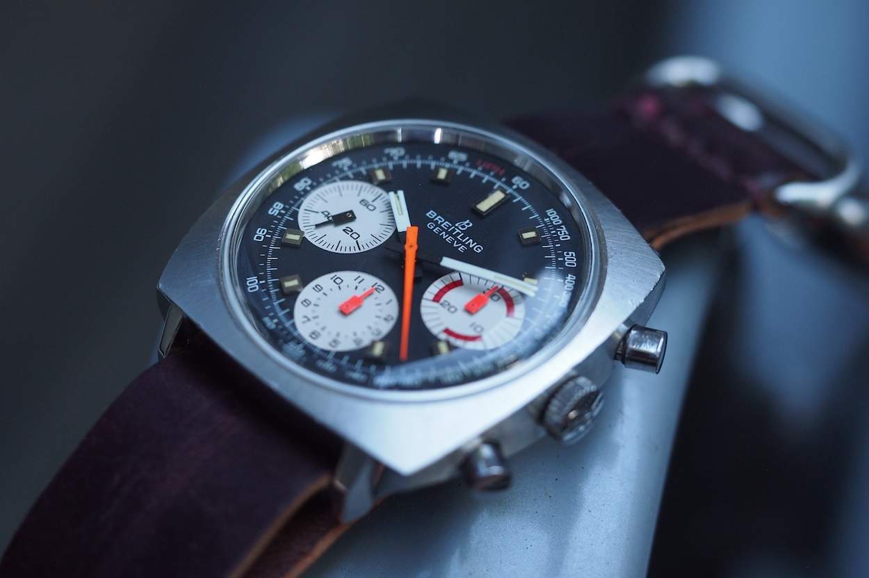
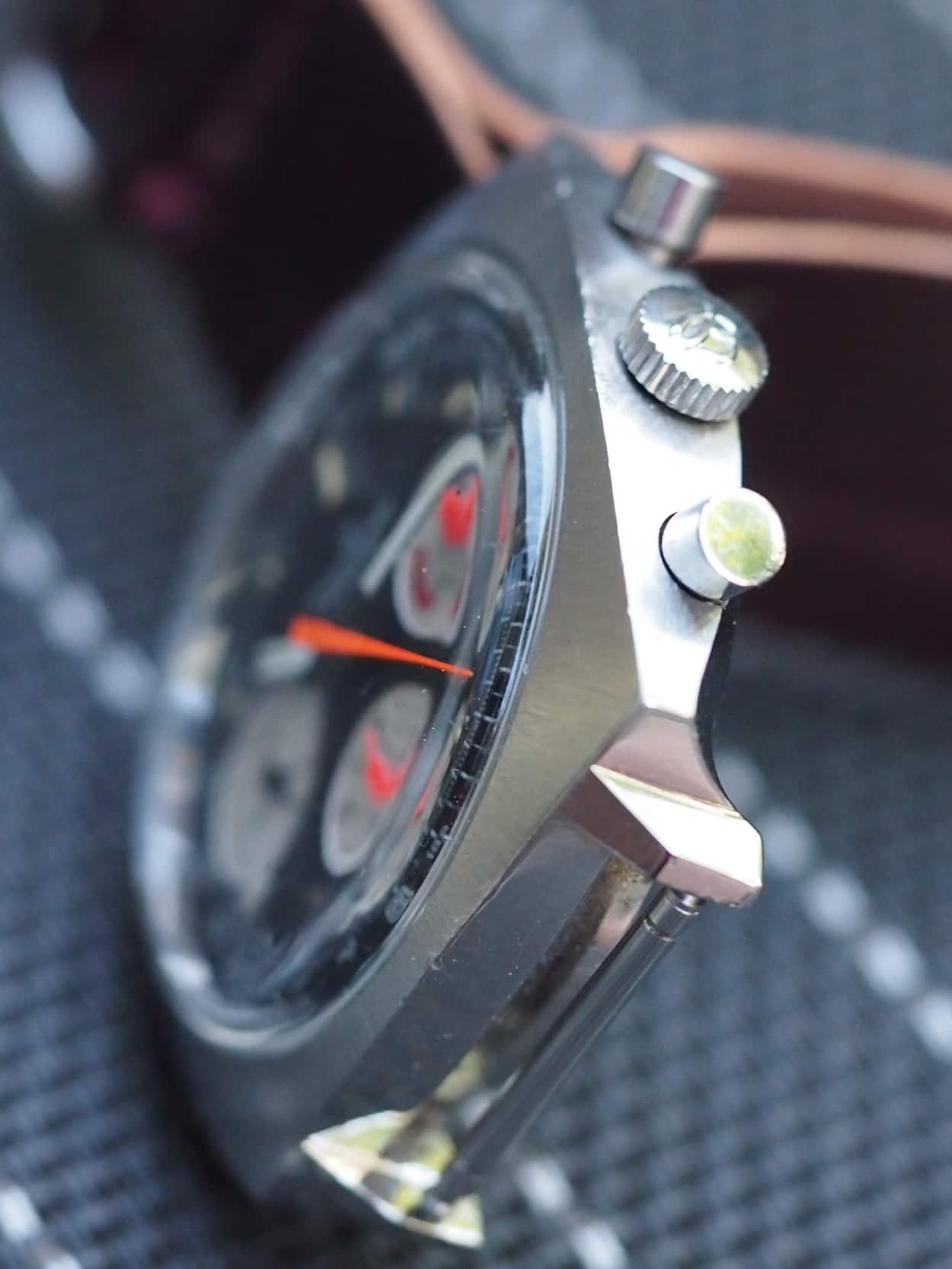
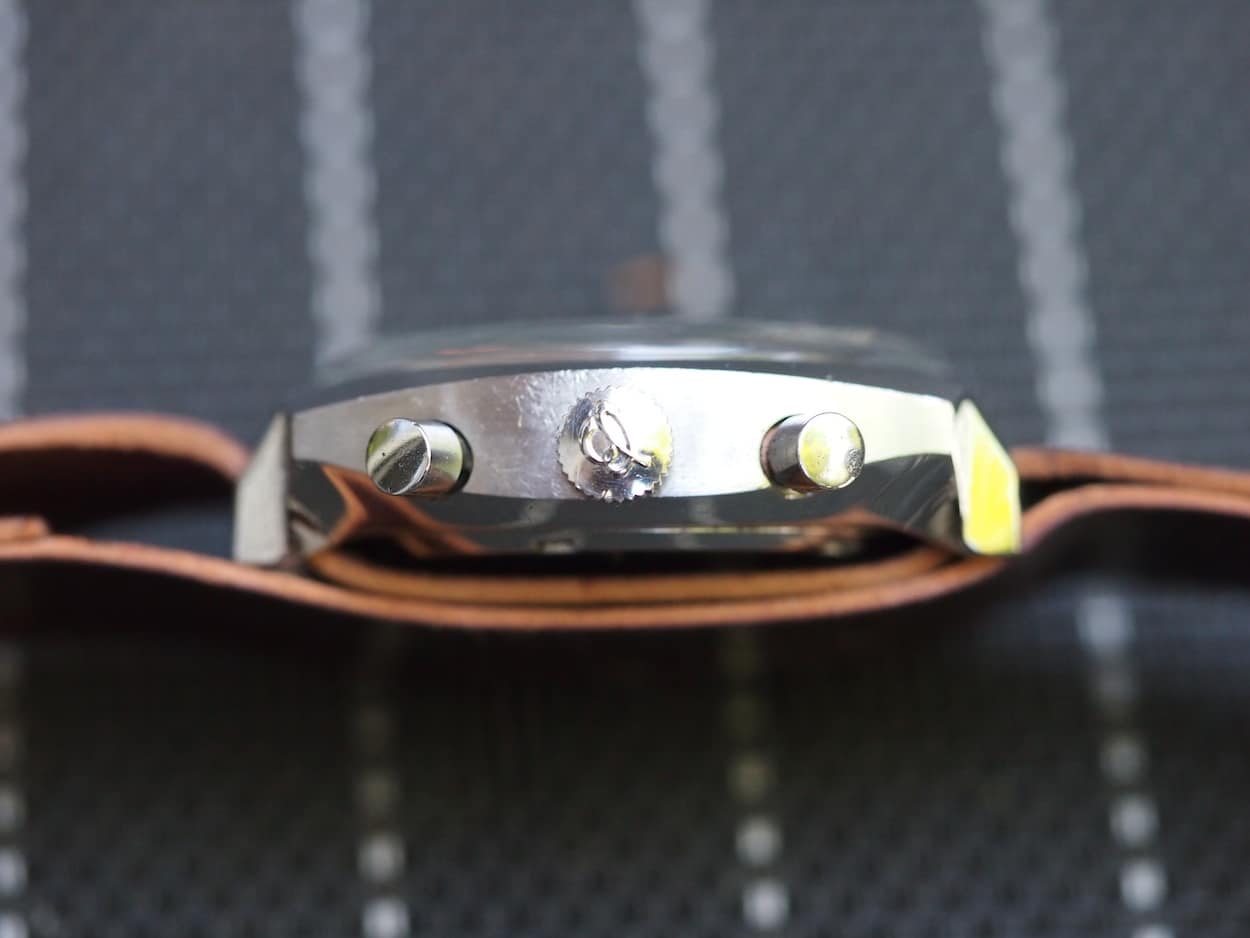
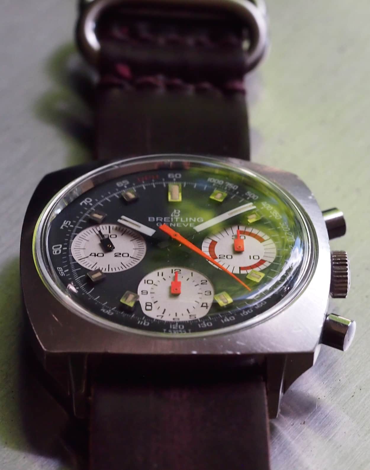
One of the interesting things about the watch that is not present from a head-on view is the amount of intricacy in the case design. A side view, from any side, and a bottom glance exposes that there’s a lot happening. First the corners “pinch” together to create what reminds me of a throw pillow or even a lozenge. You also see some nice arcs that create the case surface. The case is actually thick and this later comes into play when wearing, as it certainly does not look like a flat slab on the wrist. The lugs, on the other hand, are not as pronounced as, say, another squarish design such as the Heuer Camaro, but they are present and really nicely done. From the bottom and the side, you see some very complex metal forming where the lugs join the case. If you can’t tell, I’m impressed by the case work and finishing.
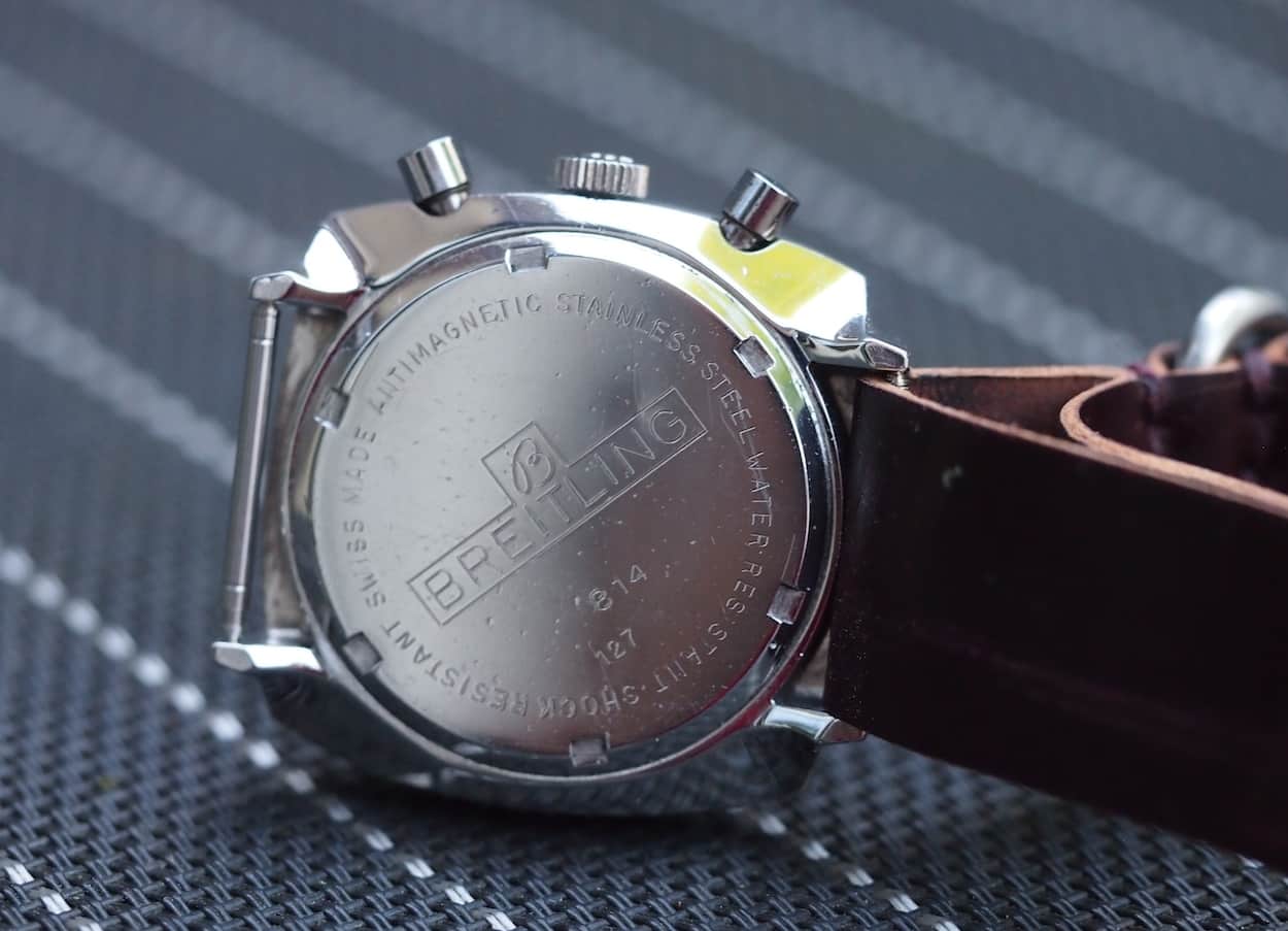
Related to the case, we see some well-designed cutouts that allow for the placement and function of the pushers. The pushers themselves are well-sized in relation to the case and are of a simple, pump style. The crown is also nice with its script “B”. It feels nice in the hand while winding, but I might have opted for something just a touch larger. In taking a quick glance at the backside, Breitling fitted this piece with a nice screw-down case back complete with all sorts of relevant information including the reference of 814 and the brand name and logo. Here again, it’s a nice touch especially when compared to many contemporary brands of the time that opted for a non-marked back. Finally, we take a look at the acrylic crystal, which is nicely domed and perfect for a watch of this era.
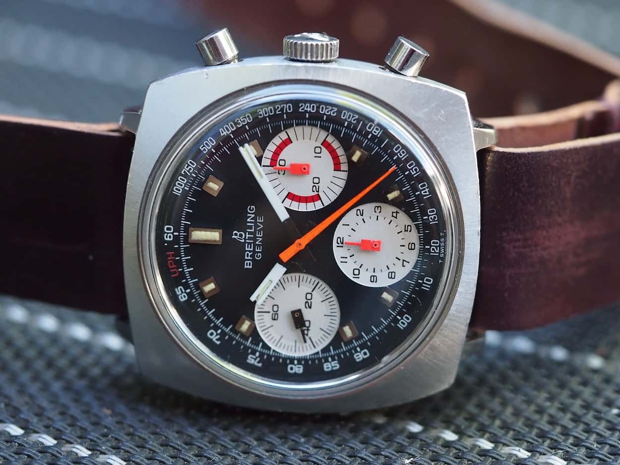
The attribute that really sold me on the Breitling Top-Time was, and is, its dial. It’s a wonderful study in high contrast, details, and functionality. It’s highly compelling yet, somehow, doesn’t seem over the top. This is a watch, if designed only slightly differently, that would likely fall into the bucket of tiresome. Details, of course, are no stranger to Breitling. The Navitimers, Consmoautes and some Chrono-Matics are flooded with scales and measurement devices that befuddle me scientifically, but somehow manage to work aesthetically. On the flip side, classic manual winding models such as the Sprint and Co-pilots contain relatively few details while still appearing as bold and strong. I like to think that this 814 is a nice blend between the two. You, at once, have the functionality of a Tachymeter coinciding with the color schemes of the yet-to-come Chrono-Matics. One might even think of this model (and its 2-register 2211 relatives) as somewhat of a transition piece out of the relatively mono or bi-chromatic 1960’s into the far more colorful and progressive 1970’s.
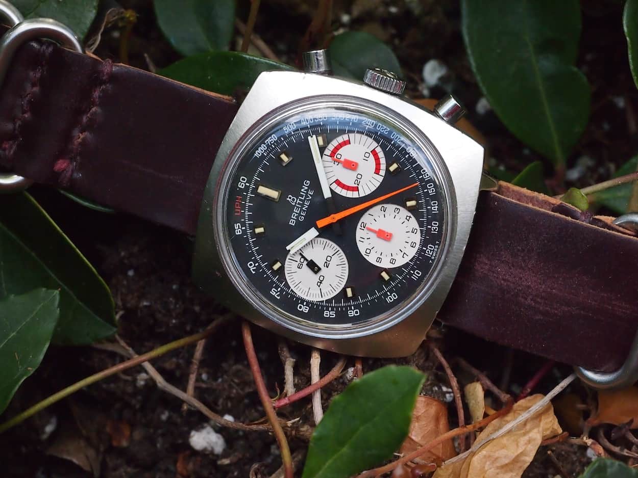
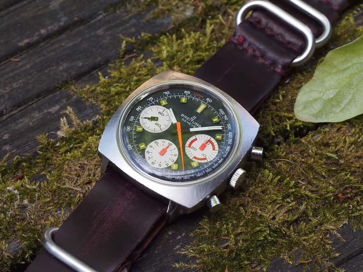
In any case, the dial, in the instance of our article, starts with a nice matte black background with white sub-registers and beautiful, rectangular, lume-filled hour plots. It contains a printed, white Breitling name and logo and a similarly printed chapter-ring Tachymeter scale. So far, if you weren’t looking at any pictures, I could be describing any number of previous Breiltings such as the fantastic Top-Time 810. However, this is where the record needle skips and all hell breaks loose! Breitling chose to introduce orange in places such as the chronograph hands and the subregister dials…and it works brilliantly. Look, I like tame pieces such as the Camaro and will likely own one at some point, but this bold, yet thoughtful, use of color really looks fantastic on the 814. It adds a ton of character to the watch and sets the tone for both future Breitlings and other brands.
I’ll take a moment to talk about the hands that Breitling chose for the Top-Time. The subregister hands are fantastically cool with their rectangular bases and small needles. I especially like the choice of orange in 2 cases and black for the other. I also like the plain shape of the central chronograph hand and its use of orange. Where I am still on the fence relates to the design, not the color, of the hour and minute hands. To me, they look a little fragile with their forked design at the end points. A nice detail about them, though, is the black paint closer to the center that gives the hands a floating appearance. In the end, though, I do favor these hands in white versus their orange counterparts due to contrast versus the chronograph hand.
So, I mentioned that this watch did not appeal to me instantly from a looks perspective primarily due to its case shape. I also mentioned the fact that trying it on made all the difference: here’s why. The Breitling Top-Time 814 fits the wrist very well. It is a very solid, well-made watch that oozes quality in its construction. It’s not a small watch but it is not massive and ungainly like some other square cases, such as the Monaco. It sits well and doesn’t “porpoise” on the wrist and looks very purposeful like some sort of racing instrument; perhaps the orange needles make me think of vintage Porsche 911 gauges or something from the era. Furthermore, the corners of the watch don’t look incredibly sharp and exposed when on the wrist and they actually curve down quite nicely towards the arm. It’s a surprise indeed. The one frustration I have with the 814 is its 21mm lug width. It’s an unorthodox size that makes strap fitting awkward. I’m a real stickler for using correct strap widths, so a call to Giuliano, for what will likely be a black rally style strap, is soon in order. For now, though, I’ve been toggling between a 20mm cordovan Horween NATO strap and a NOS Tropic big hole strap. I’ve thrown some 22mm straps on, but I actually find that it dominates the case and the eye is drawn to the bracelet instead of the dial. In a pinch, if you dislike showing spring bars due to use of a 20mm option, perhaps a 22mm strap with a more dramatic taper would work better.
I’m not fully up to speed on how difficult it is to find a Top-Time 814 as I hadn’t been looking, but I’ve been told that white dial versions are somewhat tougher to source. It does seem that a few 814’s are always present on chrono24 and, less so, on eBay. There are a lot of vintage Breitling references out there, but collectors now seem to be taking notice and are starting to give them more focus. The 814 is one of these references that is starting to gain some traction, but it is still affordable and buyable in the $1500-2250 range. In fact, at that upper end, the watch should be a time capsule piece in my opinion. As always, with chronographs, the details count heavily. Ensure all the pieces are there and don’t bet on finding loads of spares like hands, etc. The orange bits on the dial and hands do tend to fade depending on their past environments, so be on the lookout. Serial numbers for the watch can be found on the outside of the case back, so that’s a nice way of checking if things are at least on the right path. The other big piece to note is case finishing. Ensure you can still see the finishing lines on all faces and that it has not been over polished. Related to this, you’ll note a few dings on my case. Due to its shape, the 814 doesn’t weather a firm smack quite as well as a round case. Ensure that the edges and corners still remain intact and haven’t been polished away; your tolerance for how many dings are too many comes down to personal preference.
Overall, I find the Breitling Top-Time 814 to be a fantastic value. It has a lot of the attributes collectors look for in vintage watches: a high quality column wheel movement in the Venus 178, modern size, noticeable details and fantastic quality finishing. It also adds the bonus of coming from a well-known brand that produces watches today and even makes some that mimic the same color schemes used on the 814. While I don’t see the 814 becoming the next Daytona or even Heuer Carrera, there’s enough legitimate goodness here to provide plenty of room for value appreciation.
Ultimately, I learned something, perhaps troubling for my wallet, upon acquiring the 814. It’s never a bad thing to try on a watch that you’ve never liked based on pictures alone. Trying it on is free and you might be surprised about what really looks good on your wrist. In the case of this piece, it just happened to be with a watch that has a lot of great features and history. We hope you enjoyed this week’s #TBT. If you own a watch that you previously dismissed only to later fall in love with it, feel free to share your story and pictures in the comments below!

