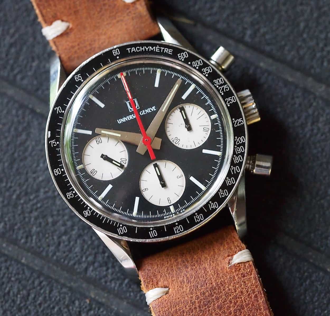
#TBT Universal Geneve Compax “Evil Nina”
It seems like it happened longer ago, but in fact it was only a year ago this past February that one of our rivals, albeit a friendly rival, published an article that seemed to send shockwaves throughout the vintage watch collecting hobby. Perhaps, but perhaps not, I’m overstating things and it only affected a narrow slice of the market, but it certainly caught my attention. The article I’m referring to is the story on the Universal Geneve Compax “Nina Rindt” published by Hodinkee in February 2014. It was a captivating article because it brought together great research, beautiful photos, a compelling story and, most importantly, a stunning vintage watch.
When I say that the article brought upon a frenzy, I mean that it created a surge in demand for the watch that is nicknamed the “Nina Rindt”. I honestly think it brought to light a watch that was so good looking yet so overlooked or unknown to the general community. Furthermore, in a sort of trickle-down fashion, the sister models such as the reverse panda and the exotic blue/gray dial in the family also gained spectacularly in popularity and value. Regarding the last point, values shot up between 5-20x within a matter of 10 months! The owner of the watch in the article, William Bright aka billfactor, even gave the sister, reverse panda edition, the nickname of “Evil Nina” and it has forever become part of vintage watch lexicon.
By now, you must be asking yourself why I am paying homage to another publication’s writing. Well, first off, I find the article a very good example of the influence that online publications, aka blogs, now have on the watch collecting hobby/industry and how quickly information circulates. Yes, folks, today’s scene trades information, and cash, at light speed indeed! Second, and more germane to the upcoming scribbling, I’m a watch collector and the aforementioned article actually drove me to take action. So, without further ado, let’s get to it and jump into this week’s edition of #TBT with some decidedly now unaffordable vintage: the Universal Geneve Compax “Evil Nina”.
After reading the article on the Universal Geneve Compax, I did what most people do after reading such information and combed through eBay to see if any were for sale. I can’t remember exactly, but I seem to recall an exotic dialed version in blue/gray but it just did not have the same appeal as the featured panda version. However, I was not to be deterred. As I am someone who frequently wakes up in mainland Europe, I decided to use the first 5-10 minutes of my daily post alarm clock haze to check eBay to see if my fellow Americans had listed anything new. Well, less than 2 weeks after reading the article, my early morning searching paid dividends.
The UG Compax I found one morning had been listed for less than 40 minutes when I stumbled upon it and was a really nice looking, later execution, reverse panda. I did about 10 minutes of pictorial comparison research on the piece to ensure it looked correct and all was seemingly ok. It was listed with a buy-it-now of $3,000 or best offer, so I took a deep breath and threw in an offer south of this. To my surprise, the response was immediate; my offer was accepted.
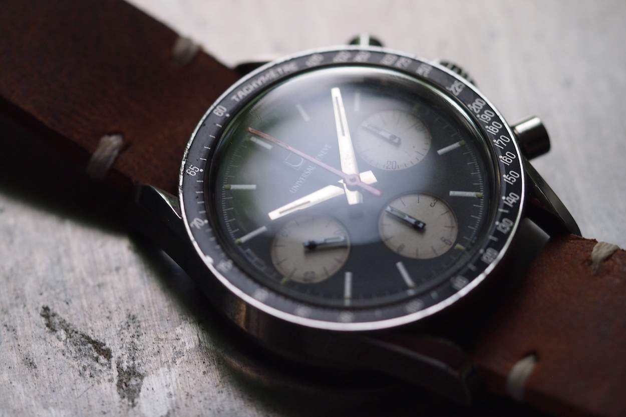
Roughly a week later, I picked up the Compax and aside from it being on a truly deplorable strap, some dust under the crystal, slightly “dirty” registers and showing evidence of an incorrect lower pusher, the watch looked great. It ran well and showed highly acceptable wear for a watch from the late 60’s that had, in fact, been worn.
So, why have I chosen only now to write about the Compax? Well, I thought it would be appropriate to provide an insider’s testimonial about why this watch is special, but also to provide an evenly balanced set of counterpoints about some of its other qualities. Lastly, I thought it would be helpful to provide some more photos of a watch that many are seeking.
I’m not going to speak much about the history of Universal Geneve as it has been documented elsewhere but it suffices to say that the company was responsible for creating some amazing movements in the 1940’s and 1950’s. The Compaxes of these periods are the stuff of legend and are often thought of as “poor-man’s Pateks”. Once the 1960’s hit, though, Universal Geneve, sadly, was faced with the same cost pressures as many other Swiss brands. Notably, Martel, their primary movement supplier, was no longer part of UG. This led UG to look outside for movements and for a relatively brief time, they chose the ubiquitous and beloved Valjoux 72. On the design side, though, all was certainly not lost as the company created some simply stunning pieces such as the Space Compax, the Tri-Compax, Aero-Compax, Uni-Compax and the Compax you see on these pages. Whereas I consider earlier UG’s to be far more delicate in execution with their often large, yet slim, cases and detailed dials, the late 60’s and early 70’s UG’s took a decided turn toward sportiness versus the models previously mentioned. Most importantly, in my opinion, the company used color combinations that often make me wonder how they went relatively unnoticed by big-time collectors until only recently. With so much kitschy ugliness going on during that period, how a company in relative turmoil such as UG managed to crank out some of its best, classic-looking pieces is beyond me, but search on images for some of the models I mentioned and if you’re not immediately attracted, you likely require a visit to an ophthalmologist. Unfortunately, this period of greatness, like that of most superstars, was not destined to last as UG then started on a slow decline and began to produce some truly atrocious junk before settling into near extinction.
In getting back to the Compax on these pages, let’s break down a few particulars. What we have is a “basic” 3-register chronograph sitting inside a 36mm stainless steel case. It features a screw down case back with the serial number stamped on the outside of the back. Inside the case sits a signed, unadjusted column-wheel Valjoux 72 movement. So, let’s take a moment to discuss this. If we stopped after reading these prior three sentences, we’d be left with the belief that we’re dealing with another me-too chronograph from the period. Honestly, there were scores of watch companies using similarly sized cases at the time and they were also tossing in a Valjoux 72. What makes the Compax even less compelling at this stage is the fact that the movement is unadjusted. Heck, Rolex was adjusting the 72 to three positions and even the relatively niche Enicar was also adjusting the movement. So why is there so much fuss? Well, let’s just say that the watch separates itself from the pack in the looks department; some might even say it gives many of the Daytonas a solid whipping.
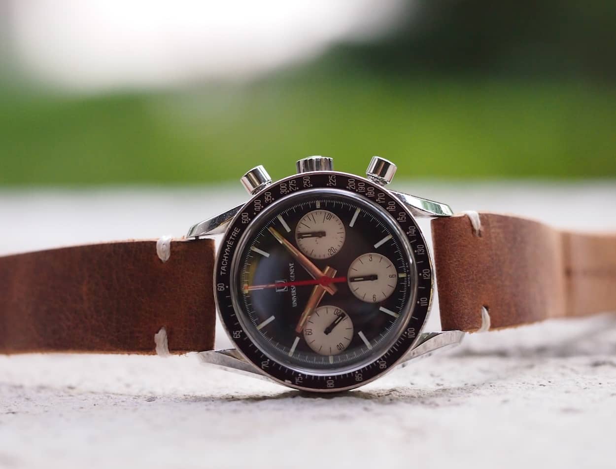
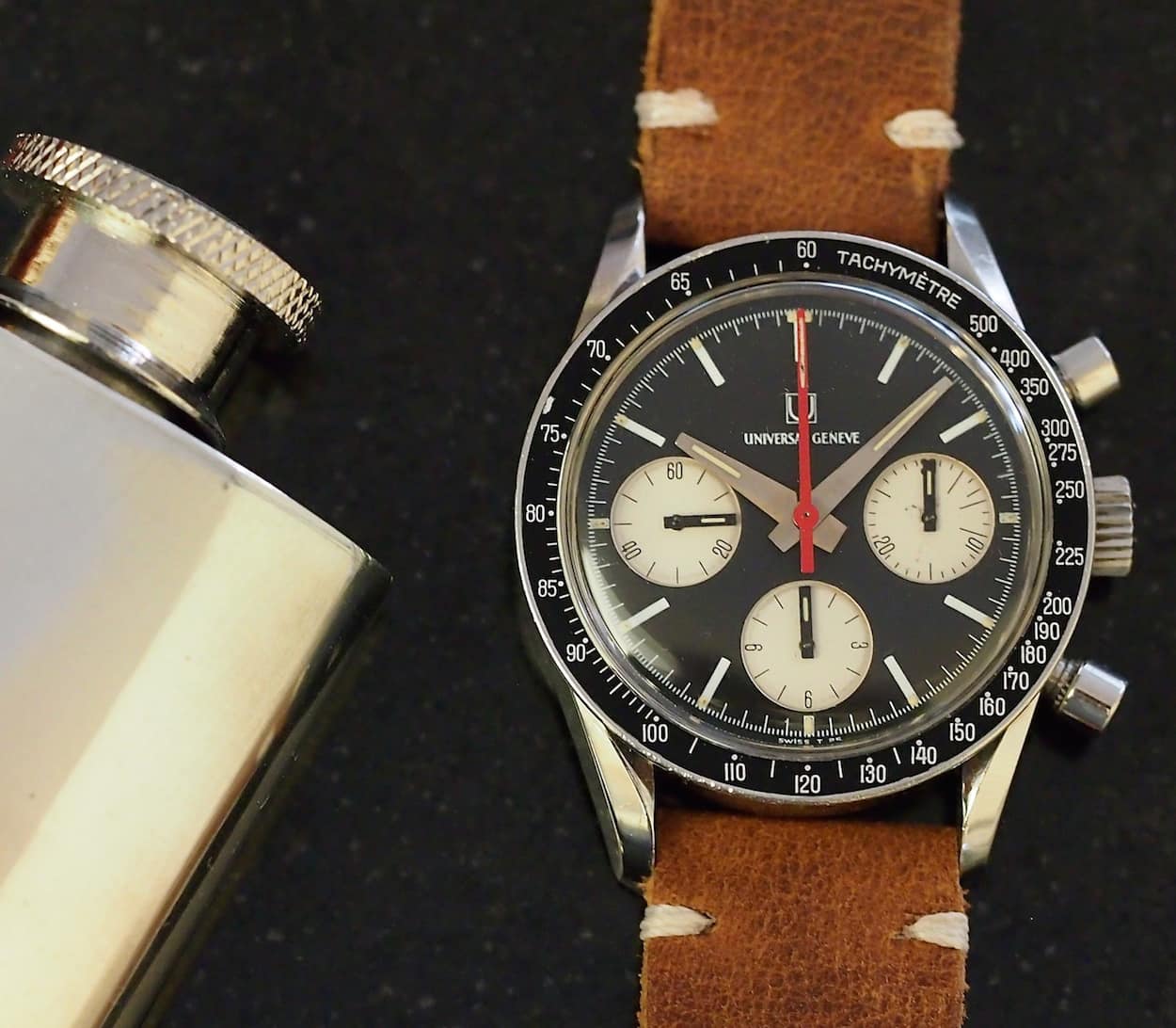
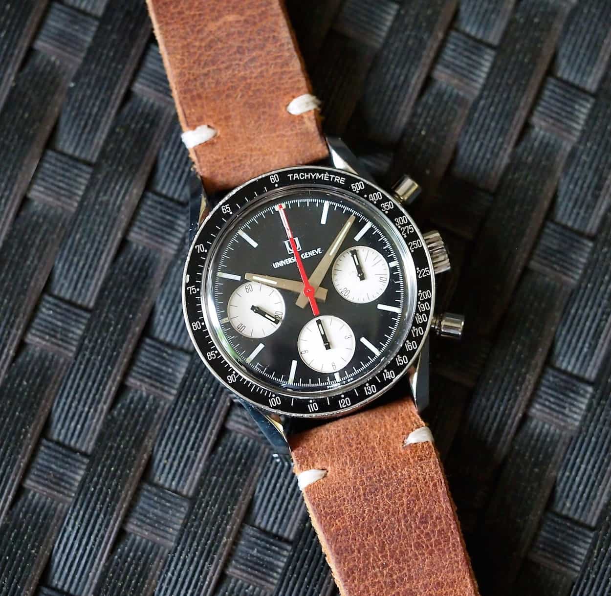
The Compax aesthetics define serious contrast yet layer in restraint; there’s little going on here that’s superfluous. If we start outside, we get a case shape that immediately recalls Omega’s Speedmaster Professional with its lyre lugs. In the “case” of the UG, though, the lugs come off as slightly different as they come out from under the bezel versus flowing off of the case radius. To be clear, they don’t help form crown guards as in the Omega. It’s somehow a “tougher” look that is likely enhanced due to a generous 19mm lug width versus 18mm on a similarly sized Carrera. Moving over to the business side, we see a couple nicely sized pump pushers and, thankfully, a well-sized and signed crown. I’ll stop here to comment; I own a fair number of V72 chronographs and there is nothing more frustrating than encountering one with a small crown. Winding a well-looked-after V72 is one of watchdom’s guiltiest pleasures and a properly sized crown is key. UG does it amazingly well and trails only Heuer (the 2447 Carrera is worth owning for that experience alone…trust me) in its execution in this department. Sorry Rolex, but I find that screwing the crown in and out on a vintage Daytona to be finicky; it spoils the moment! Jumping back in, I mentioned that the crown is signed with a matching insignia that is also found on the dial. It’s a nice detail when compared to so many chronographs of the day that used unsigned crowns.
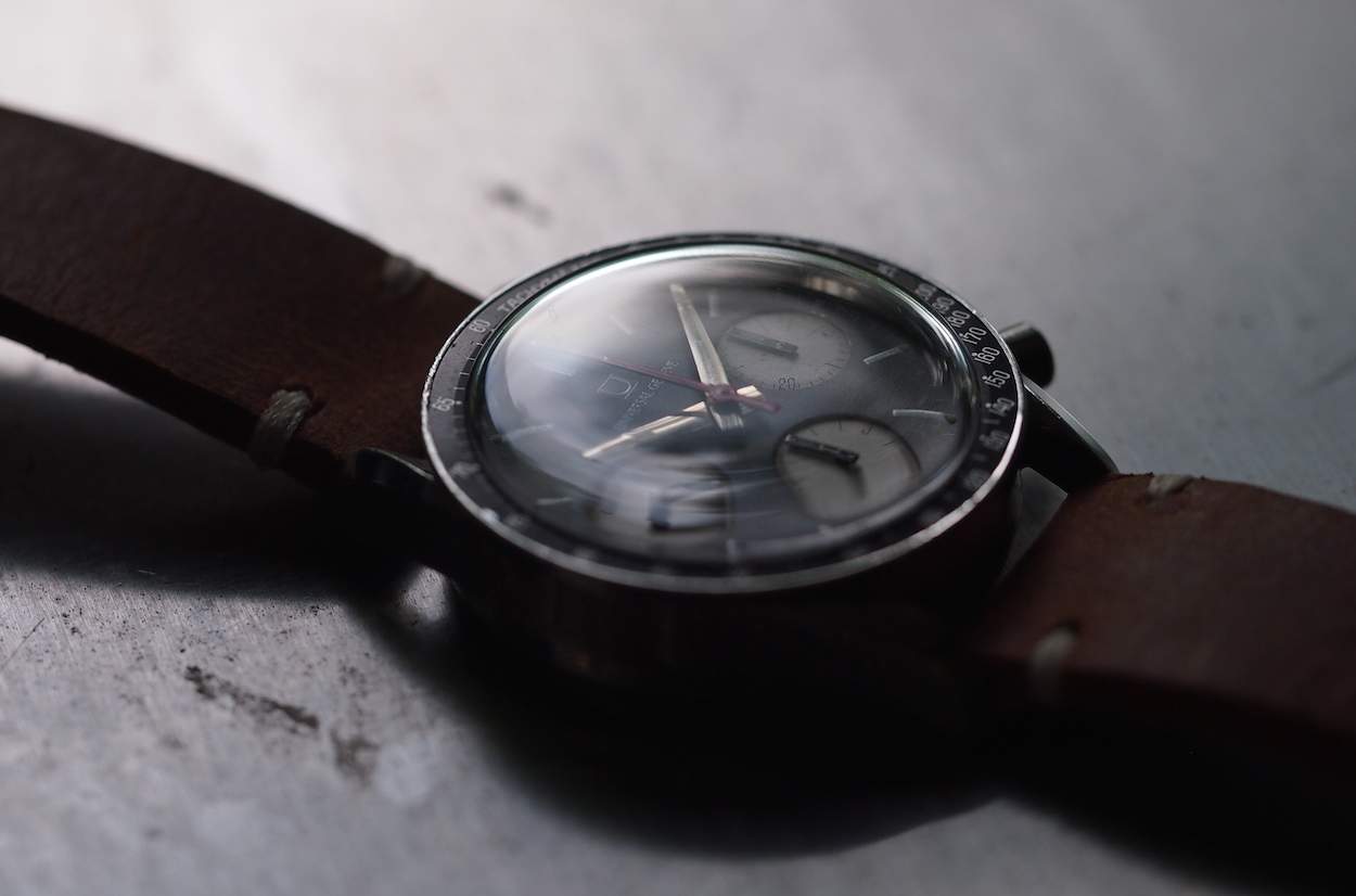
Moving on to the bezel, we have a Tachymeter scale that features an aluminum inlay set into a stainless ring that overhangs the case. It’s appropriately sized and contains a detail that collectors love: the dot over 90. So, like the lugs, we have another similarity to Omega’s Speedmaster. Before we move onto the most important part, I’ll mention that the crystal is a nicely domed acrylic affair that is also of perfect thickness. It doesn’t take away from the piece or really obscure or distort any details with its curvature. If you’re still onboard with my commentary, you’ll note that with the Compax, everything seems to be about balance.
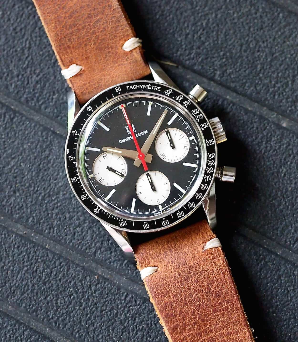
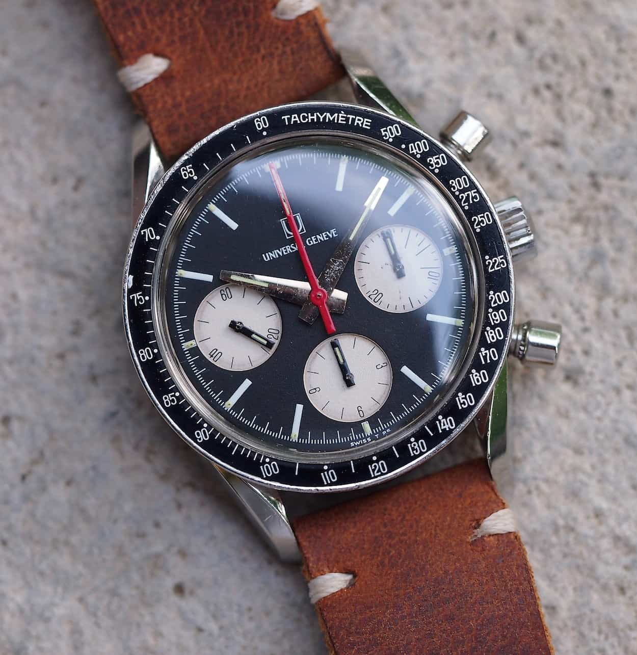
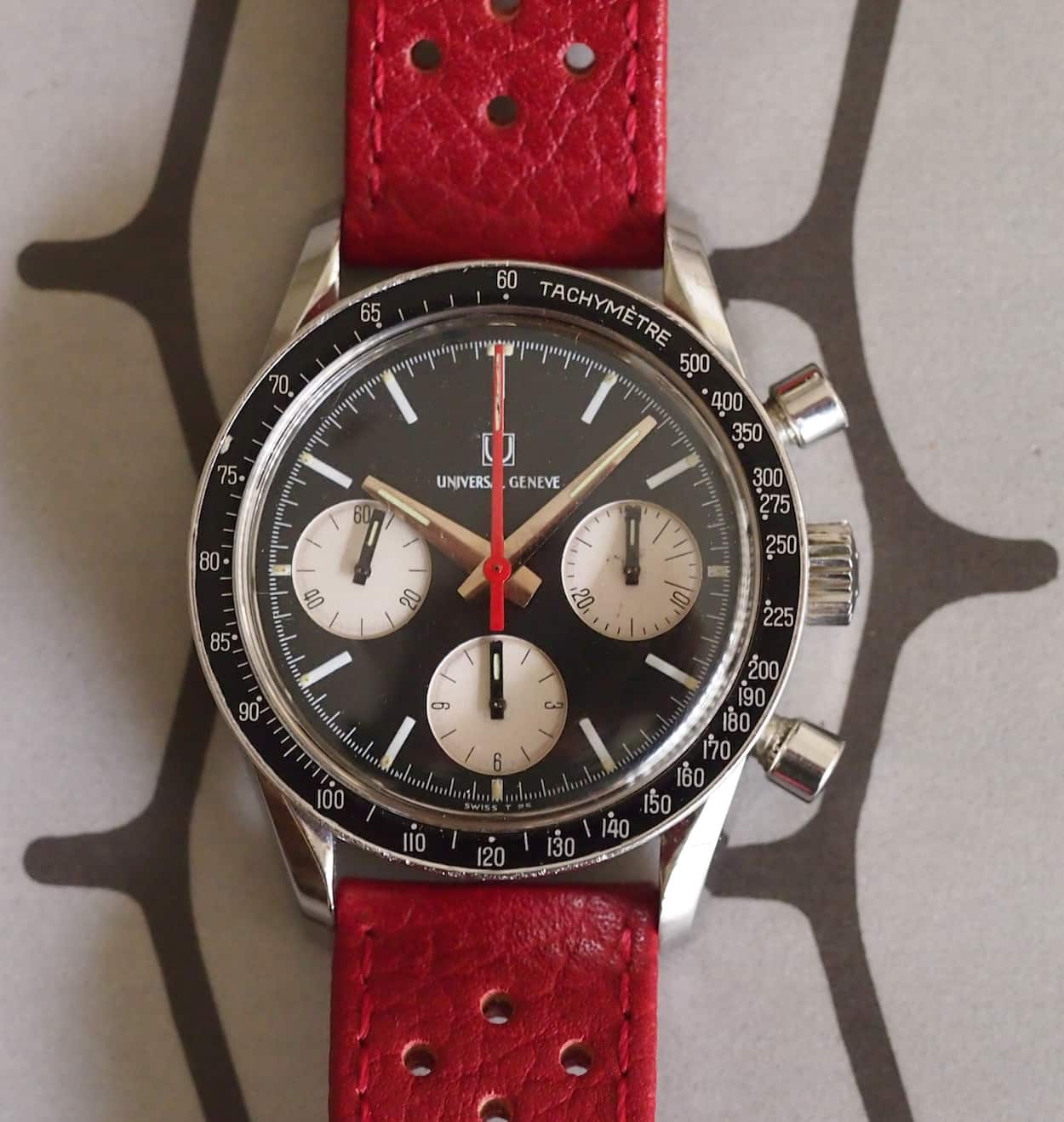
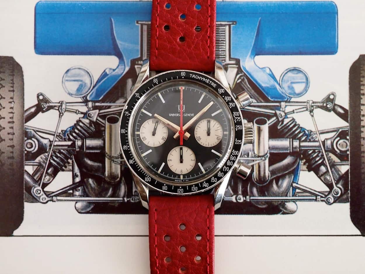
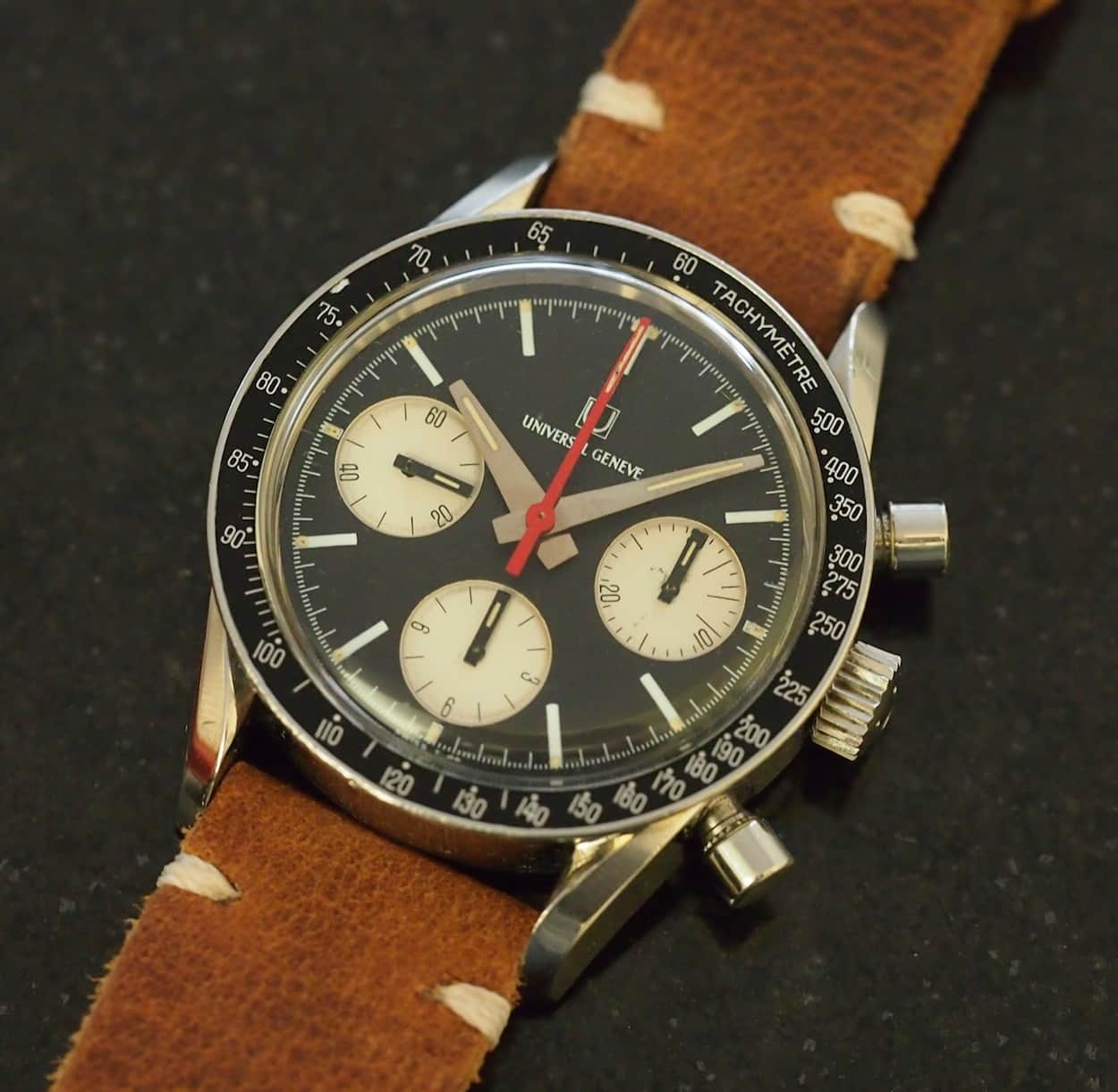
Now, we come to the dial of the Compax. It’s difficult to put into words why I, and countless others, find this dial so attractive but I keep coming back to the word balance. While I find the “Nina Rindt” panda version beautifully stark and crisp, I find this reverse version slightly more reserved, but no less compelling. What we have is a fantastic matte black dial with white registers that are slightly sunken into the dial. Since this is a later execution, the UG insignia and name are printed in white on the dial versus the earlier version with an applied metal “U”. Personally, I like this version as it is slightly less ornamental and sportier but both are nice. When looking at the dial itself, it’s tastefully done with white painted stick hour markers and a minute track that contains luminous pips outside of each hour. The sub-registers contain almost art deco like font numbers in black that are arranged with the bottom-side of the number facing out no matter the position. It’s cool and decidedly different than most other chronographs, which contain numbers printed “left to right” or in readable fashion all the way around the register. One thing I like about the Compax is that there’s no other writing on the dial explaining water resistance, number of jewels, etc. It also lacks any further measurement scale as a chapter ring, which really keeps things so clean. All in all, it’s a perfectly designed dial, but what’s a dial without great hands?
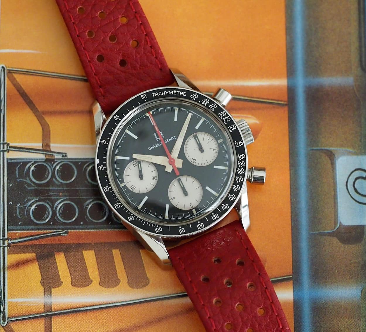
The hands: this, readers, is where the Compax truly earns its keep. The first thing to notice is the red central chronograph hand. So many of the reverse panda chronographs I own or see stay with a central chronograph hand that is of the same color as the hour and minute hands. For reference, see the reverse panda Gallet here. While this is a pleasing arrangement, the designers at UG chose to adorn the Compax with a bright red chronograph hand. Thank goodness they did this as it adds poignant contrast to a very serious dial; it really pops! This hand, with a small strip of lume, makes the watch and while the panda version largely succeeds, in my opinion, due to its three interesting black central hands, the reverse panda makes its mark by offering this subtle yet arresting contrast.
When talking about the central hour and minute hands, they’re chromed with a thin stripe of lume and crafted in a fat spear-like shape. They’re almost too fat for the dial size, but only almost. They push the boundaries of what should be found inside a relatively small watch and that, to me, also helps to define this as different from the other chronographs of the day. If you can envision hands from the Daytona or Carrera of the same era in the UG, I think you’d instantly agree that the effect would not be nearly as unique or attractive. The same can be said about the sub-register hands. They are beefy rectangles done in black, again with lume, and are once again almost too heavy for the dial. I prefer these to the earlier executions that feature needle hands due to their unique style. They’re a bit audacious but compliment the central hands and theme of the dial.
Before we get to talking about how the watch wears, I’ll point out something that refers back to the buying experience when I told you that everything was seemingly ok. When I made the offer on eBay and it was accepted, I went off to get ready for work and during a coffee, I did some more looking at the seller’s pictures. Suddenly, I got that pit of the stomach, heart in the throat feeling as I noticed a potential issue: the word “Compax” was not on the dial. I jumped over to the web and looked up images of similar pieces and found nothing without the Compax on the dial. Later, when I gained the courage, I asked forums and some other experts out there. I was told a lot of things about potential service dials, redials, but ultimately, I was told by more than one that they had seen several of these and that some later executions were shipped this way: no rhyme, no reason, and just another variation from those turbulent times. So, my fears were ultimately allayed but it did teach me a very valuable lesson about overlooking details, especially the seemingly obvious ones!
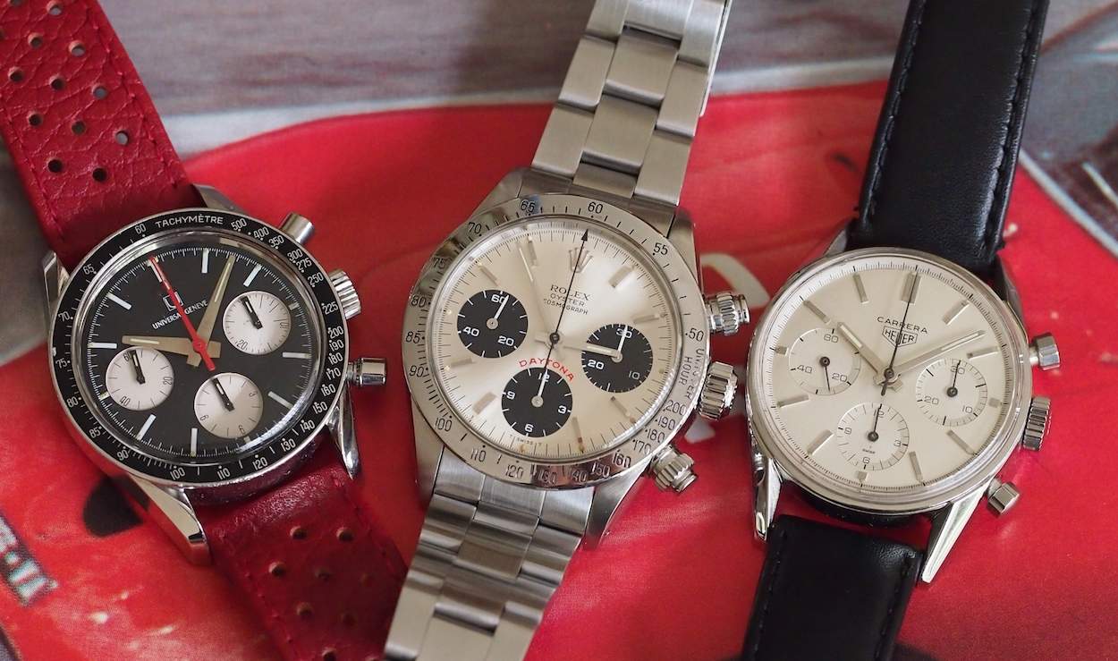
So, let’s talk about wearing the Compax. This is where I bring up what might seem like a detractor. I must clear the air here; the Compax is not a big watch. Perhaps the Nina version wears larger due to a white dial; don’t people say that everyone looks bigger in white? The Evil Nina truly does wear like a 36mm watch. Now, for me, it works with my small wrists and as I always say, 36mm was fine for men of all sizes up until the last 10-15 years. Plus, let’s get something else out of the way; the almighty vintage Rolex Daytona is also not a large watch. It’s 37mm and, granted, it probably wears larger due to its beefier lugs and the typical hefty oyster bracelet, but it is not large in the same way as, say, a Speedmaster. For your reference, I’ve included a shot of the Compax next to a friend’s Daytona and also next to a period Carrera. You can see that the Compax lines up well indeed.
As far as other wearing notes, I’ve paired this watch with a number of straps. I originally had it on a white NOS Tropic that looked funky and somewhat race-inspired in a Jim Clark sort of way, but it just didn’t compliment the watch. I also threw it on a red custom leather rally strap by Giuliano. It’s a beautiful strap, but it’s probably best used for special occasions and I’ve not really figured out those instances! So, finally, I’ve settled on using a brown 19mm prototype Horween strap from Crown & Buckle. This one, to me, does so well because the only color the strap really augments on the watch is the fading lume. Therefore, it really allows the dial to stand out and I think it actually helps the watch wear a little bigger. So, I’ve done the watch version of wearing brown shoes with a black belt, but it somehow works!
I always end #TBT with buying notes and I won’t deviate this time, but it is a hard discussion to lead. You see, there simply aren’t many of these Compax pieces around and less so for sale. I’ve seen precisely 2 of these models for sale since I purchased mine and they were listed on analogshift and Heuerworld. Pricing now seems to be firmly in the $10K range, which still seems absolutely nuts to me. I don’t have a great feel for how condition affects valuations as the sample set of sold pieces is so small but one would think that it would come into play. I also cannot differentiate between pricing on earlier and later executions. Remember, the differences are primarily related to an applied logo versus printed and different sub-register hands. Most state that the later executions are currently garnering more favor due to the boldness and sportiness related to the mentioned differences, but I think that the market is so hungry that it would devour any and all specimens. So, pieces are difficult to find to say the least and I’d also say the same about bits like hands, dials, crowns, pushers and bezels.
This is really not a watch that I would buy as a project unless you have the parts lined up or are truly ok with accepting major deviations. I did happen to see the optional Gay Freres beads-of-rice bracelet for this watch on eBay about 2 weeks after my purchase from the same seller. He was wise enough to separate the 2 to maximize profit. Stupidly, I underbid on that and it sold for about $650; I haven’t seen another. I’d safely bet the bracelets are worth well over $1,000 now. Lastly, you can at least take solace in the fact that the Valjoux 72 movement is relatively common and can be serviced. The bridge is signed so do take a look. I would also check the case back to see if the serial number can be read. This can help date the watch and provide some more surety. Inside case back is another thing to check, as the UG symbol will be present. As always, I suggest you seek counsel before buying which is what I should have done! There exists a UG forum on omegaforums.net, which is a great, responsive community: just ensure that you provide pictures!
I do hope you’ve enjoyed this story and review of the Universal Geneve Compax “Evil Nina”. It’s an amazing looking watch from a company just entering its death throes. I suppose one reason why I like vintage watches so much is that due to their mechanical nature and their coming from a time before CAD and computers, you can sense the amount of human involvement. It fascinates me that some of the best work, at least design-wise, was done by UG during a time of distress, which is not unlike what happens in the arts. On the watch you see here, I got lucky which happens ever so rarely. You really never know, but I suppose perseverance had something to do with it. As always, let us know your feedback and feel free to post pictures of your UG pieces; we could all use more pictures as a resource!

