The Doxa Sub 300 Whitepearl Is Monochromatic Cool
Doxa’s Sub 300 Whitepearl has perhaps one of the most intriguing “colorways” available to fans of the dive-watch brand. I took this monochromatic iteration of the iconic Doxa model for a dive in the Pacific Ocean to test its underwater legibility. If this experience has proven one thing, it’s that Doxa’s monochrome watch is far from dull.
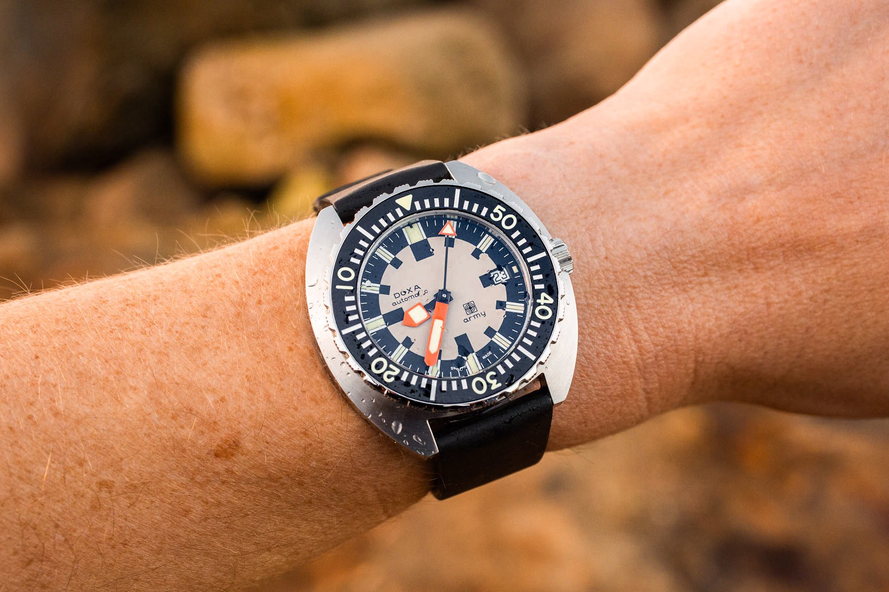
This is not the first Doxa model I have written about and reviewed for Fratello. Last year, I took the Doxa Army on an ocean adventure to get a truer sense of what owning it would be like, and I came out thoroughly impressed. The Army represented the brand resurrecting a bizarre design from the late 1960s. Doxa provided these watches to members of the Swiss military, while other examples were sold to the public. The complex checkerboard-like dial pattern had been made with legibility in mind. It’s unknown how many were made, but it was probably in the low hundreds, making them a commercial failure. At the time, these Doxa Army watches had black cases to help avoid reflections that could attract unwanted attention.
Doxa’s diving beginnings
Today, I get to write about Doxa’s most famous and iconic model line, the Sub 300 (no T). Far from the blacked-out case of the original Army, these Sub 300s border on blingy. This is thanks to the alternating polished and brushed bezel, which provides a luxurious light-play effect. Many of us are familiar with the Doxa Sub 300 story by now, but for those who are not, let me try to bring you up to speed.
Back in the mid-1960s, Doxa wanted to make a dive watch to compete with other brands that already provided watches for the sport. At the time, diving was growing in popularity. Rolex already had the Submariner, Blancpain had the Fifty Fathoms, and Zodiac had the Sea Wolf. Between the early 1950s when those watches debuted and the mid-’60s, many other options had become available too.
A diving Doxa before the Sub 300
Before releasing the Sub 300, Doxa had already experimented with a dive-watch design. This watch was known as the reference 11804-4, and the belief is that it was introduced in 1963, four years before the Sub 300.
The Doxa 11804-4 had much in common with the Eberhard Scafograf and also shared some resemblance to the Omega Seamaster 300 of the time. This was because it shared a similar case design with beautiful lyre lugs. The theory is that all three watches actually shared the same case! The watch had a 300m water resistance rating despite having a push-pull crown. The modern Doxa Sub 200 is based on this 1963 design. Even though Doxa had its conventional dive watch, the brand had bold ambitions to make a dedicated tool that included a no-decompression scale on the bezel. Fast-forward to 1967, and Doxa introduced Sub 300, which would become the brand’s icon.
The unmistakable Doxa Sub 300
The Doxa Sub 300 was a unique design for the time. With its outlandish oversized minute hand, puny hour hand, and dual-scale bezel, the Doxa Sub 300 was a pure diving tool. Even today, Doxa has a distinct DNA, meaning those “in the know” can spot one from across the room. Few brands can claim that!
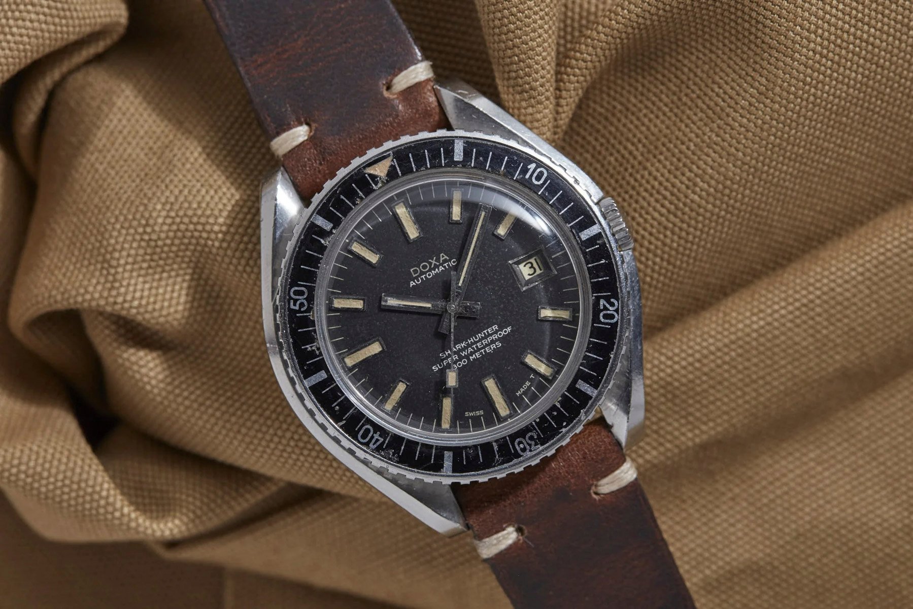
The Sub 300 originally came in orange then black and silver. Each has its colorway name; the orange is the Professional, the black is the Sharkhunter, the silver is the Searambler, the yellow is Divingstar, and so on. Further colors were added to the collection, including turquoise and navy blue. The bright colors were not just for fashion but also for underwater legibility.
The Doxa Sub 300 Whitepearl shines underwater
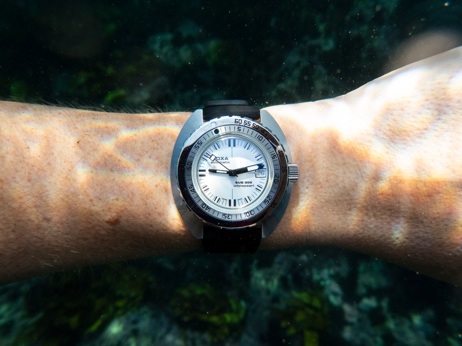
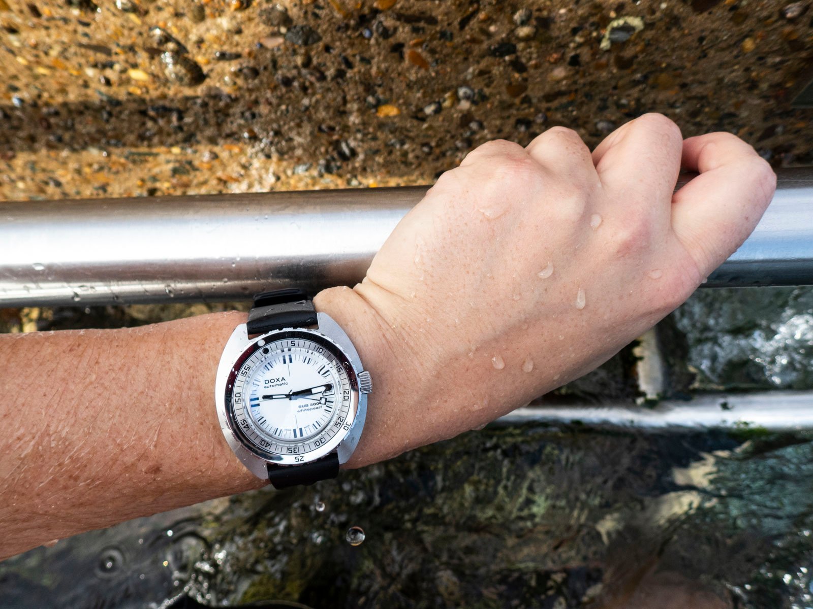
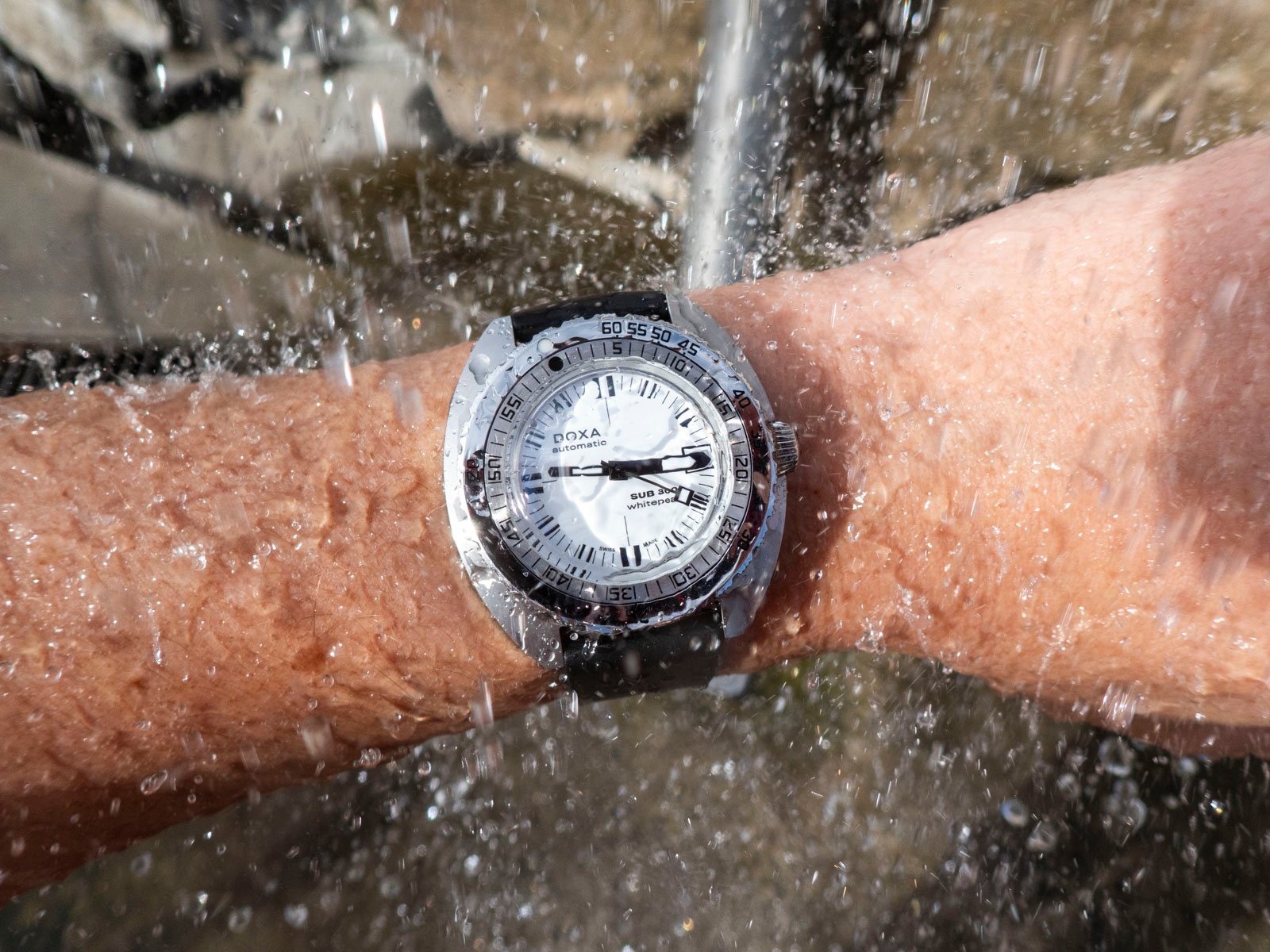
In this spirit, I decided to take the latest colorway iteration, the Whitepearl, on a dive in the Pacific Ocean to understand this intriguing Doxa model better. If you are short on time and can’t read to the end of this article, let me give you a spoiler: the Doxa Sub 300 Whitepearl shines underwater. It is very legible and incredibly enjoyable to take diving. There, I said it. Now for the longer version.
Doxa is known for color, so to release a new colorway that is quite literally lacking in color is a fascinating step. I’ve owned the Doxa Army and spent time with Doxa’s other colorful and bright underwater models, including the orange Professional. There is something about this monochromatic scheme that keeps drawing me in. Interesting, this hasn’t happened with any other Doxa watch I have had my hands on.
This made me reflect on what exactly it is about the Sub 300 Whitepearl that I find so enthralling. I came up with a saying, but it’s probably already taken: we don’t get bored of a boring watch. In other words, there is something to be said for drawing back a design to its very essence (and getting color out of the way) to make a design we won’t tire of. Look at the Rolex Submariner, for example, which is both handsome and rather staid. You can take my theory or leave it, but I am going to run with it. This particular watch looks like a black-and-white photo of what any Doxa Sub 300 could be.
How does the Doxa Sub 300 Whitepearl fare?
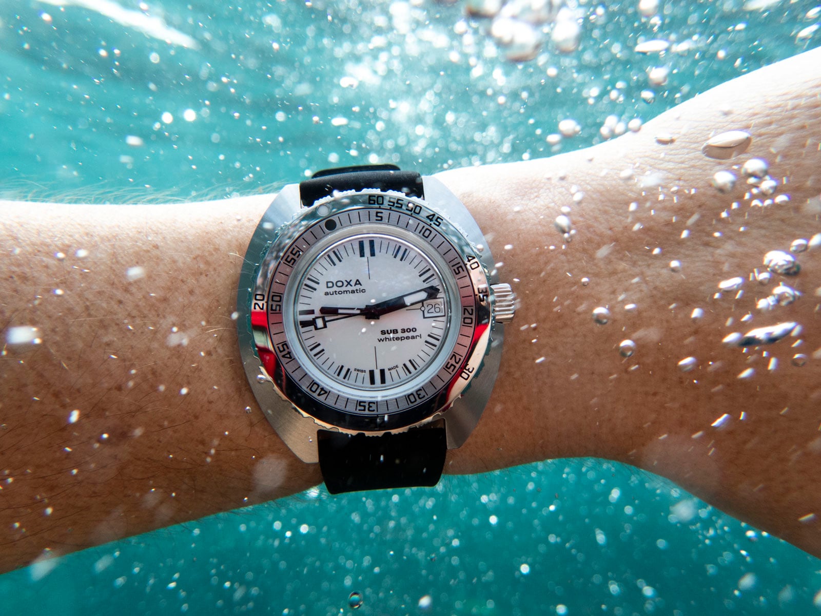
In a word, brilliantly. The Doxa Sub 300 Whitepearl is incredibly legible underwater, as I hope my photos indicate. When experimenting with how watches perform in the ocean from a legibility standpoint, monochromatic designs almost always work best. Simple contrast between the markers and the minute hand makes for something easy to read at depths of 1–10 meters. I haven’t yet taken it deeper than that.
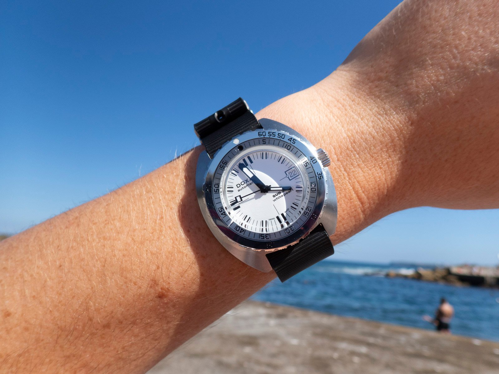
Consider you are near the ocean’s surface, where you’ll face the rough swaying of tide and sea. It can be downright difficult to glance at a watch and get an accurate reading of elapsed minutes in these common conditions. That is where designs that emphasize contrast work especially well. I was concerned that the white dial might lead to legibility issues in high-contrast lighting environments (like the Australian sun). It did not pan out that way, fortunately, and this watch remained easy to read even in harsh sunlight.
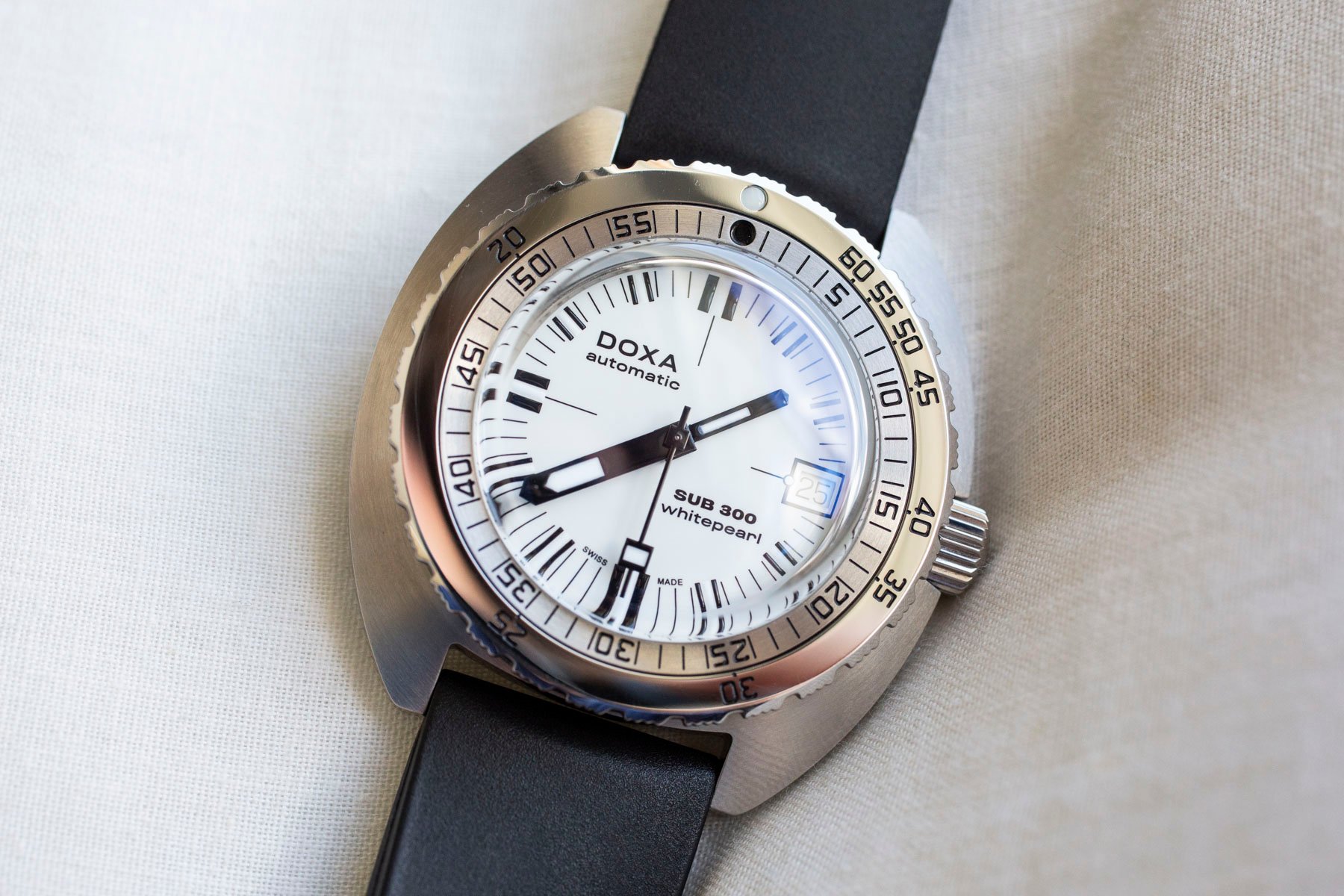
Doxa’s Sub 300 Whitepearl also has a wonderful way of getting the date window to disappear. This makes sense given the fact that the date disc is white. It’s there when you need it but “invisible” when you don’t. The same is not true for the other colorways. Some of you probably don’t care, but I am one of those annoying folks who find such things a little infuriating in some watch designs.
Beauty in simplicity
The text in the bezel indicating elapsed minutes is black, and so is the outer no-decompression scale. In other models, the latter can be orange, aquamarine, or yellow. For telling elapsed time in the rush of the sea with its myriad colors, I have found that simple black or white text is preferable to colors, no matter how dynamic. Perhaps the brighter colors do help when diving at deeper depths. If you think so, let me know in the comments!
All of this makes me wonder why the Whitepearl is not one of the original Doxa colorways, right next to the orange Professional and black Sharkhunter. Some of you might have a favorite color in the Doxa lineup. The orange Professional colorway is the first one that comes to mind since it is a culturally significant color for the brand and probably the first color we think of when we say “Doxa.” And all of that is great. For me, perhaps ironically, my favorite color scheme is simply white and black.
Final thoughts
The specifications for this watch are identical to any other modern Sub 300, so I have avoided going into them again. If you need them, you can head to the brand’s website or check the spec list below this article. However, it is important to mention that the Sub 300 models contain a COSC-certified chronometer Sellita SW200-1 movement. This makes for a reliable mechanical heart that is highly accurate. The 300m depth rating is more than anyone ever needs and assures ruggedness. Another thing worth mentioning with the specifications is the passable but not incredibly bright application of luminescent material. It is neither the brightest nor strongest, but it does shine a wonderful icy blue overnight and can still be read for many hours after going to bed.
I have simply fallen in love with the Doxa Sub 300 Whitepearl. Call it boring, but this particular colorway coupled with the iconic form factor of the Sub 300 makes for an incredibly attractive watch that I feel perfectly comfortable wearing in almost any situation. But what do you think, Fratelli? Does the polar vibe of this watch resonate with you? It certainly does with me!

