The Good, The Bad, And The Ugly Of Folding Clasps — What Makes One Great?
Clasps have a massive impact on both the aesthetic and wearing comfort of a watch. Somehow, even in 2023, not all watch brands seem to have mastered the folding clasp. Time to have a closer look at what makes a good folding clasp. What great examples can we find, and what poor examples do we just have to mention?
Just to keep things manageable, I will limit myself to clasps on bracelets. If you would like me to do the same for clasps on straps, let me know in the comments below.
The simplest early folding clasps
The simple single-sided folding clasp has been around almost as long as the watch bracelet itself. The watch bracelet became common from the 1930s onwards when Gay Frères started to supply Rolex with bracelets. Not long after, we saw the emergence of single-sided folding clasps made of pressed sheet metal. They were closed by a simple metal lip clicking in place.
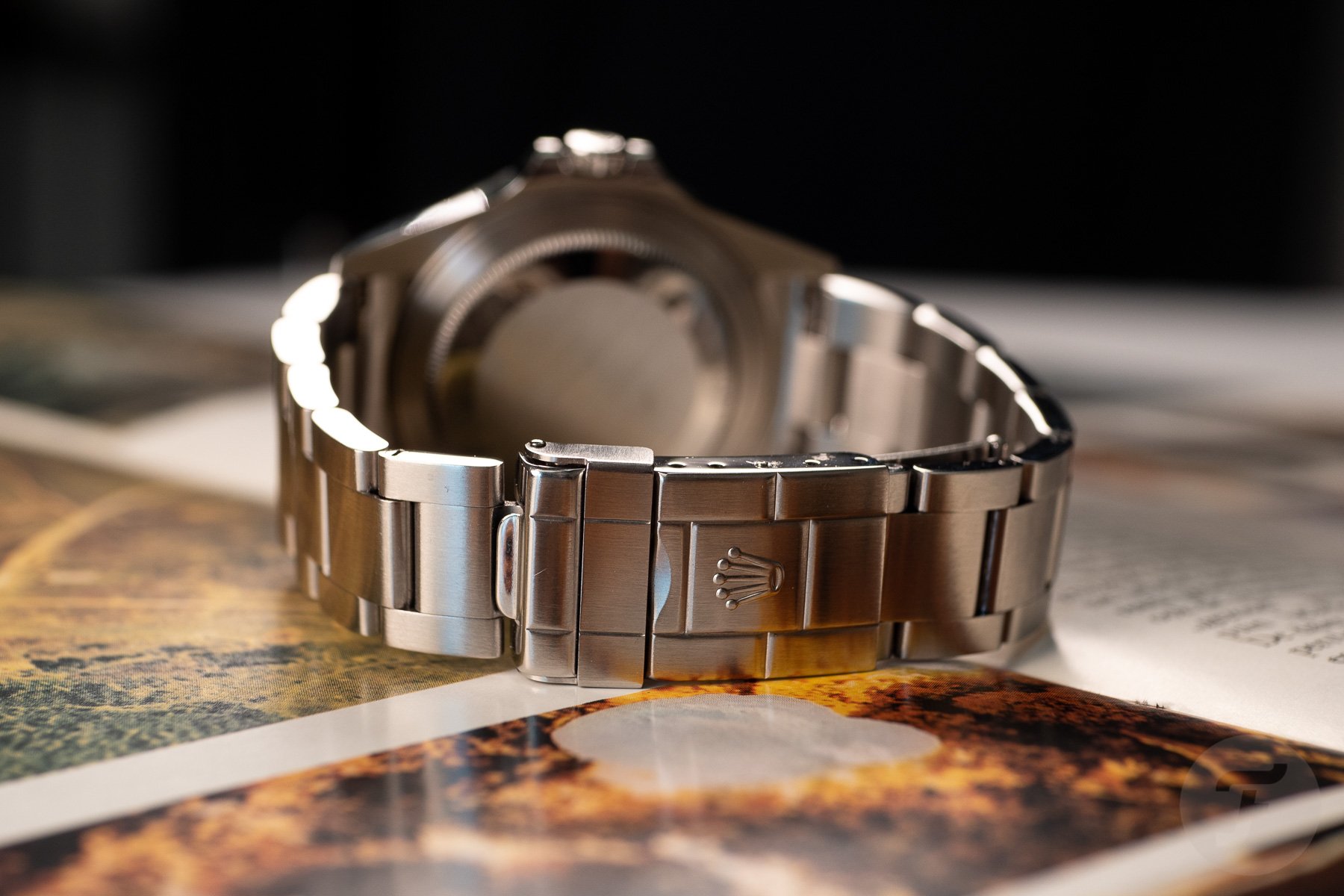
This clasp style has survived until today. It can still be found on tons of more affordable watch bracelets. This makes sense since these clasps are extremely cheap to produce and, quite simply, they just work. They even tend to last quite long, requiring a little fine-tuning (that’s “bending” in plain language) every once in a while. But as long as you don’t overdo it, they are unlikely to break from metal fatigue. I regularly wear one from 1967, and it reliably snaps shut and feels perfectly secure on my wrist.
A great advantage of these clasps is their compactness. They usually have two sheets of folded steel for the innards and a slightly thicker sheet casing around it. As I write this, I am wearing one from Rolex, from only two decades ago. It is barely 5mm thick and 28mm long. It features a fold-over safety lock and a full 19mm of micro-adjustment positions that you can use with a tool or a toothpick.
How clasps developed from there
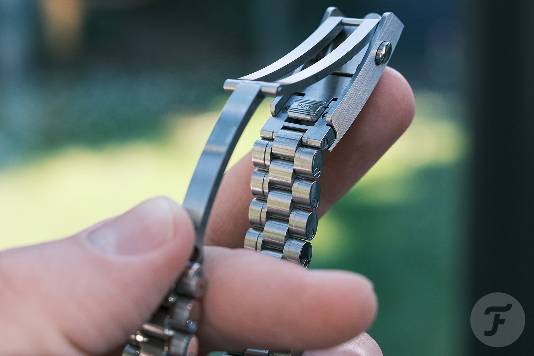
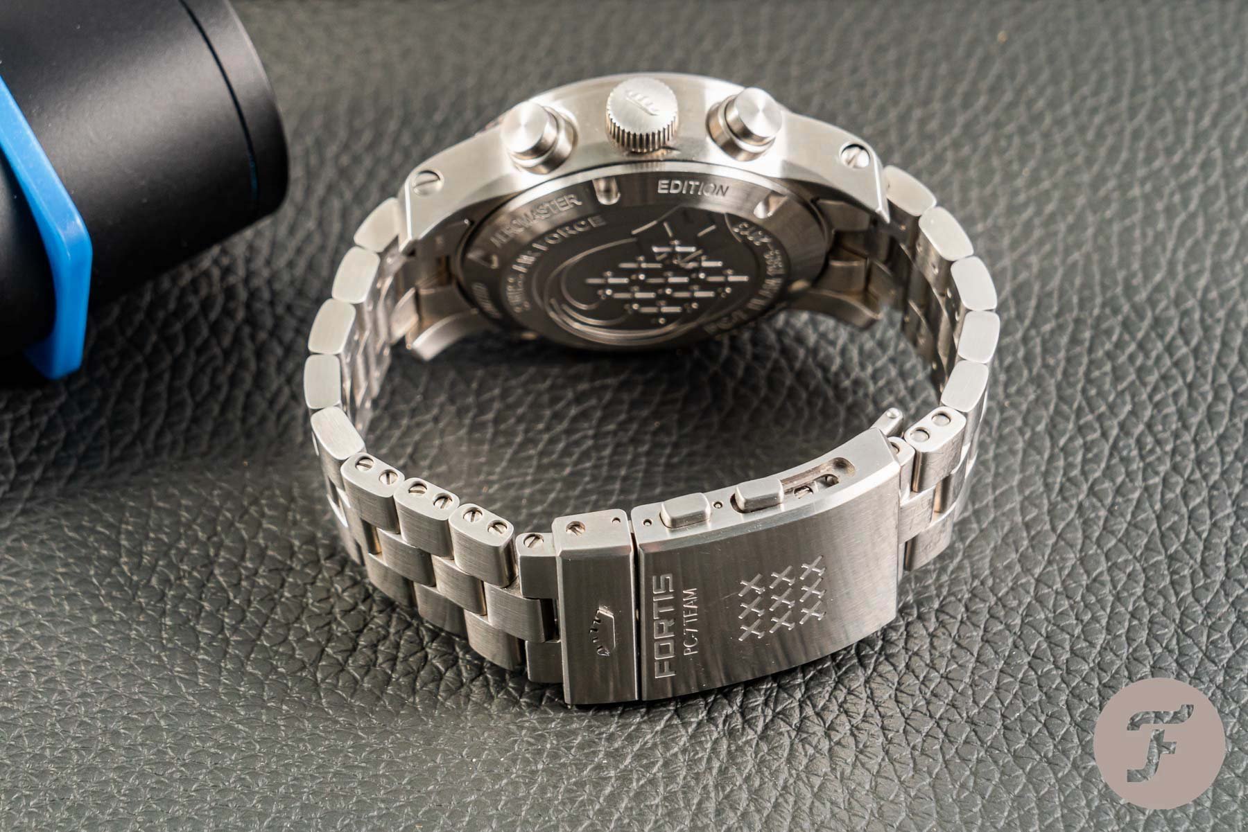
Clasps have gone through massive changes since the days of my Explorer II 16570. Two major developments have had the biggest impact — milled steel parts rather than pressed sheet metal and a gliding mechanism. The former makes for a much more solid feel and look, and the latter allows on-the-fly micro-adjustment without tools. You will usually find a push-button mechanism on such modern clasps.
These upgrades have become commonplace on higher-end watches all across the board. In fact, through spec-heavy, value-focused microbrand watches, they have even landed in the more affordable segment. However, the inclusion of these two features doesn’t necessarily lead to a great clasp. In fact, they just add to a list of things that can make or break a good clasp. Let’s explore a few of them!
Good clasps: compact and solid
Compactness matters in watch clasps. At least, they should be in proportion to the watch they’re meant to hold down. My old 16570 clasp excels in this respect. It is hardly thicker than the Oyster bracelet itself and weighs next to nothing. Adding features is nice, but it shouldn’t go at the expense of wearing comfort.
Especially in affordable options, this tends to go out the window first. I see clasps that cover nearly the entire underside of the average wrist just to accommodate a micro-adjustment mechanism. Your mileage may vary, but to me, that is a poor tradeoff.
Two clasps spring to mind that excel in combining old-school compactness with modern features. One is IWC’s clasp that is on some of the Pilot’s watches. You can push down the logo on the outside of the clasp to unlock the micro-adjustment mechanism and set the desired length. The other one I really like is the Formex clasp. It is nice and short with a super smooth 10mm toolless micro-adjustment mechanism.
Bad clasps: external extension
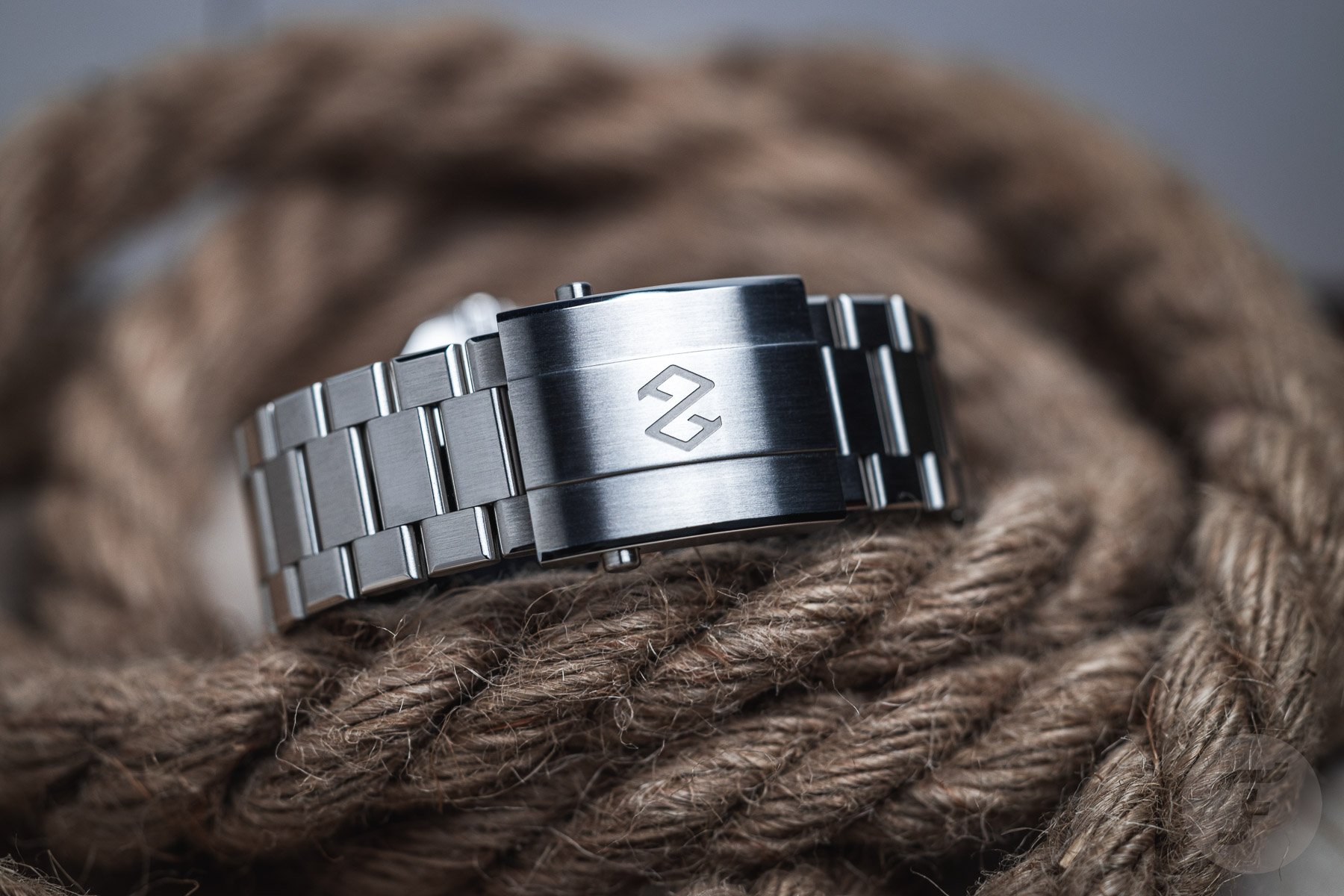
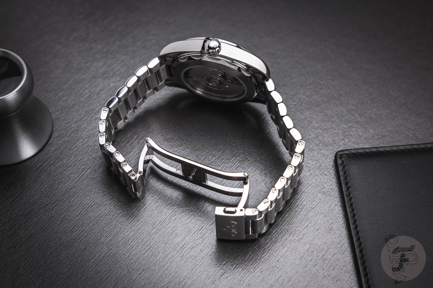
I have made the point that specs aren’t the be-all and end-all of watchmaking. The same goes for clasps. Some clasps are fitted with a toolless micro-adjustment mechanism that extends outside of the clasp. The result looks completely awkward to me. It would be acceptable as a wetsuit extension but not as a daily sizing feature for an elegant watch. Even Omega’s extension on the new Speedmaster bracelet suffers from this to some degree. The extending piece doesn’t look like a continuation of the bracelet but rather like a bit that should be covered by the clasp casing.
There is one that is widely used in the microbrand space that features four pushers — two for opening the clasp and two more for sliding out the external spacer. The entire thing is huge, and it looks odd when extended. I understand it on a hardcore tool watch that aims to offer every last feature at a sharp price. I would much rather have an old-school pin-adjust system in a more modest clasp.
Good clasps: perfectly hidden
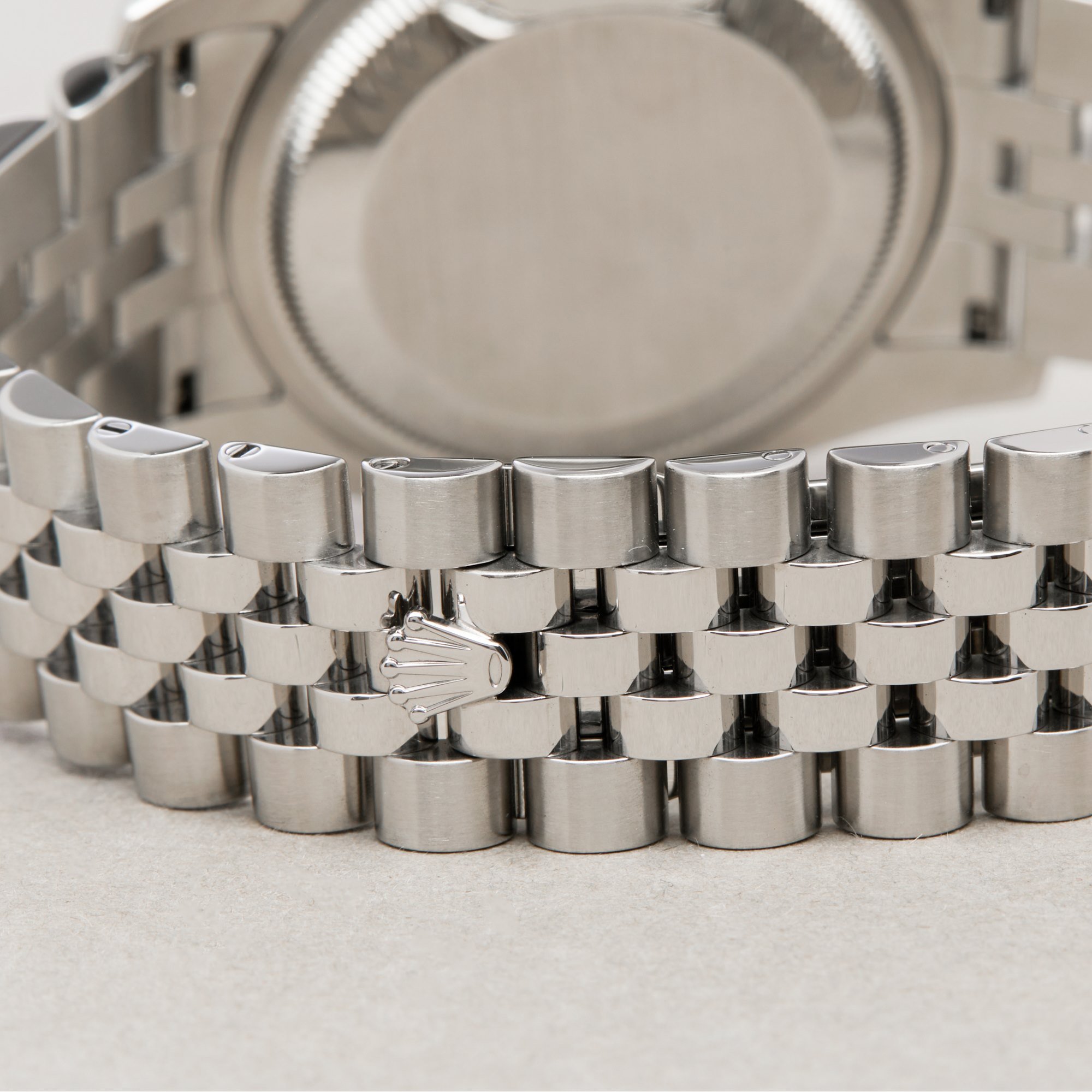
One reason to sacrifice features is to strive for a cleaner aesthetic. This brings me to Rolex once more. The Jubilee and President bracelets come in hidden-clasp variants. You get a full-sized one-sided folding deployant on the inside but no external casing. The bracelet just continues for a smooth look.
The only thing you see is a small coronet that allows you to stick your nail under it to pop it open. I know some will lament the complete lack of micro-adjustment, toolless or otherwise. To me, solidity and elegance always come first in these sorts of parts unless, of course, you are talking about an out-and-out tool watch.
Bad clasps: Two-sided or butterfly clasps
This one may divide opinions — I am curious to hear from you — but I have yet to see a butterfly clasp that makes sense to me. They are often used to hide the clasp, but that would have been possible with a single-sided clasp, as we have seen above.
My gripe with these clasps is the way you have to open and close them. There is always one side that doesn’t quite open, and then your hand gets stuck. Even worse are the ones that require a specific order of opening and closing. You will get used to it, but just hand your watch to a friend and watch them struggle. That is a sign of poor usability design.
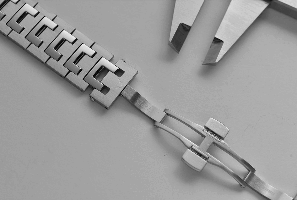
To me, butterfly clasps offer the worst of both worlds. They don’t quite offer the elegance of a single-sided hidden clasp, although, granted, they do allow for a more central meeting point. At the same time, they also hardly allow for more advanced features like micro-adjust. There are some exemptions, such as Czapek’s extending link (pictured below). Then again, that too leaves a visible gap in an otherwise beautiful bracelet.
Closing thoughts
As always, I think we do ourselves a disservice to go just by the spec sheet. With our shared obsession with specs, we incentivize brands to just add features over quality. As you can see from the examples above, that doesn’t guarantee that the watch will be worthwhile.
I see comments like, “At this price, lack of micro-adjustment is unacceptable.” I think it is a little more nuanced than that. I have spent significant time with clasps with and without toolless micro-adjustment. Interestingly, I use it all the time when I have it, but I don’t miss it when I don’t. As a result, I very much prioritize quality, aesthetics, and comfort over such features. It is a big bonus when it’s there, but the really good ones are few and far between.
What do you feel makes a great clasp? What do you look for? Any examples that are particularly good or bad you can share? Let us know in the comments below!

