The Seiko Watches I Want To See Reissued — Champion, SilverWave, Sonar 7015, And More
My journey into Seiko and it’s watches has been a relatively recent part of my watch collecting journey. Technically, I haven’t added any Seiko watches to my collection yet, but there’s an excellent reason for this.
I’m one of those people who go down the rabbit hole when learning about a brand. I like to look at the brand history: where it came from, the older watches in their back catalog, and… Well, that’s where I got stuck. Some of the best looking pieces for Seiko came from its back catalog. Seiko did some really cool work back in the 60s, 70 and 80s. While some of the cool pieces did see the light again in the form of reissues, some other seriously badass watches have not been so lucky. They remain a part of history. But, how cool would it be to see these come back to life?
Without further ado, these are the Seiko watches I want to see reissued…
 Source: beyondthedial.com
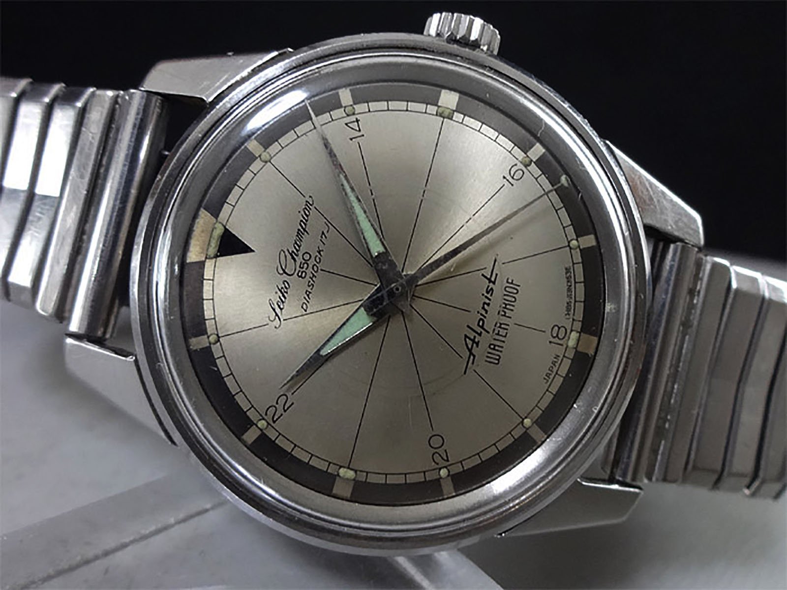
Seiko Champion 850 Alpinist
I think it’s fair to say that the Alpinist family of watches is one of Seiko’s most popular watch families of the current day (Mike gave a nice little rundown on the modern Aplinist history here). Every time Seiko drops a new color, its fan base goes wild. This isn’t totally unjustified as it’s a smart silhouette, and some of the dials are gorgeous. However, there was an older, cooler uncle back from the early 1960s.
…well-lumed and highly legible.
Seiko first introduced the Alpinist line in 1961 with the extremely rare Laurel Alpinist. The Japanese concept of “yama-otoko,” or “mountain man” served as the Alpinist’s inspiration. The Japanese countryside is famously covered with stunning mountain landscapes, and mountain climbing was a popular hobby. These watches were marketed toward this type of adventurer — well-lumed and highly legible.
The Champion
In 1962, Seiko changed the name to the Champion Alpinist, and then again to Champion 850 Alpinist in reference to the movement number. The Alpinist continued until around 1965 when Seiko discontinued the line, though models continued to be produced under the Champion name.
…gorgeous brown and champagne dial.
The Seiko Champion 850 Alpinist is a gorgeous little watch, though. It’s perfect for a reissue! So sharp and sporty yet equally formal and reserved. It’s a perfect example of the Japanese brand’s blend of timeless classicism and careful design. The case measured just 35mm wide by 43mm long and featured the slim lugs typical of early 1960s Seiko watches. The case back features an attractive retro Alpinist mountain logo, which I really like too. But, the real star of the show is the gorgeous brown and champagne dial. I especially love the sector lines breaking up the dial. I even love the fact that the dial used five different font faces. Usually a no-no in modern design, it works deliciously here.
Things I’d like to see on a reissue:
- Bump the size up to 38 or 39mm. 35mm would be slightly too small by today’s standard.
- I’m not sure what the lug width was, but let’s go with a nice round 20mm. Most people have a range of straps in that size.
- Keep the no date dial. A date would spoil the classy dial!
- Use a slim movement. Something too bulky would ruin the vintage vibes of the watch!
 Source: beyondthedial.com
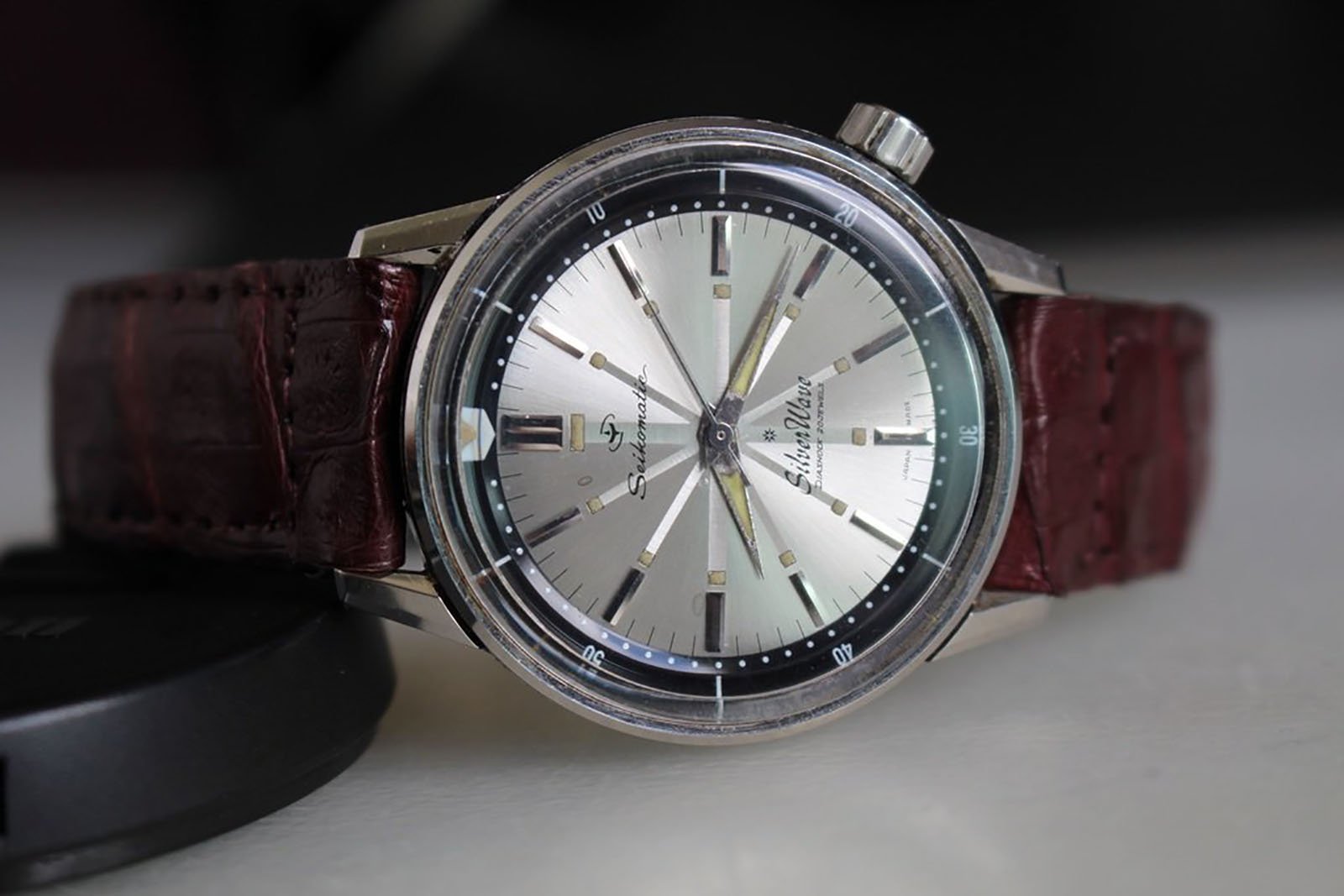
Seikomatic 50m SilverWave
Next up, we have the first real entry in Seiko’s history of dive watches. After the Second World War, diving became a more accessible pastime, and the cost of recreational scuba diving equipment fell. Its popularity increased to more than just a military or commercial activity. Watch manufacturers saw this as both an opportunity and a challenge. Long had water been the enemy of watches, but now the two opponents needed to make up and get along.
The introduction of the Seikomatic 50m SilverWave diver’s watch in 1961 marked several firsts for Seiko:
- Sports diver’s watch
- Watch with an internal rotating bezel
- Use of the tsunami wave symbol
- Automatic watch to employ a screw-down case back.
Colors galore
Throughout its relatively brief production run from 1961 to 1964, the original SilverWave came in various color options. There were black dials, silver dials, and different color internal bezels too. Buyers were spoiled for choice! My favorite color combo was the black bezel with the silver dial.
…a real strap monster…
The Seiko SilverWave came in at 37mm in diameter and roughly 44mm in length. From the description alone, I expect that it’s an extremely comfortable wearer. From pictures I’ve seen online, this little darling was a real strap monster, and its drilled lugs only made strap changes simple. Talking about the lugs, they are beautifully sculpted, expertly so in fact.
Capping things off is a tall acrylic crystal with angled sides and a flat top that only helps to bring in the dial’s size. Plus, the internal rotating bezel slopes down sharply towards the dial, and this makes things look smaller. It all equates to an elegant and stunning little watch which would make a perfect reissue candidate!
Things I’d like to see on a reissue:
- Bump the size up to 38mm or 39mm as I mentioned. 37mm would be doable for sure, but I think a slightly bigger case might work better visually.
- I know that the historically accurate thing to do would be to retain the 50m WR, but let’s bump that up to 100m. I want to be able to take this thing on holiday and in the water.
- New colors. I think a nice emerald green or deep blue would look great as bezel colors, matched with that lovely silver dial!
 Source: retrowatchguy.com
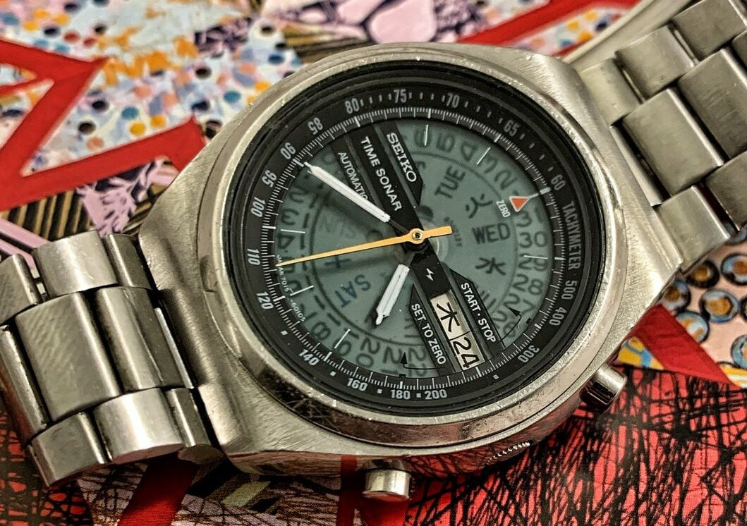
Seiko Time Sonar 7015
In the late 1960s and early 1970s, Seiko experimented with some of the first automatic chronograph movements ever made. The Japanese brand was ahead of the game at the time. The Swiss were also creating their own automatic chronographs, think of the Heuer-designed Chronomatic and the Zenith El Primero. Unlike Seiko, they were not as experienced as mass-production techniques, meaning they were much, much higher in price. Seiko practically wrote the book on mass production in the watch industry; thus, it was able to keep the costs for its chronographs much more accessible.
…golden age of Seiko sports watches.
The 1970s were very much the golden age of Seiko sports watches. The 1960s were also great, as shown by the fact that the first two watches on this list were from that decade. The 1970s is when Seiko pushed on and began experimenting more, featuring various case and dial designs.
The reference 7015 Time Sonar embodies all of this era’s style and charm, and then some. It’s one of my favorite vintage Seiko watches for sure. As with most of Seiko’s finer work, the dial is a real standout. The defining translucent dial reveals the inner workings of the fantastic 7015 movements.
The venerable 7015
The 7015 movement is worth writing a little about too. Seiko was developing two automatic chronographs at the turn of the 1970s. The Suwa and the Daini factories both worked on their own calibers. Suwa came up with the famous 613X line of movements, whereas Daini was responsible for the 701X family. The 701X series is arguably the more technically advanced of the two. It has an additional flyback functionality, and some models even featured a unique stacked hour and minute chronograph register. The 7015 found in the Time Sonar only has a central chronograph hand with no additional registers for recording elapsed time.
The 39mm stainless steel on the Time Sonar case is also worth mentioning. The ‘hidden’ lugs are 18mm wide, and they curve down beautifully. It’s a very modern (especially in the early 1970s!) case from Seiko and just a spectacular overall piece of design. As a big fan of the color yellow on watches, the yellow central chronograph hand just tops it all off. I really want to see this one brought back to life.
Things I’d like to see on a reissue:
- 39mm would be sufficient for the case, but 40mm with 20mm lug width might be a little better for more people by today’s typical standards. 18mm lugs would cause a few strap dilemmas for some people.
- Keep that delectable yellow central chronograph hand! If that goes, I’d be distraught.
- Try not to change much else. One of the key factors on this watch’s inclusion on the list was I really loved it as it was. A few minor sizing tweaks to bring it to today’s standards are fine, but let’s not mess with the overall aesthetic. OK? Good.
 Source: watchiwant.com
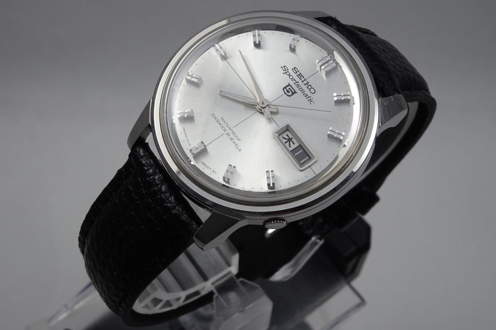
Seiko 5 Sportsmatic 6619-7090
From the name alone, you’d expect this to be a rather sporty watch, but to me, it’s far more dressy by today’s standards. Back in 1963, when this watch was first introduced, Seiko’s Suwa division attempted to bring their success to a younger market. To do this, they wanted to design a watch that would be more attractive to a more active crowd. The Seiko Sportsmatic 5 was the brand’s attempt to do just this: it had a day, and quickset date function, waterproof and shockproof case, and an automatic winding mechanism touted as the ‘magic lever’ (allowing the rotor to wind bi-directionally).
…it’s an authentic Japanese domestic market watch.
Overall, the dial layout is very well balanced. There are two lines of text at the top and bottom of the dial and a nicely framed day-date window at 3 o’clock. It’s worth noting here that this watch has just one language (Kanji) on the day wheel, so it’s an authentic Japanese domestic market watch. The date wheel is in contrast to the day wheel with white numerals on a black background. This makes it very easy to read at a glance. It’s also visually far more interesting, at least in my mind.
Grammar of Design
The dial keeps getting better, though. While the gorgeous silver sunburst is a marvel in its own right, but the rest of the dial and case design seems to have benefitted from some of Taro Tanaka’s “Grammar of Design” principles, developed the year before in 1962. I mean, just look at those beautiful indices. Sharply cut and beautifully tall and, combined with the sunburst dial and subtly folded hands, this watch was designed to reflect light spectacularly. Even the case is simple, yet purposeful, in shape. For what was intended to be a budget-friendly watch for the time, Seiko still took a lot of care and pride in ensuring that the watch looked far more premium when on the wrist than its price tag might suggest.
Things I’d like to see on a reissue:
- Maintain the original sizing as close to the original 38mm x 43mm as possible. As I see this as a somewhat dressy sports watch, there’s no need to increase the size.
- Keep it slim. The original was 12mm thick, but if it were possible to reduce that at all, then I’d be very keen! Again, it’d play into the dressier stylings of the watch.
- Keep it budget-friendly. Seiko meant the original to be affordable for the younger generation in 1963. If any brand could keep the RRP low while maintaining a high quality and finishing level, it’s probably Seiko!
There we have it. The Seiko watches I’d love to see reissued. Seiko, if you’re reading this, please make all four, as I would buy each one in a heartbeat! These are all pieces that’d add something new to most collections.
Now, dear reader, what about you? What do you think of my choices? Have you been down this same rabbit hole and delved into Seiko’s back catalog? Did you find any pieces you’d love to see reissued and come back to life? Perhaps there’s a vintage piece you’ve been chasing on eBay or Chrono24 for a long time with no success? Speak up! Now is your chance to vent and tell us all about it!
