The Serica 4512 California Is A Surprisingly Refreshing Take On The Military Field Watch
Serica is a young French microbrand based out of Paris. The brand released its first version of its military-style 4512 back in 2019 to great critical acclaim. After their initial success, the guys at Serica updated the 4512 last year. With new dial options and a new movement, the watch has seen some remarkable improvements—time to find out more about this great military-style Serica 4512.
It was somewhere late last year when Thor from Time+Tide and I discussed some of our favorite new watches when the name Serica came up. Thor told the story of having the Serica 4512 W.W.W. (Wrist Watch Waterproof) for review and how impressed he was with the watch. Fast forward a couple of months, and Thor reminded me of the brand once again. Serica, by that time, had just announced their upcoming 5303 diving watch. It’s a second step for the brand that has an ever-growing fan base of enthusiasts on the edge of their seats. With the 4512 in for review and the 5303 coming up shortly, it’s definitely time to find out more about Serica.
The story of the Serica 4512
Creating this military-style watch came from the core philosophy of the small team at Serica, and is centered around the idea of creating watches that are as equally tough as they are beautiful. In addition to this, the watches must also be affordable. It’s a central idea that is quite easily put down on paper. However, in trying to combine these three elements, you often find new brands where at least one is lacking. The Serica guys are watch enthusiasts first and foremost and have been part of the industry in one way or the other. Jérôme Burgert and Gabriel Vachette from the great French watch magazine Les Rhabilleurs teamed up with watch designer David Gagnebin and Matt Hranek from the WM Brown Project. You might also recognize his name as the author of the great book, A Man And His Watch. Their combined stories made sure the mission was in good hands.
Great design means great balance.
I’m usually not on board for today’s military-style field watches. Though I greatly appreciate their connection to history, most models have amazing stories behind their designs. But what I often find lacking is the charm. This is the extra bit of magic that makes it more than just a utilitarian tool watch. Often, a military-style field watch leaves me a bit cold. But the Serica 4512 combines the familiar military field watch style with a ton of charm. The watch has a certain elegance that easily sets it apart from many of its counterparts. Let me try and explain why this sum of parts works so incredibly well.
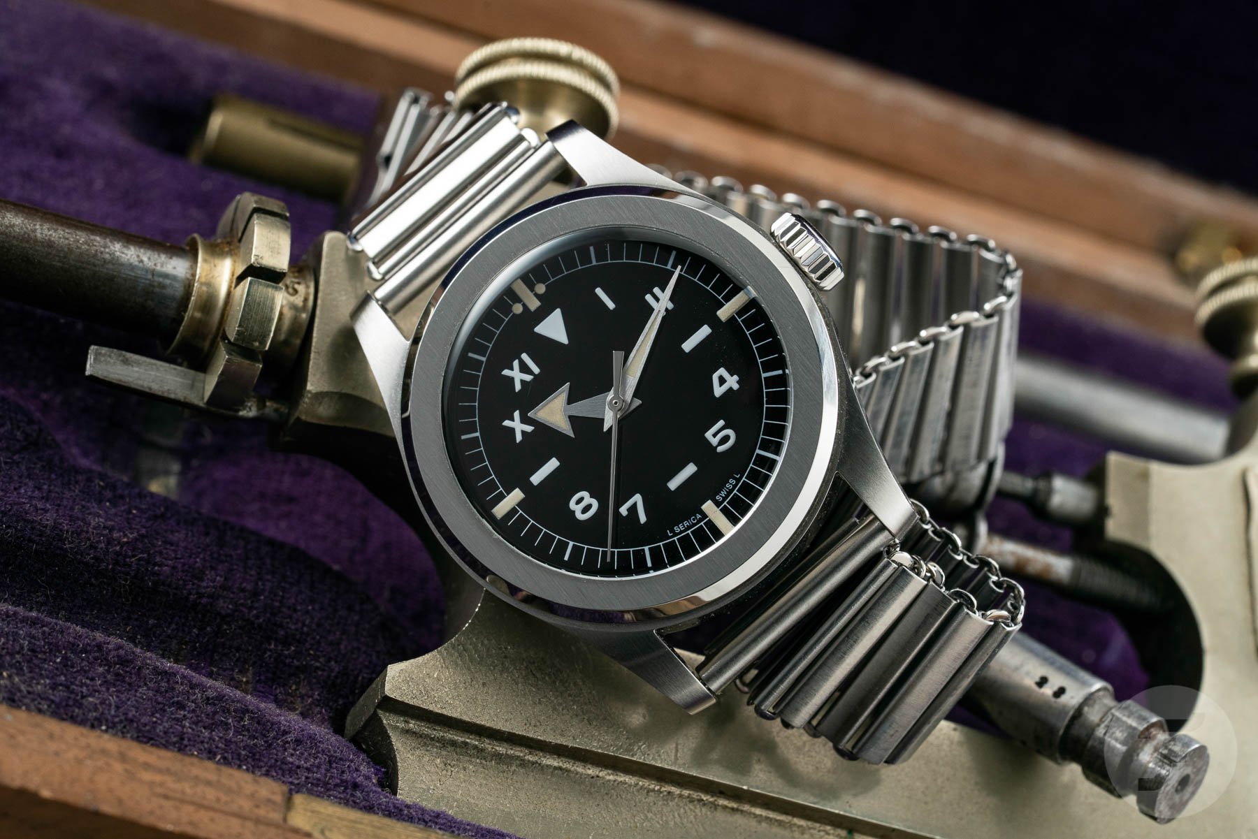
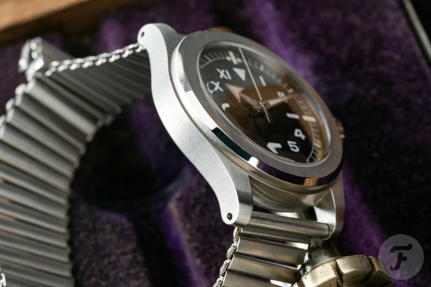
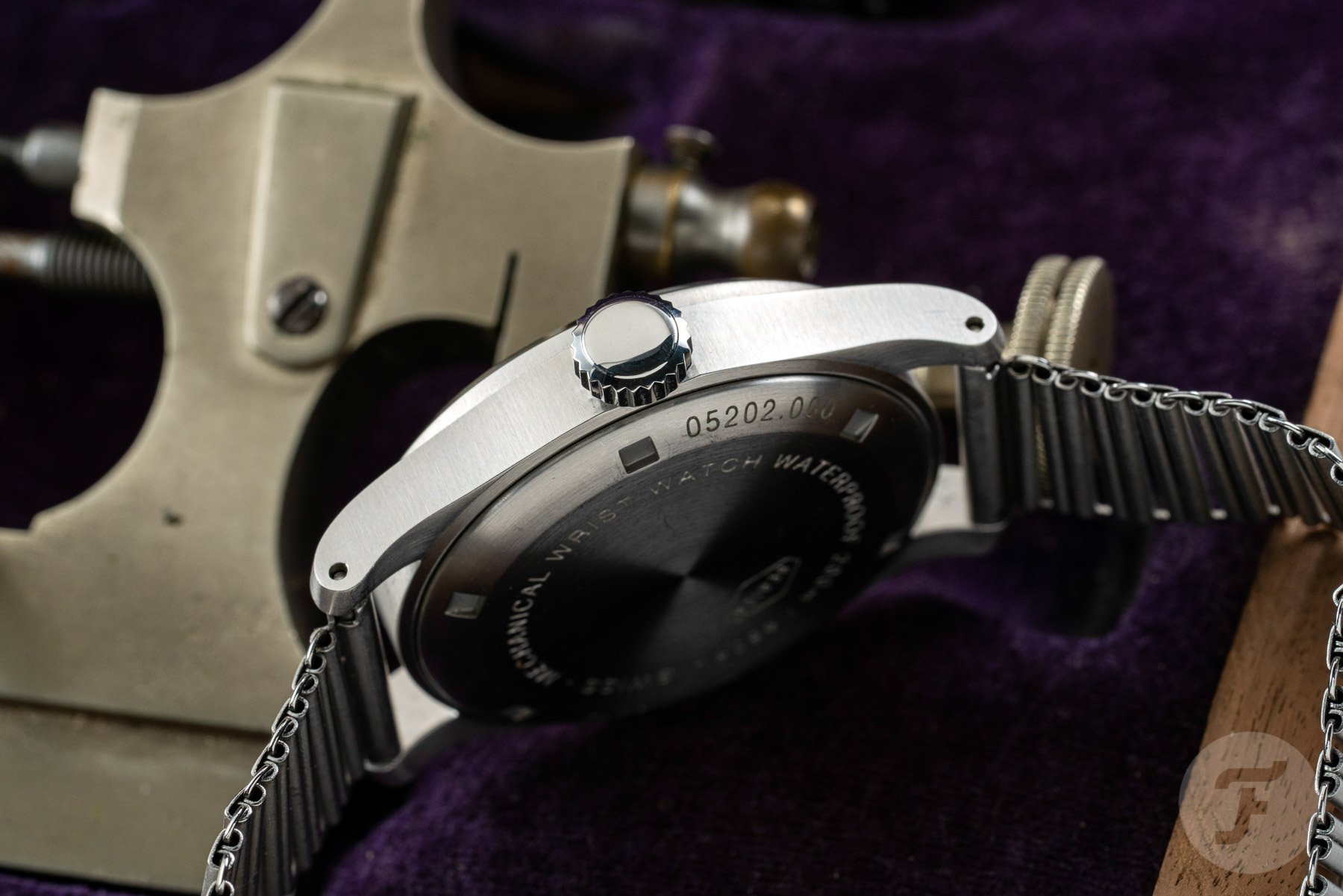
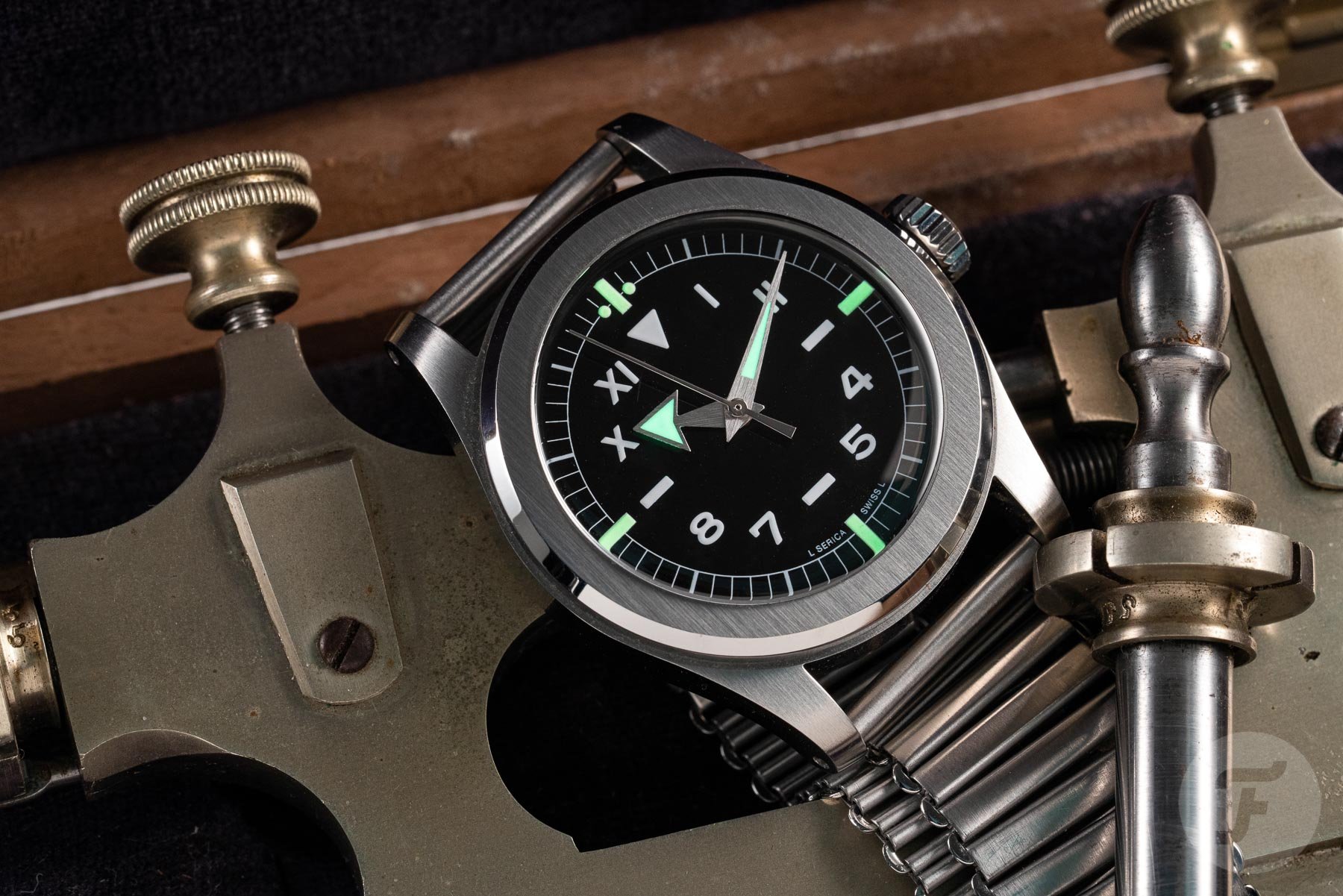
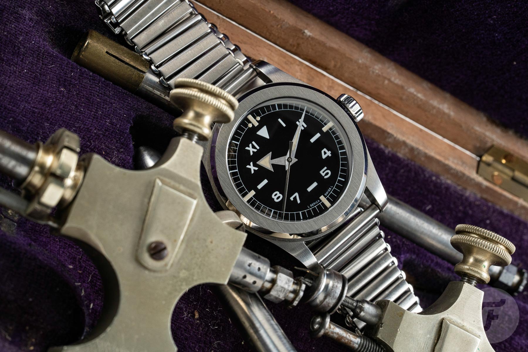
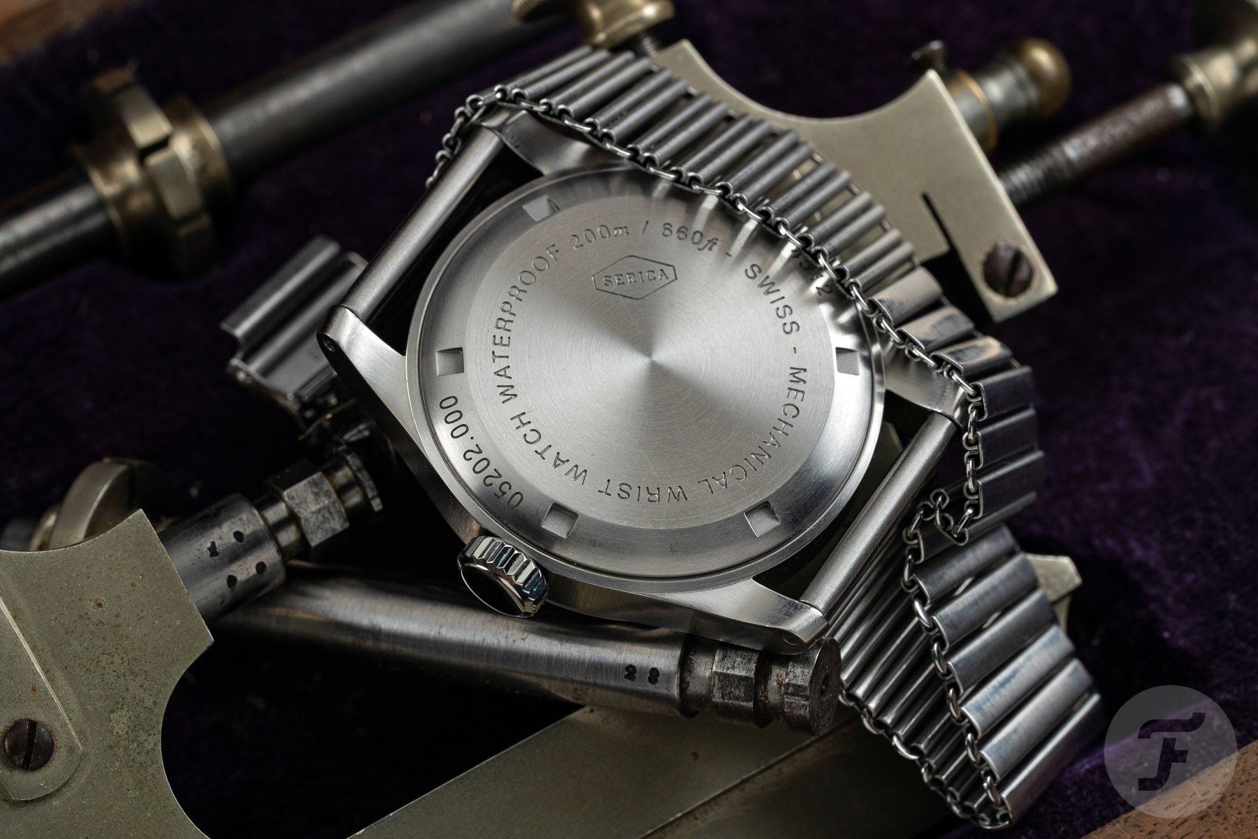
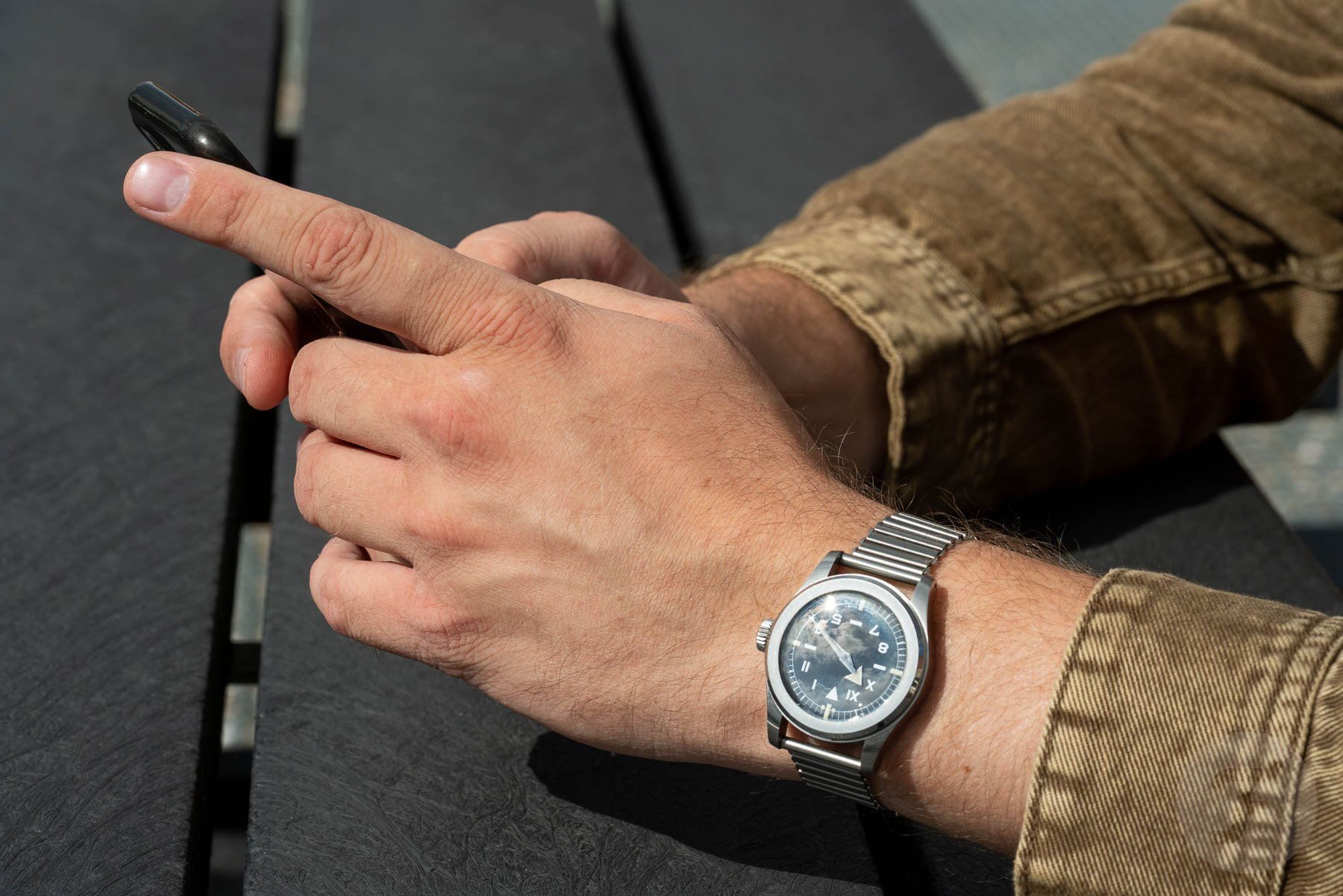
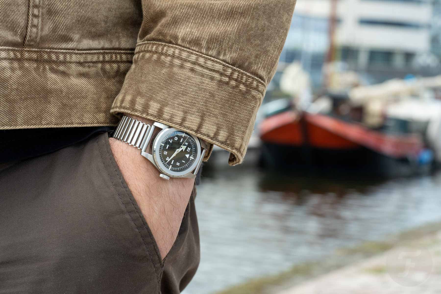
The 4512 features a 37.7mm, round, stainless steel case. It’s 11,3mm high with elegantly styled, broad-shouldered lugs. The watch features a 2mm-thick sapphire crystal and is water-resistant up to 200 meters. The sides of the case and the lugs feature brushed finishing in true tool watch fashion. The greatest feature is the brushed flat top bezel, the design choice that gives the case a lot of its character. The bezel features a polished bevel that adds just the right amount of visual sparkle. But the flat bezel also creates the perfect visual balance in combination with the lugs and the dial. Another perfectly proportioned element is the large crown. Its substantial size makes it not only easy to use in different conditions, as well as perfectly balanced in the overall design. And just for added delight, Serica gives the choice of a right-handed and left-handed crown version.
Three different dial designs
The Serica 4512 comes with a choice of three different dials. At the base of all three variants is a lacquered black dial with contrasting white printed elements. All three feature the same rectangular hour markers at 3, 6, 9, and 12 o’clock, generously filled with Super-LumiNova for great legibility in darker conditions. When it comes to the different dial designs, the first of the three is the WMB dial. It features the familiar 24-hour layout of a military field watch encircled by a classic railroad track. On the track, you will find large luminous dots as hour markers. The second is the so-called Commando dial, essentially a toned-down version of the WMB dial that features a different track and does not feature the large hour markers.
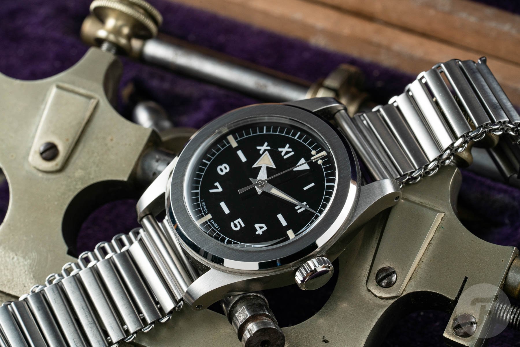
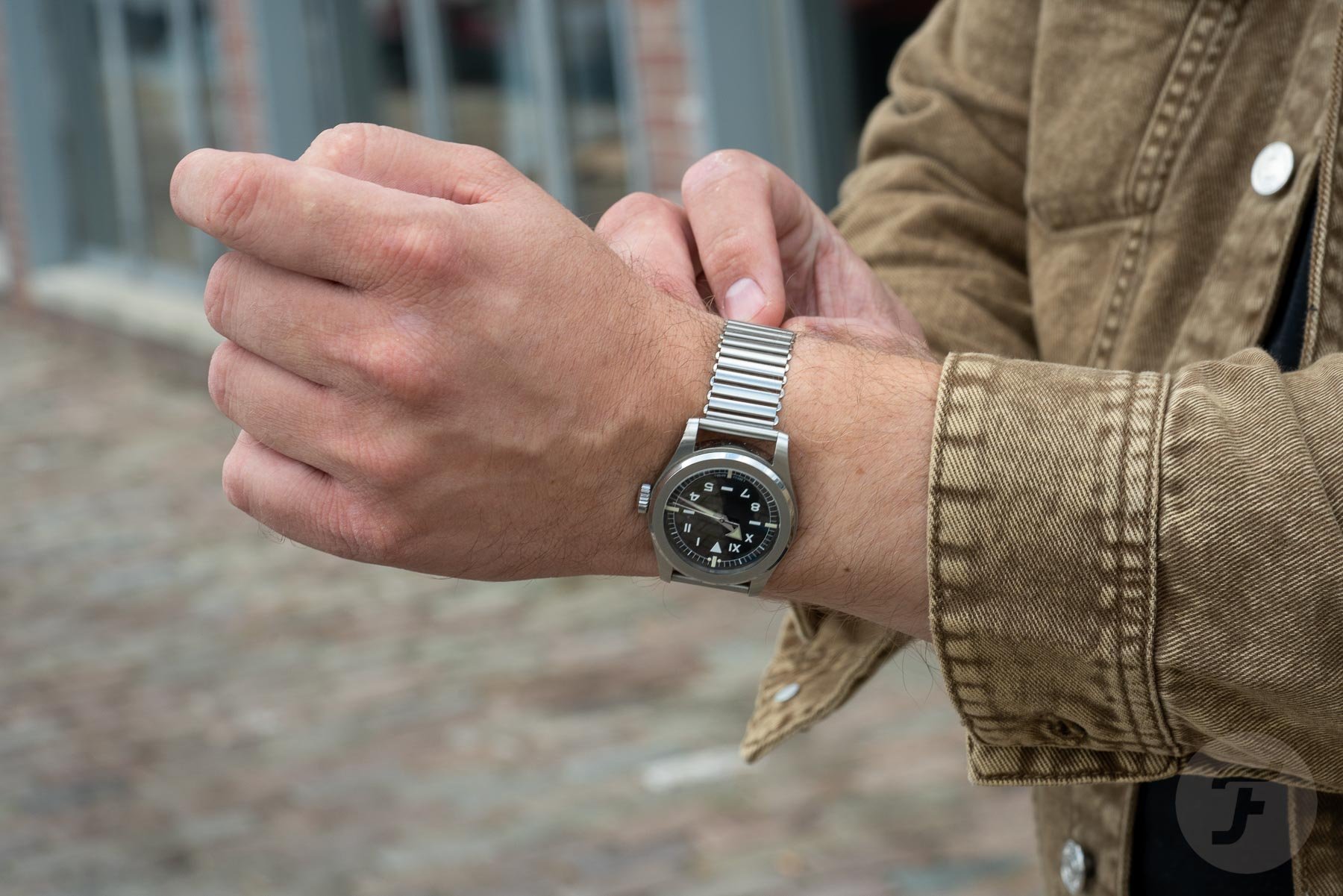
The third option is the California dial. It’s a little less busy, easier on the eye, and has plenty of charm with its iconic half-Roman, half-Arabic numerals. I personally prefer the California dial over the two other dials. It’s a little easier on the eye, and it adds a ton of appeal. Hovering above the dial are the brushed steel broad arrow hands also filled with Super-LumiNova. For the first iteration of the 4512, Serica offered the choice of board arrow hands or slimmer alpha hands. For the second, they’ve opted for the broad arrow hands as the one way forward. They are a great choice as they add more character and recognition on top of creating a better overall visual balance with the dial designs.
Product over branding
One of the most remarkable features of the dials is that they do not feature a Serica brand logo. Neatly tucked away at the 6 o’clock position, you will find the visual confirmation that you are indeed wearing a Serica watch. When I asked company founder Jérôme Burgert whether it was a deliberate choice, he was unequivocal in his answer: “From the very beginning, I wanted to escape from branding and communication and focus on a product that would speak for itself. It is a watch with a timeless yet unique design that packs so many qualities that it doesn’t need a loud logo on the dial. I wanted to make these same people actually look at the watch for what it is. Look at a design, proportions, finish, and how a watch should fit and feel.”
What seemed a bit weird at first quickly turned into something that is a signature of the brand.
In a world largely focused on the appeal of branding, it’s definitely a ballsy move. I was amazed because the Serica logo is straightforward and well designed — the fact that it’s not on the dial doesn’t mean there isn’t one at all. While I am not in favor of big logos on watches, a logo does give you that connection to a brand. Whether it’s the reassurance of buying a quality product or being part of a group with an equal mindset. In all honesty, after just a couple of days, I got used to not really having a logo on the dial. What seemed a bit weird at first quickly turned into something that is a signature of the brand.
Inside the case
Inside the stainless steel case, Serica also chose to go with a different movement for the second generation. The first generation 4512 was powered by the manual winding standard grade ETA 2801. For the current 4512 models, the brand switched to the manual winding version of the STP1-11. The decorated movement operates at 28,800vph, has 18 jewels and a 45-hour power reserve. Compared to the ETA 2801, the new movement offers greater accuracy at +/-6 seconds a day.
…it’s another clever feature that makes this watch even more appealing.
Burgert explained that it’s a switch fueled by both the lack of availability of the ETA movements and the great reliability and accuracy of the STP movement. A combination of these two factors made the choice to change movements a logical one. Opting for a manual winding movement is, in my opinion, a perfect choice. It requires you to take the time to connect to your watch by winding it at least once every two days. Considering its great charm inspired by the past, it’s another clever feature that makes this watch even more appealing.
The Bonklip bracelet
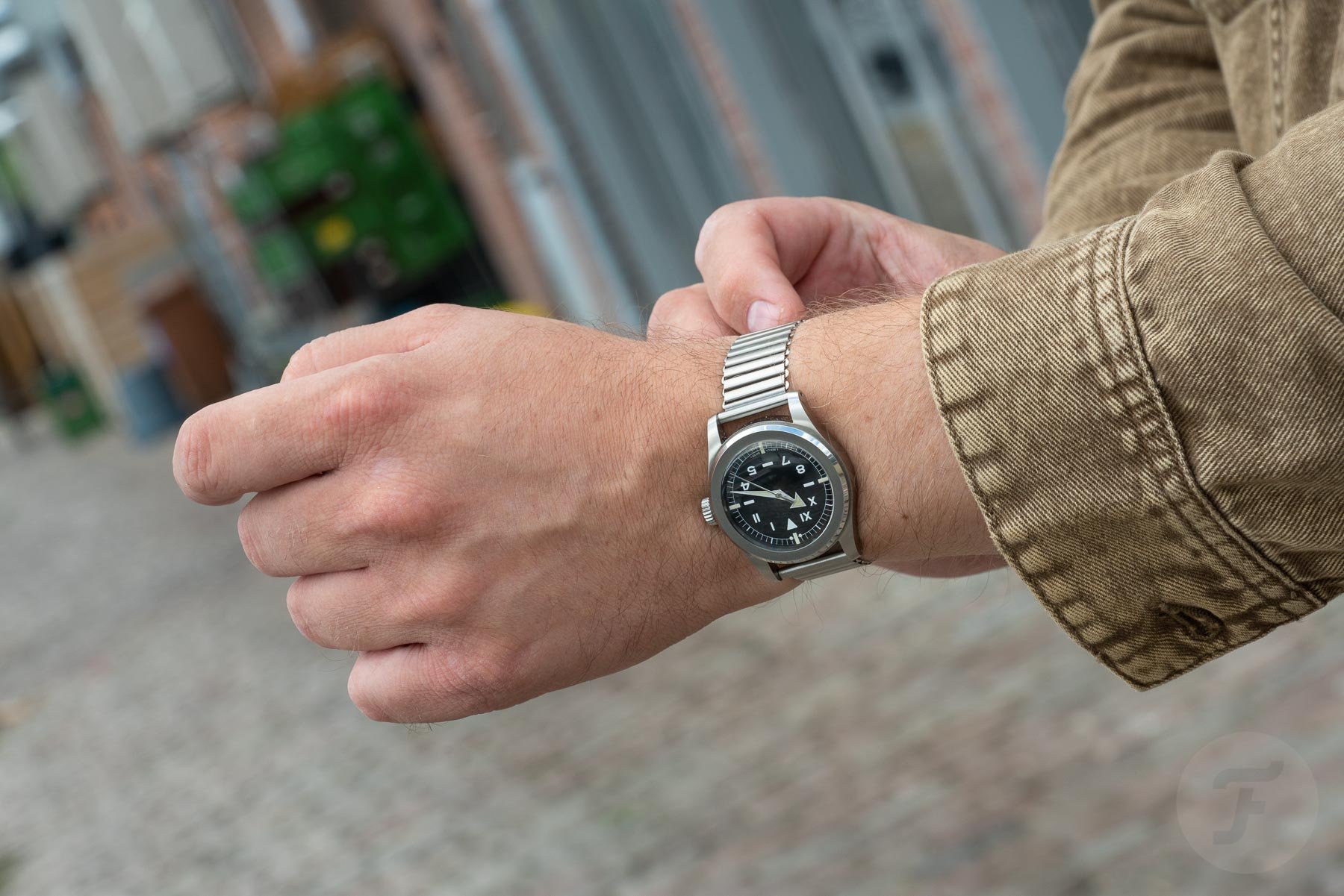
The watch comes equipped with an extremely well-executed Bonklip bracelet. It’s a remake of a 1920s UK-designed bracelet that is as thin as it is flexible. It’s a ladder-style bracelet that is 20mm wide all the way around. To put the watch on your wrist, you have to thread your hand through the open loop, pull on the end and adjust it to the right size before fastening it with a clip between two of the links. The bracelet feels supple, and because it’s very flexible, it makes the watch extremely easy to wear. The bracelet is very comfortable and soft and, at the same time, offers the sturdiness of a steel bracelet. On top of that, it can be counted as yet another element that adds a great deal of style to the watch.
Serica offers the bracelet in two lengths. The normal size is suited for wrist sizes up to 19mm. The larger bracelet is 4cm longer. As a result, the fastening clip will end up fastening further up the side of the bracelet rather than towards the inside of your wrist, with the fastening clip ending up closer to the lugs. Because of its looped design, it’s not just the wrist size that must be considered. The size of your hands also plays its part, as I quickly found out. While I adore the bracelet in both its design and comfort, I can just barely manage to squeeze my hand through the normal-sized version each time I put it on my wrist. Though not a major issue, it is something to keep in mind if you have larger hands. All in all, I must say the bracelet is another clever choice by Serica to make the watch even better in terms of comfort and looks.
Wearing the Serica 4512 California
By now, you’ve probably been able to form an idea of what I think of the Serica 4512 California. My thoughts on this watch can be summed up rather briefly: it’s an absolute joy to wear. The combination of its dimensions, the bracelet, and its design make it a fantastic daily wearer. During my time with the watch, I mixed it up with several other watches that were in for review. But I found myself constantly going back to the 4512. It really stole my heart in the short period of time that I had it in for review. I have to say that this really does not happen too often so I have to give full credit to Serica for creating an exceptional watch.
Final thoughts
The sum of all its parts shows that the Serica 4512 California truly is a labor of love. If we go back to the beginning of this review, I mentioned that the guys behind Serica had set out to create a watch that is both tough and beautiful yet comes at an affordable price. Starting with the first point, the build quality is thoroughly on-point. The bracelet is thin and flexible but oozes quality. Additionally, the movement has proven to be accurate and reliable in the short time I’ve had it on my wrist.
The design of the 4512 has tons of great retro-inspired appeal. On top of that, the visual balance of all these different elements is spot on. I honestly haven’t found anything that I would do differently. Even the fact that there is no logo on the dial made perfect sense once you get used to it. Like company founder Jérôme Burgert said: It’s all about the product. This brings me to the point of affordability. All three Serica 4512 models are available for €690. Honestly, it is hard to find a better watch for the money. It really is that simple. Serica’s first mission has been accomplished, and with the new 5303 diver on the way, things are looking bright for the future of the brand. And personally, I can’t wait to see where it leads.
To find out more about the Serica 4512, visit the official Serica website.

