Jorg’s Top Five Creative Watch Advertising Campaigns
When did you last see a watch ad that made a lasting impression on you and wasn’t created decades ago? While plenty of brands in different industries have found great success in finding new ways to connect to their audience through advertising, the watch industry is hardly creative in both ideas and execution when it comes to advertising. But that doesn’t mean there haven’t been great promotional campaigns. Let’s take a look at five creative watch advertising campaigns that have great iconic value.
If anything, watch brand advertising has hardly changed in decades. For years watch brands have been painting a static picture of an aspirational world of luxury in their advertising. Unfortunately, that world often seems distant, outdated, and out-of-touch with reality. While there is essentially nothing wrong with creating an aspirational world, it would be more palatable were it today’s world and not some ancient depiction of what the world of luxury was.
Outstanding creativity
Despite everything that is wrong with modern-day watch advertising, we have also seen some amazing work over the years. It’s why we have seen an incredible increase in appreciation for the vintage watch ads. The absolute king of creating great advertising back in the day was Rolex. The brand’s amazing advertising is also what inspired our series of articles you can find here.
For this list, the focus is on five creative watch advertising campaigns instead of just five individual ads. First, a list of five great ads would be almost impossible to create. There are simply too many to leave out. And secondly, a full campaign shows whether the creative idea is good enough to base an inspiring campaign on. It is worth mentioning that a brand can only appear on this list once.
1. Rolex “If You Were…”
As said, Rolex has been the best at creating some amazing advertising over the years. But I have to say its best work was created quite some time ago. Especially in the 1960s and 1970s, Rolex nailed it with a string of creative and iconic advertising campaigns. Many enthusiasts agree and people love to buy framed ads to put on their wall. And I totally endorse that. Some of these campaigns deserve to be on the wall in your office or at home.
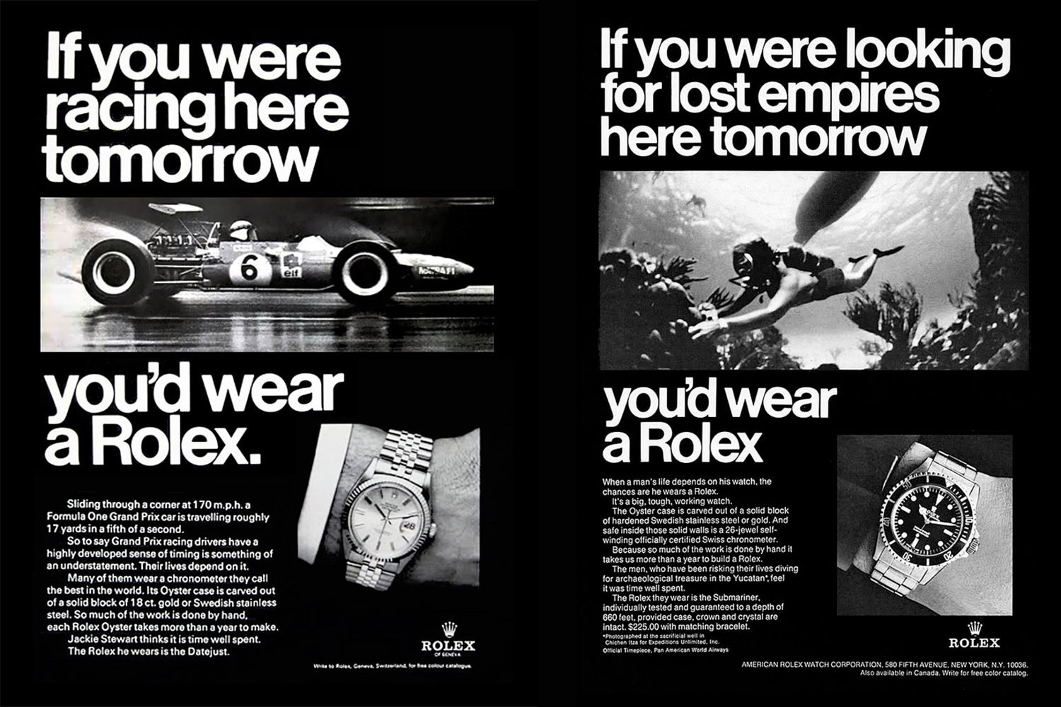
But a large number of great campaigns also make it hard to choose. For me the single greatest campaign Rolex ever created is the iconic series of, “You’d wear a Rolex,” ads from the 1960s and 1970s. As I mentioned in the first Rolex ads article I wrote: “The ads feature a very clear grid of text and images placed on a black background.
Every single one of the ads featured the message “If you were … tomorrow, you’d wear a Rolex.” placed in the iconic Helvetica font. The font was created by Swiss font designer Max Miedinger, and he named it Helvetica in 1960 which means Swiss in Latin. It’s a nice and clever choice Rolex made for the ads.”
In addition to that, the ads place you as a reader in an active situation and that brings the story to life for readers. Compared to a lot of current-day advertising it’s a lot more engaging. And like so many other watch enthusiasts, I would also gladly put this series on my wall.
2. Omega Olympic “Great Moments In Time”
The partnership that Omega has with the Olympic Games is one of the longest partnerships in watch history. Although often overshadowed by Omega’s partnerships with NASA and the James Bond franchise, the partnership has an amazing value. Each Olympic Games brings us new stories and Omega has been part of those stories since 1932. Omega’s position as the official timekeeper for the Olympics began in 1932 when the games were held in Los Angeles. Since then, Omega has timed most of the summer and winter events (with next year’s Tokyo games marking the 29th such occasion). There have been notable exceptions for both competitions, however. Seiko took on the role in 1964 and ’92 for the summer Olympics, while the Japanese giant also handled the stopwatch during the ’72, ’94, ’98, and ’02 winter games.
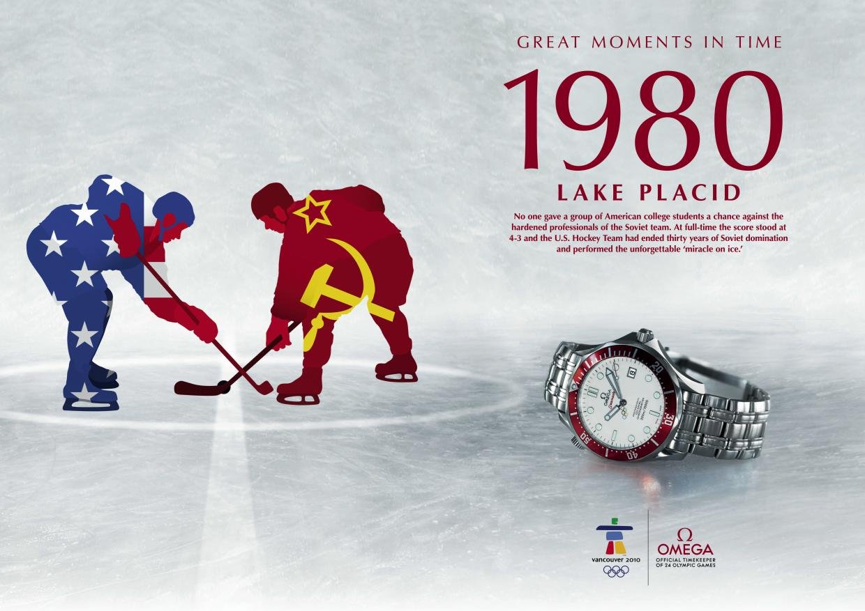
Back in 2006 Omega presented a series of ads/posters that tell one story of each of the 22 Olympic Games Omega had been a partner of up to that point. And the center focus of the posters were not the watches nor the brands, but the graphic depiction of those stories. As a big sports fan, flipping through the series is an absolute joy. Not only do I remember the legendary tales, but the visual storytelling is also great.
Omega had the guts in 2006 to create a campaign focused on storytelling rather than focus on the product or the single athletes and I love that. Although the ad shown does show an Omega Seamaster 300M, I suggest you check out the posters in the gallery below and see all the different posters for all the different Olympic Games. Like the Rolex campaign, they make for wall-worthy art.
3. Swatch Herbert Matter × Paula Scher
I remember this campaign as if it were yesterday. I don’t know if this was universal or if it was only a thing in the Netherlands but when I went to high school in the late eighties we used to have a planner that we would double in thickness because of all the cool stuff you would glue in there to personalize it and make it look cooler.
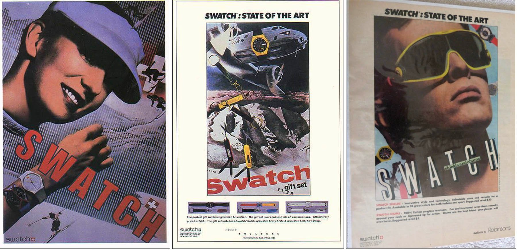
Mine was full of images of Nike Air Max sneakers, Nike ads with Andre Agassi and John McEnroe, O’Neill surf ads, and Swatch ads. And as you probably would have guessed, I glued this specific series of ads in my planner. I loved the quirky and colorful style of the ads and it totally matched the Rock ‘n Roll Tennis Agassi and McEnroe were promoting.
Only years later did I find out the exact story behind the ads. There is a nice write-up here on Retinart where you can read about the Swatch advertising created by Paula Scher in the 1980s. One of the campaigns was the one shown. As explained in the article Swatch moved its offices to the Swiss International Business Building, and discovered the work of Swiss design legend, Herbert Matter on the wall.
In 1932 Matter designed a series of iconic ads for the Swiss National Tourist Office. When Paula Scher saw them, she knew she had to recreate them for Swatch. She copied Matter’s art and added Swatch watches in the images. Back in the 1980s, this was a pretty ballsy move as Matter’s work was very well-known. But I loved that she made her own rules to create something very iconic.
4. Linde Werdelin “The Perfect Five”
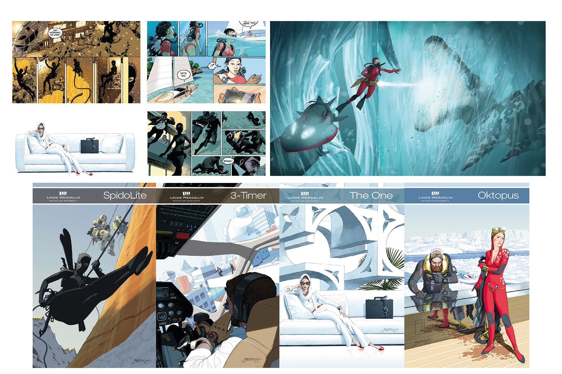
One of my other passions besides watches is collecting comics. I am not the biggest comic nut but I like a well-drawn realistic comic with a good story. For comic enthusiasts, Largo Winch is a favorite here. So it probably comes as no surprise that I was blown away when I received a set of transparent Linde Werdelin product sheets in the style you see above. It looked absolutely stunning and original. It was part of the bigger “The Perfect Five” campaign that the brand had created.
“The Perfect Five” actually is a graphic novel told in multiple parts that Linde Werdelin released with Dominique Bertail and Thierry Smolderen from 2010-2012. The images from the graphic novel were not only used for the comic itself but also for an online campaign, the product sheets and all the other promo materials. You can check out three parts of the graphic novel here.
The characters in the comic wear the Linde Werdelin watches and the story is written so the watches have an active role in the story. This gives them extra character and it links directly to the physical product. Besides that, the people behind the brand also play a pivotal role in the story. For me, this is the single most creative campaign ever created in the watch industry. Not only does it tell a story that brings the watches to life. The art that communicates that story is brilliant.
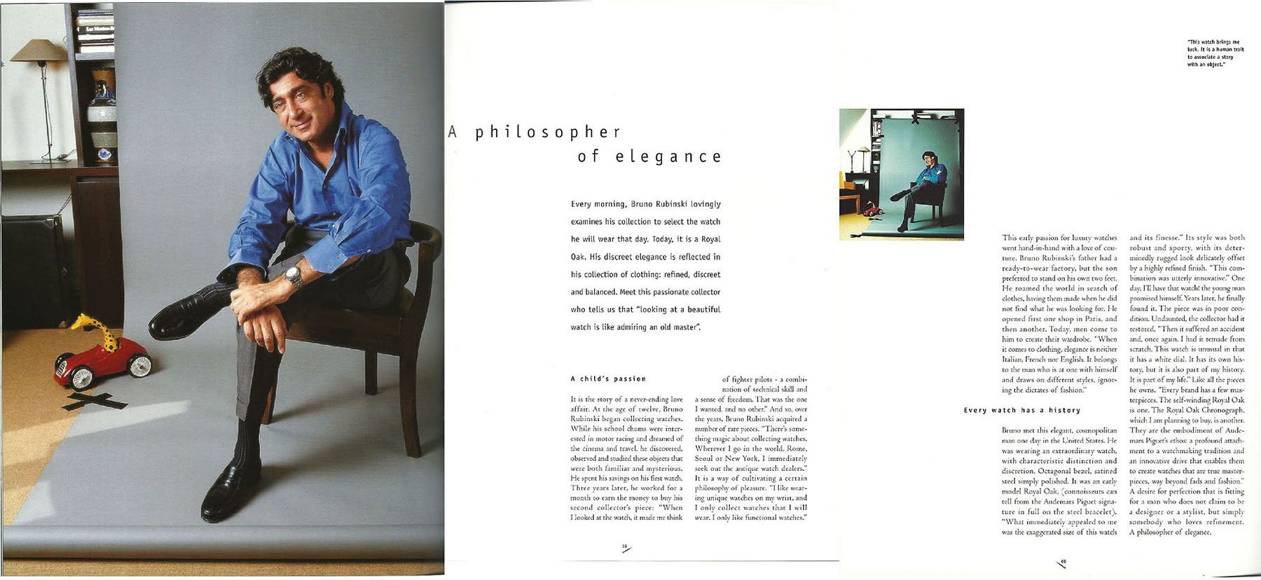
5. Audemars Piguet Campagne
This is actually cheating a bit because it’s effectively not a campaign. It’s part of an Audemars Piguet catalog from the early 2000s. Robert-Jan showed it to me sometime back in 2003 and we still discuss sometimes how great this is. The magic of the story: real stories by real people actually owning an Audemars Piguet. No brand ambassadors, no influencer stories but Bruno Rubinski, a watch collector that explains the love for his Royal Oak.
And that’s exactly what I love about this promo campaign. It uses real people with real stories you can relate to. I want to hear how good a watch is from the people that own one. After reading this I was even more sold on the iconic value of the Royal Oak. It’s a lot more effective than all the static and impersonal campaigns we see too much of nowadays. Sure, it’s difficult to make this story into a one-pager. But it doesn’t mean it can’t be done.
In the end for an ad to work, it must land in your heart. With all five of these ad campaigns, I have a truly personal connection. They essentially tell my story by telling their story. And I do not necessarily love all the watches that are advertised. But I do feel a personal connection to the brands throught these stories. And that’s the most powerful connection we can have to good advertisement. And we need more of that!
There you have it. Jorg’s top five creative watch advertising campaigns ever. Let us know what your favorite advertising campaigns are.

