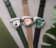
Vintage-Inspired Watch Designs — What Makes Them Work Or Not?

There’s no shortage of vintage-inspired watches in today’s market. With so many options, there are bound to be hits and misses. This article will be a personal take on the factors that attract me to a vintage-inspired watch design or do the complete opposite. I have found four main aspects that seem to frustrate me the most.
You see, in my role as a contributor for Fratello, I am lucky to see many different watches. This has been an interesting process of self-discovery with the hobby too. Being exposed to so many designs has not only provided some clarity in what my tastes are but also provided moments when those tastes are turned on their heads.
Analyzing vintage-inspired watch designs: my methodology
Today, I wanted to share a few thoughts on some of the design elements I see in heritage-inspired watches and why I think they might contribute to or detract from the designs’ success. As part of this, readers, I would welcome your thoughts in the comments, particularly about specific design decisions and whether they bug you or not.
Before we begin, I wanted to explain my methodology. I decided to pick a few of the major brands that have regularly made these design decisions and unpack the issues. To do this, I’ll look at a few watches from each brand’s current or back catalog and explain what elements don’t resonate with me and which ones do.
Longines: Art Deco oversized
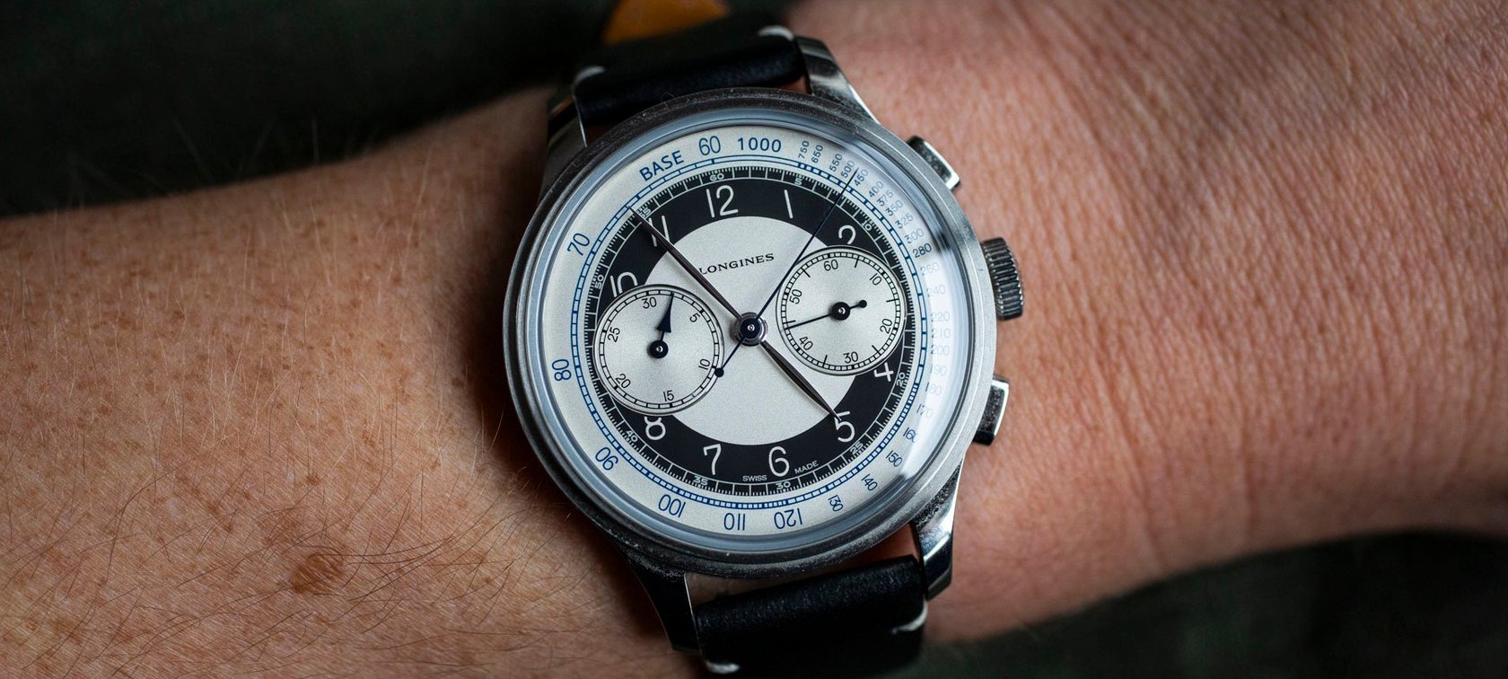
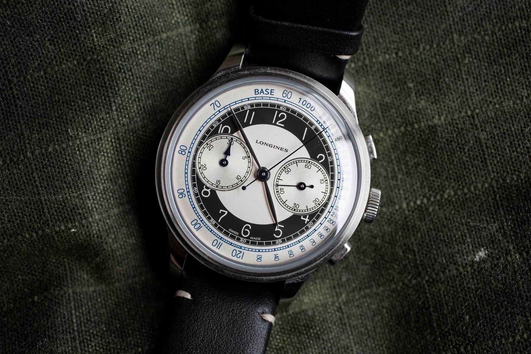
Longines is probably one of the best at recreating references of yesteryear but with modern specifications. The Heritage line has led to hit after hit, and the Heritage Classic Chronograph hails from it. The watch is also known as the “Tuxedo Chronograph” because of the use of black and silver on the dial to create a contrasting effect, like a bullseye or tuxedo suit. The design was inspired by a watch from the early 1940s. The original featured Longines’s highly esteemed 13ZN caliber, while the modern version features a beefed-up ETA workhorse.
I’m a fan of Art Deco designs, and the Longines Heritage Classic Chronograph has quality to match. I should like this watch. But I’ve never been able to warm to it. Why? The 40mm case is too big. For an enthusiast familiar with this watch’s 13ZN forebears, which usually came in cases no larger than 38mm, this Heritage Chronograph is too big. It creates a generally clumsy feel on the wrist.
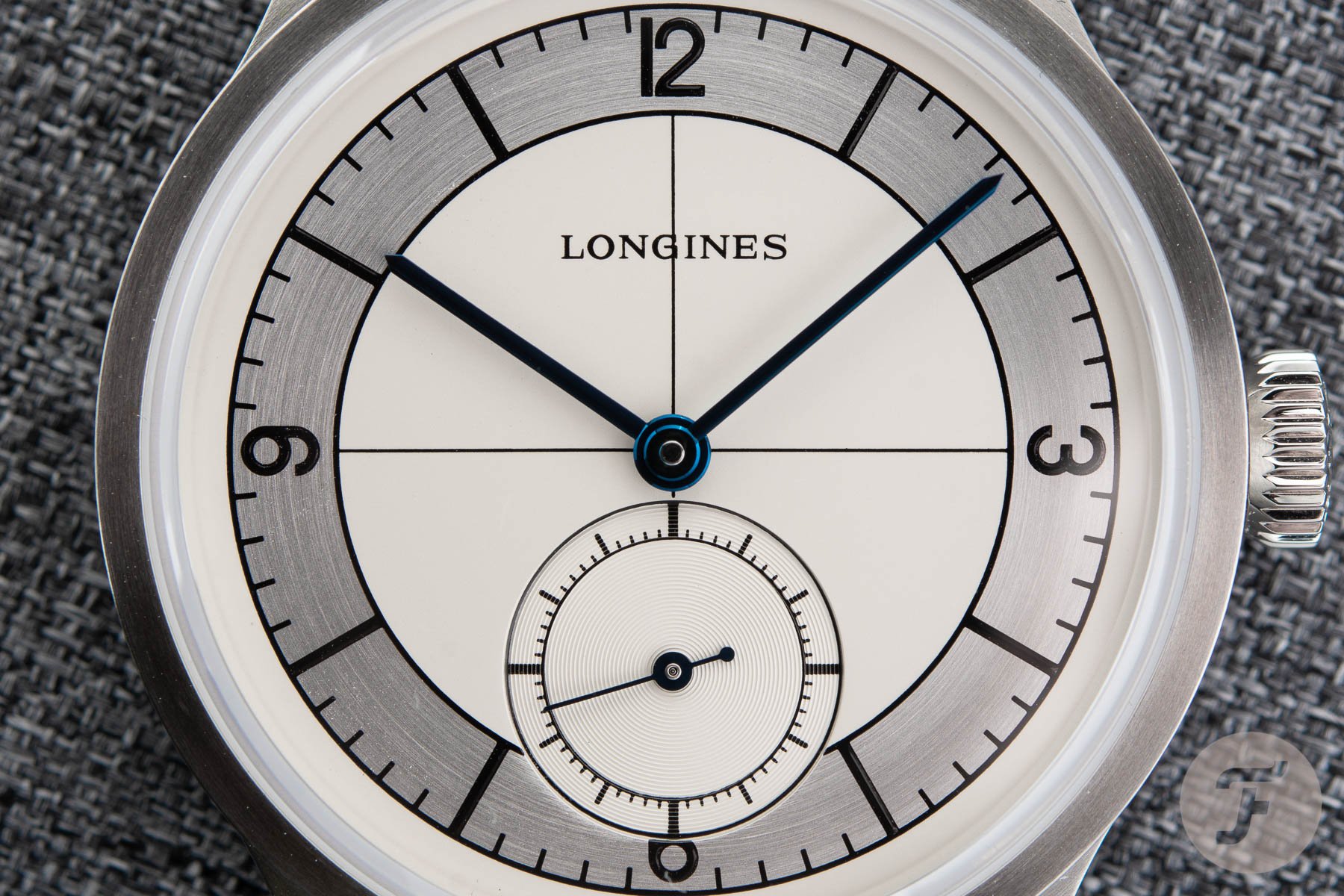
The same is true of the Longines Heritage Classic. It is a beautiful watch, no doubt, but when I plant it on my wrist, it just doesn’t sit right. The 38.5mm diameter looks like it is all dial and, consequently, it feels too big. The dial design just works better in a vintage 34–36mm size.
So, what works with these watches? Longines nailed a lot of small details. The dial designs are extremely well executed. Everything from the use of heat-blued hands right down to the fonts shows great respect for the original designs. For this, Longines deserves praise. Unfortunately, for me, it all falls apart with the larger case sizes.
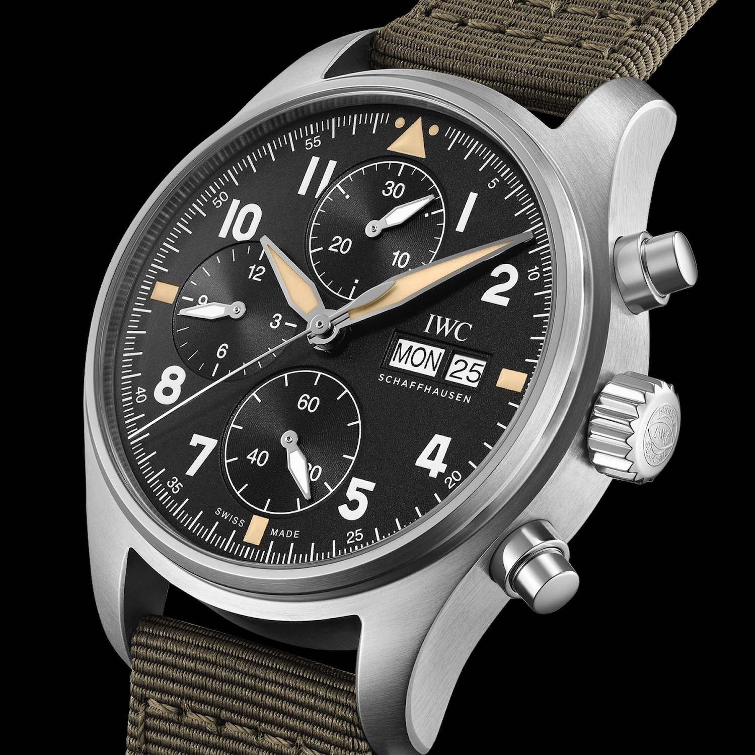
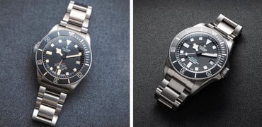
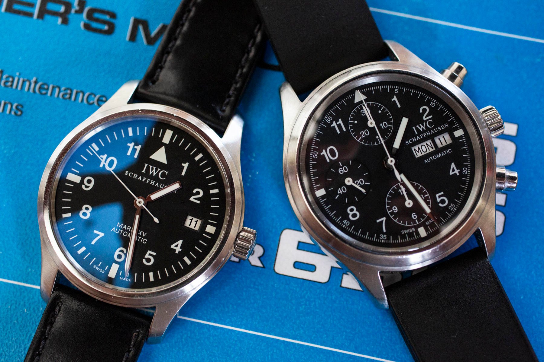
IWC Pilot’s Watch Automatic Chronograph Spitfire
IWC: Why can’t we get the hands right?
It’s no secret that I have an affinity with IWC. This is because my family history is tied to the brand’s hometown of Schaffhausen. However, my affinity is with IWC’s watches of yesteryear. This is reflected in my daily watch, which is an IWC Mark XV Pilot’s Watch from the early 2000s. Very little in IWC’s current catalog speaks to me (except perhaps a certain special RAAF Pilot’s Watch). IWC’s recent releases since the Mark XVIII haven’t grabbed me like the brand’s older designs, and its vintage-focused references leave me scratching my head.
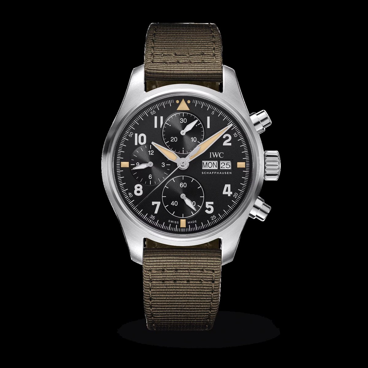
Pilot’s Watch Chronograph Spitfire
The brand’s Spitfire line is a good example. Let’s look at the IWC Pilot’s Watch Automatic Spitfire or the chronograph version. This is a product line that I should naturally gravitate towards due to its focus on the brand’s past as an expression of modern watchmaking. But I can’t wrap my head around some of the design choices. Why do these watches need faux patina? And why does IWC continue to use sword hands that had nothing to do with the RAF watches of yore? Rather than adding authenticity, these choices detract from it.
What most frustrates me about the latter design choice is that I know IWC knows this as well as anybody. You see, one watch that does “work” for me is the IWC Pilot’s Chronograph Tribute To 3705. This timepiece shows that IWC really can design something with the impact of past designs while also introducing a suite of technical improvements. The problem is that IWC only seems to be open to properly nailing its designs when it comes to special editions rather than standard-production pieces. That hardly seems fair.
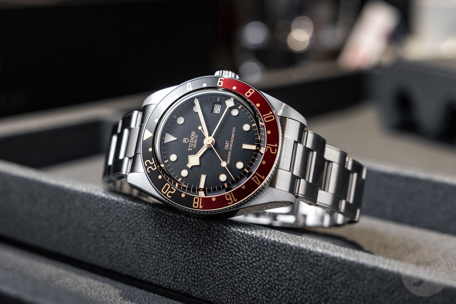
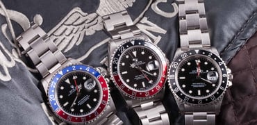
Tudor: “Gilt” to the hilt
So many brands love throwing a lot of gold elements into their designs. But Tudor recently sparked chatter with the heavy use of gilt-tone elements in the Tudor Black Bay 58 GMT. Now, judging by the specifications alone, this is a compelling timepiece. Don’t get me wrong; I can recognize the better elements of what Tudor brings to the table from a consumer standpoint. But the brand excels at the art of getting things nearly right. The GMT is a perfect example — a fine watch that is covered in “gilt” to the hilt (not to be confused with true gilt dials). Like faux patina, copious amounts of gold paint and plating lead me to a quick sense of fatigue with a watch’s design.
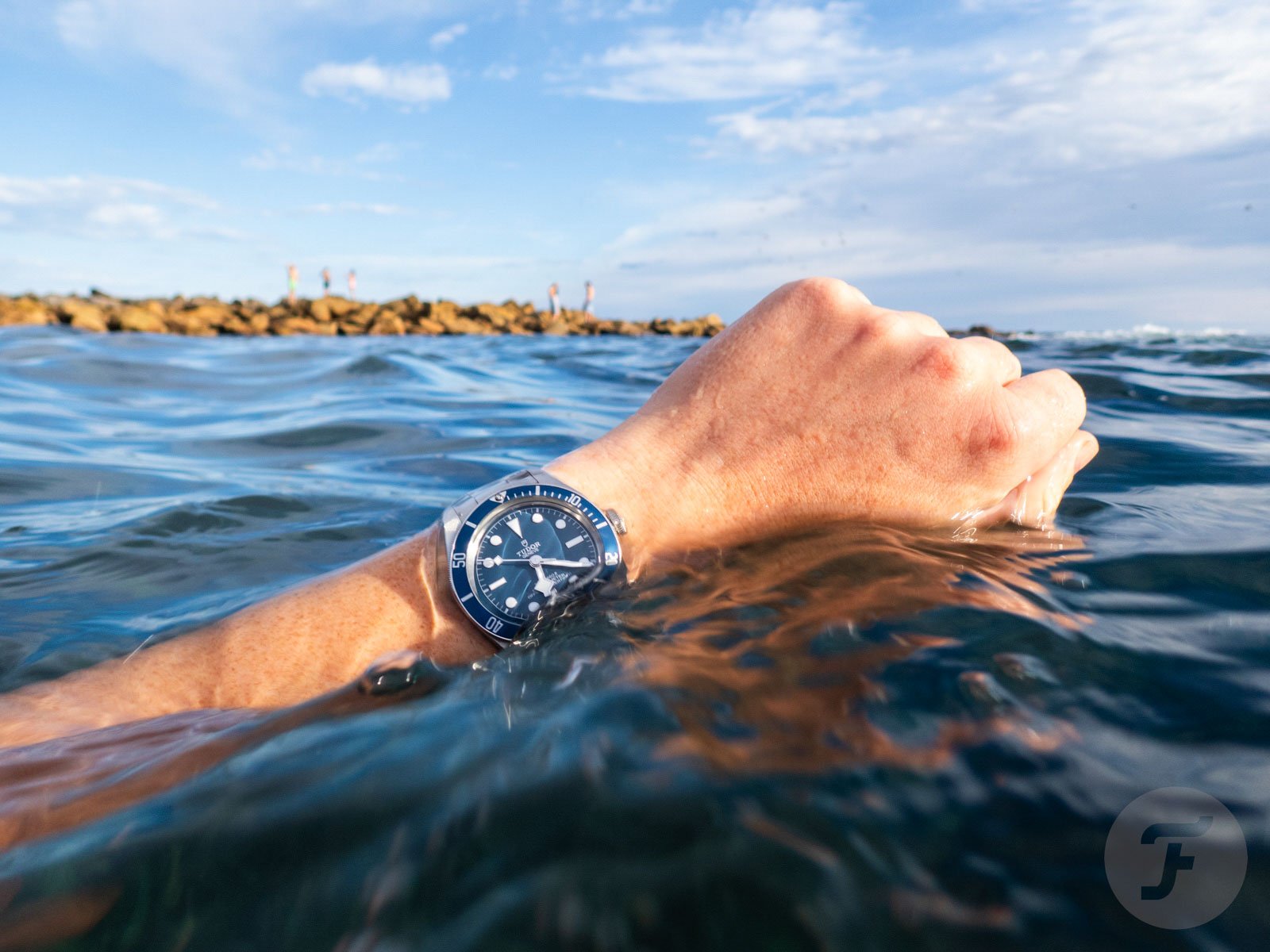
The thing is, with Tudor, we can afford to be patient. As the Black Bay 58 in blue shows us, the brand might first release a watch with “gilt” and faux patina but often then provides a more aesthetically modern version with silver markings and indexes with crisp white lume. While one could argue that the blue Tudor Black Bay 58 is a boring watch, my counterargument would be that you don’t get bored of a boring watch!
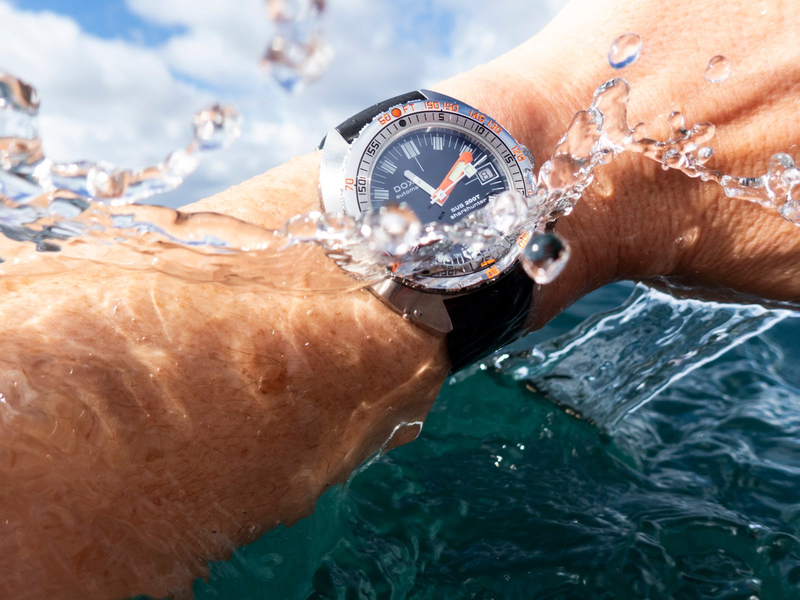
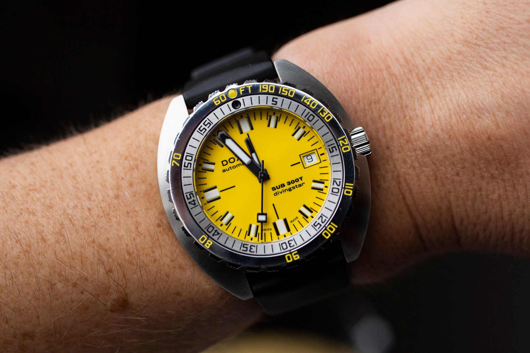
Doxa: When the colors are off…
Doxa’s recent release of the Doxa Sub 200T is a classic example of designers “hedging their bets.” By this, I mean there are so many options for the consumer — including dial color, lume color, and a bracelet or matching rubber strap — that there should be something for everyone. This only applies if you already like the basic Doxa aesthetic, but you catch my drift. The “best” Sub 200T models are the ones that haven’t “aged.” The Doxa Sub 200T Divingstar is a real standout in this regard. This yellow watch with white lume is something I’m sure I wouldn’t get sick of, unlike anything with faux patina. I found that the green lume on the Sharkhunter, Searambler, and Professional models unfortunately tends to look sandy in some light. This brings it too close to faux patina for my liking, breaking what is otherwise a great design.
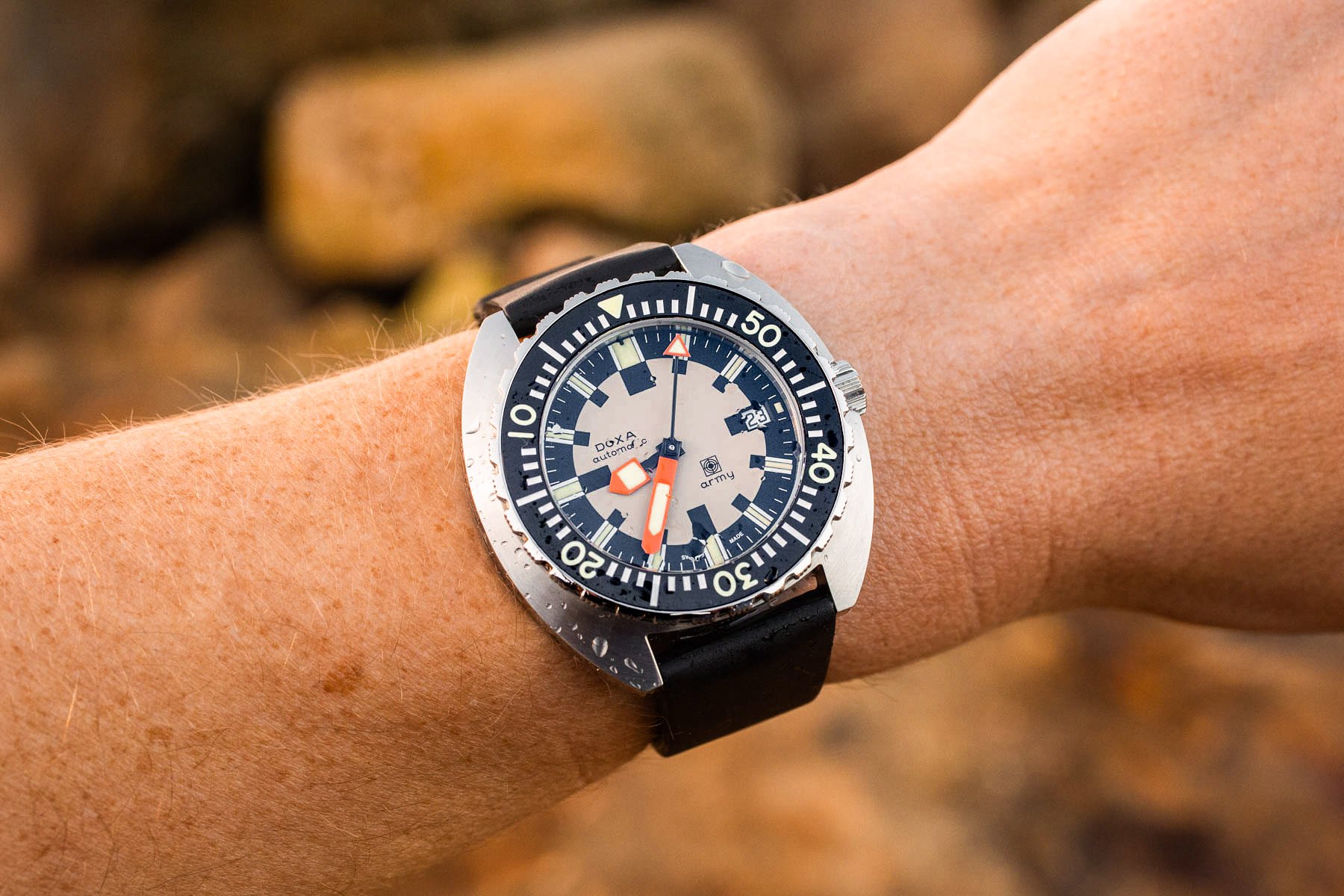
The release of the Doxa Army reveals how the pursuit of vintage designs can be fraught with challenges. Original images of the Doxa Army from the period revealed an egg-white or off-white dial offset with black details, sort of like a chessboard. I was initially enchanted by the quirky design of the Army and its compelling wearing experience thanks to it being slimmer than the 300T. But I grew weary of the watch because the color on the dial wasn’t quite right. It was like the outside of an egg that had been baked in the sun too long. This dissatisfaction was underscored by seeing the original in images while researching my (admittedly glowing) review. How the sands of time can shift perspectives. I would be the first one to admit that viewpoints and tastes can change.
Closing thoughts
For me, whether a vintage-inspired watch “works” or not can boil down to just a few things — period-correct sizing, historically accurate design, keeping “gilt” in check, and the absence of faux patina. More than anything else, these elements or the disregard for them seem to either draw me to or repel me from vintage-inspired watch designs.
Again, this article is entirely subjective, and I would welcome your thoughts in the comments. Do you also share my impressions on these elements of vintage-inspired watches, or do they differ wildly for you, and if so, why? Let me know in the comments.