Watch Giveaway: Axios Flagship Is A Fruity Dive Watch Looking For Love
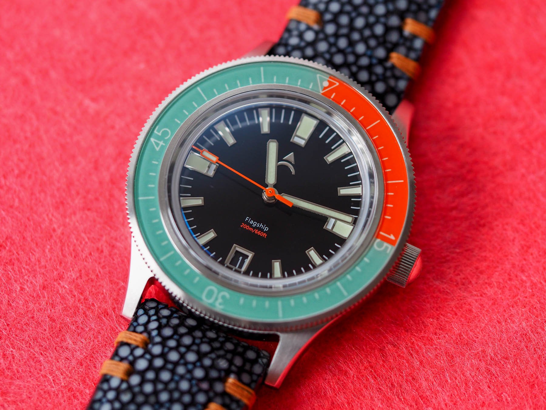
Sometimes, truth be told, I get a bit of stick from my peers for supporting some smaller brands. I’m not a complete micro-head. Far from it. I like a select few brands that I feel do something worthwhile and I support them fervently. I’m a sucker for execution and flair. Normally, for a brand to command my attention, it has to do something either very well or very “wow”. The watch I have here for you today is not particularly original but it is a well-made daily diver with just the right amount of watermelon freshness to catch my eye. I give you (quite literally) the Axios Flagship.
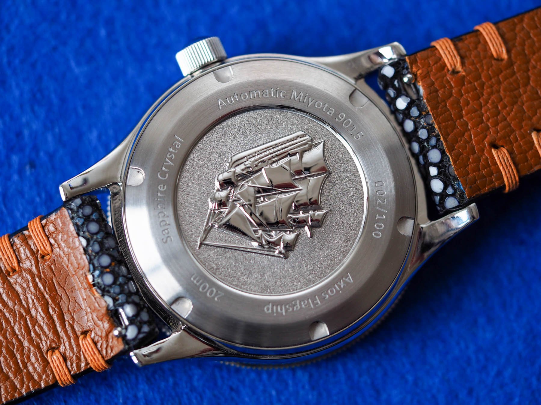
I rarely do this, but I’m going to start with the closed case back of this 40mm divers’ watch. On the back, we have a very deeply embossed motif representing Nelson’s Flagship, HMS Victory. We can see around the edge that this Axios is limited to 100 pieces and individually numbered. This one I’m giving away is number 002 so very likely the first model to leave the factory for public consumption given brands’ tendency to hold on to the first model for themselves.
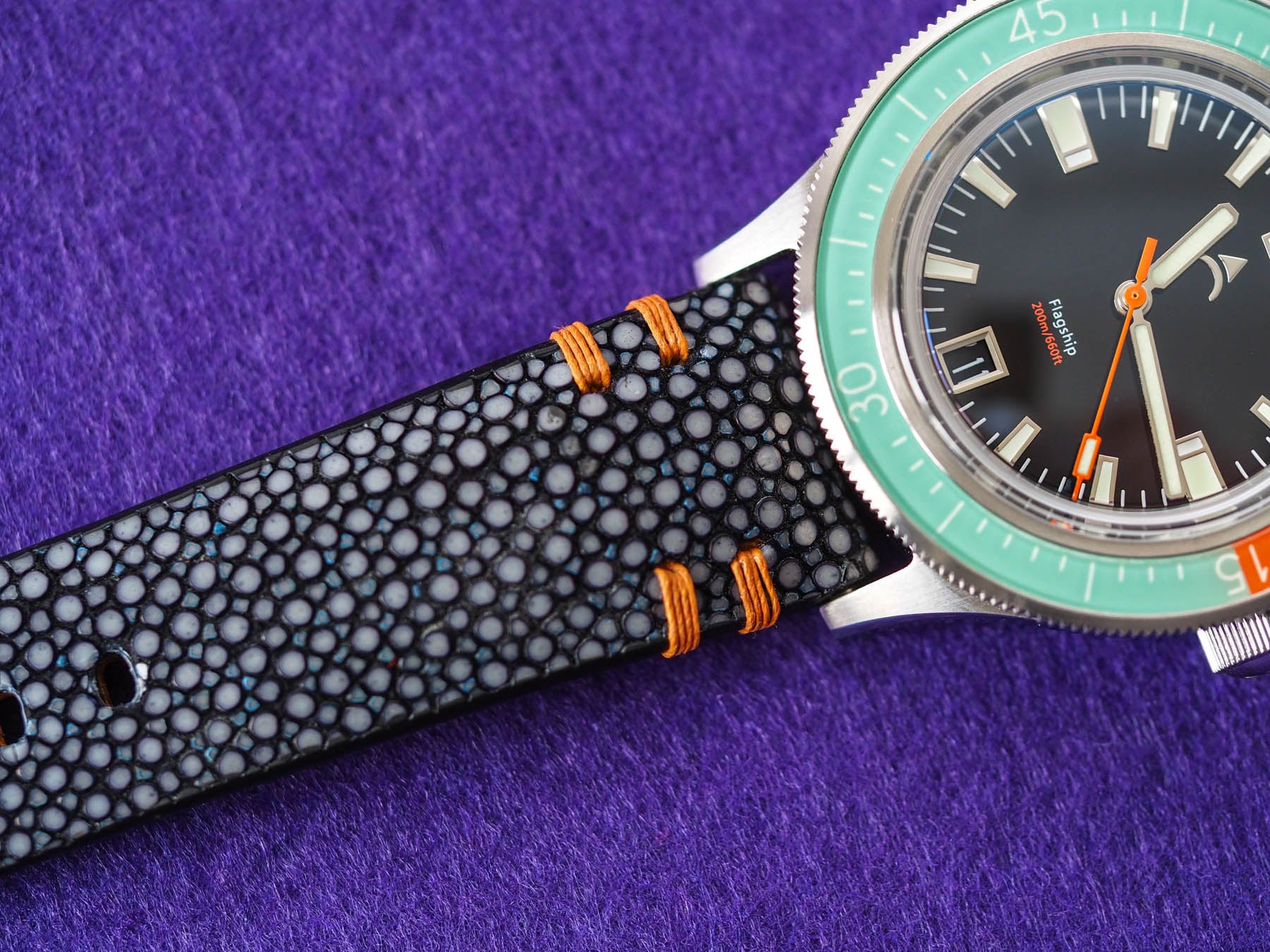
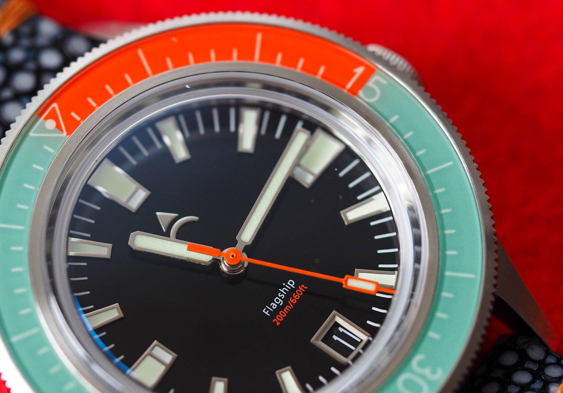
Additionally, the text informs us that the Axios Flagship is powered by a Miyota 9015 automatic and that the watch is water-resistant to 200 meters. This water-resistance rating is also printed on the dial in teensy-weensy orange letters beneath the Flagship text between the 6 o’clock date and the center.
The best thing
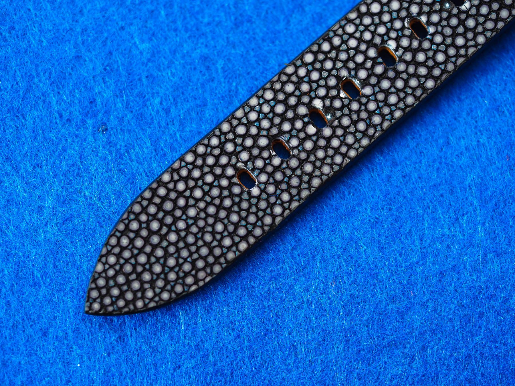
In my opinion, the best thing about this striking diver is the colorway. The mint green and fiery orange make for a strong, unusual combination that reminds me of something between a Zodiac watch and a candy store. The use of the fiery orange on the dial and the seconds hand is a smart way to tie the whole thing together. While the stingray strap the watch comes on may not be to everyone’s taste, I like it. The shoulder stitching doesn’t seem to fit with the colorway at first, but it is such a cool material I think I could quickly get over it. Anyway, if you don’t like it, you can change it. I’ll be sending the lucky winner a beads of rice bracelet and an Axios rubber strap also, so you can flip them to your heart’s content.
Some weird quirks
The absence of a wordmark on the dial gives me some serious Star Trek vibes. I don’t hate it per se, but it is odd. Most brands, were they to drop either the logo or the wordmark from the dial, would, I think, drop the logo. The name very rarely plays second fiddle, but here it does. Placing this unusual feature on the opposite side of that almost microscopic text was clearly not done by accident. Here, the legibility of the time is crucial. It is obvious that the designers placed function way, way, way before form.
A note on fonts
In Britain, road signs are written in a special font known as Transport. It was developed specifically for this application and has a few interesting quirks that I can actually see reflected here in this watch. When devising the new font, typographers decided to use lower case lettering with initial capitals rather than all capitals as had been popular in the past. The justification for this was partly because of long-distance legibility (the shift from caps to lower case provided more natural word spacing), and also because the brain can (supposedly) interpret lowercase words faster because of the variation and “visual cues” that exist throughout its natural flow (and because we’re simply more used to reading lower case as we have done since we were kids).
Symbols can distract where text informs…
Capital letters are the same height, which makes it tougher for the brain to quickly break down the meaning because it is laboring away identifying each letter individually. As such, they are much more arresting. When we see capital letters, we see symbols. Symbols can distract where text informs…
Additionally, the Transport font uses wider letter spacing or kerning (nothing to do with Georges Kern). This also makes it easier to read quickly. So when we look at the font choice of the Flagship text, it is not only very small, but we see it has lower case letters with an initial capital and pronounced kerning. All of these things add up to make it as invisible as some printed in a contrast color can be. The result when it comes to the Axios Flagship’s dial? A chromatic link that delivers information in an impressively unobtrusive way. How’s that for tumbling down the typographical rabbit hole.
It could be yours
So what do I want you to do to win this fruity beauty? I need you to answer the following (very difficult question):
Considering that legibility is of paramount importance to dive watches, how would you design the perfect diving tool? What colors, materials, and finishes would go into your perfect diver?
Don’t be shy. Go nuts. Have fun with it. Try and keep it within CITEs boundaries, but don’t stress yourself too much if you desperately want to share with the world how you desire a turtle shell dial. We’re a broad church and we won’t judge. I make no promises about the reaction of concerned customs officials, however. Oh, and by the way, this model is actually sold out (check the website here), so you’ll be winning the last of its kind. No pressure…
This is a preferred position post. Learn more.

