Watchee, an iOS App for Watch Collectors
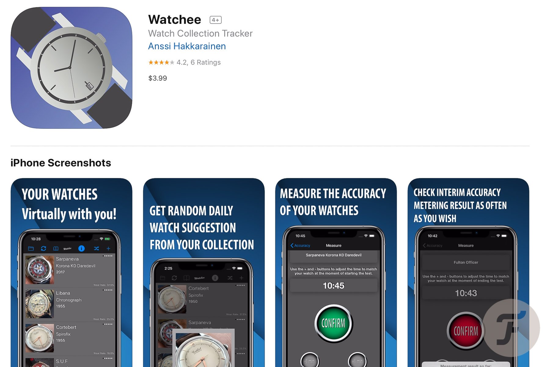
Anssi Hakkarainen from Finland has been programming for almost 35 years. That’s approximately the same period that he has a particular interest in watches. So quite naturally, Anssi developed an iOS app for his own watch collecting needs, Watchee.
Developing started some years ago, but it was only October 2018 that friends encouraged him to share the app via Apple’s App Store, and today, it’s been available there for about a full year. Now that it’s is on sale in the App Store, Anssi had the chance to improve it every once in a while. The Watchee app meanwhile saw many updates, some of which provided additional new features to the app.
Watchee is useful for whom?
If you’re an avid watch collector, you’ll probably know that situation where you want to show one of your watches to someone, and you can’t find it between those one-zillion pictures on your phone. Or you’re thinking of buying a new strap for a specific watch in your collection; however, once at the shop, you don’t precisely recall the lug width. And you want to brag about how little you paid for that particular watch in your collection, but don’t want to lie.

These situations and many more – I’ll discuss some other functionalities later – can be prevented with a user-friendly app like Watchee. Of course, user-friendly is critical here in this context. An app like this, where you have to enter rather large amounts of data, is only functional if this isn’t too much of a hassle. Because we all know that otherwise, you make a good start, however, get demotivated quickly, resulting in not using the app in the end anymore. So, let’s start with a first look at the app and then with the way data is entered.
A first look at the app
After having downloaded the Watchee app from Apple’s App Store and opening it on your iPhone, one will see a grey blank screen with lines and icons at the top and bottom. No fancy flash screen, picture, or visual. Just an empty screen. Luckily it’s pretty evident that if you want to start something, an [+] icon usually does the trick, and that’s what it does here as well. Tapping the [+] icon opens a ‘Watch Details’ fill-in screen.
Entering data
The fill-in screen is a fairly clear one. It starts with the possibility of entering two pictures, but that can be done later as well. For these pictures, you have the choice to take them from your phone’s available photos or take new ones with the camera. Some of the fields, like Brand, Model, Ref., and Serial Number, have to be just filled-in. Others will open a scroll wheel with options. These scroll wheel options are comfortable, of course, but mean a limitation at the same time as well. I found a few of these limitations a bit disturbing, and even something which I would like to see solved in one of the future revisions of the app.
…limitation in entering data
The first one of these limitations, I learned, is in the diameter and thickness of the case. They have to be filled in in full millimeters, like 39, 40, or 41. I know a millimeter is a rather tiny unit, however, in watch-land little details count and for a collector, a watch with a diameter of 41.1 is different to one with a diameter of 41.9 mm. Even more with the thickness, a decimal millimeter value would be preferable, choosing between 12 or 13 mm just isn’t very adequate.
Second. The field ‘Waterproof’ misses 6 ATM or 60 meters. A value, amongst others, used by IWC for many of their Pilot watches, and for instance by Omega with this Speedmaster ’57. All in all nothing unbearable, of course, and as far as I can see pretty easy to change in a future update of the app.
Some more thoughts
Except for the above-mentioned limitations, I could think of some other points which might cause questions. I won’t say they’re wrong or errors in the app, more personal thoughts, and preferences.
For instance, entering the case material I missed the bi-color or two-tone option. It’s either steel or gold; I didn’t see Steel/Gold. This, however, can be very easily solved by entering the second material into the Bezel Material field. Like Case Material: Stainless steel. Bezel Material: Gold (Yellow). Probably that’s even how it’s meant. In that case, a Gold/Steel watch with an Aluminium bezel inlay would be the trouble.
…Nano-Ceramic Glass?
At the different types of glass, I personally don’t know what ‘Nano-Ceramic Glass’ is or which brand this uses, and I kind of miss Seiko’s ‘Hardlex’. At the Crown-Type field I can imagine that ‘Protected’ and ‘Screw-Down’ don’t rule each other out. And at Movement-Type ‘Tourbillon’ would be more a construction of the escapement than a type of movement. At least, it doesn’t rule out both types, ‘Manual’ and ‘Automatic’.
And last, for consistency reasons it would be nice to get the possibility to choose from already entered brands. If it was only to make sure they’re entered the same way every time over again.
Functions of the Watchee app
But let me stop whining here. By no means I want this to be a complaining review as I truly like the app and its possibilities. It’s just difficult to get it perfectly right for everyone, I’m very well aware of that, and that’s not necessary as well.
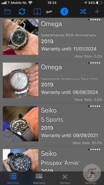
So what awaits when you’ve entered (part of) your watch collection? First of all a home screen showing a beautiful list of your watches. By tapping the top-left folder icon, this list can be sorted by Brand and Model, Purchase Price, Wear Rate (*) I’ll get to this later), or Year of Manufacture. At this point, I kinda miss sorting the list by date of purchase. The second-left icon, two rotating arrows, rotated the picture of the watch to show the case back; if a case back picture has been entered of course.
The Book icon is to show a screen with a summary of your watch collection. How many watches are entered, what’s the total you spent on the entire collection, how many have been sold (if any), and in that case, what your profit was selling them. The (i) icon will leave the list as it is; however, it changes the information shown on each tap. First is the basic Brand, Model, and Year of Production, then the next tap displays when the watch was last worn, which movement it uses, and the power reserve. Tapping three times shows the reference and serial numbers, and whether or not it’s complete with box and papers. The penultimate tap reveals the price you’ve paid for the watch, while the last one shows the watch’ age and for how much you’ve owned it.
Explaining the (*)
Two paragraphs up I mentioned the Wear Rate with an (*). Wear Rate is a nifty feature of the app which allows you to keep track of how often you wear a specific watch. Just choose the watch you’re wearing at that time, and hit [mark as worn today]. The total number of times you wore the watch will be displayed on the watch’s information page, together with a percentual wear rate and the date it was last worn.
For the indecisive amongst us, the fourth icon, two crossing arrows, gives a suggestion on which watch to wear today. Then, if you don’t like the suggestion, you’re of course allowed to overrule it and have the app draw again until you like it and hit ‘Wear today’.
Additional Extra’s
Additional to the list of watches in your collection, there’s an option for two extra lists. One to store the warranty paperwork of a watch (chosen from the main list), and one to store information on any service which was given to a specific watch (again, chosen from the main list).
Accuracy

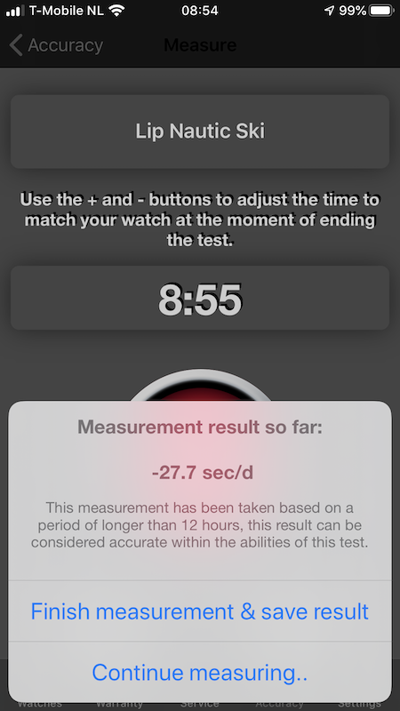
Last but not least, with the last update of the app, which occurred when I was writing this review, another feature was included. A feature to help measure the accuracy of a watch. It works like this. After choosing a watch from your collection one hits a blue (start) button. With -1 and +1 you’ll set the digital time shown in the app to the actual time on the watch. Then, if the watch’s second-hand hits the 12, you’ll hit a green (confirm) button. The results are shown in a way as in the above screenshot. I didn’t have time enough to get some experience with this in order to judge the functionality.
Conclusion.
All in all, a very nice and handy app to keep track of your watch collection and most of the data of your watches. Certainly, worth the price; I can only recommend it. You’ll find the app in the Apple App Store here: Watchee


