Watches & Pencils #47 – Dial Color Confusion: Salmon Dials And More
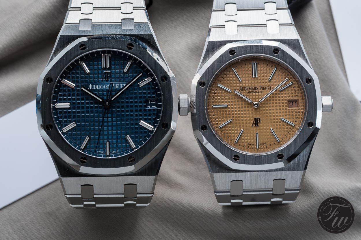
Recently, multiple brands released their ‘salmon’. I mean a dial with the colour which is described as salmon. Or named ‘salmon’ by the watch crowd. To commit to this I thought it was time to create my own ‘true’ salmon dial:
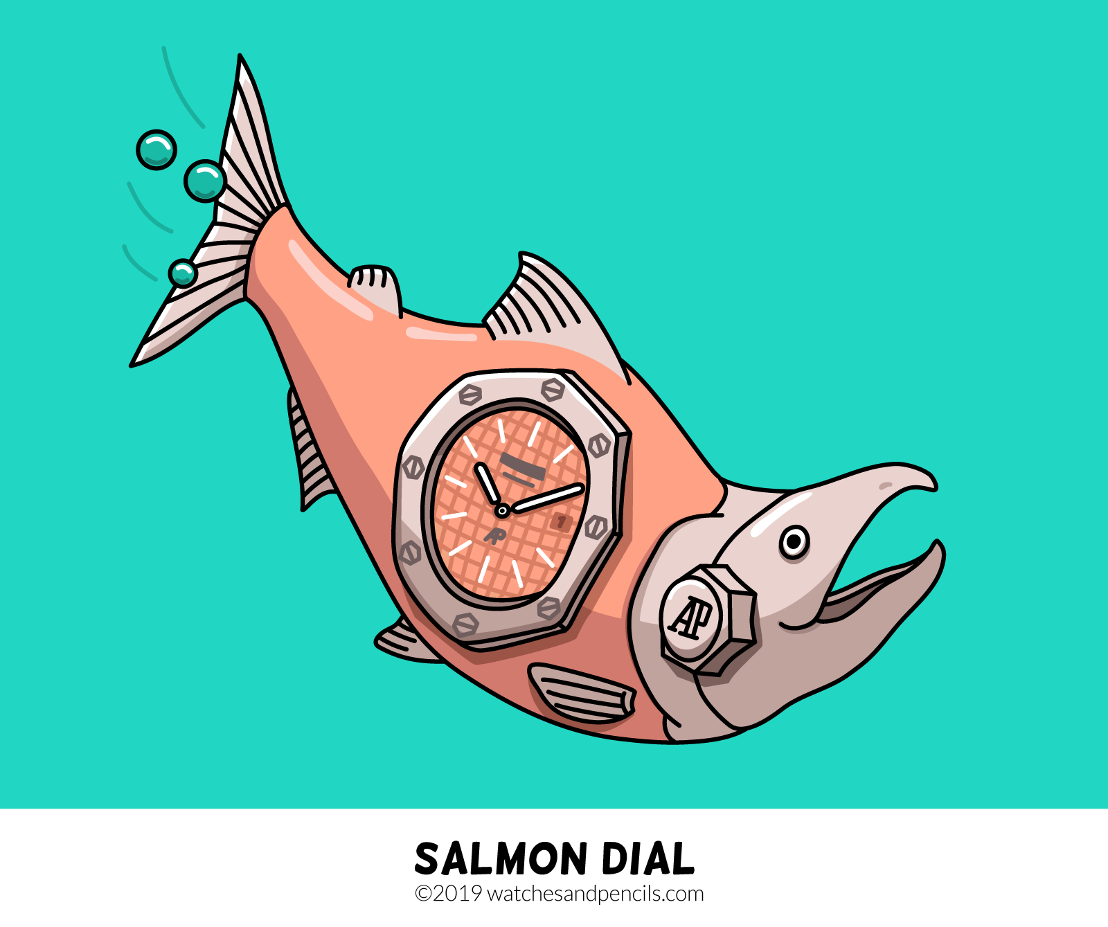
Why do I say ‘true’? Well, there has been some discussion going on this new Audemars Piguet (reference 15202BC). Is it a salmon dial or not? Audemars Piguet describes it as pink-gold. Some watch collectors say it’s salmon. Confusion everywhere. How can you verify this?
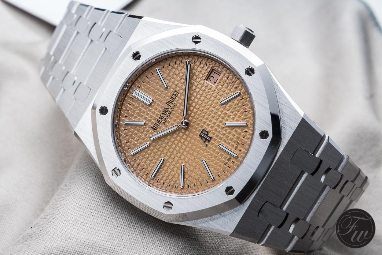
Salmon dial or not?
See It Yourself!
Although most professional photographers can get the colours right, it’s often the device of the viewer (and the settings) which makes it look less correct. Plus, there is one evil disturbance which will always be difficult to tackle: environmental light. On the spot when taking the picture, but also when viewing the picture. Although most recent high-end mobile devices are decent at correctly displaying colours, the best option is to see it in real life. Outside and with daylight (preferably, cloudy).
Discussions About Dials
Dials and their colors seem to be one of the most difficult things to get right. Last years I’ve been following several discussions about this topic. One of the most recent ones is the discussion about the Seiko Alpinist Hodinkee limited edition. In short: some people interpreted the published pictures as a watch with a matte blue dial. When they received the watch they were disappointed, because it turned out that it was a sunburst dial. Some tips to prevent this scenario:
- Always verify your assumptions with the seller if you’re suspicious about something.
- Do a quick Google search for more pictures, from different angles.
- Do more research about the watch series. In the case of the Seiko Alpinist, the green ‘regular’ model also has a sunburst dial. Most of the time, special editions are mainly about changing a dials’ color, not the kind. Otherwise, it will/should be mentioned explicitly.
Of course, not only the buyer can do something about it. The seller should also be aware of this. When I put a watch online I have one simple rule: try to catch the main characteristics in the pictures. Is it a glossy dial? Is it a dark dial? Is it big? Is it brushed steel? There are multiple ways of getting the pictures right, but then again, a picture is a more risky medium in terms of color interpretation compared to real life looks. Team member Bert created a nice watch photography guide a while back, which I highly recommend.

Black is always the safest choice.
Descriptive Terms
So why does this confusion happened around the term ‘salmon dial’. I do not have a clear answer to that, but I do have a theory. Terms like ‘salmon’ do not have a hard color code or something like that. It’s a soft term and it describes more of a color area. Plus, everyone has a different thought when he or she thinks about a salmon. There are so many kinds of salmon with each there own ‘salmon pink’. In my opinion, it’s ok to link colors to animals, materials, etc. But, do not put too much weight to it, unless it’s a widely accepted and documented color. Both from a sellers and a buyers perspective.
Spot The Differences
To show you the ‘colour area’ where I was talking about I want to wrap up by putting several ‘salmons’ below each other. All named or being described as a ‘salmon dial’. Will the real ‘salmon dial’ please stand up:
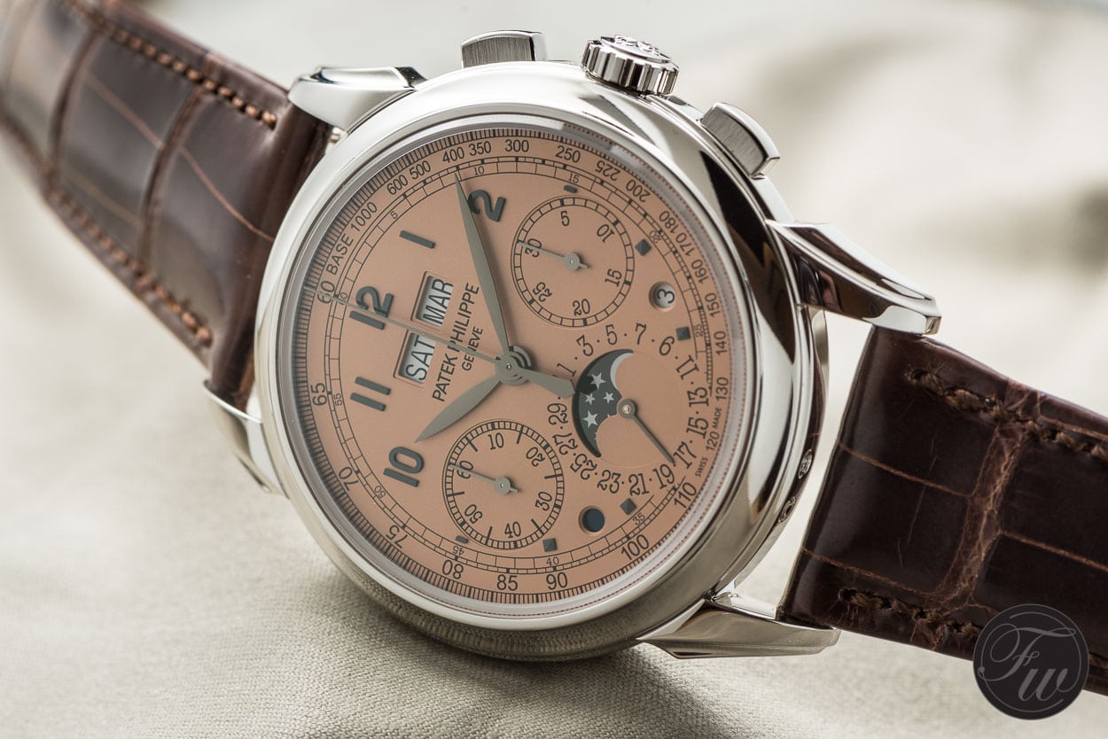
Patek Philippe (reference 5270P)

Montblanc Heritage Manufacture Pulsograph (reference 119914)
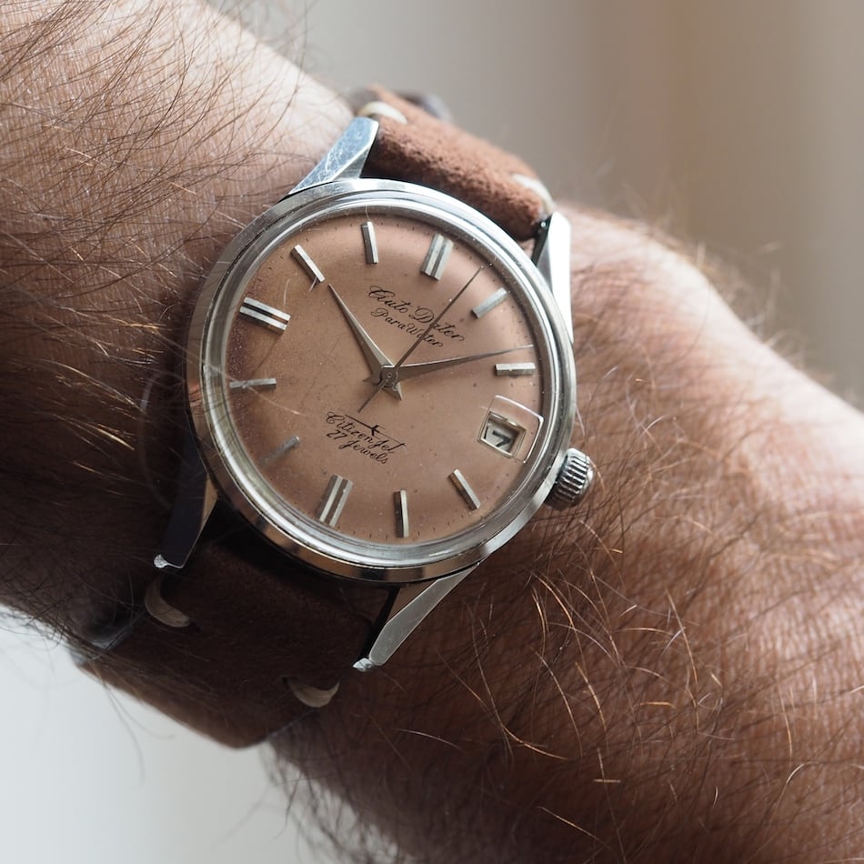
Citizen Jet Auto Dater 9
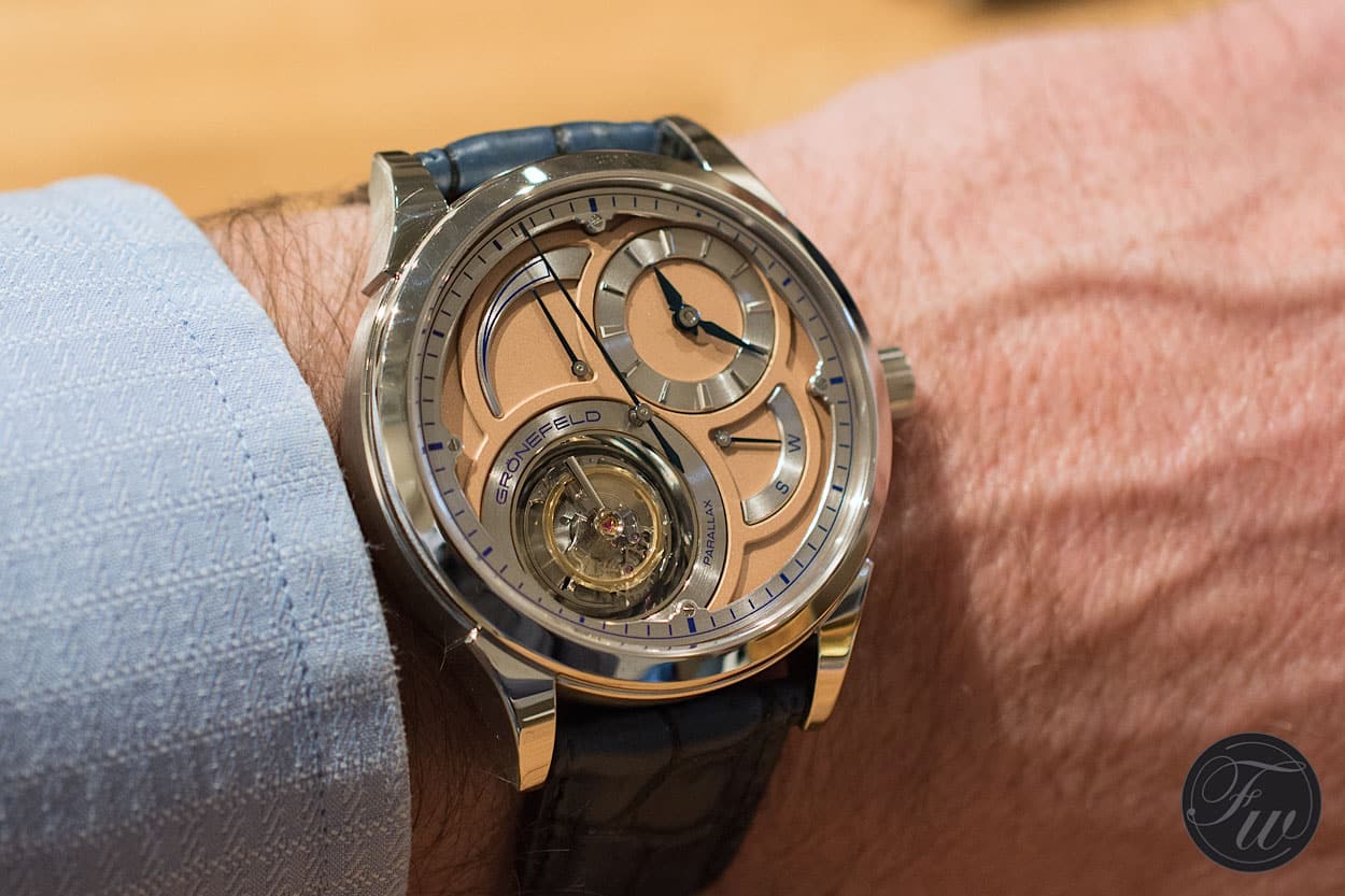
Grönefeld Parallax Tourbillon
